When building a website, there’s a ton to take into consideration, from SEO, to landing page performance, but one of the most important parts is the UX design.
After all, it’s the whole structure, look, and experience of your site.
UX stats show that 88% of online shoppers say they wouldn’t return to a website after having a bad user experience. In fact, 70% of online businesses that fail do so because of bad usability. It’s not negligible.
There are a few best practices to keep in mind to ensure good UX, particularly for
eCommerce sites.
Whether you’re looking to do a round of UX optimization on your eCommerce store, or want to get started on the right foot for your next websites, we got you!
Keep reading to know everything about eCommerce UX best practices.
What is eCommerce User Experience (UX)?
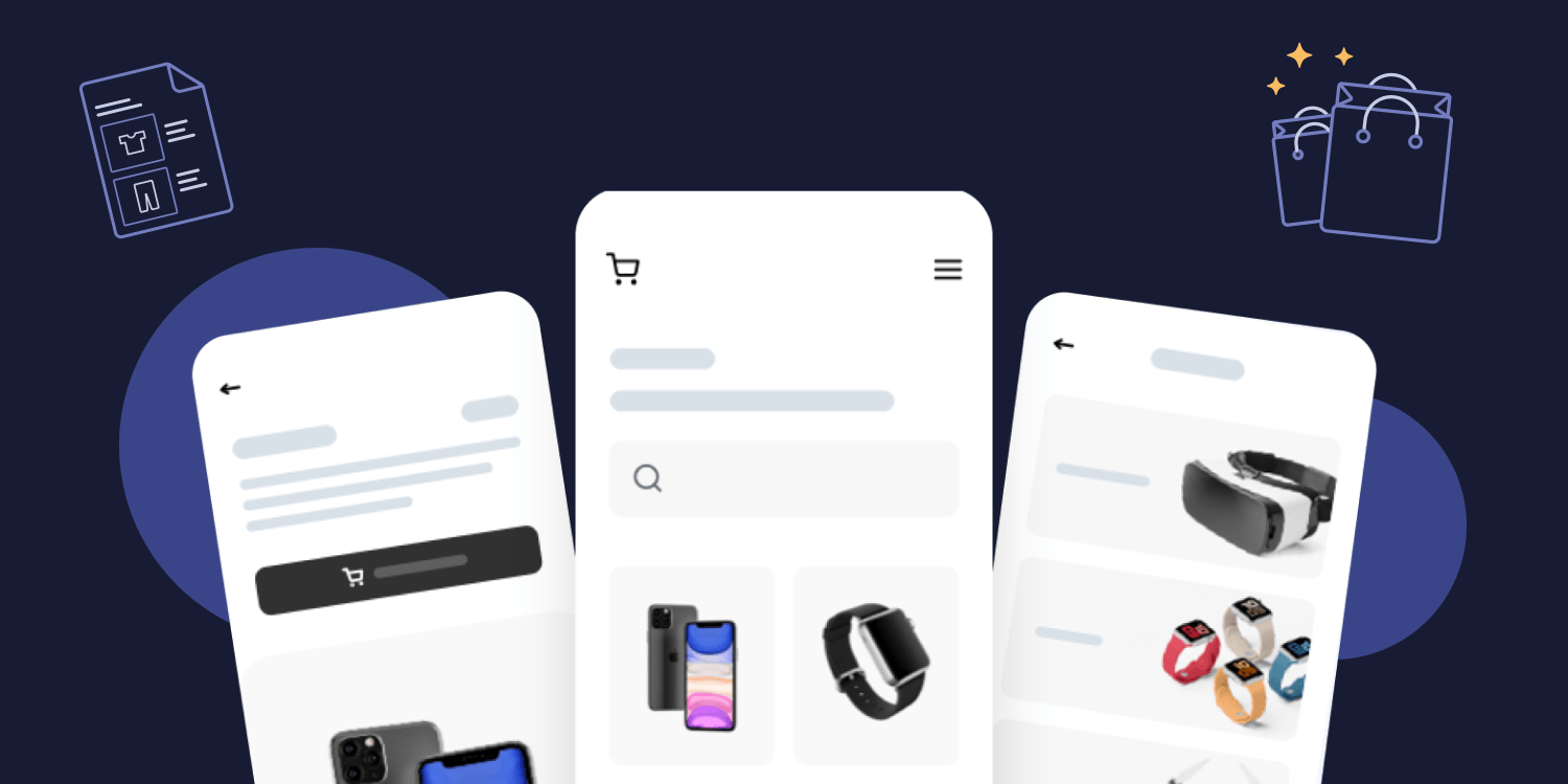
Ecommerce UX uses UX design to create the perfect customer experience on an eCommerce website, enticing website visitors to complete a purchase. It includes having good functionalities for your online store, great and easy navigation, good usability, and an overall great online shopping experience for all users.
Why is eCommerce UX important?
Ecommerce sites rely on conversions, and a good eCommerce UX can
improve conversion rate, reduce cart abandonment rates, and enable you to get more returning customers. In other words, it increases your eCommerce business bottom line.
6 Best eCommerce UX best practices and tips
1. Build for mobile first
Having a responsive design that works just as well on mobile devices as it does on desktop is now more than a best practice, it’s website building 101.
According to Statista, in 2020, 67% of global online retail traffic was generated via mobile. In the fashion industry, the mobile share of traffic was even higher, amounting to 76%.
Make sure the eCommerce UX design you choose works perfectly with mobile phones and tablets. It’s quite easy nowadays. All you need to do is choose a website builder that’s made for mobile too (like Duda).
If you want to go even further, you can create a mobile app if it fits your user needs.
2. Create simple & easy navigation
Your eCommerce website design needs to be as crystal clear and simple as possible.
The focus is on the products, the promotions, the CTAs. The goal is to ensure users will navigate the page easily, find what they are looking for, have no friction and proceed with a purchase.
Here are a few tips to help you improve the ecommerce site navigation:
- Optimize the homepage:
We want users to have a good first impression of the page, and know from the get-go what the ecommerce store is all about. Have an
eCommerce homepage that’s easy-to-understand, with one goal, focusing on best-selling products and what the brand excels at.
- Create clear category pages:
Make sure to classify and showcase your products into clear categories that make search as quick and easy as possible.
- Have clear, above the fold CTAs:
You want your target audience to do one particular action, so make sure that’s what you promote on your website; it’s easy to get lost with multiple CTAs everywhere (buy now, become a member, subscribe to newsletter, learn more), but it makes it confusing for the customer. Stick to one CTA and showcase it above the fold, so users don’t have to scroll and search for it.
- Provide optimal site search:
Make sure you have a search field available to help users find any product they look for. You can also include product discovery sections (similar products, new items, trends, etc.)
- Personalize user interface:
A good example of UI design personalization is Amazon’s recommended products’ list. Show products that were recently consulted, added to cart, or in the user’s wishlist to help with conversions and search.
- Improve the shopping cart experience:
The shopping cart UX should be seamless. There should be all the product information needed at this point of the shopping process (name of the item, number of items, picture, price). To ensure that everything goes as smoothly as possible, you can do some a/b tests, and use tools to help you create the best possible shopping cart.
3. Optimize product pages and descriptions
Product pages are an essential part of your eCommerce website. That’s where users can learn more about your product and where they will decide if they want to buy or not.
Here are a few tips to optimize or
design your product pages:
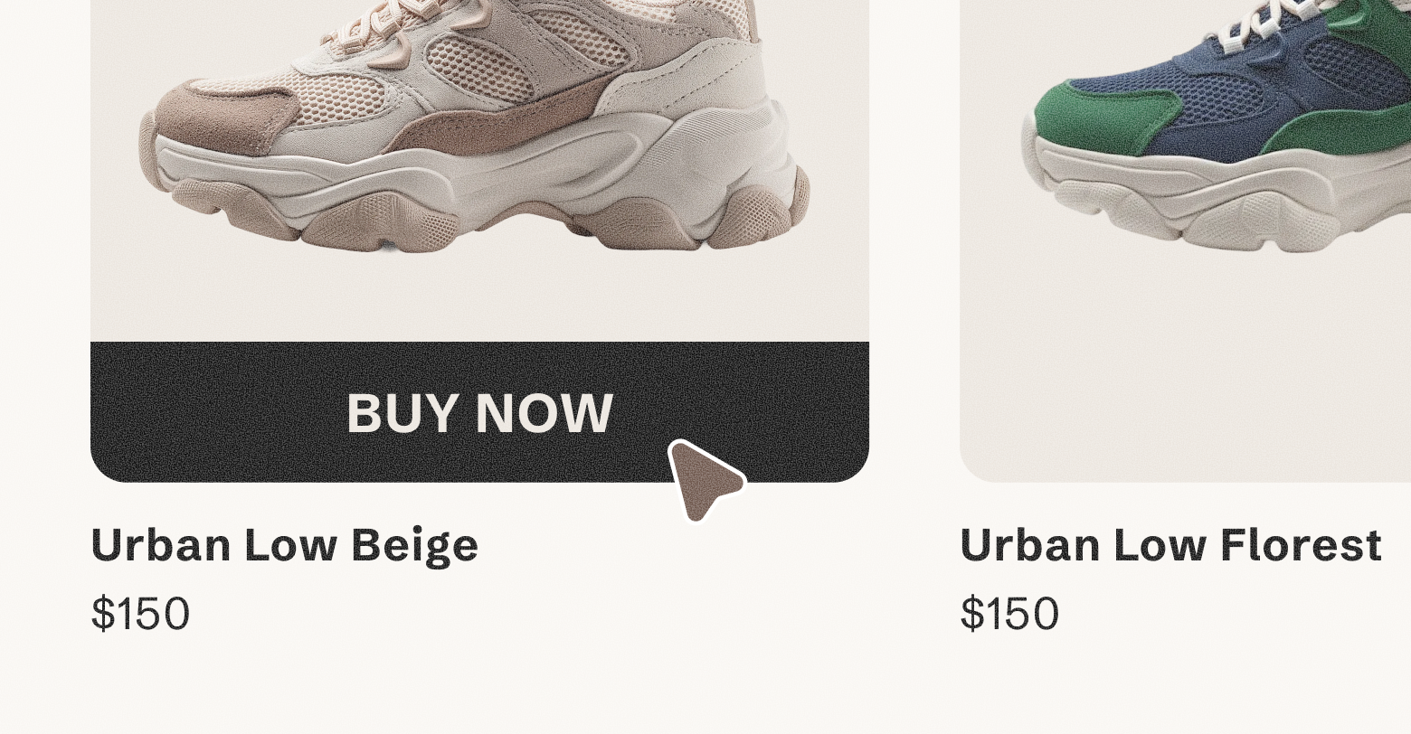
- Add high-quality images: Never neglect the quality of your product images, it’s the best way for most users to really understand what they are buying. Can you imagine an online store without any images? Would you buy anything?
- Have clear product names: Make sure you give product information that helps users understand your product better (Clear and descriptive product names, product descriptions, product videos, and more.)
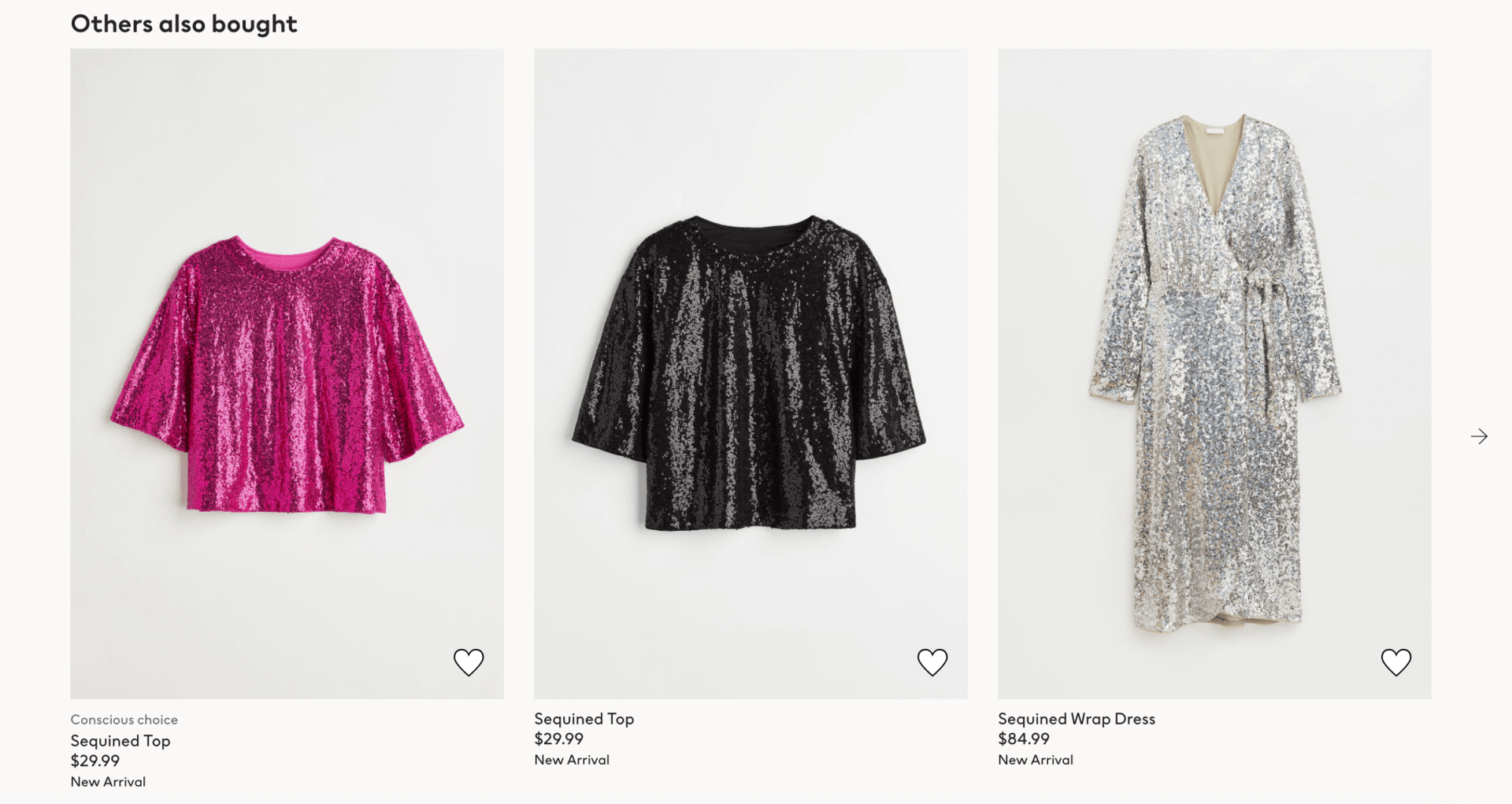
- Showcase upsells and related products: Ensure users can be inspired to buy more with related products featured at the bottom of your product pages. It could be products you’d want to use with the first item, that are similar, or that have the same function.
- Use interactive tools: You can implement tools to help the user shop, such as comparison tools, previews to see how furniture or paint would look in your home, or tools to choose the shade of makeup that fits each person best. These tools can help personalize the shopping experience and help customers make a decision and buy.
4. Have a clear and fast checkout process
The checkout process needs to be seamless so users will proceed with the payment.
Here are a few tips to improve your checkout experience:
- Reduce checkout friction: Once your customers are on the checkout page, you need to reduce friction as much as possible and enable them to complete the purchase. You can do that by using various common payment options (apple pay, stripe, credit card), enabling guest checkout payments so customers don’t have to create an account, and having a clear page design users will understand easily.
- Show a clear order summary: If your customers don’t know what’s in their order to confirm one last time before paying, they might not proceed with the payment at all. Make sure you confirm clearly what is going to be bought during the checkout process.
- Provide visual feedback during the checkout process: Listing all the items is one thing, but showing product images really helps the user see at a glance what they are buying.
- Forget the pop-ups: Now is not the time to promote your new collection or discount. Your users are about to pay, so just let them. The only CTA that matters at this stage is the “proceed to payment”
- Display a detailed order confirmation after purchase: Once the order is completed, your job isn’t done yet. You need to confirm the purchase by email, with the list of items purchased, the order confirmation number, and links to contact resources if they need updates with their order.
- Send order and shipping updates via email: Once the order has shipped, make sure the customer is aware and can track the shipment every step of the way.
5. Improve website speed
Amazing UX doesn’t really matter if your website is slow.
Website performance has a major impact on conversion rates.
According to a study by Portent, a site that loads in 1 second has an e-commerce conversion rate 2.5x higher than a site that loads in 5 seconds.
Why? Users leave as soon as the page takes too much time to load.
It’s a friction that gives users a very bad impression of the website, which can have a major impact on sales for eCommerce stores.
To improve your eCommerce website speed, you can:
6. Add social proof, credibility and customer satisfaction
It’s important to build customer trust. You want users to visit your website and feel like they are engaging with a trusted brand. There are numerous ways to do so, the first is having a UX design that’s sleek and seems trustworthy, but there are lots of other tips that can help:
- Showcase security badges and awards: You can showcase badges proving your website is secured, particularly at the checkout stage. If you have won awards for your product or brand, don’t hesitate to showcase them as well.
- Have customer support: Have a chatbot or customer support team that can answer any interrogations from your users. This will help tremendously to put them at ease and trust your company.
- Include video reviews: Show the product design, functionalities, and real-life application with videos. Ideally, if these are videos from real people and their experience with the product, it’s even better.
- Add customer testimonials and reviews: Have comments, star-ratings and other types of reviews on your product pages, so that customers can see if the product fits their needs and what other customers are thinking about it.
- Collect customer feedback: After a purchase, you can ask your customers to write such reviews, either directly on your website, or privately. This can help you improve your product, price, and offering, but also the amount of social proof on your eCommerce site. The more (positive) testimonials, the better!
- Be transparent: According to Forbes, over
90% of consumers say brand transparency is important to their purchase decisions. Make sure you’re transparent, don’t claim that products can do more than what they were built for. If users have a good expectation of what the product can and cannot do for them, they won’t be disappointed when they receive it. You should also clearly showcase your exchange and return policy from the get go.
- Implement social shopping: Social media doesn’t cut it for you? You can go as far as to create your own community on your eCommerce website where customers can share photos, discuss the products, ask and answer questions, etc. This can build a sense of belonging and improve the repeat purchase rate and overall brand loyalty.
Common eCommerce UX mistakes to avoid
Now that you have everything you need to create a great eCommerce website UX, here are some common mistakes you should avoid making.
- Too many pop-ups and promotions: It’s tempting to have a few promotions and discounts and try to push them on our website so your traffic sees it, but you have to make sure not to overwhelm users with too much information at a time. Usually, less is more. Having one or 2 good promo, clearly understood by your audience can be a lot better than 10 annoying or confusing ones.
- Neglecting informative pages: The
about us page, contact pages and forms might not lead to direct conversions like the checkout page, but they shouldn’t be neglected either. People oftentimes need this extra information to make a purchase decision and to trust your brand.
- Don’t have complicated forms: When it comes to forms, whether it’s during the checkout stage, creating a membership, subscribing to a newsletter, less is always more. Forms should be short, clear, and request the very minimum of information you need so your audience won’t feel like they need to give out too many details and leave. On average, eCommerce sites use 12.8 fields at checkout. But you can collect all customer data using 6 to 8 fields.
- Don’t try to reinvent the wheel: As you may have noticed all through this article: The simpler, the better. If you want to impress, you can do so with a sleek, simple, and easy-to-understand
eCommerce design, no need to have an overcomplicated, revolutionary website. The important thing is to focus on the products and guide your customers in their shopping journey, not to impress them with sounds, effects, weird logos, or website functionalities. If anything, these add-ons may confuse or annoy visitors and increase your churn and bounce rate.
Best eCommerce UX websites
Here are some examples of websites that use these best practices and have great, easy-to-use eCommerce websites.
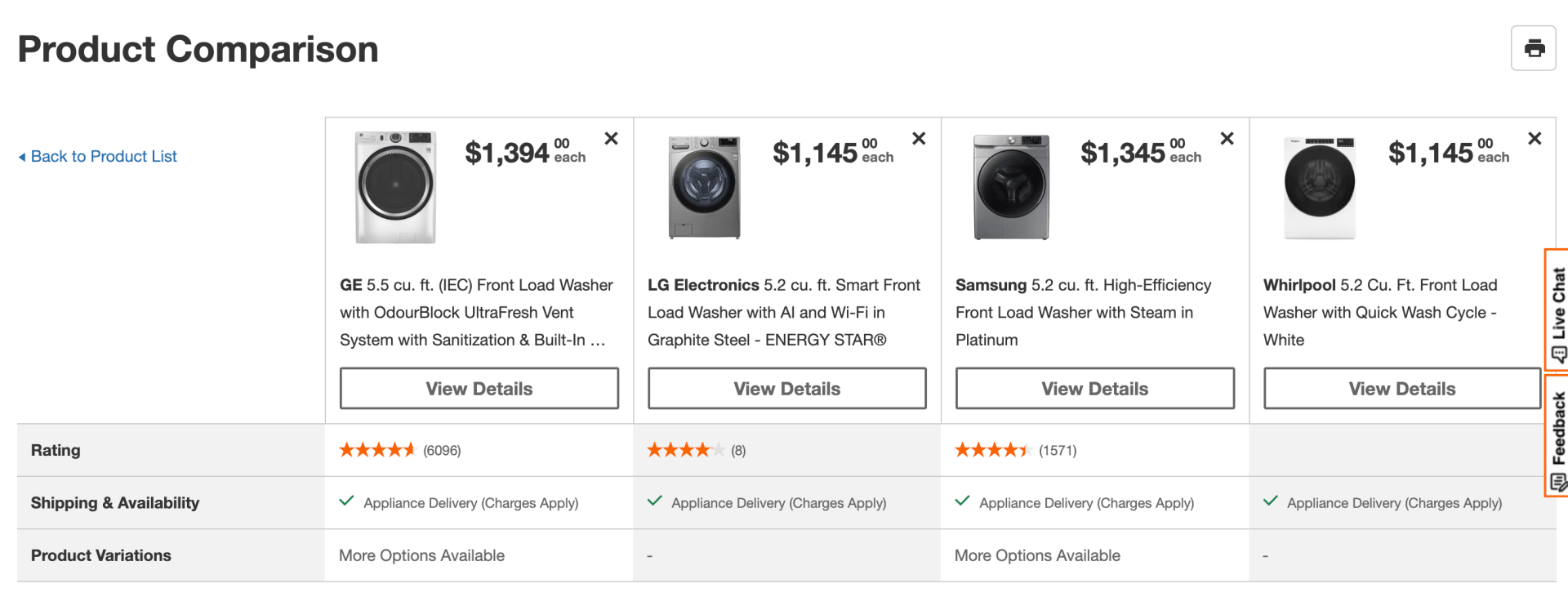
Home Depot
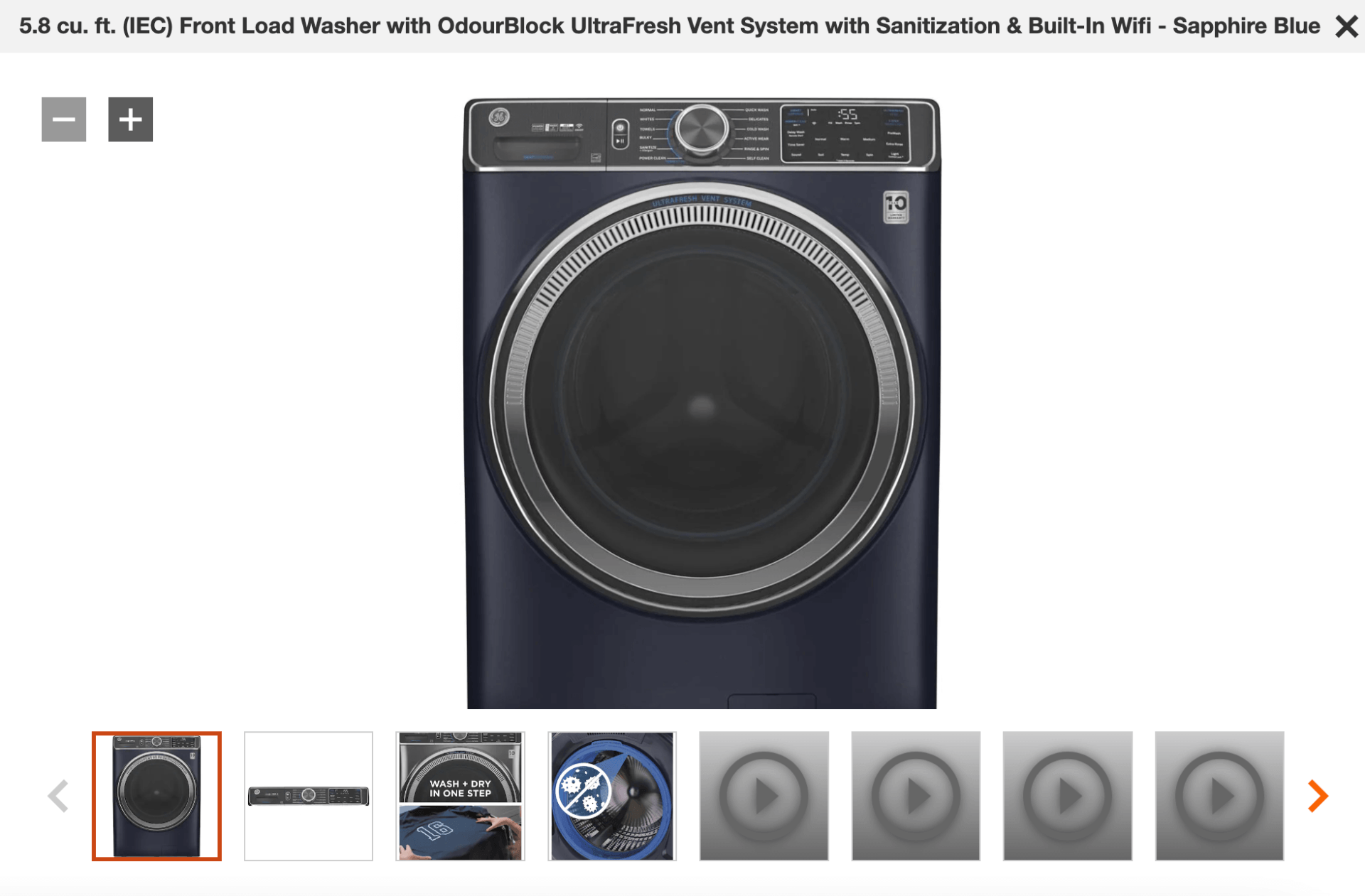
Home Depot's website offers a very good comparison tool. When you need big appliances or items with specific sizes and specifications, it’s particularly useful to compare each product, their features, size, price, and even reviews.
Their product page also showcases images, zooms, and videos showing the product in action.
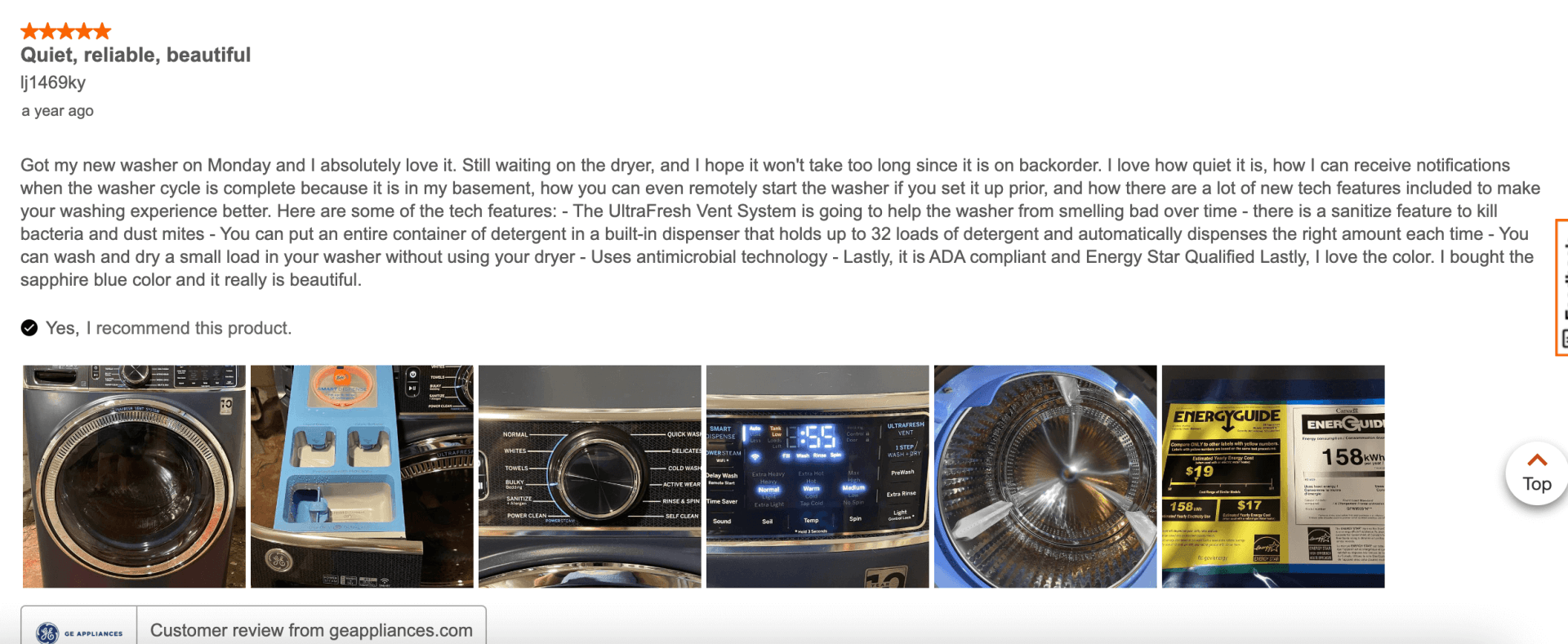
You can also see all reviews from customers who bought the product, filter by the number of stars attributed, and have pictures to showcase the product as received and used by actual customers.
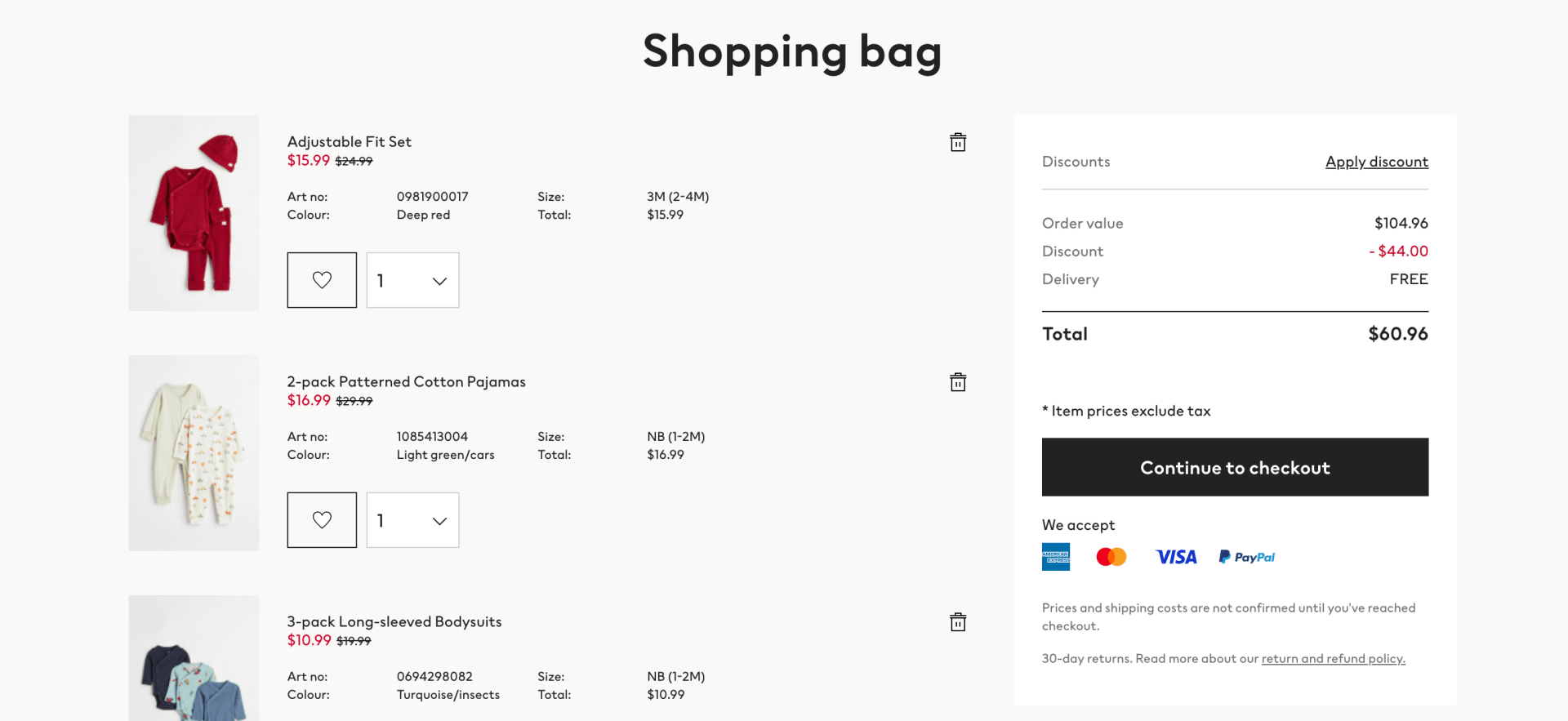
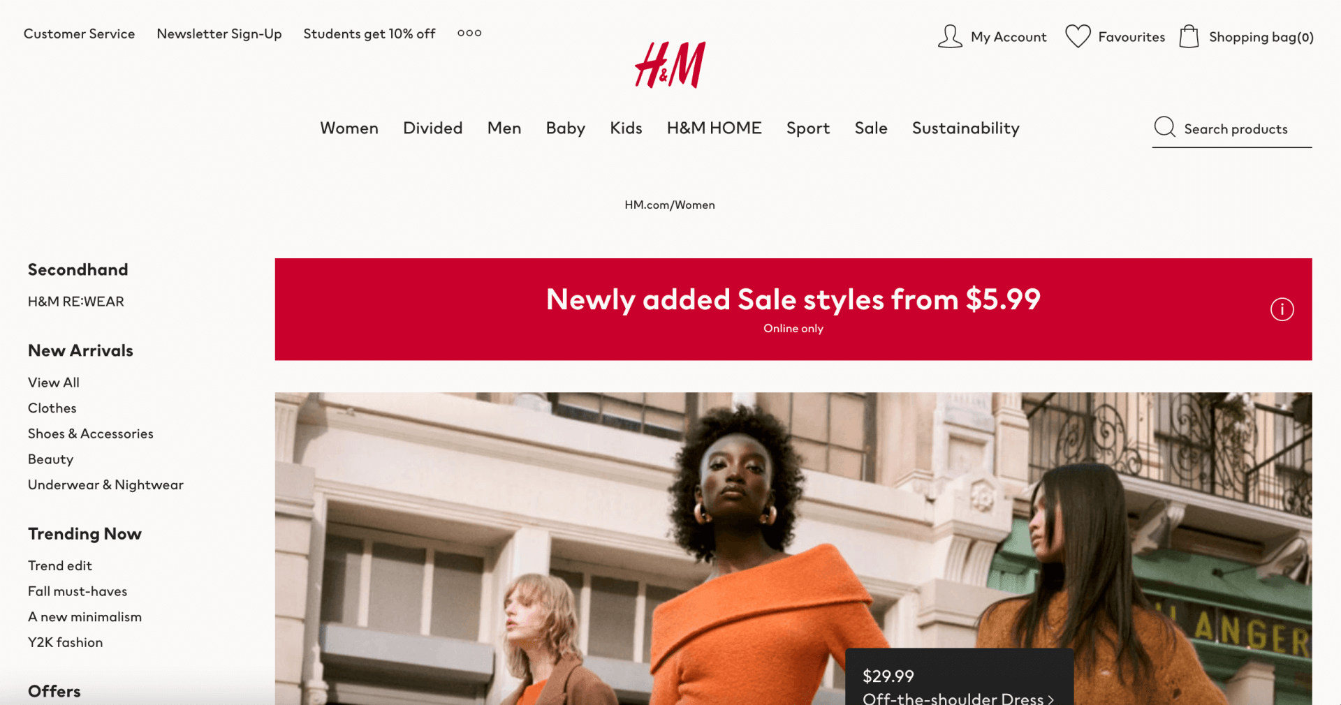
H&M
H&M offers a very clear shopping cart and checkout. You can clearly see how much discount is in red, what each item’s price is, how many of each you have in your shopping cart, etc.
You can easily see the promotion they want to showcase at the moment as it is up top when you arrive on the page, they then showcase different products and best sellers.
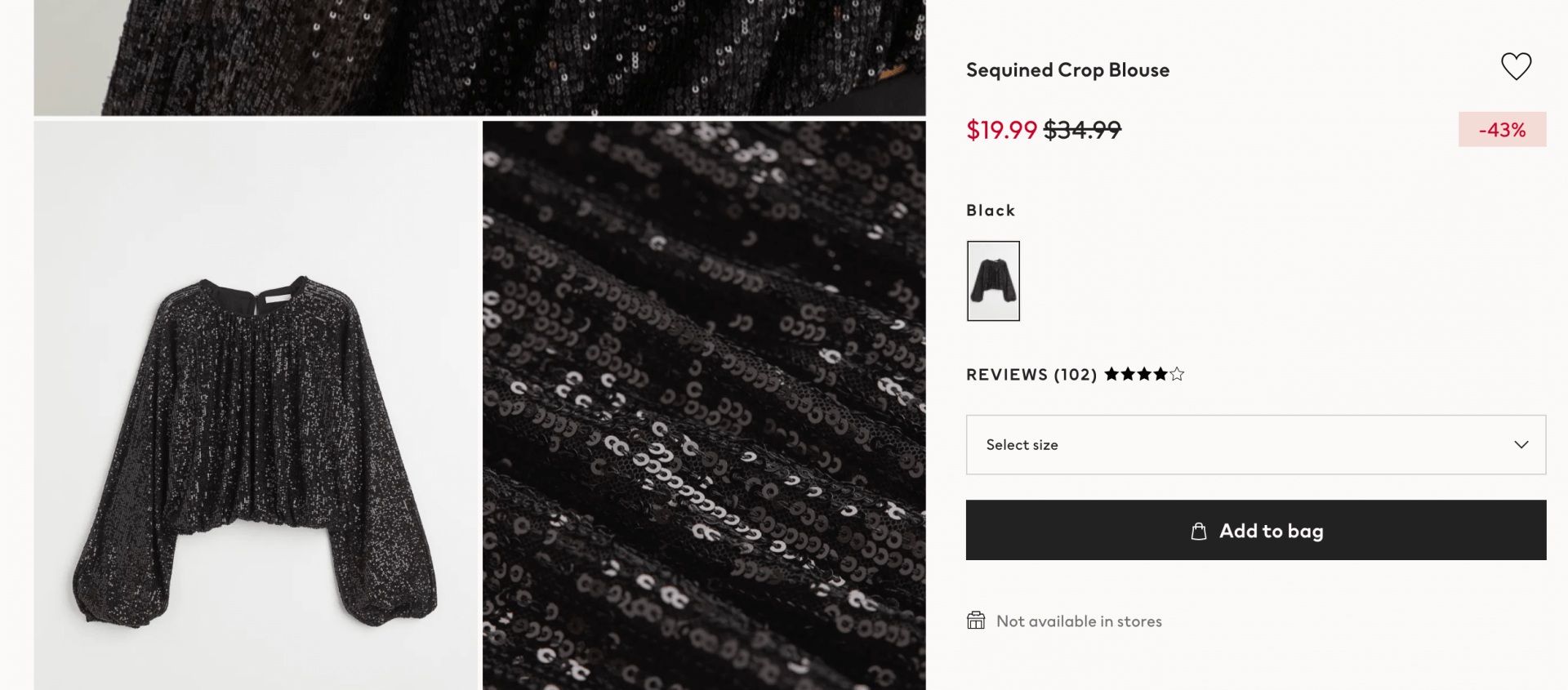
The product page presents different angles and zooms showcasing the product, its look, texture, and color, quite in detail. It also showcases quite clearly if there’s a discount on the product.
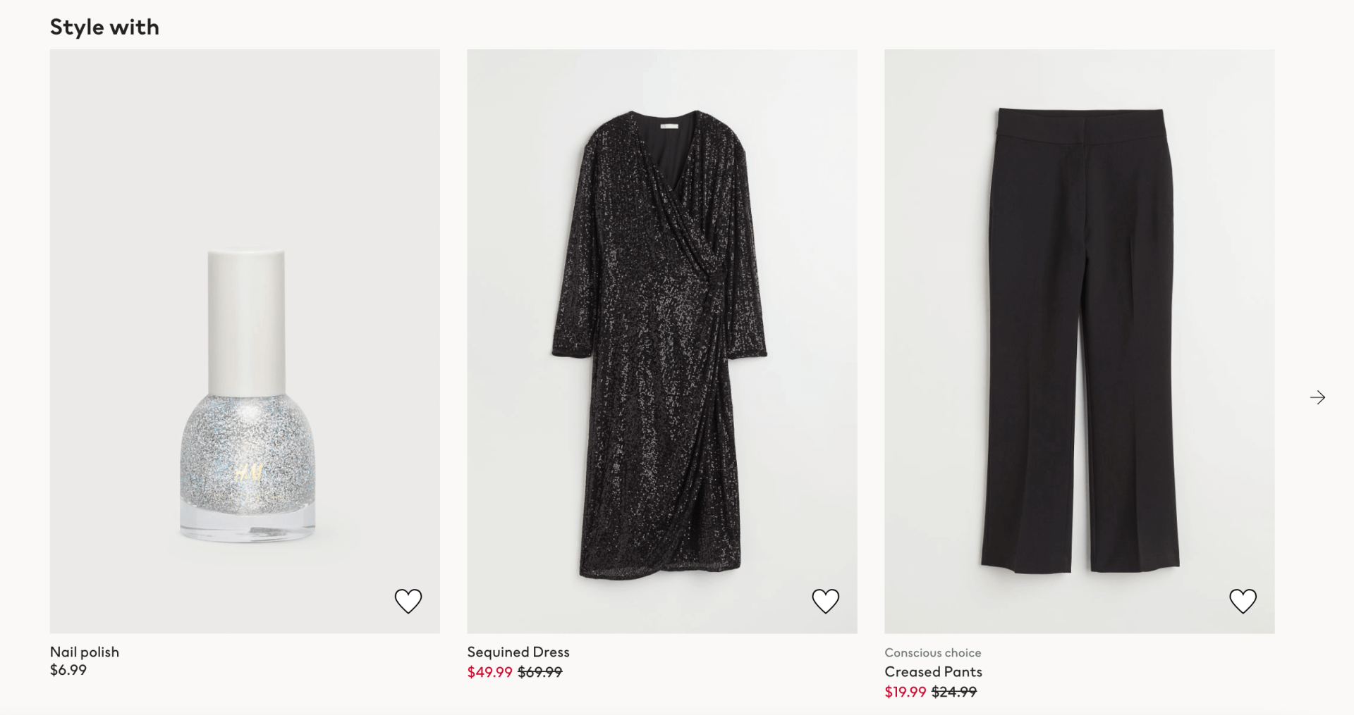
They also showcase some clothing options to buy with the blouse, and similar items you might like.
Time to create the best eCommerce experience
Now that you know all the tips of the trade on eCommerce UX, you’re all set to create one (or hundreds!) of eCommerce websites.
To start on the right foot, with a website builder that offers all the capabilities you’re looking for (Fast, easy, scalable, white label, customizable) why don’t you try
Duda’s eCommerce website builder?
Related Posts
By Shawn Davis
•
June 3, 2026
Discover how adding an online store to your website dramatically increases AI visibility and crawl rates, turning commerce and discoverability into a powerful growth flywheel.
By Stephen Alemar
•
March 5, 2026
Agencies: Learn 7 proven, non-salesy strategies to upsell online bookings to your SMB clients. Position bookings as a high-value, low-risk business upgrade.
By Stephen Alemar
•
February 10, 2026
Discover the best eCommerce solution for your SMB clients Learn key criteria and compare platforms like Duda, Shopify, and BigCommerce to find the right-sized fit.
Show More