Imagine you enter a store (a brick-and-mortar one) looking for new clothes.
The place looks old, dirty, and not taken care of. The products are just thrown everywhere without any categorization.
There’s a cute shirt there; no price.
A few nice shoes; no sizes.
The register is nowhere to be found and so are the employees.
Overall, you have a bad vibe. So what do you do?
You leave, of course!
Ecommerce stores are no different, first impressions are crucial.
You need a solid design so potential customers will feel good about the brand and therefore buy the products.
But where to start?
Here’s everything you need to create an eCommerce website design that will garner trust and, most importantly:
sales.
Why is eCommerce design important?
Web design is an important factor, particularly for eCommerce websites. With a good eCommerce website design, you can provide a high-quality user experience that in return, will give you more sales.
It’s not just a color palette, it’s the whole identity of your online store.
The glue that puts it all together.
The online shopping experience.
How do you design eCommerce websites?
There are numerous things to consider when doing
eCommerce website development and designing for eCommerce sites.
From fonts to functionalities, every design element has its purpose.
Before you go through your
eCommerce checklist, here’s what you should keep in mind design-wise.
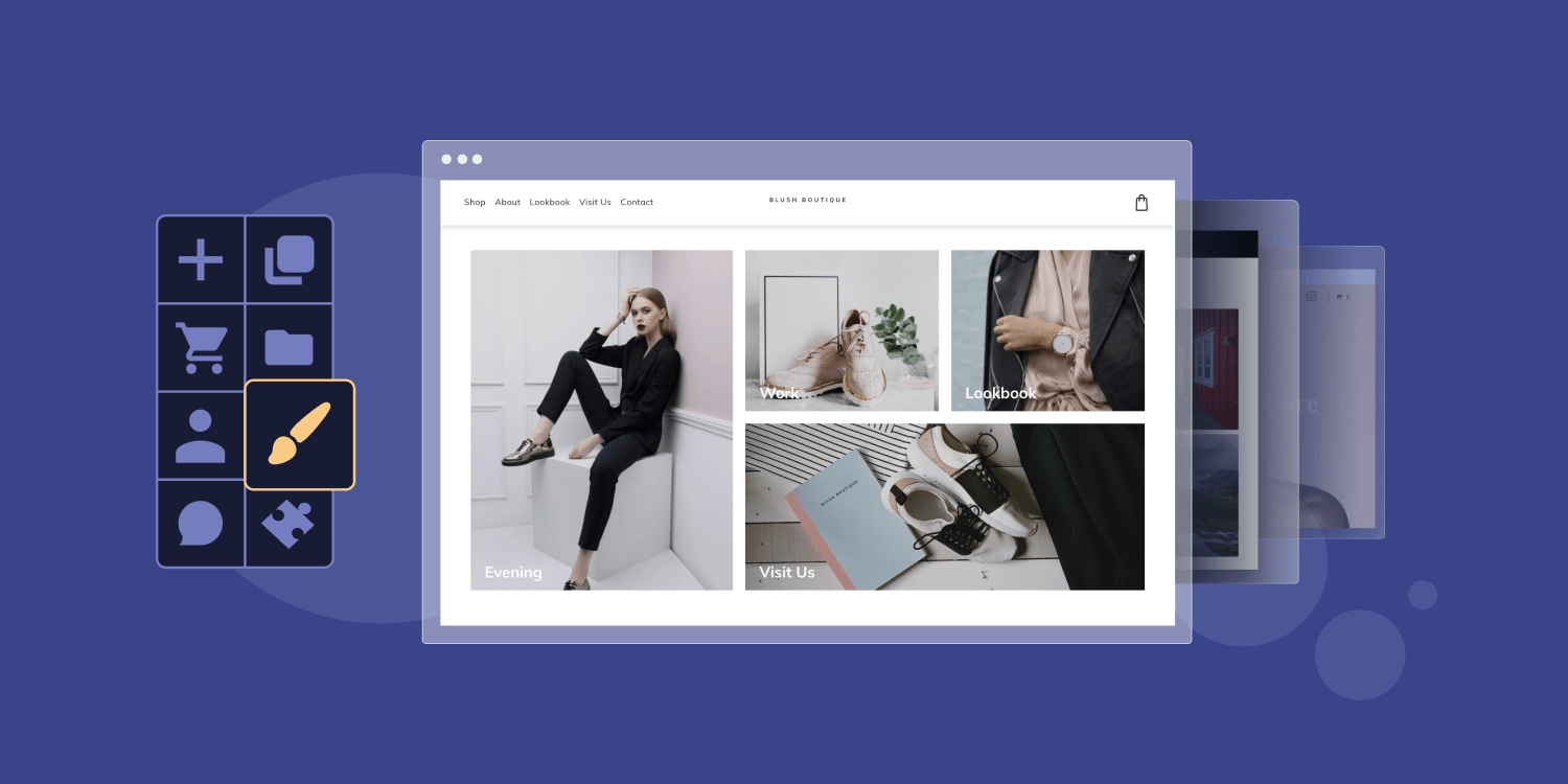
1. Choose Your eCommerce Platform Carefully
You
can code everything yourself.
Or you can take the much
MUCH faster way: using a
website building platform.
There are many different options out there, from WordPress to Shopify, but you need to choose the one that fits best with your needs.
If you’re an agency, freelancer, or looking to create multiple eCommerce websites seamlessly, then
Duda is certainly your best bet.
It’s a pretty neat tool for beginners since the interface and layout are very user-friendly.
There are tons of
website templates you can choose from to get started, which makes the designing part super easy.
Try Duda for free
2. Have a flawless navigation
The number one priority of every eCommerce website UX should be flawless, simple, and intuitive navigation. Users should know how to find the product they are looking for at first glance.
Here are some key best practices to ensure flawless navigation in your page design:
- Have a sticky navigation menu available from all pages except checkout; This way, users will always be able to find the menu no matter where they end up.
- Use known symbols and icons: No need to reinvent the wheel. A cart is a cart. Changing the known icons will only confuse your users.
- Keep the design simple: Sometimes less is more, and in the case of eCommerce design, this could not be more true. If the user has too many visual cues, they won’t know where to focus and where to go.
- Have a search bar always available: Usually found in the header or navigation menu, a search bar will help users find what they are looking for much faster.
- Build a responsive design: Make sure your eCommerce site is responsive and is just as easy to navigate on mobile devices as it is on desktop.
3. Build Trust
Before anyone enters their credit card online, they need to know they can trust the website.
Here are a few ways you can build trust:
- Customer reviews and testimonials: Having other people’s opinions on the item, whether it’s comments, case studies, or a star rating system, can really give potential customers more trust in the product.
- Logos, badges and certifications: If you won awards, badges, or certifications, show it! It can help users see that your eCommerce business is the real deal.
- Provide information on the business: What’s your mission, your story, why are you in business? Make sure your target audience can get to know your business better. You can also have a FAQ or link to your social media pages to help customers learn more about the business. It’s also a good idea to provide contact information (phone number, email, address).
- Multiple payment options: Using payment gateways such as Paypal, Apple Pay, or Stripe during the checkout process can definitely help users feel more secure.
- Have multiple product images: The more high-quality images and videos you can provide to really give the customer a good idea of the quality of the product they’ll receive, the better.
4. Design a Converting Homepage
First impressions are crucial, and your homepage will most likely be the first entry point for most of your potential customers, so make sure the page is optimized to get the best possible conversion rate. Here are a few design tips that should help you design your eCommerce homepage:
- Have clear CTAs (call to action) above the fold
- Personalize the homepage to fit the brand
- Showcase best-selling products
- Make sure key information is visible
- Track your homepage’s
eCommerce KPIs (traffic, conversions) and optimize as you go
5. Design Clear Product Categories
If you have more than one product, categories are a must-have.
Clear categories make it easy for customers to navigate your website and find what they are looking for (therefore buying it!).
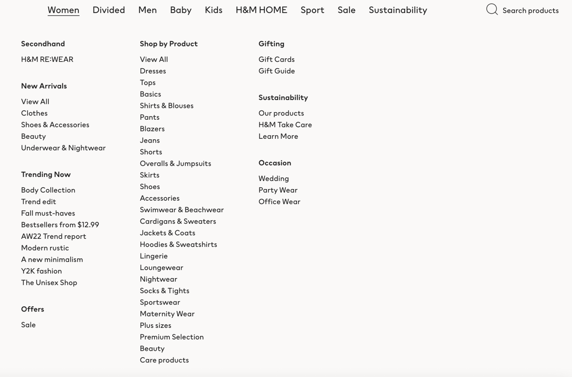
A great eCommerce website will have easy-to-use product categories in its navigation menu. It can look something a little like this:
In this example from H&M, they have a whole lot of items for men, women, kids, sportswear, home decor, so they need very robust and clear categories to help users navigate their site.
The categories are very clear; no millions of icons, color schemes, or unreadable typography, just black on white, divided by the type of person who wears the clothes (man, woman, baby, kid, etc.), then divided by the type of product (new arrivals, secondhand, trending) and by type of product (shirts, pants, shoes).
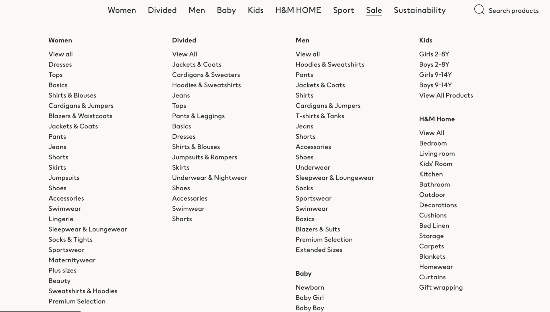
They also have a
Sale category where everything is then divided by categories of items. This way, users just shopping for a good deal and nothing in particular can also find what they are looking for.
Of course, for most eCommerce stores, you won’t have hundreds of product categories like that, but the best eCommerce website design can make a very complex website feel super easy.
6. Design Informative Product Pages
Product pages are one of the most important parts of your eCommerce website (if not THE most important).
That’s where you can really showcase the product and convince the user to buy. There are tons of best practices for product pages, but here are just a few you should make sure to follow:
Have a clear product description
If buyers aren’t sure what the product can or cannot do, the material, the purpose, or how to use it, they won’t buy it. So make sure the product description is clear and has all the relevant information (sizes, specs, how to use, why to buy, etc.).
Ensure SEO optimization
Search engines are an incredible way for buyers to find your eCommerce website, so make sure you optimize your product pages for SEO. This way, when people search for a product like yours, they’ll end up on YOUR product’s landing page. There are multiple
SEO optimization tools you can choose from.
Show multiple high-quality images
The significant difference between buying live, in real-time, and buying online, is that you can’t physically see and touch the product, which makes images all the more important. Make sure images on your product page are high-resolution, that you show different angles, and zooms, so you can really show off those bright colors or quality fabric, just like you would in real life.
Add testimonials or reviews
It’s human behavior to seek social proof, particularly in e-commerce. Add testimonials from happy customers, or reviews, showing how great the product is so your buyers will be more confident to buy.
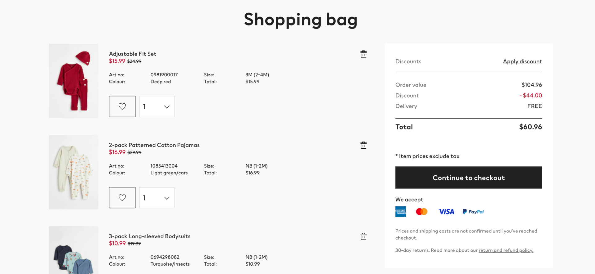
7. Design a Seamless Shopping Cart
Now we’re getting into very serious business; the shopping cart.
If there’s one place you don’t want to mess up your UX design, it’s the shopping cart and checkout process.
At this point, your users have selected items; they clearly are interested in what you have to offer; all they need is that last little push to enter their credit card.
If you’ve read this far, you probably see a trend:
The simpler, the better!
Make sure this trend is followed all the way through the shopping cart experience as well.
Your users should clearly see:
- What items are in their cart (including price per item, sizes, colors, etc.)
- How many of each item they selected
- An option to delete or add items
- A section to add a coupon code or discount
- Their total (subtotal, taxes, shipping fees and discounts)
- A clear “continue to checkout” CTA button.
Other information you can display:
- If there is any promotion they are missing out on (for example:
Buy one more item for free shipping)
- The delivery and return options.
- The payment methods and payment gateways your eCommerce store accepts
- A button to subscribe to the newsletter or become a member for a discounted price (Get 10% off by becoming a member)
Make sure not to overload your buyer with too many discounts, information, or visual stimuli. Make it very clear and sleek, with white spaces and nothing extra. Don’t display banners or pop-ups at this point; you really want the user to simply look at their shopping bag and click “continue to checkout”.
8. Design a Reliable Checkout Page
Now for the last and pivotal part of your eCommerce website: The checkout page.
I only have one word: Reliability.
The last thing you want is for your checkout page to crash, transactions to stop, or any other bugs, which is why you should use a
reliable website builder for eCommerce in the first place (one that has a 99.99% uptime, like Duda).
Here are other checkout best practices to keep in mind:
- Multiple payment gateway options: The more options your customers can use (Apple Pay, PayPal, Stripe, etc.), the more likely they will trust your checkout process and proceed.
- Simple interface: Now’s the time to be as simple and straightforward as possible. A complicated checkout process is your worst enemy.
- Forget about pop-ups: Once users attain the checkout stage, you should never distract them with pop-ups, promotions, discounts, or anything else that might distract them from the checkout process.
- Enable guest checkout: Enable users to checkout as guests; if you need an account, it adds a lot of steps and that might be discouraging for a lot of people.
- Mobile-friendly design: Whether your users shop on desktop or mobile, the experience should be just as simple and easy.
- Progress indicator: It’s a good idea to display a progress bar so customers know what the next step is and when they’ll have completed the checkout process.
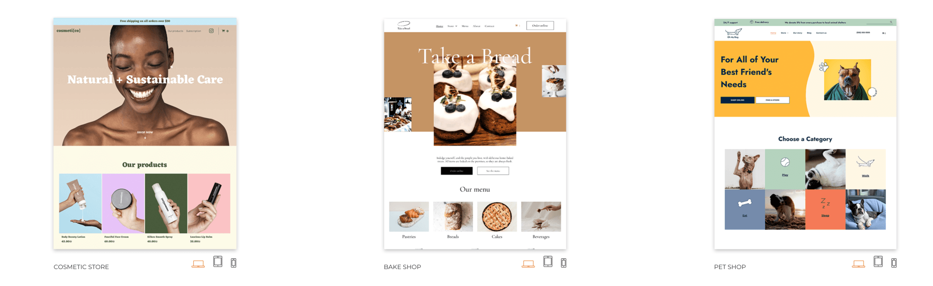
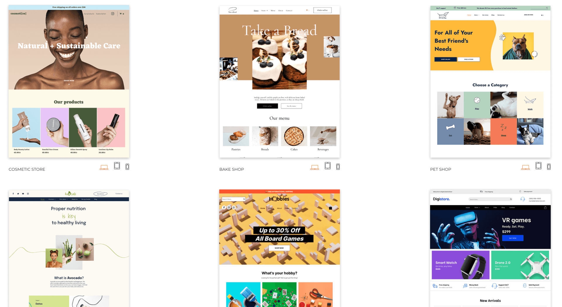
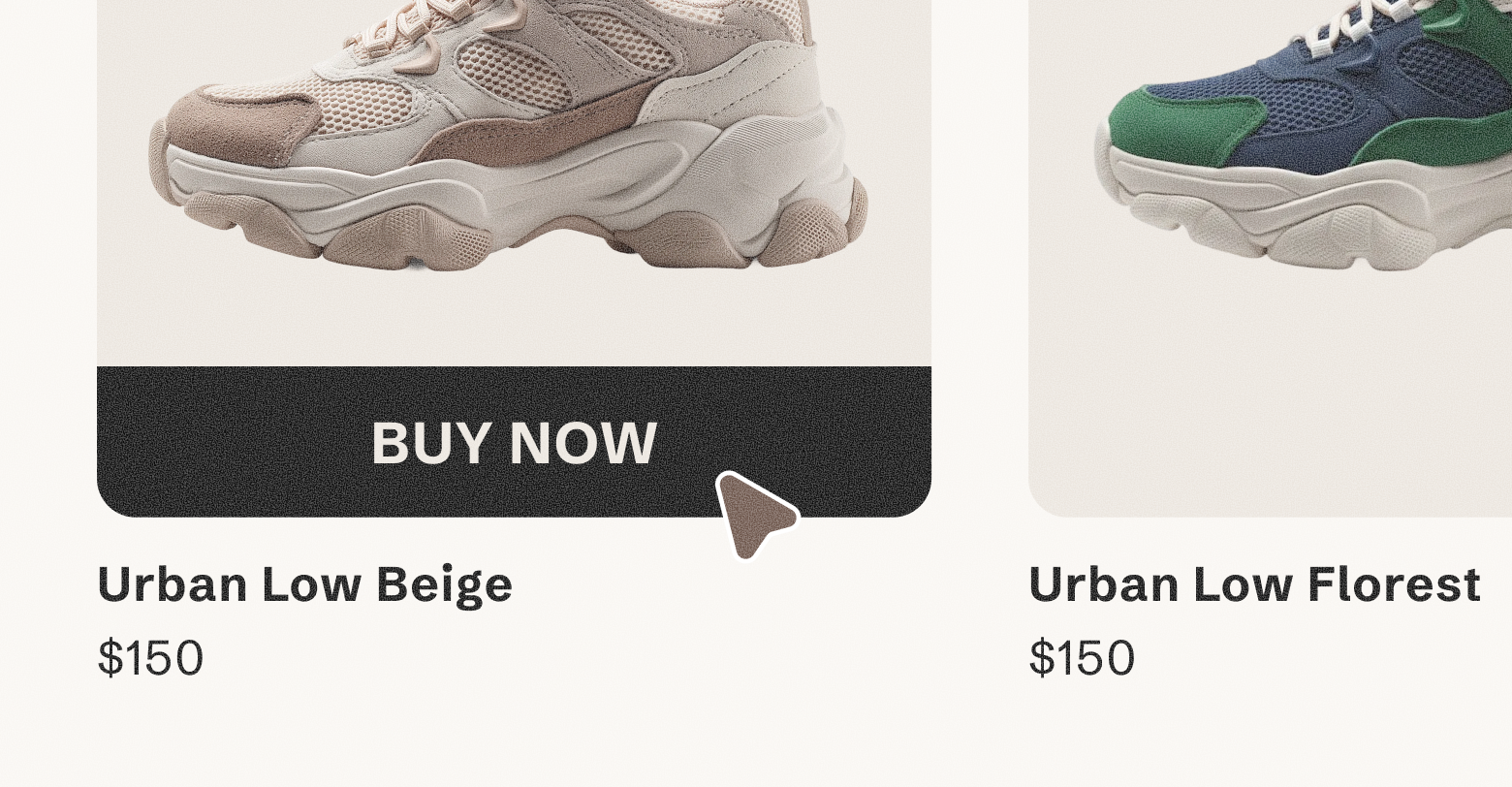
eCommerce Design Examples
Here are some
eCommerce design examples you can use right away with Duda:
Related Posts
By Shawn Davis
•
June 3, 2026
Discover how adding an online store to your website dramatically increases AI visibility and crawl rates, turning commerce and discoverability into a powerful growth flywheel.
By Stephen Alemar
•
March 5, 2026
Agencies: Learn 7 proven, non-salesy strategies to upsell online bookings to your SMB clients. Position bookings as a high-value, low-risk business upgrade.
By Stephen Alemar
•
February 10, 2026
Discover the best eCommerce solution for your SMB clients Learn key criteria and compare platforms like Duda, Shopify, and BigCommerce to find the right-sized fit.
Show More