As a
website builder offering the ability to build
eCommerce websites we know that when designing an eCommerce website you have a few key elements to keep in mind...
- Product pages
- Category pages and sub-category pages
- Shopping cart and checkout process
- Navigation menu
But one type of page typically goes under the radar (when it’s really the one you should focus on).
The homepage.
An eCommerce homepage design can make or break your eCommerce store.
Here’s why.
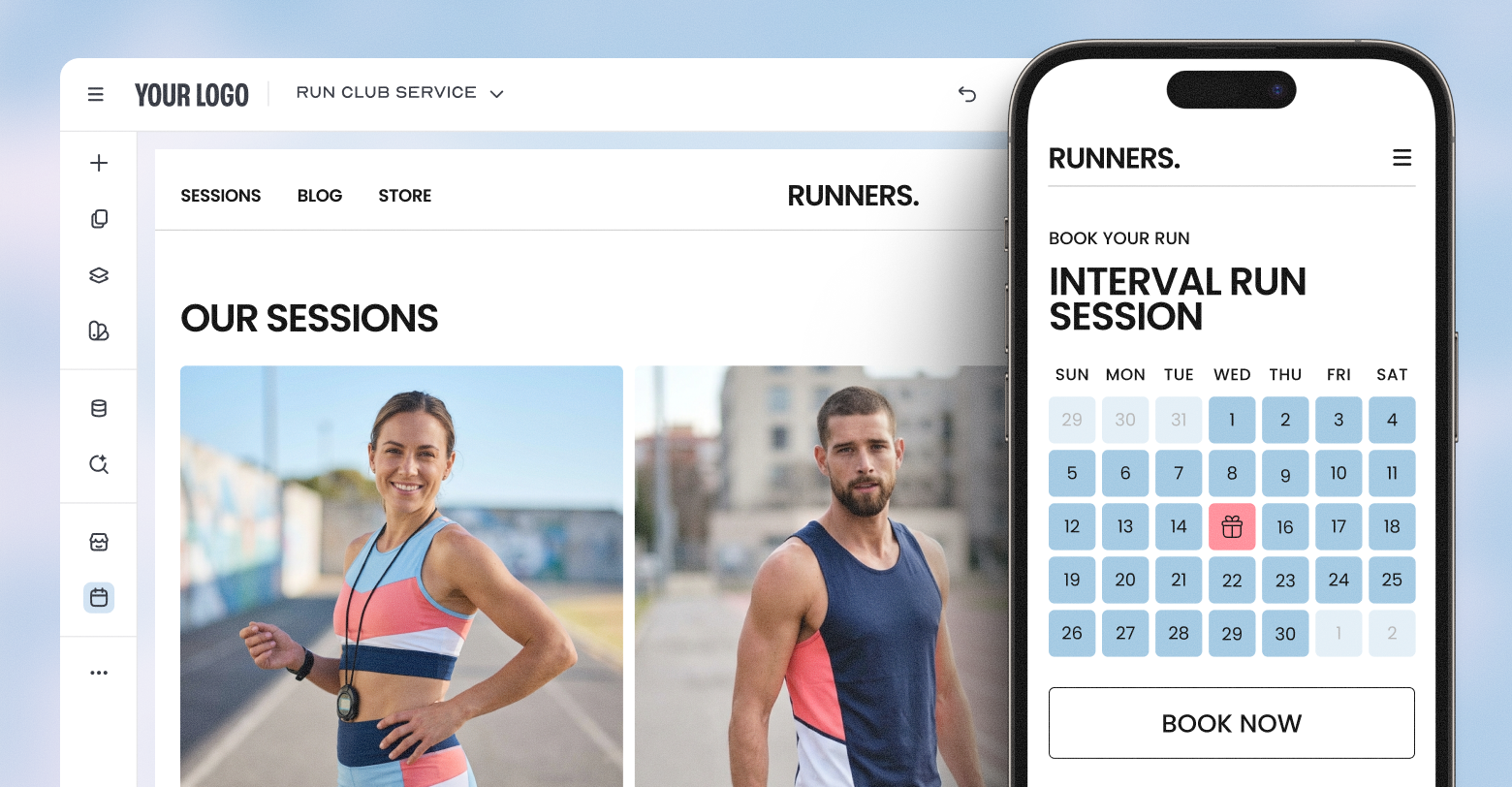
Why is a Good eCommerce Homepage Important?
First impressions are your bread and butter.
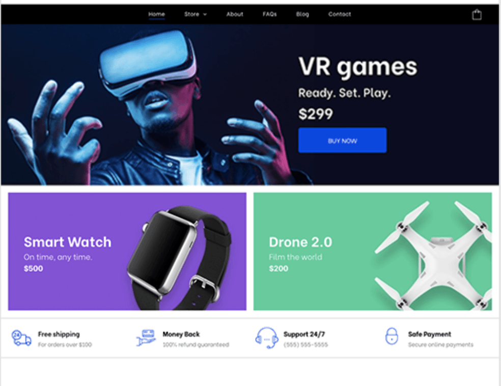
Your eCommerce homepage sets the tone for your entire online store in milliseconds. It showcases your brand, value proposition, popular products, new items, best sellers, promotions, and helps users navigate to exactly where they want to go.
The homepage is basically your storefront.
The different design elements, call to action and product images you will bring to the top of the page will show what your eCommerce brand considers relevant information for the customer.
Some brands will choose to showcase a carousel of their latest collection or new products, client testimonials, or promotions and incentives.
8 eCommerce Homepage Best Practices to Convert
I’m sorry to have to tell you this but having a good-looking homepage is far from enough nowadays.
Competition is rough, an eCommerce website design has to take everything in consideration from user experience (UX) to SEO, conversion rates and digital marketing to even have a chance of success.
So where to start?
Let me show you the way.
1. Optimize For One CTA
High-quality CTAs (or Call to Actions) are one of the most important parts of any website, let alone online stores.
However, CTA buttons are often used incorrectly.
On eCommerce homepages they are frequently confusing, with multiple different actions, leading the user into various directions.
If you don’t know where to lead your users, you can’t expect them to do the desired action.
So what’s the solution?
Stick to one clear CTA.
Your CTAs should be:
- Visible above the fold
- Actionable
- Have a clear messaging
- Lead directly to the action (no strings of 20 landing pages one after the other)
2. Build For Mobile First
We’ve all been there.
You’re bored, do a little online shopping and boom!
You just spent $200 while waiting at the dentist.
But you didn’t spend that money just because you were bored, you did so because the page was optimized for mobile devices.
No way you would’ve kept on shopping if you had to resize, zoom in and out, scroll past white spaces and fight with the desktop version of the page on your mobile phone.
That’s why building an eCommerce site with mobile-first design is essential.
Not only will the user experience be better, which dramatically increases your conversion rate, but it’s also crucial for SEO.
Mobile-first indexing has been a main concern since 2018, it’s now so well implemented that it’s just part of life for anyone doing SEO.
So make sure you’re not the only eCommerce store left without a mobile-first website.
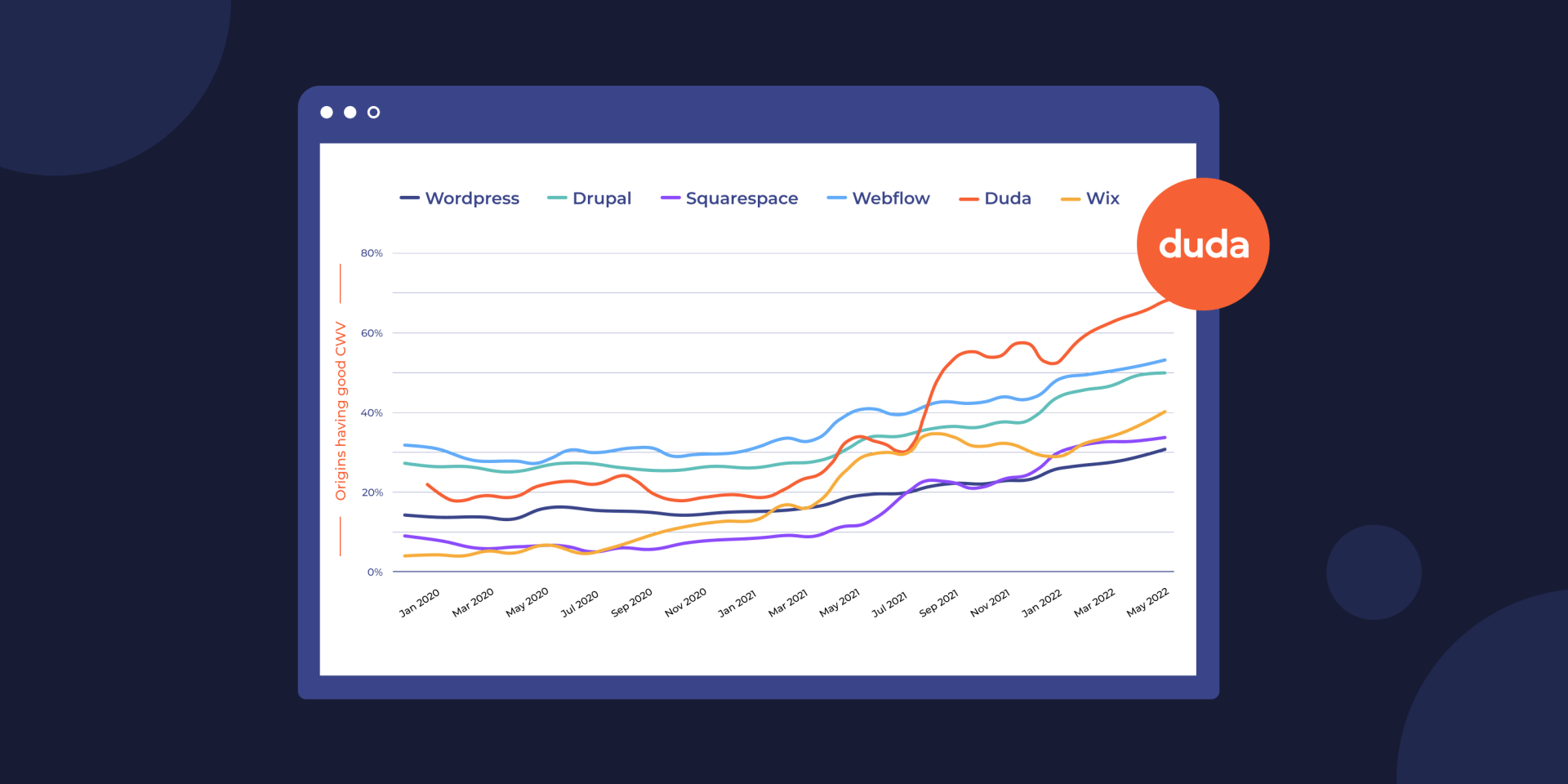
3. Optimize For Speed Performance
Purchase decisions can be
fast, so your eCommerce store should be able to keep up.
You want to increase your conversions?
Increase your speed.
According to Portent, a site that loads in 1 second has a conversion rate 3x higher than a site that loads in 5 seconds. Needless to say that
speed performance really impacts your website conversion rate.
Do you really need any more convincing?
Now how do you optimize for speed? Here are a few things to keep in mind:
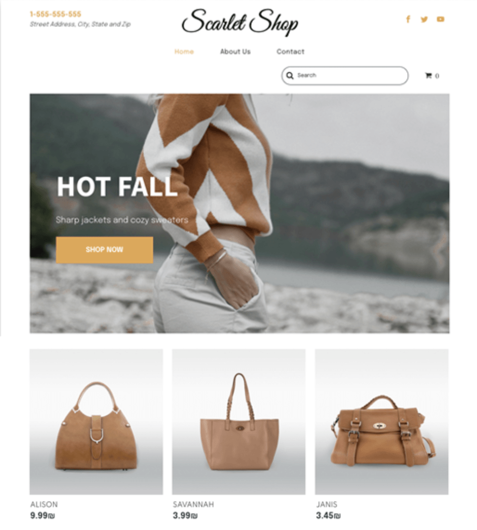
4. Simplify The Navigation Menu
Making it difficult to find an item or a product category is the best way to lose customers.
That’s why you need a clear and simple navigation menu.
The ideal is to have a navigation bar in your header with all the product categories clearly listed, and why not a search bar to make it even easier?
Here are some tips to simplify your navigation menu:
- Clearly indicate categories and sub-categories in the header menu
- Have a separate category for sales, new items or special promotions
- Include an easy-to-use search bar
- Prioritize usability over creativity. Don’t go over the top with design; the simpler the better, an eCommerce website is not the place to build a creative but hard to understand navigation bar.
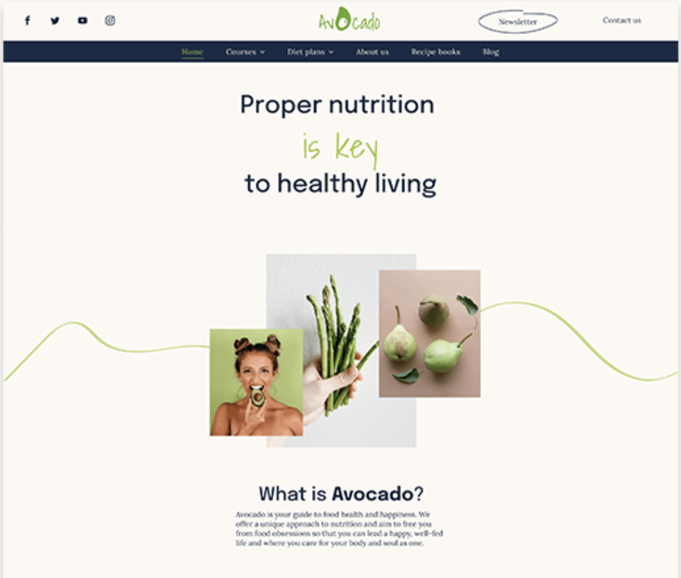
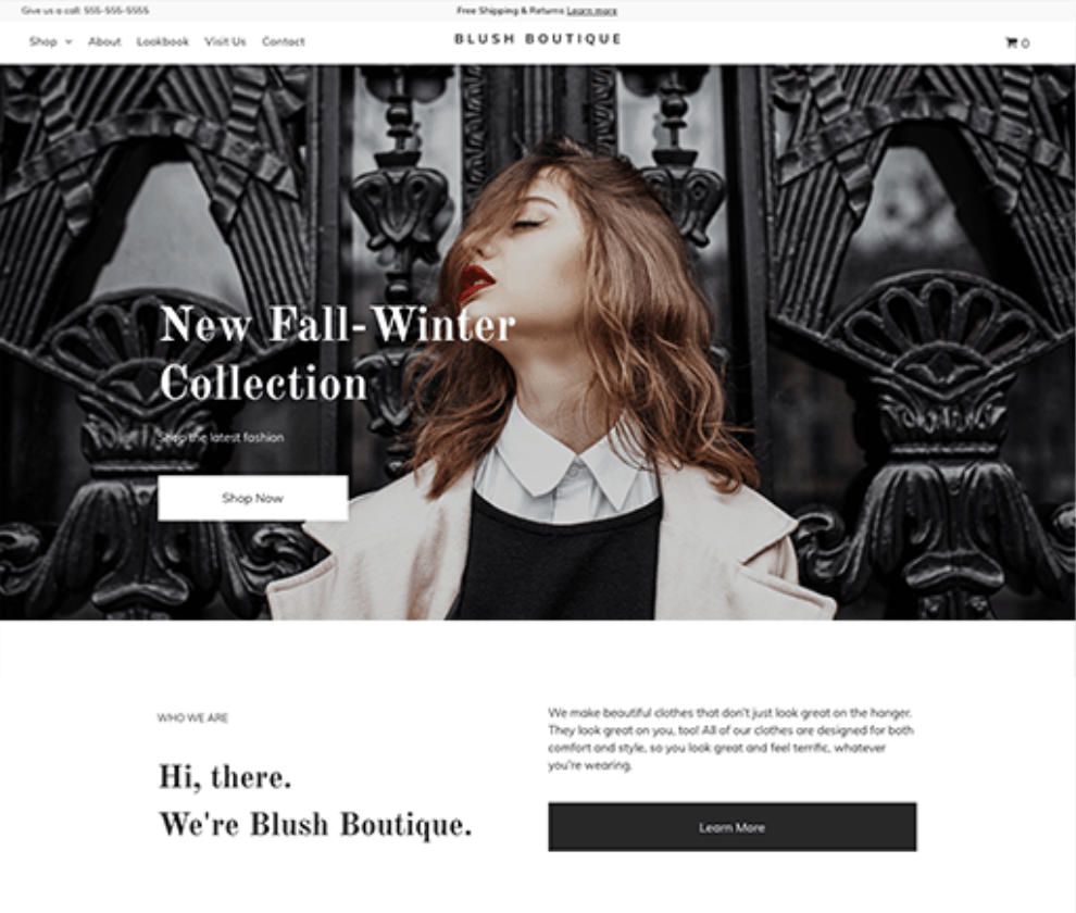
5. Personalize The Homepage to Fit The Brand
The homepage is the eCommerce business’s very own storefront.
It should reflect their brand in every way possible. From the web design, to the colors, fonts, logo and layout.
Not only should you show who the brand is, but also showcase their value proposition clearly.
You can for example include your slogan, mission statement, or the company’s best sellers.
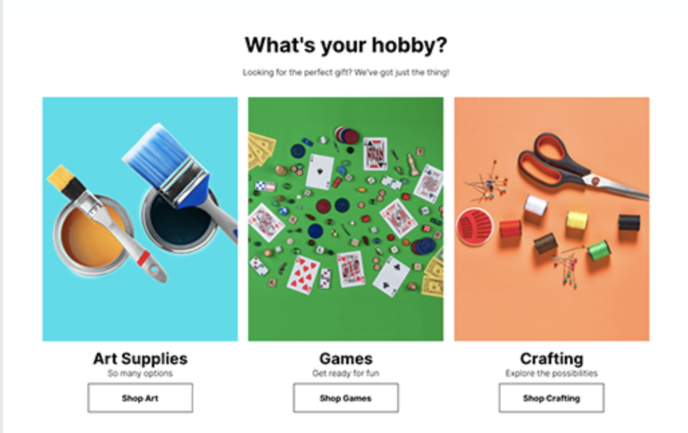
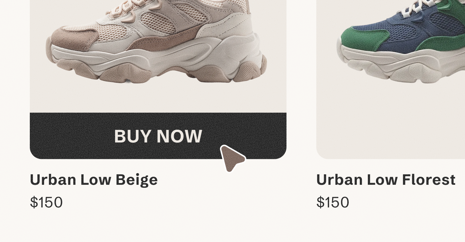
6. Showcase Your Best-Selling Products
Increase conversions by showcasing your best-selling products right on the home page.
Most of your traffic will be looking for your best-sellers, either because they heard of it, saw it on social media, or want to buy it again. And if they can’t find them right then and there, they may not buy.
The best-sellers are also popular for a reason, it’s probably one of the company’s best products, or the product that resonates most with your audience.
7. Make Sure Key Information is Visible
Customers may need some key information before they buy; the shipping delays and fees, return policies, accepted credit cards, etc.
If this information is not readily available to your potential customers, they might abandon their cart to never return.
So make sure to showcase the most important information at the bottom of the home page (ex: Free shipping on all orders, hassle free returns, in-store pick up).
Other information (payment methods, policies) can also be in a FAQ page, in the checkout page, or in the footer.
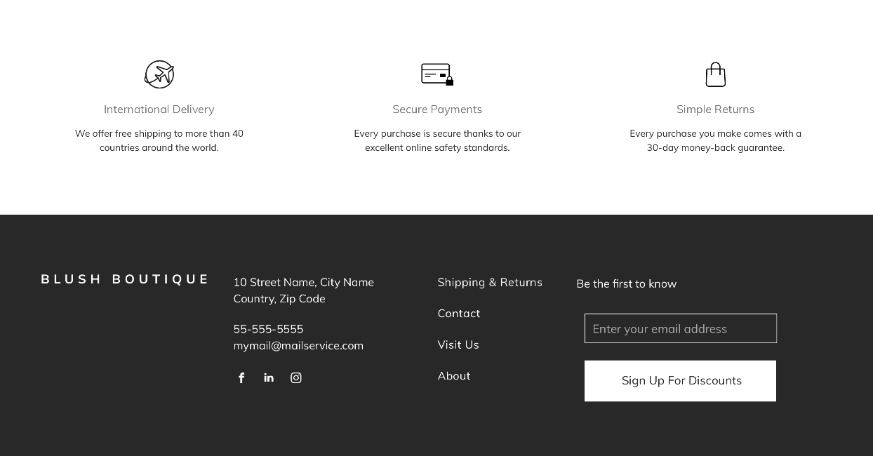
8. Make Sure The Footer Contains The Essentials
A crucial part of your website is the footer. Having your footer on all pages (including the homepage) with all the relevant information your users need is a must. It drastically improves the customer experience and reduces the bounce rate.
But that can only be true if you put all the relevant information in your footer.
Here are a few key elements you can include:
- Contact information (Phone number, email, address, or contact form link)
- Copyright Notice
- Privacy Policy Link
- Sitemap
- Logo
- Social Media Icons
- Shipping methods and return policies
- Main category pages
- Newsletter
Ready to Get The Best eCommerce HomePage Ever?
Related Posts
By Shawn Davis
•
June 3, 2026
Discover how adding an online store to your website dramatically increases AI visibility and crawl rates, turning commerce and discoverability into a powerful growth flywheel.
By Stephen Alemar
•
March 5, 2026
Agencies: Learn 7 proven, non-salesy strategies to upsell online bookings to your SMB clients. Position bookings as a high-value, low-risk business upgrade.
By Stephen Alemar
•
February 10, 2026
Discover the best eCommerce solution for your SMB clients Learn key criteria and compare platforms like Duda, Shopify, and BigCommerce to find the right-sized fit.
Show More