On June 28, 2025, the European Accessibility Act (EAA) will come into effect, requiring websites and digital services to meet accessibility standards across the EU. This means agencies working with European clients—or those with global audiences—need to ensure their sites comply. Non-compliance could result in legal penalties, financial losses, and reputational damage. To learn more about EAA compliance, check out our blog: "EAA is coming for your clients. Help them comply!" and
this guide written by our partners, AudioEye.
But accessibility isn’t just a regulatory issue—it’s a fundamental human right.
The United Nations has declared accessibility a human right. As such, web design
agencies and designers must ensure that their creations are accessible to all. This is not only the right thing to do but also protects clients from lawsuits for failing to provide accessible online experiences.
And yes...that happens.
Between 2017 and 2024, over 4,000 lawsuits were filed annually against companies for ADA (Americans with Disabilities Act) non-compliance, according to reports from
Accessibility Works and
Clockwork Design Group. In 2024 alone, more than 4,000 lawsuits were filed in state and federal courts, continuing a consistent trend of high litigation volumes.
While high-profile suits like those against
Domino's,
Fox News,
Hasbro,
Target, and
even Beyoncé get all the attention in the media, 77% of the lawsuits in 2023 were actually filed against businesses doing less than $25 million in revenue. And, according to the Bureau of Internet Accessibility, the average settlement cost is
roughly $25,000.
As an agency, it's your responsibility to make sure your clients are aware of and meet these requirements. If a client has to pay $25,000 to settle an accessibility lawsuit, they're going to be looking for someone to blame. And guess who that's going to fall on?
In today's article, we'll give you a complete checklist to run through when handling web accessibility for your clients.
A deeper dive into web accessibility
We know YOU already know what
web accessibility is. Otherwise, you wouldn't have made it this far as an agency owner.
That said, you have an additional responsibility to educate your clients on the importance of web accessibility and
how it impacts their business.
- Web accessibility = "the ability to access" for everyone. Having an accessible website is about providing equal access and opportunity to people with physical and situational disabilities. It also extends to those with socio-economic restrictions on speed and bandwidth and people who prefer mobile devices over desktops and vice-versa.
- It doesn't just benefit people with disabilities. While features for auditory support or color contrast may be meant for users with disabilities, things like mobile optimization and
clear navigation benefit everyone.
- Your clients' sales are on the line. According to the World Health Organization,1.3 billion people around the world experience a significant disability. Without an accessible website, as many as 1 in every 6 site visitors won't even have the opportunity to become customers.
- Failing to meet accessibility requirements costs them dearly. Not only will your clients potentially face lawsuits and settlements, but they'll also lose credibility and trust from customers if their website is inaccessible. When you factor in lost sales, diminished public image, and potential lawsuits, you're looking at a six-figure loss.
Why is website accessibility so important for agencies?
As an agency, it's your responsibility to make sure your clients are aware of and meet W3C's
Web Content Accessibility Guidelines (WCAG 2.2). In addition to showing you care about creating inclusive online experiences, building accessible websites for your clients ensures they aren't at risk of legal action per the ADA.
By extension, it shields your business from the potential legal consequences of delivering work that isn't in compliance with accessibility standards. If a client has to pay $25,000 to settle an accessibility lawsuit, they're going to be looking for someone to blame. And guess who that's going to fall on? (We’ll give you a hint, it’s you…)
By prioritizing web accessibility for your clients, you can:
- Market your sites as "accessible" to future clients
- Enhance the user experience and maximize conversions
- Protect yourself and your clients from accessibility-based lawsuits
- Improve SEO performance through accessibility features
- Boost your agency's reputation and credibility
You'll also be able to create new revenue streams for your clients. By making websites accessible, agencies help their clients reach a broader audience, including the
estimated 25% of the US population with disabilities, who hold significant spending power. In the US alone, this group has discretionary spending around $175 billion.
And for your agency, offering web accessibility services (e.g., accessibility audits, consulting, and remediation) allows you to diversify, differentiate, and provide additional value to clients. You can charge for these separately or bundled with other offerings.
Be prepared to answer clients' questions regarding accessibility.
Certainly, some of your current and future clients will ask about what you're doing to make sure their site is accessible.
They'll want to know things like:
- The # of critical accessibility errors currently live on their site
- The tools you use to assess the UX for accessibility errors
- Which accessibility standard(s) your team evaluates against (A, AA, or AAA)
- How you approach web accessibility when
designing an eye-catching website
- Your process for creating accessible content (alt text, captions, transcripts, etc.)
- How do you monitor accessibility over time
- How you collect and incorporate feedback from various user groups into future UX iterations
Clients want to know that accessibility isn't a one-time consideration for your team. Demonstrating an effective mechanism for incorporating user feedback and designing for diverse needs and personas will put you ahead of 90% of the web design agencies out there.
Be prepared to explain the importance of accessibility to clients who object.
Of course, creating an accessible website can sometimes be more expensive. And if you're selling an accessibility package on top of your standard services, they might not see the real value in spending the extra money.
They might say something like:
- "Nobody's ever complained about our site before."
- "People with disabilities don't buy what we sell."
- "We don't have the resources for this right now."
- "It's just going to make our site look boring."
- "We already use an AI-powered overlay."
Clients who don't know the facts might make assumptions about their customers or how accessibility impacts their business.
In reality:
- Most people aren't going to tell the site owner their site's inaccessible. They'll just leave. Or, the site could be so inaccessible nobody can even reach the "Contact Us" page or email form.
- Blind people might not purchase flying lessons for themselves, but they might for a friend.
- The potential loss from an accessibility lawsuit is significantly higher than the cost of creating an accessible site. And if they're an
ecommerce client, they're disproportionately at risk.
- You can make a site accessible without changing the core design.
- According to UsableNet's abovementioned report, there were 414 lawsuits filed against companies using overlays or active widgets.
The legal aspect: accessibility guidelines, regulations, and standards
The Web Content Accessibility Guidelines (WCAG) were first introduced by the World Wide Web Consortium's Web Accessibility Initiative in 1999 with WCAG 1.0. This early version provided
14 guidelines based on fundamental principles of accessible design, such as providing text alternatives for non-text content and using colors that do not rely on color alone for meaning.
Since then, WCAG has undergone several updates, and multiple other legal documents have been introduced to regulate website accessibility.
Let's dive in.
Section 508 of the Rehabilitation Act (1998)
Not long after WCAG 1.0 was released in 1999, the US government passed
Section 508 of the Rehabilitation Act, which requires federal agencies to make their electronic and information technology (EIT) accessible. Section 508 standards were refreshed in 2017 to incorporate WCAG 2.0 Level AA criteria, aligning federal requirements with widely recognized web accessibility standards.
Health Insurance Portability and Accountability Act (HIPAA)
While HIPAA primarily addresses the privacy and security of health data, its implications for web accessibility center around ensuring that electronic healthcare records and other online health information services are accessible to individuals with disabilities, under broader non-discrimination policies.
WCAG levels: A, AA, AAA
WCAG 2.0 guidelines are categorized into
three levels of conformance to help organizations meet the needs of different groups and situations:
- Level A (minimum level): The most basic web accessibility features must be implemented. Failing to satisfy this level would make it difficult for many people with disabilities to access the content.
- Level AA (mid-range): Addresses the biggest barriers for disabled users, and is generally aimed at improving accessibility for all. It is also the level most often referenced in legislation and policies.
- Level AAA (highest level): The most complex level of web accessibility, level AAA improves the experience for users with a wider range of disabilities. This level is not required by most policies but is good practice to aim for if possible.
POUR principles
WCAG 2.0, released in 2008, introduced four key principles under which accessibility should operate: the
POUR principles. This update expanded the guidelines to encompass all digital content and was structured around testable criteria, making it easier to implement and verify.
The POUR principles outline four essential criteria to consider for accessibility:
- Perceivable: Information and user interface components must be presentable to users in ways they can easily see.
- Operable: UI components and site navigation need to be functional and easy to operate.
- Understandable: Information and the operation of the user interface must be understandable.
- Robust: Content must be well-written and structured enough that a wide variety of users and assistive technologies can interpret it correctly.
WCAG 2.1 and 2.2
WCAG 2.1 and WCAG 2.2 each introduced specific improvements to the existing web accessibility guidelines to better address emerging needs, especially as digital technologies evolved.
WCAG 2.1 enhancements
Released in June 2018,
WCAG 2.1 added 17 additional success criteria to WCAG 2.0.
Key enhancements included:
- Mobile accessibility: New guidelines were introduced to improve access for mobile and touch-screen device users. This includes making functions accessible from a keyboard and ensuring that users can use devices in any orientation (portrait or landscape).
- Low-vision support: Improvements were made to support users with low vision, such as requirements for text spacing and non-text contrast, which help ensure legibility and readability.
- Cognitive disabilities: New criteria aimed to help users with cognitive, learning, and neurological disabilities, offering more ways to find content and making it easier to use inputs other than keyboard.
WCAG 2.2 additions
The Web Content Accessibility Guidelines (WCAG) or
WCAG 2.2 were officially published as a W3C Recommendation on October 5, 2023. This update fine-tuned user interactions and contexts that were not fully addressed by WCAG 2.1. It added nine more success criteria to further support users with cognitive and learning disabilities, as well as users with low vision.
Key introductions included:
- Findable help: This criterion requires that help be available on a website, such as human contact information, self-help options, and automated help, which is especially beneficial for users who may struggle with navigation or complex information.
- Consistent help: Ensuring that help options are available consistently across different web pages.
- Accessibility of personal information: Guidelines that help users with cognitive disabilities by simplifying the process of entering personal information and correcting mistakes.
ADA compliance
The Americans with Disabilities Act (ADA) mandates that all public entities and businesses that serve the public must be accessible, including online resources. This act covers a wide range of disabilities, including physical, sensory, and cognitive disabilities. Websites must be designed to provide equal access and equal opportunity for people with these disabilities.
European Accessibility Act (EAA)
As mentioned earlier in this article, the EAA will come into effect on June 28, 2025, and requires websites and digital services to meet accessibility standards across the EU, representing a significant milestone in digital accessibility legislation across the European Union.
This comprehensive directive requires websites, mobile applications, eCommerce platforms, and digital services to meet specific accessibility standards. The EAA mandates that digital products and services be designed to be more accessible to people with disabilities, covering a wide range of digital technologies. Organizations must ensure their digital offerings are perceivable, operable, understandable, and robust, aligning closely with the Web Content Accessibility Guidelines (WCAG) 2.1 Level AA standards. Non-compliance can result in significant financial penalties and legal consequences, making it crucial for businesses operating in or serving EU markets to prioritize digital accessibility.
The complete website accessibility checklist for agencies
1. Ensure color contrast ratios.
Color contrast ratio refers to the difference in light between text (or graphical elements like icons) and its background. High contrast makes content more readable for those with visual impairments, including people with color blindness or deteriorating vision conditions.
To meet WCAG AA, the contrast ratio should be at least 4.5:1 for normal text and 3:1 for large text, graphics, and UI components (like form input borders).
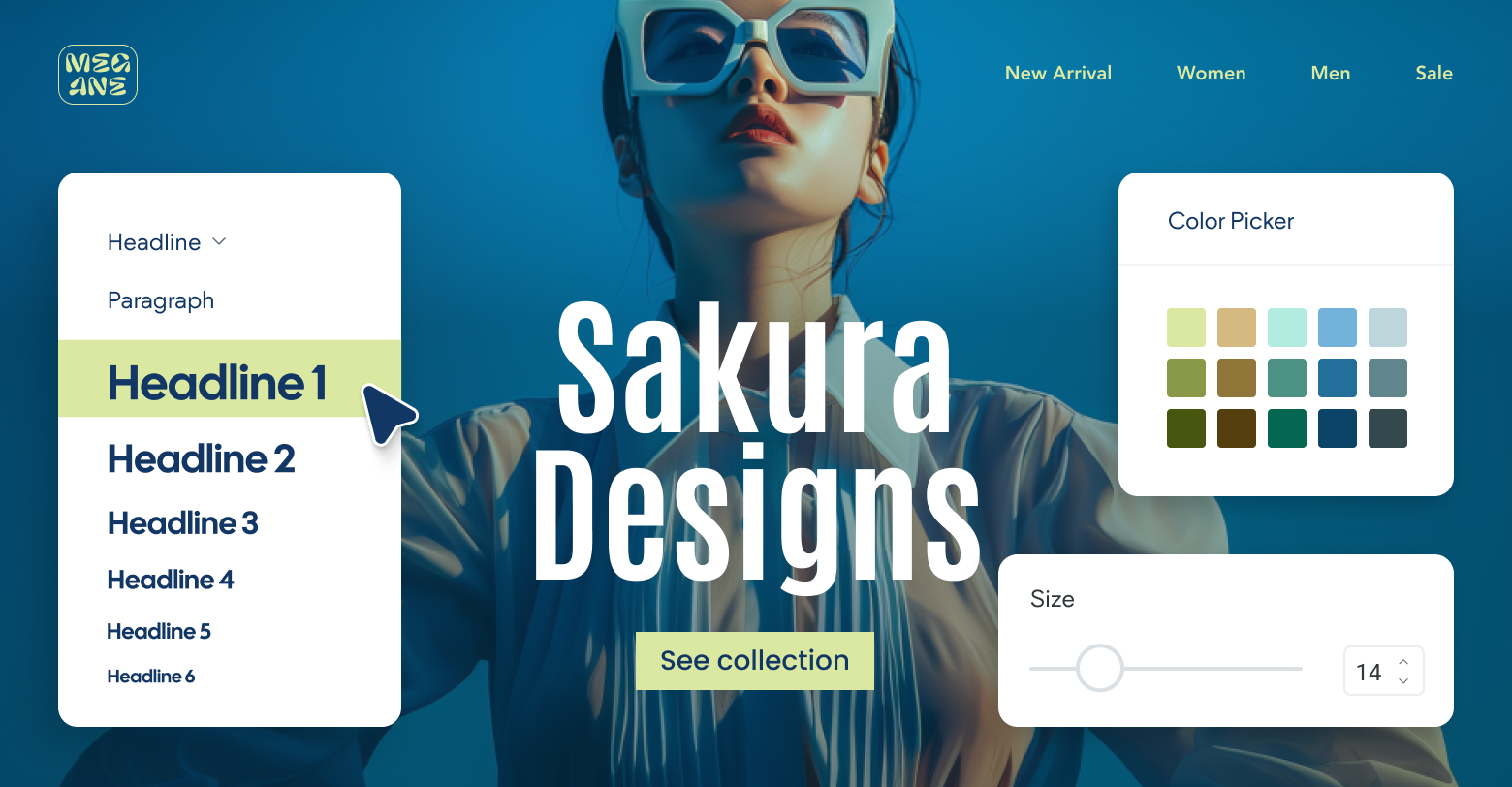
Duda has
recently introduced a built-in Color Contrast Ratio checker within the website builder. Located in the color picker of text elements, this feature provides instant feedback with a failed (red X) or passing score of AA or AAA, allowing agencies to verify color contrast without leaving the editor, and design with color contrast in mind from the start.
Tips:
- When designing elements like buttons or graphical controls, test the foreground/background on those elements before implementing them on the website.
- Ensure that contrast remains sufficient even in dark mode or high-contrast settings, as some users may rely on these for better visibility.
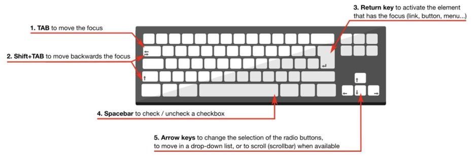
2. Make sure your client’s website is keyboard accessible.
The Web Content Accessibility Guidelines (WCAG) emphasize keyboard accessibility as part of the "Operable" principle, which mandates that all web functionalities must be accessible by keyboard alone.
This allows anyone who can't use a mouse — due to physical disabilities, visual impairments, simply not having one, or personal preference — to navigate and interact with site content.
Users should be able to navigate menus, activate links and buttons, fill out forms, and use custom interactive widgets without a mouse.
Source
To implement keyboard accessibility:
- Make all interactive elements, including links, buttons, and form inputs, able to be selected, focused, and activated using the keyboard, typically with the Tab, Enter, and Space keys.
- Avoid keyboard traps where a keyboard user cannot move focus away from an interactive element without using a mouse. Users should be able to navigate through all page elements using standard keyboard commands and exit any focused element.
- Provide visual indicators such as outlines or highlights when interactive elements gain focus to help users identify their location on the page.
- Make all windows closable using the Esc key; for example, when using modal windows or lightboxes.
- Include scrolling functionality using the arrow keys.
3. Avoid flashy designs.
For those with impairments, fast-moving
website animations, strobe-like effects, and sudden movements can be disorienting (and, in serious cases, cause seizures or nausea). According to Success Criterion 2.3.1, web content
must not flash more than three times per second to meet the minimum compliance (Level A).
To fix issues with overly-flashy or moving design elements:
- Use tools like thePhotosensitive Epilepsy Analysis Tool (PEAT) to test content for seizure risks.
- Avoid elements that flash or flicker faster than three times per second.
- Ensure that any flashing content does not exceed the general flash and red flash thresholds, which are particularly triggering.
- Provide mechanisms for users to stop, pause, or hide flashing or blinking content, especially for auto-playing videos or animations.
- For emergency alerts, use a gentle fade-in effect instead of flashing, adhering to the threshold guidelines.
Figma’s website is a great example of how to use animations to your advantage without compromising accessibility.
Throughout the site, animations demonstrate the product’s features in real time, as you scroll.
But users have the option to show the controls if they’d like. And the light color palette and slower movements make it easier on the eyes.
4. Provide unique page titles.
Page titles are crucial for web accessibility as they help users (particularly those using assistive technologies like screen readers) understand what a webpage is about without needing to read the entire content. These titles appear in browser tabs, search engine results, and are read aloud by screen readers when a page is accessed, making them vital for navigation and orientation.
According to WCAG Success Criterion 2.4.2 "Page Titled", each page should have a title that describes its topic or purpose clearly and distinctly to facilitate user navigation and orientation.
To create compliant page titles:
- Ensure each page title describes the main content or purpose of the page. This helps users navigate through tabs and understand the page content at a glance.
- Each title should be unique within the website to avoid confusion and help users distinguish between different pages when multiple tabs are open or when using history navigation.
- Titles should be concise and prioritize the most important information. Placing unique and relevant information first in the title (front-loading) can be more helpful, especially for users who rely on screen readers.
- Avoid generic titles like "Products" or "Services," which do not provide specific information about your client’s page content.
5. Organize your content.
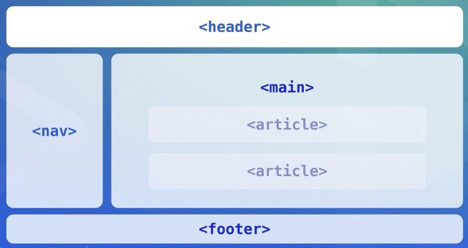
Using HTML5 semantic elements like <header>, <footer>, <nav>, <article>, and <section> significantly enhances web accessibility. In addition to helping with SEO, they provide a clear structure to your client's webpage, which is crucial for users who rely on assistive technologies like screen readers.
Source
To properly implement these elements:
- Use <header> for introductory content or navigational links and <footer> for information about the author, related documents, and copyrights.
- Use <nav> for major navigation blocks, such as primary site links, which can be easily located by screen readers.
- Use <article> for self-contained compositions that can be independently distributed or reused, such as blog posts or news articles.
- Use <section> to define sections within a document, like chapters, headers, footers, or any other sections of the document.
For example, a blog post page could have a <header> for the site name and main navigation, an <article> for the blog post content, <section> tags to delineate different parts of the article, and a <footer> with copyright and other site-wide information.
An ecommerce site might use <nav> for the site’s main shopping categories, each product detail could be wrapped in an <article>, and user comments in separate <section> tags within the article.
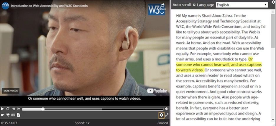
6. Provide captions and transcripts for videos.
Captions and transcripts make video content accessible to people who are Deaf or hard of hearing, those who have difficulty processing auditory information, and non-native speakers. Since they make so anyone who cannot hear the audio to follow along with the video, they also cater to those in quiet or noisy environments or who prefer reading to listening.
Source
Under the Web Content Accessibility Guidelines (WCAG), captions are mandatory for all prerecorded audio content in synchronized media (such as videos) at Level A, and for all live audio content at Level AA.
- For pre-recorded content, provide closed captions that can be toggled on and off. Ensure captions include not only dialogue but also other audio cues like sound effects and music when they are essential for understanding the content.
- For live content, use real-time captioning services.
- Transcripts should include detailed descriptions of all significant audio and visual content, not just dialogue. This might include descriptions of actions, facial expressions, background noises, and scene changes.
7. Include labels for form elements and inputs.
Labels are crucial for form elements and inputs as they provide clear descriptions of what information users need to input. They also help users who struggle with reading or understanding the form fields.
Under WCAG 2.1, labels or instructions are required for user input when content requires user interaction. Specifically, WCAG 2.1 under Success Criterion 3.3.2 (Labels or Instructions) mandates that labels or instructions be provided when content requires user input for Level A compliance.
For repeat customers, it's best to include an autofill attribute on these forms to allow browsers and assistive technologies to recognize and autocomplete form fields based on the user's past input. And for entries with only a selection of options, opt for a dropdown menu instead of an input field to ensure users can select from a list of choices instead of typing them out.
Technical execution involves the following:
- Proper labeling: Every input in a form should have a corresponding label element that defines the purpose of the input field. This is achieved by ensuring the for attribute of the label matches the id attribute of the input element, creating a programmatically determinable relationship between the label and the specific input.
- Visual design and CSS: While CSS can be used to visually enhance or hide labels for aesthetic purposes, it's crucial that the labels remain functionally accessible to all users, including those using assistive technologies. Techniques like "screen reader only" classes can be used to hide labels visually while keeping them accessible to screen readers.
- Placeholder text vs. labels: It's a common misconception that placeholder text can replace labels. However, placeholders disappear when the user starts typing, which can confuse users who might forget what information belongs in the field. Placeholders should be used to provide an example of the type of input required, not as a substitute for labels.
- Semantic HTML: Use semantic HTML5 elements like <label>, <input>, <textarea>, and <button> correctly to ensure they provide the necessary accessibility features inherently supported by browsers and assistive technologies.
8. Give additional options when users make mistakes.
When users make an error on your client's site, they should be guided clearly on how to correct it. This support is especially important for users who rely on assistive technologies, as they may not perceive visual cues that indicate errors.
WCAG 2.1 includes specific guidelines for error identification (SC 3.3.1) and error suggestion (SC 3.3.3), which require that errors be described to the user in text, and that more than mere identification of errors is provided—suggestions for correction should also be given.
Follow these best practices to create a more inclusive error-handling experience for users:
- Errors should be immediately noticeable and clearly explained. Positioning error messages at the top of the form and providing in-page links directly to the erroneous fields can help users quickly understand and rectify issues.
- Include clear descriptions of what the error is and how to fix it. For example, instead of simply saying "Invalid entry," specify "The Date field is in the wrong format; it should be DD/MM/YYYY."
- Use visual cues like color changes alongside programmatic changes such as ARIA labels to indicate errors. However, ensure these cues are not solely visual as this does not accommodate all users.
- Provide real-time validation that alerts users to errors as they occur. This approach helps prevent errors before form submission, enhancing the user experience by reducing the need for error correction post-submission.
- Use JavaScript and ARIA. Utilize JavaScript for dynamic error handling and ARIA properties to link error messages directly with the form inputs they relate to, improving accessibility for screen reader users.
A simple one is a "go back to home" option for a 404 error.
You could take it to the next level by implementing a chatbot for your client's website, too.
This can provide immediate assistance to users who encounter errors and need help fixing them. The chatbot could ask the user for more information about the error or point them in the right direction.
9. Provide easy-to-identify links.
Making links easy to identify involves ensuring they're distinguishable from standard text without relying solely on color. This helps users with visual impairments or color blindness.
Additionally, the purpose of each link should be clear from its text or context, aiding those who use screen readers and those with cognitive limitations.
To effectively label links, you should:
- Use styles that differentiate links from regular text (underlining works best because most people know an underline indicates a link). Ensure that these styles are consistent throughout the site.
- Use descriptive text that provides clear information about the destination of the link. Avoid vague text like "click here" or "more", which does not provide information about the link’s purpose.
- Color should not be the sole method of identifying links; instead, it should be used alongside other indicators. For users who are color blind, relying on color differences alone to distinguish text can lead to usability issues.
- For links that contain icons or images, use ARIA labels or alt text to clearly describe the action or destination of the link.
10. Provide options for navigation.
Proper navigation structures are essential for web accessibility, allowing users with different needs and preferences to interact with the site effectively. This includes people using assistive technologies, those with motor disabilities who rely on keyboard navigation, and users with cognitive impairments who benefit from straightforward and predictable navigation paths.
The Web Content Accessibility Guidelines emphasize the need for accessible navigation, which includes providing mechanisms to bypass blocks of content that are repeated on multiple pages, ensuring that navigation sequences are logical and operable through keyboard and assistive technologies, and making the focus visible on all interactive elements.
Use the following best practices to ensure your client's site offers accessible navigation options:
- Include multiple ways to navigate the site, such as menus, search functions, site maps, and tables of contents. This variety helps cater to different user preferences and accessibility needs.
- Use semantic HTML elements like <nav> for navigation sections, and properly mark up lists within navigation menus using <ul> or <ol> depending on whether order is relevant. This structure aids assistive technologies in understanding and interacting with the site layout.
- Provide "skip to main content" links at the beginning of pages to allow users to bypass repetitive navigation links. This feature is especially useful for those using screen readers or keyboard navigation.
- For dropdowns and fly-out menus, ensure that all users, including those who navigate by keyboard, can access all items. Menus should be operable with both mouse and keyboard interfaces, and should not require specific timings for mouseovers, which can be challenging for users with motor impairments.
- Use methods like ARIA labels or visual cues to indicate the current page or section within navigation menus. This helps users understand their current location within the site structure, which is crucial for orientation.
11. Provide feedback and write useful error messages.
There's nothing more frustrating than running into an error on a website and not being able to figure out what went wrong or how to fix it. Providing clear and concise feedback to users when they encounter errors is essential for a positive user experience.
The Web Content Accessibility Guidelines (WCAG) cover error identification (SC 3.3.1), providing suggestions for correction (SC 3.3.3), and preventing errors (SC 3.3.4), especially in legal and financial contexts where mistakes may have serious consequences.
To improve your client's website error handling, consider implementing these best practices:
- Use live regions in your HTML to alert screen reader users immediately when errors occur. This method informs them about errors without needing to change the focus or reload the page.
- Include specific instructions on how to fix the errors. For example, if a required field is empty, the error message should state which field is affected and what is expected (e.g., "The Date field is required and must be in the format DD/MM/YYYY").
- Ensure that error messages are accompanied by both visual cues (like icons or different text colors) and programmatically determined markers (such as using aria-describedby) that assistive technologies can convey to users.
- Use inline validation to provide immediate feedback as users fill out forms. This helps prevent errors by confirming correct entries as soon as they are made and providing tips or corrections before the user moves on to the next field.
- Position error messages right near the form fields they relate to, or list all errors at the top of the form with links that take users directly to the erroneous fields. This helps users identify and correct multiple issues more efficiently.
12. Build responsive sites.
A
responsive website is one that adapts to different screen sizes, resolutions, and orientations so that the content is displayed correctly on any device. It's probably something you're already familiar with, as aesthetic flexibility, user convenience, and mobile-first design are becoming increasingly popular.
Now, plenty of modern websites are designed to be responsive out of the box (including every site built with
Duda's website builder for agencies). Disability or not, everyone will need to use a device with a different screen size and input method to access your website at any given time.
We have lots of tips on this topic:
- Use fluid grids that use relative units like percentages rather than fixed units like pixels. This flexibility allows the content to expand or shrink to fit the screen size.
- Ensure images and other media content resize within their containing elements. The use of CSS techniques such as max-width: 100% can keep images from extending past the screen width.
- Use media queries to apply different styling rules based on the device characteristics, such as its width, height, and orientation. This allows for precise control over how content is displayed on various devices.
- Use the viewport meta tag to control layout on mobile browsers, setting parameters for width and initial scale to enhance user experience.
- Ensure navigation menus are accessible, with adequate tap targets and keyboard navigability, to accommodate touch and non-touch users alike. Also make interactive elements like buttons and links large enough to be easily tapped on a touchscreen device.
- Avoid fixed positioning. Fixed UI components can interfere with zooming and scaling on small screens, so it’s better to use static or relative positioning.
13. Include headings and spacing.
Headings structure the content by defining a clear hierarchy. Well-placed headings allow users to easily skim the content, and they play a crucial role in enhancing the accessibility of a website.
To implement them, follow these basic guidelines:
- Use headings hierarchically from <h1> to <h6>. The <h1> should always be the main title of the page, and subsequent headings (<h2>, <h3>, etc.) should denote sub-sections within the document in descending order of importance.
- Ensure that headings are descriptive and provide a clear indication of the content that follows them. This assists in making the content more navigable and comprehensible, particularly for users who rely on assistive technology.
- Avoid skipping heading levels (e.g., going from <h1> straight to <h3>). This can confuse both users and assistive technologies. Maintaining a logical order helps in creating a coherent flow of content.
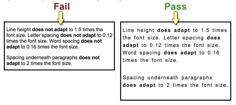
There's a second half to the readability equation, though: spacing.
Source
Proper text spacing entails adequate line height, word spacing, and letter spacing, all of which make the text legible for anyone reading your client's content, even if they adjust text settings on their browsers.
- Follow WCAG guidelines which recommend a line height (line spacing) of at least 1.5 times the font size, and spacing following paragraphs of at least 2 times the font size. Letter spacing (tracking) should be at least 0.12 times the font size, and word spacing at least 0.16 times the font size.
- Make sure these spacing settings allow for content to be readable even when text size is increased by up to 200%.
14. Add alt text to images.
Alt text is a textual description of an image that is displayed if the image cannot be loaded, or for users who use screen readers to access your website. In addition to being a cornerstone of web accessibility, it's an important part of your
SEO checklist, as it provides context and meaning to images on your website.
When writing alt text:
- Avoid unnecessary words like "image of" or "picture of." The description should be informative and context-relevant without being overly detailed, aiming to keep under about 125 characters to avoid being cut off by some screen readers.
- Tailor the alt text to reflect the image's role within its accompanying content. For example, the description for an image used in a technical article would differ from that of the same image used in a casual blog post.
- Avoid decorative text for purely decorative images. If an image is only part of the site for show, use an empty alt attribute (alt="") to avoid cluttering screen reader output with unnecessary descriptions.
- Include keywords for SEO. Incorporate relevant keywords in the alt text to enhance the image's visibility in search engine results. However, ensure these keywords are naturally integrated and relevant to the image.
- Maintain a neutral and objective tone. Refrain from subjective interpretations of the image unless it directly relates to the content's message.
- For complex images like charts or graphs, consider using a brief alt text combined with a more detailed description close to the image or in a linked detailed description page.
Pro tip:
With Duda, you can
instantly generate alt text for all your client's site images at once.
15. Provide accessibility audits for clients.
The same way you'd audit a client's site for
Core Web Vitals or
SEO performance, you should also consider auditing the site's accessibility. For newly onboarded clients, this can be a great way to showcase your agency's value. For existing clients, accessibility audits present an opportunity for upselling services or adding more value to your package.
A few things to cover:
- Check color contrast. Use a contrast checker tool to ensure that the foreground and background colors have sufficient contrast for readability.
- Test keyboard accessibility. Use only the tab key to navigate through elements on the page, and make sure all interactive elements can be reached with the keyboard alone.
- Review alt text for all images. Ensure that descriptive and relevant alt text is provided for all images in the site.
- Check for proper headings structure. Inspect each page to make sure headings are used hierarchically, and they accurately reflect the content on the page.
- Test with a screen reader. Pay attention to any issues that may arise and make necessary fixes.
From there, provide a detailed report with recommendations for improvement. Include screenshots and detailed explanations of any accessibility issues found, along with steps to remedy them.
16. Provide controls for auto-playing content.
Auto-playing media, such as videos, animations, or audio, can create accessibility barriers for those using screen readers or those who are sensitive to certain types of content. Even if you follow the above mentioned rules and avoid using content that's too flashy, some viewers will simply find the animations overwhelming.
Specifically, WCAG success criterion 2.2.2 (Pause, Stop, Hide) mandates that moving, blinking, scrolling, or auto-updating information can be paused, stopped, or hidden by the user unless it's essential to the functionality or the information being conveyed.
To implement this:
- Ensure all media controls for auto-playing content are visible and accessible to all users, including those who rely on keyboard navigation and screen readers.
- Avoid auto-playing significant audio content, and consider the implications for users with different needs. If auto-play cannot be avoided (e.g., for a
SaaS website demoing a product), make the "pause" and "stop playback" controls immediately available.
- Regularly test these controls to ensure they work correctly across different devices and browsers. This includes checking their functionality with assistive technologies like screen readers.
Testing and quality assurance
In addition to implementing the accessibility best practices outlined above, it's crucial to test your clients' websites for accessibility before they go live. Throughout the design and development process, you should continuously evaluate every element, so you can address accessibility issues early on.
Here are a few things you can do to test for accessibility:
- Use automated tools. There are many online tools available that can scan your clients' websites and identify any potential issues with accessibility. Some popular options include the
WAVE Web Accessibility Evaluation Tool,
Lighthouse (in Chrome DevTools), and
Axe Testing Tools.
- Test with a screen reader. Using a screen reader allows you to experience the website as someone with visual or cognitive impairments would. Common screen readers include
NVDA and
VoiceOver.
- Conduct manual checks. While automated tools and screen readers can catch many accessibility issues, it's also important to do manual checks for common problems like color contrast, keyboard accessibility, and heading structure.
- Include users with disabilities in testing. Invite individuals with disabilities to test the website and provide feedback on different elements.
- Gather feedback from diverse user groups. When assessing site accessibility for your clients on an ongoing basis, it's important to gather feedback from diverse groups of users. This could include individuals with different types of disabilities, individuals with varying levels of technical expertise, and individuals using different assistive technologies.
As an agency owner, it's important to remember that digital environments have frequent updates and changes. Continuous monitoring and improvement are essential to maintaining accessibility standards over time. Regular audits, user feedback mechanisms, and updates in response to regulatory changes are necessary to ensure ongoing compliance and user satisfaction.
Choose a website builder that sets accessibility as a priority.
Ahem...that would be us. We're
100% committed to accessibility!
The Duda website builder includes several built-in tools to help you design more accessible websites for your clients. We leverage semantic HTML5 for optimal content structure, options for adding alt text to images, and ensure keyboard navigability across sites.
Duda also supports automatic setting of the site's language based on user settings, which aids screen readers in providing the correct linguistic support. Plus, we integrate with accessibility tools like AudioEye, which offer automated help to meet compliance standards more effectively.
Using Duda, $8.13 billion AppFolio
was able to make 7,000+ real estate websites more accessible. If they can do it, so can you.
Haven’t tried Duda yet? Start your
Duda free trial now.