Everything with
eCommerce sites is so crucial.
You get something wrong, and your clients' bottom line suffers.
It’s true when thinking about the
eCommerce site homepage, but it’s also true when trying to figure out how to build the product detail page.
Now you might be thinking: but the product detail page is pretty straightforward, I don’t need any special instructions for that….
Well… You’d be surprised.
There are product detail pages that went terribly wrong because best practices were not followed. Others were simply not great.
You want a product detail page that kills it for your clients.
This article will help you nail it with best practices to follow.
Let’s jump right in.
What is a Product Detail Page (PDP)?
Before we’ll dive into how to sharpen your clients' product detail page, let’s first align what a product detail page is.
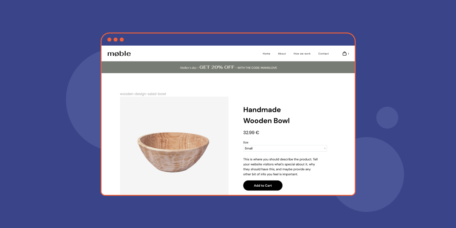
Common in the world of eCommerce websites, a product detail page lays down the product details such as the product description, size, color, price, shipping info, customer reviews, and any other relevant product information or photos and videos, as well as expected functionalities (add to wishlist, add to cart, search bar and so on). Take amazon product pages for example.
Why is a good product detail page important?
Now that we have answered what a product detail page is, it’s worthy to make sure we understand why it’s so important.
Unlike with a physical product, your clients' customers can’t actually feel the item, but they do want in-store experience, online. So the product detail page is the second best thing after a physical product to make them acquainted with the item as much as possible. As such, It’s one of the most important factors impacting the buying decision. In other words, it can be the difference between a sale and no sale at all.
Just look at this stat, according to
Salsify Consumer Research Report, 45% of shoppers said "high-quality images and detailed product descriptions" are among the leading reasons they trust a product online. So a good product detail page is not just about providing information, it’s also about inspiring confidence and trust, which is crucial in the eCommerce arena.
What are the essential elements of a product detail page?
What else besides high-quality images and detailed product descriptions should a product detail page include? Buckle up - The list is long.
The essential elements of a product detail page are:
- Product Name - Here you put the product's full name. Try to invest in an enticing name and also a name that will include all the keywords to match the search of this item.
- Product Description - Including specs, how to use the product, etc. You can use bullet points for clearer product page design readability.
- Images - Product listings should include high-quality images.
- Price - List how much the product cost and any other price-related info such as discounts or reductions in price. Locate the price next to the “add to cart” button.
- Size - Provide size options for the item.
- Color - Provide color options for the item.
- Availability - Detail whether the item is in stock and present its inventory status (if the inventory is low and the user should hurry up).
- Add to wishlist - I can’t tell you how many times I've used this one, it’s a real lifesaver. It allows you to save items you are interested in purchasing in the future to a wishlist.
- Quantity - List how many items of that product to include.
- Shipping Information - Including Shipping costs and return policy.
- Rating & Reviews - You can add a star rating system, as well as user experience with the product.
- Product Recommendations - List similar products and new products to help upsell.
- Recently Viewed - Help potential customers with their purchase decision by showcasing the listing pages of products they viewed (and therefore are interested in).
- Breadcrumbs - Usually appear on the top of the page, breadcrumbs present the path leading to the specific product page.
- Add To Cart Button - This is one of the most common elements allowing you to add items to your cart.
- Search Bar - To help your customer experience, make a search bar available to users to search by product title, or product categories.
The best practices to build a converting product detail page
Now that we understand that product detail pages are important, and could be the most important pages in an eCommerce site, we must make sure we follow the best practices to optimize these pages, making them as converting as possible.
Since there are a lot of components in a product detail page, there are also many best practices to follow. Don’t worry, though. This list of best practices will cover everything you need to know.
1. Know your audience
In order to create an effective PDP, you need to have a deep understanding of your target audience. You need to know what they want, what they don’t want, and how they like to buy products.
Questions to ask yourself include:
- What value does the product provide to the audience?
- Does this product solve a customer problem of some kind?
- What motivates the ideal customer to use this product?
- Are there certain aspects of the product the customer would find especially interesting?
These are just a few of the potential questions to pose when preparing to begin a product detail page design project. Obviously, depending on the situation, there may be many more. The important thing is not to rush the planning process and really think through what the product page you’re creating requires.
2. Write a descriptive product name that includes relevant keywords
The product name is something you should invest a lot of thought in. It is not as simple as it sounds - It’s not just the name of the product. Well, it is, but it’s so much more than that.
A product name should be as descriptive as possible for the product to be easily found, including related keywords and specific characterizations and variations. For example: If your client is offering a lace shirt named ‘Crystal’ the product name should not be just ‘Crystal’ but also include the keywords “Shirt” and “Blouse” as well as “Lace” “Round” “Vintage” and so forth.
3. Optimize the images you use
Nearly every page on a website can benefit from the inclusion of high-quality images. They simply make an experience much more engaging. However, on a product detail page, they play a particularly important role.
More than likely, the images you add to a product page will be the primary focus of anyone who lands on it. To hammer it home, think of it this way: people visit a product page specifically to see the images we are talking about. It’s best not to disappoint.
When selecting or creating product images, here are a few things to think about:
- Consider going beyond just images and including other types of ‘enhanced content’, such as product videos, comparison tables and more.
- Make sure the images are high-resolution
- More images are almost always better, the norm is at least 5-6 images
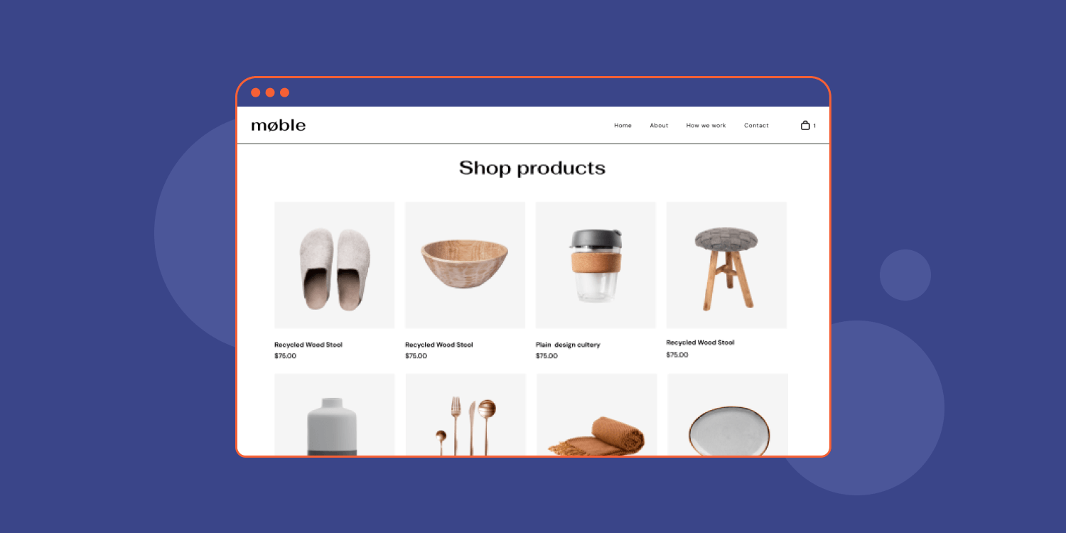
- Add your product images in the same background color and generally speaking, make sure the images are consistent across all products
- Show the product from different angles to provide a comprehensive view, preferably offer 360º images (and if possible offer zoom or enlarge buttons).
- Show the product in use in at least one of the images (for example, show a dress being worn by a model). Speaking of models, it’s recommended to show the size and height of your models so shoppers will have a reference.
- You can also get creative - Freeze frame photography is pretty nifty.
4. Write a thorough product description
As mentioned above, one of the most important elements of any product detail page is a well-written product description that clearly states what your client is selling and why a shopper just has to have it. Try to think of the product from the shopper’s point of view.
Here is what to remember about product descriptions:
- Be clear and concise, don’t write long sentences and paragraphs
- Be as specific as possible
- Organize the content hierarchy of the description, and use subheaders, bullets and numbers to improve readability.
- Highlight any values and unique selling points
- Answer any questions a shopper might have about the product, detail materials, ingredients and so on
- Feel free to use adjectives, but not too many
- Try to address any concerns the shopper might have about the product
- Mention any compatibility with other products
- Remember SEO and include important keywords New Paragraph
5. Nail your CTAs
CTAs shouldn’t be missed. They should be as prominent as possible, and even sticky, if possible. At no point when a user is on your product page should the CTA be out of view. The whole point of a product page is to get a user to make a purchase.
Besides making the CTAs pop, they should be clear - leaving no room for doubt as to what they are trying to lead the shopper to do (hint: buy).
And there are other tweaks you can make to optimize CTAs:
- Have the cart button show the number of products in the cart
- Mind the copy on the button. Minor changes can make a real difference, for example, providing a sense of ownership like “Add to
My Cart” or urgency like “Add to cart
now” can really move the needle.
- Make the CTA buttons big, and I do mean BIG!
6. Create a Sense of Urgency
Creating a sense of urgency is a tried-and-true marketing tactic for pushing customers to make a purchase right away. This can be done in a variety of ways, but here are a few of the most common methods to put customers in a “buy now” mindset:
- Show a limited-time coupon
- Display a countdown that indicates a sales ends soon
- Highlight a discount (e.g., 50 percent off)
- Provide a low-stock alert
7. Social proof is everything
The power of social proof is not something to take lightly. It provides you with the kind of credibility you need to make a sale. Showcase product reviews, ratings, testimonials, certifications, badges and anything else you can get your hands on.
Product ratings and reviews, in particular, are crucial in the eCommerce world, and there are countless stats to support that, here are a few:
8. Optimize for mobile
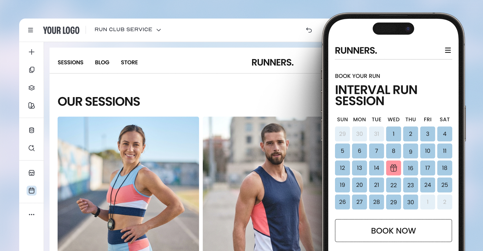
Today, most people engage with the web through their mobile devices. It’s the era of Mcommerce. With stats showing that
79% of smartphone users have made a purchase online using their mobile devices, it’s easy to see why all websites today need to be mobile-friendly, and this applies to eCommerce solutions as well.
Here, the most important thing is choosing a mobile-friendly website building platform that got you covered when it comes to mobile experiences. If you’re using
Duda to create product detail pages for your small business client’s eCommerce website, you’re already mobile-friendly! All Duda websites are automatically optimized to look great on the small screen and adhere to Google’s best practices.
9. Address SEO needs
Every online store wants its web page to be found at the top of Google search engine results. The same thing goes for any of their product detail pages. Here are a few tips on product detail pages SEO that you may find helpful:
Conduct keyword research with tools like Keywords Everywhere, Ahrefs, etc. - Choose keywords with low competition and medium-to-high search volume
- Only focus on one or two keywords per landing page
- Create comprehensive and valuable product descriptions
- Use high-quality images that are optimized to load quickly
- Measure the success of your product pages and adjust accordingly
Final Note
Well-designed and planned product detail pages are one of the keys to small business eCommerce success.
The best practices outlined in this post are meant to provide you with essential information to ace your eCommerce product pages.
We hope you find the information we've included helpful as you plan your next eCommerce project.
Related Posts
By Stephen Alemar
•
March 5, 2026
Agencies: Learn 7 proven, non-salesy strategies to upsell online bookings to your SMB clients. Position bookings as a high-value, low-risk business upgrade.
By Stephen Alemar
•
February 10, 2026
Discover the best eCommerce solution for your SMB clients Learn key criteria and compare platforms like Duda, Shopify, and BigCommerce to find the right-sized fit.
By Renana Dar
•
May 5, 2025
Many SMBs still hesitate to embrace eCommerce. As the agency partner, you have the opportunity to tear down the perceived walls of eCommerce and show clients how eCommerce can make their business more efficient, accessible, and profitable.
Show More

