Website animations are one of the best ways to add interactivity and visual appeal to your client's website. They're easy to add using your
website builder, and they range from simple hover effects to complex animations that tell a story or showcase products.
From a psychological standpoint, animations create a positive user experience by grabbing attention, conveying emotions, and reducing cognitive load. They engage viewers in a way text and images alone simply cannot.
In the early days of site animation, we relied on GIFs, which were quite tacky (though, I'll admit, kind of fun). In the late '90s, Macromedia Flash became the go-to tool.
Fast forward to today: With new trends like micro-interactions, scroll-triggered animations, and 3D animation, there are countless opportunities to differentiate and leave a lasting impression on everyone who lands on your client's site.
But...where do you start?
In today's guide, I'll show you.
What is website animation?
Website animations are moving images, created with the use of code and design elements, that add dynamic effects to a website. They can range from simple transitions, like fading in and out, to complex interactions, like parallax scrolling or animated illustrations.
You can use web animations for practical and aesthetic purposes. For example:
- Guiding users through a process, such as filling out a form or navigating to a certain page
- Telling a story (e.g., a tutorial)
- Conveying progression through a task (e.g., with a time bar)
- Highlighting important info, like a call-to-action button or a new product release
- Gamifying the user experience by adding interactive elements
- Creating an immersive experience to showcase a product or service
- Adding a touch of personality and brand identity to the website's design
When used effectively, they bring your client's site to life and capture their customers' attention (without adding much to the overall cost of building it).
However, used poorly, animations can create a clunky, distracting user experience and cause the site to lag.
Why web animation is important:
For starters, people have short attention spans. In fact, it takes about
50 milliseconds for a user to form an opinion about your website before they decide to stay or leave.
There are other factors that play into their decision (mostly
SEO factors, like loading speed and mobile optimization). And they say not to judge a book by its cover. But
~94% of first impressions are design-related.
There are several benefits to adding animations to client websites:
- Improve user engagement.
Animations are attention-grabbing and interactive, making the site more enjoyable to use. They also prompt users to take specific actions, keeping them on the site longer.
- Simplify complex messages. Around
two-thirds of us are visual learners. With web animation, colors, graphics, text, colors, and audio come together to make pertinent information a lot more digestible in a much smaller space.
- Improve SEO performance.
Among Google's 200+ ranking factors are dwell time and engagement rate. If users leave the site quickly, search engines will stop ranking it high.
- Drive higher conversion rates. The longer users are on the site (and the easier it is for them to engage with the site in a meaningful way), the more chances you'll have to convert them.
- Build a unique a recognizable brand.
The animation techniques you use to highlight branding elements, product features, and benefits for your clients will reinforce their brand, create an emotional connection with users, and overall contribute to their products being top-of-mind when customers are ready to make a purchase decision.
Of course, there are potential drawbacks. If your animations are poorly timed, over-the-top, or too close to one another, they're more of a distraction than an asset. Too much movement can also slow down the web page and doesn't always translate well to mobile interfaces.
Common website animation languages
There are a few different ways to add animation to a website, depending on your level of coding experience and the complexity of the animations you want to create.
CSS animations
This is probably the simplest way for beginners to add animation to their website. CSS Animations use keyframes and properties like "transform" and "transition" to create movement or transition effects (e.g., changing the color of a button when a user hovers over it). They're lightweight, don't require JavaScript, and have good browser support.
JavaScript libraries
Libraries like GSAP, Three.js, and anime.js, offer a more robust set of tools for creating complex animations with just a few lines of code. They're particularly useful for complex or interactive animations where CSS falls short, like adding interactive animations or 3D graphics.
JavaScript's real strength in animations comes into play with its ability to handle user interactions and events, though. You can start, stop, slow down, speed up, or alter animations in response to user input like mouse clicks, scrolls, and touches.
They're also more processor-intensive than CSS animations, especially if you don't optimize them properly. It's important to use efficient code and leverage the browser's capabilities (like requestAnimationFrame()) to minimize performance impacts.
SVG
SVG (Scalable Vector Graphics) animations involve manipulating SVG elements to create animations directly within the SVG structure. SVG is an XML-based format for describing two-dimensional graphics, and you can animate it using CSS, JavaScript, or through its own specific animation elements embedded within the SVG markup.
Just like with HTML elements, you can use CSS to animate SVG properties. This includes transitions for simpler animations and keyframes for more complex sequences. Since SVG elements are part of the DOM (Document Object Model), you can target and style them using CSS. You can animate properties like opacity, transform, and stroke using CSS.
The best thing about SVG animations is they don't require rasterization and can scale without losing quality. Still, keep accessibility in mind and remember that complex or excessive animations can still lead to performance issues, particularly on less powerful devices.
JSON/Lottie
JSON/Lottie animations represent a powerful and efficient way to implement complex animations on your clients' websites. Lottie is a powerful library that interprets JSON files exported from Adobe After Effects using Bodymovin. It seamlessly renders these animations on the target platform, providing a native and immersive experience.
You can access Lottie libraries on Android, iOS, React Native, and web-based platforms. By interpreting JSON data, this library utilizes native APIs to draw and animate vector graphics, resulting in captivating animations.
Since animations are rendered using native platforms' capabilities, they are generally more efficient and smoother than traditional GIFs or video formats. Plus, devs can control Lottie animations programmatically, offering possibilities like pausing, reversing, looping, or dynamically altering animation parameters at runtime.
That said, Lottie doesn't support all After Effects features. So, you might have to simplify some effects and features for compatibility.
Canvas
Canvas is an HTML element that acts like a 2D drawing surface for JavaScript. You can use it to create animations, games, and other graphics on the fly using scripts.
Unlike SVG, which treats elements as objects in a scene, Canvas manipulates pixels directly instead. This makes it more suitable for creating complex animations where you need fine-grained control over every pixel. For example, you might use Canvas to create animations that involve pixel-perfect 3D transformations, like rotating or moving objects in perspective.
Canvas requires JavaScript and can be very processor-intensive. So, it's important to optimize your code and avoid excessive redrawing on every frame to keep performance smooth. Use requestAnimationFrame for the animation loop to ensure smooth animations that are synchronized with the browser's repaints.
Also, Canvas animations won't be accessible to screen readers and other assistive technologies. So, you'll have to provide alternative text or methods for conveying important information.
WebGL
WebGL (Web Graphics Library) is a JavaScript API for rendering 2D and 3D graphics in the browser. It's based on OpenGL, a popular graphics library used by native applications to create high-performance animations.
WebGL has good browser support and offers great performance since it runs natively on the GPU instead of using the CPU like Canvas animations. This makes it ideal for creating complex interactive animations, games, data visualization, and simulations.
Like Canvas, WebGL requires JavaScript coding skills and can be processor-intensive. Also, since WebGL is based on graphics hardware capabilities, it's not universally supported and might require fallback options for older or less powerful devices.
25 types of website animation (and when to use them)
Navigation animations
In
web design, navigation refers to the system that allows users to move through different parts of a website.
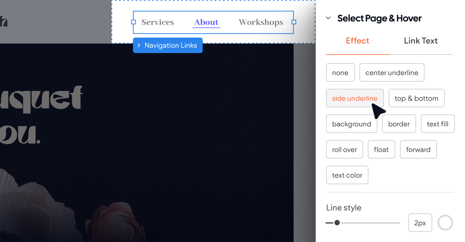
Navigation animations involve animating the elements visitors use to move around a website, like menus, buttons, and links. These include clickable hover icons, drop-down menus, or animated transitions between pages.
These are the most important types of animation because they organize your client's site architecture. They divide everything into categories, which significantly cuts down the time people spend searching for information.
Consider adding
hidden navigation
throughout your pages. For example, when a user clicks on a LinkedIn icon to share a page, it takes them straight to the share screen in an app-like interface.
Hero animation
A website's "hero" is the main content or image at the top of its web page. To make the
hero image more interesting, you could use animation instead. Animating hero elements involves using motion graphics, videos, and slideshows to grab users' attention and make a strong first impression.
Hero animations could be:
- Loading animations
- Video headers
- Animated illustrations
- Hover effects
- Background animations
Effective hero animations should enhance storytelling. They should feel purposeful without overwhelming and encourage user interaction without distracting from the content.
Progression
A simple way to get users to keep interacting with the site is to show them how far they have to go. This improves engagement with other interactive elements — like forms or questionnaires — by gamifying them.
A few examples:
- A progress bar on a checkout page
- A percentage sign next to a survey question
- A timeline illustrating the steps of a process
- An animation showing progress made on a 2,000-word blog post
Progression animations allow visitors to pace themselves and track their accomplishments. And they help them commit to long-form content, which they might abandon if no end is in sight.
Attracting attention
You can boost web conversions simply by animating the elements you want site visitors to click on.
Anywhere someone can...
- Download something
- Fill in a form
- Leave customer feedback
- Book a meeting
- Start their browsing journey
...you might want to consider adding a bit of animation to the landing page.
It doesn't have to be complicated (actually, it shouldn't). A little glow, enlargement, or a subtle wiggle effect can entice users to take action.
Skeleton screens
A skeleton screen is a design pattern used as a placeholder to enhance the user experience during page load times. It displays a wireframe-like visual that mimics the final layout of the page, providing users with clues about the content that will appear.
This approach gives users a sense of progression, making them feel like they're getting closer to their goal as things load (and taking their minds off the wait itself). Skeleton screens can be particularly effective in two scenarios:
- Resource-intensive pages
that require loading data from multiple sources or executing background scripts to display content
- Image-heavy pages with lots of high-quality visuals that take time to load
However, it's essential to use skeleton screens judiciously. They are not a substitute for
optimizing Core Web Vitals. If a page already loads quickly (in less than 500 milliseconds), adding a skeleton screen might not enhance the user experience.
Also, avoid using them for processes where a progress bar might be more appropriate, such as file uploads or downloads, as skeleton screens are best suited for indicating the loading of page content, not process progress.
Transition without hard cuts
A "hard cut" happens when a user navigates to a different part of the same page (e.g., a different blog post section) and it skips directly there. This abrupt change can be disorienting and jarring.
Transition animations make the movement more natural. So, when someone clicks on a different section of your client's landing page, it auto-scrolls to that point, and the user's eyes follow it.
Visual feedback (kinetic typography)
Visual feedback is one of the most important types of website animation because it tells your viewers what they've done (or haven't done).
As users interact with different elements of the website, it shows them what they're doing. For example:
- Displaying a checkmark when a password meets the required parameters
- Highlighting errors on a form
- Displaying a blurb of information over an (i) symbol
- Highlighting text as someone copies it
The main purpose of visual feedback is to give users a visual confirmation that something has happened from their action. Plus, it can give real-time feedback as to what still needs to be done.
Creative effects
Depending on the exact site you're working with and the nature of your client's business, you might consider adding some creative animation effects.
- Explainer videos
- Product demos
- Interactive shopping experiences
- 360-degree views of products
- Virtual tours
For example, a real estate firm might include a virtual house tour for one of its newest listings to potentially grab the attention of homebuyers on the market.
Loading animation
Nobody likes waiting for something. But you know what's worse?
Waiting for something and having no idea how long the wait will last.
That's where loading animations come in.
They're subtle visual cues that tell users when a process is happening or how long they should wait. They usually appear in the form of a loading bar, percentage circle, or other visual indicators.
Even if you can't provide a progress bar for loading times, you should still add a spinning loading icon or some sort of widget to let visitors know something is happening.
You could even add a fun fact, "hack" for using your product, or even a joke to make the wait more enjoyable.
Otherwise, people will become impatient and leave your website altogether.
Logo animation
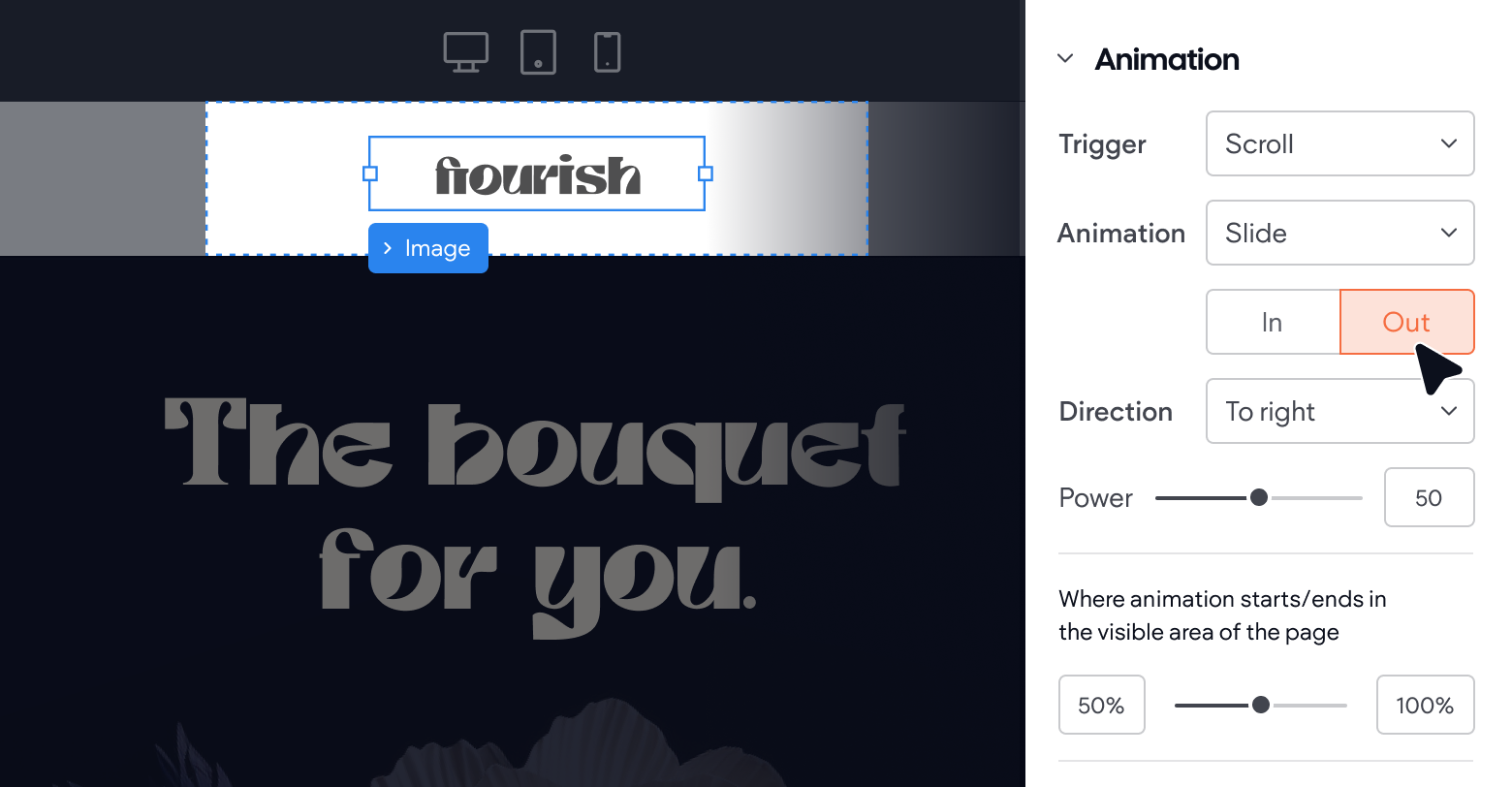
Throughout your clients' websites, basic logo animations are a nice, subtle way to accentuate their brand. Normally, a logo animation takes place on a loading screen or as users scroll down the page.
If it's a minimalist icon, a simple rotation or gradual addition of lines or color can do the trick. For text-based logos, you might slide the letters onto the screen one by one or have them jump up once in a wave formation.
Dynamic backgrounds
Dynamic backgrounds are exactly what they sound like — engaging elements that add motion and interactivity to a website's backdrop.
They include video backgrounds, animated patterns, parallax effects, particle systems, and gradient animations. And they significantly enhance user engagement by adding depth, creating emotional connections, and delivering a more immersive experience. Use them for:
- Storytelling
- Branding
- Creative showcasing
The big challenge with making the entire background dynamic is to ensure it doesn't distract from the main content. If the text is hard to read on an animated background, users won't bother trying.
You'll also have to consider loading speed a bit more here. Make sure you test the animations on different devices and internet connections to ensure it doesn't slow down the overall user experience.
Galleries, slideshows, and videos
Sometimes, straightforward scrolling isn't the best way to engage viewers. If your client wants to showcase a portfolio, multiple product features or use cases, or a series of distinct images, slideshows or galleries are the way to go.
Slideshows let people click through at their own pace. They make one scroll motion, and it takes them to the next section or product, for as long as they'd like the stay there.
Galleries let users click through thumbnail images of multiple products, then click on the one that interests them most.
For some types of slideshows and galleries, consider adding an auto-play video or animated demonstration instead of a basic picture — for example, the hero animation on the
Duda home page.
Micro-interactions
A micro-interaction is a tiny animation that responds to user action. For example, when you hover over a button, it might slightly change color or enlarge in size.
They're subtle but effective ways to help people navigate the website and understand how they should interact with different elements. In the case of the abovementioned example, the micro-interaction would trigger a response in their brain to click the button.
Although micro-interactions are small, they play an important role in guiding site visitors from one part of the journey to the next. They help people take action without thinking.
Modal and popup animations
You apply modal and popup animations to overlay elements like:
- Newsletter signups
- Discount offers
- Contact forms
- Prompts to turn on web notifications
- Additional information
- Graphic elements (e.g., videos and infographics)
They're quite similar to popups, but a lot less annoying. They're perfect for helping users get more information about the product, brand, or subject matter without leaving the page they're currently on.
Slides, fades, and bounce effects are all excellent examples of animations you can use to make these elements a bit more engaging for the user.
Interactive animation
For complex websites (e.g., gaming sites), interactive animation can enhance the overall experience dramatically.
You can use it to:
- Create a story or gamified journey for users
- Cause animated effects to happen when someone scrolls over an element
- Enable visitors to draw shapes or patterns on the website, then respond with more animations based on what they’ve created.
For example, a car brand might let users see how different colors and specs affect the appearance of a new model vehicle before they click on the product configurator. Or, a VR game developer might let users check out some of their real prototypes in action.
Hover animation
This is the most common (and broad) type of interaction (for desktop, that is).
Hover effects, like micro-interactions, happen when someone moves over an element on their computer or mobile device.
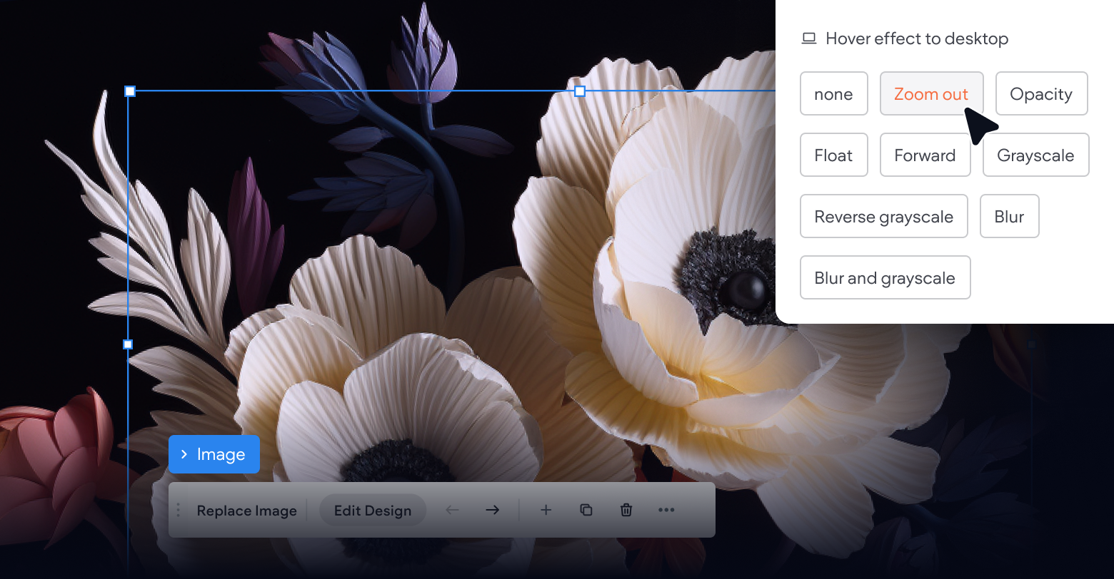
This type of animation is perfect for website images and interactive graphics. You can use hover animations to encourage people to click through features, view products in 3D, or even see before-and-after shots of a product.
Although they don't work on mobile devices, you can program a similar effect on mobile devices that mimics pushing a button. In the same way a clickable asset might enlarge when someone drags their mouse over it, it can grow slightly in size when a user clicks it.
Warning animations
Your client's website might be under construction. A link might be broken. Or a user might land on a page that no longer exists.
Rather than let people click off a 404 page or guess what's coming, consider creating an animated warning message that appears directly on the page.
The animation can include a warning symbol or friendly character (e.g., a sad emoji), along with a clickable link that takes people back to the homepage.
Augmented reality (AR)
AR website animation has much fewer applications than the other animation types on this list (it's a technology in its infancy). It's also trickier to implement because it requires advanced coding skills and user devices that support AR.
However, once implemented, AR can create a significant buzz around your client's website. You might use it to:
Allow customers to "try on" virtual clothing or accessories before purchasing
Use their phone as a viewfinder for 3D objects in the real world (e.g., furniture placement)
Create a unique and interactive experience for visitors that completely transforms their perception of the brand.
IKEA,
Amazon, and
Warby Parker are among the dozens of large retailers that have used AR to create a playful and engaging shopping experience for customers.
3D animations
3D animation brings to life computer-generated imagery within a simulated three-dimensional environment, where objects can rotate and interact much like they do in the real world.
To enrich the visual appeal and depth of online content, web designers often incorporate these animations, and sometimes blend them with 2D animations for enhanced complexity.
You can also program 3D animations to respond to user interactions like mouse movements, keyboard inputs, and touch gestures on smartphones and tablets.
Scrolling animation
In web design, we categorize based on their execution and display methods. These include:
- One-screen scroll animations, where effects occur within a single page section without actual page movement
- Scroll-bound animations, which change elements' behaviors based on the scrolling speed and position
- Scroll-triggered animations
are initiated when a specific scroll position is reached, progressing independently of further scrolling.
For an interactive website, parallax scrolling is an excellent scrolling animation example. You can also use viewport and scroll effects to craft a sensationally engaging site.
Really, though, the possibilities are endless. 3D scrolling animations, zoom effects, and image filters are just a few of the many custom animations you can use to create unconventional movements when users scroll through the content on your page.
Click animation
Click animations are similar to hover animations, but they're triggered after click events rather than before. They serve the same purpose as most micro-interactions: to indicate to the user their action was recognized and completed successfully. Normally, this is something simple, like a color change or slight enlargement/contraction of the element.
Storytelling
A picture is worth a thousand words. And a video is worth a million. Animations used to convey a story or a journey combine copy and moving visual elements to help you convey your message more easily and impactfully than you could with a static message.
As an example, you could use a slide animation to show visitors your client’s brand’s rich heritage or company culture on an 'About Us' page. You can also add storytelling elements to their hero banner, product/service pages, and blog posts by adding short, looping videos.
Whole-page motion
Animations can bring dynamic whole-page effects to a website, like a subtle tremble or a sweeping movement across the screen. For example, imagine a webpage that shakes when the user scrolls or a series of images that slide in from different directions on page load.
While these effects mainly serve to draw attention rather than enhance usability, they can significantly differentiate a website by adding an element of surprise or visual interest.
Dynamic menus
Static dropdown menus only give site visitors a few navigation choices. They can head to the main category pages, and that's it. By varying menu options from user to user, your clients can cater to specific visitor segments based on their location, previous browsing behavior, or even real-time factors like time of day.
Welcoming and onboarding animations
Arguably some of the most important animations on this list, welcoming and onboarding animations engage users before they've even taken a single action.
Welcome animations are shown as soon as a user enters the site and create a positive first impression. They normally take a similar format as modal animations and greet first-time visitors with a discount, CTA, or a message from the brand.
Onboarding animations help new customers familiarize themselves with the website features and services (e.g., a portal for tracking orders, a referral program, or a virtual tailoring tool). They can also guide users through registration or introduce new features and updates.
Best website animation tools
GreenSock (GSAP)
GreenSock (GSAP) is a powerful JavaScript library that offers unparalleled flexibility and control, allowing you to craft complex, timeline-based animations that enhance the user experience. It's particularly useful for engaging website visitors, improving interaction, and bringing a brand's digital presence to life.
Let's say you're designing a website for a tech startup wanting to showcase its innovative product through an engaging and interactive presentation. You could use GSAP to animate the product features as the user scrolls down the page, making each feature pop up dynamically and thus enhancing the user's engagement and understanding of the product.
ScrollMagic
As the name implies, ScrollMagic is a JavaScript library for creating scroll interactions. It's best utilized for triggering animations or changes in website behavior based on the scroll position, making it ideal for storytelling, parallax effects, and revealing content.
For example, if you're creating an educational website about space, you could use ScrollMagic to trigger animations of planets flying in as users scroll down the page, enhancing the learning experience by visually guiding them through the solar system.
Velocity.js
Velocity.js is a lightweight JavaScript animation library that enhances UI animation workflows by offering faster performance than jQuery's .animate() and even CSS transitions in some cases.
It's particularly effective for animating CSS properties, transforms, and SVGs, making it suitable for intricate UI animations like hover effects and page transitions.
If you're
building an ecommerce website for a client, you can use it to smoothly transition in product details as the user scrolls, improving the shopping experience by making it more dynamic and engaging.
Mo.js
Mo.js is a motion graphics library that offers a declarative syntax (meaning it uses natural language to define animations) and a diverse range of effects. This makes it an ideal choice for designers and developers looking to add motion to their projects.
It's particularly effective for crafting custom animations — be it a simple movement or complex sequence. A practical example would be using Mo.js to animate interactive elements on a landing page, such as buttons or icons, to draw attention and improve user engagement.
Anime.js
Anime.js is a well-known lightweight JavaScript library renowned for animating CSS properties, DOM elements, and SVGs. It's exceptionally versatile for web projects because it's written in vanilla JavaScript, making it compatible with any framework or library.
You can use it for various animations, from basic transformations to more elaborate effects like morphing and staggering animations. In fact, its built-in staggering system simplifies complex animations and makes it one of the easiest to use libraries on the market.
For example, you could use Anime.js to animate a series of product images on an
ecommerce homepage to create a dynamic, engaging user experience as visitors browse through products.
Vivus
Vivus.js is a JavaScript library for animating SVGs, so they appear as if they're being drawn. It's simple to use — no advanced programming skills required — and is compatible with all modern browsers.
Use Vivus.js to add dynamic visuals to web interfaces and boost user engagement — for instance, animating a company logo on a website to draw attention and convey brand identity dynamically.
Powtoon
Powtoon is an online platform for creating animated videos (most often, training and educational ones).
It's known for its user-friendliness, enabling users to craft engaging "Powtoons" with characters, scenes, and interactive elements like quizzes. This makes it ideal for creating diverse training modules, company policy explanations, or onboarding new employees and customers.
Real-life applications include developing an animated tutorial for a new software tool being introduced in a company, making the learning process more interactive and enjoyable.
Adobe Animate
Adobe Animate is a tool within the Adobe Creative Cloud suite of
graphic design tools that agencies use to create 2D animations and interactive vector graphics. It's employed across all kinds of media — television, video games, educational content, and, yes, web content.
What's great about it is it offers a broad range of creative capabilities for animators, allowing them to produce detailed animations without the need for hand drawing, thus saving significant time. A tangible example of its use could be creating web-based educational tutorials.
Blender
Blender is a comprehensive open-source 3D animation suite that covers just about every aspect of the 3D pipeline — rigging, animation, modeling, rendering, compositing, simulation, and motion tracking. You can use it for all kinds of animations, including full-on animated films, visual effects, artwork, 3D printed models, interactive applications, and gamified web experiences.
A solid example of Blender's application is its use in the production of animated feature films, where it's employed to create detailed 3D characters, environments, and visual effects. As an agency owner, you could use it for clients in the film or gaming industries.
Synfig
Synfig is a free, open-source 2D vector graphics and animation software designed to produce film-quality animation with fewer people and resources. It's particularly suited for creating detailed, frame-by-frame animations and is used for creating cartoons, animated ads, and instructional materials.
One of my favorite ways to use Synfig is to create educational animated videos explaining complex subjects in a visually engaging manner (e.g., a product explainer). It makes it easier for viewers to understand and retain information.
Autodesk Maya
Autodesk Maya is a prominent 3D animation and modeling software developed by Autodesk. It's widely used for creating 3D applications such as video games, animated films, TV series, and visual effects.
Maya is especially beneficial for students in creating realistic renderings of characters and effects. If you want to create a realistic-looking video with an AI-generated script for a website, Maya could help you build the animations.
Website animation best practices
Even if you know all about types of animations and tools, your ability to execute them effectively for your clients comes down to whether you do it right.
Here are my essential best practices to follow when adding animations to client websites:
- Keep it purposeful.
Make sure every animation serves a specific purpose and isn't just added for the sake of being flashy or trendy. Animations should enhance user experience and help convey information, not distract from it.
- Balance speed and performance.
I can't stress this enough. While smooth animations are visually appealing, they must also be optimized for performance to ensure the website doesn't slow down or crash. Make sure to test animations on different devices and browsers to ensure they run smoothly.
- Be consistent with your design language.
Animations should align with the overall design of the website and be consistent throughout. This creates a cohesive user experience and avoids confusion.
- Prioritize functionality. Nobody's going to your client’s website just to marvel at it. And too many animations can overwhelm users and make the website look cluttered. Use animations strategically, only in places where they add value to the design or enhance user experience.
- Don't forget about
accessibility. Consider your client's target user base when you add animations. Certain UI features, such as motion or flashing elements, can be harmful to people with sensory issues, for example.
Real-world examples of website animation
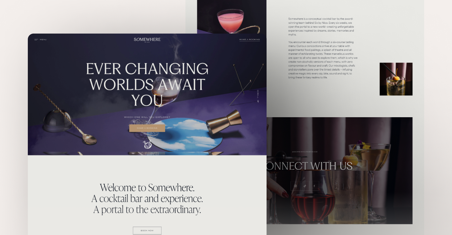
Somewhere by Nico
The
Somewhere by Nico home page is one of the better examples of simple and elegant web design. It is saturated with animation, but it is done smartly and in a way that is pleasing to the eye. In fact, they manage to produce an identity that characterizes them, both on a visual and animative level.
Legacy Homes
Legacy is a website
built with Duda. They're a real estate firm in Idaho with an eye-catching website, to say the least.
They're a solid example of how to use hero animation.
- The header and CTA button contrast enough to remain visible.
- The video playing behind them moves slowly enough to let you see all the fine details.
- The colors in the homes they display match the website, so there isn't too much contrast.
Buying a house is one of the biggest decisions someone most of us make in our lives, and giving a preview with a hero animation brings potential homebuyers who are "just looking" into the funnel.
ClickUp
ClickUp is the popular project management software known for its whimsical branding. And the
ClickUp website is a great example of
SaaS web design. Their homepage features bold colors and playful animations that immediately grab your attention. But, more importantly, these animations serve a purpose in demonstrating the software's functionality and ease of use.
For example, the animation of a user effortlessly moving tasks around in their project management board effectively conveys this as a simple, intuitive tool. Small click and hover animations over icons help users navigate between features and use cases right on the page. And left-to-right scroll-bound animations add a layer of depth to sections of the site.
Scrub Daddy
Scrub Daddy's website is mostly static, but its loading animations are a standout feature. As the page loads, white dots that resemble suds rotate around the center of the screen. When the page loads, they expand across the screen, to phase in the web page.
Its hover animations are also clean and pronounced, with its yellow buttons contracting then expanding over a slightly larger area than most.
Animations in Duda
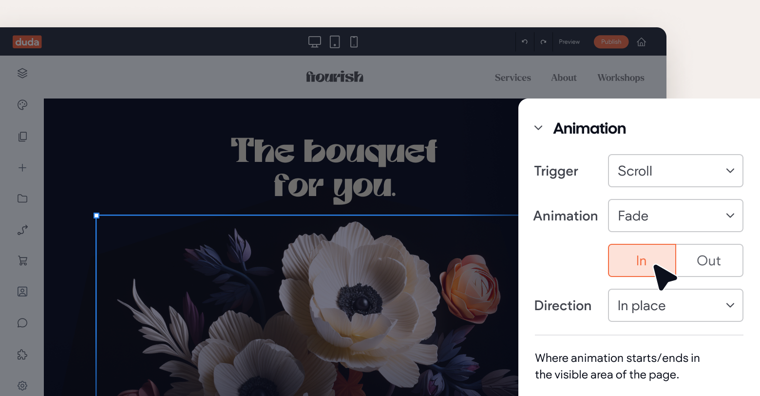
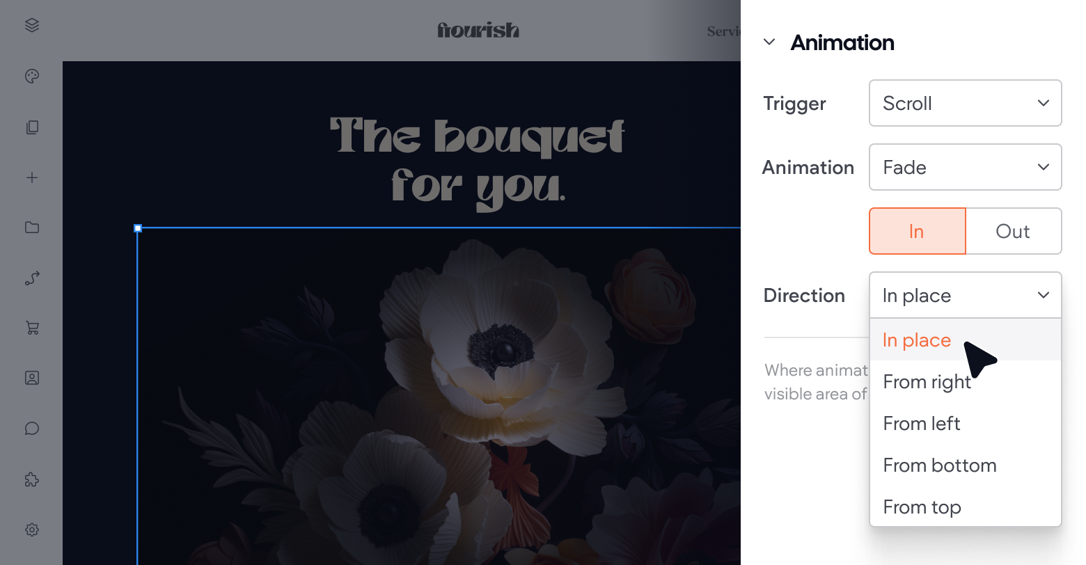
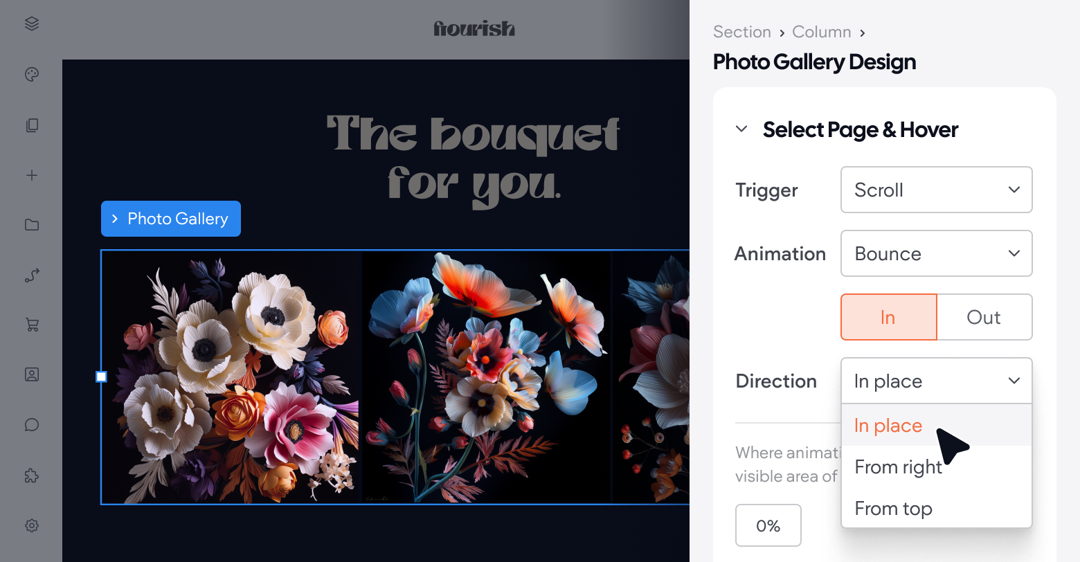
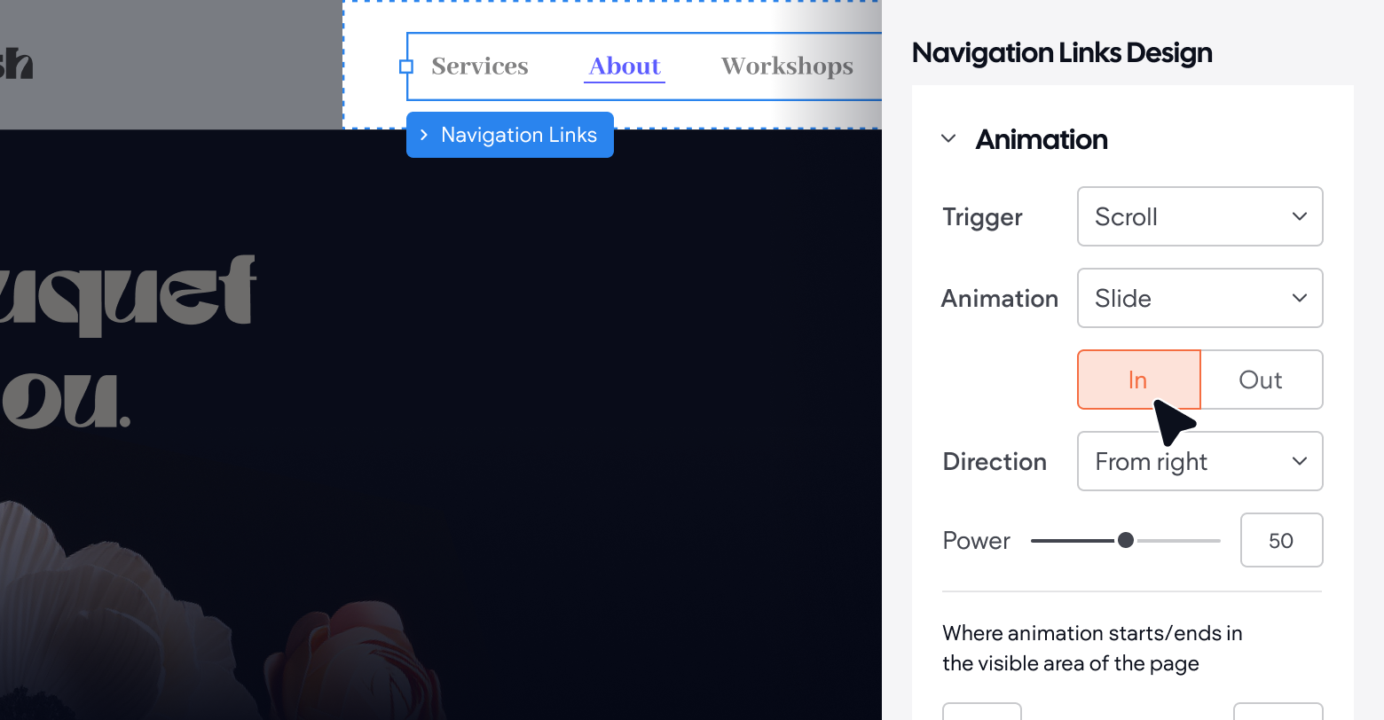
Duda offers a comprehensive set of animations triggered by the entrance or scrolling actions, such as slide, zoom in/out, bounce, rotate, fade, and more (they change according to the trigger). In addition, Duda offers specific widgets with unique animations, like navigation animation, photo gallery animation, and media slider animation.
Of course, you can also customize Duda to include your own CSS animations.
Final thoughts
Web animation is one of the most important elements to consider when
building a high-converting website. And technology is only making it better — 3D and VR/AR animations are adding a whole new level of immersion and engagement to websites, and AI (like
Duda's AI assistant) can help you optimize websites for loading speed,
SEO, and more with minimal effort.
That said, it's important to do animation the right way.
- Don't overdo it.
- Avoid being too flashy.
- Be consistent across all your pages.
- Don't detract from the message you're trying to convey.
If you can do that, you'll have no problem helping your clients differentiate themselves and their products and services from the rest.

