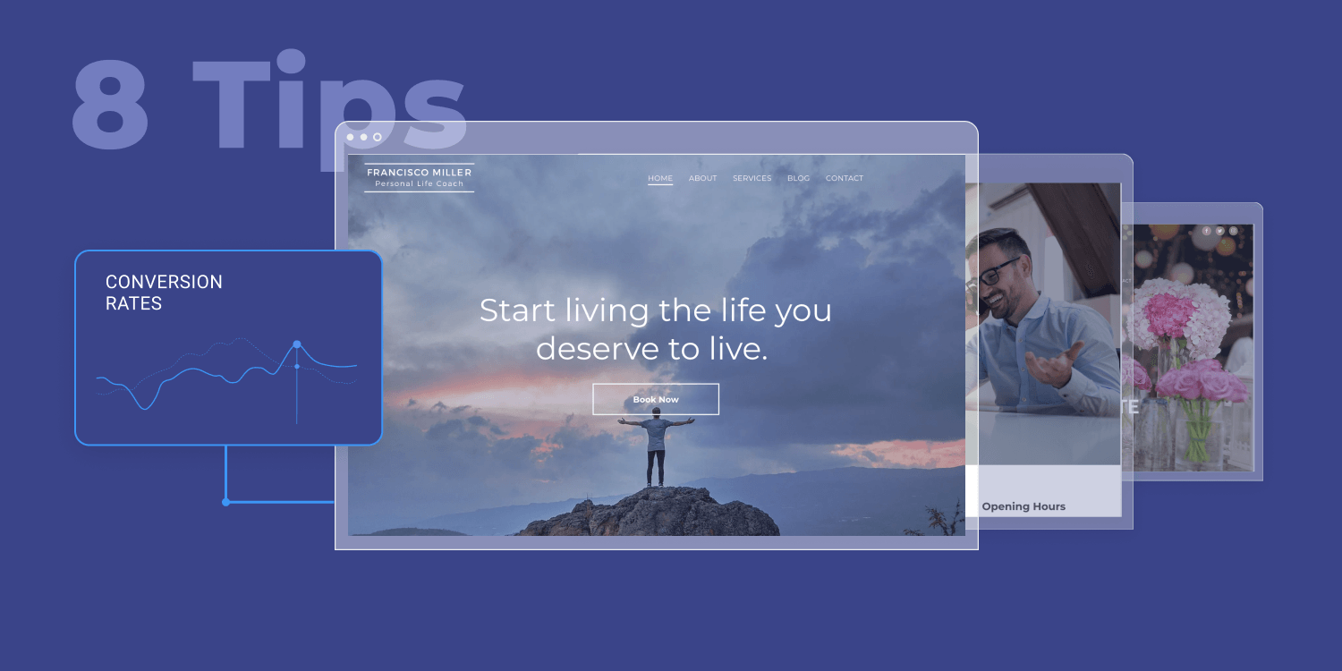
Conversion. That’s the bottom line of a website. Of course, there are other important objectives, like staying true to the brand, telling a story, and so on – but when it comes down to what matters most, clients want websites that convert (and a
website builder that is optimized for conversion).
What is considered a high conversion rate? Well, numbers vary depending on the industry your client’s business falls under, but the average conversion rate across industries is 2.35%. That said, it’s up to you to figure out how to pass that number, potentially going over 10%, which is considered a rare, but attainable conversion rate.
If you look at top-performing websites, you might notice they have a lot in common. Here’s a quick review of must-have elements you can incorporate to achieve optimal website conversion rates for your clients.
1. Ease users in with the right navigation
Navigation is like Google Maps for websites. It should be clear, descriptive, easy to understand – otherwise, users will get confused and leave the website. Studies show that users expect navigation to be easy, and a high percentage of them will leave a website once they find the navigation to be confusing. Obviously, this means that the website’s conversion rate will be affected.
Converting websites have very clear and simple navigation. They usually follow navigation conventions such as placing menu elements where people expect to find them (top menu, sidebar, footer), not having too many elements, arranging navigation items in a logical order and adding breadcrumbs to assist with navigation.
In a recent
DudaCon session we had on how to turn websites into conversion engines, Andy Crestodina brought up another interesting tip: using specific navigation labels rather than vague ones, and making them as descriptive as possible. Think about the “services” label – is it descriptive enough? Wouldn’t users benefit from a label that describes the kind of service offered?
2. Create compelling descriptive headers and subheaders
Being descriptive is not limited only to navigation labels. The website headers and subheaders deserve a descriptive touch as well. They are equally as important, making it easier for users to skim the page (as they hardly ever read everything), highlighting the value they will get from engaging with the site content. If the title is not clear or enticing, they will not engage with the rest of the content.
While there are best practices out there for writing headers and subheaders that encourage users to engage with the rest of the content (keeping the header short is one of them), it’s also important to test headers and subheaders and see if there’s an impact on conversion. You might be surprised by how dramatic results can be.
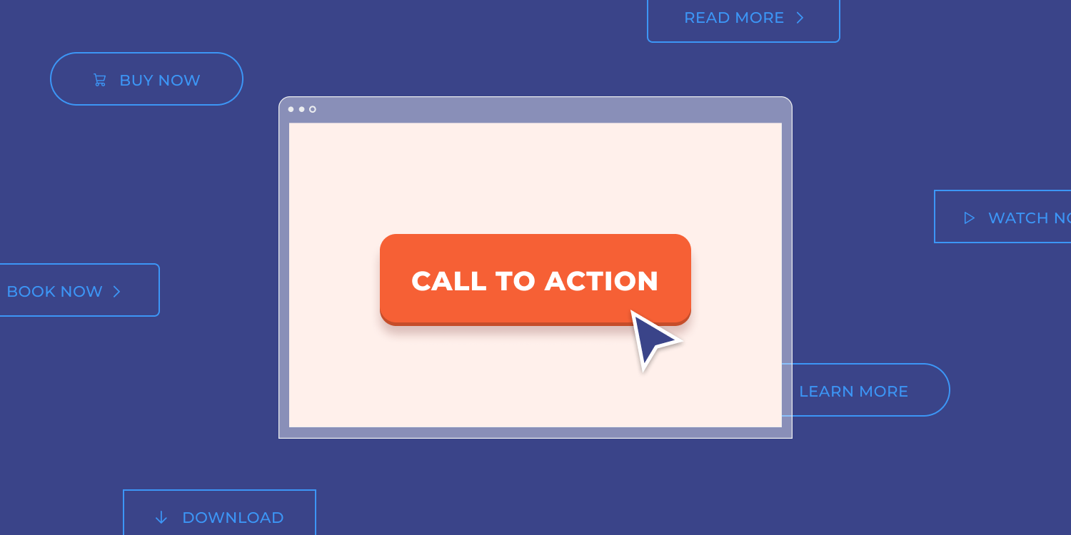
3. Invest in your CTAs
So you nailed the navigation, headers and subheaders. What’s next? Not surprisingly, CTAs. CTAs should be your next top thing to optimize when creating or maintaining a client’s website. It’s no secret that short CTAs, combined with action-oriented words (‘start’ ‘buy’ ‘sign up’ ‘join’ ‘get’ ‘try’) are more effective, that’s textbook. However, try to be as specific as possible. Instead of ‘sign up’ you can actually write your client’s specific offer. What else?
Since CTAs lead to the conversion items and their purpose is to get the users to take action, they should be easy to find. They should be noticeable. A simple thing like having the CTA appear above the fold and having more CTAs scattered around (there’s a fine line between extensively using CTAs and overusing them), can really make or break the conversion curve.
Also, a website’s CTAs should be visually appealing, and the main CTA should really stand out.
4. Upgrade your client’s content with videos
Speaking of standing out, one thing that really attracts users' attention is video content. In fact, a lot of customers prefer watching to reading, and consequently, they stay longer and engage more, which has a positive effect on conversion. There are
countless stats supporting video content on websites, showing a higher conversion rate and other important metrics. Video has a way of communicating the brand personality and tapping into users’ feelings that is unique to this format.
You’re probably wondering what types of videos you can create for your clients… There are so many options! To name a few: hero videos, how-to videos, and testimonials. Testimonials… This brings us to our next tip.
5. Build credibility with social proof and other elements
Is your client’s product any good? Well, you’ll have to prove it! Top converting websites use social proof to influence users and support the messaging, These can be testimonials, case studies, or reviews. Of course, that’s not the only way to prove your client is legit. You can and should incorporate logos, awards, and other credibility-building assets. Do you have usage numbers? Great, proudly present them.
Back to testimonials, though. Some use testimonial pages (here’s a nice blog post about
how to create a testimonials page that converts), but it’s also beneficial to use testimonials across different pages, in addition to putting them all on one designated page.
6. Align visual hierarchy & messaging
Let’s back up a little bit. We’ve discussed different sorts of components and visual elements but we haven’t discussed the visual hierarchy and its alignment with the messaging. It basically means that you are considering all components of the page and aligning them in a way that corresponds with the importance of each component.
Using aspects such as size, color, contrast, white space, repetition and proximity of elements, you can send the right message that conveys exactly what your clients want to send out.
If you find yourself unsure on where to put what (after all, everything is important, isn’t it?), try asking yourself whether the most visually prominent element is also the most helpful, important, and compelling one?
7. Utilize urgency on websites
Sometimes site visitors just need that extra nudge in order to take action. They need to understand that now is the time to act. That sense of urgency really gets the conversion curve up.
Offering incentives, promoting limited-time offers, or both, are good places to start. You can have a countdown timer to really illustrate the urgency. It works like a charm. Also, in eCommerce websites, triggering FOMO by demonstrating scarcity (showing a limited number of items left) is another thing that does the trick. Then there’s the issue of using users' real-time behavior, such as presenting how many users are currently viewing the page, which also triggers all the right things.
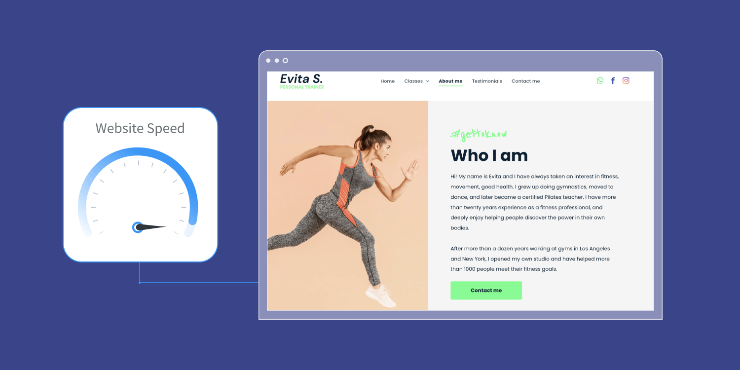
8. Optimize for site speed
Now that your client’s website's stars are aligned, there’s something you just have to make sure is working properly. It’s not the visuals or the text, but it’s just as important: site speed.
Long story short, you can do everything right, but if you get site speed wrong, the website conversion rate will suffer greatly. Users expect websites to load in the blink of an eye, so every second counts. A one second delay is a big deal in terms of conversion rate.
There are, of course, best practices such as compressing media and leveraging browser caching, and we cover these in our blog post “How Performance Really Impacts Website Conversion Rate,” but there is also something to be said about the infrastructure you choose for your client's website. There are significant differences in site speed between website building platforms, so choosing a platform that is both optimized for site speed and scores high in speed parameters and
Google’s Core Web Vitals is critical in that aspect.
Build websites that convert
Your clients want websites that convert and they trust you to get them there. Although getting conversions is not a walk in the park, there are a lot of things you can do while building or designing your client’s website in order to make sure it is optimized for conversion.
Some conversion components require your expertise (such as writing copy that converts and aligning the messaging with the visual hierarchy), but a lot of them actually just require you to make the right decisions when it comes to the website building platform you’re utilizing in your journey to create converting websites for your clients.
The right website building platform, for instance,
Duda’s website builder, can offer predesigned templates with integrated conversion-driving elements, such as intuitive navigation and prominent CTAs. Your chosen platform also has a lot to do with site speed, which is an important element that affects website conversion.
When it comes down to it, there are a lot of pieces in the conversion puzzle and as an agency, you should tend to all of them simultaneously, but choosing the right website building platform can really help in assembling that puzzle.
Try Duda today!
Related Posts
By Mike Paciello
•
May 19, 2026
The web had its worst accessibility year in six. On GAAD's 15th anniversary, learn why the 2026 regression is a process problem and how Duda and AudioEye help agencies fix it.
By Duda
•
March 10, 2026
Discover a more intuitive, professional UI with a streamlined sidebar and enhanced top navigation, helping you build faster and with greater confidence.
By Stephen Alemar
•
October 23, 2025
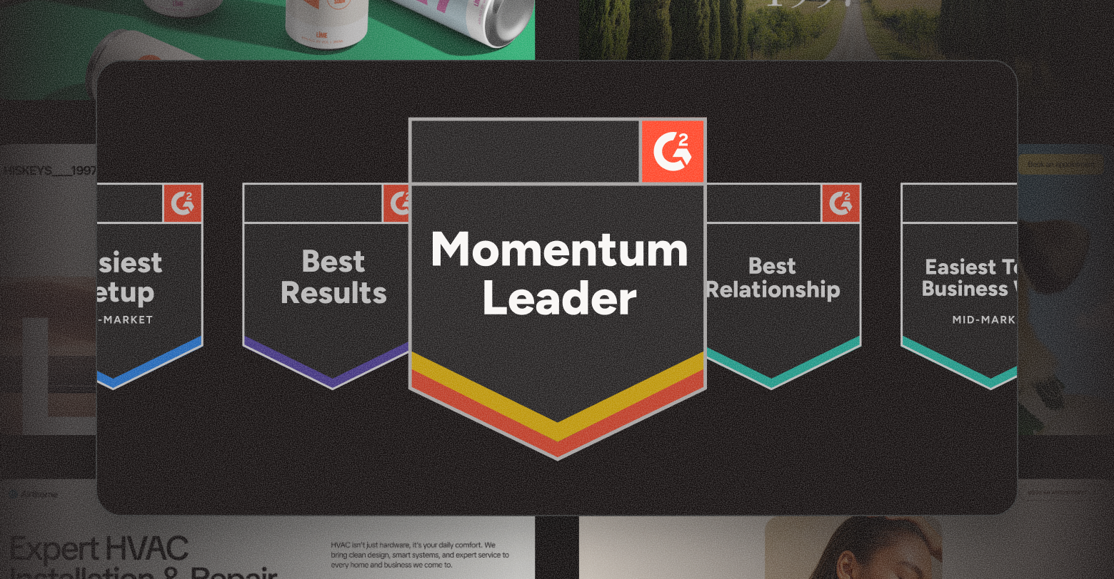
Discover why Duda is a top-rated website builder on G2, recognized for usability, easy setup, strong relationships, and excellent results, all backed by real reviews.
Show More