In the eCommerce world, first impressions are everything. If buying from your client isn't easy or engaging enough, there are millions of other products out there. Customers will just move on.
To create
selling websites for your eCommerce clients, you have to keep a lot of balls in the air.
- It has to be easy for customers to find what they're looking for.
- You have to serve the multimedia content that helps them make a purchase decision.
- Everything needs to be optimized for search engines.
- Despite having so much info, you have to keep everything minimalist — white space is your friend.
And, of course, everything needs to be on-brand. Consistently.
Roughly
94% of first impressions are related to web design. And you have
~2.6 seconds to hook your potential customer.
With such a short window of opportunity (and new
eCommerce trends like AR and voice shopping starting to shape the landscape), the list of factors you have to stay on top of to offer a 5-star service for your clients is only growing.
But, no matter what, you really have to know what you're doing when designing an eCommerce website for your clients.
What is an eCommerce website, exactly?
When you think of eCommerce, you probably think of...
- Marketplaces like Etsy and Amazon
- Big-box retail websites like Target and Walmart
- The cool clothing brand you stumbled upon on Instagram
- The local bakery that now sells its famous cookies online
And you're right. Those are all eCommerce sites.
But eCommerce goes a lot further than that.
At its core, eCommerce is about selling goods or services online. So, any website designed to process customer transactions is considered an eCommerce website.
How it's executed can vary wildly depending on whether you're transacting in a B2B or B2C setting.
- B2C eCommerce deals directly with the end-user (i.e., retail). These are the direct-to-consumer (DTC) brands that sell products like my bulleted example above.
- B2B eCommerce sells to other businesses (e.g. a SaaS company or digital marketing agency). In B2B, you might sell services, products, or a mix of both.
As an agency owner, you'll likely work with clients in both the B2C and B2B spaces. You need to understand what makes each type of eCommerce website tick in order to deliver the best results for your clients.
Why does eCommerce website design matter?
The main reason you should care about eCommerce website design is...well...money.
75% of customers say they judge a business's credibility on the design of their website. For your clien’t online store, this means that if your website looks outdated, unprofessional, or just plain ugly, customers will be less likely to trust the products listed on it.
Since most customers (88%) will leave a site without returning solely because of a bad user experience, there are also huge implications here when it comes to SEO and conversions.
- Out of Google's
200+ ranking factors, a huge chunk of them are related to how people interact with your client’s eCommerce store. Technical problems, slow loading times, and poor navigation can all directly impact
eCommerce SEO performance. Since they increase the bounce rate, they also indirectly impact the search engine rankings.
- If users won't return, that means they aren't buying from your client. And just like that...they have lost at least one sale.
You obviously want your clients to see an ROI from your services. Without making design a #1 priority, you'll actually end up costing them money (and potentially tanking their business).
Tips and best practices for eCommerce web design
If you're now wondering, "What makes a great eCommerce website?" you're in the right place.
Here are my best eCommerce website design tips for agency owners:
1. Branding is your top priority.
Your client's online store isn't always the first touchpoint. Maybe they ran a social media ad or paid a few TikTok influencers for UGC.
But it's always the most crucial one. That's where people will see what you're all about, so it determines how they feel when they think about the brand long after they've left your client's website.
Branding elements include:
- A strong logo (and font to match)
- Colors that match the brand's style and evoke certain emotions
- A cohesive design throughout the website, from the homepage to the checkout funnel
- High-quality images and multimedia that represent your client's products in the best light possible
- Consistent visuals, style, and copy throughout the entire site experience (including checkout)
If you haven't noticed, consistency is paramount here. Everything from pop-ups to product images needs to match the overall vibe of the rest of your client's website.
2. You need a mobile-first shopping experience.
According to
Statista's Market Insights, mobile devices accounted for $2.2 trillion in eCommerce purchases in 2023. This means they now account for ~60% of the world's total eCommerce sales.
Each year, more and more site traffic comes from mobile, too. In 2018, it only accounted for 56% of all online sales. And by 2027, it'll account for more than 62%.
Think about it: How often have you been bored while scrolling through Twitter or Instagram and ended up impulse-buying from an ad in your feed?
That's what your clients' customers are doing, too. They're on their phones scrolling social media and typing into Google, and they need a seamless experience to purchase products from their favorite brands.
eCcommerce mobile websites interact quite differently from web interfaces. Here's a quick list of things to prioritize:
- Responsive design (Can the site work on multiple device sizes?)
- Easy navigation (Can users interact with the page like it's a mobile app?)
- Clickability (Are buttons, links, CTAs, and product images easy to click with your thumb?)
- Scrolling (Do users browse without lots of tapping and typing?)
- Performance (Are pages, menus, images, etc., optimized for faster loading times on mobile devices?)
3. Ensure fast load time
Remember how I said you have ~2.6 seconds to make a first impression? Well...the clock is ticking from the moment they decide to click on your client's website.
And most of the time, that means waiting for a site to load.
On average, websites take 2.5 seconds to load on desktop and 8.6 seconds to load on mobile. It depends on the nature of the eCommerce website, but the general consensus is that the site should load within 3 seconds (though ≤2 seconds is ideal).
Some ways to improve load time include:
- Compressing images
- Enabling browser caching
- Minimizing HTTP requests
- Reducing server response time
- Using a content delivery network (CDN)
When
designing an eCommerce site for a client, avoid using large, high-resolution images that can slow down loading times. And even if you think they look "cool," avoid large, clunky animations that take forever to load (they normally detract from the overall user experience, anyway).
Related:
How Performance Really Impacts Website Conversion Rate
4. Navigation should be straightforward and intuitive.
The best way to increase your client's conversion rate is to make their site structure and navigation foolproof. Don't make users think about where they should click or what they're supposed to do next.
Make it simple, interactive, and user-friendly.
- Use a predictable menu layout that most people are accustomed to (think about what they see on Amazon, Walmart, or eBay).
- Tell customers exactly how many pages are in the checkout process (and which stage of the process they're on).
- Keep call-to-action (CTA) above the fold, so users can click right away.
- Lead users through a logical, step-by-step purchasing process.
- Minimize navigation layers (e.g., don't have multiple dropdown menus or submenus).
Internal links are awesome for this. For a DTC eCommerce business, this means...
- using clickable images as category pages
- linking to informational pages like "Shipping Information" or "Product FAQs"
- including search functionality that lets customers search by keyword
- implementing breadcrumbs so users know where they are on the site
From a search engine optimization perspective, these things also help web crawlers read and index the site more effectively. So when customers look for products on Google, they'll show up instead of someone else's.
5. Write clear CTAs.
The call-to-action is where things get subjective. It really is all about your client's target audience, brand identity, and, of course, the nature of their eCommerce business.
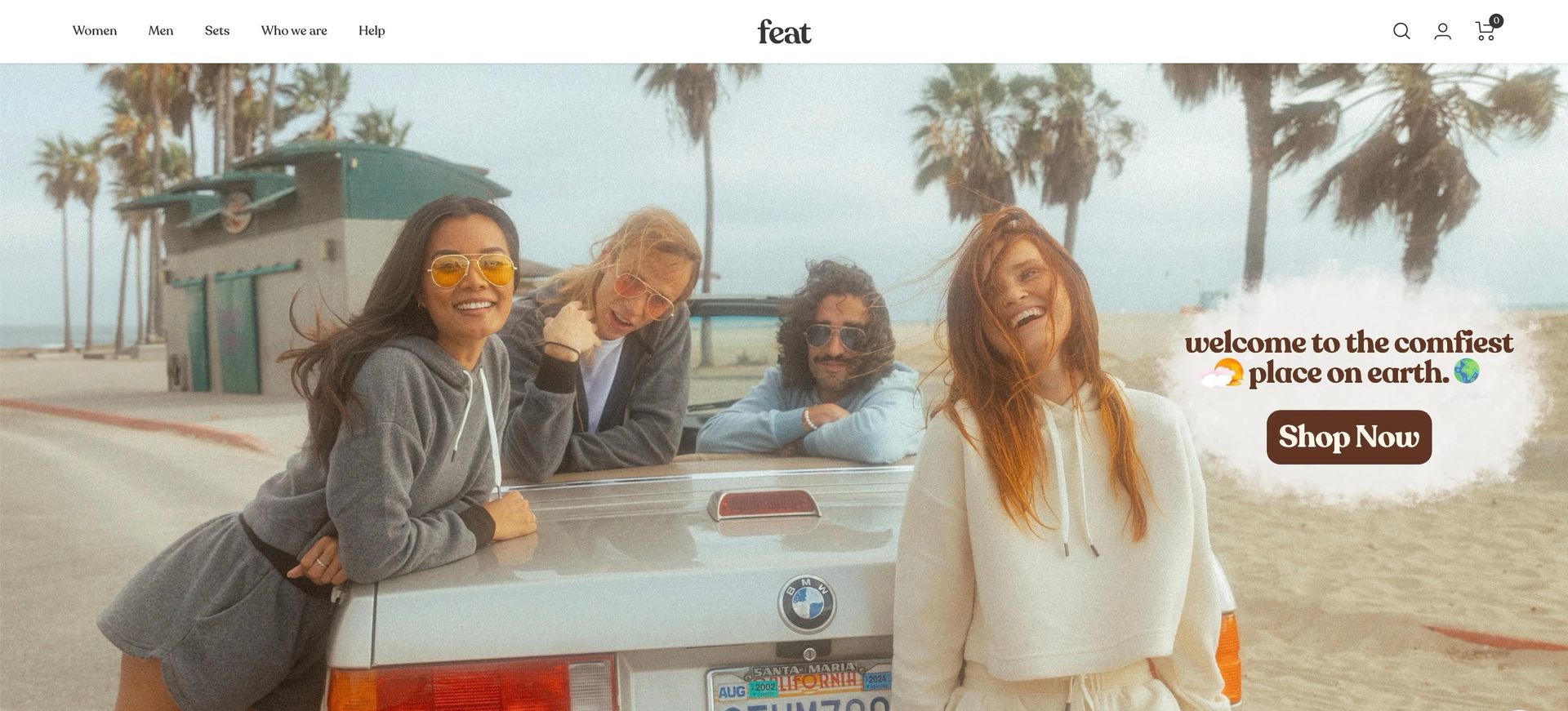
Take Feat as an example. They're a company that makes simple, monochromatic hoodies, sweatpants, and loungewear.
"Welcome to the comfiest place on Earth" tells us all we need to know about Feat. It's cool, beachy, and...well...exactly what you'd imagine when you think of cool, California comfort.
From a design standpoint, there are a few things to keep in mind here:
- The font color should contrast with the background of the page.
- The button should be highly visible. Use a shape that matches the brand's aesthetic (e.g., square, rounded edges). And, if you want to use bright colors, this is the place to do it.
- Keep it above the fold.
- Keep it simple.
What’s great about Feat is they added a white bubble around this design element to make it completely obvious while still highlighting the vibe they want to give off with their homepage screen.
6. Make the site accessible for all users.
Web accessibility is one of the most important factors to consider when designing an eCommerce site, and
your website builder of choice should support it. Yet it's often overlooked. Everyone loves online shopping, but not everyone is able to use a website the way you might think they can.
Some quick tips for improving accessibility on your client's site include:
- Use alt tags on images so screen readers can describe them to visually impaired users. You can use
Duda's AI Assistant to generate alt tags with a single click!
- Provide keyboard navigation options for people who cannot use a mouse
- Make sure the text has sufficient contrast with the background color
- Use a 44×44 px. area for touch controls like "Buy," "Add to cart," and CTA buttons (capture a wider range of touch inputs)
- Avoid flashing animations that may trigger seizures for users with epilepsy
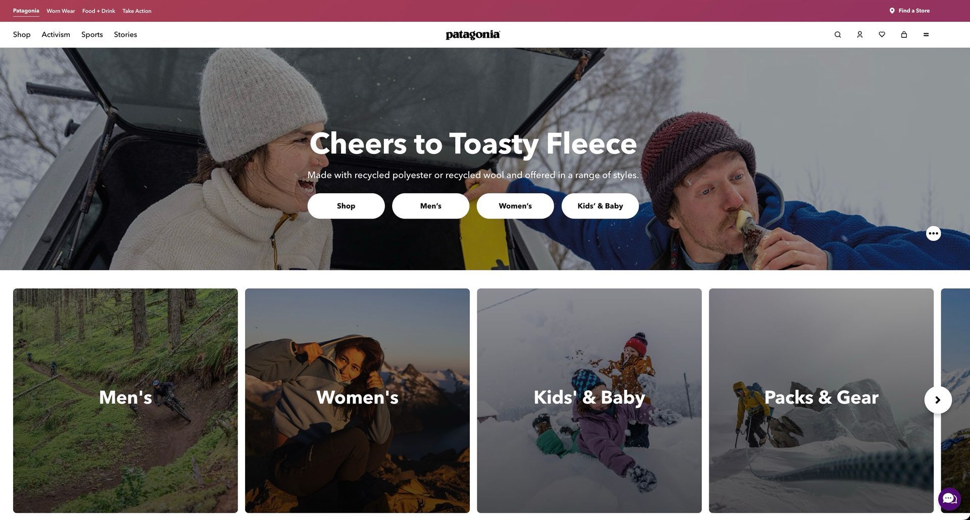
Patagonia’s website does a really good job here. All the most critical categories are front-and-center, in a large, bold, contrasting font that’s impossible to miss.
Improving accessibility isn't just for those with disabilities. It also improves the overall user experience for everyday users.
For instance, a text description of an image can help someone with a slow internet connection or limited data plan understand what they're about to click on before loading the full-size image.
Plus, accessible sites tend to have better SEO rankings and are more user-friendly in general.
Related:
Why Web Accessibility Is Important For Your Business [+6 Tips]
7. Design your client's homepage with care.
Home is where the heart is. And on your client's eCommerce site, it's where potential customers begin to form an opinion about the brand.
Depending on how large their eCommerce platform is (i.e., how many products/categories they have),
eCommerce homepage design works a bit differently. But there's one important thing to keep in mind: the hierarchy of information.
The most important things should be first. For a larger site, this is normally a series of "Category" pages that help site visitors navigate to the specific product they're looking for.
For a small business selling niche products, you can opt for a "Featured Products" section that showcases top-selling items, something that highlights their new collection ("Shop Now"), or a "Featured in" section to show off press mentions, reviews, and social proof.
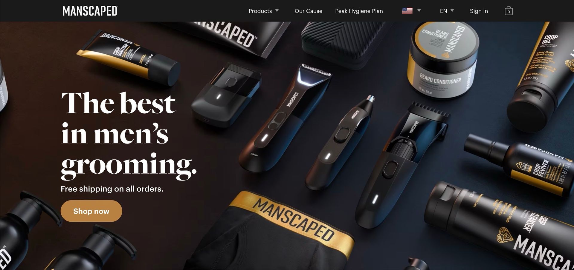
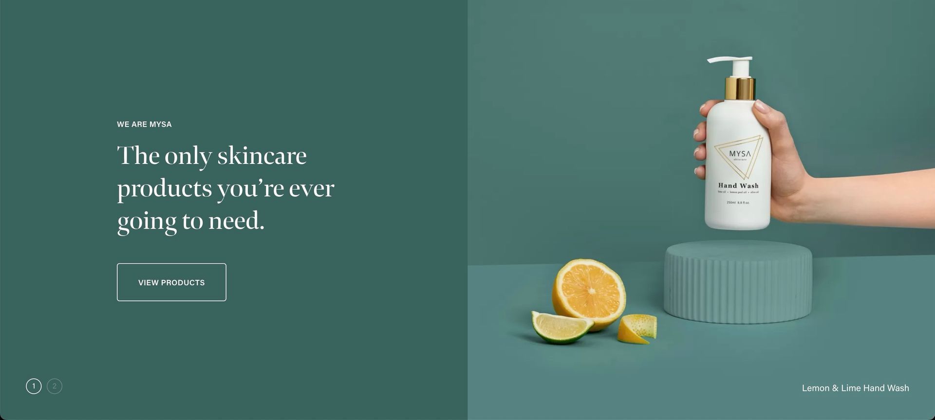
On the home page, you can use hero product images in your design. This is your opportunity to show how your client's products work in real life (or show them how they could feel by using them).
Less text is better. Use contrasting colors in your images as well for accessibility and legibility reasons. If your client has a lot of products, consider using a carousel design to showcase their top products.
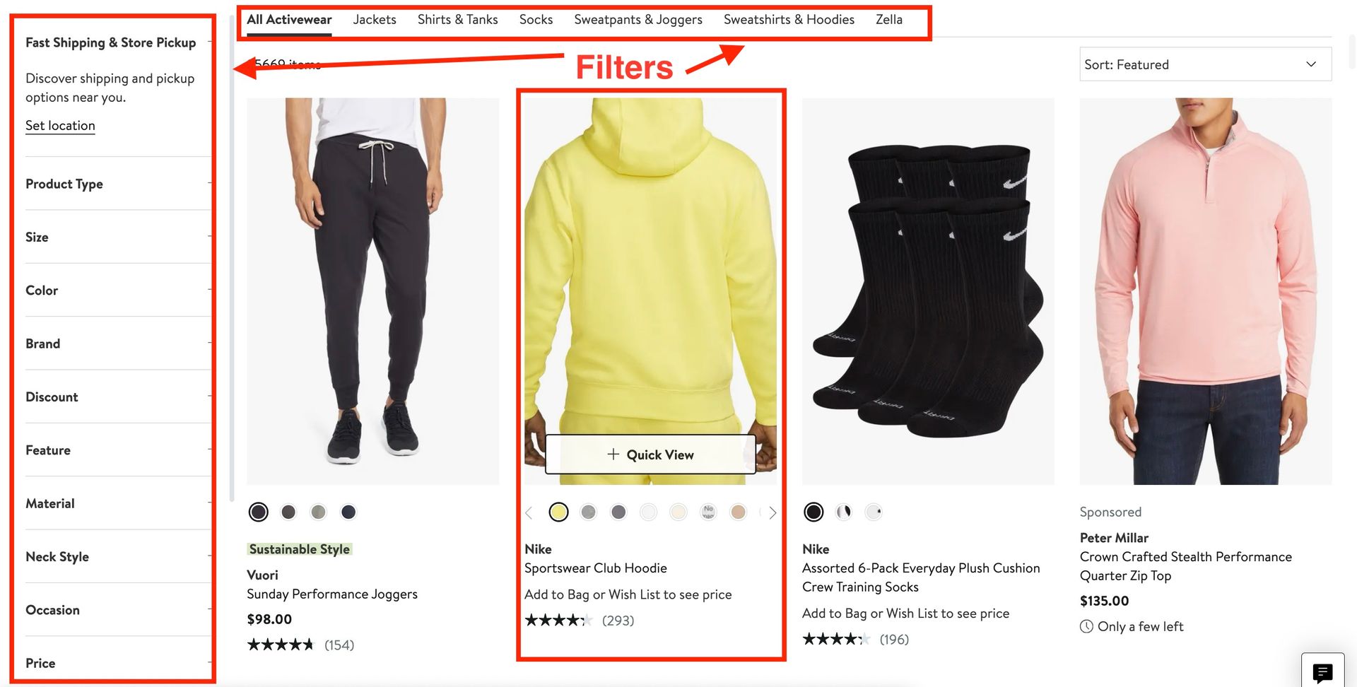
8. Create a logical hierarchy for all your listing pages.
Listing pages should be scrollable, filterable, and sortable. Users should be able to find what they need quickly but also have the ability to narrow down their search based on specific criteria like product categories, colors, or budget constraints.
When users scroll through listing pages, they should also see a preview of each product with key information like pricing, ratings, and size/color options.
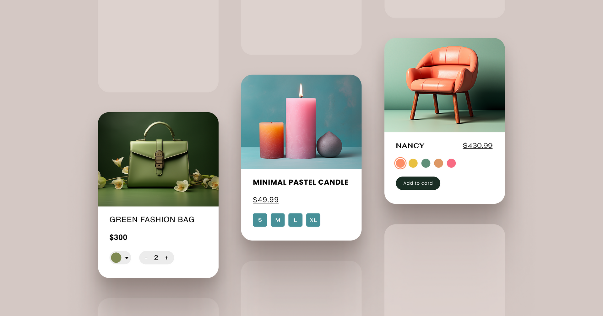
9. Design product pages for conversions.
The whole point of a product page is to help customers make a purchase decision. When
designing product pages for your clients, keep in mind everything customers need to make a purchase.
- High-quality product images — all angles of your product, what it looks like in action, and different potential use cases
- Product descriptions — something that describes product features, how it works, and its benefits. Be mindful of SEO here, too. Here, as well, you can use
Duda's AI Assistant to generate product descriptions with a click.
- Social proof — reviews, testimonials, ratings, and user-generated content
- Detailed product information — dimensions, features, material, and care instructions
- Shipping and return policies — information on shipping fee, estimated delivery time, and return/exchange procedure
- Clear call-to-action — a big, bold button that clearly states what customers need to do next ("Add to Cart")
- FAQ section — product photos, reviews, and descriptions won't clear the air completely, which is why you should include an FAQ section to address any remaining concerns
Product pages are often the final stage in the conversion funnel, so you need to make sure they're visually appealing and informative to push customers toward making a purchase.
10. Add an "About us" page.
This does wonders for trust signals. Google uses it to better understand the website and determine how it should rank for user searches.
But more importantly, an "About us" page helps customers connect with a brand on a personal level. Customers want to shop from authentic brands, so use this space to tell the story behind your client's brand, their mission, and values.
You can include images of the brand's team members, information about how it was founded and the brand's history, and any charitable initiatives they've taken on.
Related:
About Us Page Essentials, Examples & Templates
11. Keep the checkout process as frictionless as possible.
Believe it or not, the checkout process is actually where tons of customers are dropping out of the conversion funnel. According to research from Baymard Institute,
17% of online shoppers have abandoned a purchase in the past year solely because checking out required too many steps.
- Include a "View Cart" button, so customers can double-check they didn't double-add anything or forget to remove something and update their cart accordingly.
- Display the shipping upfront. 61% of online shoppers have abandoned a cart due to unexpected shipping costs.
This is a place where mobile optimization is absolutely critical. If it's too difficult to handle on a smartphone, what do you think are the chances of them running over to a desktop to complete the purchase? Slim-to-none.
12. Offer multiple payment options.
This one's easy. Your integrated payment processor should be able to handle all kinds of different payments to accommodate any customer's preferences.
- Debit cards
- Credit cards
- Venmo
- PayPal
- Apple Pay
- Google Pay
- Buy-now-pay-later options like Afterpay and Klarna
If you want to go one further, include express checkout integrations like Google Pay, so customers don't have to spend time entering their shipping address or payment information.
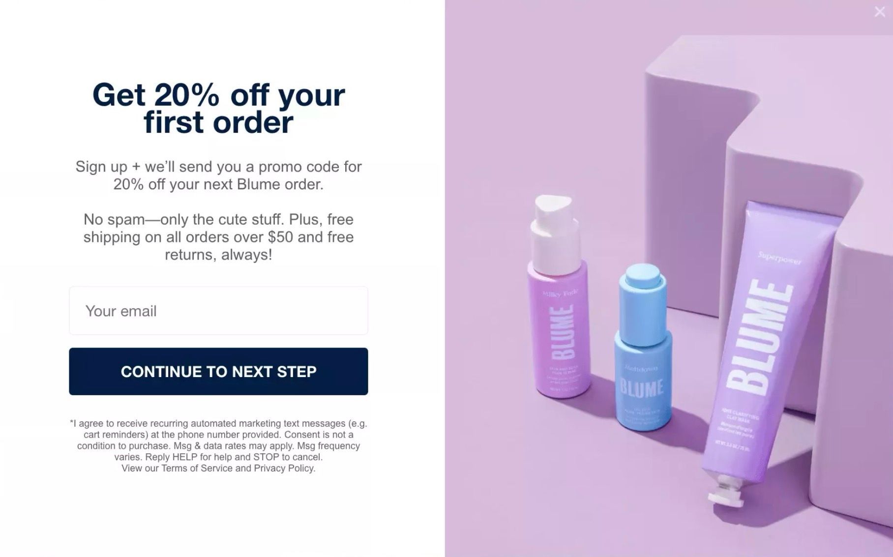
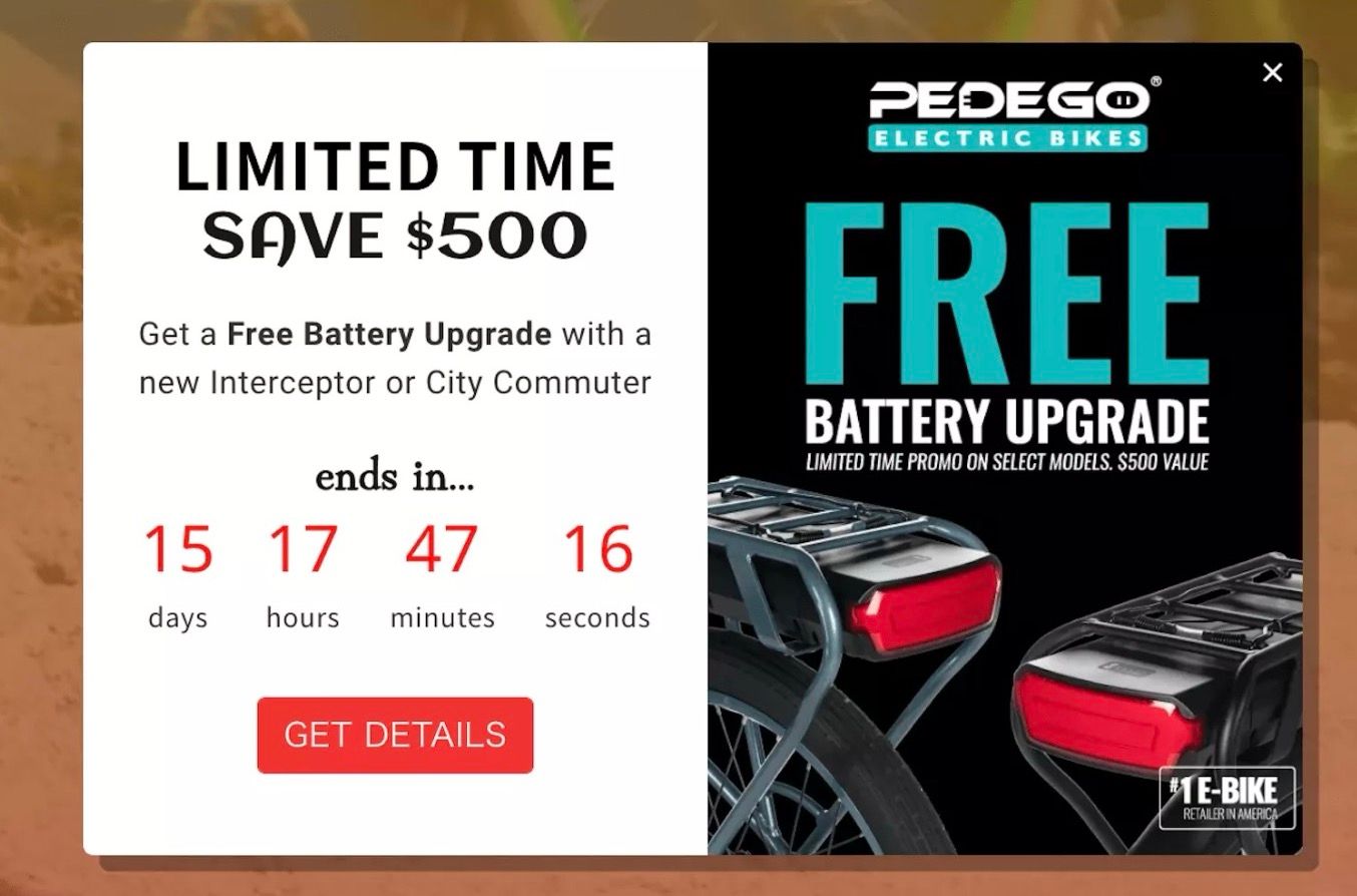
13. Use pop-ups strategically.
Nobody wants to use a storefront with tons of pop-ups. But there's definitely a time and a place.
For example, a first-time buyer could be prompted with a pop-up offering them a discount code for entering their email address. Even if they don't buy right away, you'll have their email for future marketing efforts.
Another example would be using a pop-up to promote free shipping or announce a flash sale.
Just make sure not to overdo it. Too many can make your site load really slowly, and it can annoy your clients’ customers who already want to make a purchase.
14. Demonstrate transparency, security, and privacy.
Online business requires customers to enter their credit card information, address, and, depending on the product, other sensitive details. So, It's natural that they may have some security concerns.
- Ease their minds by displaying trust signals like
- Security badges (e.g., Norton Secured)
- Certifications (e.g.,
SSL certificate for eCommerce)
- Social proof from satisfied customers
- Privacy policies and data protection protocols
If you use the Duda website builder, we'll
automatically generate an SSL certificate for all your clients' sites.
15. Make all content scannable.
One of the most important things to remember about everything on an eCommerce site is that
nobody is going to read all of it. That's why I stress keeping the most important information above the fold, using big, bold headers, and highlighting the product in the hero image.
When someone scrolls through a landing page or browses products, they aren't reading every word. They're scanning for important details that grab their attention and answer their questions, like
- What does this product do?
- How much does it cost?
- What styles/colors are available?
- How long will it take to arrive?
- Can I trust this brand?
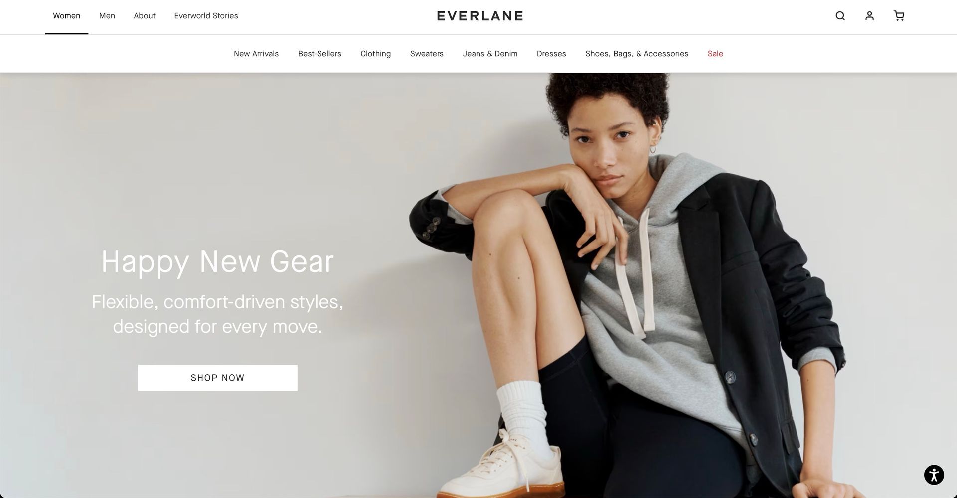
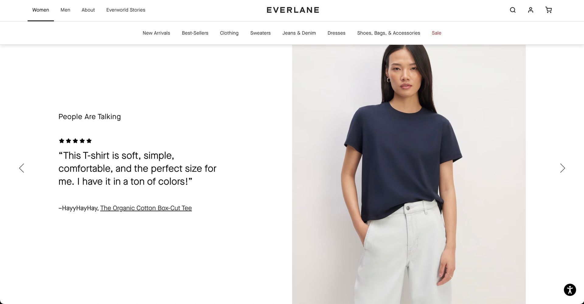
I really like the way Everlane does this. On the home page, everything is clear, easy to read, and highlights the simplicity of the brand perfectly.
Below the scroll, design elements take up the screen perfectly. And CTA buttons are easy to click on any device.
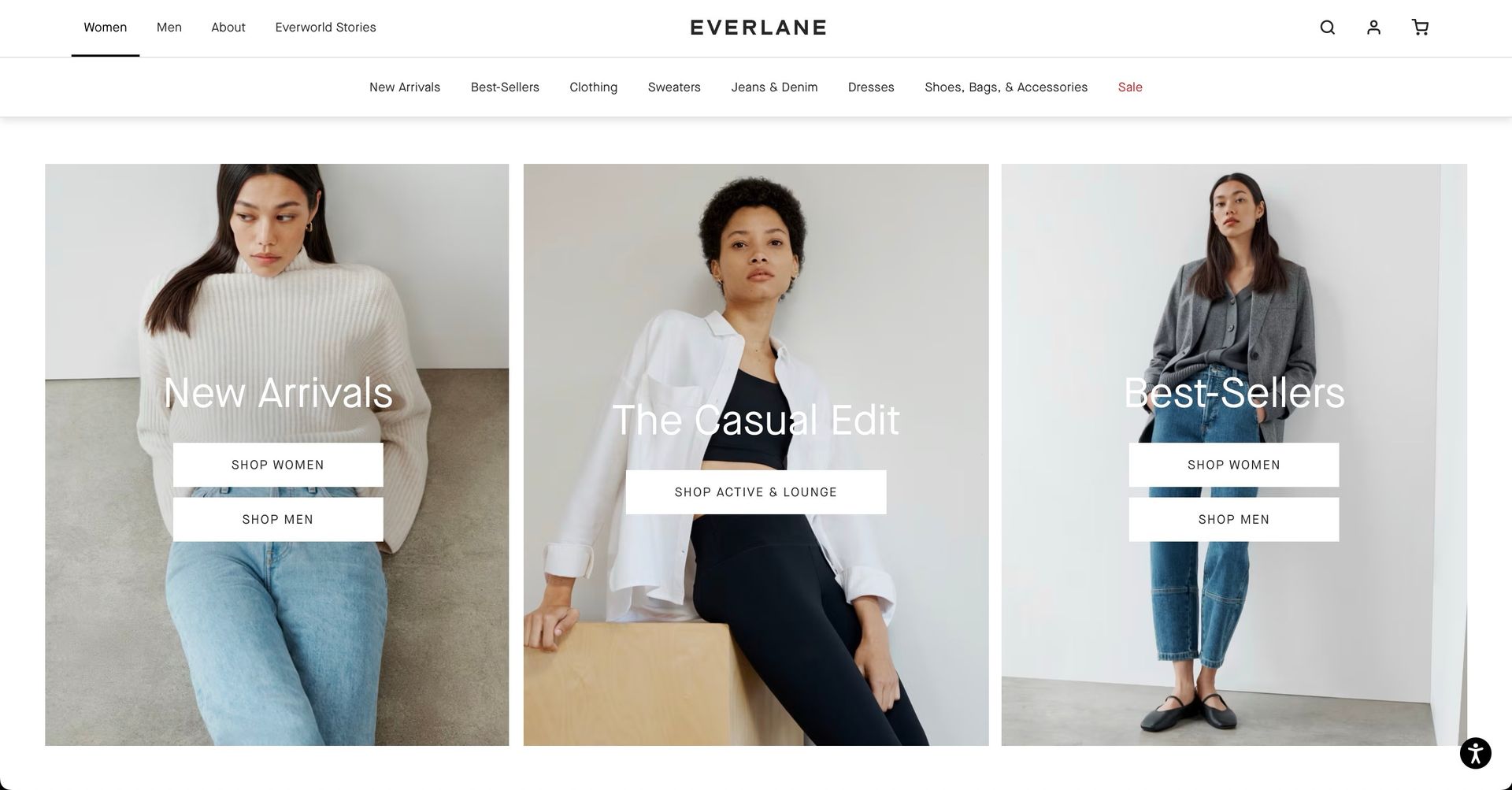
They include scrollable individual items to give users a better idea of the shopping experience.
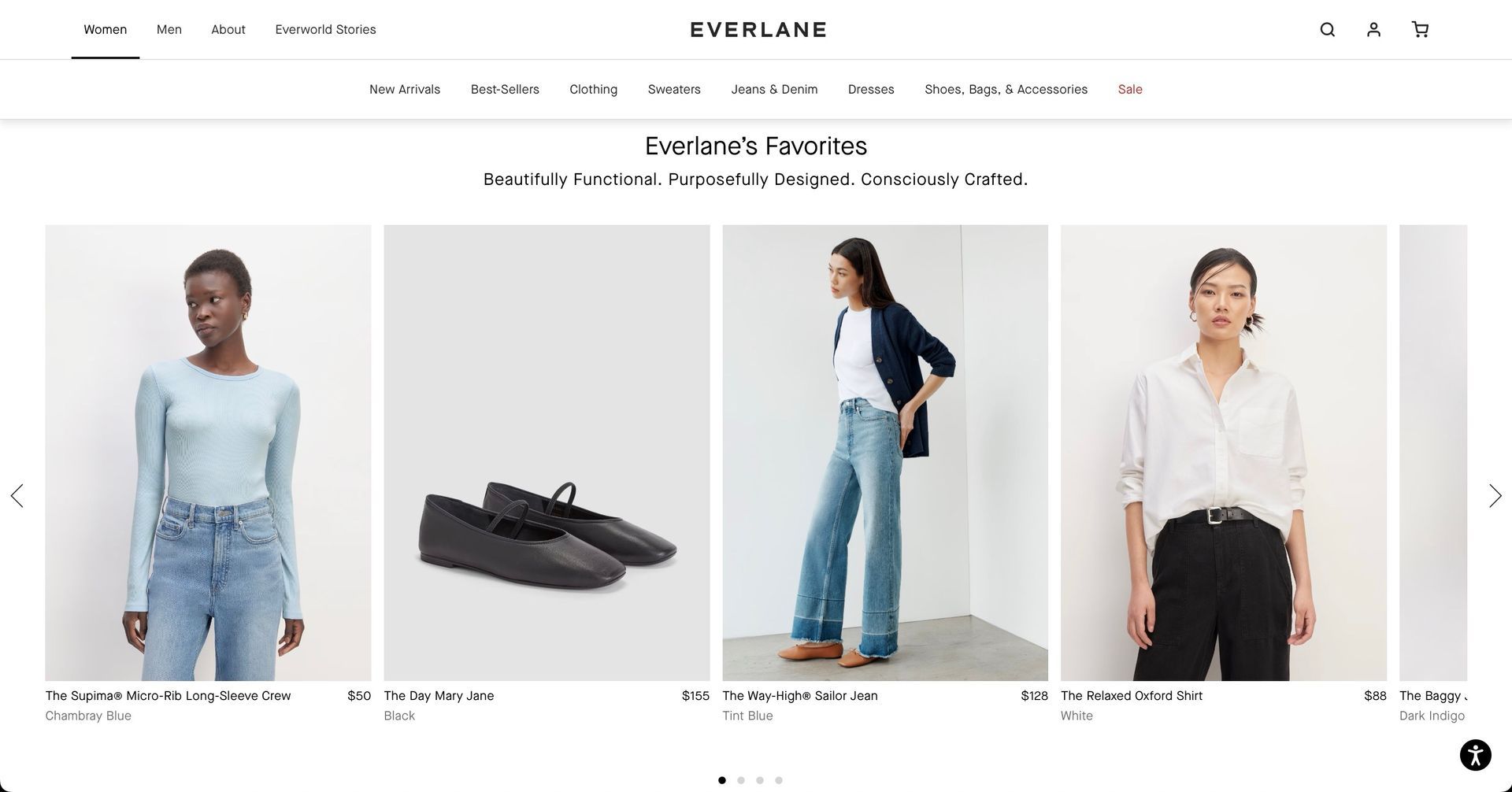
They highlight social proof and user-generated content throughout their site in a very clear and organized fashion.
And they reinforce their brand while using minimalist design principles when demonstrating their brand values (in this case, sustainability).
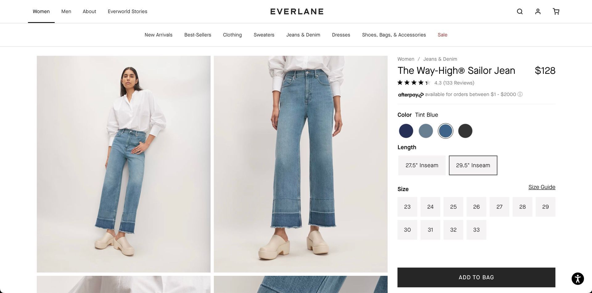
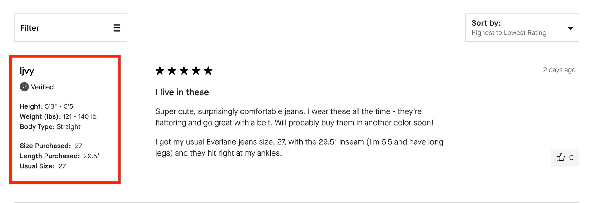
All their product pages are intuitive and incredibly easy to scan for the most essential content.
Reviews even have additional information that potential customer could use to help them decide which products to order.
16. Incorporate trust signals throughout the website.
Social proof is the most important sales tool.
92% of customers hesitate to buy something without reviews, testimonials, or ratings.
- Optimize for reviews.
Have your client reach out to satisfied customers and ask them if they'll leave a review on their site.
- Put reviews at the forefront.
The homepage, landing pages, and product pages should all have one scroll section featuring 3-5 testimonials from happy customers.
- Share user-generated content (UGC). Repurpose customer photos or videos of them interacting with the product for the website.
- Display trust badges from businesses like the Better Business Bureau, Google Trusted Store, or McAfee.
- Create case studies or spotlights
for successful customers who have used the products.
- Highlight the brand's values, such as a commitment to sustainability or fair trade practices. Include any charitable initiatives the brand has taken on.
Most customers make decisions based on others' experiences and how your client’s products align with their values. By incorporating these into the design elements, you're helping your client build trust and establish a connection with their customers.
17. Use high-quality visuals.
eCommerce is a visual platform. And most of us are visual learners. You can't just have a few product images and call it a day. Everything needs to be on point.
- Product photos should use the same colors as the ones you highlight in your client's web design (and broader marketing campaigns)
- Typography should match the logo and tone of the brand
- Use all types of video content — short-form UGC from customers on TikTok, long-form videos about the mission statement, how-tos and product demos, and everything in between.
The biggest opportunity in your web design is with UGC. The reason for this is twofold:
- Potential customers want to see others using the product. So, websites increase their conversion rate by an average of 10% when they use content from their customers throughout the platform.
- Reposting content from real users is the best way to engage them. Your client will start to form a community, and their customers will feel more connected to the brand because they're literally noticed.
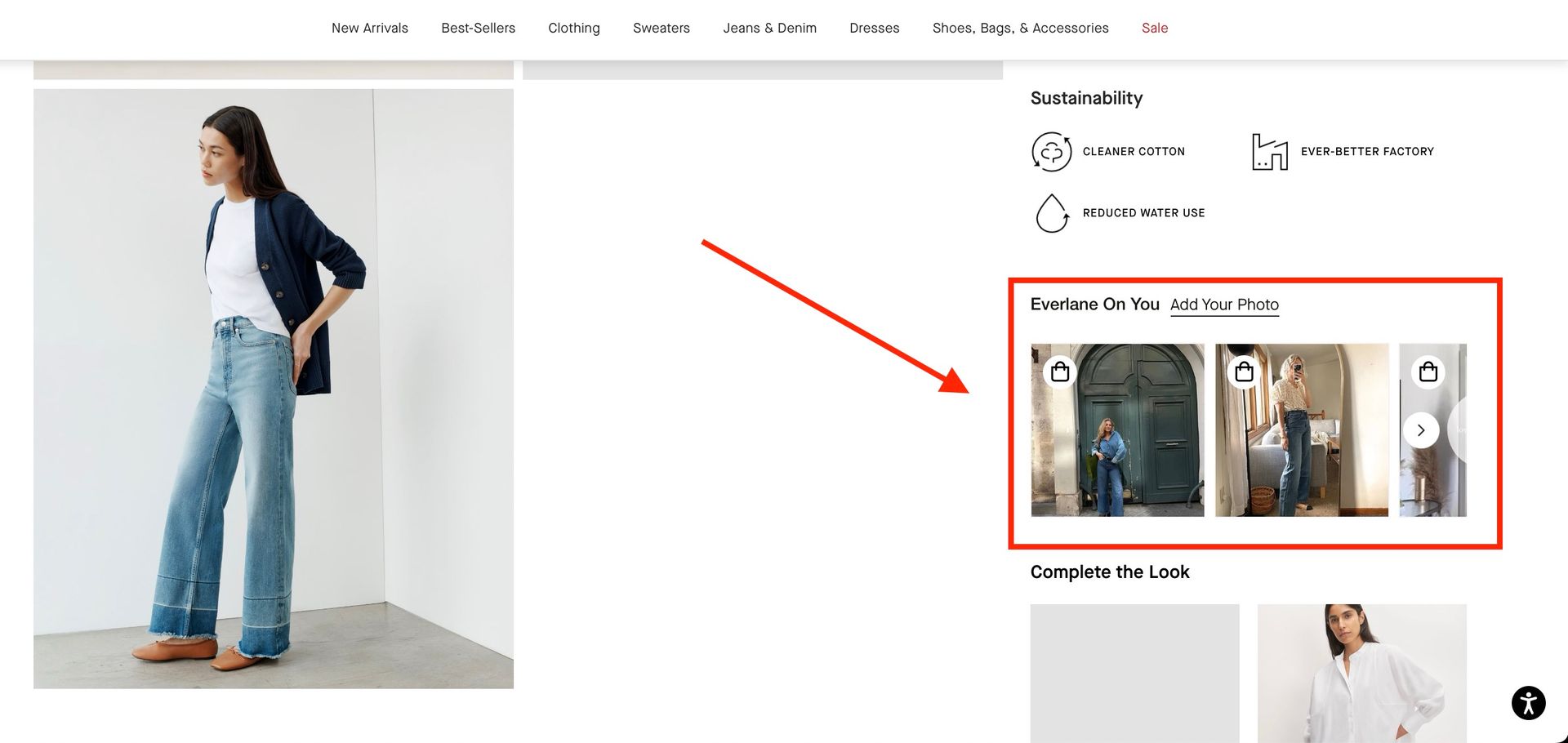
Going back to Everlane, they do a great job here with their "Everlane and You" section.
On every product page, buyers can see photos of other customers wearing the item. They can submit their own, too.
18. Create an extensive information repository.
The most crucial info should be front and center. This includes:
- The shipping and return policy
- FAQ section for common questions
- Contact information for customer service
Some other helpful info to have on your client's site (depending on their eCommerce business) could be:
- Size charts and measurements for clothing, shoes, or furniture
- Instructions or manuals for products that may require assembly or setup
- Product specifications, including materials used, dimensions, weight, etc.
- Warranty information
You'll have a hard time maintaining high customer satisfaction if you aren't able to answer basic customer questions.
Besides highlighting your client’s shipping/return policy and product-specific FAQs on corresponding product pages, it's a good idea to use a chatbot or live chat feature (Duda works with plenty).
This way, customers can quickly get the answers they need without having to dig around for it.
19. Use the right platform.
As an agency, you're getting paid for the web design service. But you're profitable because you can do it efficiently. So, templates are your best friend.
Start with the right website builder, create templates, and then customize them for all of your clients.
Shameless plug here, but Duda's
purpose-built for agencies. It's one of the only eCommerce website builders out there with
client management,
team collaboration, and
white labeling capabilities.
And our
AI assistant makes it easier than ever to create beautiful websites for your eCommerce clients at scale.
20. Additional design tips:
I've covered most of the bases here. But here are a few miscellaneous design tips you might find helpful:
- The focus should always be on the product, not the design. Nobody's coming to someone's website and thinking, "Oh, wow, this website is gorgeous!" Let the website be the podium the product stands upon.
- Build interaction into the site.
For example, a color-changing feature for clothing items, a matchmaking quiz for a skincare brand, or a virtual try-on feature for glasses.
- Use big words (and few of them). Identifiers, headings, and categories should be descriptive, concise, and eye-catching.
- Consider video instead of a hero image. Behind your heading, subtext, and CTA button, a product video or animated GIF could work better if your product needs more context.
Most importantly,
test everything. You can read a million books and articles on eCommerce web design. But, ultimately, your clients' success will come from figuring out what works and what doesn't.
There are countless design principles, but you won't know what works best until you've implemented them and studied the results.
Final thoughts
Every eCommerce website is different. That's a good thing, though. It means there's no right or wrong way to design one (save the best practices I've outlined above).
The exact colors, design elements, images, videos, and messaging that actually resonate with customers are somewhat unpredictable until you test dozens of different variations.
The easiest way to get started is with Duda's
eCommerce website builder. It's got everything you need to bring clients' ideas to life in a beautiful and functional way, get their products to market, and start testing what works best.