Chances are that if you’ve ever shopped online, you did so through a mobile device.
Maybe you were scrolling social media on the subway and clicked on an ad or sms notification.
Maybe you were in Walmart and wanted to see if this 30% off vacuum really is such a good deal, by comparing it with amazon prices.
As of Q3 of 2020, an average of
55.4% of consumers worldwide purchased something online using a mobile device.
So, if you’re creating a new
eCommerce website, having it designed for mobile users is paramount.
Here’s how to make sure your online store is not only available but optimized and designed specifically for mobile.
Why Have eCommerce Mobile Websites?
If you’re
designing eCommerce sites, you know that user experience (eCommerce UX) is crucial, particularly for online shopping.
And online shopping is now done mostly with mobile eCommerce sites.
In fact, Retail mcommerce sales hit $359.32 billion in 2021, an increase of 15.2% over 2020, according to
Insider Intelligence.
Having a mobile version of your website design is not only helping you cater to a much larger audience, it also enables you to provide a user-friendly mobile experience that will
improve your eCommerce conversion rate, SEO, and digital marketing performance.
Here’s how to have a mobile-first responsive design for eCommerce.
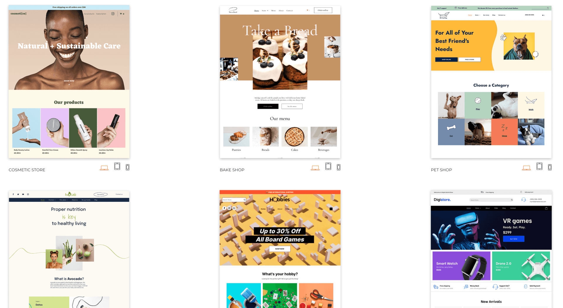
How to Create an eCommerce Website?
Whether your audience is on android or iPhone, there are certain site design musts you need to do to create a great web design for mobile shopping.
You can work hard and design with the html and css. However, if you want to save some time, there are also multiple
website builders that can help you create a good eCommerce website from the get-go, with user-friendly templates.
Here are some tips for creating the best possible mobile eCommerce website.
General tips: As people usually scroll and navigate on mobile using their thumbs, place essential controls (like call to actions and navigation menus) somewhere accessible for the user’s thumbs. Make sure the buttons are also big enough for easy access. Choose the appropriate
font for a mobile website design. It’s also important to track your
eCommerce KPIs and compare mobile and desktop performance to tackle any issue.
Homepage: There are a few
eCommerce homepage best practices, but in a nutshell: Keep it simple. Don’t have your users scroll too much to find what they are looking for or click on your CTA.
Navigation menu: The navigation menu should be easy to find and access. Usually, a sticky header with a burger menu on the top of the screen is best, along with your shopping cart and homepage links. Provide filter options, as well as a search bar to help users find what they look for.
Product categories: Make sure the categories are well divided with a logical hierarchy and that you don’t have too many categories. It can be difficult to scroll through hundreds of product categories on mobile phones. Separating them into multiple subcategories can help.
Product pages: Make sure users can find information easily and compare items while navigating your
product pages. Provide high-quality product images but make sure they are optimized for mobile usage (with sliders and possibility to open them and zoom in). Make the ‘add to cart’ button sticky to help with navigation and conversions as well.
Checkout process: Ensure there are no frictions or usability problems; all the information is clearly displayed on mobile. Keep form fields to a minimum, and use native scrolling tools to enter dates. Have a guest checkout, and use HTTPS for your eCommerce business site so users know they can trust it.
Pop-ups:
Pop-ups on mobile are not a very good idea as they can be harder to close, and hurt your conversions, so use them with parsimony, and ensure the design works with all mobile phones and tablets. If you have to use them, ensure they are not full screen and have a very clear close button.
SEO optimization: Your eCommerce store has to be optimized for search engines. Make sure the product descriptions, alt text, headers, and web page content are filled with the right keywords, but also that the page load time is optimized for maximum speed.
3 Examples of eCommerce Mobile Websites
There are thousands upon thousands of incredible websites built for mobile, just as there are just as many that I could classify as being very poorly designed.
Since we have to make a choice at some point, here are the 3 best mobile eCommerce website examples out there (according to me).
All of these also offer mobile apps providing even more functionalities to smartphone users who want to shop online, but I’ll only discuss their mobile website here.
Without further ado, here are a few of the best eCommerce mobile websites out there and why.
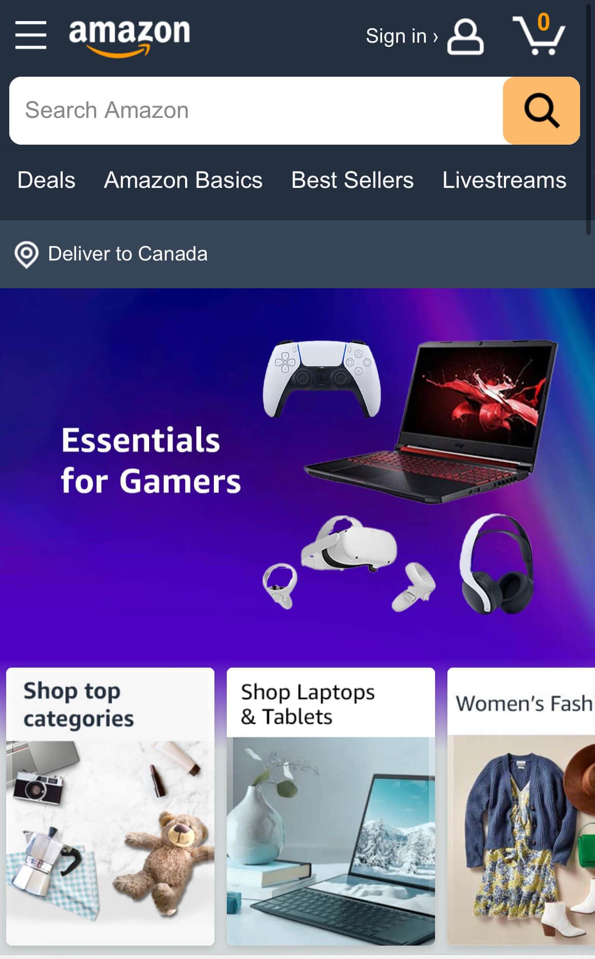
Amazon
If you don’t know Amazon, you’ve been living under a rock for the past 10+ years.
Amazon is the world's largest online retailer and a prominent cloud service provider. Their online store is the most popular worldwide as it sells virtually everything, and ships it almost everywhere.
Their mobile website sets the tone for the industry.
As they sell almost everything, they customize their offering to each user, by suggesting products the customer may be interested in. Either because they searched for it, bought it, put them in their cart, added them to their favorite or wish lists, or it’s a similar item as the one they are interested in.
This is particularly important on mobile as users don’t have screen space for thousands of different promotions or items. You need to pick and choose what they may be most interested in, and Amazon does it perfectly.
It’s also very easy to complete a purchase on their mobile website. They have very few steps (even less if you have an account with your payment information and address already in). You can buy by pushing a single button, and even have recurring deliveries for various items like dog food, detergent, toilet paper, name it.
Amazon’s website design isn’t the prettiest, but it’s definitely one of the most functional and simple ones, and as you know:
the simpler the better. It’s easy for users to navigate, find what they are looking for, and have an overall great online shopping experience.
Etsy
Etsy is an American eCommerce company selling handmade or vintage items and craft supplies. As such, they sell a wide range of items, in multiple categories like jewelry, bags, clothing, home décor, furniture, toys, art, craft supplies and tools. So their mobile website needs great navigation, and they do deliver.
Etsy provides a very intuitive user interface and a great search autocomplete function. Their categories are well presented so you can easily find whatever you’re looking for.
They focus on seasonal and popular items on their homepage and showcase custom suggestions based on past searches, much like Amazon.
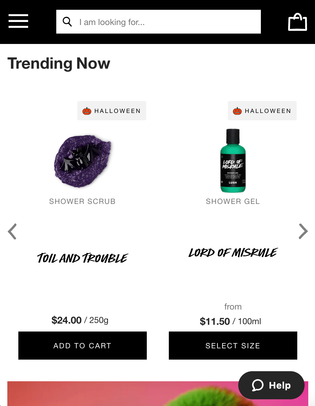
Lush
Lush is a British cosmetics retailer founded in 1995, it’s the one example on this list who’s not an online shop exclusively. Lush has hundreds of brick and mortar locations, but, of course, sells its products online as well.
You would think that maybe this distinction would reflect poorly on the quality of its mobile website, however, it’s quite the contrary.
Lush’s mobile website is simple to use, clean, and colorful all at the same time. The sleek black and white design makes it easy to navigate, while also providing the perfect canvas to showcase their colorful products and witty content.
In terms of navigation, they have multiple filters helping you choose the best product for you, from benefits, scents, type of skin and even mood. Everything is well classified and easy to understand so users can navigate easily.
Get Started With Duda
Inspired by these examples and tips? Now it’s your turn!
If you want a user-friendly mobile website builder, we got you covered with
Duda.
Duda was built to provide you with all the best features for mobile
eCommerce websites, so why not
try it out!
Related Posts
By Shawn Davis
•
June 3, 2026
Discover how adding an online store to your website dramatically increases AI visibility and crawl rates, turning commerce and discoverability into a powerful growth flywheel.
By Stephen Alemar
•
March 5, 2026
Agencies: Learn 7 proven, non-salesy strategies to upsell online bookings to your SMB clients. Position bookings as a high-value, low-risk business upgrade.
By Stephen Alemar
•
February 10, 2026
Discover the best eCommerce solution for your SMB clients Learn key criteria and compare platforms like Duda, Shopify, and BigCommerce to find the right-sized fit.
Show More