With more than
three-quarters of a million fonts available, how do you choose which to work with when designing a website that will primarily be viewed on mobile devices? And, yes, you read that correctly — there are at least 750,000 fonts.
Why so many options? Perhaps because typography is a vital component to design. Typography is more than fonts — it’s, as
Neil Patel says, where “...art meets text. It refers to the arrangement of type.” In addition to font choice, it also includes line length, kerning (white space between letters) and more.
Patel also argues, “font is a specific style of typeface with a set width, size, and weight… Georgia is a typeface; 9pt Georgia Bold is a font.” Many designers, though, for simplicity’s sake, use “font” and “typeface” interchangeably — and we’ll do so in this post.
The font you choose matters. It influences a user’s perception of a company’s message and brand, and has a massive impact on the readability of the website’s text.
So, with so many options, which fonts (and typefaces) should you be using?
In this post, we’ve outlined the eight best fonts to use in mobile web designs.
Let’s dive in...
Serif vs. SANS-SERIF
A serif is a decorative line or taper that appears at the end of a letters stem. So a “serif” font is any font that has letters that include this decorative addition. By contrast, a sans (“sans” is French for “without”) serif font will not include these subtle elements of design.
In a 2014 article for
Marketing Land, entrepreneur Jeremy Smith provided the following guidance to designers who are trying to figure out which font to use on a web page:
- To enhance comprehension and readability, choose a serif font.
- To increase legitimacy, choose a serif font. A
survey by Errol Morris of the New York Times found that serifs increase believability; the serif font Baskerville especially influenced readers into trusting web content.
- To get attention, consider a sans-serif font.
It’s wise to keep these basic recommendations in mind as you select a web font that will work well for mobile site visitors.
Pairing Fonts Together
As you probably know from your own design experience, certain fonts/typefaces play well together, and others don’t.
One school of thought is to use a sans-serif font for headers and a serif font for body copy. However, opposites don’t always attract and you still want to ensure that you choose two fonts that complement each other.
Another common design choice is to pair similar fonts with one another. The idea in this instance is that similar fonts smooth over differences and keep website visitors focused on the content.
Protip: Duda allows you to
add custom and Google fonts quickly and easily, but don’t overdo it! Keep a website to two to three fonts/typefaces on a website.
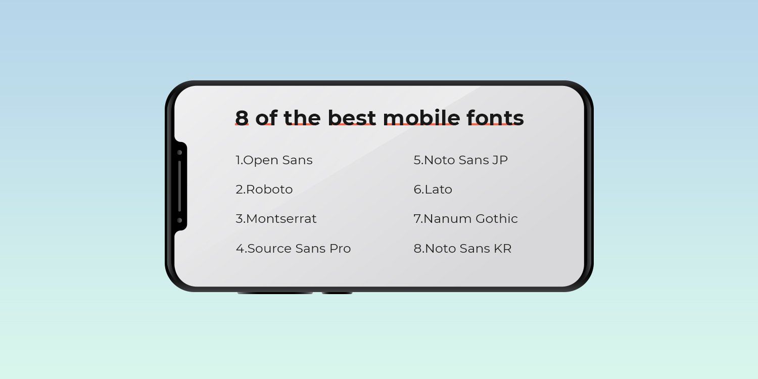
The 8 Best Fonts for Mobile
Now, let's take a look at the top eight fonts to use in mobile web design. For clarity, we've broken the list into four serif fonts and four sans-serif fonts
The 4 Best Serif Fonts for Mobile
Serif fonts have what look like feet (often called a “stroke”) attached to the ends of the letters. These types of fonts often appear more traditional and formal.
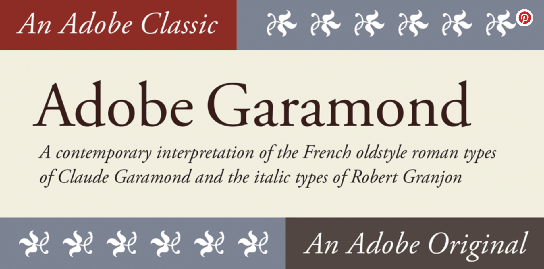
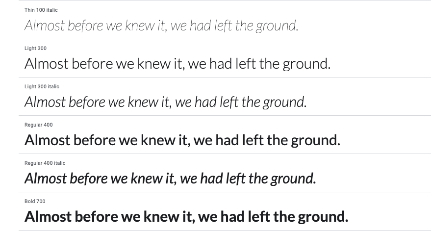
Adobe Garamond
Designed in 1989 by Robert Slimbach, this font is based on the original Garamond
typefaces named for 16-century engraver Claude Garamond. This font family is often used in book printing. The various renditions of Garamond, including Adobe Garamond, use letters with a relatively organic structure that resembles old-fashioned penmanship, but with a more structured, upright design.
See it below, courtesy of
Font Spring.
This font pairs well with Orpheus, Franklin Gothic and Prenton.
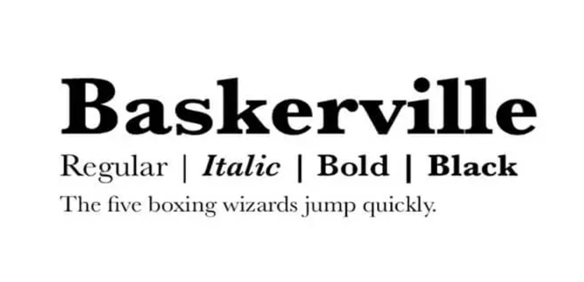
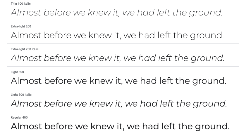
Baskerville
This very classic font was designed in the 1750s by John Baskerville. It is still commonly used today because it reads well, and, as demonstrated in the Morris experiment, lends authority to your content and design.
Check a sample of this font below, courtesy of
Fonts in use.
This font pairs well with Lucida Grande, Helvetica Neue, Open Sans, Georgia and Proxima Nova.
Computer Modern
Although made for computers, it was inspired by traditional American Lanston Monotype Company's Modern Extended 8A, part of a family Monotype originally released in 1896,
according to Wikipedia. Created by
Donald Knuth, this font is commonly found on the mobile web design, but also frequently appears in scientific papers.
See an example below, courtesy of
Identifont.
Computer Modern pairs well with Luxi Mono.
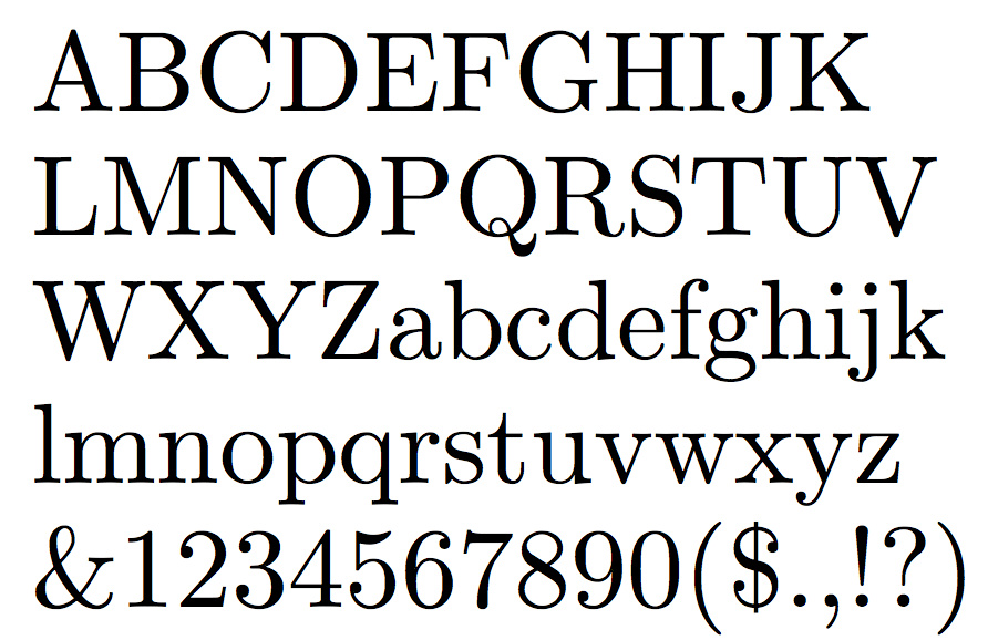
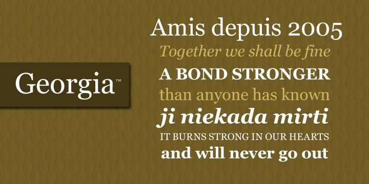
Georgia
The Georgia font pairs well with Helvetica Neue, Arial, Freight Sans, Open Sans and Lato.
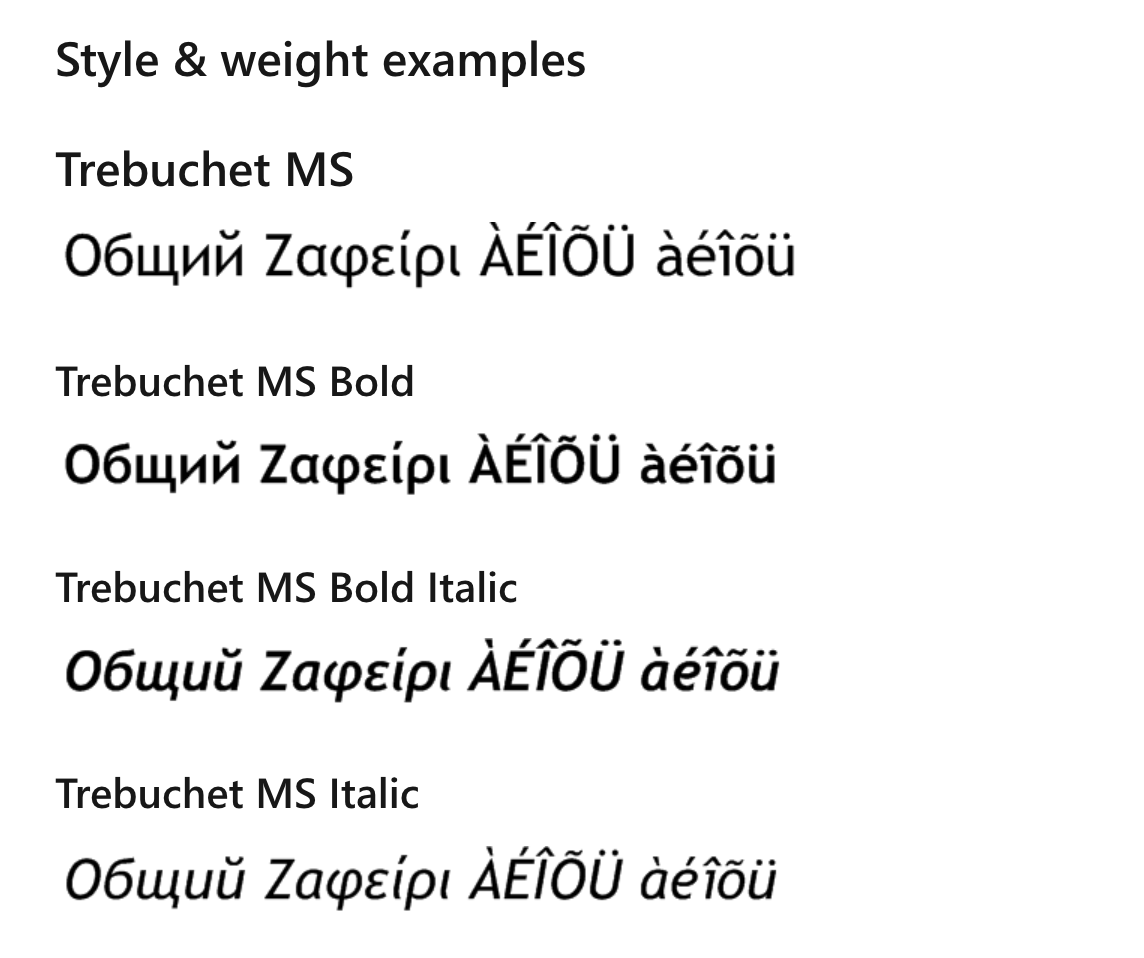
*BONUS* Trebuchet
Developed and trademarked by Microsoft, Trebuchet is a very popular font on mobile. As Microsoft points out, the font, designed by Vincent Connare in 1996, is a humanist sans-serif made for easy reading on a screen. The legend is that Trebuchet fonts were named such because they are intended to be the vehicle that fires messages across the Internet.
Connare wanted personality in the type, even at small sizes, while retaining clarity and readability. He also wanted something significantly distinguishable from Verdana and MS Sans.
You can see an example of this font from Microsoft in the image below.
This font pairs well with Fjord, Verdana and Georgia.
The 4 Best Sans-Serif Fonts for Mobile
Sans-serif fonts lack the aesthetic extenders on the ends of letters that serif fonts have. Sans-serif tends to look more modern and these fonts are easier to read on titles, buttons, and short texts.
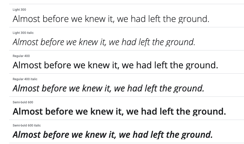
Open Sans
Open Sans is a humanist sans-serif font designed by Steve Matteson. Specifically designed for the web and mobile, it uses upright pressure, open shapes, and a neutral but friendly appearance to make it easy to read.
See an example of this font below, courtesy of
Google.
Open Sans pairs well with Montserrat, Lato, Brandon Grotesk and Roboto.
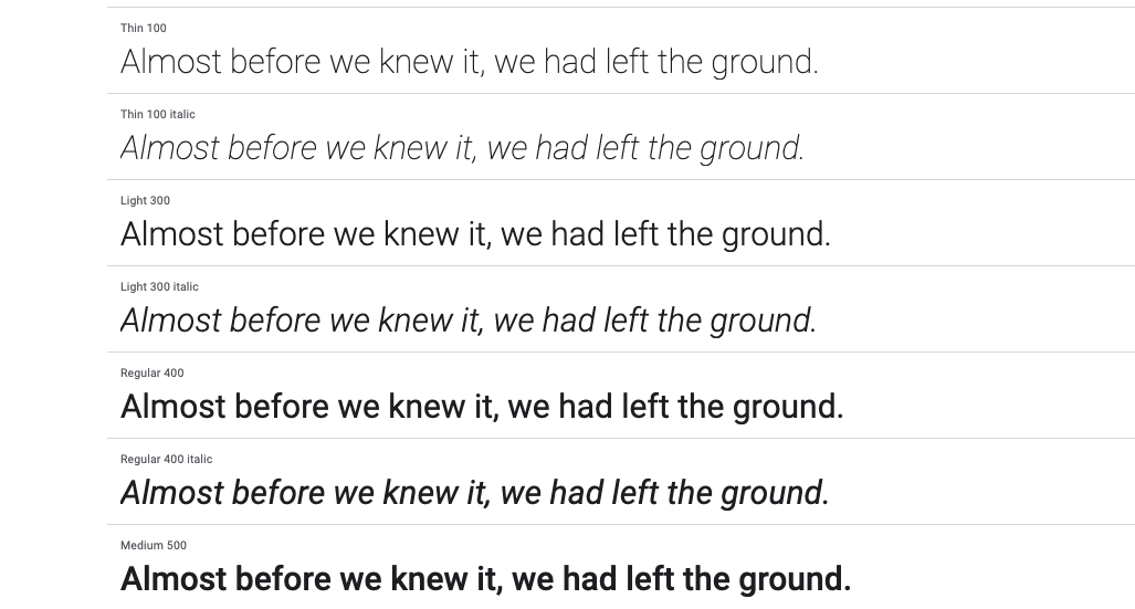
Roboto
Roboto was developed by Google for mobile, and it’s the main font for the Android mobile OS. Google describes it as dual-natured with a mechanical skeleton and largely geometric forms, while featuring friendly and open curves.
You can see a sample of this font from
Google below.
Roboto pairs well with Roboto Slab, Open Sans, Lato and Playfair Display.
Montserrat
Based on the signs in the old Montserrat neighborhood of Buenos Aires, this font family was designed by Julieta Ulanovskym. It uses a geometric type optimized for digital usage.
You can find a sample of this font below from Google.
This font pairs well with Open Sans, Roboto Slab and Lora.
Lato
Designed by Warsawukasz Dziedzic in the summer of 2010, the name of this font means “summer” in Polish. It has an open feel that’s bright and summery, which makes it popular for mobile applications and mobile websites.
You can see a sample of this font in the image from Google below.
This font pairs well with Superior Title, Mate, Futura, Caslon and Clarendon.
The Most popular of all mobile fonts
In the above list, we’ve covered what we think are the best fonts to use on mobile. However, they’re far from the only ones. Below are the
top 20 most-used website fonts as determined by the Web Almanac.
THREE MISTAKES YOU DON’T WANT TO MAKE WHEN CHOOSING A FONT
While those fonts mentioned above are certainly among the best to use, there are also a number of mistakes that can be made, especially when
building a website for mobile. Among the most common of those are as follows:
Using too many fonts
Perhaps the most common mistake across when
creating a site for desktop and mobile is using too many fonts. It can hugely impact the overall look and feel of a site and ultimately it will see users leave the page quite quickly. As a rule, it’s generally considered best to not use any more than two different font families. Different sizes and weights can be implemented but you should typically avoid using multiple styles on the same page. This should then be consistent across your entire site.
Size does matter
As we’ve alluded to above, size on fonts does matter. Many websites have consistently the same size font across their site, which while consistent, doesn’t allow the page to flow like having multiple sizes would.
While you shouldn’t vary font size too drastically, avoid any more than three to four, a size hierarchy can be really useful in guiding a user through your site. This means placing the most important information in larger font. It will act almost as a tour for the user, with them moving around the page exactly how you want them to.
Don’t use illegible fonts
Too many websites try to be “edgy” with their fonts, and while it may look cool using a font that looks like graffiti, ultimately it’s going to be difficult to read on a mobile website. While it is important to select a font that represents your brand, if it is illegible then it’s only going to have a detrimental effect on your website.
Final Thoughts on Mobile Fonts
Next time you design a website, choose one of the best mobile fonts we’ve discussed to ensure that visitors can easily read the site’s content on mobile devices. When narrowing down your choices, think about the personality the you want to convey with your font. Just be sure to keep the number of fonts on any single website to a maximum of two or three. Finally, like with all things related to website design, A/B test your fonts whenever possible and adjust as necessary.