The Dos & Don’ts of Website Menus

September 16, 2020
0 minute read

A website menu is one of the most critical parts of any website. A well-designed navigation menu will welcome and engage all customers. One link should intuitively lead to another and most users will expect a hierarchy that implicitly makes sense for everyday users.


When creating a website menu, you should give some thought to all of the elements of each page as you assign them a name and place in the navigation hierarchy. This seemingly mundane task can have a great impact on the usability (and success) of a website.

As a professional website builder platform for digital marketing agencies, Duda has compiled this list of the do's and dont's of website menus to help you deliver the best results to your clients.


What is a Website Menu?

A website menu is an essential tool that helps users navigate through different web pages or sections on your site. It is basically a series of nicely designed text links that provide visitors with a quick way to know what page they’re on and understand the architecture of the site.


Types of Website Menus

Website menus can be created in all kinds of ways; however, there are a few main types of menus you’ll find all over the web. Let’s look at a few examples.

Sticky Menu 

A screenshot of a band website with a sticky menu

Also referred to as the floating menu, sticky website menus are good for long-scrolling pages. They stay put even if the user is scrolling down the website.

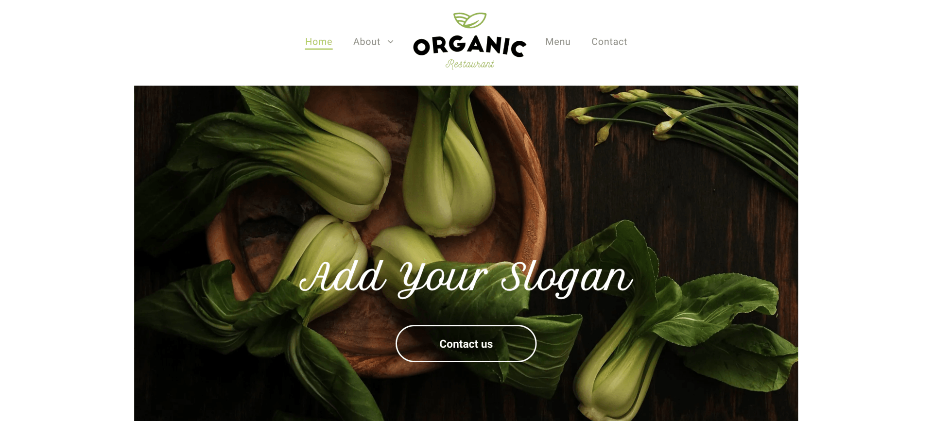
Classic Navigation Website Menu

A screenshot of a restaurant website with a classic navigation menu

This is the most common type of menu format, found on millions of sites across the web. The classic navigation menu is placed in the header of the website, typically as a general horizontal list.
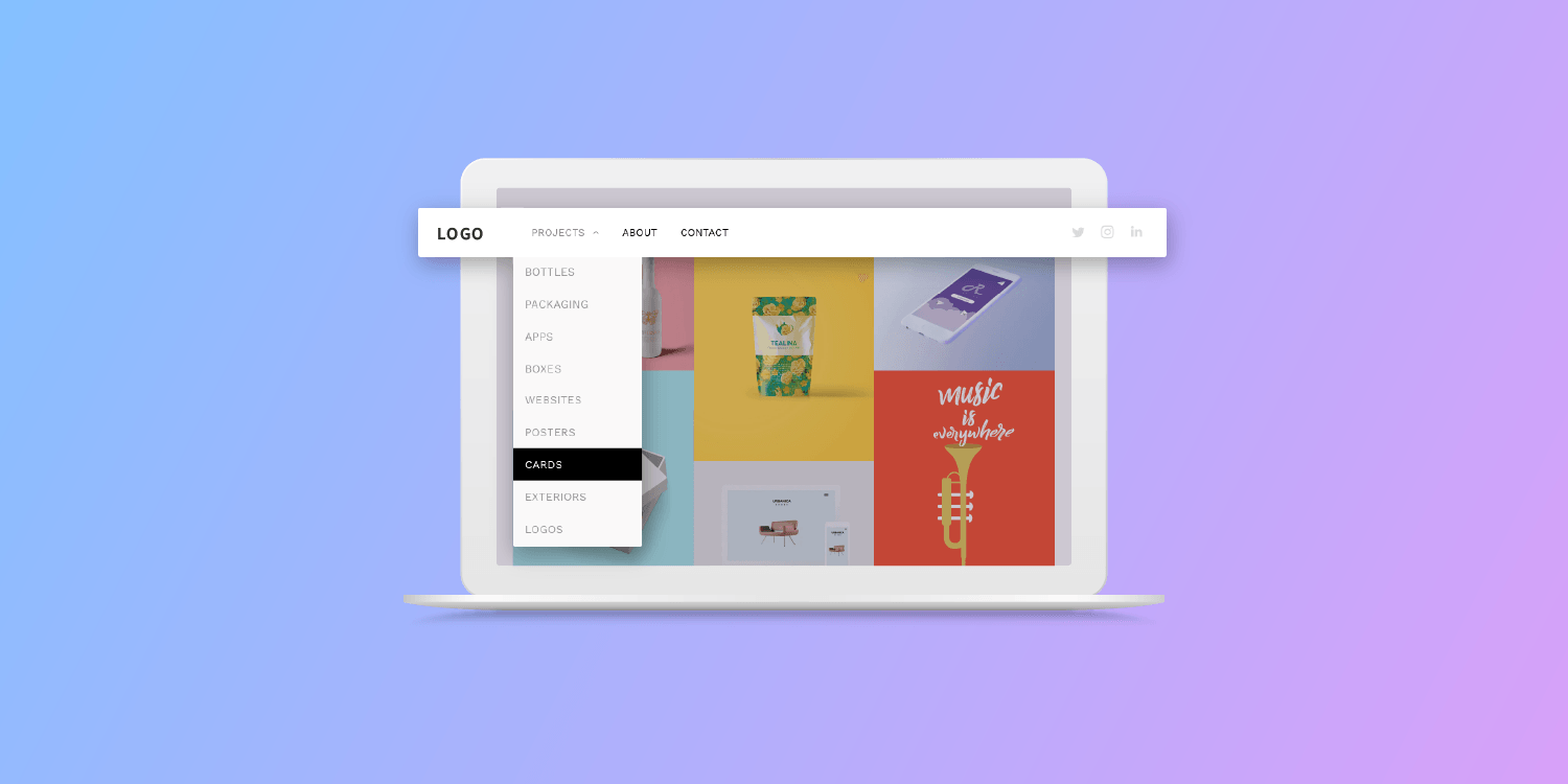
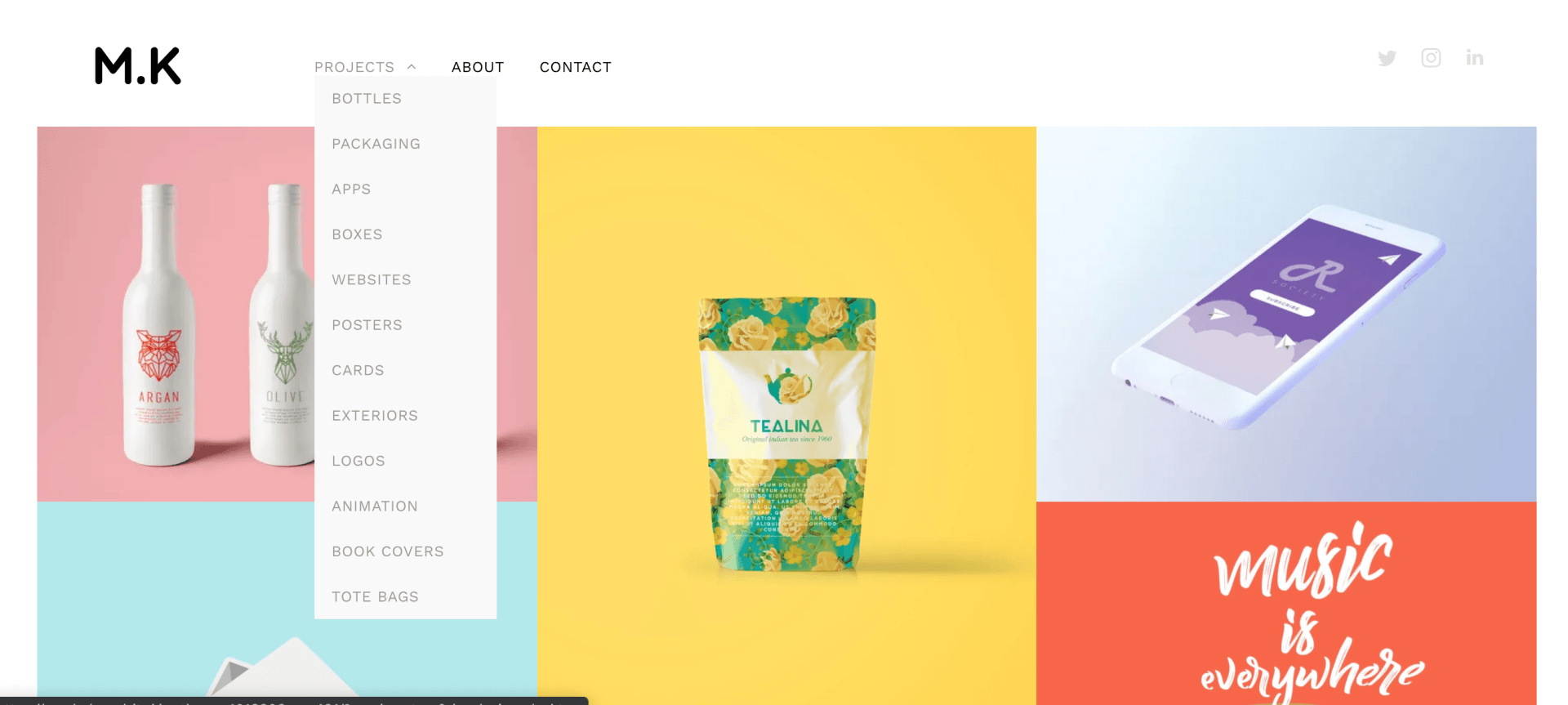
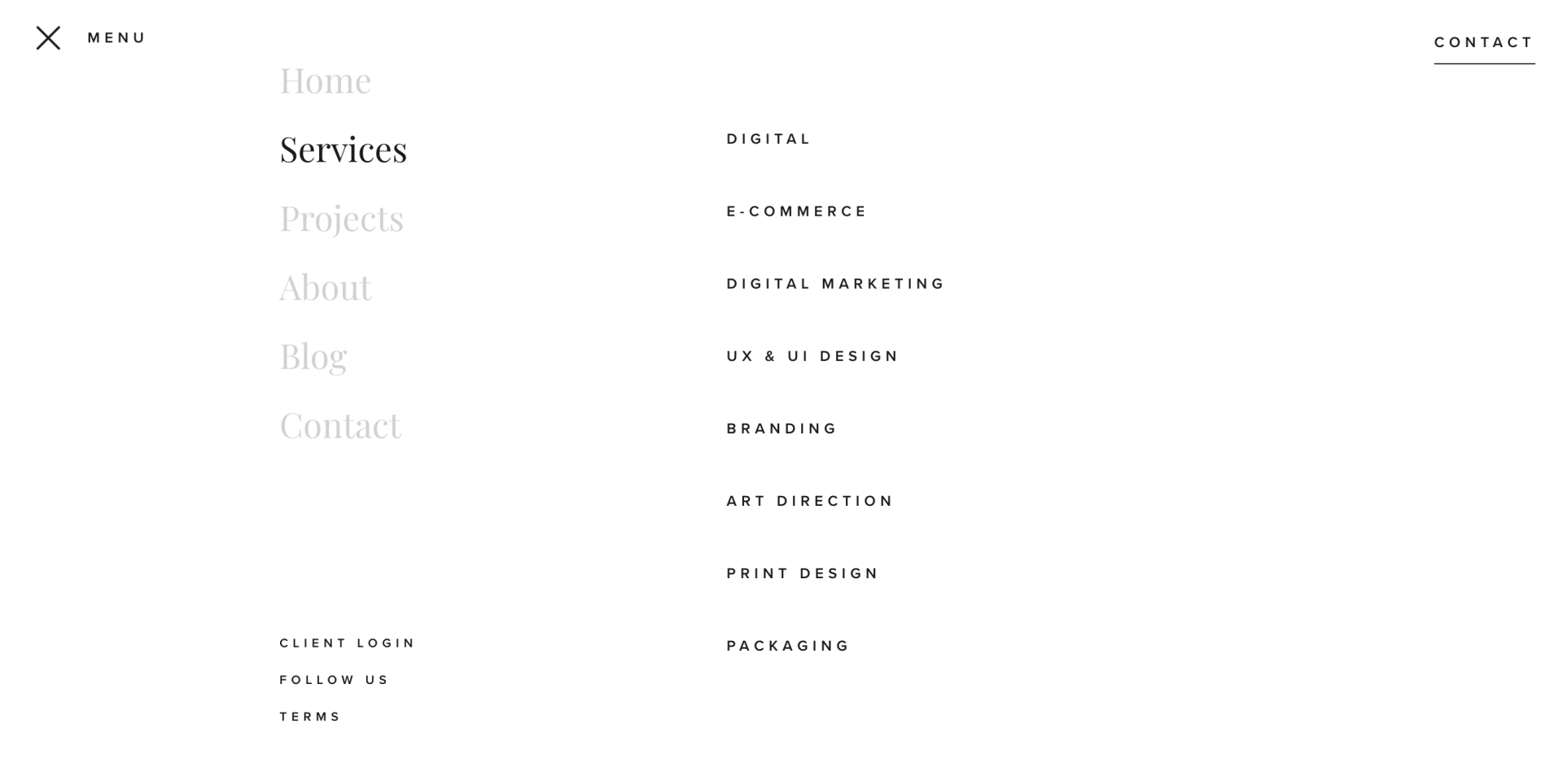
Drop-down Menu

A screenshot of a website with a drop-down menu

The drop-down menu offers the user additional navigation links via a popup once the user clicks on or hovers over any main menu option. This menu is suitable if your website has a lot of content to offer.

Hamburger Menu

A screenshot of an architect website with a hamburger menu
A screenshot displaying the open menu of an architect website

This website menu design is good for mobile-friendly websites. It is an icon made of 3 horizontal stripes. Upon clicking the icon, you get a list of options to choose from.

Sidebar Menu

A screenshot displaying the menu of a hospital website

As the name suggests, the menus located on the extreme right or left of the website page are known as sidebar website menus.

Which Website Menu Type is Best for My Site?

There’s really no perfect answer to this question. Every website is different. Each website owner will have their own preference. But there are some ways you can know if your website menu is on the right track. 


Most visitors expect to find a horizontal menu at the top of a website or a vertical menu on its left-hand side when browsing on a desktop. Hamburger and dropdown menus offer more space for content on a smartphone and have generally become expected on the mobile web. Putting your website menu in these standardized places helps visitors navigate easily through the website.


How Many Items Should Be Included in a Website Menu?

A crowded menu is a bad menu. The website menu should be concise and must have a limited number of elements in it. For instance, if there are 30 items in the navigation menu, it is hard and boring to scan through all of them when all you’re looking for is an About Us page.


Streamlining the website menu and only including important options will drive more engagement with your website and improve the general design of your site. As a general rule, try to keep your number of navigation items to under 10.


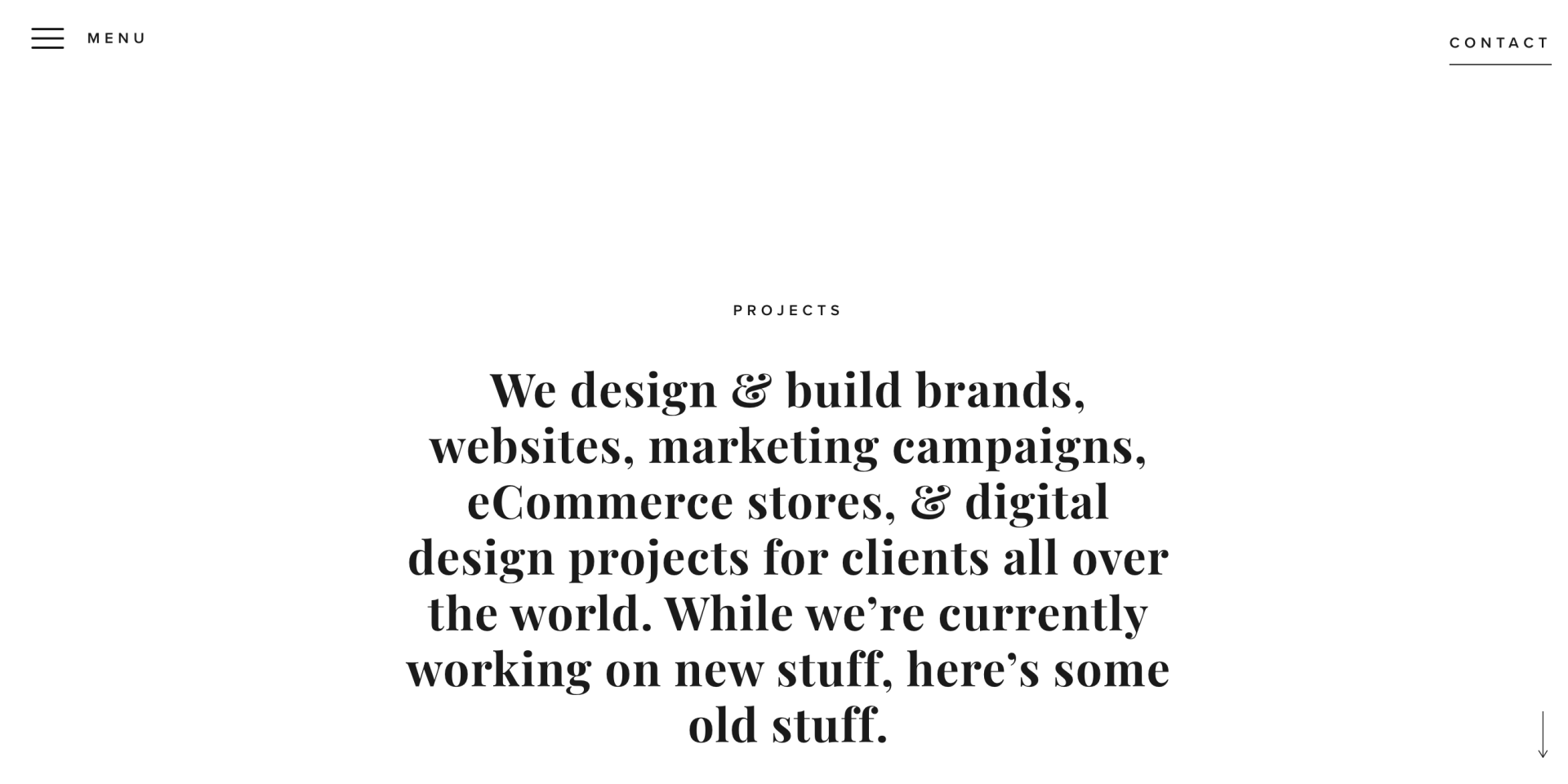
Characteristics of a Great Website Menu Design

A website menu design or structure can only be considered good if it is easy to use. Your navigation menu can either build up your brand or frustrate newcomers. 

The following characteristics are hallmarks of an effective website menu design.


Website Menus Should be Intuitive

Consumers form their first impression of your website almost instantly. According to some reports, an average user spends about less than 15 seconds on a site. If the user cannot get their desired information within this timeframe, they will almost certainly abandon the site. An intuitive website menu will go a long way towards ensuring that you’re keeping as much of the traffic engaged with a site as possible.

Website Menus Should Be Deep, Not Wide

If there’s just too much content and you cannot cram all of it into your primary menu, you may want to consider creating some deep sub-menus to ensure your navigational hierarchy is easy to understand.

Clearly Label the Items in Your Menu

When it comes to naming the elements in your menu, opt for clarity and simplicity. When the word is not clear, it creates a negative impact on a visitor’s experience.

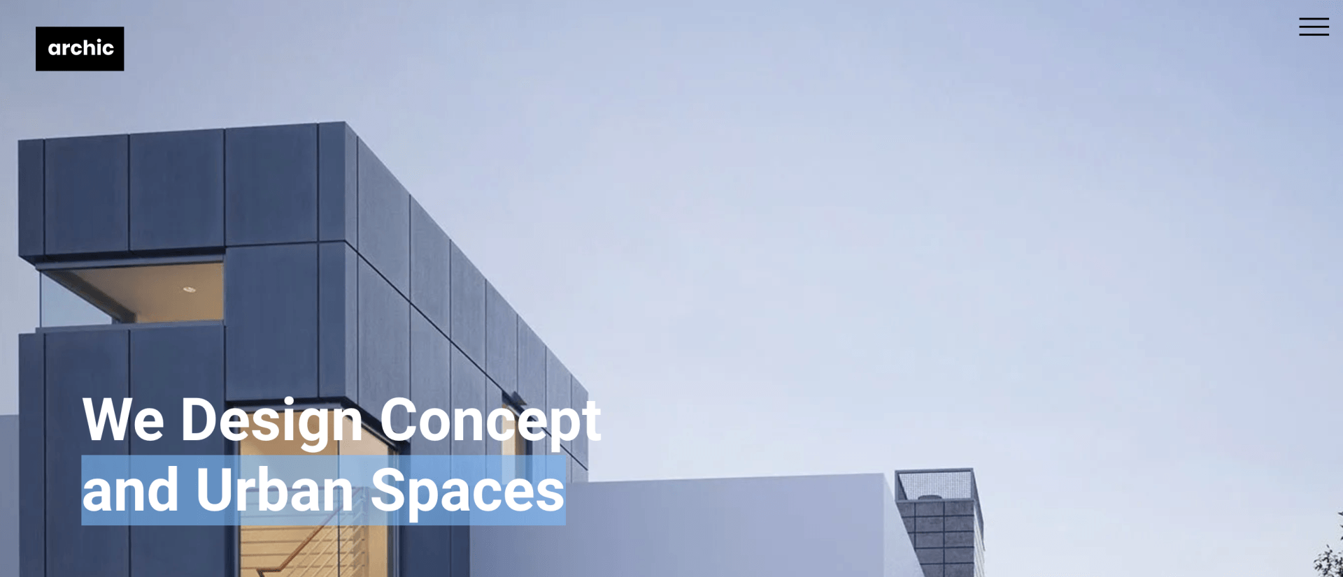
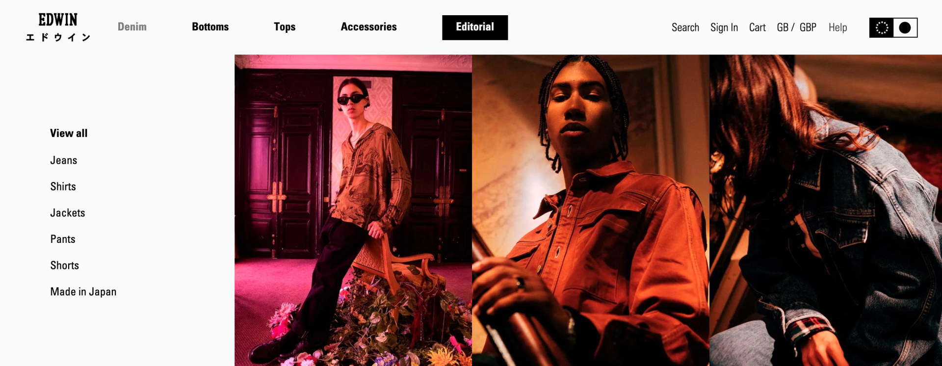
Real-world Examples of Amazing Website Menu Designs

A screenshot displaying the menu of the website of Edwin Europe, a denim brand

Edwin Europe is a denim brand. Its website features a combination of a classic navigation and sidebar menu that enables users to easily control their experience on the site.

A screenshot of the homepage of Long Story Short website
A screenshot of the menu of the digital marketing agency Long Story Short

If your website has a lot of visual content, then you should take a look at the site menu of Long Short Story. They have managed to build an elaborate menu in an eye-catching and intuitive way using hamburgers, sub-menus and sidebars.

Screenshoot of website that displays an image of a person writing with a pensil

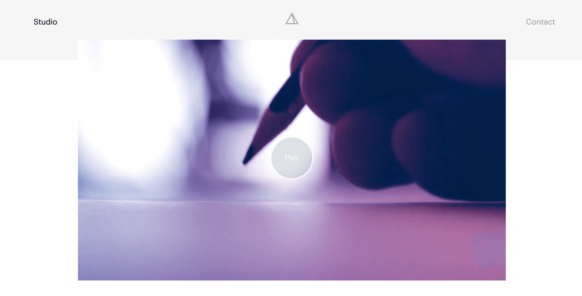
Just two menu items? Sounds great! Bad Assembly combines brevity with an infinite scroll to create a fantastic website menu experience.

A screenshot of the Sparked website, which offers services to help businesses grow their online presence.

Sparked, a Toronto-based digital agency, uses a classical navigation menu design with a slight twist. It’s featured in the far upper right corner of the site.

A website displaying a colorful basketball court. The image is from the website of William Lachance, a web designer and developer.

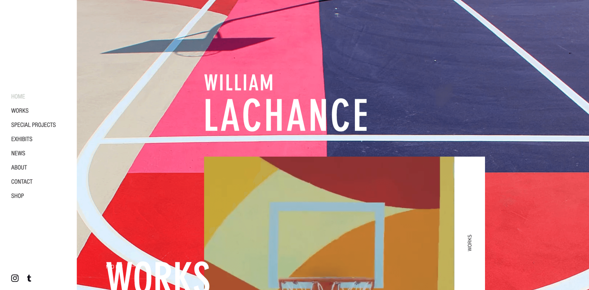
William LaChance is an artist that features a fantastic sidebar menu on his site. It’s so prominent, you can imagine this menu never fails to grab a visitor’s attention as they look through the site for the artist’s work.

A website page displaying a bottle with a skull on top, glowing on a black background.

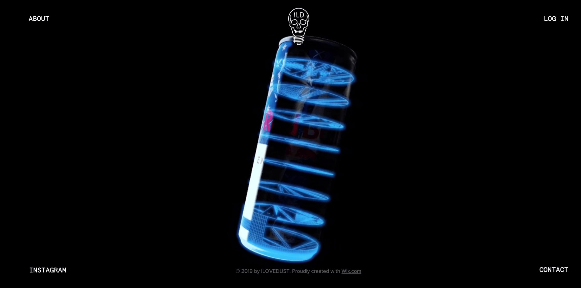
I Love Dust is a graphic design agency that amazes visitors by placing their work square in the middle of the page. This may be one of the only 4-corner menus I’ve ever seen on a site...

Closing Thoughts

The website menu is an integral part of the design of your website and a valuable navigation tool for the visitor. Hence, it is necessary to create an easy-to-use and well-thought-out menu design to please your clients. Give it the attention it deserves, and your website menu will pay dividends down the line.

Recent Posts

By Duda March 10, 2026
Discover a more intuitive, professional UI with a streamlined sidebar and enhanced top navigation, helping you build faster and with greater confidence.
Graphic with
By Stephen Alemar October 23, 2025
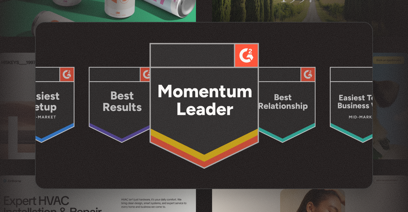
Discover why Duda is a top-rated website builder on G2, recognized for usability, easy setup, strong relationships, and excellent results, all backed by real reviews.
By Ilana Brudo October 16, 2025
Discover why digital marketing agencies are choosing Duda over Wix Studio and WordPress for speed, reliability, and client experience, and how it helps them scale without operational overhead.
Show More

Did you find this article interesting?


Thanks for the feedback!
By Shawn Davis April 1, 2026
Core Web Vitals aren't new, Google introduced them in 2020 and made them a ranking factor in 2021. But the questions keep coming, because the metrics keep changing and the stakes keep rising. Reddit's SEO communities were still debating their impact as recently as January 2026, and for good reason: most agencies still don't have a clear, repeatable way to measure, diagnose, and fix them for clients. This guide cuts through the noise. Here's what Core Web Vitals actually measure, what good scores look like today, and how to improve them—without needing a dedicated performance engineer on every project. What Core Web Vitals measure Google evaluates three user experience signals to determine whether a page feels fast, stable, and responsive: Largest Contentful Paint (LCP) measures how long it takes for the biggest visible element on a page — usually a hero image or headline — to load. Google considers anything under 2.5 seconds good. Above 4 seconds is poor. Interaction to Next Paint (INP) replaced First Input Delay (FID) in March 2024. Where FID measures the delay before a user's first click is registered, INP tracks the full responsiveness of every interaction across the page session. A good INP score is under 200 milliseconds. Cumulative Layout Shift (CLS) measures visual stability — how much page elements unexpectedly move while content loads. A score below 0.1 is good. Higher scores signal that images, ads, or embeds are pushing content around after load, which frustrates users and tanks conversions. These three metrics are a subset of Google's broader Page Experience signals, which also include HTTPS, safe browsing, and mobile usability. Core Web Vitals are the ones you can most directly control and improve. Why your clients' scores may still be poor Core Web Vitals scores vary dramatically by platform, hosting, and how a site was built. Some of the most common culprits agencies encounter: Heavy above-the-fold content . A homepage with an autoplay video, a full-width image slider, and a chat widget loading simultaneously will fail LCP every time. The browser has to resolve all of those resources before it can paint the largest element. Unstable image dimensions . When an image loads without defined width and height attributes, the browser doesn't reserve space for it. It renders the surrounding text, then jumps it down when the image appears. That jump is CLS. Third-party scripts blocking the main thread . Analytics pixels, ad tags, and live chat tools run on the browser's main thread. When they stack up, every click and tap has to wait in line — driving INP scores up. A single slow third-party script can push an otherwise clean site into "needs improvement" territory. Too many web fonts . Each font family and weight is a separate network request. A page loading four font files before rendering any text will fail LCP, especially on mobile connections. Unoptimized images . JPEGs and PNGs served at full resolution, without compression or modern formats like WebP or AVIF, add unnecessary weight to every page load. How to measure them accurately There are two types of Core Web Vitals data you should be looking at for every client: Lab data comes from tools like Google PageSpeed Insights, Lighthouse, and WebPageTest. It simulates page loads in controlled conditions. Lab data is useful for diagnosing specific issues and testing fixes before you deploy them. Field data (also called Real User Monitoring, or RUM) comes from actual users visiting the site. Google collects this through the Chrome User Experience Report (CrUX) and surfaces it in Search Console and PageSpeed Insights. Field data is what Google actually uses as a ranking signal — and it often looks worse than lab data because it reflects real-world device and connection variability. If your client's site has enough traffic, you'll see field data in Search Console under Core Web Vitals. This is your baseline. Lab data helps you understand why the scores are what they are. For clients with low traffic who don't have enough field data to appear in CrUX, you'll be working primarily with lab scores. Set that expectation early so clients understand that improvements may not immediately show up in Search Console. Practical fixes that move the needle Fix LCP: get the hero image loading first The single most effective LCP improvement is adding fetchpriority="high" to the hero image tag. This tells the browser to prioritize that resource over everything else. If you're using a background CSS image for the hero, switch it to anelement — background images aren't discoverable by the browser's preload scanner. Also check whether your hosting serves images through a CDN with caching. Edge delivery dramatically reduces the time-to-first-byte, which feeds directly into LCP. Fix CLS: define dimensions for every media element Every image, video, and ad slot on the page needs explicit width and height attributes in the HTML. If you're using responsive CSS, you can still define the aspect ratio with aspect-ratio in CSS while leaving the actual size fluid. The key is giving the browser enough information to reserve space before the asset loads. Avoid inserting content above existing content after page load. This is common with cookie banners, sticky headers that change height, and dynamically loaded ad units. If you need to show these, anchor them to fixed positions so they don't push content around. Fix INP: reduce what's competing for the main thread Audit third-party scripts and defer or remove anything that isn't essential. Tools like WebPageTest's waterfall view or Chrome DevTools Performance panel show you exactly which scripts are blocking the main thread and for how long. Load chat widgets, analytics, and ad tags asynchronously and after the page's critical path has resolved. For most clients, moving non-essential scripts to load after the DOMContentLoaded event is a meaningful INP improvement with no visible impact on the user experience. For websites with heavy JavaScript — particularly those built on frameworks with large client-side bundles — consider breaking up long tasks into smaller chunks using the browser's Scheduler API or simply splitting components so the main thread isn't locked for more than 50 milliseconds at a stretch. What platforms handle automatically One of the practical advantages of building on a platform optimized for performance is that many of these fixes are applied by default. Duda, for example, automatically serves WebP images, lazy loads below-the-fold content, minifies CSS, and uses efficient cache policies for static assets. As of May 2025, 82% of sites built on Duda pass all three Core Web Vitals metrics — the highest recorded pass rate among major website platforms. That baseline matters when you're managing dozens or hundreds of client sites. It means you're starting each project close to or at a passing score, rather than diagnosing and patching a broken foundation. How much do Core Web Vitals actually affect rankings? Honestly, they're a tiebreaker — not a primary signal. Google has been clear that content quality and relevance still dominate ranking decisions. A well-optimized site with thin, irrelevant content won't outrank a content-rich competitor just because its CLS is 0.05. What Core Web Vitals do affect is the user experience that supports those rankings. Pages with poor LCP scores have measurably higher bounce rates. Sites with high CLS lose users mid-session. Those behavioral signals — time on page, return visits, conversions — are things search engines can observe and incorporate. The practical argument for fixing Core Web Vitals isn't just "because Google said so." It's that faster, more stable pages convert better. Every second of LCP improvement can reduce bounce rates by 15–20% depending on the industry and device mix. For client sites that monetize through leads or eCommerce, that's a revenue argument, not just an SEO argument. A repeatable process for agencies Audit every new site before launch. Run PageSpeed Insights and record LCP, INP, and CLS scores for both mobile and desktop. Flag anything in the "needs improvement" or "poor" range before the client sees the live site. Check Search Console monthly for existing clients. The Core Web Vitals report surfaces issues as they appear in field data. Catching a regression early — before it compounds — is significantly easier than explaining a traffic drop after the fact. Document what you've improved. Clients rarely see Core Web Vitals scores on their own. A monthly one-page performance summary showing before/after scores builds credibility and makes your technical work visible. Prioritize mobile. Google uses mobile-first indexing, and field data shows that mobile CWV scores are almost always worse than desktop. If you only have time to optimize one version, do mobile first. Core Web Vitals aren't a one-time fix. Platforms change, new scripts get added, campaigns bring in new widgets. Build the audit into your workflow and treat it like any other ongoing deliverable, and you'll stay ahead of the issues before they affect your clients' rankings. Duda's platform is built with Core Web Vitals performance in mind. Explore how it handles image optimization, script management, and site speed automatically — so your team spends less time debugging and more time building.
By Ilana Brudo March 31, 2026
Vertical SaaS must transition from tools to an AI-powered Vertical Operating System (vOS). Learn to leverage context, end tech sprawl, and maximize retention.
By Shawn Davis March 27, 2026
Automate client management, instant site generation, and data synchronization with an API-driven website builder to create a scalable growth engine for your SaaS platform.
Show More

Latest posts