You wouldn't build a house without a floor plan. You wouldn't create a sculpture without a sketch. Just like any other creative process, web design requires planning and organization. And that's where wireframes come in.
By wire-framing before
building your clients' websites, you're ensuring that the design process goes smoothly and efficiently. You can easily test user flows, make changes to the layout, and get final approval from your clients — all before investing time and resources into the actual building.
Now...there are a few instances where wireframing isn't needed. If:
- You're making a small website (1-3 pages)
- There are no external stakeholders
- Your project is intricate or complicated (in which case, a high-fidelity prototype is better)
Even if your client has very specific design preferences and doesn't want to deviate from them, wireframing can help them actually visualize their ideas and make necessary changes before the actual design process begins. We even use wireframes when
creating Duda templates.
In this guide, I'll show you examples of different types of wireframes, and give you our best practices for creating them.
What is a website wireframe?
Of course, you're already familiar with the concept as an agency owner or agency employee. However, a proper definition of a wireframe will help us contextualize the discussion.
Wireframes are visual blueprints that outline the structure and layout of a website. They serve as a guide for designers, developers, and clients to understand the basic functionality and flow of mobile and desktop versions of the website before moving on to the more detailed design phases.
A wireframe typically includes the following:
- Basic page layout and structure
- Content placement and hierarchy
- User interface elements (e.g., buttons, forms, and menus)
- Navigation elements and user flow
- Annotations explaining design rationale or functionality
Wireframes can range from rough hand-drawn sketches to more detailed digital designs. They are not meant to represent the final product but rather to be a North Star for communication and team collaboration during the design process.
Wireframes vs. mockups
Mockups are more detailed visual representations of a website design, often including colors, typography, images, and brand elements. While wireframes focus on the layout, functionality, and structure of a website, mockups provide a more realistic preview of what the final product will look like.
Wireframes are generally created at the beginning stages of a client project, while mockups are created after the wireframe and before the final design.
If wireframes are the blueprints, mockups are the 3D renderings of a building.
Wireframes vs. prototypes
A prototype is an interactive version of a wireframe or mockup that allows users to test the functionality and flow of a website. While wireframes and mockups are static representations of a website, prototypes are interactive — they simulate users' actions and responses.
After wireframing, finalizing the design elements with your client, and creating a prototype, you'll use prototypes to test and validate the UI/UX before moving on to development.
Internally, wireframes are for team alignment. Prototypes are for client or user feedback on design and functionality.
If wireframes are the blueprints and mockups are the 3D renderings of a building, prototypes are the model homes that people can walk through and experience.
Why is wireframing important in web design?
Even if you
weren't running an agency or working at one and managing multiple client projects at once, wireframing would be a crucial first step in theweb design process.
But when you're trying tobuild a scalable web design process, there are several reasons why wireframing becomes even more important:
Efficiency
Wireframes allow for faster and more efficient design iterations compared to starting directly with high-fidelity designs. This is because wireframes focus on the overall structure and functionality, making it easier to make changes.
Clear communication
By visualizing website architecture, wireframes serve as a common language between your team and clients. Everyone can easily understand and provide feedback on the basic layout and structure of the website before you move forward.
Cost and time savings
Identifying issues and making changes during the wireframing stage is significantly faster and less expensive than making changes after you've already prototyped the site or during the building stage. And since you're managing several other projects, those kinds of delays can affect other clients, too.
Better user experience
By testing user flows and making necessary changes during the wireframing stage, you can ensure that the final product will provide a seamless and intuitive experience for your clients' end users. This means their site will perform to its full potential.
Tools to create a website wireframe
Before diving into different types of wireframes and how they look, let's go through the tools you'll
actually use to create one.
1. Pen and paper
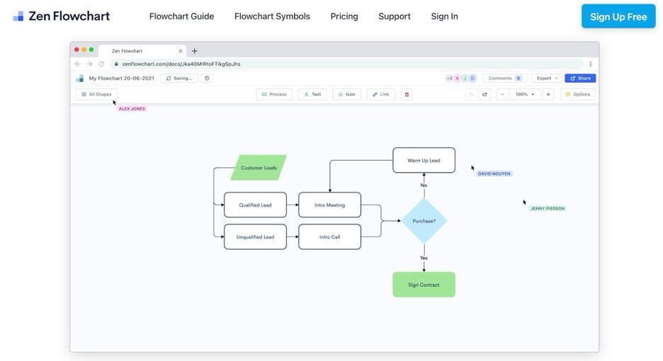
Zen Flowchart uses a minimalistic drag-and-drop interface, making it easy for users to create wireframes without a steep learning curve. It focuses on low-fidelity wireframes, which are simpler and faster to create. This makes it ideal for the early stages of design, where the focus is on layout and functionality rather than detailed visuals.
It also offers over 50 pre-built wireframe templates for various types of projects, such as landing pages, web apps, and mobile apps.
14. Miro
Using Miro's wireframing platform, you can select and add components for various devices (phone, tablet, desktop). It provides around 60 pre-built UI components, such as buttons, lists, icons, and progress bars, which can be easily customized to fit your wireframe needs.
And its infinite canvas gives your team the flexibility to create extensive wireframes without worrying about space constraints. So, it's perfect for large-scale client projects.
15. Google Slides
Although Google Slides is not a dedicated wireframing tool, it can still be effectively used for creating simple, low-fidelity wireframes. The shapes and preset features you'd use to create a slideshow presentation translate well to wireframing. And, since the rectangular slides fit the size of a computer screen, each slide can represent one scroll.
You can even create basic clickable prototypes by linking slides to simulate user interaction flows.
16. Creately
Creately is a powerful visual collaboration and diagramming tool that supports wireframing for web and app development. It simplifies the process of creating low-fidelity wireframes with intuitive drag-and-drop functionality and extensive template libraries.
Beyond static wireframes, Creately supports basic interactivity by allowing design team members to link pages and components. This feature helps you visualize navigation flows and user journeys, providing a more realistic user experience for early testing.
18. Edraw Max
Edraw Max provides a vast collection of 26,000+ templates and 10,000+ shapes for different types of diagrams, including wireframes. It's available on Windows, macOS, Linux, and as a web app, and its drag-and-drop system allows designers to place elements like buttons, text boxes, and navigation bars effortlessly.
19. Uizard
Uizard is one of the best
AI-powered design tools for agencies. The Autodesigner allows users to create UI designs from text prompts, rapidly transforming ideas into functional mockups.
One standout feature is the
Wireframe Scanner, which lets you upload hand-drawn sketches that Uizard automatically converts into digital wireframes. This feature speeds up the ideation process by turning rough concepts into editable designs within seconds.
On top of that, Uizard’s
Screenshot Scanner allows users to upload screenshots of existing designs, which the tool then converts into customizable wireframes. And the Focus Predictor feature generates heatmaps to predict which areas of the design will attract the most user attention.
Users can toggle between high-fidelity designs and low-fidelity wireframe mode, allowing them to view the bare-bones structure of their design for easier usability testing and feedback.
20. Axure RP
Axure RP is a powerful, versatile tool UX designers and product teams use to create both static wireframes and highly interactive prototypes.
What sets it apart is its ability to create complex prototypes with conditional logic, dynamic content, and multi-state interactions. You can simulate real-world interactions like form submissions, sortable grids, and animations to create highly functional prototypes that mimic a fully developed product.
For full-service agencies, it also streamlines the handoff to developers with features like automated redlines and CSS inspection, ensuring that prototypes can be easily understood and implemented.
21. Wireframe.cc
Wireframe.cc is a minimalist, browser-based wireframing tool that prioritizes simplicity and ease of use. It's ideal for designers looking for a quick and distraction-free way to create low-fidelity wireframes without getting bogged down by excessive features or design elements.
You can create wireframes in minutes by simply clicking and dragging to draw elements like boxes, buttons, and text fields. For faster wireframing, it even provides pre-built sections that can be quickly added to your layout.
22. InVision
InVision is an advanced tool that allows users to design wireframes through an intuitive drag-and-drop system. It also offers a Freehand tool for creating low-fidelity wireframes collaboratively — perfect for quick brainstorming and sketching ideas in the early design phases.
One of its core strengths lies in its collaboration features. Multiple team members can leave comments directly on the wireframes, streamlining feedback and enabling rapid iterations.
And once your wireframe is complete, you can turn it into a fully interactive prototype. InVision allows you to simulate user flows, test navigation, and gather feedback on the user experience in real time.
7 examples of website wireframes
Without further ado, let's look at different types of wireframes and when you might use them.
Hand-sketched low-fidelity wireframe
This is one you'll either do with a pen and paper or a software that supports freehand drawing, like Figma's sketching tools for tablet devices.
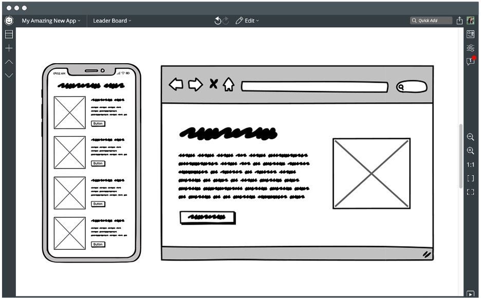
Hand sketches are the wireframes you'll create in the first stage of the web design process. They only take around 3-5 minutes to create, and you'll use them to get the very basics of your website down — the placement of elements, how they interact with each other, and the general layout.
Detailed hand-drawn wireframes
These go more in-depth into what the final website will look like and provide more direction for designers.
They might feature a header section with a logo, navigation menu, and social media icons. They'll also have more indication of what certain types of elements do (e.g., a video widget or contact form).
After your designer creates a basic sketch, they'll refine the concept with specific elements your client wants to see, along with their own design decisions.
Low-fidelity wireframe
You'll need one of the abovementioned design tools to create low-fidelity (lo-fi) wireframes. These are simple, basic visual representations of a webpage's layout and structure, focusing primarily on content placement, navigation, and functionality. They serve as a rough sketch or blueprint to help communicate ideas and concepts without going into detailed design elements.
They use simple shapes (boxes, lines) to represent elements like buttons, images, or text without focusing on colors, fonts, or precise details. They avoid the use of color or elaborate styles, using only black, white, or gray tones to emphasize the structure and layout rather than aesthetics.
They might include annotations or notes to explain specific functionalities or design decisions, but they are generally quick and easy to create, allowing designers to focus on the overall user experience rather than visual design.
High-fidelity wireframe
A high-fidelity wireframe is a detailed and more realistic representation of a website or application, focusing on visual design elements, content, and interactivity. Unlike low-fidelity wireframes, high-fidelity wireframes are more polished — they closely resemble the final product, giving stakeholders a clearer idea of what the finished design will look and feel like.
They include:
- Specific fonts, colors, icons, and images
- Actual content — real copy, images, and labels
- Interactive features like clickable buttons, dropdowns, and hover states
- Spacing, padding, and alignment according to the layout, grid system, and overall design structure
These kinds of wireframes focus on mimicking the end-user experience more closely. They facilitate a smooth handoff for usability testing and feedback that is more relevant to the final product.
You'll use high-fidelity wireframes to get buy-in from your clients or stakeholders after low-fidelity versions have been reviewed and iterated upon.
Wireframe mockup
A wireframe mockup is a more refined version of a wireframe. It is often used in the mid-to-late design phase to represent the design of a website or app with greater detail than a basic wireframe but without full functionality like a prototype. It combines some visual design elements with the structural layout to give a clearer sense of how the final product will look.
Wireframe mockups sit between wireframes and high-fidelity prototypes, offering more design context than a low-fidelity wireframe but not as polished or interactive as a fully functional high-fidelity prototype.
User flow wireframe
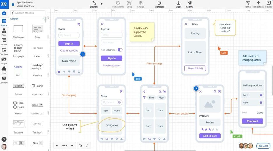
A user flow wireframe not only depicts the UI elements and page layouts but also includes directional arrows or links between wireframes to indicate the sequence of interactions. It shows how users move from one screen or page to another.
These wireframes focus on the actions users need to take to achieve specific outcomes (e.g., signing up, purchasing a product, or completing a form). Each step in the user flow corresponds to a wireframe that represents the UI at that point.
It also highlights decision points, where users might have multiple options, such as choosing between different navigation paths or taking certain actions (e.g., clicking “Submit” or “Cancel”).
It's one of the final stages of the wireframing process before creating a high-fidelity prototype.
Interactive wireframe
An interactive wireframe is a prototype that allows users to interact with the design, providing a realistic simulation of how the final product will work and function. They are usually high-fidelity (though they can be lo-fi as well) and include clickable links, hover states, animations, and other interactive features.
Interactive wireframes are perfect for usability testing, as they allow users to experience the design in a more immersive way. You can gather feedback on navigation, functionality, and user flows to optimize the layout before moving on to the final design phases.
To create one, add interactive elements like buttons and links within your design tool, then connect them to other pages or sections within the wireframe.
Duda's website wireframing best practices
As an agency owner or employee, you don't just need to know how to build and use wireframes effectively, but how to do so at scale, across your entire design team, for every one of your clients.
Here are some best practices for creating website wireframes that will help you get the most out of your design process:
1. Create a standardized process your designers will follow.
Design work is inherently creative, but successful design agencies also need to be consistent and efficient. You'll want to create a standardized process your designers will follow for each project, using the same tools and workflows.
It should look something like this:
- Gather project requirements from the client and create a design brief.
- Use a wireframe tool like Balsamiq or Figma to build initial low-fidelity wireframes based on the sitemap and user flows.
- Review and iterate on the wireframes until you have a solid foundation to move on to high-fidelity designs.
- Test for usability and gather feedback on the high-fidelity wireframes before sending them to your design team for final design.
- Turn hi-fi wireframes into prototypes for final review and testing.
Every step of the way, you should have clear approval workflows to get feedback and sign-off from stakeholders before moving on.
2. Consider the differences between mobile and desktop wireframing.
Desktop wireframes allow for more complex layouts because they have more screen real estate. You can use multi-column layouts and include more elements in a visible space.
But don't fall into the trap of adding too many different elements just because you can. When you're wireframing for desktop, you have to make sure there's ample breathing room around UI components like buttons, navigation, and content blocks.
Mobile wireframes require a simpler, more focused layout. Often, you'll need to prioritize which elements are most important and adapt the design for touch-based interactions. Use larger buttons (44x44px minimum) to ensure usability on mobile.
When designing, start with a mobile-first approach and then scale up to desktop so that all the critical elements function well across devices. Starting with mobile also ensures you don’t overload the mobile version with unnecessary details.
And of course, remember to test designs on actual devices frequently to ensure usability across all screen sizes.
3. Use the optimal size for each type of wireframe.
A common wireframe size for desktop devices is 1440x1024 pixels, which accommodates most standard desktop displays. Use a grid system (like 12-column Bootstrap) to organize content easily across different screen sizes.
For mobile devices, the standard size for is typically 375x667 pixels (iPhone X) or 360x640 pixels (Android devices), with button sizes and touch targets at least 44x44 pixels for easy interaction.
And for tablets, wireframes usually are 800x1280 pixels for 8-inch devices or 1200x1920 pixels for 10-inch tablets.
4. Include all the necessary elements.
You can't forget the following elements when creating wireframes:
- Information architecture: This outlines the structure of the content and how users will interact with it. Break down the wireframe into main sections (header, body, sidebar, footer), making sure content and navigation are logically placed.
- Navigation: Make navigation intuitive and consistent across all your web pages. The placement of menus, CTAs, and links should guide the user smoothly through the site without confusion. Include placeholders for menu items, search bars, and other key navigational elements.
- Layout design: Define how content is arranged visually on the page. Focus on maintaining consistency in the layout and using white space effectively. Avoid getting caught up in aesthetics — wireframes are meant to map structure, not visual details.
- Responsive elements: Consider how each element will adapt across different devices. Plan for interaction states (e.g., how buttons or links respond to touch on mobile versus click on desktop) to ensure a seamless experience across platforms.
5. Add context with annotations and feedback.
Annotations are especially important when transitioning from wireframes to prototypes or high-fidelity designs. Use them to clearly communicate design decisions, interaction flows, and functionality. This helps developers and stakeholders understand how elements are expected to behave (e.g., dropdown menus, hover states, etc.).
Early in the process, gather feedback from stakeholders and users through usability testing to refine your wireframes. Early input will prevent costly revisions later and ensure the design aligns with both user expectations and what your client is looking for.
Duda: The best way to build websites at scale
Building every website with a design tool like Figma or Adobe XD is time-consuming and inefficient, especially for agncies who need to create multiple websites at a time.
That's where Duda comes in.
Our website builder helps you automate your design workflow by streamlining all the steps from wireframing to final launch.
With Duda, you can:
- Create customizable templates, sections, and widgets for different industries/client types and use them as a starting point for each project.
- Use our intuitive drag-and-drop editor to quickly build responsive websites without needing any coding skills.
- Easily collaborate with your team and assign tasks within the platform.
- Automate design and development tasks, such as resizing images and optimizing for different devices.
- Manage all your clients through our client management system, with the ability to white-label your work and give them access to edit their site if needed.
And to automate advanced design tasks, you can use Duda's versatile API for advanced workflow automation.


