Beyond its fundamental role as a brand identifier, a logo serves as a visual shorthand that communicates the values, personality, and unique selling proposition of a business. In an era where
75% of consumers can recognize a brand solely by its logo and
60% admit to avoiding businesses with an unattractive one, we can't overstate a logo's power in building brand recognition and trust.
For small and mid-sized businesses, brand recognition and trust are even more crucial — they don't have the same awareness level across demographics as big brands do. So, it's one of the most essential elements of the digital branding that drives future engagement, sales, and loyalty for their customers.
As an
agency owner, clients might ask you for a logo around the same time you build their website. It's your job to create attention-grabbing logos that capture the true essence and message of your SMB clients.
But there are tons of different types of brands (and, by extension, several types of logos). Knowing when and how to use each one will help you guide the design process for each client.
Types of logos for small and mid-sized businesses
When you look at the logos of famous brands, you may think there's tons of room for creativity and endless possibilities.
In truth, you can narrow the majority of logos down to these eight categories:
- Wordmark
- Lettermark
- Letterform
- Emblem
- Pictorial mark
- Abstract mark
- Mascot
- Combination mark
Beyond the standard categories, there are also hybrid logos that combine elements from multiple types. Thanks to technology, modern
logo trends like 3D, dynamic, and animated logos are becoming commonplace, as are techniques like negative space.
Let's dive in.
Wordmark (logotype)
Source
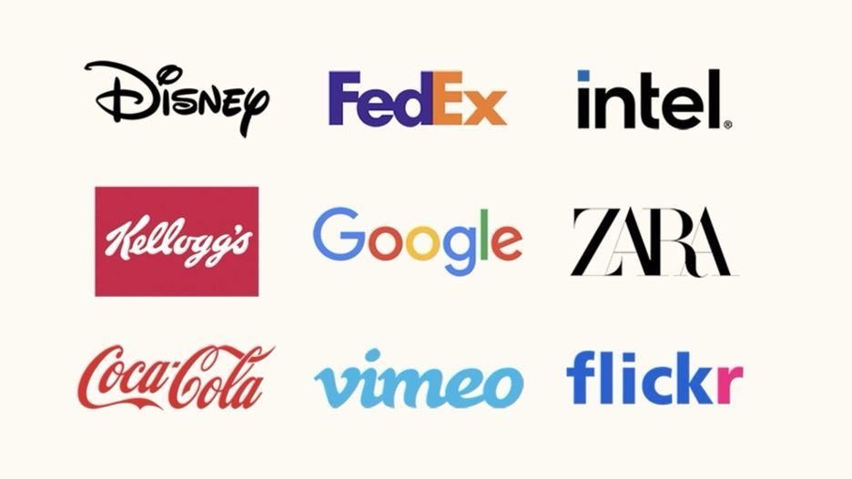
Wordmark logos, also known as logotypes, are a type of logo that consists of the company or brand name in a stylized typeface. This kind of logo focuses on text to convey the brand's identity, with unique typography and color playing a key role in its design. It leverages font style, weight, and spacing to reflect the brand's personality and values.
Familiar examples include:
- Cartier
- Coca-Cola
- Facebook
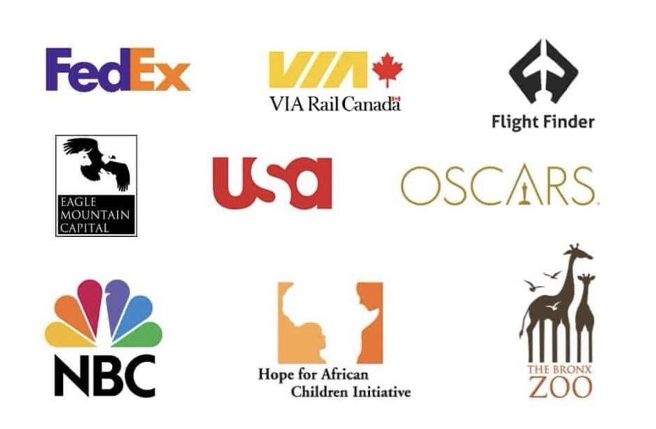
- FedEx
- Google
- L'Oréal
- Netflix
Visa
As another example, Duda’s main logo is also a wordmark logo.
Pros and cons of wordmark logos
Wordmark logos can make a brand name highly recognizable and memorable, especially if the name is unique and the typography is distinctive. Their straightforward nature makes them easily adaptable across lots of different media and marketing materials.
That said, if the brand name is not inherently unique or the design lacks creativity, wordmark logos can blend into the background, making it hard to stand out in a crowded market. Some wordmark logos are less legible when scaled down for smaller applications, such as social media icons or mobile applications.
When to use a wordmark logo
Wordmark logos are particularly effective for small and mid-sized businesses with a concise, distinct name that embodies the brand's essence. They are ideal for small and mid-sized businesses that need customers to recall their full name for brand awareness purposes — e.g., fashion brands, restaurants,
SaaS platforms, and professional service providers.
Use a wordmark logo when...
- Your client wants to highlight their brand name as the primary element of your identity.
- They're seeking a timeless look that can evolve with minimal updates.
- They’re a local business with a descriptive, non-creative name (e.g., “Joe’s Plumbing Services”).
- Their customers need to know the full name (e.g., a
restaurant).
Choose a different type of logo when...
- The brand name is lengthy or complex, as it may become difficult to design a legible and impactful logo.
- The brand lacks a distinct personality or unique qualities that can be communicated through typography alone.
Considerations before using a wordmark logo
Your font choice should align with your client's brand's personality. For instance, Coca-Cola's iconic, cursive font conveys heritage and elegance, while Google's sans-serif typography reflects its modern, tech-focused approach.
Also, keep in mind that wordmarks can be challenging to trademark if the brand name is generic or descriptive. In this case, a combination mark may be more suitable for your client's legal protection.
Lettermark (monogram)
Source
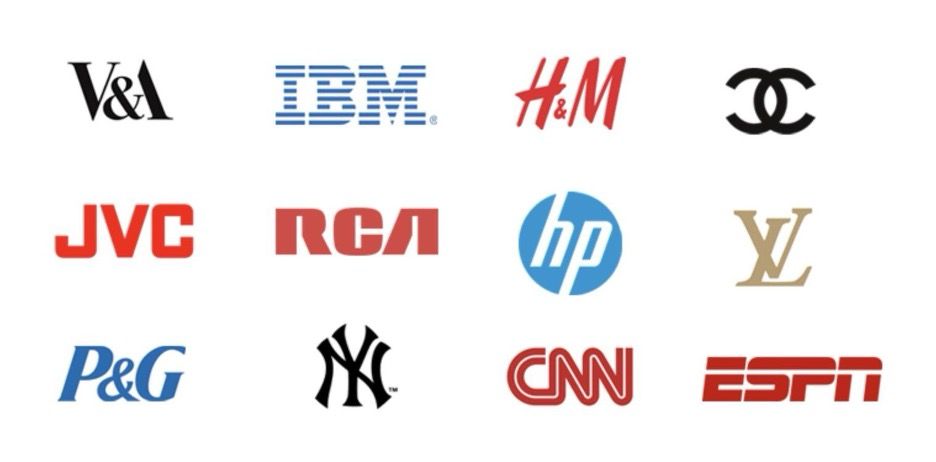
A lettermark logo is a typography-based logo that consists of the initials or acronym of the brand's name. It is similar to a wordmark but focuses on the initials rather than the full name. These logos are simple and bold.
Familiar examples include:
Pros and cons of lettermark logos
Thanks to their minimalistic approach, lettermark logos are perfect for brands with long names or complicated brand identities. They offer a more concise representation of the brand and are easily adaptable for use on various mediums.
However, they're challenging to create if the initials don't form a unique or recognizable symbol. If the acronym isn't catchy and aesthetically pleasing enough to stick, you'll have a less memorable logo.
They also limit future branding opportunities — for instance, if your client decides to change their brand's name or expand into different markets.
When to use a lettermark logo
Lettermarks are best used when a client's name has...
- Multiple clunky words (e.g., IBM stands for International Business Machines, which doesn't roll off the tongue)
- Strange-sounding names that don't match the company's purpose (e.g., H&M is short for Hennes and Mauritz, which doesn't sound like a clothing brand at all)
- A long name that’s difficult to remember or pronounce
In the SMB space, they’re well-suited to agencies, freelancers, and professional service providers, which often use their personal name in their company name (e.g., a real estate agent or freelance web designer coming to you for a branding package).
In cases like these, it's better to design a compact, eye-catching symbol that strongly represents their brand's name.
Choose a different type of logo when...
- The initial doesn't form an aesthetically pleasing and memorable symbol.
- The acronym already exists (and ranks on Google) for something completely different.
- Your client's brand name is likely to change or expand in the future.
- Their business is new or not yet well-known, and a lettermark alone might not communicate enough about what the company does.
Considerations before using a lettermark logo
Given the simplicity (compared to a wordmark), your #1 priority should be to create something highly unique and recognizable in your client's industry. That means designing a logo their target customers won't easily confuse with another company.
You'll also want to check SERPs before deciding to go with a lettermark. When it comes to
branded search, your client will run into lots of trouble if their initials already rank for other popular phrases. For example, searching "ATT" returns tons of pages about the telecom company. So "Austin's Towing & Transport" would never show up on Google for it, even on local search.
Letterform
Source
Letterform logos are another type of typography-based logo. The main difference is they use one specific letter of the brand's name to create a unique symbol or image. Typically, this type of logo is more abstract and creative, using shapes and negative space to form the letter.
Familiar examples include:
- Airbnb's home-shaped "A" symbol
- Beats by Dr. Dre's "b" logo with a circle around it
- Facebook's "f"
- McDonald's golden arches
- Yahoo's "Y!"
- The new Twitter (X) logo
Pros and cons of letterform logos
For small and mid-sized businesses, letterform logos offer the flexibility of being either retro or modern, depending on the chosen typography. Since they use the first letter of the company’s name, they also have a strong association with it. This makes them highly memorable.
However, they can be challenging to design if the selected letter doesn't lend itself well to abstract interpretation or if the brand name is not short enough to be associated with a single character.
When to use a letterform logo
Letterform logos are best suited for SMB clients who...
- Have unique or visually appealing letters in their name.
- Want a versatile logo that can work independently from the brand's full name.
- Want a familiar, icon-based logo without developing new.
In general, they're best used when your client has a mobile app or SaaS product. Since they translate well to small screens, they're perfect for mobile interfaces.
Considerations before using a letterform logo
With letterform logos, there is a risk of creating something too abstract and losing the connection to the brand name. It's always best to choose the first letter of the brand name and draw a strong association with that letter in other marketing collateral.
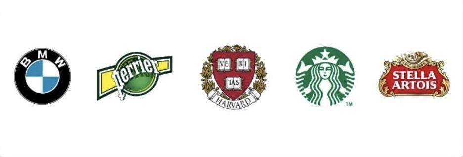
Emblem
Source
Emblem logos are characterized by their classic appearance, which often resembles a badge, seal, or crest. They typically incorporate the company name, date of establishment, and, sometimes, a motto within a symbolic design.
These types of logos are rich in detail and have a traditional, timeless feel. They evoke a sense of heritage and authority.
A few examples:
- BMW
- Porsche
- Harley-Davidson Motorcycles
- Starbucks
- Sports teams logos
- University symbols
- Major organizations (e.g., NASA)
- Local shops
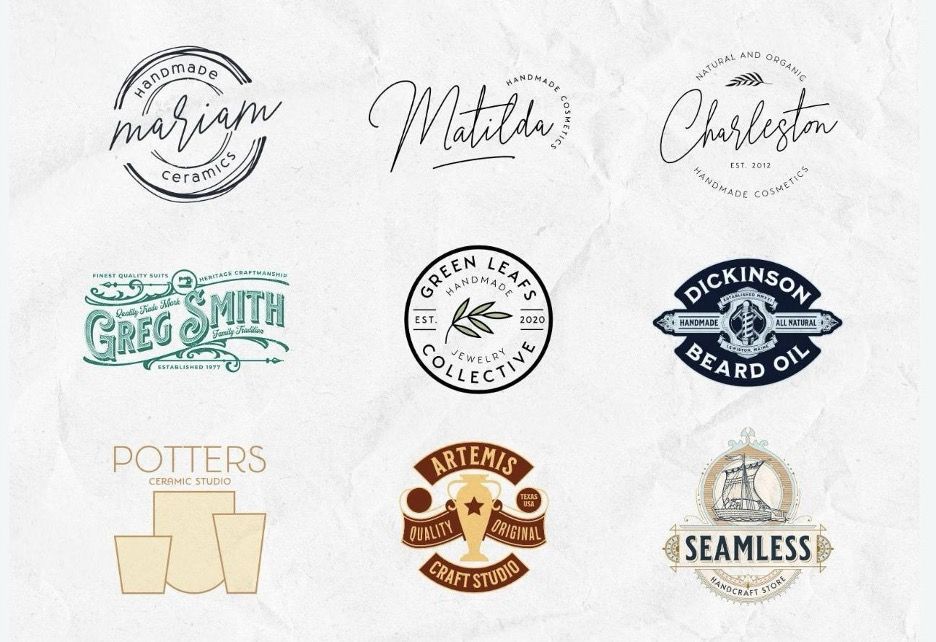
In the SMB space, they also translate well to high-quality products — think: anything handmade, organic, or sustainable. Like this:
Source
Pros and cons of emblem logos
The main advantage of an emblem logo is its traditional, timeless aesthetic. It also allows for a lot of detail and symbolism to be incorporated into the design, which makes it visually appealing. Plus, incorporating multiple brand elements — such as the founding year or a motto — enriches the brand's story.
However, these types of logos might become illegible on smaller branding materials, like business cards and social media profiles. They also require a lot of space to be displayed properly and, if they aren't well-designed, can easily become cluttered.
When to use an emblem logo
It's best to use emblems...
- For small and mid-sized brands that want to emphasize a rich history or traditional values.
- In industries where trust and authority are paramount, such as education, government, and premium, handmade, or artisan products.
- If your client wants a logo that can stand alone without the company name in certain cases (e.g., on clothing or souvenirs).
- When a local business client wants to stick out more.
If your client is aiming for a minimalist or ultra-modern image, however, emblem logos may come off as too clunky or old-fashioned. It's also not recommended for SMBs with long or complex names (though it can work for abbreviations in some cases).
Considerations before using an emblem logo
When designing an emblem, consider incorporating modern design elements to avoid the logo appearing too dated or out of touch with current trends. Also, evaluate whether an emblem design will accommodate future brand evolution without requiring a complete overhaul.
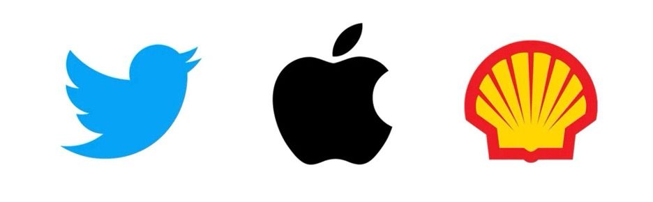
Symbols, brand marks, and pictorial marks
Source
Pictorial marks are similar to emblems in the sense that they're more figurative and less abstract than letterform logos. However, they don't incorporate any text elements within the design.
These types of logos rely purely on image recognition and are often used when a brand name is already well-established. A few examples include:
- Apple's apple
- Dominos’s domino
- Shell's shell
- Twitter's bird
- Puma’s puma
- Target’s target
Pros and cons of pictorial marks
Pictorial marks are simplistic and highly recognizable. Since they're normally a visual representation of an actual word, using a pictorial mark can make your client's target customers begin to associate that word with their brand. They also have the advantage of being easily reproduced at any size without losing impact.
They can, however, be challenging to design for lesser-known companies as they require a strong level of brand recognition for the logo to be effective.
When to use a pictorial mark
A pictorial mark is a good choice if your client...
- Wants a simple, easily recognizable logo that can stand alone without any text elements.
- Has a single-word brand name that's a real English word.
- Has a unique, visually appealing product or service that can be represented by an image (e.g., the Twitter bird representing tweeting).
Considerations before using a pictorial mark
For SMBs, it'll be tough to grow brand awareness with a pictorial mark alone. Instead, use the symbol to improve brand recognition by reinforcing the image with the corresponding brand name (either in a text or lettermark logo) on their websites and other branded materials.
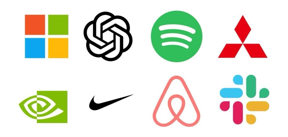
Abstract mark
Source
Abstract mark logos are image-based designs that use abstract shapes and forms to convey a company's branding. Unlike pictorial marks, which represent recognizable objects and real words, abstract marks are metaphorical. They're a completely unique visual representation of the brand's values, ideas, or identity.
An abstract logo can be anything from a simple geometric shape to an intricate composition, with each design element carefully chosen to reflect the brand's personality.
Popular examples include:
- Adidas's three stripes and flower
- Nike's "swoosh"
- The Pepsi Globe
- Spotify's three soundwaves
- The Olympic rings
- Slack's 4-colored octothorpe
- Chase Bank's blue octagon
Pros and cons of abstract marks
Abstract marks leave tons of room for creativity and allow for a unique, one-of-a-kind logo that sets the brand apart from others. They're also easy to apply to all your sales and marketing collateral, since they're not limited by any specific company name or product.
For growing small and mid-sized companies, they're among the best logos for creating a differentiated brand long-term. Especially considering they can transcend language and cultural barriers, they're an excellent choice for brands that need something to evolve with them as they scale nationally or globally.
Without a clear connection to the brand's products or services, though, they do require more marketing to communicate your client's message effectively. And since they don't represent a real word like a pictorial mark, they're sometimes harder for consumers to remember compared to logos that include textual elements or recognizable imagery.
When to use an abstract mark
An abstract logo is best for SMBs that...
- Need a modern, sleek image that transcends specific products or services.
- Have a clear brand identity and personality that can be translated into visual elements.
- Plan on scaling and evolving their products or services in the long-term.
- Target a global market, where a non-representational symbol can communicate across cultural boundaries
That said, if your client has a very specific focus or is highly localized, a more literal logo could convey your message more directly.
Considerations before using an abstract mark
The abstract design should align with your brand's core values and messaging, even if it's not immediately obvious to the viewer. For example, Chase's blue octagon conveys their sleek corporate image, while Spotify's three soundwaves embody music and audio.
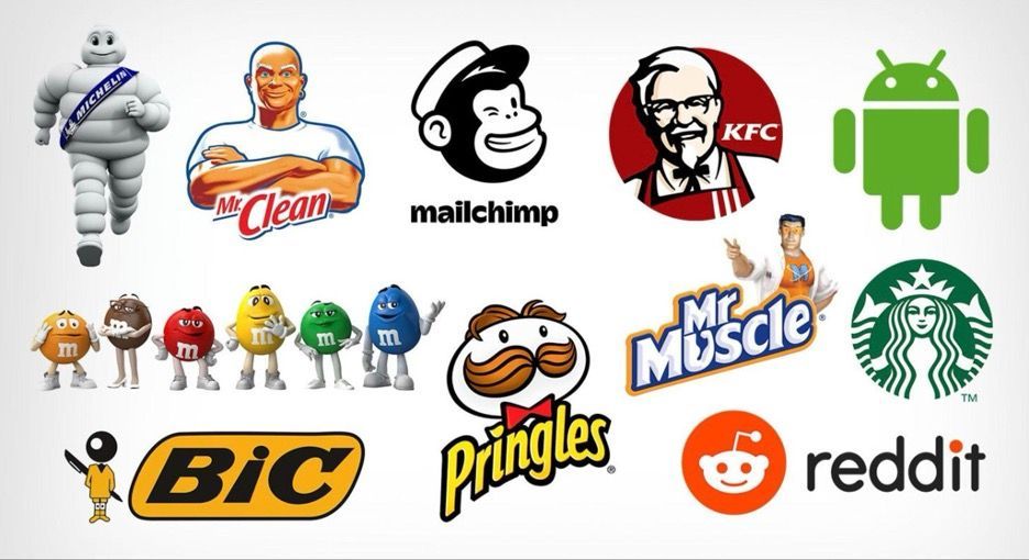
Mascot
Source
Mascot logos feature an illustrated character often designed as an ambassador for the brand. These characters can be people, animals, or even animated objects, embodying the brand's values, message, or personality in a way that's engaging and relatable.
Mascot logos are particularly effective in creating a friendly and memorable brand image, inviting an emotional connection with the audience. That's why food brands, sports teams, and companies targeting families or children use them most often.
Well-known examples include:
- Kellogg's Tony the Tiger
- KFC's Colonel Sanders
- Pringles' mustachioed man
- Geico's gecko
Pros and cons of mascot logos
In terms of brand recognition, mascots are incredibly effective because they create an emotional bond with the audience. They're engaging, fun, and memorable, which leads to increased brand loyalty. It's also easy to share and market products or services with a mascot logo, as it's generally more relatable to consumers.
However, creating a mascot requires significant creative resources and budget, not just for designing the initial character but also for continued marketing and merchandise — a key consideration for SMBs with limited marketing budgets.
It's also tough to design a mascot that's (a) universally appealing and (b) aligns with your client's target audience and brand message. And, it's not likely you'll be able to change your mascot in the future without confusing or losing customers.
When to use a mascot logo
A mascot is an excellent choice for small and mid-sized companies that...
- Want to create a strong emotional connection with their audience.
- Target families, children, or other demographics that respond well to friendly characters.
- Have the resources and budget to maintain consistent branding and marketing efforts featuring the mascot.
- Can commit to the long-term implications of featuring a specific character as their brand ambassador.
For clients targeting a more conservative, professional, or mature audience, you should avoid this type of logo. Financial services or B2B customers, for instance, probably won't resonate with the playful nature of a mascot.
Considerations before using a mascot logo
Before creating a mascot logo, develop a backstory and personality for them that aligns with the values of your client's brand and target audience. Also, be mindful of cultural sensitivities and ensure the mascot is designed to be inclusive and appealing across different demographics.
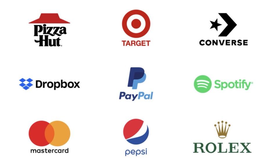
Combination mark
Source
Combination mark logos feature both text and a visual element, making them a versatile choice for companies of all sizes. The text can be either integrated into the visual element or placed separately, with both elements working together to create a cohesive logo.
They're called "combination" mark logos because they combine the best of both worlds: a recognizable visual element (either a pictorial mark, abstract mark, or mascot) and a textual element, which can be customized to fit your client's unique brand and messaging.
In fact, practically every logo we mentioned above has a text component. For example, the word "Spotify" is frequently present next to those three soundwaves, and McDonald's iconic golden arches generally have "McDonald's" sitting right below them.
Pros and cons of combination marks
Combination logos are generally the most successful — that's why
nearly two-thirds of the Fortune 500 use a combination between wordmark and icons. SMBs using them have the freedom to evolve their brand image while maintaining visual recognition. And they can easily customize them for different audiences or marketing channels.
On the downside, they're more challenging to design, as both elements work together cohesively. Plus, they require more space than single-element logos, which can be a challenge in very small applications or where minimalism is required. Especially in those cases, there's a risk of making the logo too busy or complicated, which dilutes its impact and makes it harder for consumers to recall.
When to use a combination mark
A combination logo is an ideal choice when...
- A newer brand needs to make their name and products/services immediately recognizable.
- A company's name is abstract or generic and needs visual elements to convey its unique identity or industry more clearly.
- Your client wants a full range of customization options — like the ability to use the full logo or just the visual element or text in different marketing materials.
If the brand name is very long or complex, keep in mind this makes the combination of text and symbol too crowded. When minimalism or extreme simplicity is a core aspect of the brand's identity, a single element logo is more impactful.
Considerations before using a combination mark
Ensure the text and imagery components complement each other without one overpowering the other. The symbol and text should feel integrated, even if used separately, maintaining a consistent brand identity across all uses.
Aim for a straightforward design that communicates the brand's message clearly. And avoid overly complicated imagery or typography that could confuse the message.
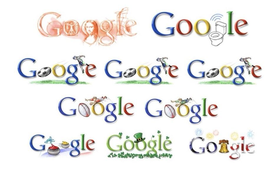
Dynamic mark
Source
Dynamic mark logos are a modern and flexible approach to branding, where the logo changes its design, form, or color based on its context, application, or environment. They can include different color schemes, imagery, or typography choices and are used to convey specific messages or evoke certain emotions depending on the context.
These types of logos are typically seen with large corporations that have multiple products, services, or campaigns under their umbrella branding (though they work well for SMBs with multiple distinct offerings or ICPs).
For example, Google has a dynamic logo that changes colors and shapes for different occasions and events.
Pros and cons of dynamic marks
For SMBs, dynamic marks are an effective and budget-friendly option because they offer multiple versions of the same logo, allowing for customization and versatility without the expense of designing multiple logos. They can also humanize the company by giving them the opportunity to celebrate special occasions or show support for social causes.
That said, overuse of dynamic marks might confuse consumers who may struggle to recognize a brand without consistent visual cues. They also require more effort and resources to design, as each version of the logo must be carefully crafted with consideration for its context and message.
When to use a dynamic mark
Dynamic logos are best used for...
- Brands that operate in diverse markets or have a wide range of products and services.
- Digital-first companies that frequently engage with their audience across various online platforms.
- Companies that want to showcase their adaptability, creativity, and cultural relevance.
Considerations before using a dynamic mark
Before deciding on a dynamic logo, ensure it aligns with your client's brand identity and doesn't feel forced or gimmicky. From there, only use dynamic marks some of the time — to reinforce a specific message, show support for an event or cause, or differentiate between products or campaigns.
3D logos
Source
3D logos add depth and dimension to the traditional logo design, creating a sense of realism and tangibility. Unlike flat, two-dimensional logos, they use shadows, gradients, and perspective to simulate three-dimensionality. This makes the logo pop, potentially giving it a more dynamic and modern appearance.
3D logos are commonly used in the technology, entertainment, and gaming industries, where innovation and forward-thinking are key brand attributes. If you work with SMB SaaS clients, you'll use this type of logo frequently.
Pros and cons of 3D logos
The biggest advantage of 3D logos is their ability to stand out and grab attention. They convey a sense of innovation and modernity, aligning well with brands that are technology-driven or future-oriented. They're particularly effective in
web design, digital media, animations, and video content, where their full depth and dynamism can be showcased.
They're also more susceptible to design trends. They might necessitate more frequent updates to stay current. Plus, they don't translate well to print materials or smaller applications, so you'll need to provide alternative versions of the logo for those channels.
When to use a 3D logo
Use 3D logos when...
- Your client's brand is all about innovation, progress, and pushing boundaries.
- You want the logo to make an impact and stand out in digital marketing materials.
- They primarily operate in tech, entertainment, or gaming.
Considerations before using a 3D logo
Consider whether a 3D logo aligns with your client's long-term brand identity or if it might require updates to keep up with design trends. Understand their target audience's preferences and whether a 3D design will resonate with them or distract from your brand's message.
Animated logos
Animated logos use motion and animation to create an engaging brand experience that resonates with viewers. They can range from simple movements or transitions to more intricate animations and videos.
You wouldn't use an animated logo all the time. It plays more of a role in broader brand storytelling. You can use it to create:
- Website animations
- Intros and outros to social media content
- Videos and commercials
- Presentation slideshows and trade show booths
- Customer login screens
Here are a few examples
from HubSpot to inspire your own.
Pros and cons of animated logos
Animated logos are a highly immersive way to tell your client's story, increasing recall value and brand recognition. They improve engagement with your website (or, in the case of SMB SaaS, your product) by providing something visually stimulating and unique.
However, the animation process can be time-consuming and requires additional resources (i.e., an animator). Plus, not all animations translate well to different devices or platforms, so you'll need to test and optimize your client's user experience accordingly.
When to use an animated logo
Animated logos can be used when...
- You want to take your client's brand storytelling up a notch.
- Your website design includes animation elements that tie in with the logo.
- Other website or marketing content is visual and dynamic.
Considerations before using an animated logo
The best animations involve organic movement that aligns with the logo's design and smaller shapes. If the moving pieces don't connect or there are too many moving parts, the logo becomes too distracting.
Slime
Source
Slime logos are exactly what they sound like — logos that use a slimy, gooey texture to give them a unique look and feel. The trend has been around for a while in the graphic design world, and it's gained popularity among SMBs targeting younger demographics or trying to create a playful brand image.
Pros and cons of slime logos
Slime logos are bold, eye-catching, and memorable. They're especially effective for social media and digital marketing campaigns, as they tend to stand out in crowded feeds. They're also relatively easy to create, making them a budget-friendly option.
However, the slime trend is just that – a trend. As with all trends, it will eventually fade away, so using this style might not provide long-term value for your client's brand identity.
When to use a slime logo
Use slime logos when your client wants to stand out in social media feeds or digital marketing campaigns by creating a fun, playful brand image. If they're targeting younger demographics like children or teens, it might be a good fit.
Considerations before using a slime logo
Consider if the slime trend aligns with your client's brand and long-term image. It's much less versatile than other logo styles, so it's only the best option for certain types of brands and industries.
Fonts inside a shape
Source
If you want to get extra creative with your logo design, try incorporating text into a shape. This technique lets you combine two design elements in one, creating a unique and cohesive look.
For example:
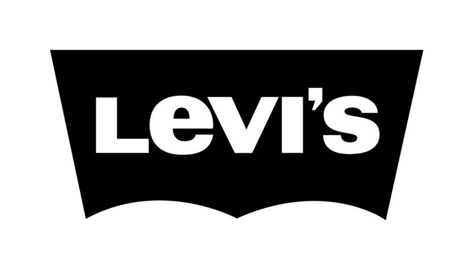
- Levi's combines their brand name with a jeans pocket shape.
- LEGO puts its four letters inside a red box.
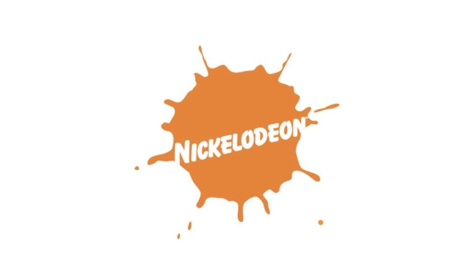
- Nickelodeon uses a splat shape with their brand name inside.
- Burger King's logo combines their brand name (shaped like a burger) with a burger bun shape.
- Doritos uses their brand name inside a triangle shape, similar to the shape of their chips.
Pros and cons of using fonts inside a shape
Using this technique can create a visually striking logo that stands out from other brands. It also allows you to emphasize your brand name and make it more memorable. Additionally, incorporating a shape can add depth and dimension to an otherwise plain text logo.
However, this style might not work well for all brands or industries. It also requires careful consideration and design skills to ensure that the font and shape complement each other instead of clashing.
When to use fonts inside a shape
The "font inside a shape" style is most common when selling consumer goods, particularly food and beverages. It doesn't translate well to service-oriented or B2B industries, where a more professional and straightforward logo is more appropriate.
Considerations before using a font inside a shape
Make sure the shape is relevant to your client's industry or brand. For instance, the Levi's logo's shape works well because it matches the stitching on the back pockets of their jeans, which is an identifier someone is wearing Levi's.
Negative space
Negative space is the area around and between design elements in a logo. Clever use of negative space can create an optical illusion or hidden imagery, adding depth and intrigue to a logo.
Most famous examples:
- FedEx's logo has an arrow hidden in the negative space between the "E" and "x," symbolizing speed and precision.
- The Milwaukee Brewers' logo has a baseball glove hidden in the negative space between the "M" and "B."
- Tostitos' logo features two people enjoying chips and salsa, created by the negative space between the letters "T" and "i."
Pros and cons of using negative space
Using negative space is like adding an Easter egg to your client's logo. Those who discover it have a "a-ha" moment and instantly see the brand more favorably for their wittiness and creativity. Of course, negative space also makes a logo more visually interesting and unique.
However, creating an effective negative space logo takes skill and creativity. It's not always easy or intuitive to use empty space in a meaningful way. Plus, if it's not done well, the hidden imagery will go unnoticed by almost everyone.
When to use negative space
Using negative space can add an element of surprise and intrigue to almost any logo. But it's best for small and medium-sized businesses directly related to a particular activity, object, or location.
For instance, a veterinary clinic called "MediPets" might use a logo with a hidden image of a dog in the negative space between the "M."
Considerations before using negative space
Your logo is a lettermark, wordmark, or combination mark first. So, the prerequisite for negative space is a simple, clean design with enough space between the elements to create an optical illusion. If your logo doesn't follow other best practices, the creativity of using negative space won't matter.
Trending SMB logo types for 2024
Besides the classics, SMBs and freelancers are experimenting with multiple different techniques to make their logos capture the essence of their brand.
Here's a look at some of the emerging trends that have caught our attention and are likely to gain popularity in upcoming years:
- Minimalistic text- or icon-only logos (particularly in SaaS)
- Combining 2D and 3D elements for a more dynamic look
- Using all-lowercase letters in logos to appear more personable (like our logo!)
- Use of gradients to add depth and dimension
- Bright and bold colors
- Hand-drawn elements for a more organic and personal touch
- Retro and vintage inspired designs
The do's and don'ts of SMB logo design
While trends can provide inspiration, creating a timeless logo that effectively represents your client's brand is the ultimate goal.
Here are some do's and don'ts to keep in mind when designing an SMB logo:
- Use analogous and complementary color schemes to your advantage.
Analogous colors create a relaxing and grounding feel, ideal for wellness and nature-centric brands. Complementary colors, on the other hand, offer high contrast, perfect for brands aiming for a bold and modern look.
- Take advantage of color psychology.
The colors you choose for the logo convey different messages and evoke various emotions. For instance, green signifies growth and freshness, ideal for food and environmental brands, while black suggests sophistication, making it a good choice for luxury brands (PhotoADKing).
- Pay attention to sizing and scalability. Ensure the logo remains legible and impactful across various applications, from tiny app icons to large banners.
- Incorporate specific shapes
(circle, square, triangle) into the logo design to convey your client brand’s values and message subtly. For example, circles symbolize unity and completeness, squares represent stability, and triangles signify creativity and direction.
- Use legible typography. Choose
web-safe fonts that ensure readability across all sizes and mediums.
- Use typography as a focal point.
The font's personality should align with your client’s brand, from elegant serifs for high-end brands to bold, sans-serif fonts for more modern businesses.
Choosing the right type of logo for your SMB clients
In reality, each client will need more than one logo to cover all their branding needs. Most companies have a primary logo and several variations for different purposes, such as social media profiles, website headers, business cards, etc.
Here are the three main types of logos you'll have to consider:
- Wordmark/lettermark
— For your client's main logo.
- Icon
— For their social media profiles, website headers, and app icons.
- Combination mark
— A combination of both wordmark/lettermark and icon for versatility and recognition. This may replace the wordmark/lettermark or icon in any context.
If your client has a specific symbol or emblem that embodies their brand, you can also create a brand mark logo for use in specific situations such as packaging or merchandise.
And if they mention their main goal is long-term brand recognition in a B2C vertical, you can pitch them a mascot logo (though you'll want to make sure they have the budget for continual use and understand the implications).
As for the actual design, that requires creativity and a clear idea of what your client represents.
Fiverr offers an excellent resource for choosing specific design types for any one client. Professional designers on the platform have created tens of thousands, and
they've published the most successful ones for inspiration.
Popular online logo makers
Designing a logo from scratch is challenging and time-consuming. Fortunately, there are dozens affordable
agency tools that offer pre-made templates and advanced logo-designing capabilities. There are also logo makers with AI technology that provide customized designs based on your client's preferences and industry.
Some popular options include:
- Canva is lauded for its hands-on logo designer and reasonable pricing. It's ideal for beginners and comes with a vast array of templates and a fairly intuitive design process.
- The
Tailor Brands AI Logo Maker automatically generates logo templates based on detailed user preferences. It's elements are fully customizable and it caters to a wide variety of industries.
- Brandmark is another AI-powered logo creator. It's reasonably priced (starting at $65 per design package for a client). And it comes backed with full copyright ownership.
- Looka starts with a survey of logo styles to tailor suggestions closely to your preferences. Its free version includes logo designs, but its paid Brand Kit includes everything you need to use the logo on all of your branded platforms: social media, business cards, website branding, and more.
- Adobe
Express and
Illustrator help you design high-quality logos with more customization. Express helps you create logos quickly, while Illustrator offers professional-level tools for precise and detailed designs.
Final thoughts
When working with SMB clients, it's crucial to understand the unique challenges and opportunities they face. Small and medium-sized businesses generally operate with tight budgets and limited resources, making it essential for you to deliver high-value, cost-effective solutions that can drive meaningful results.
Building a strong brand identity begins with a compelling logo, but it doesn't end there. To offer a comprehensive digital branding package, you need to use a powerful
website builder for agencies (like Duda), that enables you to deliver on all fronts.