When building a client's website, choosing the right font is a crucial part of creating a visually appealing and user-friendly experience. While the possibilities for fonts on the web are seemingly endless, it's important to remember that not all fonts are created equal.
This blog post aims to provide a comprehensive understanding of web safe fonts, equipping your agency with the knowledge to make informed decisions about which fonts to use when building websites for your clients.
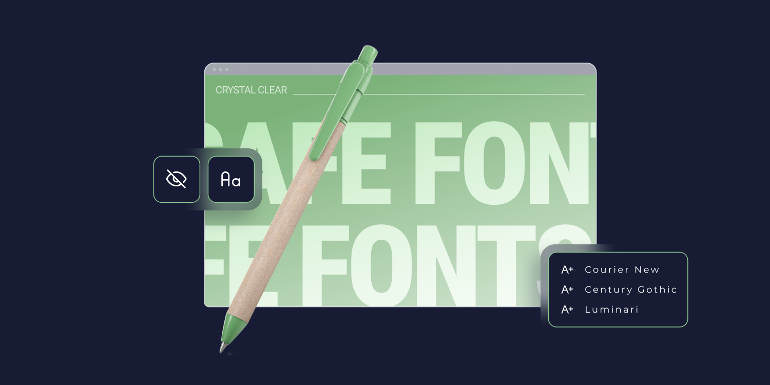
WHAT ARE WEB SAFE FONTS, EXACTLY?
Web safe fonts are typefaces that are universally available across different devices, operating systems, and browsers. Since the vast majority of devices already have them installed, website owners can reasonably expect them to appear the same on all devices.
Put simply, these fonts don't require any downloading or external resources—they're already installed and ready to go.
The main advantage of using web safe fonts for your clients is that they minimize the risk of design inconsistencies, ensuring that your website's text looks as intended for every user, no matter what device they're using.
What are the Different Font Families?
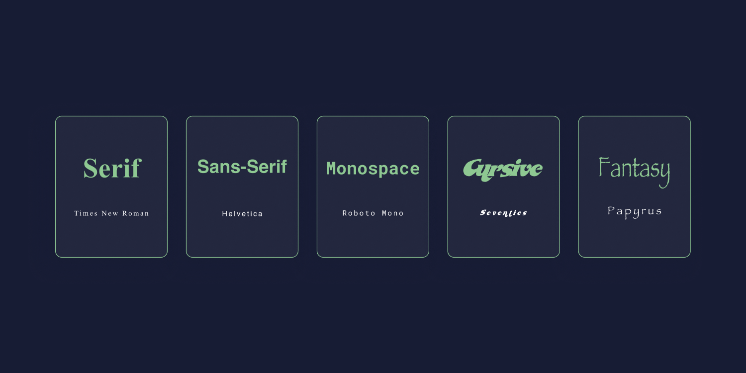
In CSS (and general typography), there are five different font families:
- Serif — Serif fonts include fonts like Times New Roman and Georgia. They are distinguished by the small lines at the ends of their characters, known as "serifs."
- Sans-Serif — Sans serif translates to "without serif"—the fonts in this family don't include any of those small lines at the ends of their characters. Popular sans-serif fonts include Arial and Helvetica.
- Monospace — Monospace (or fixed-width) fonts are all equally spaced, meaning that each character has an equal width. Courier is a popular monospace font example. Roboto Mono and Source Code Pro are other popular monospace fonts.
- Cursive — Cursive fonts imitate cursive handwriting (at least somewhat). They are often used for logos, web design features, and other branding elements.
- Fantasy — Fantasy fonts are artsy in nature, making them ideal for creating a unique brand image. Papyrus is a well-known fantasy font.
Aside from being more difficult to read, monospace, cursive, and fantasy typefaces can also be difficult to render on certain devices. For this reason, web safe fonts primarily consist of serif and sans-serif typefaces.
Aren't Web Safe Fonts a Thing of the Past?
As of 2023, Google Chrome holds a
65.74% market share, making it the leading web browser by a huge margin. Since most people use Chrome on mobile devices and desktop, some website builders have pronounced web safe fonts "dead."
This couldn't be further from the truth. There are several critical reasons to consider web-safe fonts in your web designs.
Operating System Support and Compatibility -
While Chrome is the most popular browser, users access the web through various devices and operating systems. Fonts are often tied to the operating system rather than the browser, and not every OS supports the same fonts. Designing a website with a font that's only supported by the latest version of Windows 10, for example, will likely lead to inconsistencies for users on other platforms or older versions.
Faster load times and improved user experience - Using custom local fonts or fonts hosted by third-party providers can slow down your website's loading times.
When you choose the right
fonts for your website, you practically eliminate the need for additional font downloads, which speeds up your site.
Nearly
70% of consumers consider page speed when deciding whether to make a purchase. So your decision to implement web safe fonts for your clients also means you'll help them sell more.
Web Accessibility vs. Browser Accessibility -
Web accessibility is critical for your clients' site visitors with disabilities, such as vision impairment or cognitive disorders.
When choosing a font, you need to consider factors like readability, contrast, and the ability to scale for various screen sizes and resolutions.
Web safe fonts don't necessarily guarantee web accessibility, but they are accessible to all browsers.
What Font Size Should You Use on a Web Page?
For responsive websites, it's best to use a font size between 16px and 20px. However, the exact size you use will vary depending on a few factors.
A few rules to live by when sizing fonts for your clients' websites:
- Body fonts should be around 16px. When choosing your default font size (i.e., the one the majority of your paragraphs, lists, and other content will use), 16px is a good starting point. Consider a smaller size for an interaction-heavy page or a font that is naturally larger. Use a bigger font if your client's page is text-heavy.
- Text inputs are at least 16px.
If you're designing a mobile web app, iOS browsers will zoom in on the left side of text inputs that are smaller than 16px. This is an easy way to ruin a great user
- Secondary text should be two sizes smaller than body text. Photo captions, pull quotes, and footnotes should be two sizes smaller than the body font.
- Headings should increase in size with each level of the hierarchy.
Your H1s should be at least 24px and then increment by 8 or 10 for each successive heading.
- Always use fallback fonts. When selecting a font, make sure to include at least one fallback font that is the same size and family as the primary font you’re using. This way, visitors will still experience the intended design even if their device or browser does not support your chosen web safe font.
Most importantly:
Always look at your fonts on a real device. Different browsers and operating systems will render certain fonts differently (especially
mobile fonts), and whether or not this will happen is unpredictable.
If you don't test your website before deployment, you seriously run the risk of fonts becoming illegible or incompatible on certain devices, even if they look fine in your website builder.
Duda allows you to
upload an unlimited number of fonts to use on your clients' sites. The font upload process is easy and quick, and once a font has been added, it’s accessible in every text element on the site, as well as in the Global fonts.
35+ Best Web Safe Fonts for Your Clients' Websites
By now, you're probably at the edge of your seat wondering, "which fonts can I actually use?"
This tried and true list of web-safe fonts will look great on all browsers and devices:
1. Arial
Arial is the standard sans-serif font. It's a popular font to use in web design, and it's available on all major operating systems.
This font is the default font on Google Docs and PowerPoint, so it's also familiar and easy for your clients to work with.
2. Arial Black
The main difference between Arial and Arial Black is that Arial Black is bolder. Where Arial's "Bold" font weight is slightly heavier than regular, Arial Black adds more impact and attention to headings, headlines, and ad copy.
3. Baskerville
Baskerville is a traditional serif font with an old-world charm. It has thin, fine lines and delicate curves that give it a softer feel than other typefaces.
This font will look best on devices with high-resolution displays, as its thin lines may blur on low-resolution screens.
4. Bodoni MT
Bodoni MT is a classic font that dates back to the late 1700s. It combines traditional serif letterforms with modern strokes, making it look contemporary and elegant.
This font will work best in larger sizes for titles, subtitles, or logos. It can be used for body text, but readability may be an issue at small sizes because of its thin lettering.
5. Tahoma
Tahoma is one of Microsoft's new sans-serif typefaces. It's a great choice for anyone who wants to use a font that looks modern and professional without being too jarring or outré.
Tahoma also has an extensive character set, so it can be used in multiple languages.
6. Georgia
Georgia is a clean, legible typeface that looks great at any size—particularly in body text. It is characterized by its large lowercase letters, which make it readable in smaller font sizes.
Georgia is perfect for anyone looking to create a traditional, timeless feel without straying too far from modern web design trends.
7. Calibri
Calibri is Microsoft's default typeface and comes pre-installed on all Windows computers. It's a humanist sans-serif font that looks modern and professional without appearing too sterile or cold.
It has an extensive character set, so it can be used in multiple languages, making it ideal for clients that cater to an international audience.
8. Cambria
Cambria is a transitional serif typeface designed for on-screen readability, making it one of the best serif fonts for body text.
Often compared to Times New Roman, Cambria has larger letterforms and a wider range of weights than its predecessor.
It also looks great in headlines and titles, as it provides more contrast than traditional serif fonts.
9. Century Gothic
Century Gothic is a classic sans-serif font with a modern twist. Its wide letterforms are aggressive and eye-catching, making it an excellent choice for headlines, titles, and advertisements.
When designing headlines and landing page copy for your clients, your body text should be in a more neutral font, such as Arial or Georgia.
10. Courier New
Courier New is a slab serif font. Originally developed for IBM's typewriters, it is well-suited for tabular work, technical documentation, reports, and other writing that looks best in a typewriter font.
11. Lucida
Lucida's even lettering makes it useful in directories, newsletters, and other documents where a consistent letter size is essential.
The Lucida font stack also has characters big enough for impactful headings and emphases (e.g., Bright Demibold and Demibold Italic), making it one of the most versatile fonts for web design projects.
12. Luminari
You probably won't use Luminari’s font style for traditional web design projects. This display font is reminiscent of High Middle Ages (i.e., medieval) letterforms with an artistic flair that makes it great for logo design, posters, and other creative projects.
13. Monaco
Monaco is a monospace font typically used for coding and web development. It features monospaced letterforms, meaning all characters have the same width and are aligned vertically.
Monaco's uniformity makes it easier to spot typos while coding or debugging, making it a great choice for anyone working with HTML, CSS, JavaScript, or other programming languages.
Its slightly slanted "a" and "g" add a counterbalance to its rigid letterforms, making it one of the best for readability.
Although you wouldn't use it for a blog or advertisement, Monaco can be used for subtle design elements if you have clients in the software development industry.
14. Gill Sans MT
Gill Sans MT is a humanist font best suited for advertising, bookwork, labels, and packaging. It looks best in large sizes and has wider letterforms than most sans-serif fonts.
Since it isn't as professional-looking as Helvetica, it's an excellent font choice for clients in the creative or entertainment industry.
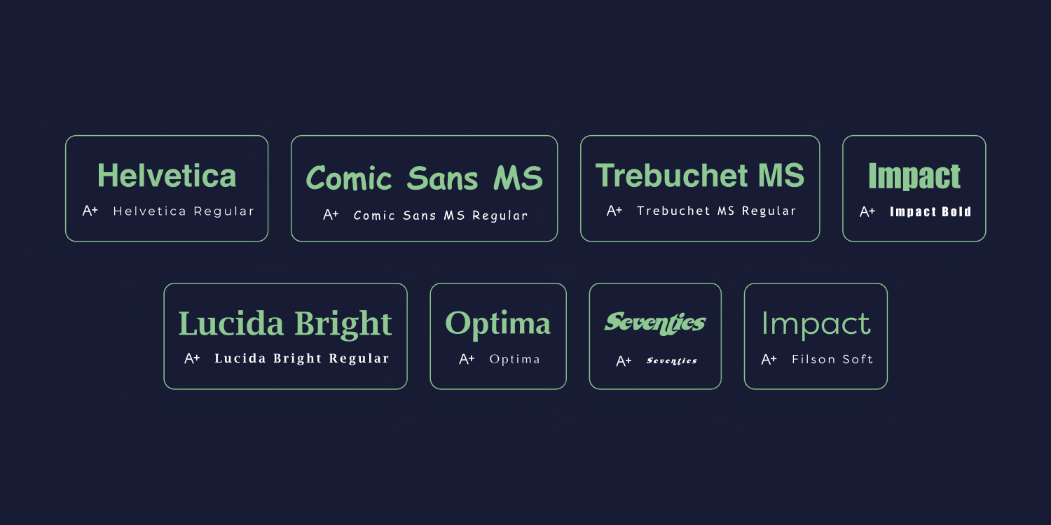
15. Helvetica
Popularized by 1960s Swiss advocates, Helvetica is a classic typeface used in many logos and digital designs. Helvetica used to be the default font on Apple devices before they ditched it for SF Pro in 2015.
16. Comic Sans MS
The
infamous font of the 90s, Comic Sans MS has earned a reputation for being difficult to take seriously.
Ideally, you wouldn't use Comic Sans for any professional purpose, but it does have its place in web design.
Clients looking to create a tongue-in-cheek vibe could benefit from using this font sparingly and playfully, such as in advertisements or humorous copywriting.
17. Trebuchet MS
Trebuchet MS is similar to Gill Sans MS in its font style and use cases. It has a friendlier vibe, making it great for headlines and titles.
A few of its letters have a subtle elegance to them that many others don't. The lowercase "g," for example, has a beautiful swoop at the bottom that can add life to any project if used sparingly.
18. Bradley Hand ITC
Bradley Hand ITC is a unique, informal script face font with a whimsical feel. It's sometimes good for creating logos and playing around with typefaces, but isn't the best choice for body text or lengthy passages due to its thin dashes and letterforms.
19. Palatino
This old-style serif font is the quintessential classic. Originally, it was designed for advertisements and large headings, but its classic, elegant letterforms make it usable for long passages.
Its balanced weighting makes it easy to read and looks elegant even when scaled down for web design projects.
20. Consolas
Like Monaco, Consolas is primarily used in coding environments. It has a sophisticated, geometric letterform that is perfect for identifying errors and typos in code quickly.
The bold version of the font can be used sparingly to add emphasis to certain portions of the coding, but it should generally stick to its original purpose as a single-purpose typeface made for programming.
21. DejaVu Sans
The DejaVu fonts were meant to provide a larger breadth of characters than other sans serif fonts. This font family was created through collaborative development—the goal was to provide a full range of accents and symbols for web pages in different languages.
DejaVu Sans is great for international websites, where you want to make sure that all characters appear correctly no matter the language.
22. Didot
Didot is widely used in fashion, magazine, and luxury branding. It's characterized by its sharp serifs and thin letterforms, which give it a sleek, modern aesthetic.
This font looks great in large sizes and when used for headlines or titles—it wouldn't be the best choice for body text, due to its thinness.
23. Garamond
Garamond is a body text font with a long history (dating back to the 1600s). It's often used in books and novels, as its small letterforms allow for more words to be packed onto the page without sacrificing readability.
Garamond is also one of the most common fonts used on the web due to its timelessness, versatility, and legibility in both large and small font sizes.
24. Goudy Old Style
Goudy Old Style is widely recognized as one of the most readable fonts ever created. Its diamond-shaped dots and heavy serifs give it a timeless quality that has made it a favorite for decades.
It's great for body text, titles, and headlines—it can easily be used to create web pages, print media, and packaging with a classic aesthetic.
25. Impact
Impact is naturally big and bold—its eye-catching letterforms make it great for titles and headlines. It's sometimes used in web design to draw the eye, but should be used sparingly, as its heavy weight can be jarring and unprofessional if used in the wrong circumstances.
This font looks great on book covers and certain kinds of ads. But it won't make sense for your clients if they aren't running a business in the entertainment or music industries (or selling a book that requires a bold, attention-grabbing font).
26. Lucidia Bright
Lucidia Bright is the serif version of Lucida Sans and is perfect for text-heavy web pages where you want to give the content a more formal look. Its strong presence adds to the professionalism and trustworthiness of your clients' websites, making it great for corporate projects or those aimed at older audiences.
27. Optima
Optima is a versatile font that can be used in multiple different contexts. Its slightly condensed letterforms allow it to take up less space, making it great for body text or titles on websites with minimalistic design elements. Optima looks great when used on banners, labels, and packaging, thanks to its balanced proportions and slightly flourished details.
28. Rockwell
Rockwell is mono weighted, meaning its font weight remains consistent throughout its design. Its main purpose is visibility at smaller sizes, but it also has a unique aesthetic that makes it stand out on the page.
29. Times New Roman
Times New Roman once ruled the world of printed media, but today it has been traded out for more modern typefaces. It's a legible font, but most agree that its outdated feel makes it an unsuitable choice for most branding design projects.
Another issue with Times New Roman compared to other fonts is its visibility. Since it is so readable, it doesn’t draw much attention to itself. Like Helvetica, it leaves a wall of text that would be more impactful with a different font face.
30. Segoe UI
Segoe UI is specifically designed for user interface text on Windows. It is not the same as the Segoe branding font, which is used by Microsoft and its partners for print and advertising.
Compared to other fonts like Tahoma, Microsoft Sans Serif, and Arial, Segoe UI is more readable and has a friendly appearance.
31. Museo Slab
Museo Slab is a slab serif font that is commonly used in branding design. It is thick enough to be impactful, yet still looks professional and readable.
It can be used for headlines, titles, and body text in both print media and digital design projects.
32. ITC Clearface
ITC Clearface works well for headings and landing page elements that need elegant undertones. Floral design patterns, pastel-colored brand packages, and typography projects are all great uses for ITC Clearface.
33. Bourbon
Bourbon is a slab serif font that has inspired many recent typefaces. It's an all-caps typeface, so while it looks great in titles and headlines, it won't work at all for body text.
It looks best when used as part of a larger design package—think logos, magazines, posters, packaging, and anything else a label or brand could appear on.
This font is only useful if you are going for a specific look (that is, an old, Prohibition-style branding package).
34. News Gothic BT
News Gothic is a similar font to Trebuchet MS, but with a more condensed structure. This makes it a solid choice for subtext and captions, as well as for titles and headlines.
It looks great in black-and-white photos or minimalist design projects. Thanks to its condensed structure, it can also be used in cases where a larger font would take up too much space.
35. Filson Soft
Filson Soft is a font family that consists of sixteen styles and was created by Mostardesign. It is a rounded version of the renowned Filson Pro. Filson Soft has a unique and elegant appearance due to its distinct letters 'K', 'Q', and 'R'.
36. Seventies
When you think of the 1970s, you probably imagine the thick, circular letterforms of the Seventies font. This distinctive font looks great in titles and headings, especially when used in combination with a bold color palette or vibrant patterns.
It's an appropriate choice for any project that wants to evoke a retro vibe, such as vintage clothing stores, concert posters, and logo designs.
37. Verdana
Verdana was designed to be legible even when displayed at small sizes (like 8px). It's slightly wider than Arial, with more generous spacing between letters, making it easier to read on the web.
It's also great for iOS and Android design, thanks to its slightly larger size and lighter weight. It looks good in body text, titles, and headlines—just make sure that you don't use too many different font sizes, as it can look a bit overwhelming when used excessively.
Final Thoughts
The 37 web safe fonts mentioned above are all fantastic options that can drive impact for your clients’ design projects. Whether you are looking for a unique font family, something with more traditional elements, or an old-school feel—there's a web safe font here to suit any project.
The most important thing about these fonts is that the font files are already installed on users’ devices, meaning no time or money is needed to be spent on extra web font downloads.
As an added bonus, this also helps make your website faster and more secure.