When your
agency gets hired to build new websites or revamp existing websites for businesses, one of the most important first steps is to choose a great logo design. The tricky balance to achieve with logos is designing something unique and brandable while not veering too heavily away from the latest logo trends.
Try a simple exercise—list the name of all the companies you can think of, from multinational tech businesses to successful local cafes. There’s a high probability that you can quickly recall in your mind exactly what the logo of each of these businesses looks like. And therein lies the power of a logo in establishing and signifying a company’s identity.
With logo design being such an important way for businesses to stand out in today’s competitive online world, and trends changing over time, it’s important not to choose something outdated or unattractive. This article guides you through the top logo trends to watch out for so your agency can create more effective, recognizable, and stylish logos for any business.
Listing the Top Logo Trends
Before getting into the nitty-gritty and presenting the top logo trends to watch out for, here are a few statistics that reinforce the importance of logo design:
Logos are far and away the most recognizable brand identifiers with
75 percent of consumers recognizing brands just from their logo.- CXL revealed the results of intriguing research on eye movements as people scanned web pages; the logo section attracted the most attention at an average of
6.48 seconds spent scanning this area.
- 60 percent of people admit actively avoiding businesses if they have unattractive or weird logos even if those businesses have great reviews.
When engaging with any new client, ask them some
essential questions that can gauge the direction you should go in with their logo. To help your clients forge a memorable identity, make a great impression, and stand out from the competition, here are some top logo trends to consider during the design, redesign, (or rebranding) of their websites.
Please note:
Though some of the logos presented here are not new (to say the least), they do represent current trends, and some would claim they were innovative enough to have predicted these trends.
Simple and Minimalistic
In a world of cluttered attention spans hampered by information overload, there’s a huge trend towards minimalism in both online and offline activities. When it comes to logo trends, the idea behind minimalism is to send a clear message or resonate visually without overwhelming people. Many well-known businesses achieve a simple and minimalistic look to their logos, such as Udemy, Apple, and Nike.
Geometry
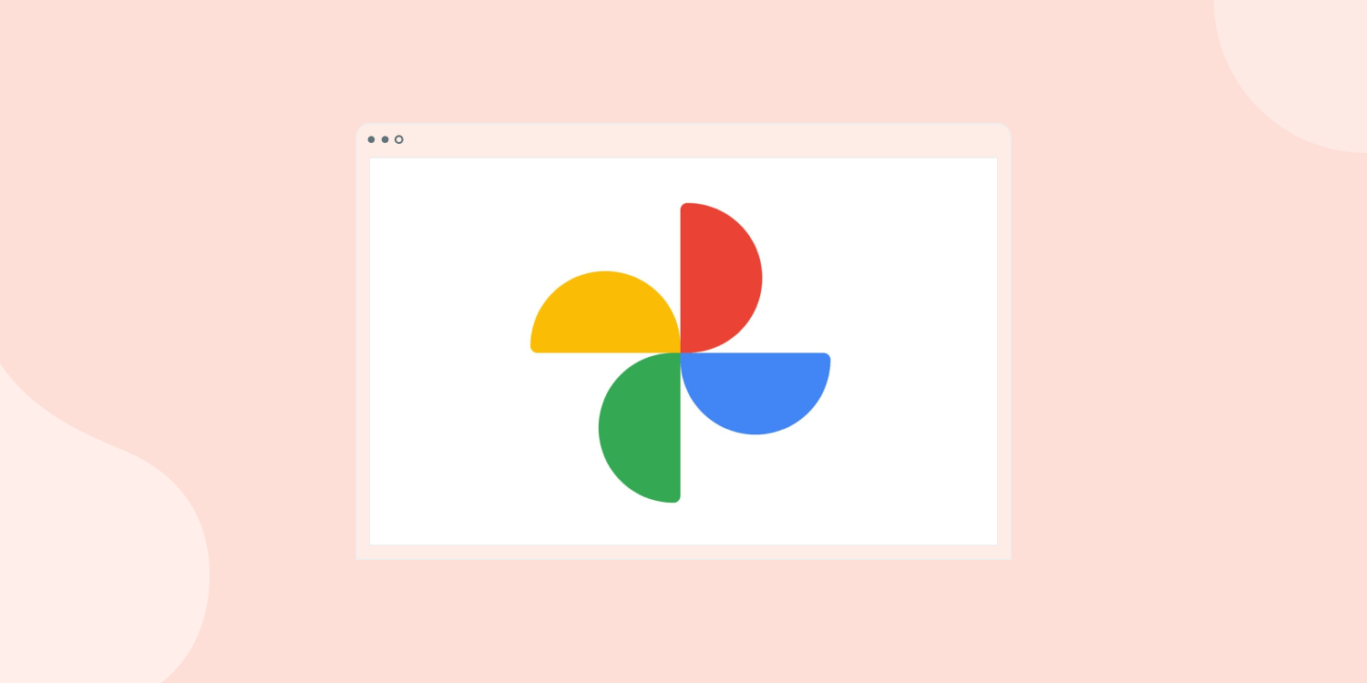
If the word
geometry brings up harrowing reminders of middle school math, fret not. From a logo design perspective, we’re referring here to the use of shapes like triangles, circles, semi-circles, and squares in logo designs. An example of this logo you’re likely to recognize is the Google Photos logo from above, which makes clever use of semi-circles. Another good example is the logo for automotive company Kia, which wraps the company’s name in an ellipse. Using shapes can create a powerful brand identity especially when either paired with distinctive, vibrant color palettes or complementary text.
Negative Spacing
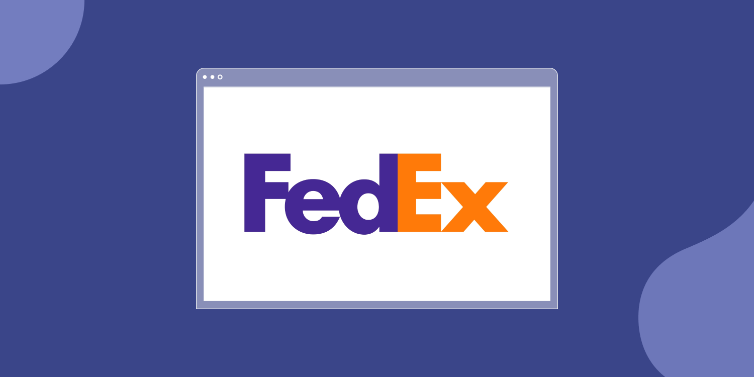
Like blazers, black heels, or jeans, the use of negative spacing is one of those perennial trends that doesn’t seem to go out of fashion. Negative spacing leverages the empty background space between or around letters, shapes, and symbols in logos for a distinctive look. The background color doesn’t necessarily have to be white, which can allow for some really creative logo designs and color combinations. A compelling example is the FedEx logo, which brilliantly uses negative space to weave an arrow into the design and cements the company’s identity as a transport company.
Experimental
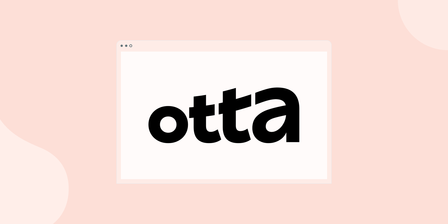
While it’s useful to stick with general logo trends, there is room for experimentation especially when it comes to fonts in logo designs. This room for experimentation does not extend to the fonts you choose for website body text because experimental texts can be difficult to read over multiple paragraphs (see the
10 best fonts for websites here). In getting experimental, you can opt for uneven spacing, vary the heights of characters, or otherwise go against the grain of traditional typography rules. A good example is the above logo used by technology job recruitment company Otta, which varies the height, angle, and sizes of letters for an experimental yet cohesive, eye-pleasing design.
Gradients
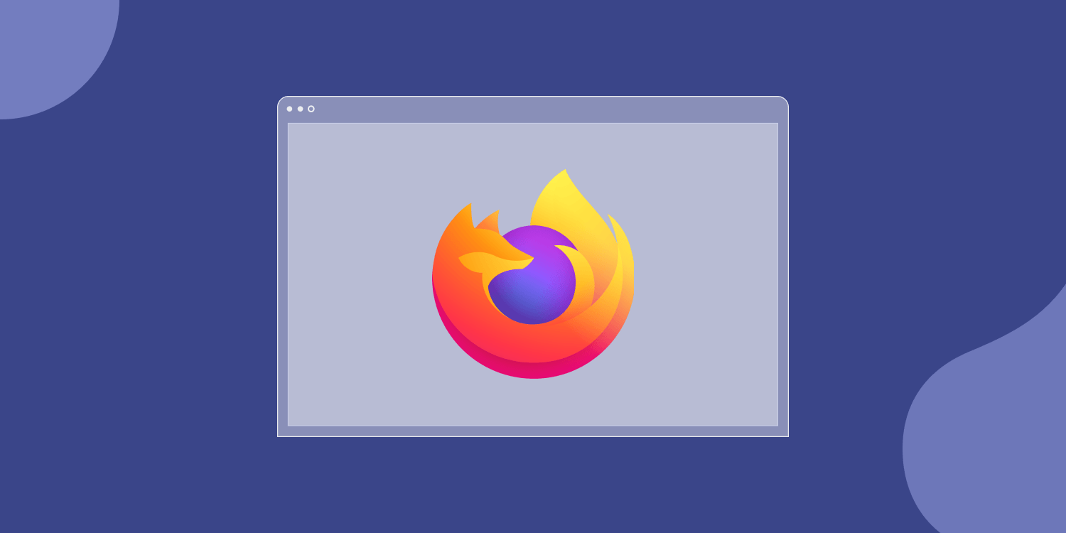
Gradient logo designs blend together two colors or two hues of the same color in a gradual transition. These multi-tone designs have made a big comeback in the world of web design having been somewhat unfashionable in the early 2010s. A well-known example is the design for web browser Mozilla Firefox, which appears to pop from the page thanks to its use of gradients. Purple, pink, blue, and orange are colors that seem to work particularly well for gradient designs.
3D Logos
This trend is not new, but it is still around. 3D logos make use of shapes, such as prisms, cones, cubes, and cylinders to add an extra dimension to company logos. For an enhanced 3D effect, you can try to combine the gradient trend with 3D shapes for something that pops out from the page and has that modern edge provided by gradient designs. Back to Mozilla Firefox, it’s a great example for 3D as well.
Animation
Animated logos go one step further than 3D; instead of creating an extra dimension, these logos add movement to the design. There’s no doubt that animated logos are sure to grab the attention of website visitors and they do a great job at communicating what a company is about. Bearing in mind that animated logo files will usually be quite large PNG-formatted images, make sure you nail down the essentials of site speed and
Core Web Vitals.
Overlapping
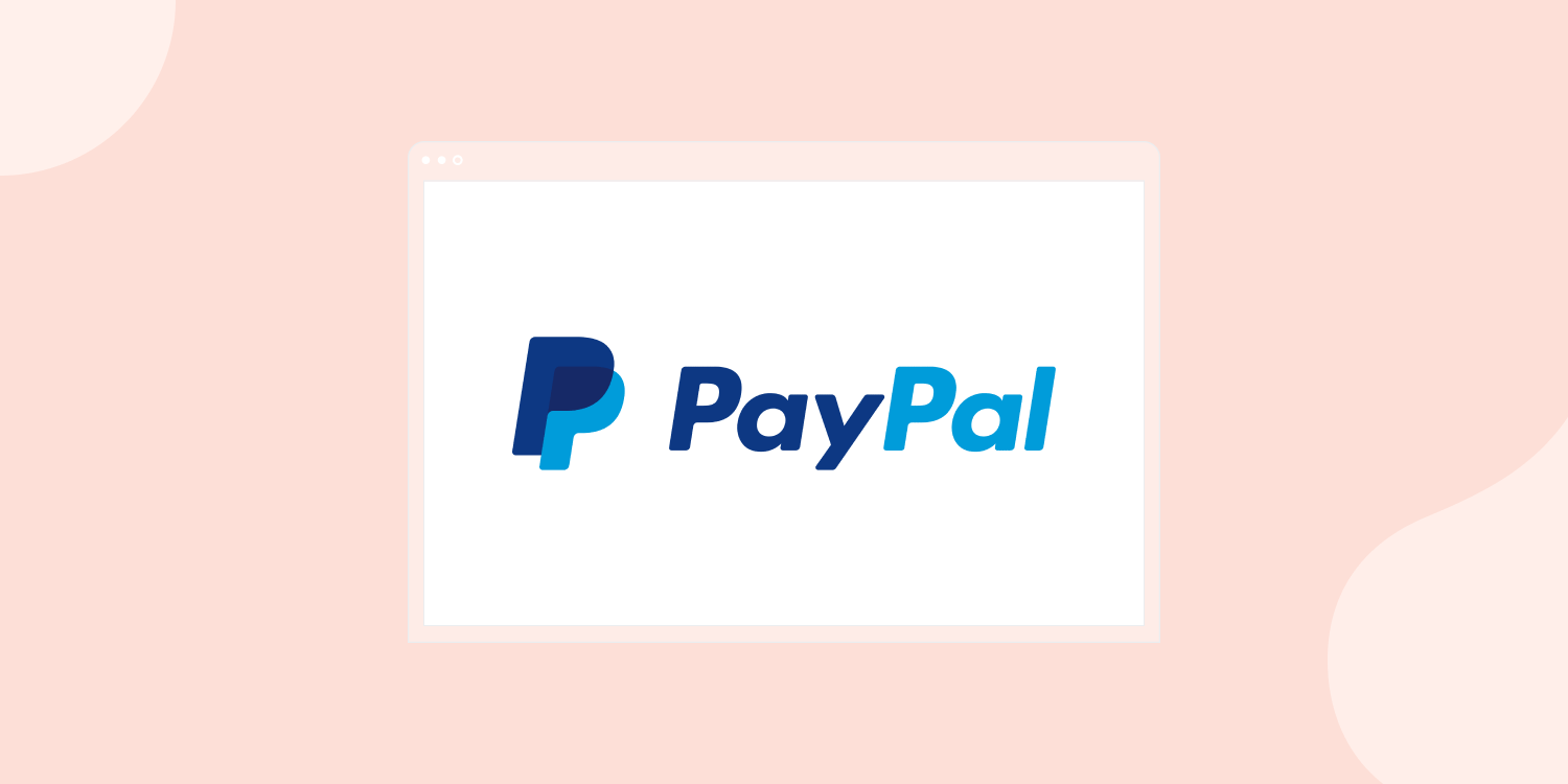
Overlapping is one of the best logo trends for adding visual depth to simple designs. As the name suggests, these logos use overlapping elements to bring a creative edge and extra volume to website logos. The most famous example is PayPal’s logo, which overlaps two P’s in different shades of blue for an iconic yet simple logo.
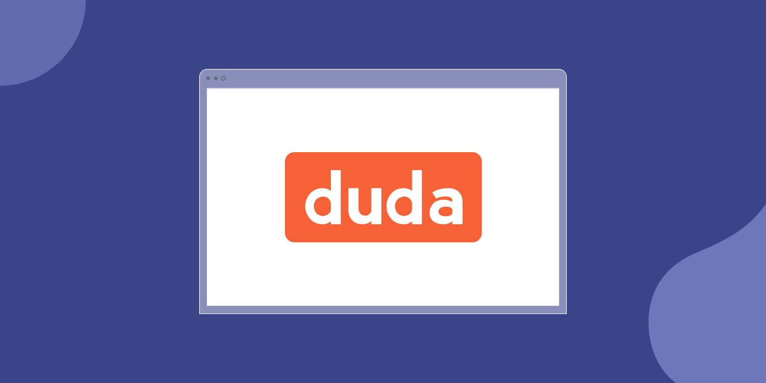
Lowercase Lettering
Lowercase lettering is our personal favorite here at
Duda. This logo trend can work really well because it bucks the trend of conventional grammar, which makes it automatically attention-grabbing. You need to add extra weight to each letter in lowercase font because the characters have less presence about them. Aside from Duda, some notable businesses using lowercase logo lettering to great effect include Adidas and Facebook.
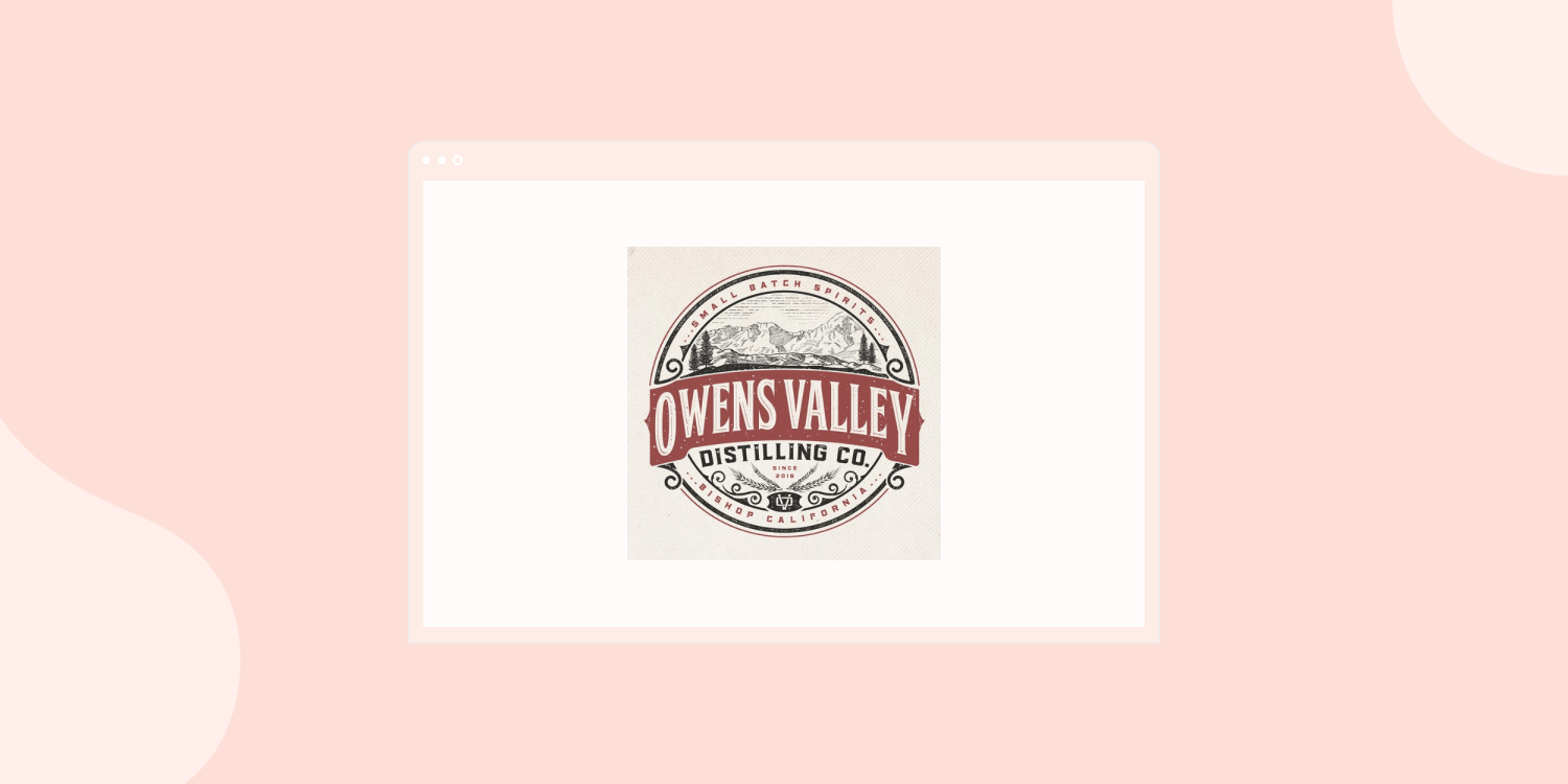
Hand-drawn
Hand-drawn logos add a wonderful personal touch to logos that can work particularly well for small consumer-focused businesses such as artisan bakeries, art studios, and micro beer breweries. The beauty of these logos comes from their structural fluidity and even slight imperfections, which sounds counterintuitive to normal logo trends but it makes sense when you want to really emanate values of creativity and personal attention to detail.
Black and White
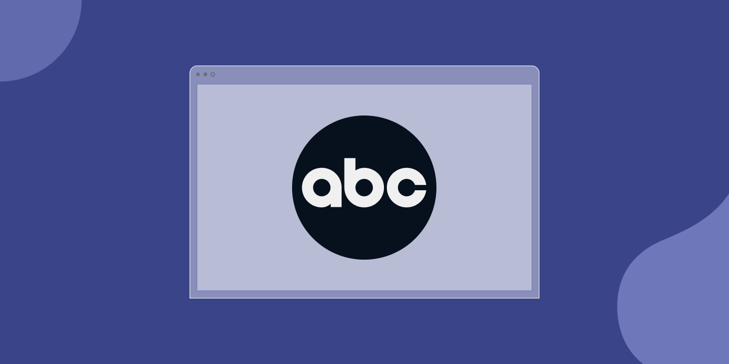
Black and white is one of those design trends that seems to possess a degree of timelessness, although its popularity waxes and wanes somewhat. For now, logos centered around these classic colors are very much in vogue for businesses wanting to convey confidence in what they do. A great example is the logo of the American television network ABC, which actually combines geometry, lowercase, and black and white effects in one logo.
Sans Serif
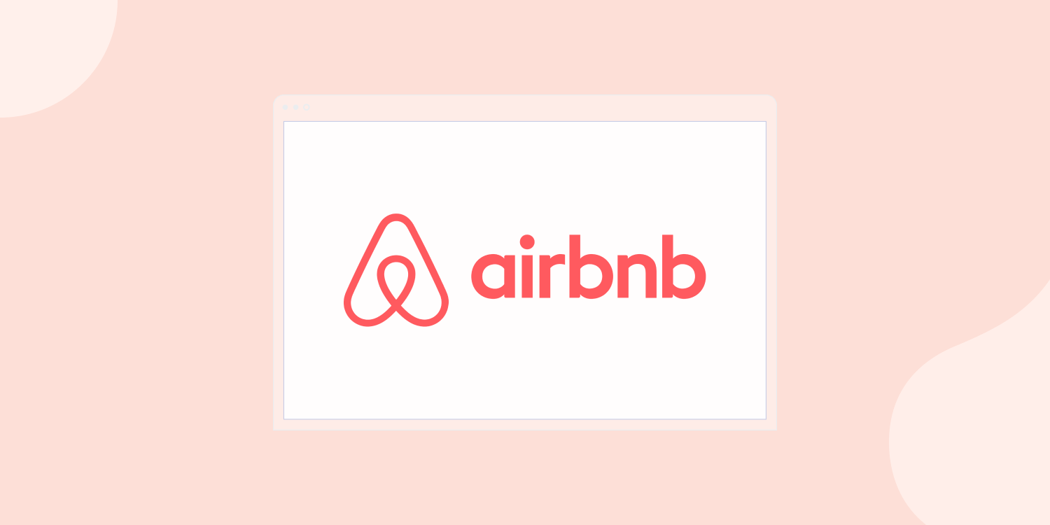
A sans serif logo is one that focuses visual attention on the fact that it uses sans serif fonts, which are minimalistic font styles that don’t have any decorative strokes extending from characters. An example is Airbnb's logo which interestingly uses a custom-created sans serif font known as Cereal.
Closing Thoughts
That rounds up our list of top logo trends to watch out for when designing or redesigning websites for clients. Consider blending some of these trends together if you want to create something really memorable that helps your clients really stand out in their industry or market.
Related Posts
By Ilana Brudo
•
June 16, 2026
Maximize agency ROI in 2026: Automate onboarding, billing, SEO, and reporting to empower your team to focus on strategy and growth.
By Shawn Davis
•
June 11, 2026
AI is transforming search into direct, on-device answers. Learn why AEO is essential for your clients’ local visibility.
By Mike Paciello
•
May 19, 2026
The web had its worst accessibility year in six. On GAAD's 15th anniversary, learn why the 2026 regression is a process problem and how Duda and AudioEye help agencies fix it.
Show More