Every business needs a website. It's how you connect with customers, showcase your products and services, provide valuable information, and establish credibility. 71% of small businesses have websites and just about every large company has one.
But for most business owners, one website is too much to handle. If it weren't for digital agencies, many businesses would struggle to create and maintain a website.
But digital agency owners and marketers face their unique challenges—instead of just one website, they build and manage many. And that means chaos for your team, difficult clients, and a lot of manual work if you aren't sure exactly what to look for.
Fortunately, you don’t need an entire redesign every time your client’s site isn’t ranking or converting the way it should. Most website improvements can be implemented quickly and easily, and there doesn't need to be any guesswork involved.
Here are 18 tips for improving the websites you build for your clients.
1. Make sure your page speed is fast. Lightning fast.
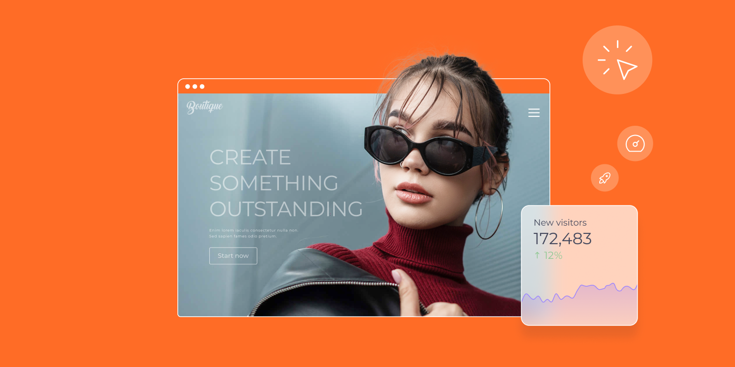
Out of Google's 200 SEO ranking factors, page speed has always been one of the most critical. Your website should take no more than three seconds to load, and even that is pushing it. Any longer than three seconds and around 40% of your users are gone.
Beyond search engine rankings and bounce rate, page speed has a profound impact on conversion rates. Since most site visitors expect a fast website experience, they will be less likely to buy, sign up, contact you, or complete any other important action on your client’s website.
To check your client's website speed, all you have to do is head to the Google PageSpeed Insights tool. It's free and accessible to everyone, so you can monitor all of your clients at any time.
Then, Google will diagnose performance issues and give you suggestions for how to improve your page speed.
If you want your client's website to load faster, there are several actions you can take to do so:
- Choose a top-performing website builder.
When selecting a website building platform, it's important to prioritize performance in Google's Core Web Vitals and site speed, as well as quality hosting. Duda stands out as the leading option for Core Web Vital scores, boasting impressive results. Moreover, Duda offers hosting on Amazon Web Services (AWS), which ensures exceptional availability, speed, and security for all websites hosted on the platform.
- Minify code.
Code with unnecessary characters can significantly slow down your website. With modification, you can reduce the size of HTML, JavaScript, and CSS files on your site by removing all the extra characters that are not needed. If you use a no-code website builder, you will be able to minify code automatically.
- Compress images.
When you upload images to your website, they usually come with a large file size. To reduce their size, you can compress them first in an image editor before uploading them to the website. This way, they won't slow down your page loading time.
- Use a content delivery network (CDN).
A CDN is a distributed network of servers hosted across the world that serve content to users based on their location. Think of it as a "global middleman" that helps speed up the delivery of content to website visitors. Especially if your clients have global website visitors (which many do), a CDN can be beneficial in reducing loading times.
- Remove unnecessary plugins.
Plugins can be helpful and offer additional features, but it's important to only use plugins you need. Too many plugins can slow down your website by creating additional HTTP requests and loading resources that aren't needed.
- Avoid clunky UI elements.
Rare fonts, overly-animated pop-ups, and outdated designs make for a frustrating user experience. Keeping the design simple and easy to use will help make it easier for visitors to find what they are looking for on the website.
- Using an effective caching system. Caching is a way of storing pages from your website locally so that when new users visit, they can access the cached version instead. This can significantly reduce the time your clients' websites take to load for visitors.
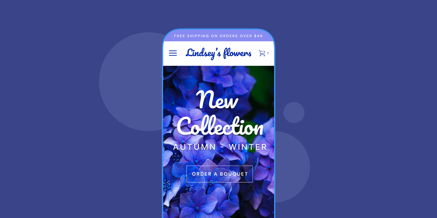
2. Make your client’s site mobile-friendly.
Google's mobile-first indexing is a process designed to help websites boost their visibility on mobile devices. Since the majority of website users are from mobile devices, Google's algorithm has tailored itself to rank mobile-friendly websites higher.
Mobile-friendliness means a few things:
- Your client’s web design should be responsive so it looks good on all devices, from phones to tablets to desktops.
- Your client’s website should be fast and easy to use for mobile users.
- The content on your client’s site’s pages should be easily accessible and readable by mobile users.
You can check whether or not your client's website passes Google's Mobile-Friendly Test. If it doesn't, you can use the tool to find out what elements are causing the problem and how to fix them.
Here are a few things you can do to make your client's mobile site more user-friendly:
- Use larger fonts and buttons to make it easier for mobile users to click and read.
- Keep the navigation simple so visitors can quickly find what they're looking for.
- Use a mobile-friendly theme that looks good on all devices.
- Use a mobile website builder to create a mobile responsive site effortlessly.
- Avoid popup ads, which are especially disruptive for mobile users.
Before launching a site for one of your clients, you should test it rigorously on different devices and browsers to ensure the user experience is consistent across all platforms.
3. Prioritize website security.
Having a secure website is essential to protecting your clients' data and ensuring visitors trust the website. Without proper security measures in place, your websites can be vulnerable to malicious attacks like malware and phishing scams.
SSL certificates are one of the easiest ways to increase security on your clients' websites, and they're now a requirement. These certificates are small data files that encrypt the data sent between a website and its visitors.
Beyond SSL encryption, there are a few other steps you can take to protect your clients' websites:
- Add HTTPS to your SSL certificate.
- Choose a secure hosting provider that offers site backups and malware scanning.
- Keep your software and plugins updated.
- Install a web application firewall to block malicious traffic.
- Run regular security scans on your website.
- Use two- or multi-factor authentication for all users.
- Manually accept on-site comments to reduce spam.
Most importantly, you'll want to use a CMS that is secure and regularly updated. Duda is a managed service, not an open-source one. For every site built using our platform, we take care of all security updates and privacy measures, ensuring your clients' websites remain secure.
We also take extra security measures, including:
- Out-of-the-box SSL and data encryption
- Malware and anti-virus protection and scanning
- Regular security audits and tests
- Path management (i.e., no direct access to important files with malicious intent)
- High availability via robust failover and redundancy mechanisms
- Backup and restore functionality
- Access control for user accounts
Click here for an in-depth look at all of our security measures.
4. Simplify your client’s website navigation.
When site visitors arrive at your client’s homepage or landing page, where do they go next?
A sitemap is a visual representation of a website's structure and content. It provides users with an overview of how all the pages and content are organized, allowing them to easily navigate through the website. This can be especially useful for larger sites with many pages and sections, as it helps visitors quickly find what they're looking for.
Your client’s website navigation includes menus, buttons, and drop-down menus. Make sure these are placed logically and clearly labeled so visitors can easily find what they're looking for.
On a larger scale, it also includes all your internal links and calls to action (CTAs).
To optimize your client’s website navigation, follow these best practices:
- Use internal links where it makes sense.
- Make sure all your navigation buttons are large enough to click on.
- Use breadcrumbs to allow users to trace their way back up through your client’s website hierarchy.
- Place the navigation in a consistent position across all pages, so visitors can easily find what they're looking for.
- Include a search bar so visitors can find what they're looking for quickly.
- Make all the contents of the site visible and remove any duplicates or unnecessary pages.
Ultimately, the point of website navigation is to make it easy for visitors to find what they're looking for and navigate around your site. When working with a client on a new website, ask yourself: "If I'm looking for this, where would I find it?"
5. Focus on headings and subheadings.
Did you read every word of this blog up to this point? Probably not.
80% of readers only make it as far as the headline when reading website content, and even fewer actually read the post.
Even those who share articles, videos, and other content online don't often read the full text. A study conducted by computer scientists at Columbia University found that 59% of shares on social media have never been clicked, meaning that people are sharing content without actually reading it.
So, how do you make sure readers get the information they need?
Focus on headers and subheaders. That way, you can break up long blocks of text into smaller digestible pieces, making them easier to scan and read quickly. They also act as visual cues that let readers know what the content is about, so they can decide whether to keep reading or not.
Since they are visual cues, it's important to ensure that the headings and subheadings stand out. This can be done through formatting (e.g., bold, italics, or larger font size), color, or even images.
You can also accentuate these with UI elements like arrows, clickable assets, or call-outs to guide readers through the content in a way that's easy to follow and understand.
The type of copy that is used for headlines and subheadings also matters. But how you convey the message will vary wildly depending on the target audience.
In general, you should aim to keep headings and subheadings brief and use language that's easy to understand. You can also spice up headlines with powerful words, numbers, or questions to draw readers in.
6. Use white space effectively.
White space is the area that's left blank, without any text or other elements on it.
It may seem counterintuitive to leave empty space on a website, but white space can actually be used to great effect. It makes the content easier to read by breaking up long blocks of text and guiding readers through the page. It also provides a visual break that helps draw attention to important elements and makes the website look more professional.
White space has become a contentious issue between designers and clients.
Although design theory promotes white space as critical for aesthetic appeal and user experience, many clients feel that it is an inefficient use of valuable real estate which could be better utilized with more visuals or text to convey information.
Nevertheless, savvy designers understand the importance of maintaining this balance in their projects.
Micro vs. Macro White Space
Designers familiar with the concepts of micro and macro white space can better explain the value of this technique to clients.
Micro white space is the space between elements such as text, images, buttons, and other UI elements. This type of white space creates a visual hierarchy that allows users to navigate the website more easily.
Macro white space is the overall spacing between sections and pages. This type of white space gives visitors a sense of breathing room when navigating the website, which can help reduce the feeling of being overwhelmed by too much information.
7. Create scannable text.
Remember the fact that most people never read past the headline of website content?
A big wall of text is one of the most intimidating things for a reader, so you need to make sure the content is scannable.
To make a page more scannable, it should have these core elements:
- A solid heading structure:
Headers and subheaders are essential for breaking up long blocks of text into smaller chunks that are easier to read.
- Images: Images break up large blocks of text, accentuate the website design, and add context to the content that helps readers understand it better.
- Bulleted or numbered lists:
Lists help readers hone in on what they need without reading the entire page. They also provide a clear structure that helps guide readers through the content. (That's exactly why we made this one).
- Highlighted key points: Bolding or italicizing important words, phrases, or sentences makes them stand out and helps readers quickly identify what they need to know.
- Short paragraphs:
What they taught you in school won't work on the internet. Instead of writing long, winding paragraphs, break the content up into smaller chunks that get the point across without overwhelming readers.
- Bold or italicized text: Emphasizing essential words and phrases makes them stand out, which helps readers quickly identify the most important points.
These elements can help make the content more scannable, which can, in turn, help potential customers quickly find what they're looking for and increase engagement.
8. Talk to the user.
Everyone's full of themselves, including you.
What many people often forget is that the user comes first, and your client’s website should be tailored to their needs. Even if you're writing to a million people (which you very well may be at a digital marketing agency with multiple clients), there's only one person behind each screen.
To effectively talk to the user, you need to understand what they are looking for when they land on the page.
- What problem are they trying to solve?
- Do they want to buy something?
- Do they want to research a topic?
Once you understand their needs, you can tailor the content to provide them with the information they need as quickly and efficiently as possible.
The good news is that this is probably the easiest copywriting trick in the book. All you have to do is switch third-person references to second-person ones.
By talking directly to the user, you create a more personal experience that helps build trust and encourages them to stay on the page.
9. Offer clear CTAs.
CTAs come in many forms:
- Headlines that compel users to click
- Buttons that invite users to take action
- Links that lead visitors down the sales funnel
Regardless of the type of CTA used, it's important to make sure it is clear. An unclear CTA can confuse visitors and make them unsure about how to proceed.
To create a powerful CTA, make sure it:
- Tells the user what to do
- Is specific and actionable
- Mentions the benefit of taking that step
For example, if you're trying to get users to sign up for a newsletter, the CTA could be something like "Sign up now and receive exclusive discounts."
That way, visitors know exactly what they'll get from that action.
You could also make the CTA button read, "I want my exclusive discount," to highlight the benefit and the benefit only.
Color is important, too. We, for example, chose orange design elements against the white background because they stick out. When users can see exactly where to go next on our web page, they’re more likely to start a free trial with us.
10. Optimize images.
Image optimization is the process of adjusting the size, resolution, and file type of an image to make it load faster and use fewer resources. By optimizing images, website owners can reduce the size of their web pages, improve site speed, and enhance the user experience.
Image optimization involves more than just compressing files—choosing the right file type and size can have a significant impact in terms of search engine optimization.
When uploading images to your client’s website, it's best practice to use the smallest file size possible while still maintaining a reasonable quality.
For example, instead of using large JPEG files, you could switch to optimized PNGs and GIFs that offer better compression rates and smaller file sizes.
You can also adjust the dimensions of the image to suit your needs and use tools like image compression plugins to make sure your images are as optimized as possible.
11. Add social proof wherever possible.
Social proof sells.
88% of customers trust online reviews as though they were personal recommendations. And it's because they are—genuine reviews are posted for the purpose of helping others make informed decisions.
Since they're based on real experiences, users take them to heart—good or bad. When people see that others have had a good experience with your agency, they're more likely to trust you.
The same is true for your clients. Adding social proof to their sites proves that others have had good experiences with the product or service, which gives potential customers more confidence in making a purchase.
You can add social proof in the form of customer reviews, testimonials, case studies, and even star ratings.
On our homepage, we added a relevant customer testimonial beneath every feature-to-benefit section to show that real people have had positive experiences with our product.
On other parts of our site, we use social proof in different ways to highlight the features of our product and prove that the customer is making a smart purchase.
12. Don't overdo it with conversion forms.
A conversion form is what users fill out when they're ready to take the next step.
While collecting contact information and other pertinent details is important, too many fields can lead to form abandonment. Too few, on the other hand, might not give you enough data to qualify a lead.
The key is striking the right balance between collecting enough data and giving users an easy experience. When creating conversion forms, limit them to the necessary fields so that users aren't overwhelmed.
When in doubt, stick with just a name and email address.
You can always add additional fields later, but it's important to make sure that the form is as streamlined as possible from the start.
More complicated platforms, such as project management tools and eCommerce stores, may have multiple use cases, functionalities, and features that require additional information.
But even then, it's easier to stick with an email and password to start, and then layer in more details as the user progresses.
A/B testing, also known as split testing or bucket testing is a method of comparing two versions of a webpage or application against each other to determine which one performs better. A/B testing allows website and app owners to compare different variations against one another in order to identify the best-performing version.
Put simply, A/B works like this:
- You create two versions of a page, feature, CTA, or design element.
- You run an experiment to see which variation performs better.
- You analyze the results and make adjustments accordingly.
A/B testing is essential for optimizing website performance, improving conversion rates, and understanding user behavior on the site. Use A/B testing to experiment with different page designs, CTA placement and copy, headlines, images, layouts—basically anything that affects the user experience.
You can determine what works best by testing different variations and quickly making adjustments to improve the website or app's performance. And since this process is so data-driven, it minimizes the guesswork and leads to smarter decisions regarding your clients’ campaigns.
14. Update older content.
Some of the lowest-hanging fruit for your clients is their content that already performs well. Since the proof of success is already there, it's relatively easy to get good ROI from content updates.
You can find which content could use a refresh fairly easily. All you need to do is go to Ahrefs (or another site research tool) and use the “Top Pages” report to see which content is already generating lots of organic traffic.
Once you have a list of high-performing pages, you can narrow it down to those that contain outdated information. If they're over a couple of years old, chances are they could use an update.
Then, all you need to do is review the existing content, add any relevant new information, and incorporate any changes that have taken place in the industry since then. You may also want to update the design, visuals, and images.
15. Look for 404 pages.
404 pages are HTTP (Hypertext Transfer Protocol) status codes that indicate the page or content is unavailable on the website. It's essentially an error page when someone tries to access a page on the website that doesn't exist anymore.
While it's not ideal to have 404 pages, they can actually be beneficial for your clients if you can spot them and fix them.
Checking for 404s is simple; just run a crawl with Screaming Frog (or a similar SEO reporting tool) to generate a list of all the URLs on the website. Then, go through the list and look for any that return a 404 error code. Those are the pages you need to fix.
Once you've identified the broken pages, you can either redirect them or create a new page that's similar to or related to the old one. You could also use 301 redirects to send visitors who land on 404 pages to an alternative, working version of the same content.
We also recommend customizing the web design of the 404 page to make it more user-friendly and informative. For example, you could include a search bar, a link to your homepage, or an email contact form so visitors can get in touch with your client if they need assistance. That way, they might stay on their website despite the error.
16. Use chatbots to improve engagement.
Conversational commerce has been around for a while, but with the rise of artificial intelligence, it's now easier than ever to create chatbots to help your clients engage with their website visitors.
Chatbots are essentially automated conversations that can respond to queries, answer questions, and offer helpful information without the need for human intervention. They're often used on websites or in messaging apps like Facebook Messenger and WhatsApp.
You can integrate chatbot technology (see our App Store) into your client's website to make it easier for customers to find the information they need and make purchases or book appointments.
Chatbots can also help you improve customer service by offering 24/7 support, dealing with frequently asked questions, and providing product recommendations. Plus, since they're automated, they don't require any additional work from your client—they work while they sleep.
17. Add video and animated visuals.
Adding videos to your clients' sites is a great way to engage their audience, and it can increase conversions by 86%. Videos can be used to demonstrate products or services, explain processes, or give visitors an inside look into the company's culture.
Animated visuals are also effective at engaging website visitors. You can use animations to highlight key points, illustrate complex concepts, or create interactive experiences that keep visitors on the website for longer.
You can also add animations to show the product in use or to indicate how customers might interact with it. These animations would replace mockup images of the product on landing pages, for example.
You can create animated visuals with tools like Adobe After Effects, or you can use a platform like PowToon to quickly and easily create animations from templates.
18. Differentiate hyperlinks.
Hyperlinks are essential for users to navigate the website and find the content they want. But, if all of your client’s links look the same, it can be difficult for visitors to tell which ones go where.
Hyperlinks are supposed to add to content, not make it harder to read. You should only add hyperlinks where it makes sense and where they really add value.
To differentiate hyperlinks, use natural wording instead of specific keywords.
Final Thoughts
Small improvements to your clients' websites can make a huge difference in the long run—especially when it comes to engagement and conversions. By following the tips outlined in this article, you can create clients' sites that appeal to their target audience and give them an edge over the competition.
The most important thing to remember is that there are no one-size-fits-all solutions—what works for one website might not work for another. Like any process, website optimization is an ongoing task that requires testing and refinement.
Looking for a website builder tailored to agencies' needs? One that is packed with
templates and sections that are already optimized with the above tips?
Try Duda for free.