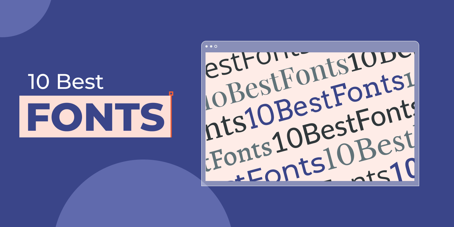
Digital agencies tasked with building sites for SMBs must carefully consider the fonts they choose for their clients’ websites. Font choice might seem trivial compared to other concerns, such as page layout and site performance, but if you’ve ever been on a website with a poor font choice, you’ll probably remember deciding that you never wanted to go back to it. But with so many fonts out there, how can you choose a suitable one? Keep reading to get the lowdown on the importance of fonts in web design and a helpful list of the top 10 best fonts for websites.
Why Font Choice is Important for Business Websites
There are hundreds of thousands of font styles online, and the particular font(s) you choose for any company’s website form part of the web design sub-discipline known as typography. This discipline centers on arranging text elements so that they attract attention, are clear, and adequately communicate a message. Part of this, of course, is the font style you opt for.
The first point of note is that people perceive certain fonts as more trustworthy than others, which is critical for businesses looking to gain the trust of prospective customers. Where the industry of a client is particularly dependent on trust (eg insurance broker) or the claims made about a product/service need backing up, font choice can make all the difference to perceived trust among website visitors.
Readability also plays an important role because some fonts are more legible than others. In particular sections of a website, such as a blog, readability should be a primary design concern. If people feel annoyed or frustrated when reading a blog post, they’ll think twice about returning to read more.
Website visitors use visual cues to scan and make judgments about a site’s looks much more rapidly than they judge actual content on the pages. This is important because the way in which a company wants to be perceived needs to be reflected in the choice of fonts used on its website. In other words, fonts need to be
on-brand for them to work as part of the overall web design. A bad font choice inhibits the ability to resonate with particular people and convey a message about a business.
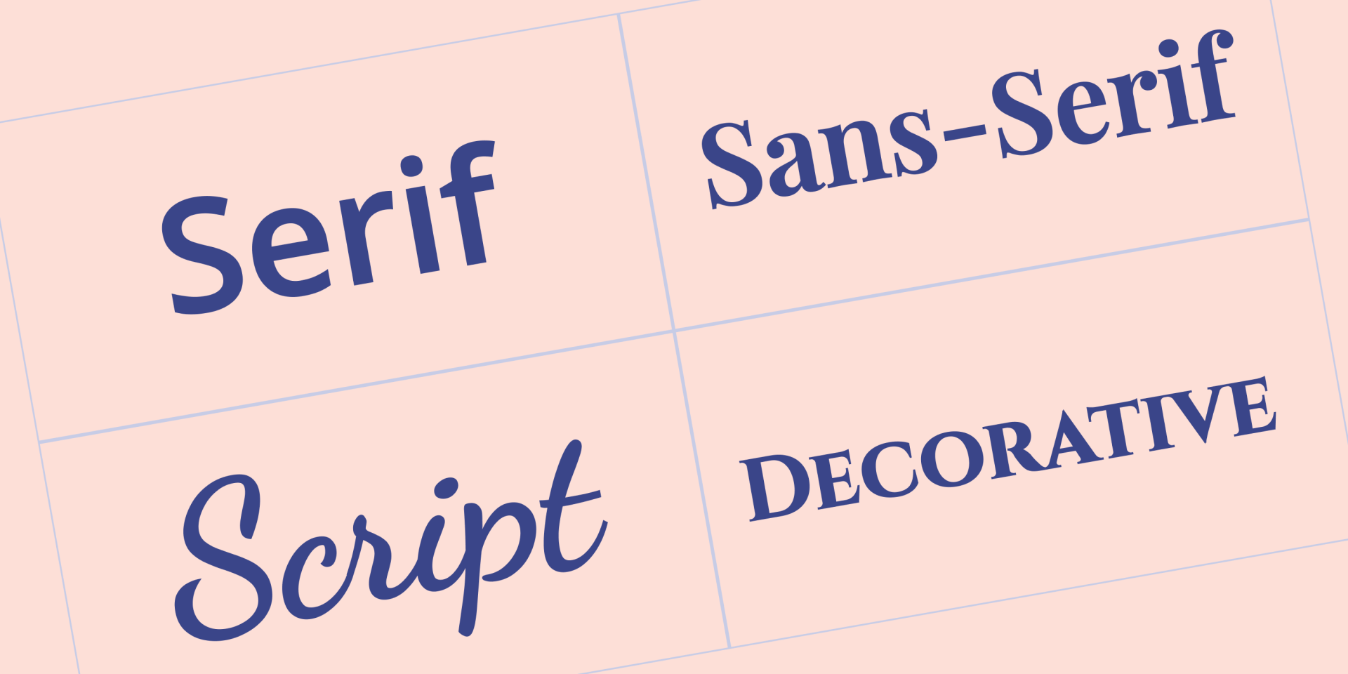
4 Main Types of Fonts
Before being able to choose the best fonts for websites, it’s useful to understand the four main types of fonts:
Serif — these fonts include small lines or strokes (known as serifs) appended to larger letters, symbols, and numbers- Sans serif — these fonts have a more minimalist design because they lack added lines/strokes on symbols, numbers, and letters
- Script — fonts that have a particular emphasis on resembling handwriting
- Display — fonts that are artistic and eye-catching , often used for decorative purposes
What to Keep in Mind When Choosing a Font
There’s much to consider when choosing a font, including some specifics about the industry a business operates in and the message it wants to convey. But there are some general snippets of advice worth keeping in mind as you build sites for clients.
Match the font with the business
Whether you’re designing a website for a small local travel business or an IT company, the font style you choose should be congruent with that company. In practice, this means that the font should match the business type and the other visual elements of the site design.
Stick to the rule of three
A classic rule of typography is to use a maximum of three different fonts in any design. For websites, use a primary font for the headings, a secondary font that covers the bulk of the written content, and then a third font to add accents to different web pages. It’s worth pointing out that the primary font is so-named not because it’s the most prevalent one throughout a site, but it’s the one that visitors will notice most because of its prominence in page titles, headings, etc.
Select web safe fonts
It’s critical to use fonts that any browser or device can properly display. In other words, fonts that the vast majority of browsers and devices have already installed. Any font that fits this definition is called a web safe font.
Thoroughly research the font
Researching a font means sifting through most of the common letters, numbers, and symbols, and making sure everything looks great. The small details can matter for your clients; for example, the last thing you want is an eCommerce site with a font that mostly looks good but has weird dollar signs.
Prioritize mobile users
Generally, issues with fonts tend to become more obvious on mobile devices. In addition, since mobile devices account for over
half of the traffic on the Internet, it would be remiss to choose one that doesn’t look great. After you finish reading this post, have a look at our list of the
best mobile fonts for web design.
Common Font Selection Fails You Must Avoid
Before getting on to the best fonts for websites, here is a brief list of common font selection fails you should try to avoid if you want happy clients:
Never use script or display fonts for body text; these fonts should be used sparingly in a site’s design- Remember that even if a font looks nice, you can mess up its implementation with line spacing that’s too narrow, weird colors, or font sizes that are too small
- Since you’ll likely use two or three fonts on any site, make sure you opt for fonts that complement each other
- For the vast majority of clients, avoid fonts that look childish. Even if a business sells casual t-shirts, its website design should still look professional
10 Best Fonts for Websites
Now, it’s time for the nitty-gritty of this article by delving into our selection of the 10 best fonts for websites. Whittling this list down to just 10 fonts was a challenge given the tons of available fonts out there, but we’ve compiled the cream of the crop here for you to choose from.
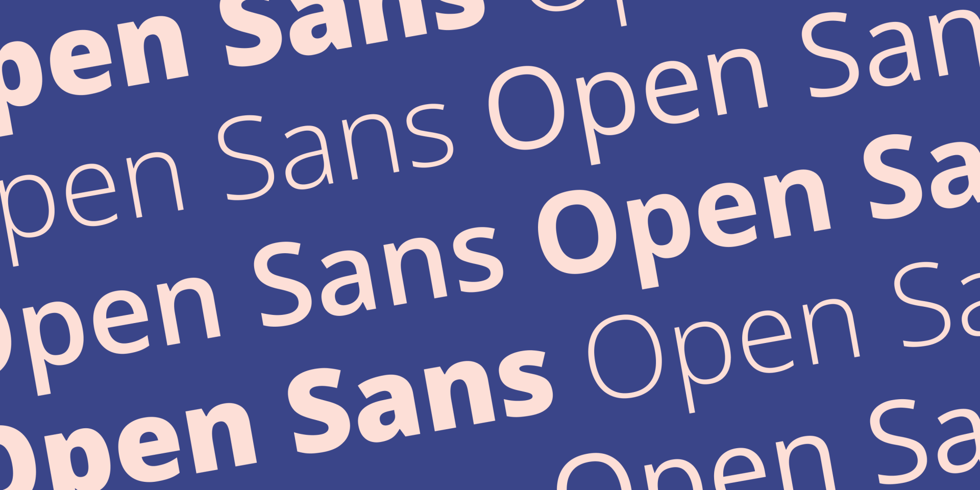
Open Sans is a sans serif font created by Steve Matteson and first released in 2011. The font’s emphasis on readability, friendly appearance, and excellent support for many different languages make it easily stand out as one of the ten best fonts for websites.
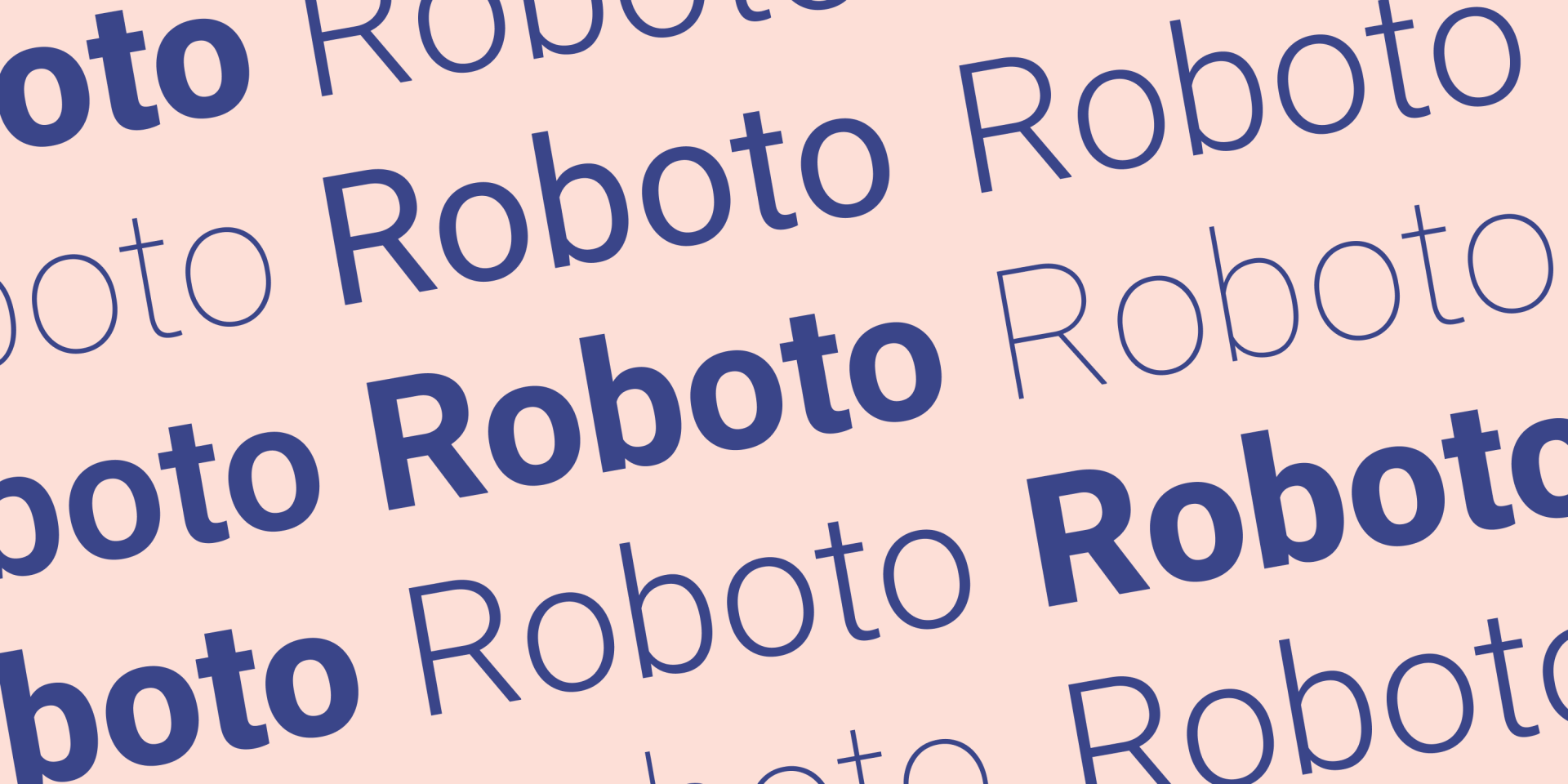
Roboto is a font belonging to a class of sans serif fonts known as neo-grotesque. The history of grotesque stretches back to the 1800s, and Roboto is a modern interpretation of this class by designer Christian Robertson. Roboto makes this list for its clever use of white space to give it a distinguished sharp design. Roboto is a free font.
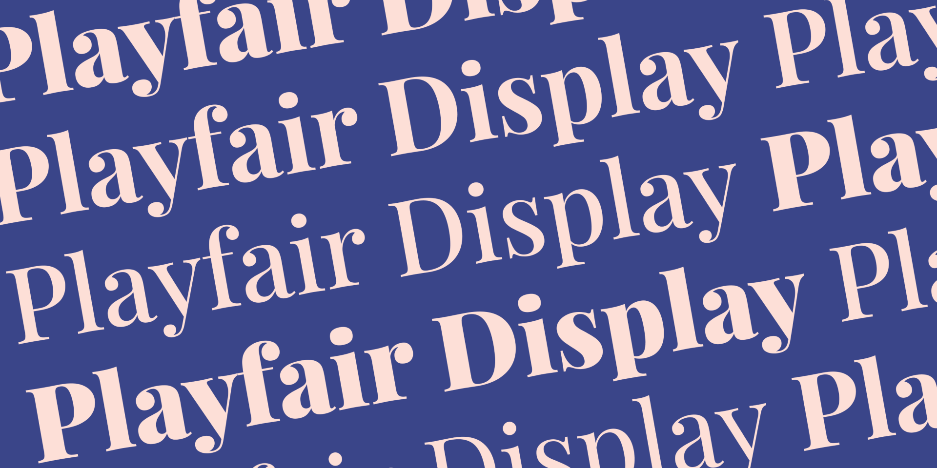
Playfair display is another of the best fonts for websites that happens to be free. Designed by the Dane Claus Eggers Sørensen in 2011, this serif font uses 18th century influences to achieve a look that’s very well-suited to headlines and titles.
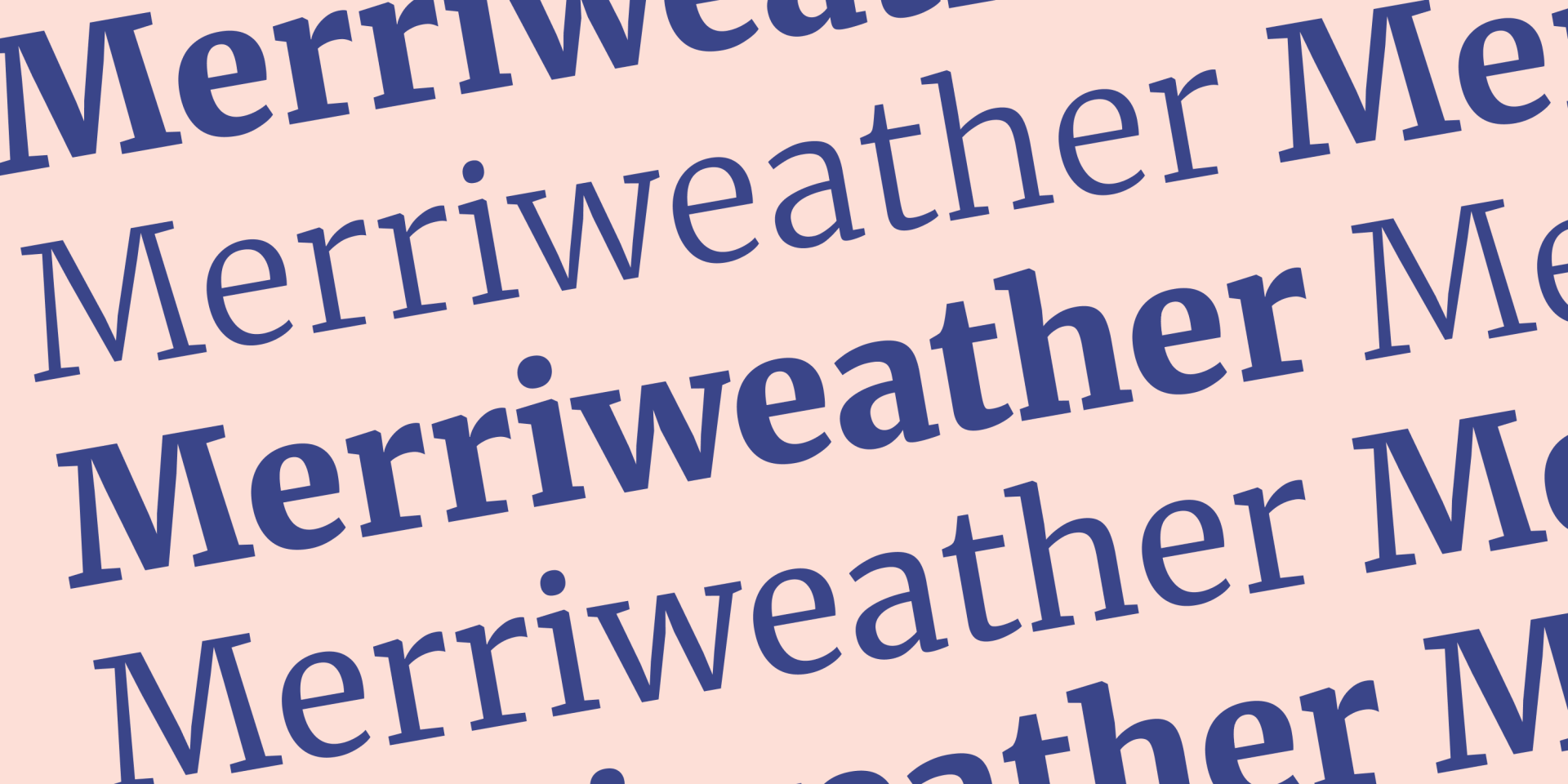
Merriweather is a serif font that focuses on being very easy to read on screens even at small sizes, which makes it a prime candidate for the body text used on clients’ blog posts, about pages, and other text-heavy pages. This font is free, and it was designed by a company named Sorkin Type.
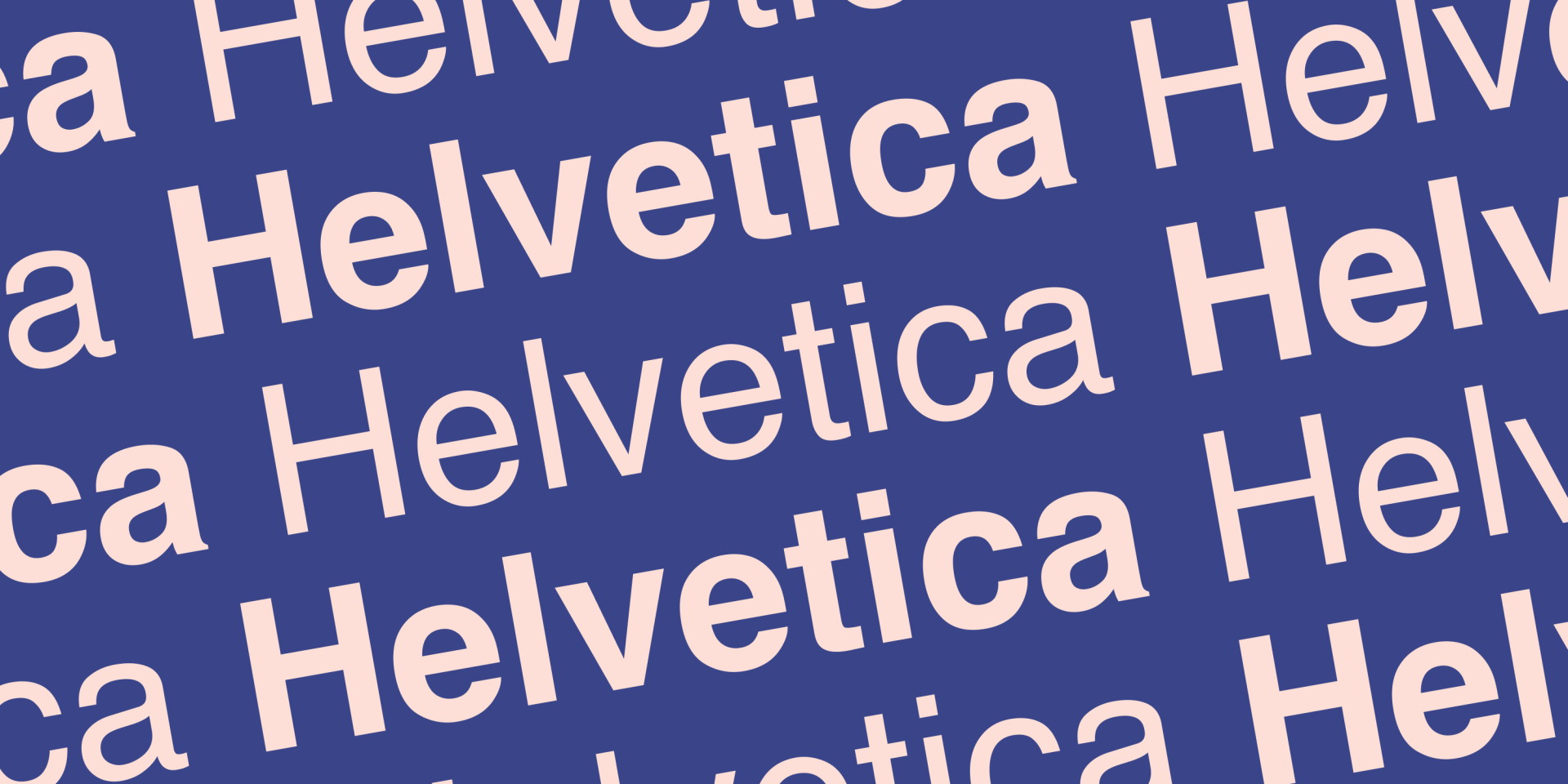
Definitely the most famous font on this list, Helvetica is a sans-serif font with a history that stretches back to 1957. Designed by the Haas Type Foundry in Switzerland, Helvetica’s seamless translation from offline to online use speaks volumes about its versatility. Helvetica comes recommended not for anything fancy, but for its neutrality, which makes for a nice safe option that lets other design elements stand out without interfering. Helvetica is a premium font that you need to pay a license if you want to use.
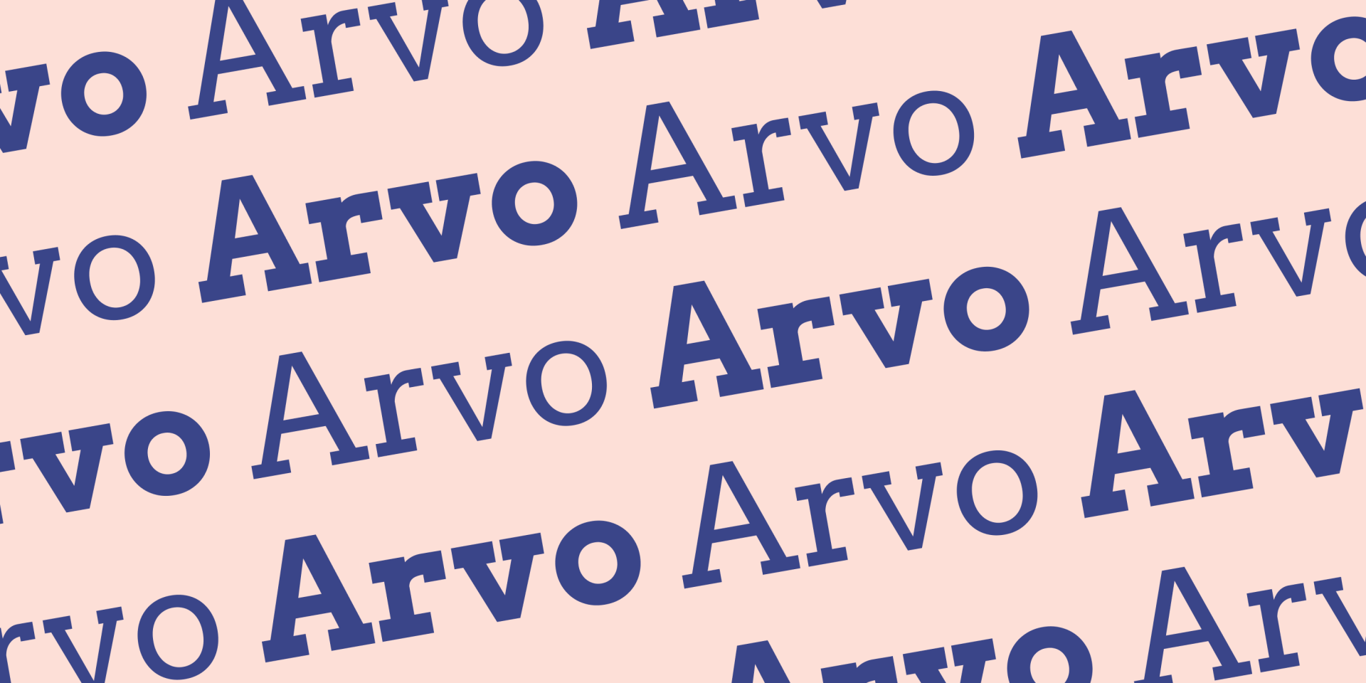
Arvo is a free serif font that’s well known for its distinct block-like serifs. Anton Koovit designed this font back in 2010 with a mission to produce an extremely legible font suited for screen. In fact, Anton himself says that he created the font for, “all kinds of operating systems and screens.” This font looks great in headings and subheadings.
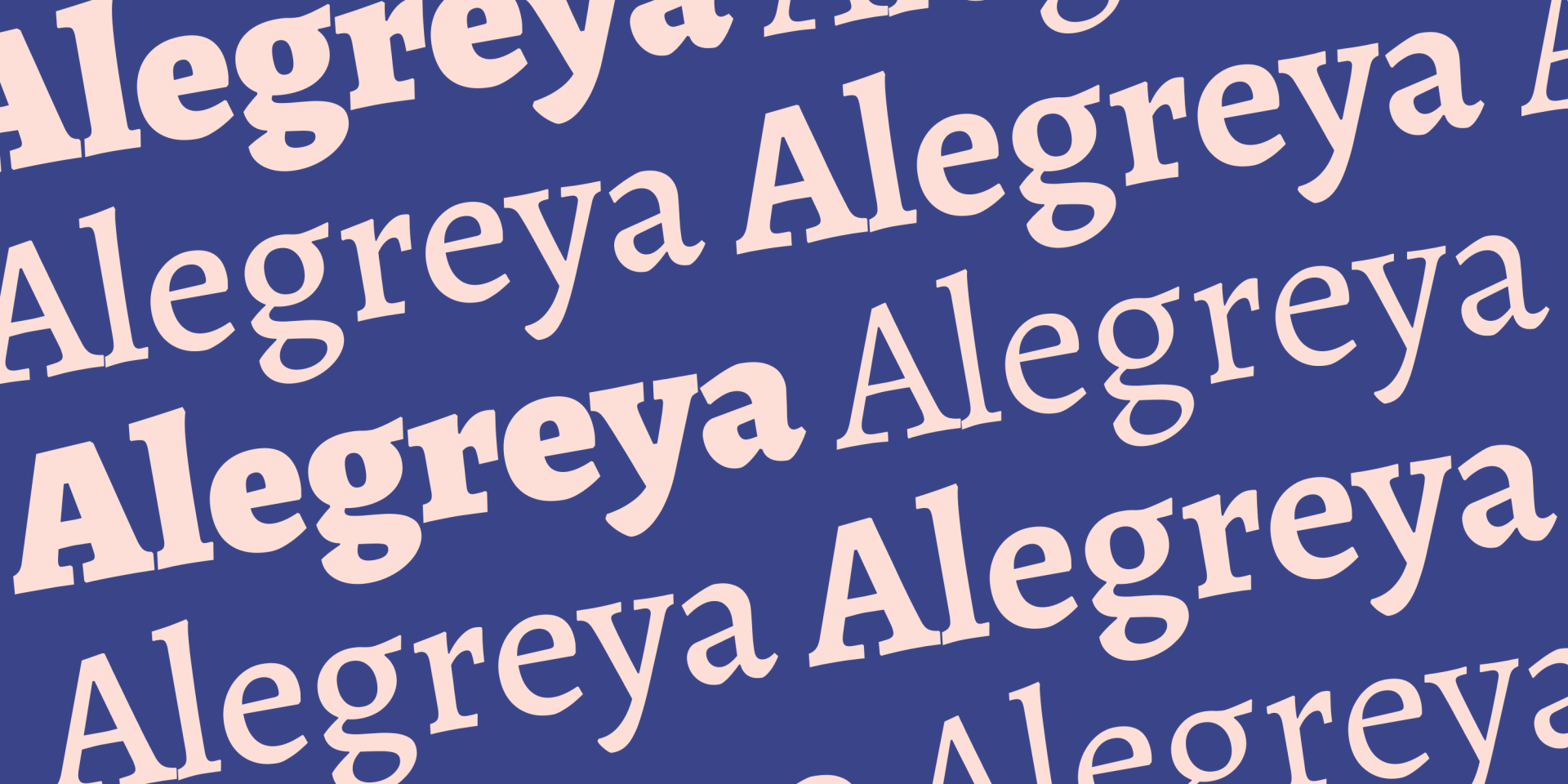
Alegreya is an open source font that has won several accolades for its dynamic and varied rhythm, which helps break up the visual mundanity of reading lengthy passages. In fact, its original designer Juan Pablo del Peral originally created it for use in literature. Alegreya comes in both serif and sans serif variations. Consider Alegreya for text-heavy websites, such as businesses that market through lengthy blog posts.
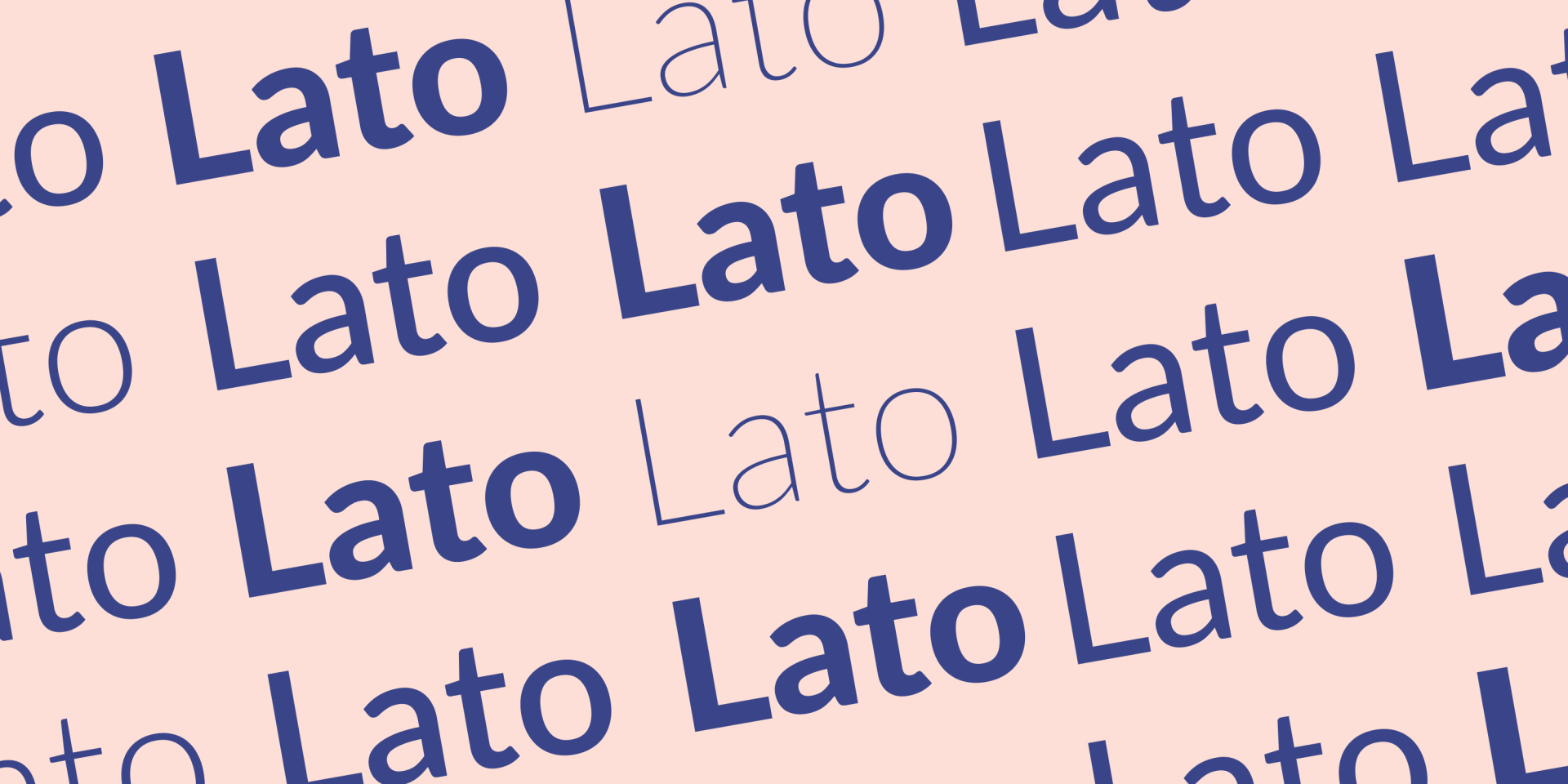
Lato is an open source font created by Polish designer Łukasz Dziedzic back in 2010. The font is sans serif; warmth and legibility are key characteristics. Businesses stand to benefit from the professional yet welcoming vibe that Lato can add to headings or body text when you want to be serious in your messaging without putting users off.
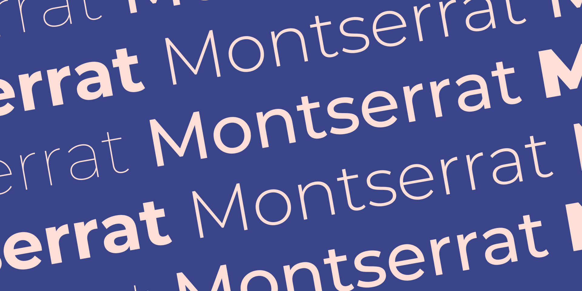
Montserrat is a free sans serif font created by Julieta Ulanovsky. Its elegant simplicity makes it an extremely versatile font for all kinds of websites. Montserrat has a modern, trustworthy appearance that works great for site titles and headings.
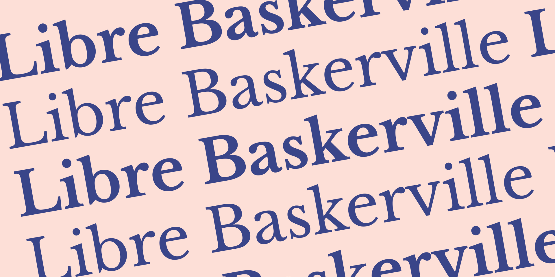
Last but by no means the least of the best fonts for websites, Libre Baskerville was created by Argentinian Pablo Impallari. Interestingly, this font was specifically designed to optimize for body text aesthetics, which makes it a natural choice for paragraphs and blog posts. Libre Baskerville is a serif font, it’s open source, and it’s based on an older font family from the 1940s.
Closing Thoughts
That concludes our picks of the top ten best fonts for websites. Whatever font or combination of fonts you choose for your clients, always remember that the decision is not trivial. Bookmark this post and return again when you need a reminder of how to select fonts for websites and common mistakes to avoid.
If you want to make everything easier, the right website builder provides you with templates that are already optimized for typography. Build striking websites with less work — have a look at our
professional website templates here.
Related Posts
By Ilana Brudo
•
June 16, 2026
Maximize agency ROI in 2026: Automate onboarding, billing, SEO, and reporting to empower your team to focus on strategy and growth.
By Shawn Davis
•
June 11, 2026
AI is transforming search into direct, on-device answers. Learn why AEO is essential for your clients’ local visibility.
By Mike Paciello
•
May 19, 2026
The web had its worst accessibility year in six. On GAAD's 15th anniversary, learn why the 2026 regression is a process problem and how Duda and AudioEye help agencies fix it.
Show More