Las agencias digitales que crean sitios web para pequeñas y medianas empresas (PYMES) deben evaluar cuidadosamente qué fuentes son las mejores para los sitios web de sus clientes.
La elección de la fuente puede parecer trivial en comparación con otras preocupaciones, como el layout de la página y el
rendimiento del sitio web.
Pero si alguna vez has estado en un sitio web con un tipo de fuente deficiente, probablemente mantienes el recuerdo en la mente y no tienes ganas de volver a visitarlo.
Con tantas opciones de fuentes que existen, ¿cómo saber cuáles son las mejores fuentes para los sitios web?
En este post, te mostramos la importancia de las fuentes en el diseño web y una lista práctica de las 10 mejores fuentes para sitios web.
POR QUÉ ES IMPORTANTE ELEGIR LA MEJOR FUENTE PARA LOS SITIOS WEB
Hay cientos de miles de estilos de fuente on-line. Las fuentes específicas que elijas para el sitio web de cualquier empresa forman parte de la subdisciplina del diseño web conocida como tipografía.
Esta disciplina se centra en la organización de los elementos del texto para que atraigan la atención, sean claros y comuniquen adecuadamente un mensaje. Parte de esto, por supuesto, lo define el estilo de fuente que elijas.
Veamos 3 puntos importantes que deberían influir en la elección de las mejores fuentes para tus sitios web:
- Confianza
- Legibilidad
- Alineación con la marca
El primer punto a tener en cuenta es que
la gente nota ciertas fuentes como más confiables que otras, lo cual es fundamental para las empresas que buscan ganarse la confianza de los clientes potenciales.
Cuando el sector de un cliente depende especialmente de la confianza (por ejemplo, un corredor de seguros) o depende de los beneficios atribuidos a un producto o servicio, se necesita de una base sólida. Por lo que la elección de la mejor fuente puede marcar la diferencia en la confianza apreciada por los visitantes del sitio web.
La legibilidad también desempeña un papel importante,
ya que algunas fuentes son más legibles que otras.
En secciones específicas de un sitio web, como un blog, la legibilidad debe ser la principal preocupación del
diseño UX y del diseño web en su conjunto. Si la gente se siente molesta o frustrada al leer una publicación del blog, se lo pensarán dos veces antes de volver.
Los visitantes de un sitio web utilizan los elementos visuales para analizar y juzgar la apariencia del sitio mucho más rápidamente de lo que juzgan el contenido real de las páginas.
Esto es importante porque la forma en que una empresa quiere ser notada debe reflejarse en la elección de las mejores fuentes para su sitio web.
En otras palabras,
las fuentes deben estar alineadas con la marca para que funcionen como parte del diseño general de la web. Una mala elección de la fuente inhibe la capacidad de empatizar con personas concretas y de transmitir un mensaje sobre una empresa.
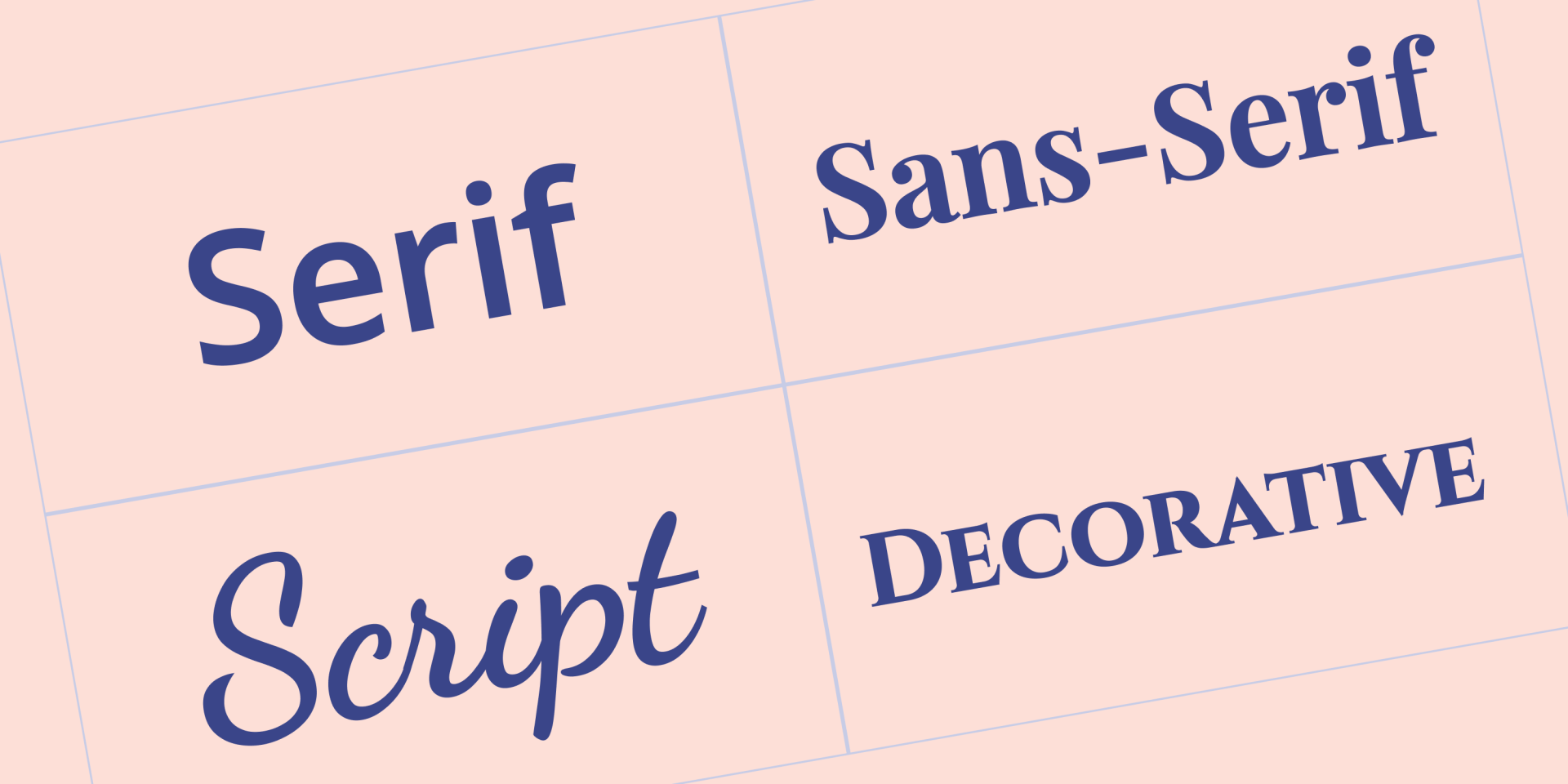
4 TIPOS DE FUENTES PRINCIPALES
Antes de elegir las mejores fuentes para los sitios web, es útil entender los cuatro principales tipos de fuentes:
- Serif — estas fuentes incluyen pequeñas líneas o trazos (conocidos como serifas) unidos a letras, símbolos y números de mayor tamaño.
- Sans serif — estas fuentes tienen un diseño más minimalista porque no tienen líneas/trazos añadidos a los símbolos, números y letras
- Script — fuentes que tienen un énfasis especial en parecerse a la escritura a mano
- Display — fuentes artísticas y atractivas, generalmente utilizadas con fines decorativos
QUE CONSIDERAR AL MOMENTO DE ELEGIR LAS MEJORES FUENTES PARA LOS SITIOS WEB
Debes tener en cuenta varios elementos a la hora de elegir las mejores fuentes para los sitios web de tus clientes, comenzando por detalles sobre el sector en el que opera la empresa y el mensaje que desea transmitir.
Hay algunos consejos generales que vale la pena tener en cuenta.
Acordar el tipo de fuente con la empresa
Tanto si diseñas un sitio web para una pequeña empresa local de viajes como para una empresa de TI, el estilo de fuente que elijas debe ser coherente con esa empresa. En la práctica, esto significa que el tipo de fuente debe coincidir con el tipo de negocio y con los demás elementos visuales del diseño del sitio web.
Mantener la regla de las tres fuentes
Una regla clásica de la tipografía es utilizar un máximo de tres fuentes diferentes en cualquier diseño. En el caso de los sitios web, utiliza un tipo de fuente principal para los títulos, un tipo de fuente secundaria que cubra la mayor parte del contenido escrito y, a continuación, un tercer tipo de fuente para agregar destaques a distintas páginas.
Cabe destacar que el tipo de fuente principal se denomina así porque es el que los visitantes notarán más por su prominencia en los títulos de las páginas, los encabezados, etc., y no por ser el más frecuente en todo el sitio web.
Seleccionar fuentes seguras para la web
Es fundamental utilizar fuentes que cualquier navegador o dispositivo pueda mostrar correctamente. Es decir, fuentes que la gran mayoría de los navegadores y dispositivos ya tienen instaladas. Cualquier fuente que se ajuste a esta definición se denomina fuente segura para la web.
Investigar bien la fuente
Buscar una fuente significa filtrar la mayoría de las letras, números y símbolos más comunes y garantizar que todo se vea bien. Los pequeños detalles pueden ser importantes para tus clientes; por ejemplo, lo último que quieres es un sitio web de e-commerce con una fuente que se vea bien, pero que tenga signos o símbolos extraños.
Priorizar a los usuarios de dispositivos móviles
Por lo general, los problemas de fuentes tienden a ser más evidentes en los dispositivos móviles. Además, dado que
los dispositivos móviles representan más de la mitad del tráfico web, sería negligente elegir una fuente que no se vea bien en ese tipo de dispositivo.
Tip: Cuando termines de leer este post, échale un vistazo a
nuestra lista de las mejores fuentes para dispositivos móviles.
ERRORES COMUNES QUE DEBES EVITAR EN LA ELECCIÓN DE LA FUENTE
Antes de pasar a la lista de las mejores fuentes para sitios web, aquí tienes un breve resumen de los errores más comunes en la selección de fuentes que deberías evitar si quieres tener clientes felices:
- Nunca utilices fuentes de script o display para el cuerpo del texto; estas fuentes deben utilizarse con moderación en el diseño de un sitio web
- Recuerda que aunque una fuente se vea bien, puede estropearse con un
interlineado demasiado estrecho, colores extraños o tamaños de fuente demasiado pequeños
- Como es probable que utilice dos o tres fuentes en cualquier sitio web,
asegúrate de optar por fuentes que se complementen entre sí
- Para la gran mayoría de los clientes, evita las fuentes que parezcan infantiles. Incluso si una empresa vende camisetas informales, el diseño del sitio web debe tener un aspecto profesional
LAS 10 MEJORES FUENTES PARA SITIOS WEB
Llegaste al corazón de este blog post: nuestra selección de las 10 mejores fuentes para sitios web. Lograr reducir esta lista a solo 10 fuentes fue un reto, considerando las toneladas de fuentes disponibles. Pero aquí hemos conseguido recopilar la flor y nata de las fuentes para que puedas elegir.
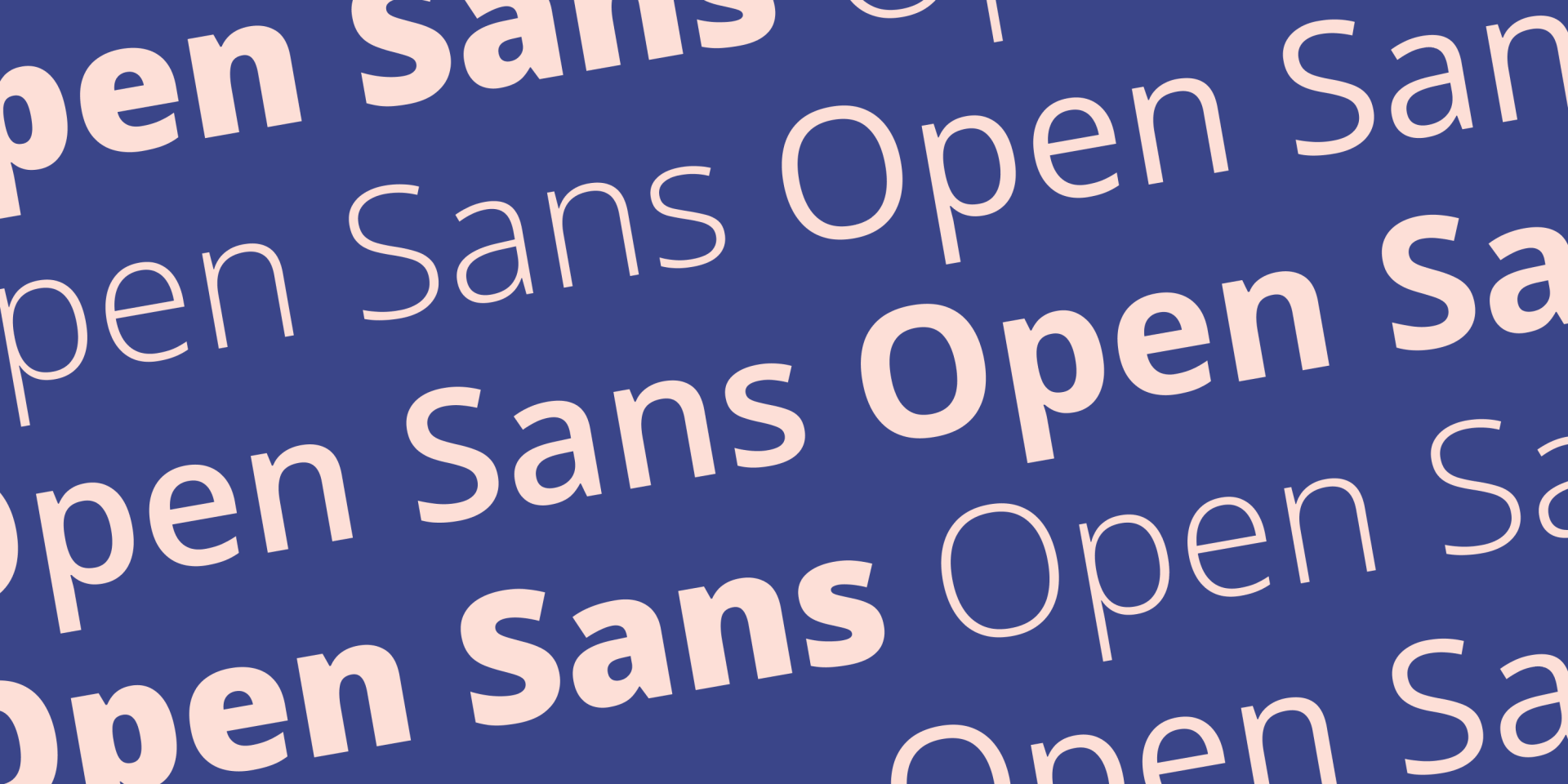
Open Sans es una fuente sans-serif creada por Steve Matteson y lanzada por primera vez en 2011. Su énfasis en la
legibilidad, su aspecto amigable y su excelente soporte con muchos idiomas diferentes hacen que se destaque fácilmente como una de las diez mejores fuentes para sitios web.
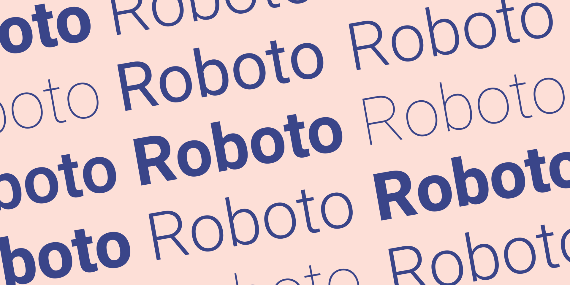
Roboto es una fuente perteneciente a la clase de fuentes sans serif conocidas como neogrotescas. La historia de lo grotesco se remonta al siglo XIX, y Roboto es una interpretación moderna de esta clase realizada por el diseñador Christian Robertson.
Roboto está en esta lista como una de las mejores fuentes para sitios web por su
inteligente uso del espacio en blanco, que le confiere un diseño distintivo y nítido. Roboto es una fuente gratuita.
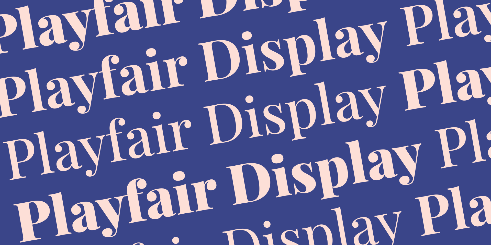
La Playfair Display es otra de las mejores fuentes gratuitas para sitios web. Diseñada por el danés Claus Eggers Sørensen en 2011, esta fuente serif utiliza influencias del siglo XVIII para lograr un aspecto
muy adecuado para encabezados y títulos.
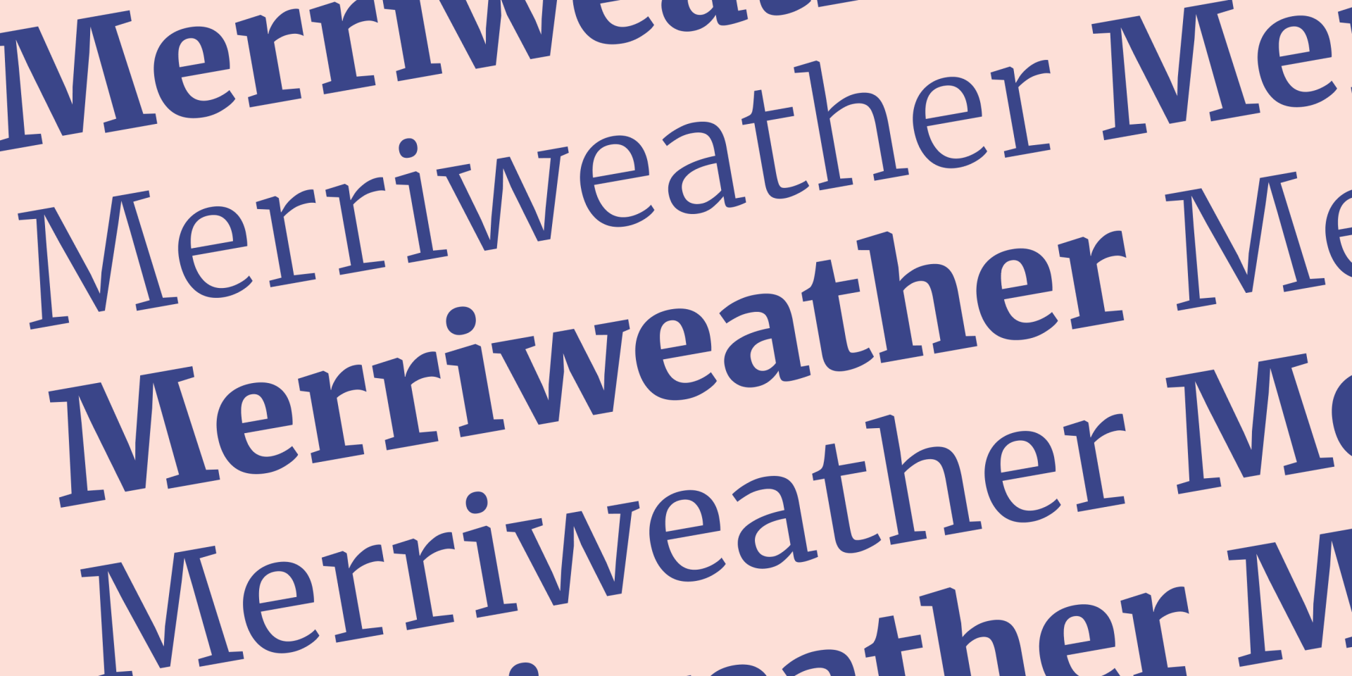
Merriweather es una fuente serif que se centra en ser muy fácil de leer en las pantallas, incluso en tamaños pequeños, lo que la convierte en una
excelente candidata para el cuerpo de texto utilizado en las publicaciones del blog de los clientes y en páginas con mucho texto.
Esta fuente es gratuita y fue diseñada por una empresa llamada Sorkin Type.
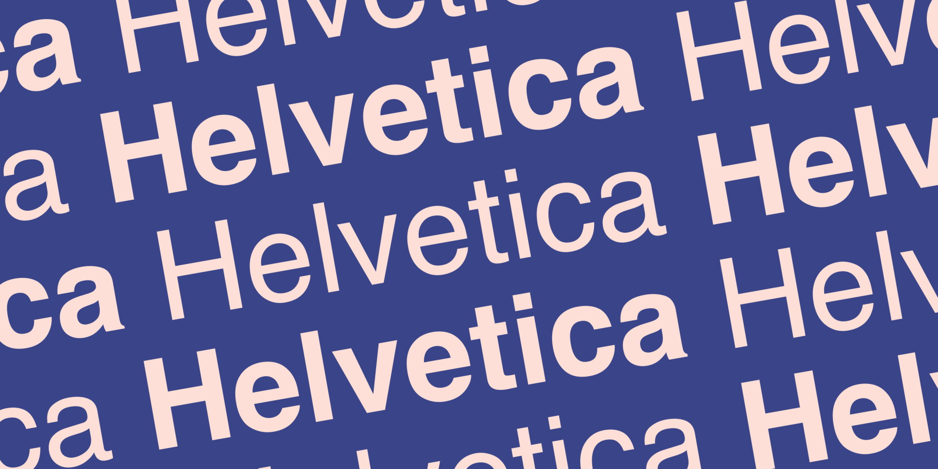
Definitivamente, la fuente más famosa de esta lista, Helvetica es una fuente sans serif con una historia que se remonta a 1957. Diseñada por Haas Type Foundry en Suiza, la perfecta adaptación de Helvetica del uso offline al online dice mucho de su versatilidad.
Se recomienda la Helvética para elementos que
no
sean extravagantes. Su neutralidad la convierte en una opción segura que permite que otros elementos de diseño se destaquen sin interferir.
La Helvetica es una fuente premium y
requiere pagar una licencia para usarla.
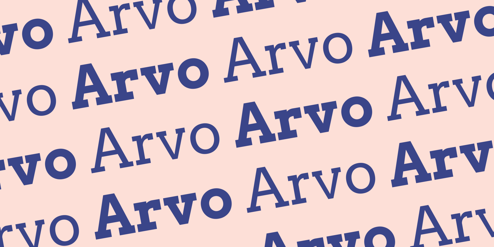
Arvo es una fuente serif gratuita y es bien conocida por sus variadas serifas en forma de bloque. Anton Koovit diseñó esta fuente en 2010 con la misión de producir una fuente extremadamente legible y adecuada para la pantalla.
De hecho, el propio Anton dice que creó la fuente para "todo tipo de sistemas operativos y pantallas". Esta fuente queda
muy bien en los títulos y subtítulos.
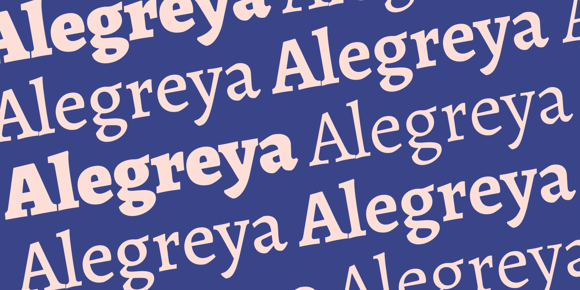
Alegreya es una fuente de código abierto que ha recibido varios elogios por su ritmo dinámico y variado, que ayuda a romper la frivolidad visual de la lectura de fragmentos largos. De hecho, su diseñador original, Juan Pablo del Peral, la creó originalmente para su uso en la literatura.
Alegreya está disponible en las variantes serif y sans-serif. Se considera Alegreya para los
sitios web con mucho texto, como empresas que comercializan a través de largas publicaciones de blog.
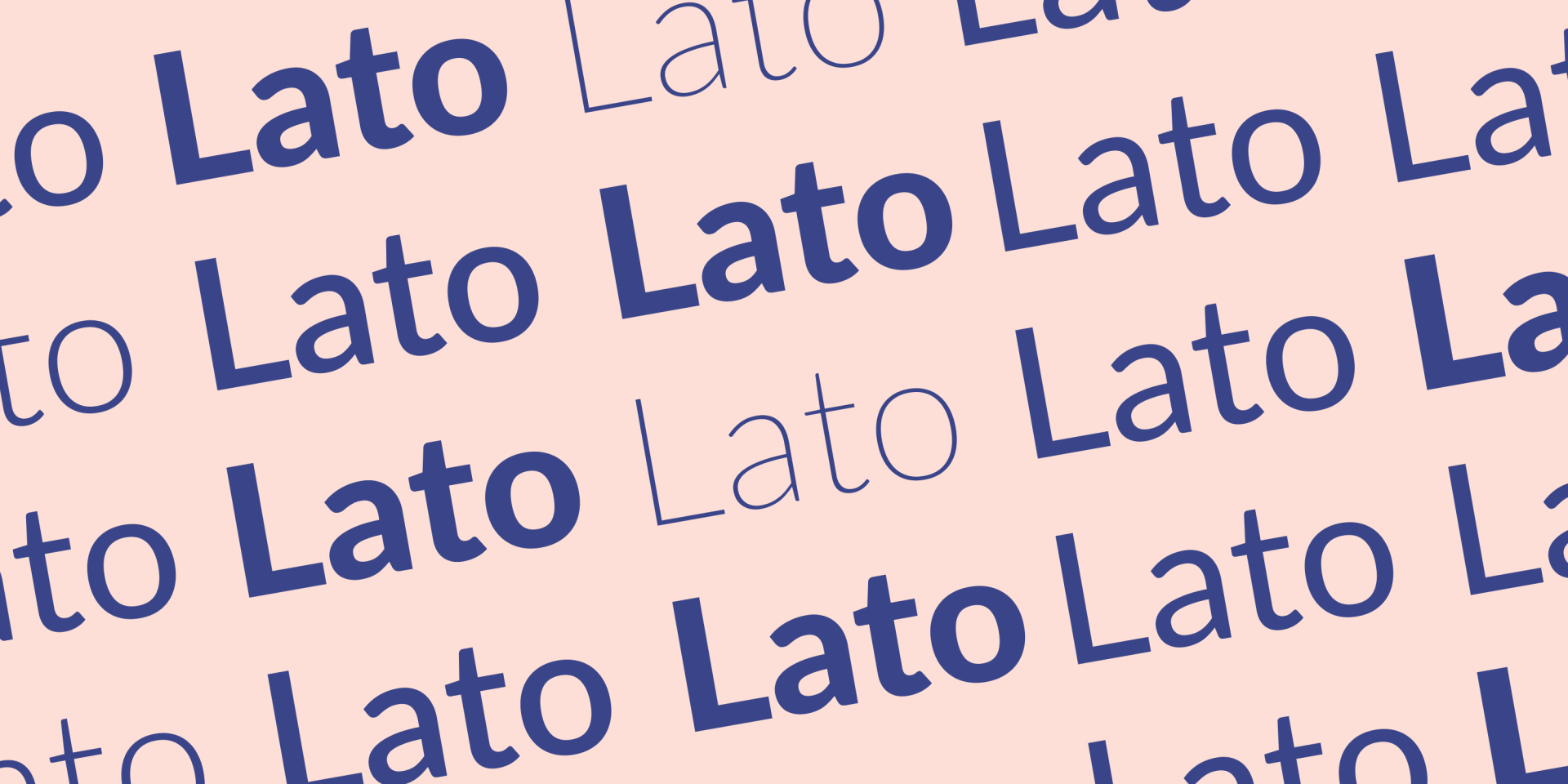
Lato es una fuente de código abierto creada por el diseñador polaco Łukasz Dziedzic en 2010. El tipo de letra es sans-serif;
la calidez y la legibilidad son características clave.
Las empresas pueden beneficiarse del ambiente profesional y acogedor que Lato puede añadir a los títulos o al cuerpo del texto cuando quieras ser serio en tus mensajes sin desanimar a los usuarios.
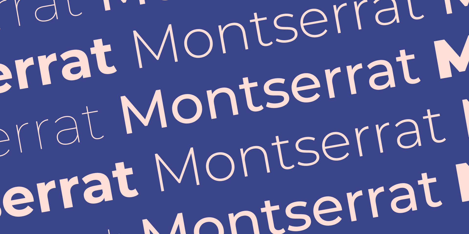
Montserrat es una fuente sans-serif gratuita creada por Julieta Ulanovsky. Su elegante sencillez la convierte en una fuente extremadamente versátil para todo tipo de sitios web.
Montserrat tiene un aspecto moderno y fiable
que funciona muy bien para los títulos y encabezados de los sitios web.
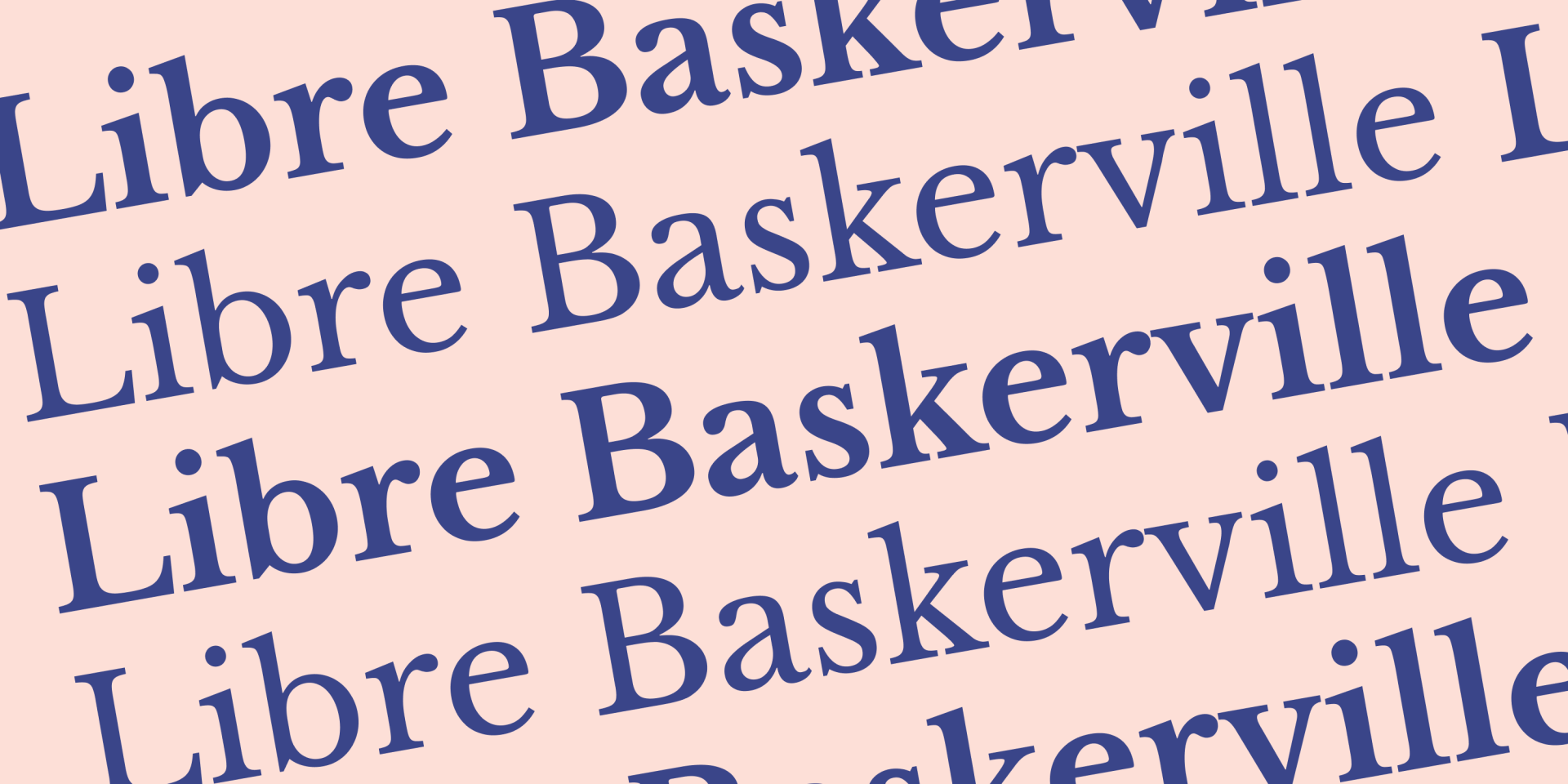
Por último, pero no menos importante, Libre Baskerville fue creada por el argentino Pablo Impallari. Curiosamente, esta fuente se diseñó específicamente para optimizar la estética del cuerpo de texto, lo que la convierte en
una elección natural para párrafos y publicaciones de blog.
Libre Baskerville es una fuente serif, de código abierto y se basa en una antigua familia de fuentes de la década de 1940.
CONCLUSIÓN