Las 8 mejores fuentes para el diseño móvil web

September 17, 2021
0 minute read

Hay al menos 800.000 fuentes disponibles para cualquiera que desee crear un sitio web que se verá principalmente en dispositivos móviles. En un universo de opciones tan grande, elegir puede llevar mucho tiempo.

En primer lugar, ¿por qué tantas opciones? Tal vez porque la tipografía es un componente vital para el diseño.

La tipografía es más que fuentes, es, como dice Neil Patel, donde "... el arte se encuentra con el texto. Se refiere a la disposición del tipo".

Además de la elección de la fuente, también hay que elegir la longitud de línea, el kerning (espacio en blanco entre letras) y más.

Patel también argumenta, "la fuente es un estilo específico de tipo de letra con un ancho, tamaño y peso establecidos ... Georgia es un tipo de letra; 9pt Georgia Bold es una fuente."

Sin embargo, muchos diseñadores, por motivos de simplicidad, usan "fuente" y "tipo de letra" indistintamente, y lo haremos en esta publicación.

La fuente que elijas importa. Influye en la percepción de un usuario del mensaje y la marca de una empresa, y tiene un impacto masivo en la legibilidad del texto del sitio web.

Entonces, con tantas opciones, ¿qué fuentes (y tipos de letra) deberías usar?

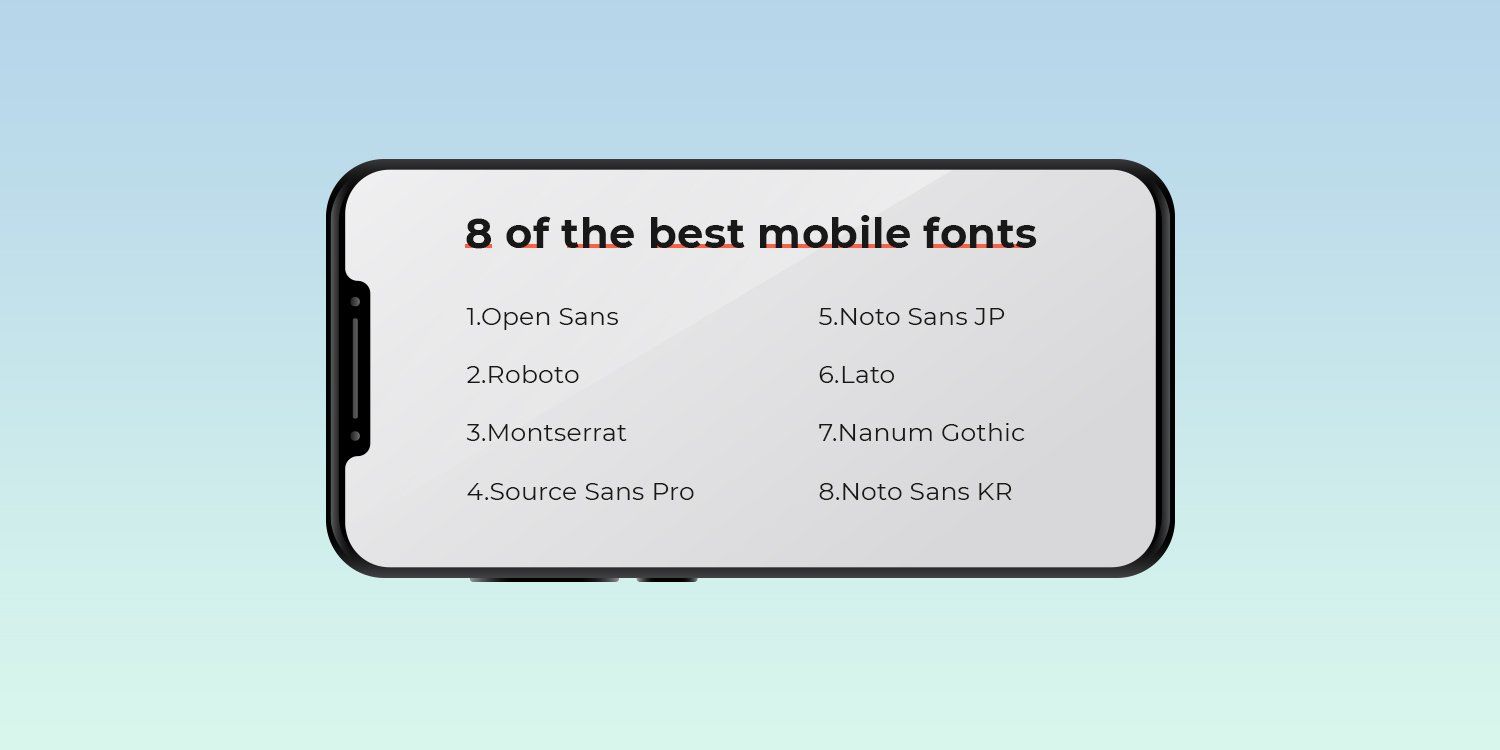
En esta publicación, hemos descrito las ocho mejores fuentes para usar en diseños web móviles.

Vamos a sumergirnos...

Serif vs. SANS-SERIF

Un serif es una línea decorativa o cono que aparece al final de un tallo de letras. Por lo tanto, una fuente "serif" es cualquier fuente que tenga letras que incluyan esta adición decorativa.

Por el contrario, una fuente sans ("sans" en francés para "sin") no incluirá estos elementos sutiles de diseño.

En un artículo de 2014 para Marketing Land, el empresario Jeremy Smith proporcionó la siguiente guía a los diseñadores que están tratando de averiguar qué fuente usar en una página web:

  • Para mejorar la comprensión y la legibilidad, elija una fuente serif.
  • Para aumentar la legitimidad, elija una fuente serif. Una encuesta realizada por Errol Morris del New York Times encontró que los serifs aumentan la credibilidad; la fuente serif Baskerville influyó especialmente en los lectores para que confiaran en el contenido web.
  • Para llamar la atención, considere una fuente sans-serif.

Es aconsejable tener en cuenta estas recomendaciones básicas al seleccionar una fuente web que funcione bien para los visitantes del sitio móvil.

EMPAREJANDO FUENTES

Como probablemente sepas por tu propia experiencia de diseño, ciertas fuentes / tipos de letra juegan bien juntas, y otras no.

Una escuela de pensamiento es usar una fuente sans-serif para los encabezados y una fuente serif para el cuerpo.

Sin embargo, los opuestos no siempre se atraen y aun así debes asegurarte de elegir dos fuentes que se complementen entre sí.

Otra opción de diseño común es emparejar fuentes similares entre sí. La idea en este caso es que las fuentes similares suavizan las diferencias y mantienen a los visitantes del sitio web enfocados en el contenido.

Protip: Duda te permite agregar fuentes personalizadas y de Google de forma rápida y sencilla, ¡pero no te excedas! Mantén tu sitio web con dos o tres fuentes/tipos de letra.

lAs 8 mejores Fuentes para diseño móvil web

Ahora, echemos un vistazo a las ocho fuentes principales para usar en el diseño web móvil. Para mayor claridad, hemos dividido la lista en cuatro fuentes serif y cuatro fuentes sans-serif.

Las 4 melhores fuentes Serif para diseño móvil web

Las fuentes Serif tienen lo que parecen pies (a menudo llamados "trazo") unidos a los extremos de las letras. Estos tipos de fuentes a menudo aparecen más tradicionales y formales.
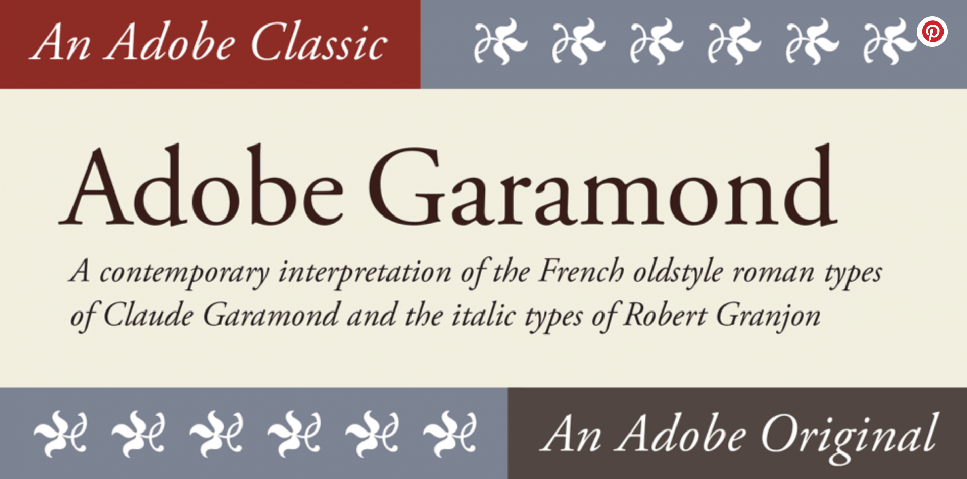
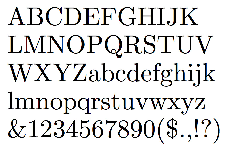
Garamond

Diseñada en 1989 por Robert Slimbach, esta fuente se basa en las tipografías originales de Garamond que llevan el nombre del grabador del siglo 16 Claude Garamond.

Esta familia de fuentes se utiliza a menudo en la impresión de libros. Las diversas versiones de Garamond, incluido Adobe Garamond, usan letras con una estructura relativamente orgánica que se asemeja a la caligrafía anticuada, pero con un diseño más estructurado y vertical.

Puedes verla a continuación, cortesía de Font Spring.

Esta fuente combina bien con Orpheus, Franklin Gothic y Prenton.
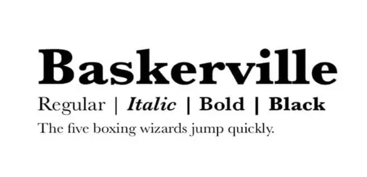
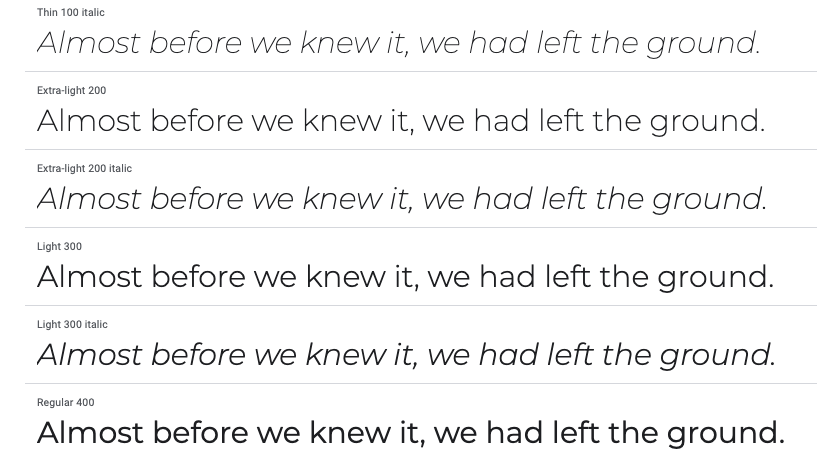

Baskerville

Esta fuente muy clásica fue diseñada en la década de 1750 por John Baskerville. Todavía se usa comúnmente hoy en día porque se lee bien y, como se demostró en el experimento de Morris, le da autoridad a tu contenido y diseño.

Échale un vistazo a una muestra de esta fuente a continuación, cortesía de Font Magazine.

Esta fuente se combina bien con Lucida Grande, Helvetica Neue, Open Sans, Georgia y Proxima Nova.


Computer Modern

Aunque hecha para computadoras, fue inspirada en Modern Extended 8A de la tradicional Lanston Monotype American Company, parte de una familia Monotype originalmente lanzada en 1896, según Wikipedia.

Creada por Donald Knuth, esta fuente se encuentra comúnmente para el diseño web móvil, pero también aparece con frecuencia en artículos científicos.

Observa un ejemplo a continuación, cortesía de Identifont.

Computer Modern combina bien con Luxi Mono.
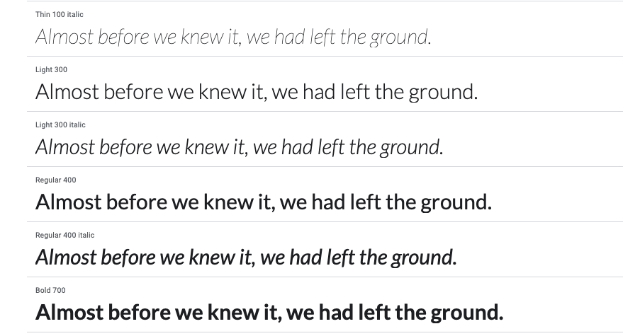

Georgia

Diseñada en 1993 por Matthew Carter y Tom Rickner para Microsoft Corporation, la fuente Georgia está destinada a ser elegante pero legible.

Observa la muestra a continuación, cortesía de AllBestFonts.com.

La fuente Georgia se combina bien con Helvetica Neue, Arial, Freight Sans, Open Sans y Lato.
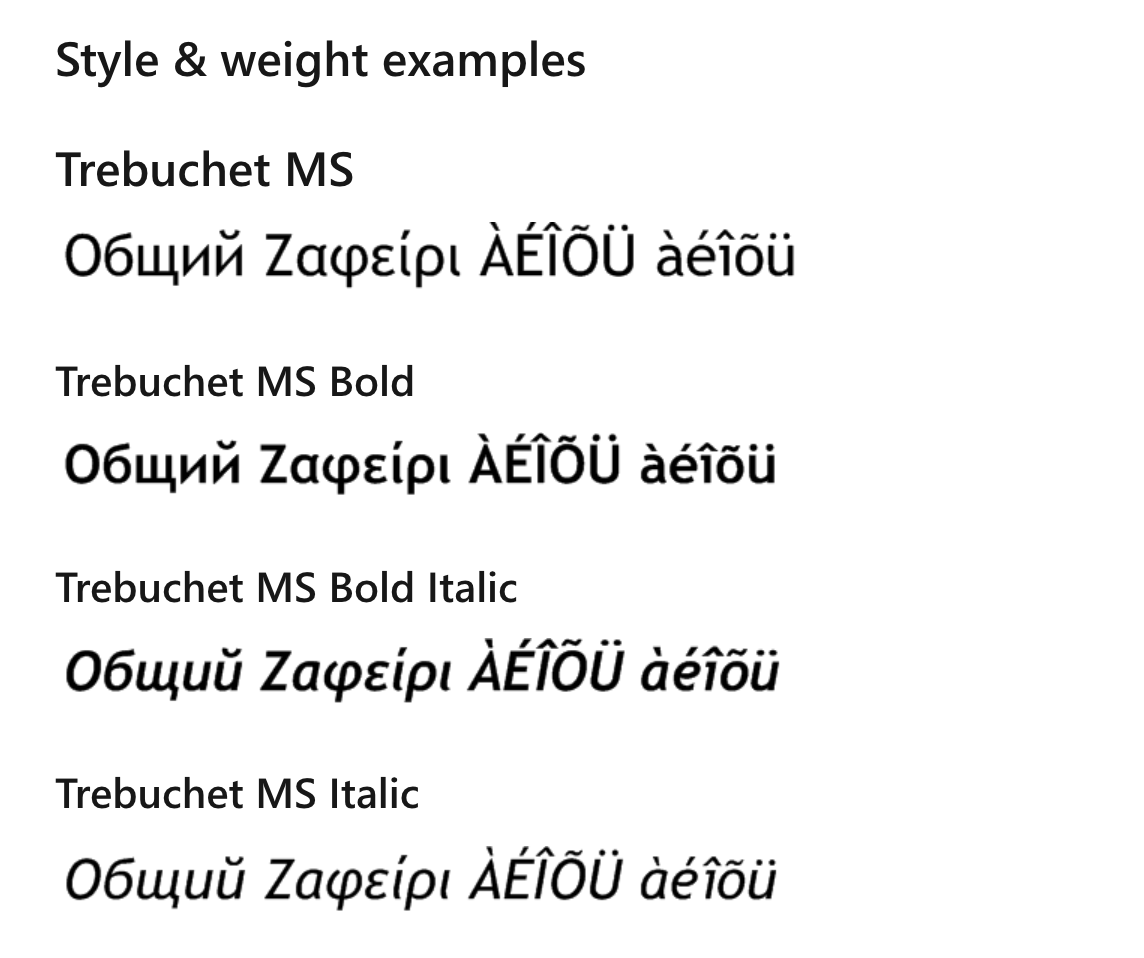
*BÔNUS* Trebuchet

Desarrollada y registrada por Microsoft, Trebuchet es una fuente muy popular en los dispositivos móviles.

Como señala Microsoft, el tipo de letra, diseñado por Vincent Connare en 1996, es una sans-serif humanista hecha para facilitar la lectura en una pantalla.

La leyenda dice que las fuentes Trebuchet se llamaron así porque están pensadas para ser el vehículo que dispara los mensajes a través de Internet.

Connare quería que el type tuviera personalidad, incluso en tamaños pequeños, pero manteniendo la claridad y la legibilidad. También quería algo que se distinguiera significativamente de Verdana y MS Sans.

Puedes ver un ejemplo de este tipo de letra de Microsoft en la siguiente imagen.

Esta fuente combina bien con Fjord, Verdana y Georgia.

¿Necesitas un constructor de sitios web que te permita construir fácilmente sitios con cualquier tipo de letra que desees?

Empieza una prueba gratuita de Duda hoy mismo.

Las 4 melhores fuentes Sans-Serif para diseño móvil web

Las fuentes Sans-serif carecen de las extensiones estéticas en los extremos de las letras que tienen las fuentes serif.

Las sans-serif tienden a tener un aspecto más moderno y estas fuentes son más fáciles de leer en títulos, botones y textos cortos.

Open Sans

Open Sans es una fuente sans-serif humanista diseñada por Steve Matteson.

Diseñada específicamente para la web y los celulares, utiliza una presión vertical, formas abiertas y un aspecto neutro pero amigable para facilitar la lectura. 

Observa un ejemplo de esta fuente a continuación, por cortesía de Google.

Open Sans combina bien con Montserrat, Lato, Brandon Grotesk y Roboto.
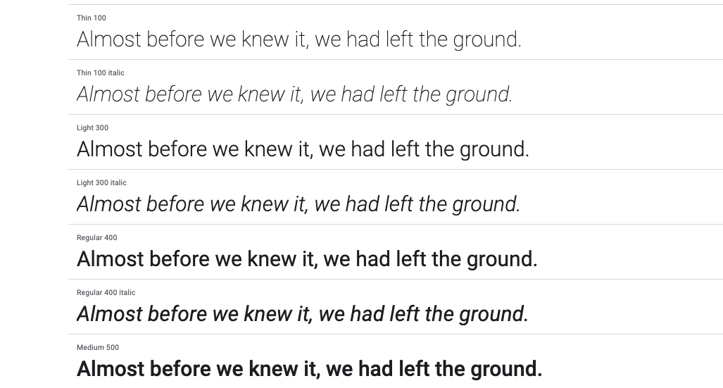
Roboto

Roboto fue desarrollada por Google para celulares, y es la fuente principal del sistema operativo móvil Android.

Google la describe como de doble naturaleza, con un esqueleto mecánico y formas mayormente geométricas, a la vez que presenta curvas amistosas y abiertas.

Puedes ver una muestra de esta fuente de Google a continuación.


Roboto combina bien con Roboto Slab, Open Sans, Lato y Playfair Display.

Montserrat

Basada en las señales del antiguo barrio de Montserrat de Buenos Aires, esta familia tipográfica fue diseñada por Julieta Ulanovskym. Utiliza un tipo geométrico optimizado para el uso digital.

Por curiosidad, Montserrat también es la fuente utilizada en todas las piezas de comunicación de Duda.

A continuación te mostramos una muestra de esta fuente en Google.

Esta fuente combina bien con Open Sans, Roboto Slab y Lora.
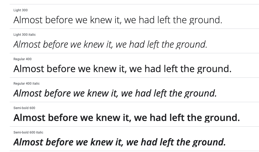
Lato

Diseñada por Warsawukasz Dziedzic en el verano de 2010, el nombre de esta fuente significa "verano" en polaco.

Tiene una sensación abierta, brillante y veraniega, lo que la hace popular para aplicaciones y sitios web para celulares.

Puedes ver una muestra de esta fuente en la imagen de Google que aparece a continuación.

Esta fuente combina bien con Superior Title, Mate, Futura, Caslon y Clarendon.


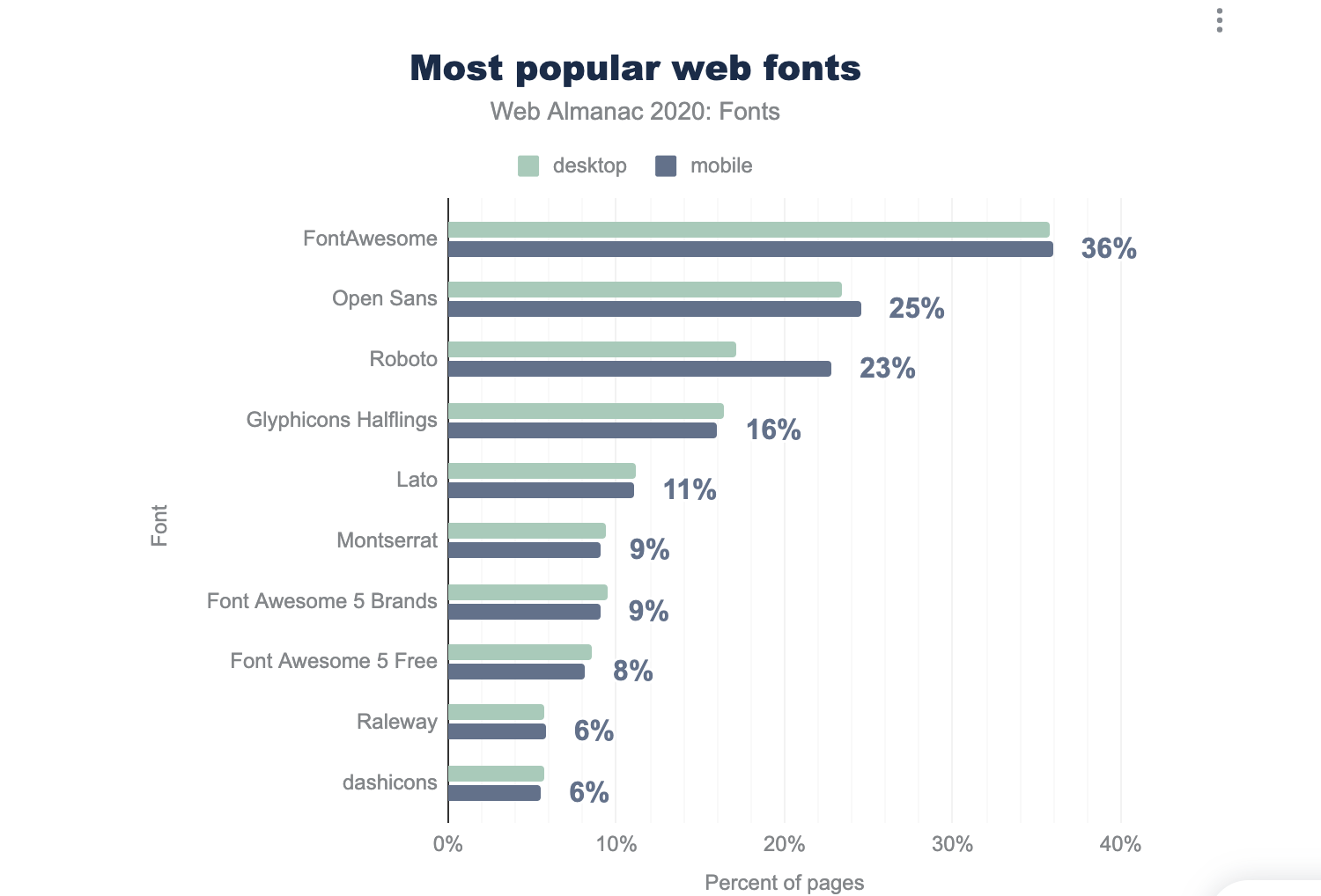
LAS MÁS POPULARES FUENTES PARA DISEÑO MÓVIL WEB

En la lista anterior, hemos cubierto las que consideramos las mejores fuentes para diseño web móvil.


Sin embargo, están lejos de ser las únicas. A continuación se muestran las fuentes móviles más utilizadas, según Web Almanac.

REFLEXIONES FINALES SOBRE Las mejores fuentes para diseño móvil web

La próxima vez que diseñes un sitio web, elige una de las mejores fuentes para celulares de las que hemos hablado para garantizar que los visitantes puedan leer fácilmente el contenido del sitio en dispositivos móviles.

A la hora de elegir, piensa en la personalidad que quieres transmitir con tu fuente.

Asegúrate de mantener el número de fuentes en cualquier sitio web a un máximo de dos o tres.

Por último, al igual que con todo lo relacionado con el diseño de sitios web, haz pruebas A/B con tus fuentes siempre que sea posible y ajústalas si es necesario.


Did you find this article interesting?


Thanks for the feedback!
By Shawn Davis April 1, 2026
Core Web Vitals aren't new, Google introduced them in 2020 and made them a ranking factor in 2021. But the questions keep coming, because the metrics keep changing and the stakes keep rising. Reddit's SEO communities were still debating their impact as recently as January 2026, and for good reason: most agencies still don't have a clear, repeatable way to measure, diagnose, and fix them for clients. This guide cuts through the noise. Here's what Core Web Vitals actually measure, what good scores look like today, and how to improve them—without needing a dedicated performance engineer on every project. What Core Web Vitals measure Google evaluates three user experience signals to determine whether a page feels fast, stable, and responsive: Largest Contentful Paint (LCP) measures how long it takes for the biggest visible element on a page — usually a hero image or headline — to load. Google considers anything under 2.5 seconds good. Above 4 seconds is poor. Interaction to Next Paint (INP) replaced First Input Delay (FID) in March 2024. Where FID measures the delay before a user's first click is registered, INP tracks the full responsiveness of every interaction across the page session. A good INP score is under 200 milliseconds. Cumulative Layout Shift (CLS) measures visual stability — how much page elements unexpectedly move while content loads. A score below 0.1 is good. Higher scores signal that images, ads, or embeds are pushing content around after load, which frustrates users and tanks conversions. These three metrics are a subset of Google's broader Page Experience signals, which also include HTTPS, safe browsing, and mobile usability. Core Web Vitals are the ones you can most directly control and improve. Why your clients' scores may still be poor Core Web Vitals scores vary dramatically by platform, hosting, and how a site was built. Some of the most common culprits agencies encounter: Heavy above-the-fold content . A homepage with an autoplay video, a full-width image slider, and a chat widget loading simultaneously will fail LCP every time. The browser has to resolve all of those resources before it can paint the largest element. Unstable image dimensions . When an image loads without defined width and height attributes, the browser doesn't reserve space for it. It renders the surrounding text, then jumps it down when the image appears. That jump is CLS. Third-party scripts blocking the main thread . Analytics pixels, ad tags, and live chat tools run on the browser's main thread. When they stack up, every click and tap has to wait in line — driving INP scores up. A single slow third-party script can push an otherwise clean site into "needs improvement" territory. Too many web fonts . Each font family and weight is a separate network request. A page loading four font files before rendering any text will fail LCP, especially on mobile connections. Unoptimized images . JPEGs and PNGs served at full resolution, without compression or modern formats like WebP or AVIF, add unnecessary weight to every page load. How to measure them accurately There are two types of Core Web Vitals data you should be looking at for every client: Lab data comes from tools like Google PageSpeed Insights, Lighthouse, and WebPageTest. It simulates page loads in controlled conditions. Lab data is useful for diagnosing specific issues and testing fixes before you deploy them. Field data (also called Real User Monitoring, or RUM) comes from actual users visiting the site. Google collects this through the Chrome User Experience Report (CrUX) and surfaces it in Search Console and PageSpeed Insights. Field data is what Google actually uses as a ranking signal — and it often looks worse than lab data because it reflects real-world device and connection variability. If your client's site has enough traffic, you'll see field data in Search Console under Core Web Vitals. This is your baseline. Lab data helps you understand why the scores are what they are. For clients with low traffic who don't have enough field data to appear in CrUX, you'll be working primarily with lab scores. Set that expectation early so clients understand that improvements may not immediately show up in Search Console. Practical fixes that move the needle Fix LCP: get the hero image loading first The single most effective LCP improvement is adding fetchpriority="high" to the hero image tag. This tells the browser to prioritize that resource over everything else. If you're using a background CSS image for the hero, switch it to anelement — background images aren't discoverable by the browser's preload scanner. Also check whether your hosting serves images through a CDN with caching. Edge delivery dramatically reduces the time-to-first-byte, which feeds directly into LCP. Fix CLS: define dimensions for every media element Every image, video, and ad slot on the page needs explicit width and height attributes in the HTML. If you're using responsive CSS, you can still define the aspect ratio with aspect-ratio in CSS while leaving the actual size fluid. The key is giving the browser enough information to reserve space before the asset loads. Avoid inserting content above existing content after page load. This is common with cookie banners, sticky headers that change height, and dynamically loaded ad units. If you need to show these, anchor them to fixed positions so they don't push content around. Fix INP: reduce what's competing for the main thread Audit third-party scripts and defer or remove anything that isn't essential. Tools like WebPageTest's waterfall view or Chrome DevTools Performance panel show you exactly which scripts are blocking the main thread and for how long. Load chat widgets, analytics, and ad tags asynchronously and after the page's critical path has resolved. For most clients, moving non-essential scripts to load after the DOMContentLoaded event is a meaningful INP improvement with no visible impact on the user experience. For websites with heavy JavaScript — particularly those built on frameworks with large client-side bundles — consider breaking up long tasks into smaller chunks using the browser's Scheduler API or simply splitting components so the main thread isn't locked for more than 50 milliseconds at a stretch. What platforms handle automatically One of the practical advantages of building on a platform optimized for performance is that many of these fixes are applied by default. Duda, for example, automatically serves WebP images, lazy loads below-the-fold content, minifies CSS, and uses efficient cache policies for static assets. As of May 2025, 82% of sites built on Duda pass all three Core Web Vitals metrics — the highest recorded pass rate among major website platforms. That baseline matters when you're managing dozens or hundreds of client sites. It means you're starting each project close to or at a passing score, rather than diagnosing and patching a broken foundation. How much do Core Web Vitals actually affect rankings? Honestly, they're a tiebreaker — not a primary signal. Google has been clear that content quality and relevance still dominate ranking decisions. A well-optimized site with thin, irrelevant content won't outrank a content-rich competitor just because its CLS is 0.05. What Core Web Vitals do affect is the user experience that supports those rankings. Pages with poor LCP scores have measurably higher bounce rates. Sites with high CLS lose users mid-session. Those behavioral signals — time on page, return visits, conversions — are things search engines can observe and incorporate. The practical argument for fixing Core Web Vitals isn't just "because Google said so." It's that faster, more stable pages convert better. Every second of LCP improvement can reduce bounce rates by 15–20% depending on the industry and device mix. For client sites that monetize through leads or eCommerce, that's a revenue argument, not just an SEO argument. A repeatable process for agencies Audit every new site before launch. Run PageSpeed Insights and record LCP, INP, and CLS scores for both mobile and desktop. Flag anything in the "needs improvement" or "poor" range before the client sees the live site. Check Search Console monthly for existing clients. The Core Web Vitals report surfaces issues as they appear in field data. Catching a regression early — before it compounds — is significantly easier than explaining a traffic drop after the fact. Document what you've improved. Clients rarely see Core Web Vitals scores on their own. A monthly one-page performance summary showing before/after scores builds credibility and makes your technical work visible. Prioritize mobile. Google uses mobile-first indexing, and field data shows that mobile CWV scores are almost always worse than desktop. If you only have time to optimize one version, do mobile first. Core Web Vitals aren't a one-time fix. Platforms change, new scripts get added, campaigns bring in new widgets. Build the audit into your workflow and treat it like any other ongoing deliverable, and you'll stay ahead of the issues before they affect your clients' rankings. Duda's platform is built with Core Web Vitals performance in mind. Explore how it handles image optimization, script management, and site speed automatically — so your team spends less time debugging and more time building.
By Ilana Brudo March 31, 2026
Vertical SaaS must transition from tools to an AI-powered Vertical Operating System (vOS). Learn to leverage context, end tech sprawl, and maximize retention.
By Shawn Davis March 27, 2026
Automate client management, instant site generation, and data synchronization with an API-driven website builder to create a scalable growth engine for your SaaS platform.
Show More

Latest posts