If you’re in the process of redesigning or migrating a website, you probably don’t want site visitors showing up to a half-finished project or blank web page. After all, an unimpressive website experience is the fastest way to help your competitors acquire new customers. A better option is to simply display an interesting, informative and beautiful “website under construction” page.
Every business wants to build a strong rapport with customers and humanize their brand. A “website under construction” page provides you with the opportunity to accomplish both of these goals, even when your whole website is down.
Therefore, it is crucial to have a “website under construction” landing page ready with a personalized message and alternative contact channels before you begin any migration or redesign your website.
To help you acquire and retain customers even when a website is temporarily down, we’ve curated a list of five incredible “website under construction” page examples for inspiration.
But first, let’s talk about exactly what goes on a “website under construction” page.
Key Elements of a “Website Under Construction” Page
Somewhat obviously, a “website under construction” page’s main purpose is to let the visitor know they are at the correct web address, but the site is temporarily unavailable for a pre-planned reason. To ensure the visitor receives that message and can still ascertain some critical information about the business, there are certain elements that should be included on every “website under construction page.” Below are a few of them...
An Intriguing Design
A plain white background with a simple message that says “Coming Soon” would technically qualify as a “website under construction page,” but it would make for a pretty poor experience. Be sure to work your brand colors and logo into your temporary landing page and feel free to use icons or imagery that represent a redesign or construction project.
An Explanation of the Page & Business
You don’t need to go into as much detail as you would on an
About Us page, but you should still include at least a short paragraph somewhere on your “website under construction” page that provides an overview of the business and why the website is currently unavailable to visitors. This will reinforce to site visitors that they are in fact in the right place and dealing with a professional business that takes its online presence seriously.
Contact Information & Lead Capture Form
Even though the full website isn’t available, you still want to give potential customers a way to reach out and contact you or stay informed for upcoming announcements about the business. This can be done by providing a phone number, email contact and links to social media profiles. You may also want to include a lead capture form that asks for the visitor’s email and signs them up for a newsletter.
Protip: Keep your lead capture form as short as possible. It’s generally difficult to prompt site visitors to fill out long lead capture forms on any kind of web page, but it is especially hard on a “website under construction” page.
WHEN TO USE A “WEBSITE UNDER CONSTRUCTION” PAGE
Of course, there’s then knowing exactly when to use a “website under construction” page. As mentioned at the top, there are a couple of main reasons as to when you would use one, but there are a number of others that may require you to use a
website builder and give your live site a bit of downtime.
That’s why it’s so important to understand the key elements of them. Among the most common reasons you’d use a “website under construction” page are:
A Website Redesign or Brand New Site
First and foremost you may be initially designing or developing your site or giving your current site a total redesign. This is the most common usage, and can range from anything from implementing a new
website template to a full scale start-to-finish design process.
If it’s the case of the former, where you already have a web presence but need a redesign, it’s so important to have a good landing page that take into account the tips offered above, while there are some great examples to inspire you as you read on.
A Rebrand
If you’re rebranding your website, whether it be off your own back or due to a company takeover, then you’re going to likely have to reskin or at least implement a number of changes on your site to reflect the change in branding.
These visual overhauls can be more time consuming than you think, so it’s important to get a placeholder sorted so as to not disrupt your business too much. There are many reasons why people go through a rebrand. It could be even as simple as a blogger wanting to monetize their site and you need to create more of an
ecommerce focused brand and site. Other reasons could be just wanting to freshen things up and modernize, and then there’s the buy-out situation which will almost certainly lead to website updates.
General Maintenance
Then there’s of course general maintenance too. You should always be keeping your fingers on the pulse when it comes to what your competitors have on their site, what pages are offering to rank best, and generally ensuring that your page falls in line with
Google’s Core Web Vitals.
If your site is going to be down for a little while while you
add widgets to your site or change up certain text or features, then it’s always a good idea to add a “website under construction” page, although you would tweak the copy to read you’re down for maintenance and offer up a time frame as to when you’ll be returning.
4 Incredible Examples of “Website Under Construction” Pages
A truly successful "website under construction" page will endow the visitor with a sense of what the brand behind the page is like — almost like a mini preview of what it will be like to interact with the fully completed website and the business that runs it.
Here are four pages that pull this off masterfully.
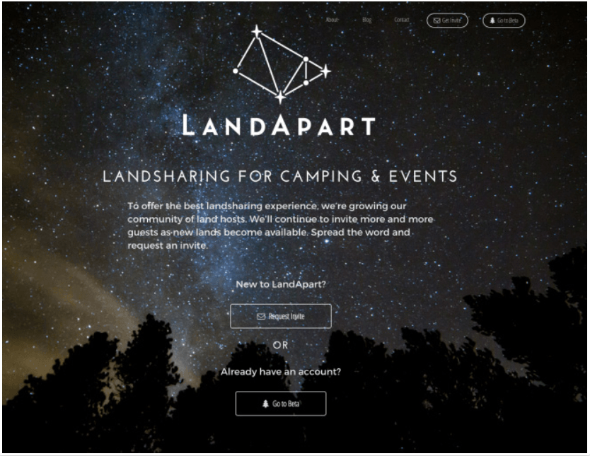
LandApart
The LandApart “website under construction” page uses clever copy and an unusual CTA to position itself as an exclusive offering that visitors should aspire to wait for. The night sky background also provides helpful visual information to new visitors and ties into the business’s overarching camping theme.
LandApart has cleverly disguised its “website under construction” page as a registration page to capture leads.
The text reads:
“To offer the
best land sharing experience, we’re growing our community of land hosts. We’ll continue to invite more and more guests as new lands become available. Spread the word and request an invite.”
Why we like it:
The call-to-action (CTA) here says “Request Invite” making the company seem like an exclusive, invite-only club. LandApart wisely chose to go with a unique CTA instead of a generic “Join Now” or “Subscribe to Our Newsletter” approach.
It works splendidly because visitors perceive the brand as more valuable prior to the product launch.
If you are in the travel and hospitality business and your operations have been impacted by COVID-19, this type of messaging and page layout will work really well until you get some clarity on when your operations can resume.
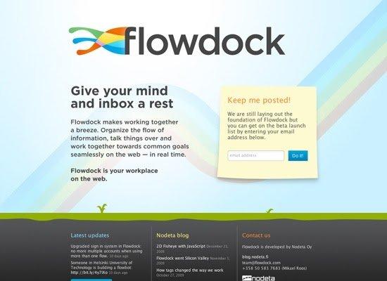
Flowdock
Flowdock uses a straightforward template with interesting copy that appeals to the logical side of visitors. It provides enough information about the product — a suite of collaboration tools — while informing potential visitors of its under-construction status.
What we like:
The page is visually appealing, drawing attention to the central part of the page with closely clustered copy and adjacent CTA. Again, the company leverages exclusivity by prompting visitors to sign up for a beta launch list. The large Flowdock banner placed right in the middle of a visitor’s line of sight also fosters a high degree of user recall.
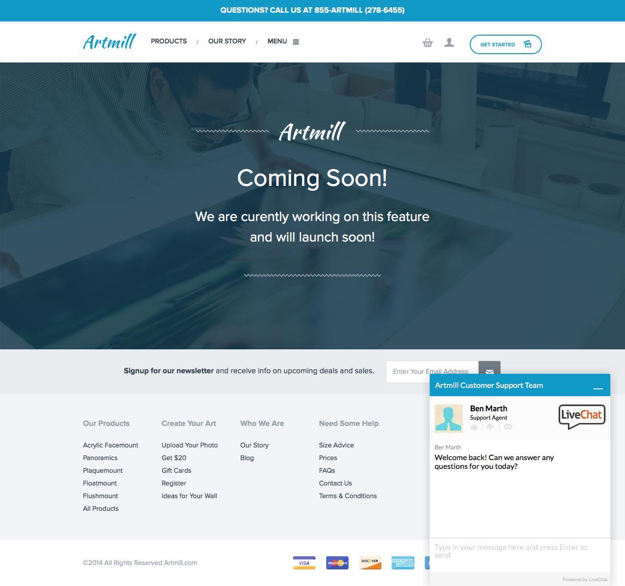
Artmill
This website template prioritizes function over form. You won’t come across any exceptional visuals or CTAs here. But its simplicity works in its favor.
What we like:
The banner on top listing the phone number of the business makes it very easy for potential customers to get in touch. Also, the automatic chat option answers some frequently asked questions while delivering a personal touch. They also have a newsletter signup option which is great for capturing leads. Overall, this is an effective page that works well with the layout of its parent website and needed little customization.
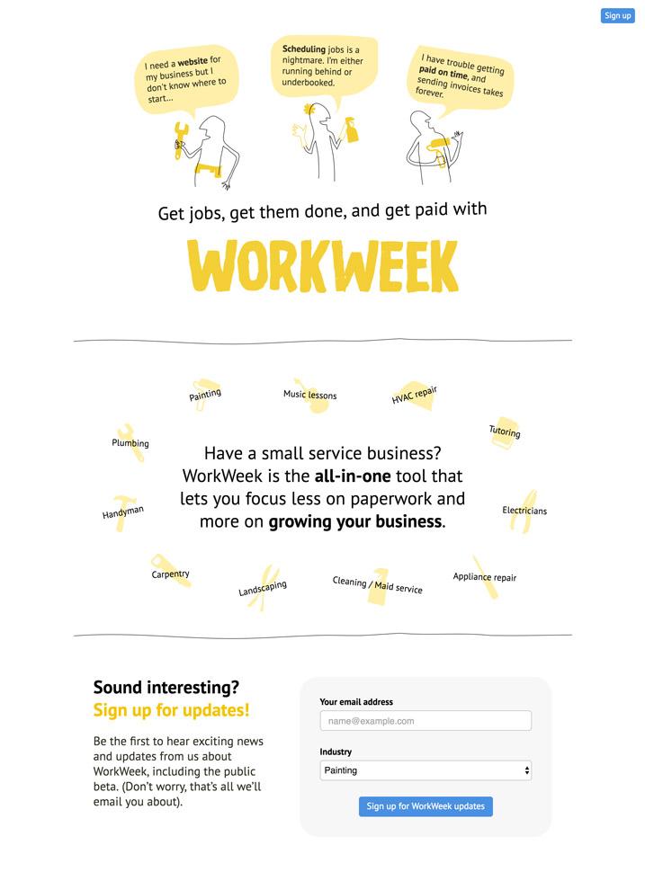
WorkWeek
This “website under construction” page is very creative and uses sketches as the primary visual anchor. The comic-strip style visuals deliver a very engaging experience, particularly when combined with the sharply worded copy. It briefly lists the three most common problems small businesses face right at the top and highlights how the product acts as the ultimate solution for each of these and more.
Why we like it: The crisp value proposition in the second section of the website provides visitors with a comprehensive understanding of the solution and how they can benefit from it. The CTA is also clutter-free and only asks visitors for their email address and industry. The dropdown industry menu is a clever lead segmentation touch that certainly helps WorkWeek segregate potential customers based on their intent.
Summing Up
The above examples obviously don't encompass the full breadth of "website under construction" page designs and user experiences; however, each one does provide a fantastic example of how you can make this type of page work for you. Just remember that what really sets a page like this apart is how the graphics, CTAs, interface, and copy come together to deliver an exceptional site experience to visitors. Focus on those elements and you're sure to create the ideal "website under construction" page for your business's site.