How To Build Great Website Templates

June 27, 2019
0 minute read


Did you know that you and your team can build great websites — and save time — by creating your own team templates using Duda's website builder?

Team templates can be used over and over again, for multiple customers in diverse verticals.

Whether there are ten people on your team or 110, team templates are a fantastic way to provide your entire team with customized, well-designed templates that look great on all devices.

To make the most of the templates you build, follow these tips:

1. KNOW THE DIFFERENCE BETWEEN A WEBSITE AND A TEMPLATE

A website is for a specific user, templates are for multiple users. A website will be used once, templates will be used multiple times. When you design a website, you have a particular audience in mind. When you design a template, you’re designing for a general audience. (For example, when you build a website, you’re probably building for a specific plumber; when you build a template, you’re building for it for any plumbers who are your customers, today or in the future.)

2. THINK ABOUT HOW YOU WANT THE TEMPLATE TO LOOK

Consider elements like the color palette (no more than three colors is best) and fonts (similarly, we don’t recommend using more than three).

3. NOW CHOOSE A TEMPLATE

You’ll need to start with one of Duda’s templates in order to build your own custom versions. On the top bar of the editor, click Team > Team Templates > Create Templates. You can start with a blank template or choose one with images and text. When choosing a template, consider the following:

  • Header and navigation style
  • Site vertical (restaurant, service, etc.)
  • Purpose (full website or landing page)
  • Number of pages (one-pager or multiple pages)
  • Features and widgets (store, blog, etc.)
  • Color scheme (dark or light)

4. GIVE THE TEMPLATE A LOGICAL NAME THAT EVERYONE ON YOUR TEAM WILL UNDERSTAND

Once you’ve chosen the template, click Create & Customize. You’ll be prompted to give the template a name so think of something that’s meaningful makes sense to everyone on your team. For example, “Wednesday Template” will probably be useless while “Carpenter Template” will be very useful. If you change your mind about the template name later, don’t worry. You can rename it at any time.

From this point onwards, you’ll be working in Template Mode. When you’re finished, click Done to save your design as a Team Template, which means anyone building websites on your team can use it as a base for their sites.

5. START WITH THE DESKTOP DESIGN

All templates are fully responsive, so it’s really important to check each version on its own (desktop, tablet and mobile) as some elements will need to be tweaked on some versions. Focus on the desktop design first and when it’s perfect, move to the tablet and then mobile versions.

Site elements that can be customized for each version include:

  • Header and navigation menu
  • Font size
  • Padding and margin spaces
  • Photo galleries layout
  • Popup size
  • Site background colors and images


6. Set the Global Design

This is where you’ll set the styles that apply to all pages and widgets in the template. Make sure you define all the elements now (even if you don’t use them), so that they are set when you and your teammates use the template. Elements controlled here include:

Global fonts: Set the font size and color for everything from H1 to H6. These styles also apply to the blog.

Global buttons: Set the design for all buttons. Stick to your color palette (no more than three colors; see Step 2) and consider adding shadows to make buttons pop.

Site background: Set a background image or color for all pages and per page.

Site layout: Choose from three customizable desktop layouts and choose your desktop width: 960px or 1200px.

7. DESIGN THE HOMEPAGE THOUGHTFULLY

The homepage is super important as it defines the entire flow of the site. If your template has multiple pages, there should be a section on the homepage for each page that appears in the navigation. For example, if the navigation includes: About / Services / Team / Contact, the homepage should have a section or row related to each of these. If your template has a single page, the navigation should connect with anchors on the page.

8. ADD IMAGES

Even though many (if not all) of the images that you use in the template will be replaced when it is used to build a website, we still recommend using high-quality, relevant images that provide guidance and inspiration. The hero image is the top image on the page — select a great, relevant, high-quality image for it. As for the rest of the images, use 1920px HD images with a max weight of 450k.


Never use images that contain text. If you want text on the hero image (a slogan, for example) add it using a paragraph widget.

9. ADD WIDGETS, PAGES & SECTIONS

Add the widgets that you want from the left side bar. To add pages, click the Pages tab and click New Page. To add sections, hover the plus sign that appears between sections and click on it to select sections. Widgets, pages and sections automatically take on the Global Styles of the site (and are completely customizable).

10. WANT A BLOG? ADD IT NOW

When you add a blog to your template, a new blog page is automatically added to the navigation. You can customize the name of this page; for example, News, Updates, Stories, etc. Once a blog has been added, blog-related widgets such as the All Posts and Search widget will become available.

11. ADD A STORE

Like the blog, when you add a store to your site, it is automatically added to the site navigation. The default store allows for up to ten items. If the template is used to build a site that has a richer store, the store can be upgraded from the site.

12. DESKTOP DONE? MOVE TO TABLET


Screenshot of a mobile app and website showing different photo gallery designs.


Once the desktop design is complete, move to the tablet version and make any necessary adjustments. Note that the two views are almost identical, with two exceptions: The tablet version has just two layout versions (the desktop has three) and there are different layout options for the Image Gallery widget.

13. MOBILE DESIGN – LAST BUT (DEFINITELY) NOT LEAST! 

Screenshot of a mobile app design settings screen with options for global design, widgets, content, and personalization.


Once the desktop and tablet design are perfect, move to the mobile version. Keep in mind that in most cases, this is how site visitors will experience the site, so make this version excellent.

You have several layouts to choose from here, though we recommend the top two. Review all of the Global Design elements (font size, buttons, etc.) to make sure they look great on mobile; if they don’t, you can easily make adjustments. You may also want to change the spacing and position of rows, columns and widgets. We recommend that you don’t use more than two columns on mobile.

In areas with multiple columns, take note of the column order on mobile. If the columns aren’t arranged as you like, you can reverse their order.

There are no video backgrounds on mobile, so make sure that if the template has a video on desktop, you’ve set an image on mobile.

Finally, double-check icons and divider width to make sure it all looks great.

14. CONSIDER LIGHTHOUSE WHEN DESIGNING YOUR TEMPLATE

Lighthouse is Google’s automated tool for improving web page quality. To optimize your template for it, follow these tips:

  • For full-bleed or background images, make sure they are no larger than 450k – 1920px.
  • For small images (gallery images, team images), load images that are the right size from the start (not unnecessarily large).
  • Avoid using custom code, especially JavaScript in the header.
  • Place widgets that might slow down site loading (for example, the map widget and HTML widget) below the fold.

For more on building sites that rank well on Google, see these tips.

15. TIDY UP AND YOU’RE GOOD TO GO

Now’s the time to clean up the template so that whoever uses it has a nice, clean template to work with. Here’s what you need to do:

  • Delete unnecessary images from the image library.
  • Check that all site links are correct (navigation menu, buttons, anchors and more).
  • Check that the URL of each page matches the page name.
  • Make sure Global Designs match template designs (text sizes and colors, buttons and more).
  • Check the color palette to make sure only template colors are used.

That’s it. Your Team Template is good to go. All that’s left to do is tell your teammates about the fantastic new template that’s waiting for them!


Related Posts

By Duda March 10, 2026
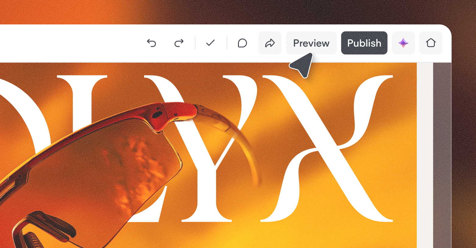
Discover a more intuitive, professional UI with a streamlined sidebar and enhanced top navigation, helping you build faster and with greater confidence.
Graphic with
By Stephen Alemar October 23, 2025
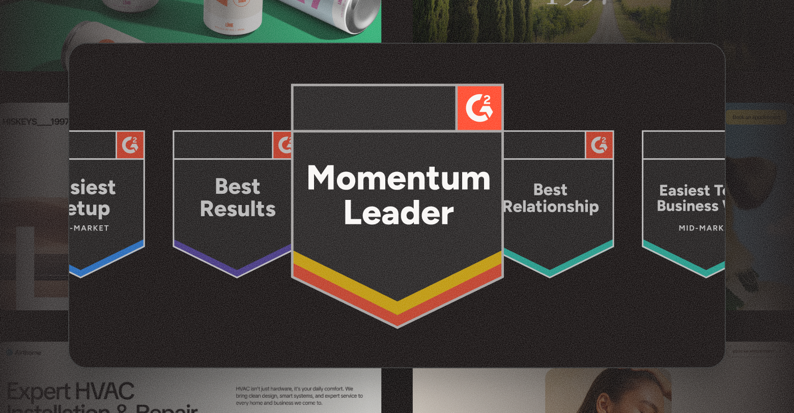
Discover why Duda is a top-rated website builder on G2, recognized for usability, easy setup, strong relationships, and excellent results, all backed by real reviews.
By Ilana Brudo October 16, 2025
Discover why digital marketing agencies are choosing Duda over Wix Studio and WordPress for speed, reliability, and client experience, and how it helps them scale without operational overhead.
Show More


Did you find this article interesting?


Thanks for the feedback!
By Shawn Davis April 1, 2026
Core Web Vitals aren't new, Google introduced them in 2020 and made them a ranking factor in 2021. But the questions keep coming, because the metrics keep changing and the stakes keep rising. Reddit's SEO communities were still debating their impact as recently as January 2026, and for good reason: most agencies still don't have a clear, repeatable way to measure, diagnose, and fix them for clients. This guide cuts through the noise. Here's what Core Web Vitals actually measure, what good scores look like today, and how to improve them—without needing a dedicated performance engineer on every project. What Core Web Vitals measure Google evaluates three user experience signals to determine whether a page feels fast, stable, and responsive: Largest Contentful Paint (LCP) measures how long it takes for the biggest visible element on a page — usually a hero image or headline — to load. Google considers anything under 2.5 seconds good. Above 4 seconds is poor. Interaction to Next Paint (INP) replaced First Input Delay (FID) in March 2024. Where FID measures the delay before a user's first click is registered, INP tracks the full responsiveness of every interaction across the page session. A good INP score is under 200 milliseconds. Cumulative Layout Shift (CLS) measures visual stability — how much page elements unexpectedly move while content loads. A score below 0.1 is good. Higher scores signal that images, ads, or embeds are pushing content around after load, which frustrates users and tanks conversions. These three metrics are a subset of Google's broader Page Experience signals, which also include HTTPS, safe browsing, and mobile usability. Core Web Vitals are the ones you can most directly control and improve. Why your clients' scores may still be poor Core Web Vitals scores vary dramatically by platform, hosting, and how a site was built. Some of the most common culprits agencies encounter: Heavy above-the-fold content . A homepage with an autoplay video, a full-width image slider, and a chat widget loading simultaneously will fail LCP every time. The browser has to resolve all of those resources before it can paint the largest element. Unstable image dimensions . When an image loads without defined width and height attributes, the browser doesn't reserve space for it. It renders the surrounding text, then jumps it down when the image appears. That jump is CLS. Third-party scripts blocking the main thread . Analytics pixels, ad tags, and live chat tools run on the browser's main thread. When they stack up, every click and tap has to wait in line — driving INP scores up. A single slow third-party script can push an otherwise clean site into "needs improvement" territory. Too many web fonts . Each font family and weight is a separate network request. A page loading four font files before rendering any text will fail LCP, especially on mobile connections. Unoptimized images . JPEGs and PNGs served at full resolution, without compression or modern formats like WebP or AVIF, add unnecessary weight to every page load. How to measure them accurately There are two types of Core Web Vitals data you should be looking at for every client: Lab data comes from tools like Google PageSpeed Insights, Lighthouse, and WebPageTest. It simulates page loads in controlled conditions. Lab data is useful for diagnosing specific issues and testing fixes before you deploy them. Field data (also called Real User Monitoring, or RUM) comes from actual users visiting the site. Google collects this through the Chrome User Experience Report (CrUX) and surfaces it in Search Console and PageSpeed Insights. Field data is what Google actually uses as a ranking signal — and it often looks worse than lab data because it reflects real-world device and connection variability. If your client's site has enough traffic, you'll see field data in Search Console under Core Web Vitals. This is your baseline. Lab data helps you understand why the scores are what they are. For clients with low traffic who don't have enough field data to appear in CrUX, you'll be working primarily with lab scores. Set that expectation early so clients understand that improvements may not immediately show up in Search Console. Practical fixes that move the needle Fix LCP: get the hero image loading first The single most effective LCP improvement is adding fetchpriority="high" to the hero image tag. This tells the browser to prioritize that resource over everything else. If you're using a background CSS image for the hero, switch it to anelement — background images aren't discoverable by the browser's preload scanner. Also check whether your hosting serves images through a CDN with caching. Edge delivery dramatically reduces the time-to-first-byte, which feeds directly into LCP. Fix CLS: define dimensions for every media element Every image, video, and ad slot on the page needs explicit width and height attributes in the HTML. If you're using responsive CSS, you can still define the aspect ratio with aspect-ratio in CSS while leaving the actual size fluid. The key is giving the browser enough information to reserve space before the asset loads. Avoid inserting content above existing content after page load. This is common with cookie banners, sticky headers that change height, and dynamically loaded ad units. If you need to show these, anchor them to fixed positions so they don't push content around. Fix INP: reduce what's competing for the main thread Audit third-party scripts and defer or remove anything that isn't essential. Tools like WebPageTest's waterfall view or Chrome DevTools Performance panel show you exactly which scripts are blocking the main thread and for how long. Load chat widgets, analytics, and ad tags asynchronously and after the page's critical path has resolved. For most clients, moving non-essential scripts to load after the DOMContentLoaded event is a meaningful INP improvement with no visible impact on the user experience. For websites with heavy JavaScript — particularly those built on frameworks with large client-side bundles — consider breaking up long tasks into smaller chunks using the browser's Scheduler API or simply splitting components so the main thread isn't locked for more than 50 milliseconds at a stretch. What platforms handle automatically One of the practical advantages of building on a platform optimized for performance is that many of these fixes are applied by default. Duda, for example, automatically serves WebP images, lazy loads below-the-fold content, minifies CSS, and uses efficient cache policies for static assets. As of May 2025, 82% of sites built on Duda pass all three Core Web Vitals metrics — the highest recorded pass rate among major website platforms. That baseline matters when you're managing dozens or hundreds of client sites. It means you're starting each project close to or at a passing score, rather than diagnosing and patching a broken foundation. How much do Core Web Vitals actually affect rankings? Honestly, they're a tiebreaker — not a primary signal. Google has been clear that content quality and relevance still dominate ranking decisions. A well-optimized site with thin, irrelevant content won't outrank a content-rich competitor just because its CLS is 0.05. What Core Web Vitals do affect is the user experience that supports those rankings. Pages with poor LCP scores have measurably higher bounce rates. Sites with high CLS lose users mid-session. Those behavioral signals — time on page, return visits, conversions — are things search engines can observe and incorporate. The practical argument for fixing Core Web Vitals isn't just "because Google said so." It's that faster, more stable pages convert better. Every second of LCP improvement can reduce bounce rates by 15–20% depending on the industry and device mix. For client sites that monetize through leads or eCommerce, that's a revenue argument, not just an SEO argument. A repeatable process for agencies Audit every new site before launch. Run PageSpeed Insights and record LCP, INP, and CLS scores for both mobile and desktop. Flag anything in the "needs improvement" or "poor" range before the client sees the live site. Check Search Console monthly for existing clients. The Core Web Vitals report surfaces issues as they appear in field data. Catching a regression early — before it compounds — is significantly easier than explaining a traffic drop after the fact. Document what you've improved. Clients rarely see Core Web Vitals scores on their own. A monthly one-page performance summary showing before/after scores builds credibility and makes your technical work visible. Prioritize mobile. Google uses mobile-first indexing, and field data shows that mobile CWV scores are almost always worse than desktop. If you only have time to optimize one version, do mobile first. Core Web Vitals aren't a one-time fix. Platforms change, new scripts get added, campaigns bring in new widgets. Build the audit into your workflow and treat it like any other ongoing deliverable, and you'll stay ahead of the issues before they affect your clients' rankings. Duda's platform is built with Core Web Vitals performance in mind. Explore how it handles image optimization, script management, and site speed automatically — so your team spends less time debugging and more time building.
By Ilana Brudo March 31, 2026
Vertical SaaS must transition from tools to an AI-powered Vertical Operating System (vOS). Learn to leverage context, end tech sprawl, and maximize retention.
By Shawn Davis March 27, 2026
Automate client management, instant site generation, and data synchronization with an API-driven website builder to create a scalable growth engine for your SaaS platform.
Show More

Latest posts