Want a surefire way to deliver beautiful websites more efficiently to your small business customers? Embrace designing websites with
sections!
Sections are powerful site-building tools in Duda (and some other platforms) that allow you to build with blocks. A section is essentially a designated horizontal row inside the site builder that can group content into visually distinguishable areas on a web page.
When responsive web design started to dominate the industry, website sections became popular. This was partly because they work well on a responsive website. The other reason they gained popularity, as mentioned above, is they make it faster and easier to design websites. Sections make it easy to break content into digestible sizes that stand out visually. Each section contains focused information so website visitors can easily navigate the site.
The power of designing with sections becomes fully apparent when they are deployed as reusable web design building blocks for your team.
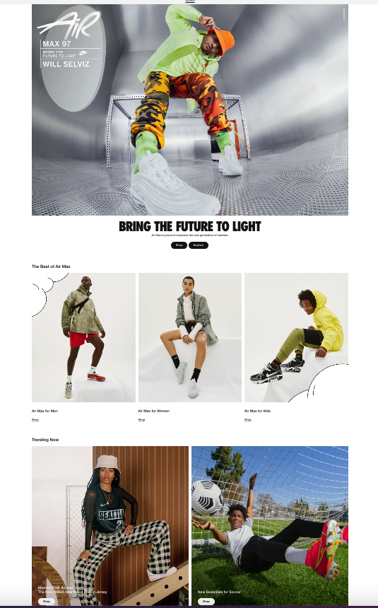
You can find sections on all kinds of websites. For instance, Nike’s website uses sections. The company uses a hero section at the top of the homepage, followed by a three-column product spotlight, then a two-column product spotlight, and finally a thinner product spotlight section. The web designer then recreates the product sections all the way down the homepage, but with different content each time. Using repeating sections makes the website feel cohesive, but allows each part to stand out visually.
Why Designing Sites With Sections Is Useful
As we all know, time is money for digital marketing agencies and web design professionals. When you save time, you’re able to take on more projects, boost profit margins and deliver more affordable sites to customers.
You can think of sections as the next generation of web design templates. With site templates alone, you have to go in and customize dozens of parts of a website individually — otherwise, your design can come off looking cookie-cutter and uninteresting.
With sections, you have more granular control and can customize the site to your client’s needs more quickly. It’s simply much faster to pull from a library of predesigned site sections and customize them than start with an entire template and make changes one-by-one throughout the website.
How To Get the Most Out of Sections
You can customize and save Duda’s prebuilt site sections to use in future website builds — and your entire team can then use and share them! The process of building sites with sections ensures you’re building unique websites, but also leveraging a plug-and-play approach to maximize efficiency.
Run the numbers. How long does it take to build a section (like pricing or testimonials) if it’s not part of the template you choose? Maybe 15 minutes? Maybe 30 minutes? If you need to do that 10 times on a 15-page website, the minutes add up.
Just think of the hours you could save by breaking your site builds into bite sie chunks. And the more custom sections you create and save, the faster site building gets!
All of these compelling reasons have made sections one of the most popular features used by Duda customers and partners.
8 awesome Website Section Design Tips
Here are eight protips to keep in mind when engaging in website section design with Duda.
Let's dive a little deeper into each one...
1. Pull From Duda’s PreBuilt Sections
Duda offers loads of different predesigned sections to choose from. To begin using them, start editing a site and click the “+” that appears between rows. Select sections from categories, such as Plans, Social, Testimonials, Team, About, Features, Intro, and more.
Duda’s team built each section following design best practices, such as the intelligent use of white space, the rule of thirds, and the golden ratio.
Once added to a site, sections behave like a “row” in the editor, so you can easily add widgets, change their order, customize the styling, add content, etc.
2. Know That Sections Automatically Adjust To Your Template
When you add a section to a website, it takes on the Global Design characteristics of that site — including fonts and colors.
If you like, you can override the settings. You might choose this if you want a specific font or color to remain the same on every website despite the global colors and font choices.
3. Add Real Images & Thoughtful Text
This rule broadly applies to most online design projects, but it still bears repeating. When you’re creating web pages, it’s important to use images of a customer’s actual business and text that conveys their brand story in a way that emotionally connects with visitors. These web design best practices apply to sections just as well as they apply to holistic site design.
4. Rein in the Amount of Content in Each Section
The prebuilt sections from Duda have ideal word counts and are built around certain images (like product images or a hero image). Stick to the recommended length – or choose a different prebuilt section.
5. Move Sections Around
If a section isn’t working, just move it up or down on the page and try it there. That’s part of why they work so well.
If a section you try doesn’t work on a client’s web page, simply bring in a different pre-built section. The beauty is that Duda’s sections work on any template – and there are loads to choose from.
6. Use Sections To Break up Text
On text-heavy pages, use sections with buttons and other visuals to break up the text and emphasize calls-to-action.
7. Rein in the Number of Sections
Users expect certain information on certain pages and won’t scroll beyond a certain point. You’ll have to get a feel for what works depending on the number of website pages overall. Perhaps the right number of sections, especially on a typical website with multiple pages, is between two and seven. Try it and test it to see the conversion rate.
8. Create Your Optimal Workflow
If you’re building dozens or hundreds of websites per month, it’s more than likely you have a repeatable workflow your designers go through as they build out each site. Duda’s most successful partners typically build out large libraries of predesigned sections that conform to their style guide, customer types, and best practices, and incorporate these into that process.
At these agencies, the most experienced designers typically spend their time creating new sections, and then share them with the website building team. This significantly speeds up the site production process without sacrificing quality.
Create New Website Section Designs Today!
Sections are a remarkably useful site-building tool and can really change the game for a digital marketing agency or web professional who is looking to scale up their operations. Give them a try today to see the amazing difference they make to your web design projects and timelines.


