Media Page Essentials & Examples

November 13, 2020
0 minute read

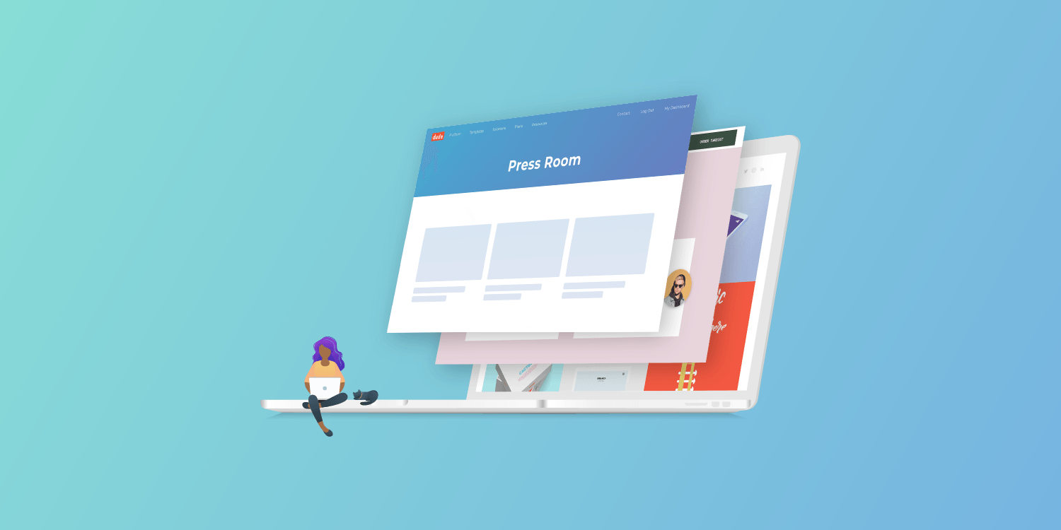
A well-designed media page (also known as a press page) is a critical brand-building tool for any organization. This is due to the fact that, next to customer reviews, there is almost no better way to build credibility with an audience than by laying out good news stories published by independent media outlets. When used properly, a website’s media page can help you capture new customers, land new investors and even generate new PR and press opportunities. 


In this post, we will:

  • Define what a media page is
  • Discuss who the media page is for
  • Outline the essential elements of a media page 
  • Offer advice on how to fit a media page into a website 
  • Highlight outstanding examples of media pages from around the web


Let’s get started…


What is a Media Page?

As the name suggests, a media page is a part of a website that is dedicated to an organization’s media mentions and press outreach initiatives. Brands typically use their media pages to share business updates via press releases, showcase positive stories covered by the press and offer up any resources journalists might need to create stories about the organization. In fact, having a media page can greatly increase the chance of being featured in news stories. 

However, never forget that a media page is first and foremost about building credibility. At the least, it should contain a list of positive stories intended to inform visitors about the organization and place the brand in a positive light.


Who looks at a media page?

While primarily used by journalists and PR professionals, media pages also cater to other categories of website visitors. Many investors, prospects, customers, and potential employees will check out a company’s media page before engaging with the brand. Given the wide range of people with various intents that could land on your media page, it’s best to make sure it provides as comprehensive a view of your organization as possible.

Essential Elements of a Media Page

There is no perfect layout or content recipe for media pages; however, there are some crucial elements that every successful one will contain. 

These include:

  • Boilerplate — A brief description of the organization 
  • Press mentions — Links to media articles and videos in which the organization is mentioned 
  • Press Contact — Contact information for the person in the organization who handles press inquiries 
  • Media Kit — A downloadable zip file of images, logos and photos that you wish to make regularly available to anyone writing a story about the organization
  • Press Logos — Logos of media outlets in which the organization has been featured

Where should the media page go on the website?


Once again, there is no perfect placement for a media page on a website. It really depends on the type of organization you have. If, for example, you're creating a website for a real-estate developer, it might be smart to add the media page to the main navigation in the header and possibly add a CTA somewhere on the homepage. However, if you are creating a site for a local restaurant, it may suffice to simply add a link to the media page in the footer.

Need website builder that enables you to create beautiful websites and media pages for your clients quickly? Start a 14-day free trial of Duda.

Outstanding Media Page Examples

The difference between good and great media pages is that great pages simplify information discovery for visitors. The formula for an effective media page is outstanding design combined with brief but comprehensive content. 

Here are some brands we think have done it right.
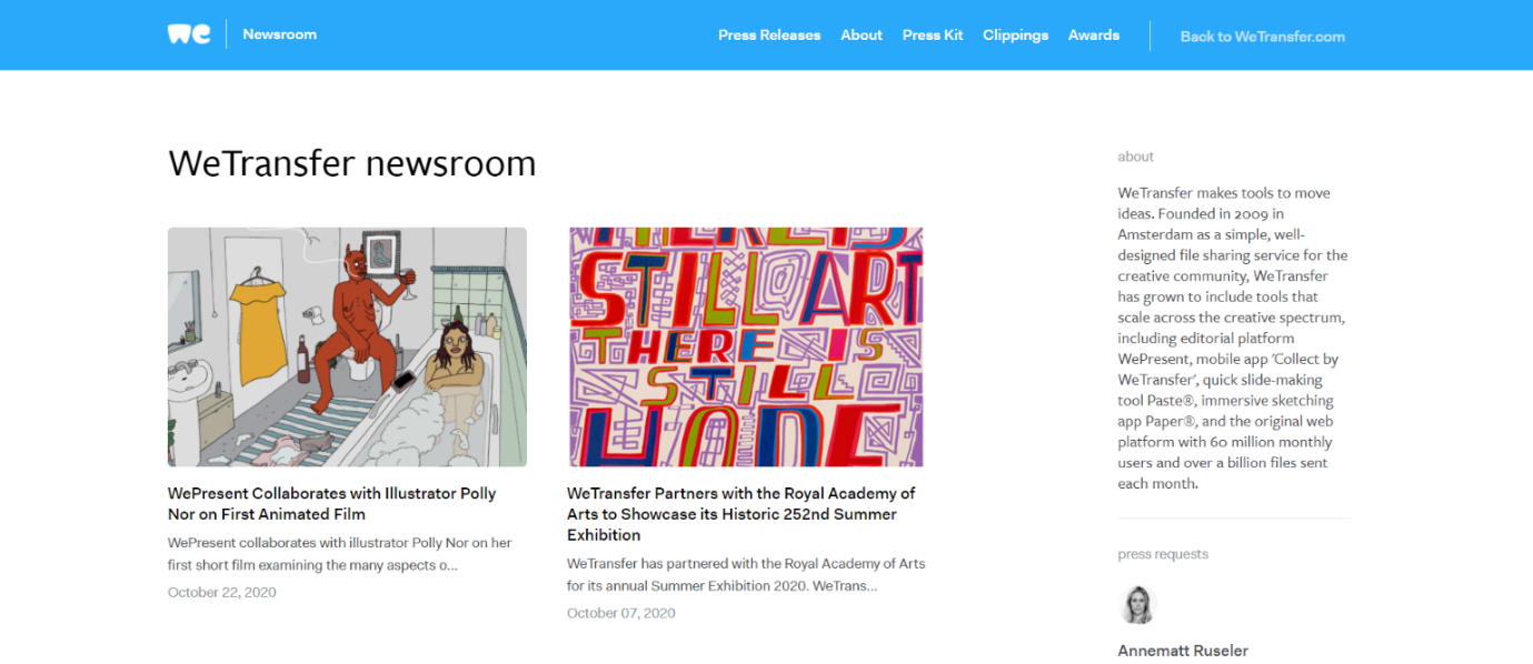


WeTransfer

The crisp and clean layout of WeTransfer’s media page conveys important information to visitors in one quick look. Company information, PR contact details, latest news, and additional resources are all accessible immediately upon landing on the page. Visitors and journalists won’t need to dig through the website to learn more about the company. 

Why We Like It: The unique story images pique our curiosity and also add a splash of contrast to the white website theme.

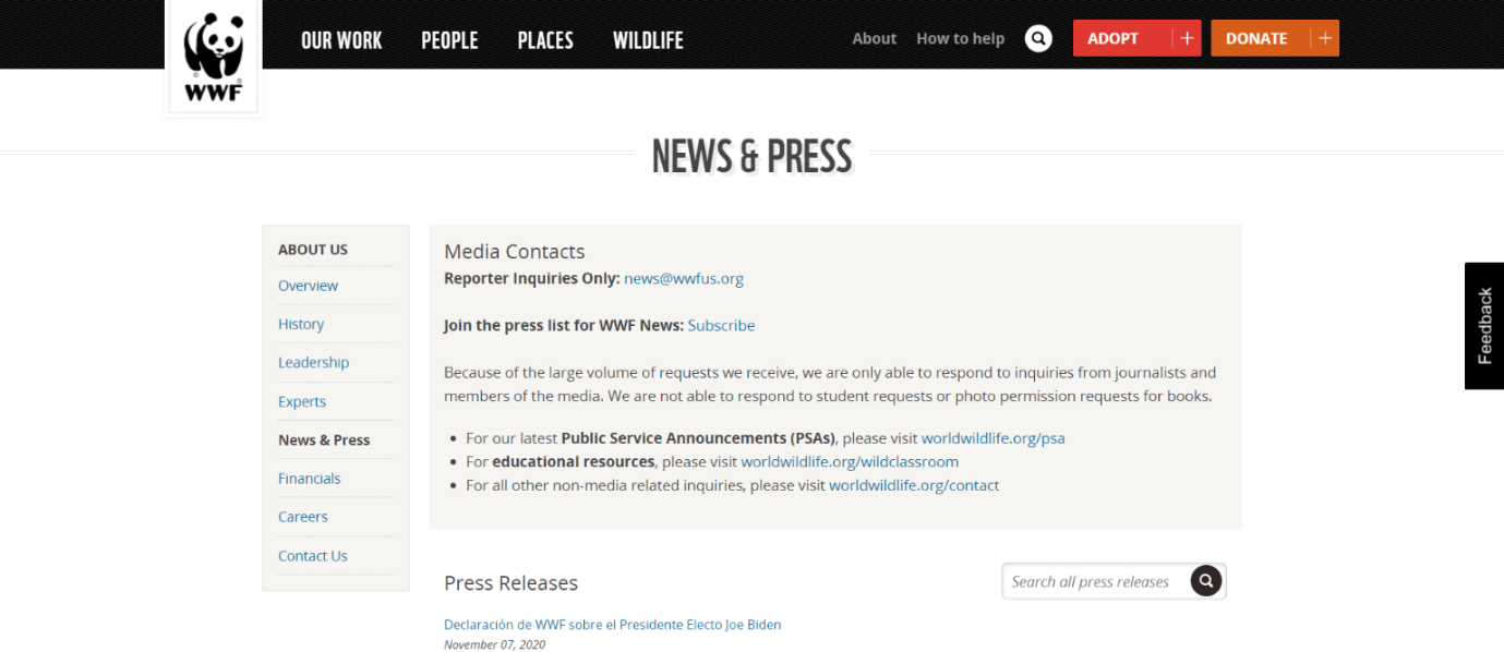
World Wildlife Fund for Nature (WWF)

As one of the largest non-profit organizations in the world, WWF has a different approach to its media page. Known for its extensive knowledge library, WWF receives many inquiries every day from students and content creators. By stating that the information on the page is intended solely for members of the media, the organization effectively segments its page traffic and incoming inquiries. 

Why We Like It: WWF reminds us that simplicity can also look elegant. The gray box directs visitor attention to the important information.
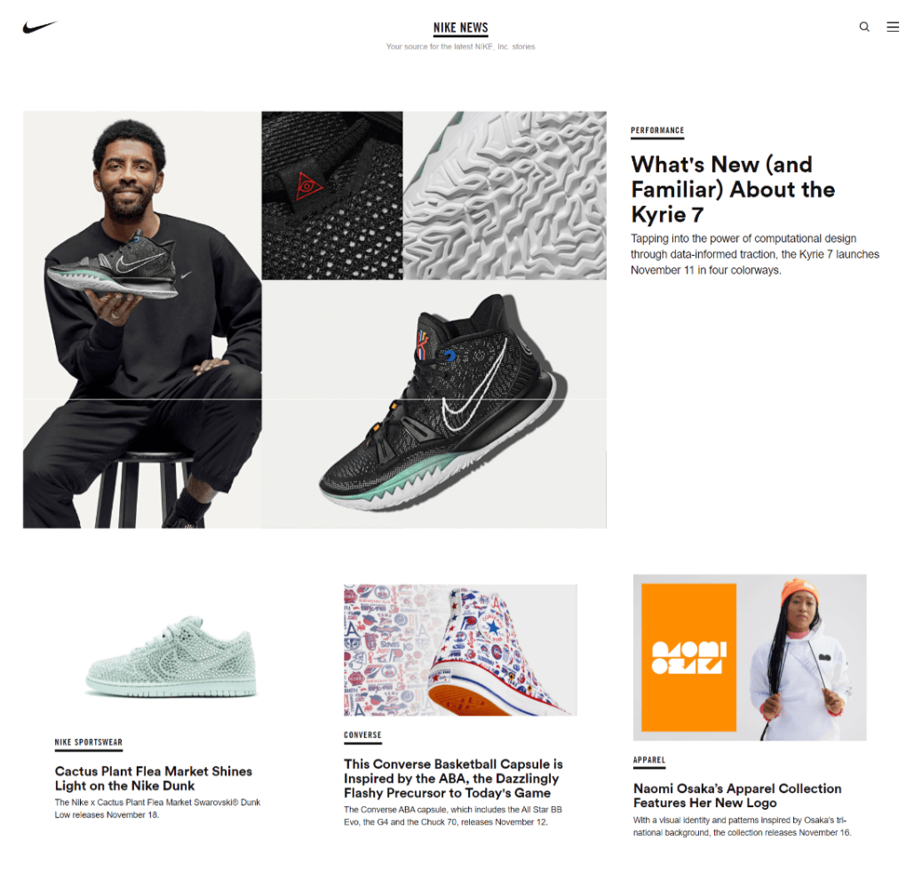
Nike

Nike’s media page takes a visual-first, product-centric approach. This isn’t really a surprise considering how the brand is known for some of the most successful product marketing campaigns in history. Targeted to both customers/fans and journalists, the media page prioritizes Nike news, and features additional options at the bottom of the page. By the time journalists scroll to the bottom, they’ve already skimmed through Nike’s latest releases. 

Why we like it: The media page exists to serve the entire Nike community rather than just journalists.

Dolby

Dolby has a large range of products and solutions which make it important to enable visitors to easily find information or news they’re looking for. The search bar at the top of the media page simplifies those efforts for journalists and leads them directly to the product/feature/investor news they’re looking for. 

Why we like it:  Dolby’s media page has a highly adaptable design that can be easily accessed from multiple devices.
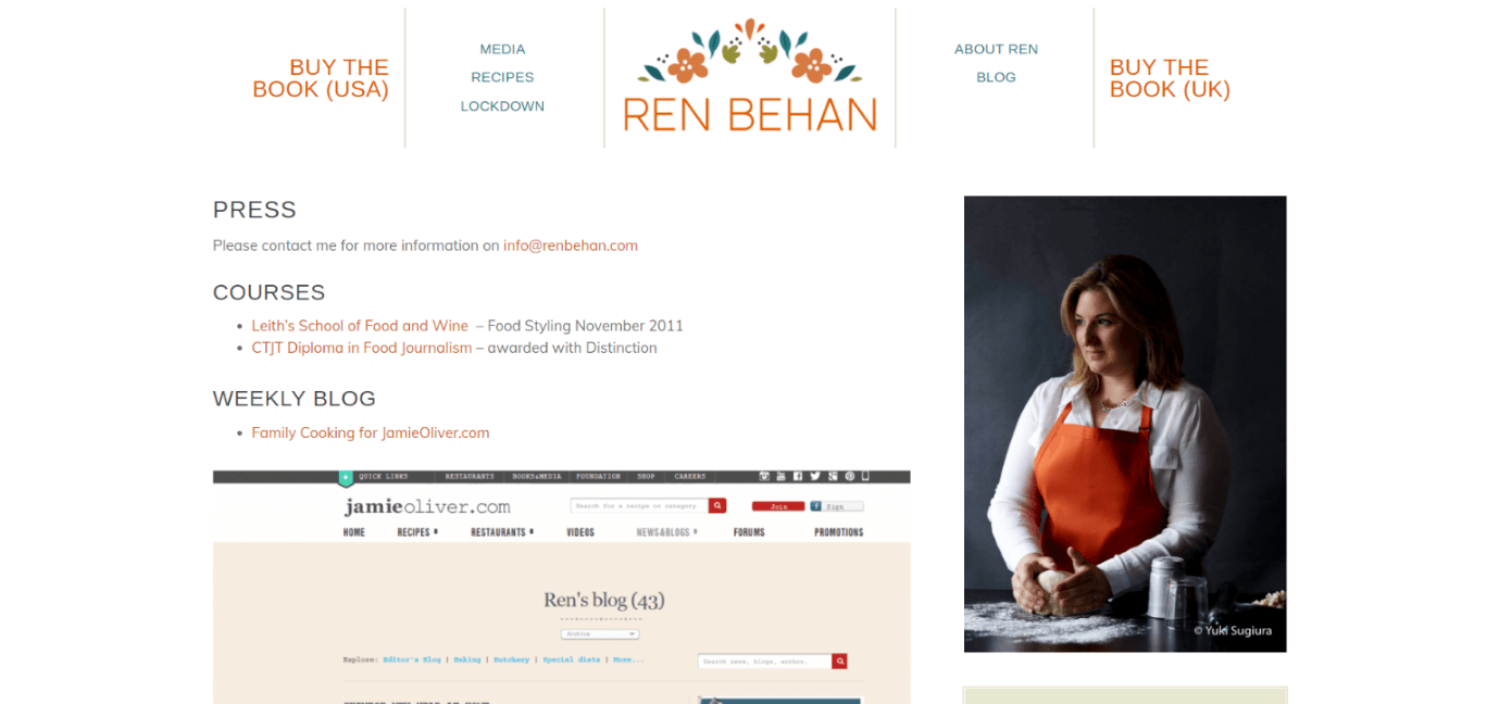
Ren Behan

How does a journalist create a media page for fellow journalists? Ren Behan’s media page is a great example of a simple, straightforward design that works. As a food critic, Ren is more likely to receive visits from restaurant owners and publishers than members of the press. So, her media page speaks to a much wider audience. 

Why we like it: A simple yet informative layout that small businesses can replicate.
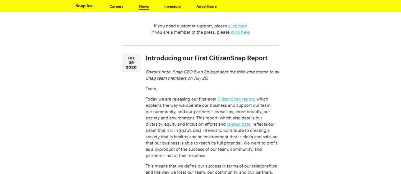
Snap

Snap’s media page reminds us of a classic blog feed. Its simple design offers an infinite scroll of Snap news stories. What makes it stand out is its mobile-first UX. Its clutter-free design also makes it easy for journalists to get in touch with the company. Additionally, the media page features GIFs and micro-animations that break the monotony created by the text.

Why we like it: We love that there are specific instructions for how members of the media can get in touch with Snap right at the top of the page. But like any good media page, there are also instructions for how additional audiences (in this case, customers) can get in contact with the brand.

Summing up

So, there you have it. We hope you found the above explanations and examples helpful when building out media pages for your clients. Good luck!


Did you find this article interesting?


Thanks for the feedback!
A screenshot of a plumber's website with a
By Renana Dar May 5, 2025
Many SMBs still hesitate to embrace eCommerce. As the agency partner, you have the opportunity to tear down the perceived walls of eCommerce and show clients how eCommerce can make their business more efficient, accessible, and profitable. Read all about it!
A computer screen with a graph on it and a purple background.
By Santi Clarke April 24, 2025
Learn how platform ecosystems drive revenue and why they are essential for the growth of SaaS businesses.
By Santi Clarke April 24, 2025
One of the greatest challenges for SaaS platforms is keeping users engaged long-term. The term “stickiness” refers to a product's ability to retain users and make them want to return. In the context of SaaS platforms, creating a sticky product means that users consistently find value, experience seamless interactions, and continue using the product over time. The following are 7 practical strategies you can take to improve the stickiness of your SaaS solution. 1. Offer websites that help customers build their digital presence One of the most effective ways to make your SaaS platform sticky is by offering websites to your users. Many businesses today need an online presence, and by providing a platform where your customers can easily build and manage their websites, you increase their reliance on your product. When you offer users a website-building solution, you’re helping them create something foundational to their business. Websites, in this case, aren’t just a tool—they become a part of their identity and brand. This deepens their engagement with your platform, as they need your product to maintain and update their site, ultimately making them less likely to churn. Plus, websites naturally encourage frequent updates, content creation, and customer interactions, which means your users will return to your platform regularly. When you can give your users the tools to create something so essential to their business, you make them more dependent on your platform. This creates a higher barrier to exit, as migrating a fully built website to another service is no small task. In fact, websites are some of the stickiest products you can sell, so adding them to your product portfolio can be one of the best decisions you can to keep your customers using your technology for the long haul. 2. Deliver continuous value through product innovation The key to keeping users coming back to your SaaS platform is ensuring that they consistently see value in it. This means not only meeting their immediate needs but also evolving to address their growing demands. Constant product innovation is essential for keeping your users satisfied and invested in your platform. One way to achieve this is through regular updates that add new features or improvements based on user feedback. A SaaS platform that evolves with its users will keep them engaged longer, making it harder for competitors to steal their attention. Encourage user feedback and prioritize updates that create tangible improvements. This creates an ongoing relationship with your users, which boosts stickiness. 3. Offer a multi-product solution Another powerful way to increase your platform’s stickiness is by offering a suite of products or features that integrate well together. When your users adopt multiple products, they are more likely to stay because they become embedded in your ecosystem. The benefits of this strategy are clear. Research shows that once users adopt more than one product, especially when they integrate >4 tools into their workflow, their likelihood of churn decreases significantly. This happens because the more a user integrates into your suite of products, the harder it is for them to switch to a competitor. These users have invested time in learning your ecosystem and rely on it for their day-to-day operations, making it much harder for them to make the switch. 4. Create a personal connection with your users Human connection is one of the most powerful drivers of user retention. People don’t want to feel like they’re using a cold, faceless platform. By offering exceptional customer support, personalized communication, and community engagement, you build a relationship with your users that goes beyond the product itself. Make sure your support team is responsive, knowledgeable, and empathetic. You can also consider offering tailored onboarding experiences to ensure users understand how to make the most of your platform. When users feel like their success matters to you, they are more likely to remain loyal. 5. Leverage data to personalize the user experience Using data to drive personalization is another strategy that can significantly increase the stickiness of your platform. By tracking user behavior and usage patterns, you can tailor the experience to each individual user’s needs. This could mean recommending features they haven’t yet explored or sending them reminders about tools they may not be fully utilizing. Personalization gives users the feeling that the platform was designed specifically for them, making it harder to walk away from. By demonstrating that you understand their unique needs, you can build a stronger connection and ultimately increase retention rates. 6. Focus on seamless integrations and API capabilities To further increase stickiness, consider expanding your product’s ability to integrate with other tools your users already rely on. Whether it’s email marketing software, CRM systems, or social media management tools, seamless integrations add tremendous value by making it easier for users to incorporate your platform into their existing workflows. The more your product can work in tandem with other popular tools, the more indispensable it becomes. In fact, users who depend on integrations are less likely to churn since their entire ecosystem is tied to your platform’s functionality. 7. Encourage user advocacy and community building User advocacy is another powerful tool in building a sticky product. When users feel a sense of community or even ownership over the platform, they become your most passionate promoters. Encourage your users to share their success stories, join community forums, or contribute to product development through beta testing or feedback loops. A thriving user community not only increases user engagement but also creates a sense of loyalty. When users are part of something larger than themselves, they are more likely to remain committed to your platform, reducing churn and increasing lifetime value. Create deep, lasting customer relationships Making your SaaS platform sticky is all about creating a deep, lasting connection with your users. This requires building a platform that continuously delivers value, creating a seamless and personalized experience, and integrating features that keep users coming back. By focusing on product innovation, offering a multi-product ecosystem, and fostering strong user relationships, you’ll be well on your way to reducing churn and boosting user retention. Stickiness isn’t just a nice-to-have; it’s essential for long-term success. Focus on creating a platform that users can’t imagine living without, and you’ll see them stick around for the long haul.
Show More

Latest posts