In my personal opinion, the
Widget Builder, available via the
Custom Plan, is one of Duda’s most compelling features. Using little more than simple, industry-standard HTML you can create reusable widgets perfectly suited to meet any client’s needs. A quick look through our
Experts portal highlights the potential. Agencies have built interactive galleries, custom shapes, and even scroll-progress bars using the powerful Widget Builder. We even do it ourselves for our own blog!
When we choose to build widgets, we do so to either make our blog posts more interactive, such as the “Copy” widget frequently used in our
AI-oriented articles, or to cut back on some of our more repetitive tasks.
All good widgets have a few things in common:
- The design is customizable
- The widget is responsive
- The code is easy to understand
With those three principals in mind, we’re going to build a custom bar graph widget together based on the very high quality, open source
Chart.js library.
While some knowledge of HTML, CSS, and javascript may help you extract the maximum amount of value from this article—there’s plenty in here for beginners too. To sweeten the deal, the complete code will be available at the end.
That being said, if you’ve never built a custom widget before, this may not be the best place to start. Instead, take a look at our
Duda University course covering this very same topic.
Ready to get started?
Conceptualize the widget
The first step in any good project is to fully understand your motivations and to clearly visualize your outcomes. Why are we building this widget? What do we hope to accomplish? How should it work? Answering these questions early in the process will help save us a lot of time later down the road.
For this particular project, we’re looking to create a reusable widget that can transform a table of data into a bar graph. With that in mind, it should have a somewhat customizable design, while still adhering to our style guides, and the ability to graph any arbitrary amount of data.
We’re going to be taking design inspiration from our “2024 AI Outlook for Digital Agency Leaders'' survey report, which includes a variety of well designed bar graphs. If you’re coding along, feel free to make the design your own.
Dig into the content and design editors
The Content Editor and Design Editor are what truly make Duda’s Widget Builder unique. Both of these tabs within the Widget Builder let us build a special form that can insert user-submitted data directly into our code. This is a crucial step towards making our widget reusable.
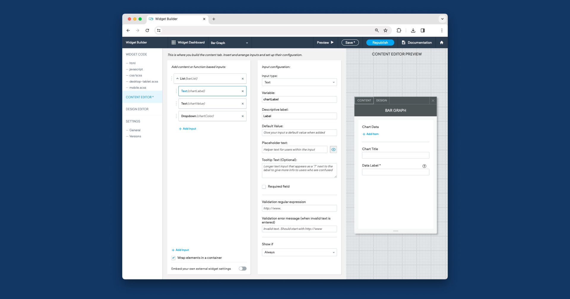
Content editor
Within the Content Editor, we know we know immediately that we’re going to need a “List” input. Lists let us create multiple miniature forms that we can access within the code as collections called “arrays.”
We’ll give our list a variable so that we can access it later, in this instance “barList,” and we’ll add three inputs within it: two text inputs and a dropdown. These text inputs will represent the bar’s Label with the variable chartLabel, and the bar’s value, with the variable chartValue. Since the bar’s value needs to be a number, we are going to add the following regular expression to the “validation regular expression” field.
The dropdown is optional, but we’ll be using it to define the bar’s color from a preselected list of options. You can take a peak at what this looks like in action via the screenshots below.
We’re going to include a few more fields in our Content Editor to help round-out our widget. These will include a text field for the chart’s title, a text field to label the data, a dropdown to pick the chart’s axis (x or y), a toggle to show or hide the legend, and a toggle to start the chart at zero or not. The table below shows all of the variables and labels we used.
Our dropdown includes two options in a “static list.”
Design editor
The Design Editor works a little differently than the Content Editor. You can either create variable-post fields, like we did before, or you can create fields that directly interact with the css file.
Our first field is going to be one of the latter. We’ll add a “CSS Slider” input type to modify the padding of our entire element, which we’ll identify with the customer selector “#barChart.”
We’ll do this again with the “Rounded Corners” input type, also targeting the “#barChart” selector, as well as with the “Background” input type.
To spice things up, we’ll add two inputs that don’t interface with the CSS file. The first will be a toggle with the label “Show Ticks” and the variable “showTicks.” This will, as the name suggests, show or hide the tick marks on the chart.
We’ll also add a “Slider,” which is different from the CSS Slider we used earlier, labeled “Corner Radius” with the variable “chartRadius.” This will change the radius of the individual bars within the chart.
The final product should look something like the image below.
Write your HTML and CSS
As the name suggests, Chart.js is mainly a javascript library. That means we won’t be writing very much HTML or CSS in this project.
In fact, within our HTML file we’ll only be adding a single line of code.
The “canvas” element is a drawable area that the chart library can modify—something we’ll get to later in the javascript portion. The important thing to note here is that id value, “barChart.” You may recognize it from the Design Editor, and you’ll see it again in the CSS file.
Within our CSS file, we’ll add some version of the following code.
You can use any values you want here for border radius, padding, and background color. You’ll notice when we eventually preview this widget that the default values within the Design Editor are these numbers! Pretty neat trick, huh?
Write your javascript
Now the javascript is where things might get a little hairy. There are two unique things we need to do for this widget to work, we need to uniquely identify our canvas element and we need to load the Chart.js script.
If you have some experience writing code you might be thinking “isn’t the ID already unique?” It should be! However, if we happen to use this widget multiple times on the same page then this ID will be repeated—breaking our javascript.
Instead, we can use another unique aspect of the Widget Builder, the “element” parameter. Take a look at the following code.
This identifies our canvas element, but it does so only within the scope of this particular widget.
Now, to load the Chart.js library we’re going to use a feature of jQuery called “getScript.” It’ll look something like this.
This function loads our script and then, once it’s finished loading, calls a function. Within that function is where we’re going to call all of our code going forward.
First, we need to parse our list that we made in the Content Editor. If you remember, the list is going to contain labels, colors, and values. Chart.js needs all three of these things in their own unique, ordered collections—so that’s exactly what we’ll do.
What we’re doing here is creating three buckets, then dividing our list items into each bucket. This is going to be useful in the next step, creating the chart.
Chart.js works by creating a “Chart,” like so.
Looking at the code above, you can see that we’ve defined the “type” as “bar.” You can also see where we’ve included the buckets we made earlier, in addition to the “dataLabel” and “chartRadius” fields we defined in the Content Editor and Design Editor, respectively.
This is essentially all you need to create a bar graph, but we’re going to take it a little further by customizing the design as well.
Immediately after that code, we’re going to add the following.
Okay, so what’s happening here? First, we’re defining the “Index Axis,” which is the orientation we discussed in the Content Editor section. Then, we are making sure that our chart is responsive and also not confined to any particular aspect ratio. Then we start plugging in a few of the fields we defined earlier.
For this example, since we’re inspired by the design in the AI survey, we’re aligning our text to the start and hiding the grid. You don’t have to do that yourself.
The version we use on the Duda blog will take the design even further with custom fonts, tooltips, and more. The design customization here is virtually limitless. If you’re interested in diving deeper, take a look at the
Chart.js documentation to explore just how many attributes you can customize.
Seeing it in action
Now that our widget is built, it’s time to use it! Here’s an example showing the most visited National Parks in 2023. As you can see, the Smoky Mountains were pretty popular last year.
Notice how the tooltip appears when you hover over each individual bar on the chart? This adds additional context and makes the entire widget a little more interactive than a normal image.
We said this needed to be customizable, and, thankfully, it is! Here’s another example graph comparing the length of our blog author’s names. This one uses a different color for the bars and switches up the orientation.
Ready to build your own widget?
The Widget Builder is an incredibly flexible tool for agencies looking to stretch the Duda platform to its limits.
Duda Experts have been using this tool to create highly interactive, advanced tools for agencies to spice up their client’s sites.
Oh, and, as promised, the complete code for this widget is embedded below.