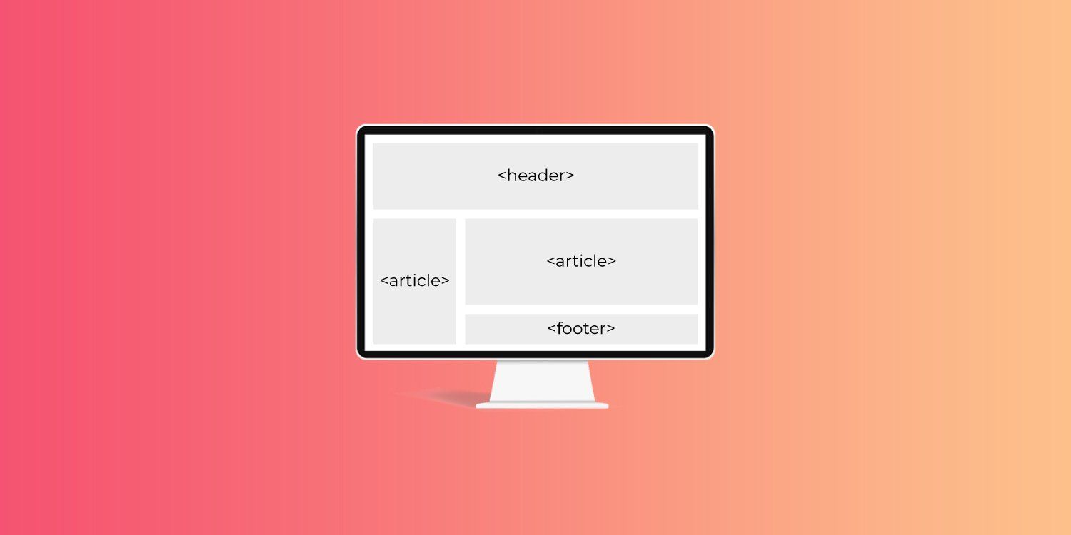
For website professionals, saving time on website builds and mockups is a must to stay competitive and profitable. One way to satisfy this business need is to use CSS grid templates and CSS grid template areas.
Many modern websites are built using grids, which divide a page into major regions and define the relationship between elements in terms of size, position, and layer. Grids make it easy to place elements into both columns and rows.
This means that whether you use code to create a CSS grid template, choose from grid template starters, use a theme built via grids, or use some plug-and-play design elements in a
website builder like Duda, it pays to understand how CSS grid templates and grid template areas work.
The power of CSS grid is incorporated into Duda’s editor via
DudaFlex sections, which enable digital marketing agencies and their customers to create pixel-perfect designs at breakneck speed inside our intuitive drag-and-drop site editor. With DudaFlex, you get the power of CSS grid-based designs in a fraction of the time it would take to develop them using the traditional coding methods outlined below.
CSS Grid Template Area Basics
A CSS grid template area makes a visual representation of the grid using both columns and rows. This makes for a faster design process than when
line-based placement or
grid-column and
grid-row values are used.
Why?
Using line-based placement isn’t as streamlined as grid template areas. And, as UI/UX Designer & Front-End Developer Ahmad Shadeed points out, when you change one element in grid-column, like the width of the sidebar span, you also have to individually change the width of the footer, main element, and other elements.
With a CSS grid template area, you set the width in a single command and then the placements of the grid cells — and everything adjusts accordingly.
Another benefit to CSS grid template areas: they are responsive.
How To Use CSS Grid Template Areas
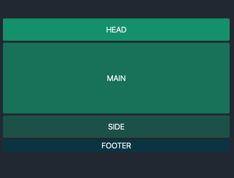
To reap the time saving benefits of designing with this method, build a CSS grid template and name your CSS grid template areas in two CSS coding steps. Common grid template areas to specify include header, menu, footer, sidebar, main content, etc. Once these are set up, they’re easy to move around within your grid template.
First, define names of your grid template areas with the grid-area property. This sets up the next step, which will create the grid-template layout.
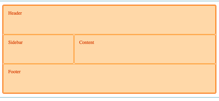
For instance, below is an example from
Mozilla that sets the grid areas with shortcuts for header, footer, content, and sidebar.
Second, use grid-template areas property to define how the areas appear in the rows and columns. This creates your easy-to-use webpage template.
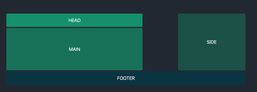
For instance, in the example below from
Mozilla, the first line command sets the display as a grid. In the next line command, the columns are defined as “9” items long. In the next line command, the rows are set. Then, the CSS grid template areas are given their arrangements.
As you see in the code above, you need to use the grid-template areas (names of your content areas) multiple times to add up to the number of columns in your grid template. The header “hd” above gets all nine widths in the column. In the next row, the sidebar as defined as “sb” in the code above gets three widths in the column, and the main content gets six widths of the column. In the third row, the footer gets all nine column widths.
Here is the HTML that follows the CSS. The HTML populates the grid template with the actual content.
Understanding the Code
You can use the shorthand CSS fraction code (fr), meaning fraction of the free space. The
fraction command eliminates overflow on the x-axis even when you set a grid-column-gap value. With the fraction command, when, as in the above example, you set each column to “1fr,” the grid accounts for the grid-column-gap value and subtracts it from the total width for each column.
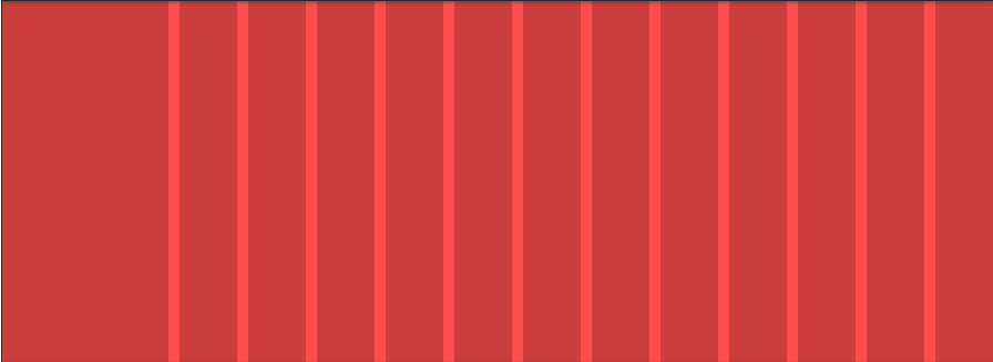
You can also use the shorthand repeat code like above to make the columns repeat. For example, “grid-template-columns:repeat (9, 1fr);” shows the combined commands that specify the fraction code and the number of columns. For 6 columns or 12 columns or 15 columns, you would change the value after it repeats.
You also can easily control other ways the grid template appears.
For instance:
- You can set the grid-gap.
- You can set a background color.
- You can set padding.
Here’s another example, which uses the “container” command instead of the “wrapper” command.
When the HTML with the actual content (not included in the above code) is added to this CSS grid template, it will result in:
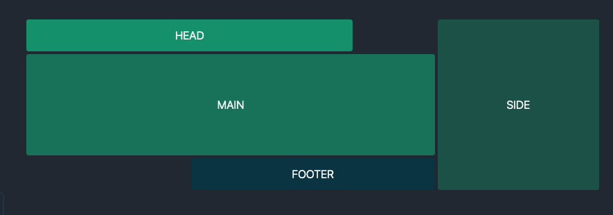
The above example uses additional shortcuts where the dot represents an empty grid shell.
You can do a ton with this quickly by only changing a tiny bit of the code. For the above, you can completely revamp the layout to look like this:
The only code that changed were where the spaces (using dots) land in the template — see below:
Let's Play With CSS Grid Templates
There’s even more you can quickly accomplish once you name CSS grid template areas and create a template.
For instance, you can also set a column that doesn’t change values followed by columns that do. Here’s how the code would be different with the first column set at 250px followed by repeating columns set by fraction of free area:
What makes CSS grid template areas really stand out is you can make them fully responsive by adding a snippet of additional code. With CSS grid templates, you can easily tell the design how to respond based on a device’s pixel width and height.
Here’s an example from
Mozilla:
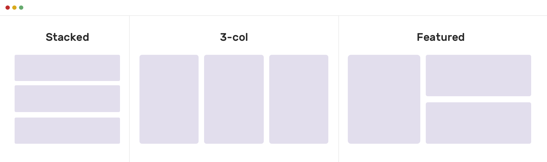
This results in two columns when the screen is at least 700 pixels but three columns when the screen is smaller. (Note: The template areas were defined in separate code not affected by the additional media query code.)
The below example takes the Alligator.io layout above and makes it work on smaller screens.
Here’s the additional code (added onto the already set Alligator.io code above without changing anything in the previous code) that specifies the max width as a smartphone of 40em. Anything at that size width or smaller will display the stacked look.
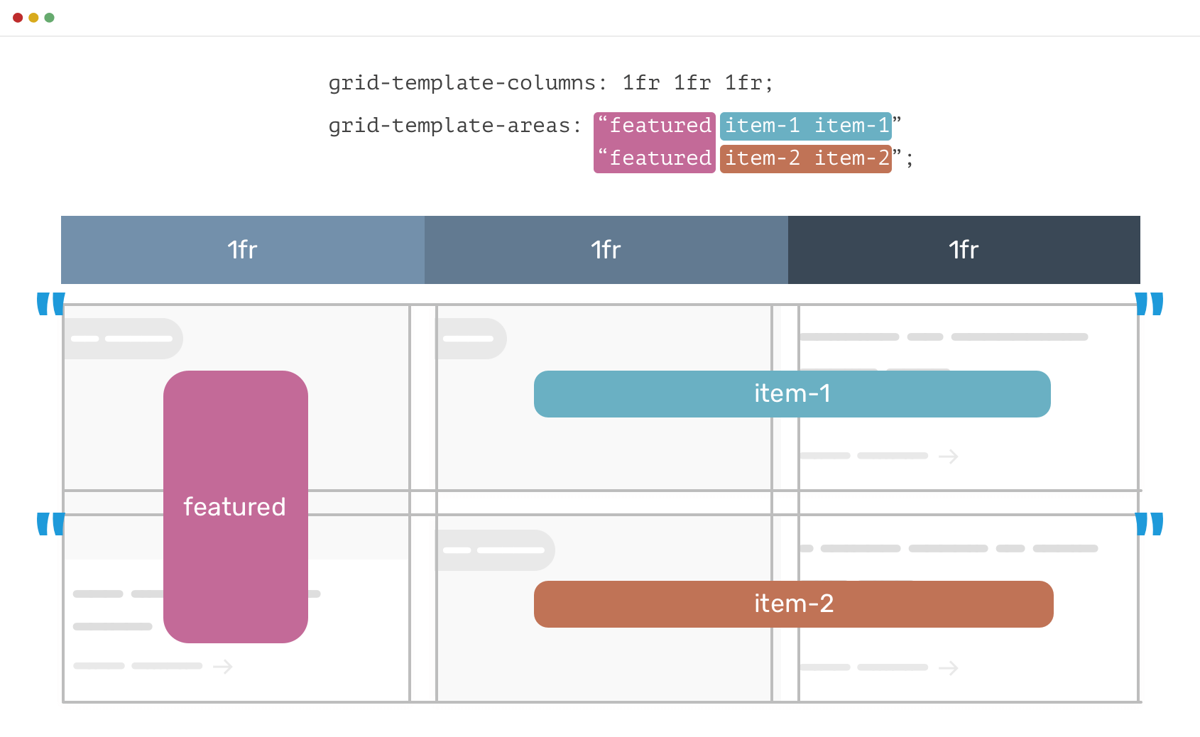
Let’s look at another example from
Shadeed that adds the media query code for three different types of devices.
Here is the initial code for defining the template areas and the three-column grid:
This is how it looks (with the labels added afterward to demonstrate placement; these wouldn’t show up without additional HTML code):
To make this fully responsive, do not change the code that defines the template areas, but add code for stacked layout and for the three-column layout with “Featured item” in column 1 and then “item 1” in column 2 and “item 2” in column 3.
What
Shadeed also does below is take the original code that created the CSS grid template and labels it with a media query.
And here's what that looks like:
Summing Up
CSS grid templates speed up design, which is why there are so many examples of prebuilt templates available. They’re also an invaluable tool for responsive websites.
Because of this — even though in a website builder platform like Duda you can cut and paste elements around without coding them in CSS — you’ll want to understand and master how CSS grid templates work to improve your web design skills.
By Mike Paciello
•
May 19, 2026
The web had its worst accessibility year in six. On GAAD's 15th anniversary, learn why the 2026 regression is a process problem and how Duda and AudioEye help agencies fix it.
By Duda
•
March 10, 2026
Discover a more intuitive, professional UI with a streamlined sidebar and enhanced top navigation, helping you build faster and with greater confidence.
By Stephen Alemar
•
October 23, 2025
Discover why Duda is a top-rated website builder on G2, recognized for usability, easy setup, strong relationships, and excellent results, all backed by real reviews.
Show More