How To Effectively Create a Contact Us Page

February 20, 2021
0 minute read

A Contact Us page can be found on almost every single small business website — which is wholly appropriate. After all, the ultimate goal of a business’s website is to enable potential customers to connect with that business. In this post, we’ll go over a few guidelines for creating an effective Contact Us page and look at some outstanding examples from across the web.

Keep Contact Us Pages Simple 


Contact Us pages have one purpose and one purpose only — enabling customers to connect with a business. Simplicity and functionality are more important than anything. However, just because the Contact Us page is not a place to use a whole lot of animations or distracting copy, it should absolutely be engaging.


Here are a few elements you should absolutely include in your Contact Us page to boost customer engagement:


  • Business Name 
  • Contact form
  • Click-to-call button 
  • Map widget
  • Business Address
  • Business Phone Number
  • Social Media Links & Icons


Reinforce a Brand’s Persona 


Brand continuity is important for any of business. Every part of a website should reinforce a small business’s brand and this principle applies to the Contact Us page as well. Yes, all of your information should get right to the point and be presented in a way that is simple to understand, but you don’t want the page to come off as dry. Incorporating your brand’s personality (subtly!) into your page will build rapport with customers and can significantly increase engagement.

Give Reasons Why Users Should Reach Out

If a potential or returning customers lands on a Contact Us page, they've shown clear intent that they want to engage with the business. That said, this is not a place in the buyer journey where you can consider customer conversion a done deal. Think of what you can add to a page to close the deal and get a customers to contact the business. FAQs, testimonial reviews, and images representing the company's work — all of these and more can be highly effective at providing customers with the final nudge they need to convert.

Top 10 Examples of Effective Contact Us Pages


There is no perfect Contact Us page. However, there are certainly lots of fantastic examples out there that do a masterful job of following the guidelines laid out above. Here are 10 we found from around the web we think are worth a look.

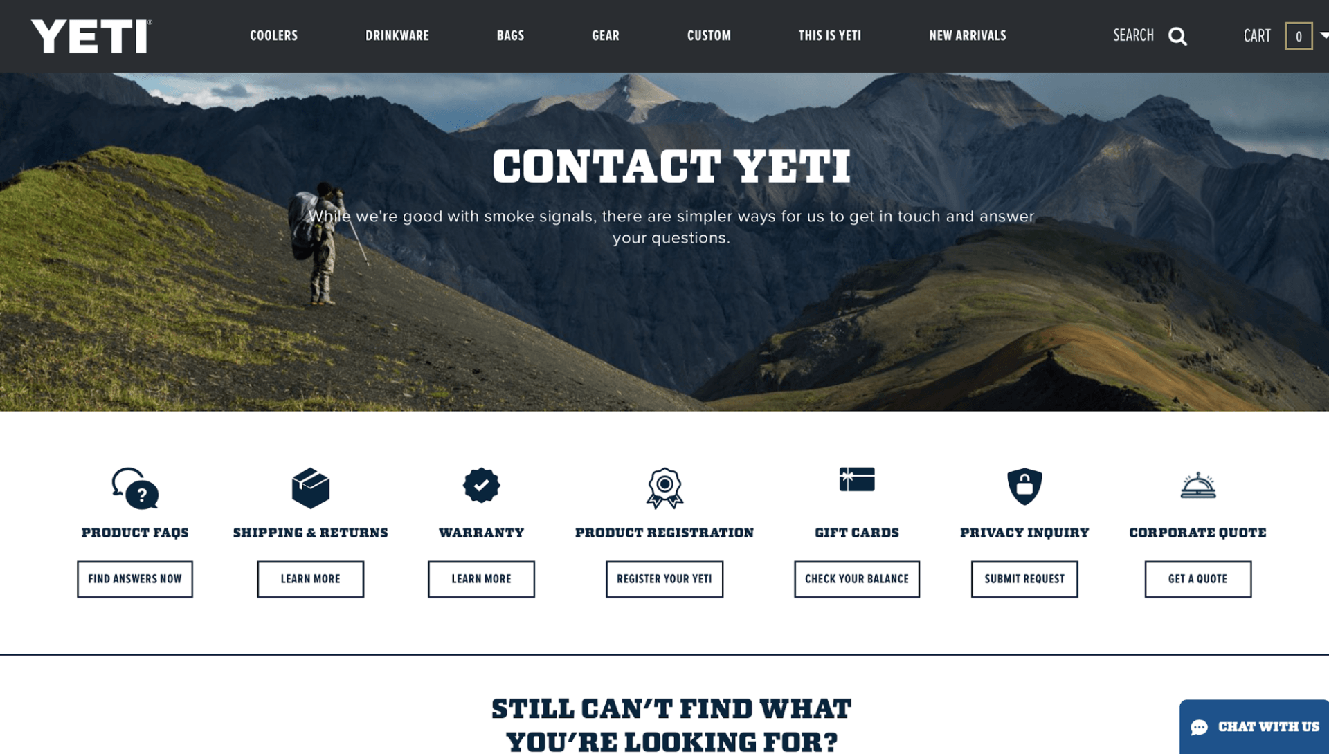
Because YETI sells indestructible drinkware, tumblers and coolers, it’s no surprise that their Contact Us page would have a scenic view of the great outdoors. This beautiful background keeps the page consistent with the company’s brand without overwhelming the visitor. Important contact information and resources are clearly displayed directly below the image and the entire page is incredibly easy to navigate.

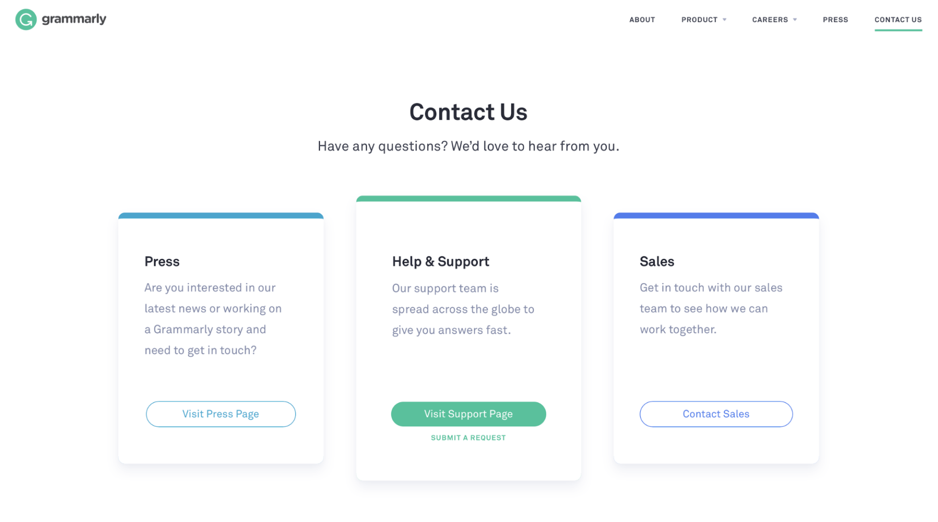
Unlike YETI, Grammarly’s Contact Us page consists of a clean-cut white backdrop with three main resources users can easily find and access in the center of the page. This clean design is a great example of the simplicity we discussed in the guidelines above..


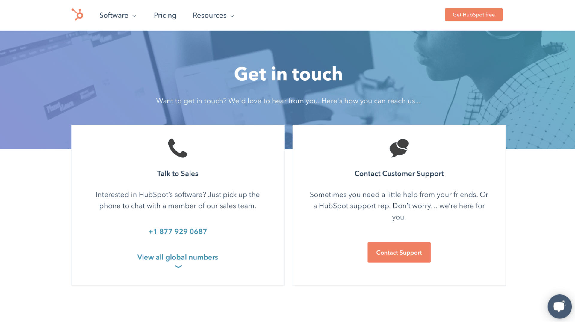
HubSpot’s Contact Us page gives users two options to contact them. There are direct numbers to various sales offices globally, as well as a live chat feature that leads you to customer service.

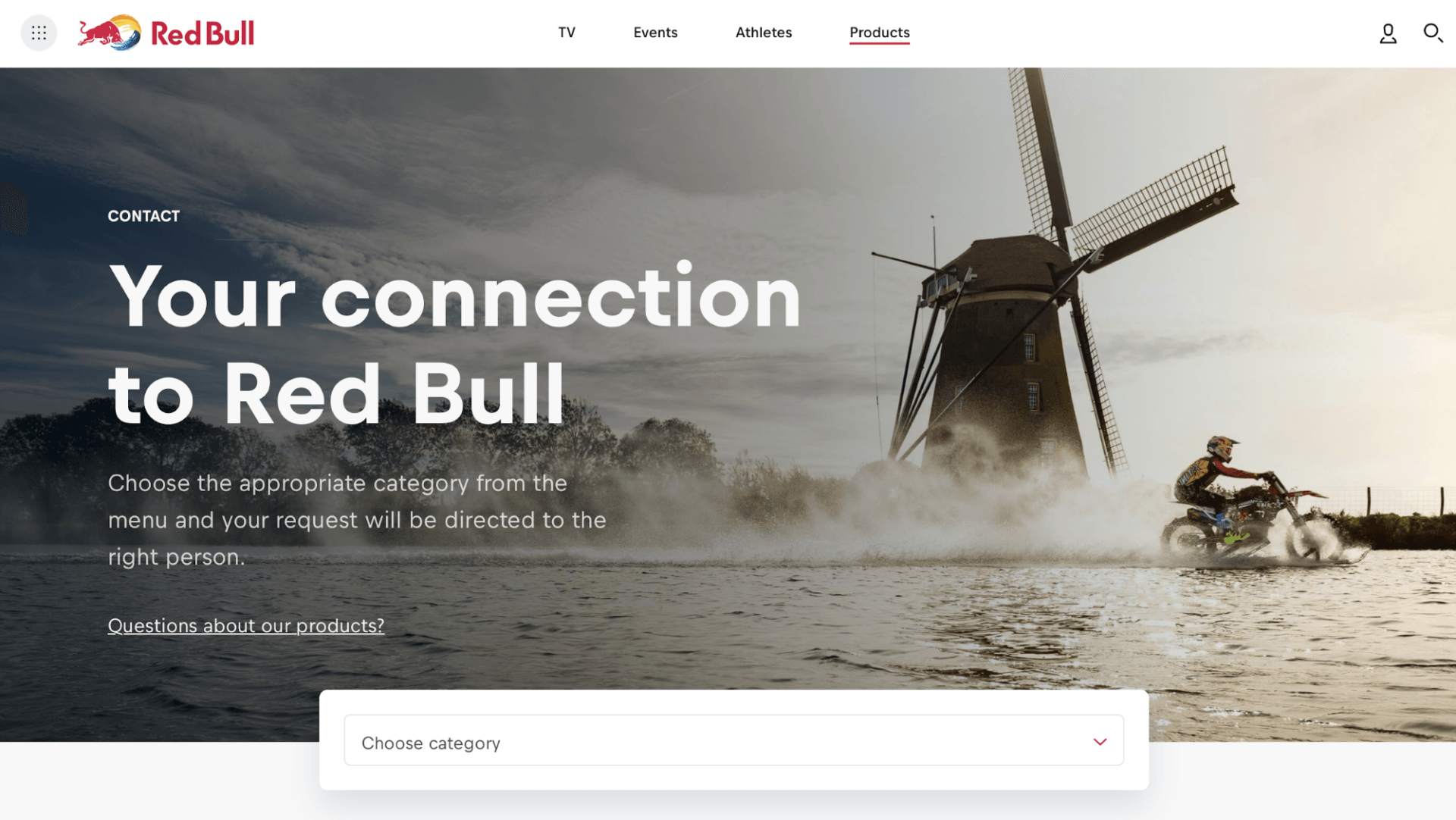
Not only do they give you wings, but Red Bull’s goal is to build a connection with users. 

Similar to YETI’s concept with the scenic photo as the backdrop, Red Bull’s Contact Us page reinforces the company’s brand with an adrenaline-pumping image. At the same time, the page invites users to explore different categories of their pre-organized FAQs.


This Contact Us page from SleekNote resembles Grammarly’s page with its basic white backdrop. SleekNote directly offers a form for users to fill out if they would like to contact them. Other resources on its Contact Us page include CTAs to book a demo or sales call.

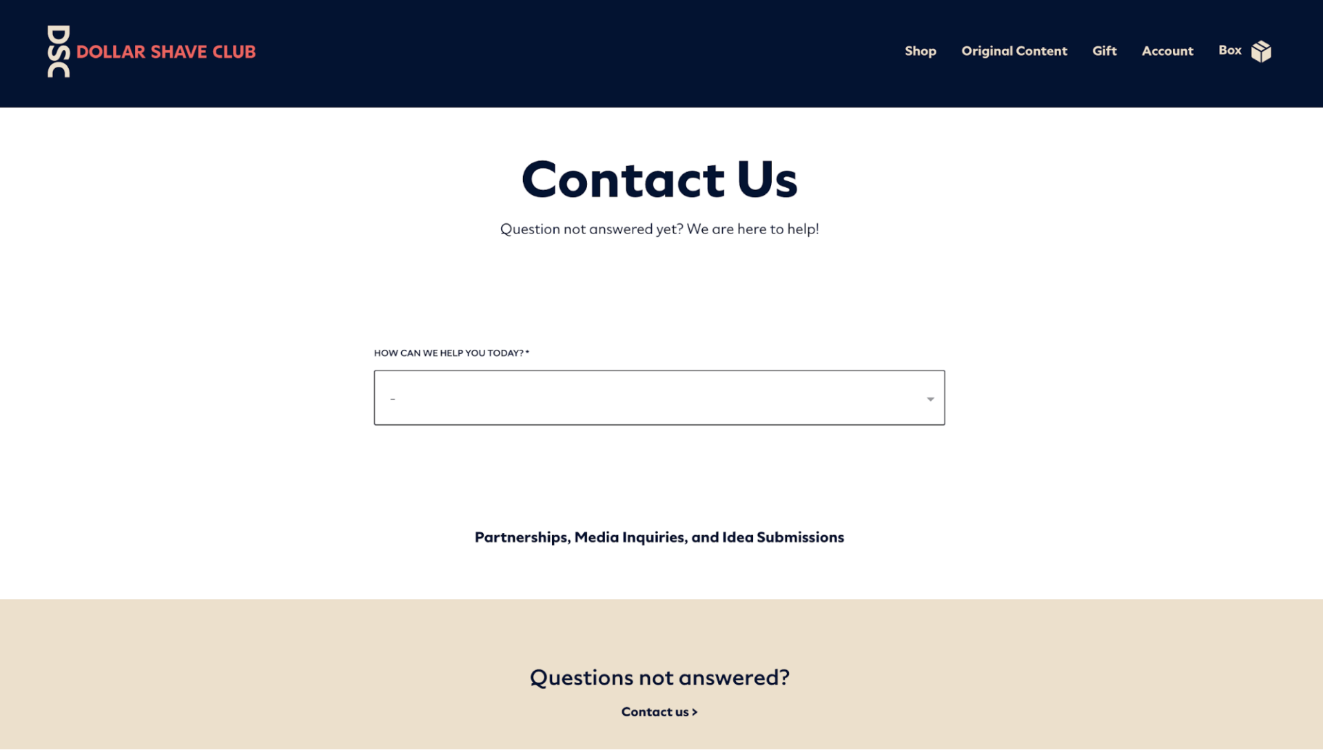
Dollar Shave Club’s Contact Us page features a dropdown menu that helps the company understand the reason a customer is reaching out and respond to their inquiry more effectively.

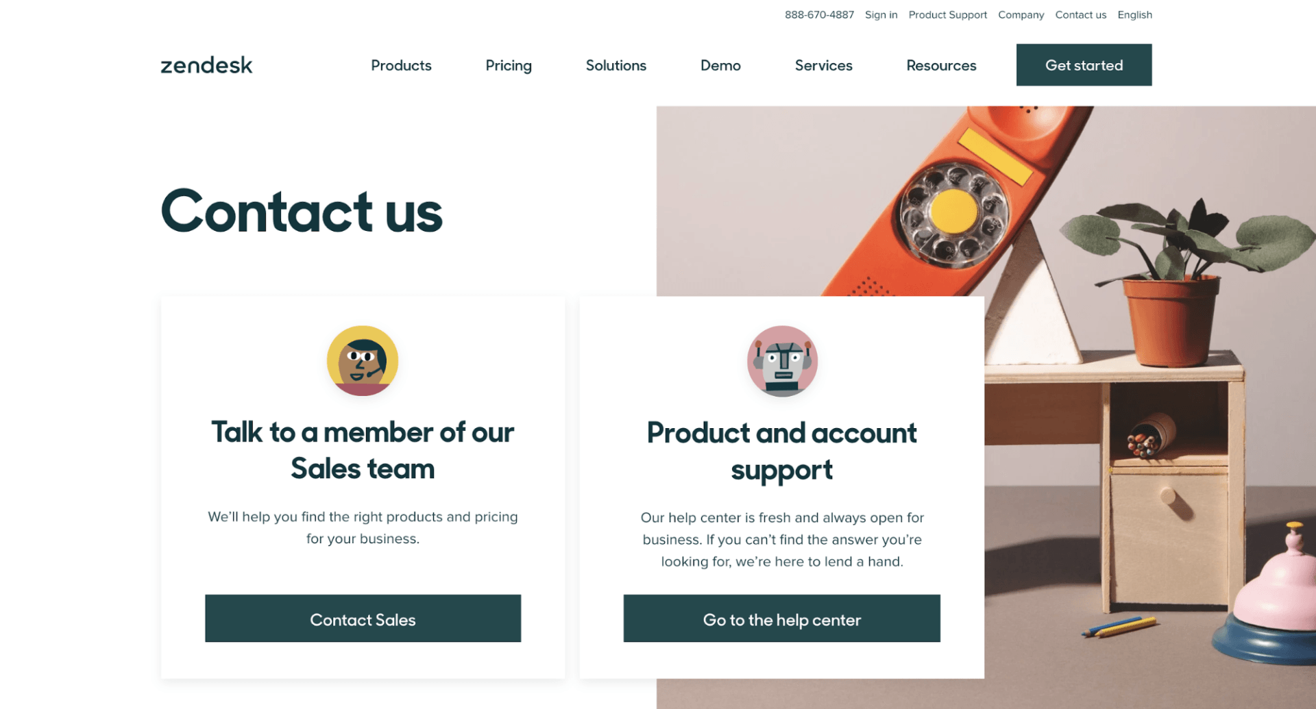
Zendesk checks all the boxes of Contact Us page best practices. It combines simplicity with engaging features in a smooth and natural way.

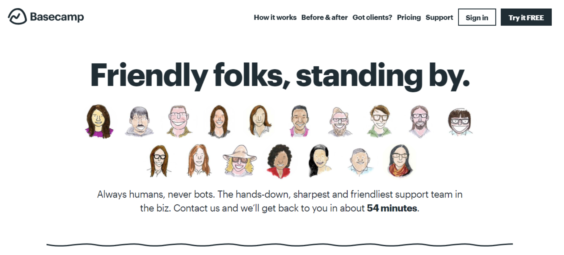
BaseCamp’s Contact Us page paints a picture for their users to prove a point. They have an adorable cartoon set up of their customer service representatives ready to help you with whatever you need. Rather than talking to a bot, BaseCamp makes it known to their users that they’re talking to real humans when they reach out that provide the “sharpest and friendliest” support. 


Similar to SleekNote, Grammarly, and Dollar Shave Club, Focus Lab uses a simple white background as a way to subtly communicate how easy it is to contact their team. They include their address, phone number, links to social media and other relevant information front and center on their Contact Us page.

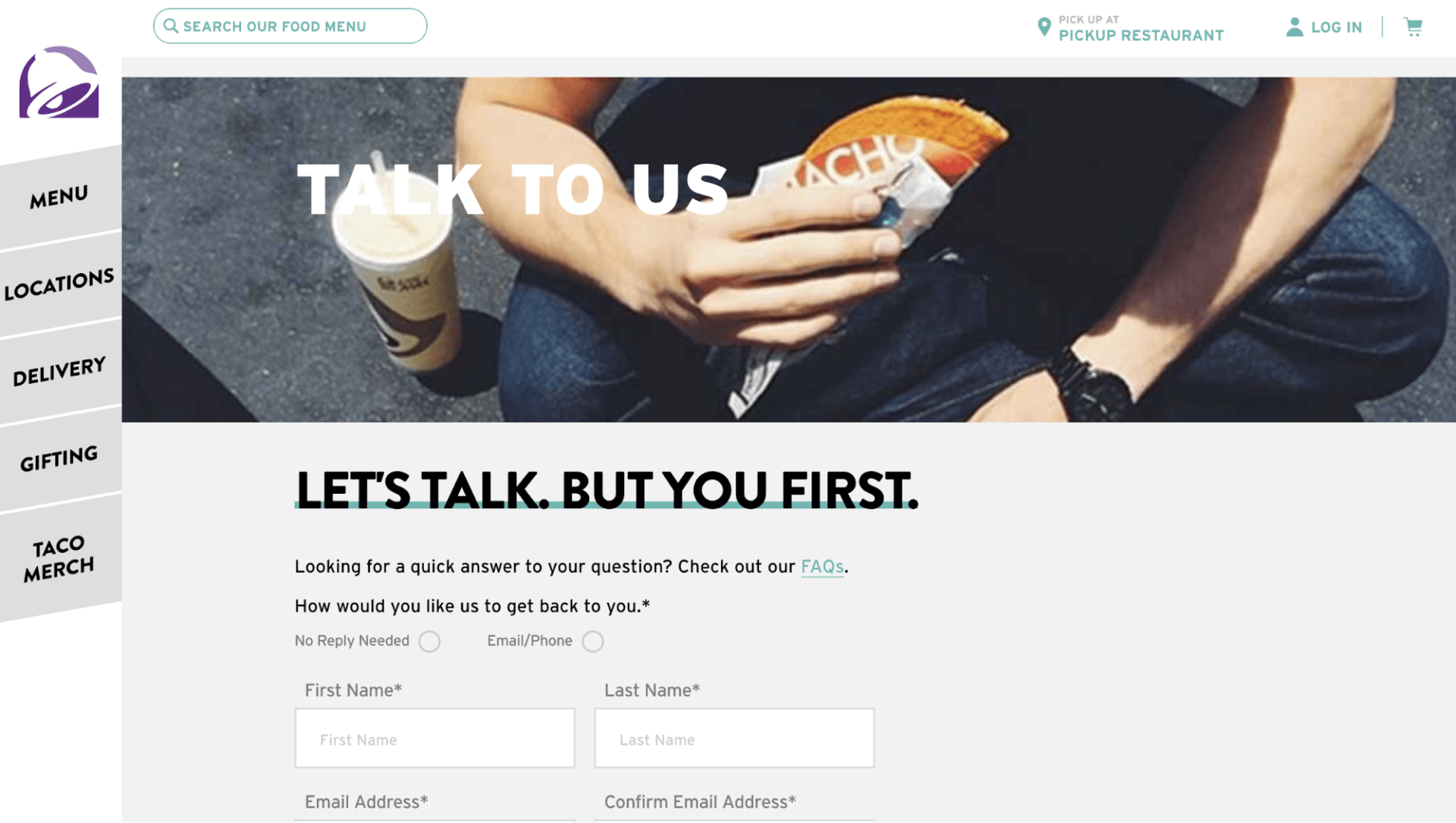
Taco Bell’s Contact Us page gets straight to the point with their information. If customers have any questions or concerns, they can simply fill out the form at the bottom and customer service will get back to them.


Key Takeaways

As stated earlier, there is no perfect Contact Us page — each one will be unique to the business of which it belongs. However, there are a few things that should always be included such a contact form, business address, business phone number, etc. Just be sure not to overdo it with a distracting design and remember this is primarily a functional page with which customers will engage.


Did you find this article interesting?


Thanks for the feedback!
A screenshot of a plumber's website with a
By Renana Dar May 5, 2025
Many SMBs still hesitate to embrace eCommerce. As the agency partner, you have the opportunity to tear down the perceived walls of eCommerce and show clients how eCommerce can make their business more efficient, accessible, and profitable. Read all about it!
A computer screen with a graph on it and a purple background.
By Santi Clarke April 24, 2025
Learn how platform ecosystems drive revenue and why they are essential for the growth of SaaS businesses.
By Santi Clarke April 24, 2025
One of the greatest challenges for SaaS platforms is keeping users engaged long-term. The term “stickiness” refers to a product's ability to retain users and make them want to return. In the context of SaaS platforms, creating a sticky product means that users consistently find value, experience seamless interactions, and continue using the product over time. The following are 7 practical strategies you can take to improve the stickiness of your SaaS solution. 1. Offer websites that help customers build their digital presence One of the most effective ways to make your SaaS platform sticky is by offering websites to your users. Many businesses today need an online presence, and by providing a platform where your customers can easily build and manage their websites, you increase their reliance on your product. When you offer users a website-building solution, you’re helping them create something foundational to their business. Websites, in this case, aren’t just a tool—they become a part of their identity and brand. This deepens their engagement with your platform, as they need your product to maintain and update their site, ultimately making them less likely to churn. Plus, websites naturally encourage frequent updates, content creation, and customer interactions, which means your users will return to your platform regularly. When you can give your users the tools to create something so essential to their business, you make them more dependent on your platform. This creates a higher barrier to exit, as migrating a fully built website to another service is no small task. In fact, websites are some of the stickiest products you can sell, so adding them to your product portfolio can be one of the best decisions you can to keep your customers using your technology for the long haul. 2. Deliver continuous value through product innovation The key to keeping users coming back to your SaaS platform is ensuring that they consistently see value in it. This means not only meeting their immediate needs but also evolving to address their growing demands. Constant product innovation is essential for keeping your users satisfied and invested in your platform. One way to achieve this is through regular updates that add new features or improvements based on user feedback. A SaaS platform that evolves with its users will keep them engaged longer, making it harder for competitors to steal their attention. Encourage user feedback and prioritize updates that create tangible improvements. This creates an ongoing relationship with your users, which boosts stickiness. 3. Offer a multi-product solution Another powerful way to increase your platform’s stickiness is by offering a suite of products or features that integrate well together. When your users adopt multiple products, they are more likely to stay because they become embedded in your ecosystem. The benefits of this strategy are clear. Research shows that once users adopt more than one product, especially when they integrate >4 tools into their workflow, their likelihood of churn decreases significantly. This happens because the more a user integrates into your suite of products, the harder it is for them to switch to a competitor. These users have invested time in learning your ecosystem and rely on it for their day-to-day operations, making it much harder for them to make the switch. 4. Create a personal connection with your users Human connection is one of the most powerful drivers of user retention. People don’t want to feel like they’re using a cold, faceless platform. By offering exceptional customer support, personalized communication, and community engagement, you build a relationship with your users that goes beyond the product itself. Make sure your support team is responsive, knowledgeable, and empathetic. You can also consider offering tailored onboarding experiences to ensure users understand how to make the most of your platform. When users feel like their success matters to you, they are more likely to remain loyal. 5. Leverage data to personalize the user experience Using data to drive personalization is another strategy that can significantly increase the stickiness of your platform. By tracking user behavior and usage patterns, you can tailor the experience to each individual user’s needs. This could mean recommending features they haven’t yet explored or sending them reminders about tools they may not be fully utilizing. Personalization gives users the feeling that the platform was designed specifically for them, making it harder to walk away from. By demonstrating that you understand their unique needs, you can build a stronger connection and ultimately increase retention rates. 6. Focus on seamless integrations and API capabilities To further increase stickiness, consider expanding your product’s ability to integrate with other tools your users already rely on. Whether it’s email marketing software, CRM systems, or social media management tools, seamless integrations add tremendous value by making it easier for users to incorporate your platform into their existing workflows. The more your product can work in tandem with other popular tools, the more indispensable it becomes. In fact, users who depend on integrations are less likely to churn since their entire ecosystem is tied to your platform’s functionality. 7. Encourage user advocacy and community building User advocacy is another powerful tool in building a sticky product. When users feel a sense of community or even ownership over the platform, they become your most passionate promoters. Encourage your users to share their success stories, join community forums, or contribute to product development through beta testing or feedback loops. A thriving user community not only increases user engagement but also creates a sense of loyalty. When users are part of something larger than themselves, they are more likely to remain committed to your platform, reducing churn and increasing lifetime value. Create deep, lasting customer relationships Making your SaaS platform sticky is all about creating a deep, lasting connection with your users. This requires building a platform that continuously delivers value, creating a seamless and personalized experience, and integrating features that keep users coming back. By focusing on product innovation, offering a multi-product ecosystem, and fostering strong user relationships, you’ll be well on your way to reducing churn and boosting user retention. Stickiness isn’t just a nice-to-have; it’s essential for long-term success. Focus on creating a platform that users can’t imagine living without, and you’ll see them stick around for the long haul.
Show More

Latest posts