18 Great Flexbox Examples for 2021

May 1, 2021
0 minute read

One of the building blocks of responsive web design is the flexbox model. The flexbox is a CSS-based layout model that allows elements within a container to be automatically arranged based on the screen size of the device they are being viewed on. 


The power of flexbox is incorporated into Duda’s editor via new DudaFlex sections, which enable digital marketing agencies and their customers to create pixel-perfect designs at breakneck speed inside our intuitive drag-and-drop site editor. With DudaFlex, you get the power of flexbox-based designs in a fraction of the time it would take to develop them using traditional methods.


Important Note: As of the drafting of this post, DudaFlex is still in beta. The DudaFlex beta is available to all current Duda customers, and will be rolling out to new customers throughout June and July, 2021. 


In this post, we've highlighted 18 fantastic flexbox examples to demonstrate some of the most popular ways this tool is used.


18 popular Flexbox LAyout EXamples

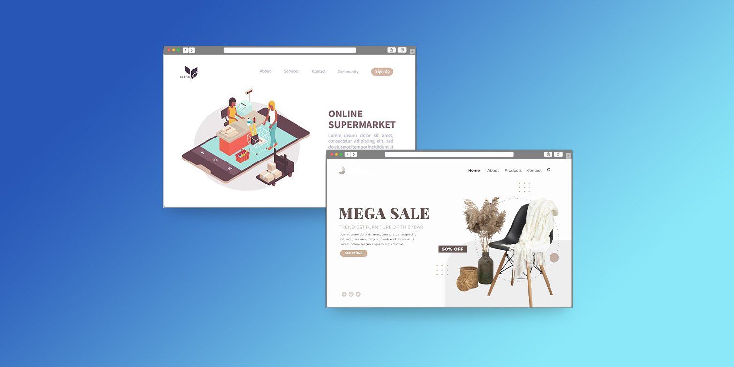
#1 Article Card (i.e., Content Card) Flexbox Example

flexbox example of an article card

One of the most flexible visual representations of digital information is the “article card” or “content card.” Using this structure, multiple elements can be used to fully describe an item or concept. Content cards are frequently used to display items in eCommerce stores, and show images, descriptions, and other information such as pricing. In a publishing context, this same flexible structure can be used to highlight an article, and show an image, headline, content summary, and other information such as estimated reading time. This particular flexbox example is one of the most commonly used. Duda contains an example DudaFlex section for creating these types of layouts.

#2 Content Card Collection Flexbox Example

flexbox example of a content card collection

While a single content card can be created using flexbox, the usefulness doesn’t end there. Multiple content cards can be nested into a content card collection, which renders beautifully across different screen sizes.

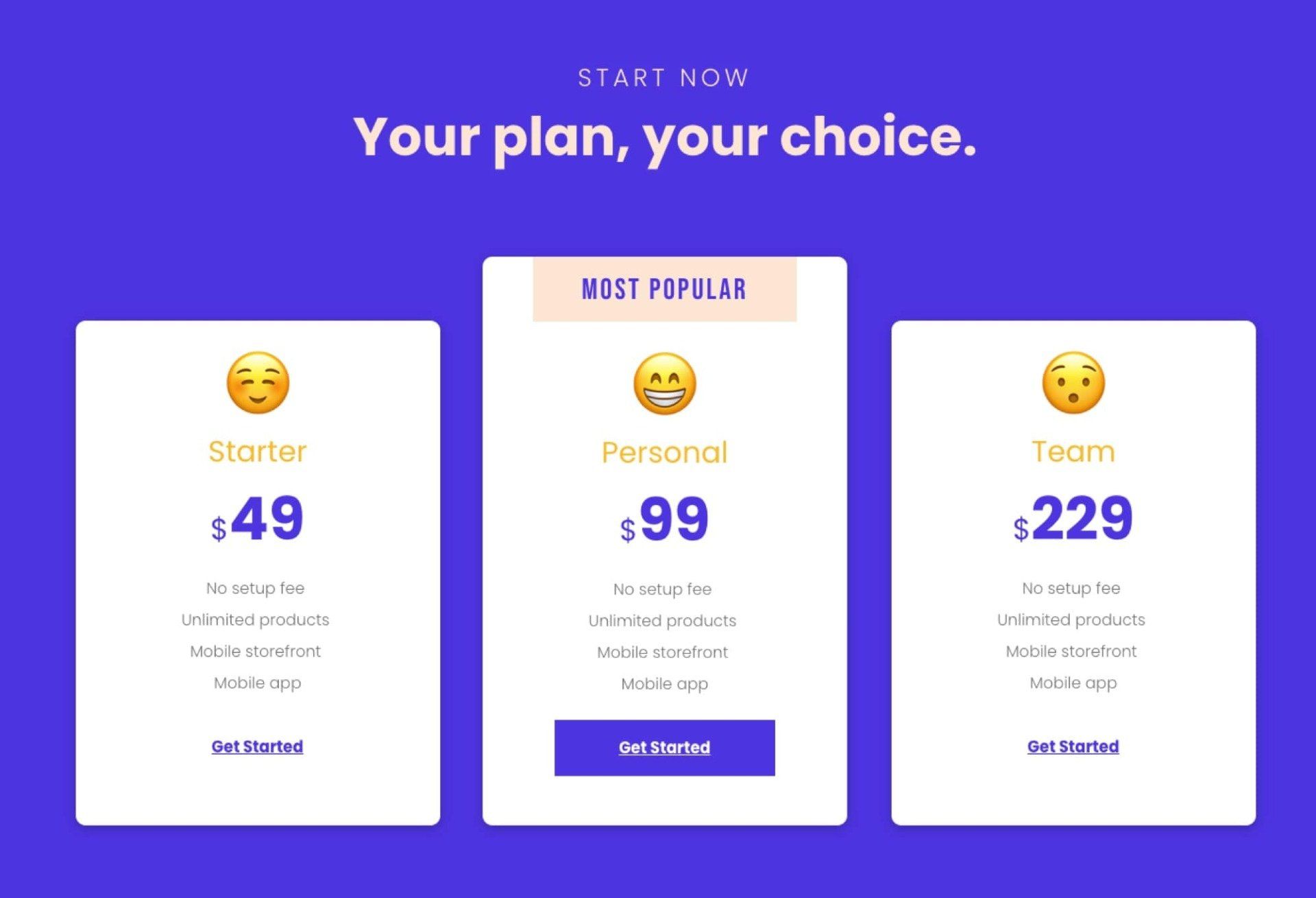
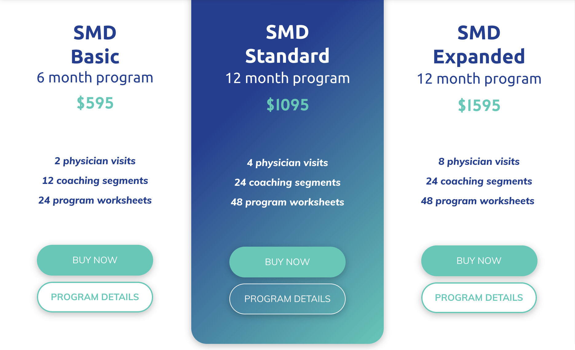
#3 Pricing Table Flexbox Example

flexbox example of a pricing table

Especially for businesses that have multiple levels of service delivered from the same platform (think service businesses with “bronze / silver / gold” tiers, or online businesses that use the Software as a Service (SaaS) business model), the pricing table is a common website element.

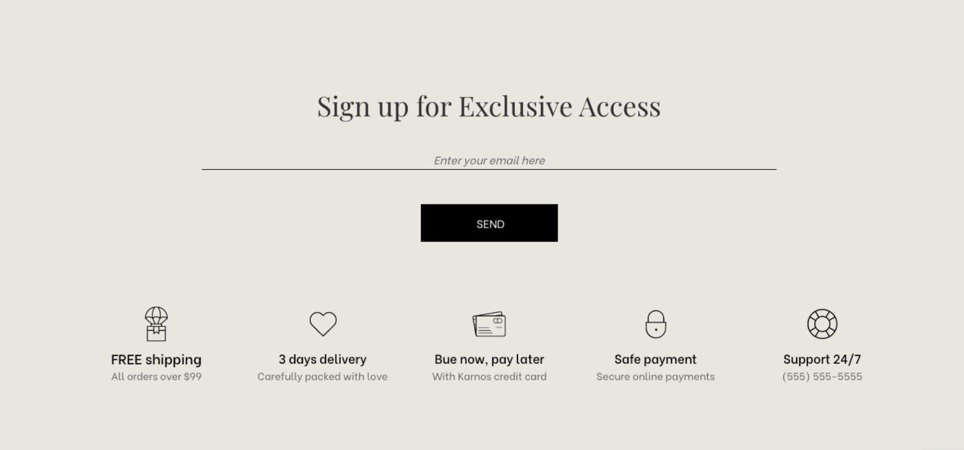
#4 Form Fields Flexbox Example

flexbox example of form fields

While it seems like a basic element of web design, forms and form fields can require significant thought in order to look great and, more importantly, deliver business results. In the past, creating forms and designing the form fields within them to work and respond across a variety of device types could be problematic.

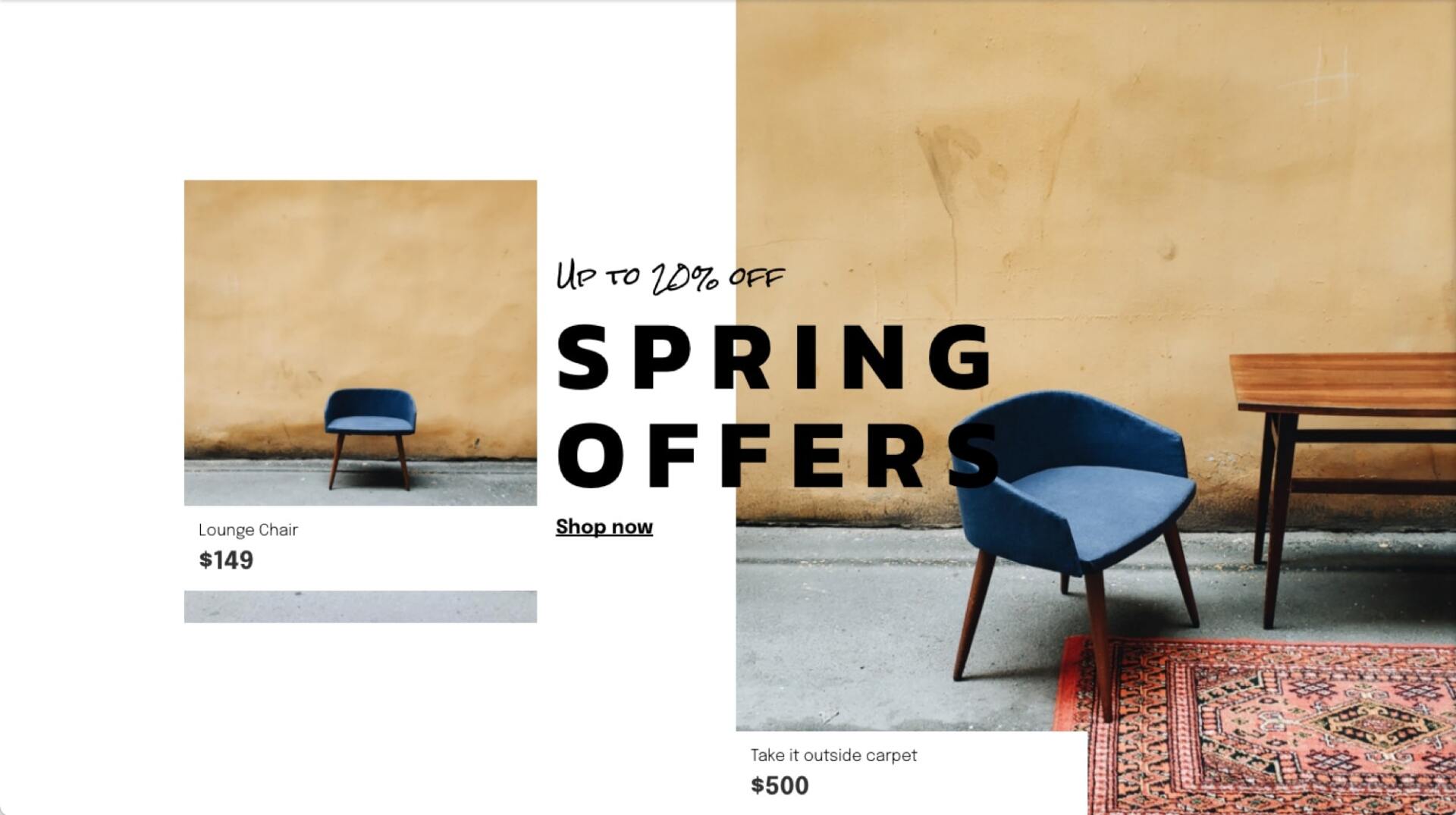
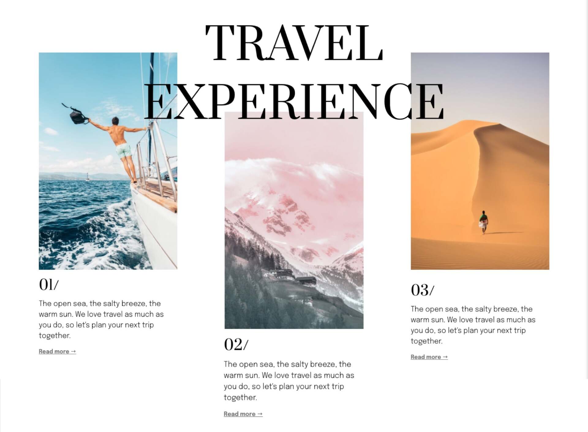
#5 Grid Photo Gallery Flexbox Example

flexbox example of a grid photo gallery

A grid photo gallery is a great way to show off multiple images to create a mood board, or to show a wide variety of visual content.

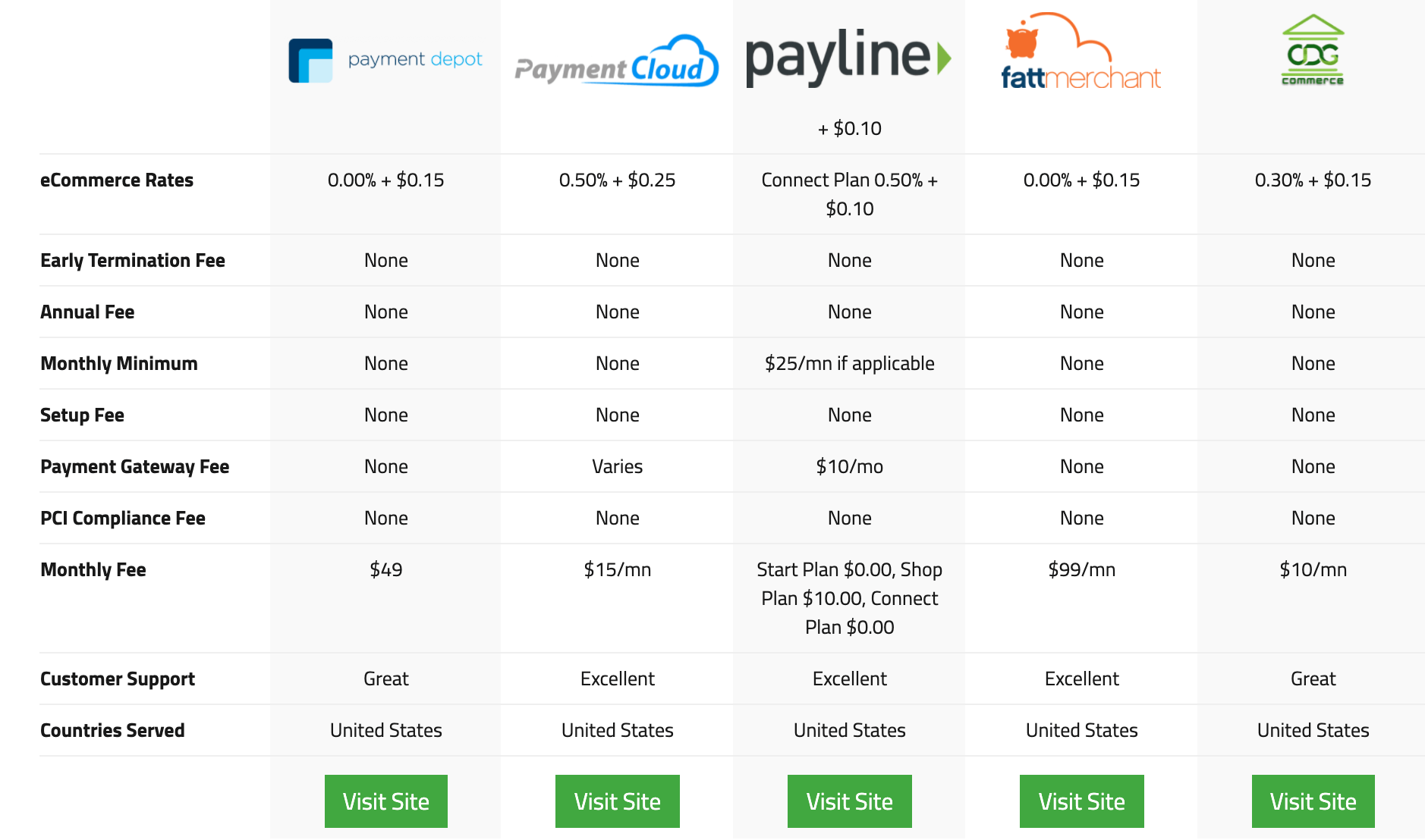
#6 Product Feature Comparison Table Flexbox Example

flexbox example of a product feature comparison table

Product feature comparison tables are made up of long columns of product features that can be compared across different product versions, different product bundles, or across competing products. The extensive and fluid detail of this particular type of content representation makes it an ideal candidate for using flexbox or other similar responsive design techniques.

#7 Tag Lists Flexbox Example

flexbox example of tag lists

Listing out tags, hashtags, and similar long lists of metadata as part of a piece of content is a difficult design problem, since a particular piece of content can sometimes be accompanied by dozens of tags (or more!). Furthermore, neighboring pieces of content may have vastly different numbers of tags associated with them, which makes it difficult to easily align them visually, and impossible to fit them into a predefined region.

#8 Table Layout Flexbox Example

flexbox example of a table layout

While incredibly common, tables can be difficult to support across various device types due to the wide variety, shapes, and sizes of content that can be placed in the various cells in a particular table. Flexbox simplifies this task and greatly speeds the development of these types of content sections and, more importantly, improves the user experience across different device types.

#9 Employee Photo Gallery Flexbox Example

flexbox example of an employee photo gallery

A flexible layout for an employee photo gallery, especially for rapidly-growing organizations, is a particularly noteworthy application of this design style. As the number of employees in an organization increases, showcasing them in a consistent and aesthetic manner is made much easier by the application of flexible design techniques.

flexbox example of a sidebar and main column layout

One of the most common page layouts, especially for content-driven websites, is a layout that contains a main (or primary) content “well,” and a sidebar that provides navigation links or highlights related information. Especially when the main column has a large amount of content when compared to the individual content units in the sidebar, a flexbox-driven design can adapt gracefully to different sidebar units of differing sizes. This becomes especially important at different screen widths.

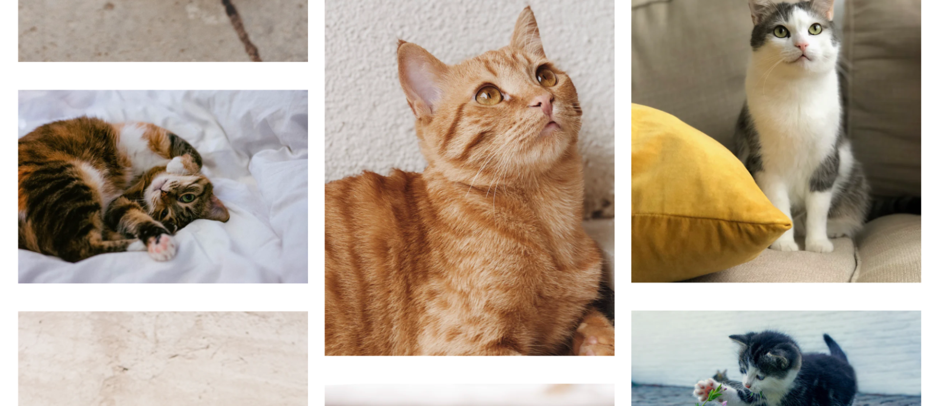
#11 Masonry Photo Gallery Flexbox Example

flexbox example of a masonry photo gallery layout

One stylish alternative to a strict grid for displaying photographs is the “masonry” design pattern, which intersperses blocks of various sizes to display different media items. (In aggregate, these blocks often end up looking like an artisanal arrangement of bricks, hence the “masonry” moniker.) Prior to flexbox and other related techniques like CSS grid, creating a masonry-style photo gallery was exceptionally challenging.

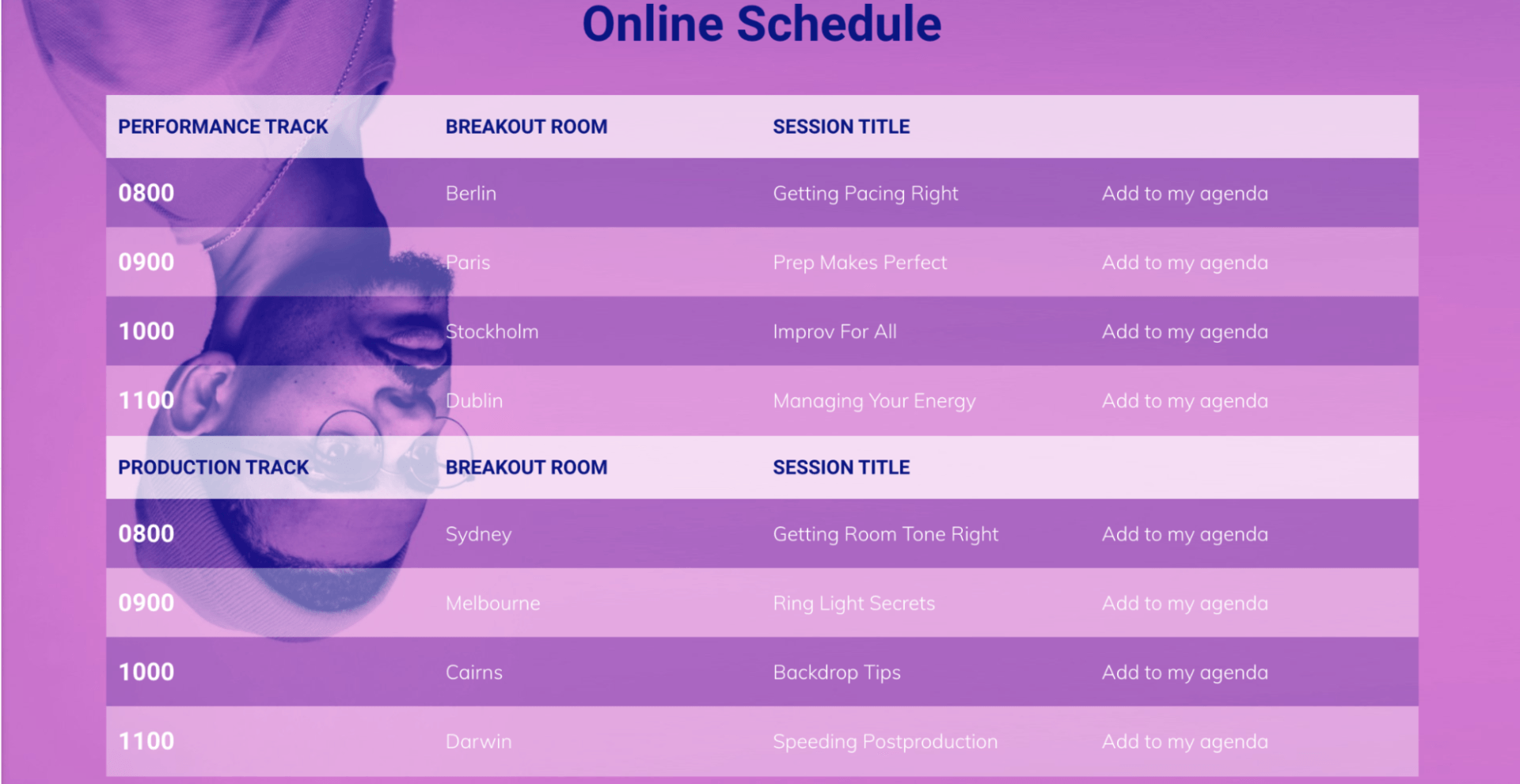
#12 Conference Event Agenda Flexbox Example

flexbox example of a conference agenda

As virtual events continue and in-person events begin to ramp back up in 2021, digital conference agendas are a great candidate for this design approach. In particular, having a digital agenda that is responsive works across both desktop and mobile devices enables attendees to access the information they need with a click. This is especially true for multi-track events that have several activities or presentations taking place at the same time.

#13 Virtual Event Speakers Gallery Flexbox Example

flexbox example of a virtual event speakers gallery

While the example above addresses the application of flexbox for displaying conference and event schedules, there is a related opportunity in applying flexbox to displays of speaker information as well.

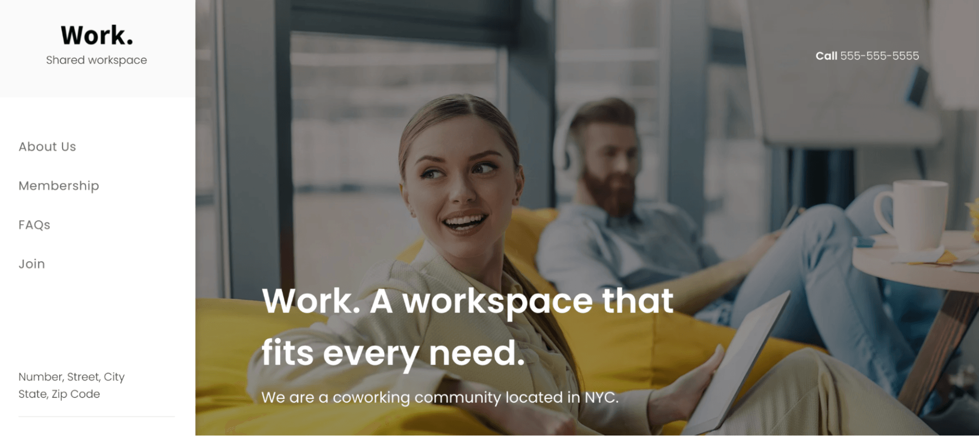
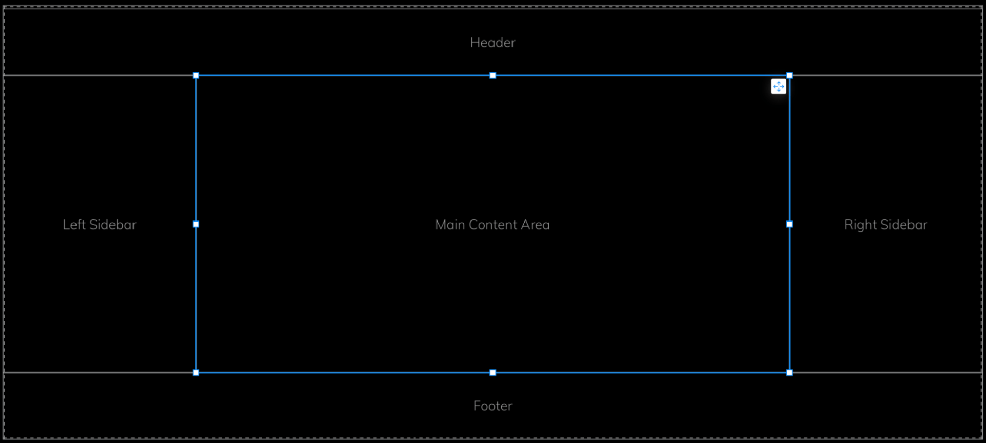
#14 Holy Grail Layout Flexbox Example

flexbox example of the holy grail layout for a website

One of the most important full-page layouts is what is commonly referred to as the “holy grail” layout. (Here’s a great article on the holy grail design layout — and why it’s called that —  from Wikipedia.) This layout combines a header, a footer, two sidebars, and a central content well. Prior to flexbox, getting this style of page layout to behave properly across various device types was challenging, hence its name.

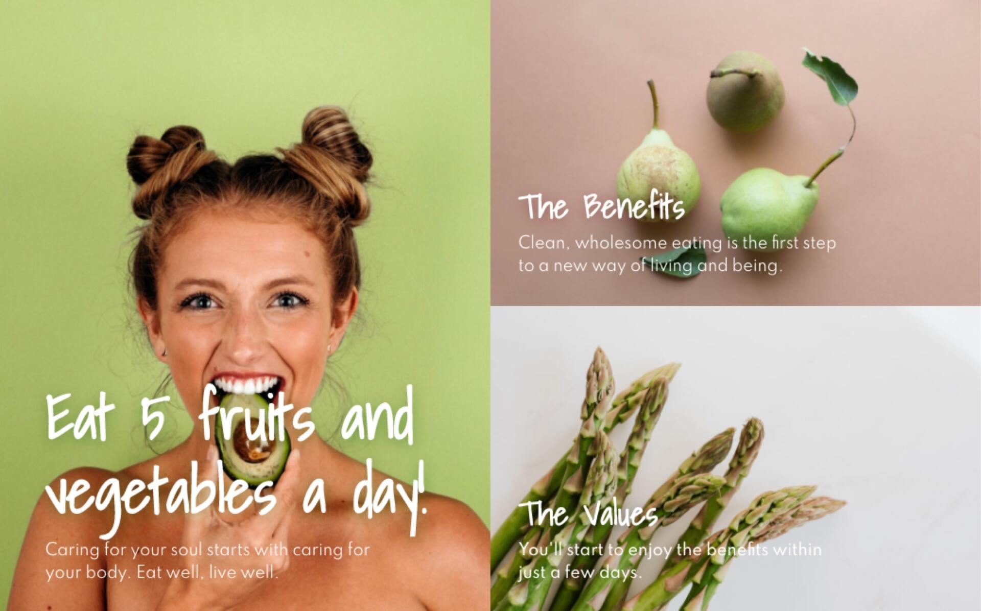
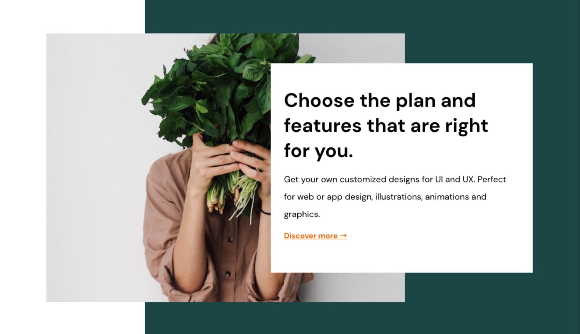
#15 Layered Content Flexbox Example

flexbox example of layered content

Thinking in three dimensions for a design can result in interesting compositions. In this example, a background, image, and text item all overlap each other, which provides a whole new dimension to the layout.

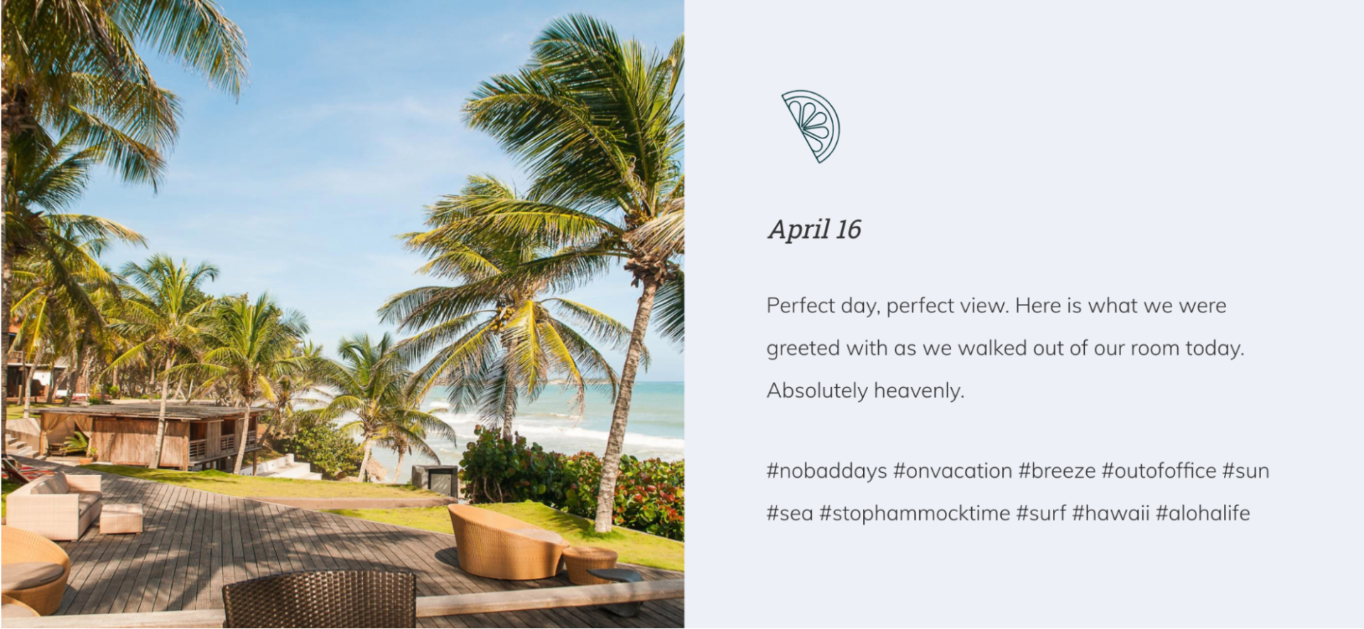
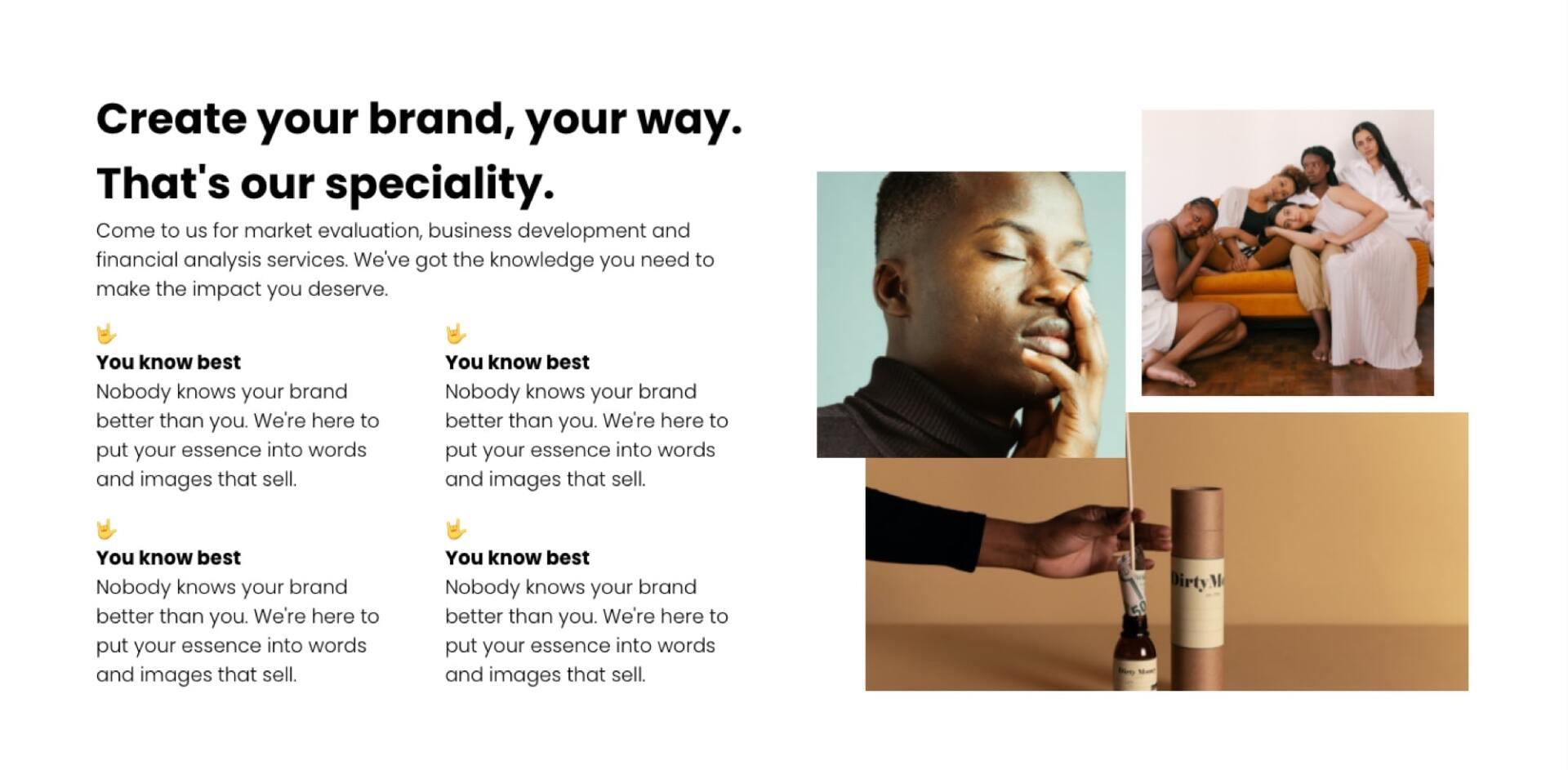
#16 Mixed Media Layout Flexbox Example

flexbox example of a mixed media layout with text and images

The creativity that can be conjured up using flexible layouts is almost endless. This example combines a variety of different text blocks of different sizes with multiple images that collectively tell a story. In particular, note the intentional use of layering in the image portion of the example, which adds an additional level of visual interest to the composition.

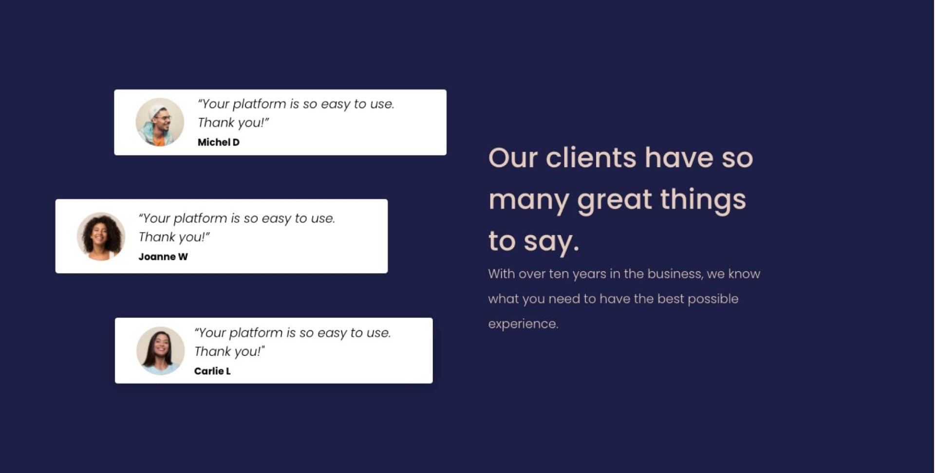
#17 Client Testimonial Flexbox Example

flexbox example of client testimonials

Client testimonials are some of the most powerful examples of social proof that a creator can include in a website design. While long scrolling lists of star ratings and reviews may get the job done, a more engaging layout can be achieved when you break out of the traditional grid model.

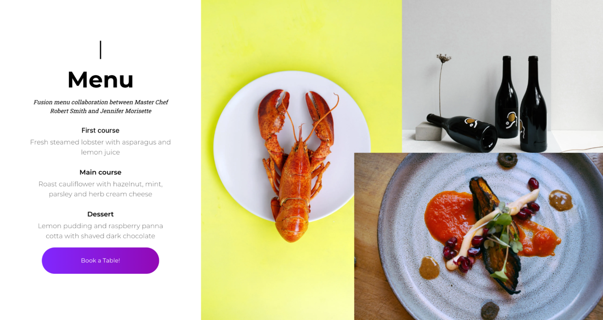
#18 Restaurant Menu Flexbox Example

flexbox example of a restaurant menu

Online restaurant menus are a great use case for flexbox-based designs. With more and more people ordering online and on the go, it’s critical that the restaurant websites convert well and display their offerings in a compelling way. The example here combines descriptions of the menu items along with delicious platings.

Conclusion

These examples only represent a small sample of the website section types that can be created using a flexbox.


Did you find this article interesting?


Thanks for the feedback!
By Shawn Davis April 16, 2026
Website builder analysed 69M AI crawler visits across over 850,000 websites in February 2026 to determine key trends and characteristics that increase local AEO
By Shawn Davis April 1, 2026
Core Web Vitals aren't new, Google introduced them in 2020 and made them a ranking factor in 2021. But the questions keep coming, because the metrics keep changing and the stakes keep rising. Reddit's SEO communities were still debating their impact as recently as January 2026, and for good reason: most agencies still don't have a clear, repeatable way to measure, diagnose, and fix them for clients. This guide cuts through the noise. Here's what Core Web Vitals actually measure, what good scores look like today, and how to improve them—without needing a dedicated performance engineer on every project. What Core Web Vitals measure Google evaluates three user experience signals to determine whether a page feels fast, stable, and responsive: Largest Contentful Paint (LCP) measures how long it takes for the biggest visible element on a page — usually a hero image or headline — to load. Google considers anything under 2.5 seconds good. Above 4 seconds is poor. Interaction to Next Paint (INP) replaced First Input Delay (FID) in March 2024. Where FID measures the delay before a user's first click is registered, INP tracks the full responsiveness of every interaction across the page session. A good INP score is under 200 milliseconds. Cumulative Layout Shift (CLS) measures visual stability — how much page elements unexpectedly move while content loads. A score below 0.1 is good. Higher scores signal that images, ads, or embeds are pushing content around after load, which frustrates users and tanks conversions. These three metrics are a subset of Google's broader Page Experience signals, which also include HTTPS, safe browsing, and mobile usability. Core Web Vitals are the ones you can most directly control and improve. Why your clients' scores may still be poor Core Web Vitals scores vary dramatically by platform, hosting, and how a site was built. Some of the most common culprits agencies encounter: Heavy above-the-fold content . A homepage with an autoplay video, a full-width image slider, and a chat widget loading simultaneously will fail LCP every time. The browser has to resolve all of those resources before it can paint the largest element. Unstable image dimensions . When an image loads without defined width and height attributes, the browser doesn't reserve space for it. It renders the surrounding text, then jumps it down when the image appears. That jump is CLS. Third-party scripts blocking the main thread . Analytics pixels, ad tags, and live chat tools run on the browser's main thread. When they stack up, every click and tap has to wait in line — driving INP scores up. A single slow third-party script can push an otherwise clean site into "needs improvement" territory. Too many web fonts . Each font family and weight is a separate network request. A page loading four font files before rendering any text will fail LCP, especially on mobile connections. Unoptimized images . JPEGs and PNGs served at full resolution, without compression or modern formats like WebP or AVIF, add unnecessary weight to every page load. How to measure them accurately There are two types of Core Web Vitals data you should be looking at for every client: Lab data comes from tools like Google PageSpeed Insights, Lighthouse, and WebPageTest. It simulates page loads in controlled conditions. Lab data is useful for diagnosing specific issues and testing fixes before you deploy them. Field data (also called Real User Monitoring, or RUM) comes from actual users visiting the site. Google collects this through the Chrome User Experience Report (CrUX) and surfaces it in Search Console and PageSpeed Insights. Field data is what Google actually uses as a ranking signal — and it often looks worse than lab data because it reflects real-world device and connection variability. If your client's site has enough traffic, you'll see field data in Search Console under Core Web Vitals. This is your baseline. Lab data helps you understand why the scores are what they are. For clients with low traffic who don't have enough field data to appear in CrUX, you'll be working primarily with lab scores. Set that expectation early so clients understand that improvements may not immediately show up in Search Console. Practical fixes that move the needle Fix LCP: get the hero image loading first The single most effective LCP improvement is adding fetchpriority="high" to the hero image tag. This tells the browser to prioritize that resource over everything else. If you're using a background CSS image for the hero, switch it to anelement — background images aren't discoverable by the browser's preload scanner. Also check whether your hosting serves images through a CDN with caching. Edge delivery dramatically reduces the time-to-first-byte, which feeds directly into LCP. Fix CLS: define dimensions for every media element Every image, video, and ad slot on the page needs explicit width and height attributes in the HTML. If you're using responsive CSS, you can still define the aspect ratio with aspect-ratio in CSS while leaving the actual size fluid. The key is giving the browser enough information to reserve space before the asset loads. Avoid inserting content above existing content after page load. This is common with cookie banners, sticky headers that change height, and dynamically loaded ad units. If you need to show these, anchor them to fixed positions so they don't push content around. Fix INP: reduce what's competing for the main thread Audit third-party scripts and defer or remove anything that isn't essential. Tools like WebPageTest's waterfall view or Chrome DevTools Performance panel show you exactly which scripts are blocking the main thread and for how long. Load chat widgets, analytics, and ad tags asynchronously and after the page's critical path has resolved. For most clients, moving non-essential scripts to load after the DOMContentLoaded event is a meaningful INP improvement with no visible impact on the user experience. For websites with heavy JavaScript — particularly those built on frameworks with large client-side bundles — consider breaking up long tasks into smaller chunks using the browser's Scheduler API or simply splitting components so the main thread isn't locked for more than 50 milliseconds at a stretch. What platforms handle automatically One of the practical advantages of building on a platform optimized for performance is that many of these fixes are applied by default. Duda, for example, automatically serves WebP images, lazy loads below-the-fold content, minifies CSS, and uses efficient cache policies for static assets. As of May 2025, 82% of sites built on Duda pass all three Core Web Vitals metrics — the highest recorded pass rate among major website platforms. That baseline matters when you're managing dozens or hundreds of client sites. It means you're starting each project close to or at a passing score, rather than diagnosing and patching a broken foundation. How much do Core Web Vitals actually affect rankings? Honestly, they're a tiebreaker — not a primary signal. Google has been clear that content quality and relevance still dominate ranking decisions. A well-optimized site with thin, irrelevant content won't outrank a content-rich competitor just because its CLS is 0.05. What Core Web Vitals do affect is the user experience that supports those rankings. Pages with poor LCP scores have measurably higher bounce rates. Sites with high CLS lose users mid-session. Those behavioral signals — time on page, return visits, conversions — are things search engines can observe and incorporate. The practical argument for fixing Core Web Vitals isn't just "because Google said so." It's that faster, more stable pages convert better. Every second of LCP improvement can reduce bounce rates by 15–20% depending on the industry and device mix. For client sites that monetize through leads or eCommerce, that's a revenue argument, not just an SEO argument. A repeatable process for agencies Audit every new site before launch. Run PageSpeed Insights and record LCP, INP, and CLS scores for both mobile and desktop. Flag anything in the "needs improvement" or "poor" range before the client sees the live site. Check Search Console monthly for existing clients. The Core Web Vitals report surfaces issues as they appear in field data. Catching a regression early — before it compounds — is significantly easier than explaining a traffic drop after the fact. Document what you've improved. Clients rarely see Core Web Vitals scores on their own. A monthly one-page performance summary showing before/after scores builds credibility and makes your technical work visible. Prioritize mobile. Google uses mobile-first indexing, and field data shows that mobile CWV scores are almost always worse than desktop. If you only have time to optimize one version, do mobile first. Core Web Vitals aren't a one-time fix. Platforms change, new scripts get added, campaigns bring in new widgets. Build the audit into your workflow and treat it like any other ongoing deliverable, and you'll stay ahead of the issues before they affect your clients' rankings. Duda's platform is built with Core Web Vitals performance in mind. Explore how it handles image optimization, script management, and site speed automatically — so your team spends less time debugging and more time building.
By Ilana Brudo March 31, 2026
Vertical SaaS must transition from tools to an AI-powered Vertical Operating System (vOS). Learn to leverage context, end tech sprawl, and maximize retention.
Show More

Latest posts