Maps are more than just pieces of information, they’re design pieces just like any other element of a website. They attract visitor attention, increase engagement, and, ideally, drive conversions for your clients. The best maps do all of this beautifully on every device by being responsive and customizable.
On our own platform, we use
Mapbox to provide the beautiful, responsive map experience that clients expect. We love Mapbox because their flexible platform provides tons of customization options, like grayscale and darkmode maps. It has great global coverage too.
That being said, we know other brands—particularly Google Maps—have much greater name recognition. Hundreds of millions of people depend on Google Maps to get them from point A to point B each and every day, a staggering figure that may have piqued your clients’ interest. If that’s the case, don’t worry! Duda’s flexible platform enables you to add nearly any kind of map you and your customers would like to use.
This in-depth guide breaks down four methods you can use to navigate the (sometimes tricky) world of Google Maps with ease.
Why would I want to integrate Google Maps into my website?
One of the first questions you may have is: why would you want to integrate Google Maps into your website in the first place? Well, there are actually many reasons. Maps can increase credibility, improve conversion rates, and so much more.
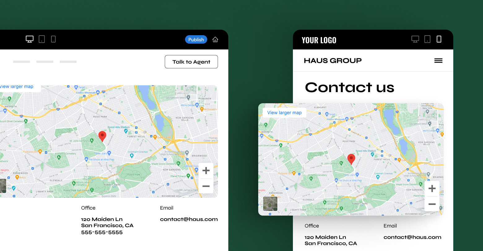
Enhancing your contact page
Most websites use Google Maps on their contact page to highlight their physical locations. This provides additional context for visitors who may want to visit, with roads, routes, and local landmarks all visible.
Highlighting routes
You may want to highlight a particular route on Google Maps for various reasons, such as hiking or running paths, or to illustrate a specific journey. This is especially useful for travel sites and blogs.
Store locators
In addition to showing your physical location, eCommerce businesses can effectively integrate Google Maps into store locator pages to highlight the nearest availability of a particular product.
There are, of course, many other reasons to integrate Google Maps. The goal is simple: to provide a visual overlay of the information you’re trying to convey. With Google increasingly prioritizing in-depth and useful features in its rankings, this can be an excellent way to meet a user’s search intent.
Why do I need to make Google Maps responsive
The tried and tested way to add a Google Maps element to a website is via their convenient “Embed a Map” button, visible on desktop after clicking “Share.” While this does, in theory, work, it isn’t responsive. In fact, Google even allows you to select a size for the embeddable maps element within the share window.
Responsive elements are extremely important for modern websites. They offer far greater design flexibility while simultaneously contorting to fit well on screens of every size, from large monitors to small phones.
Take a look at the responsive map element below. If you drag the lower right corner, you’ll be able to see firsthand what a responsive element is capable of. The map can shrink and grow seamlessly to fit any container.
So, how do you make something like this for your own website? Unsurprisingly, there are quite a few options.
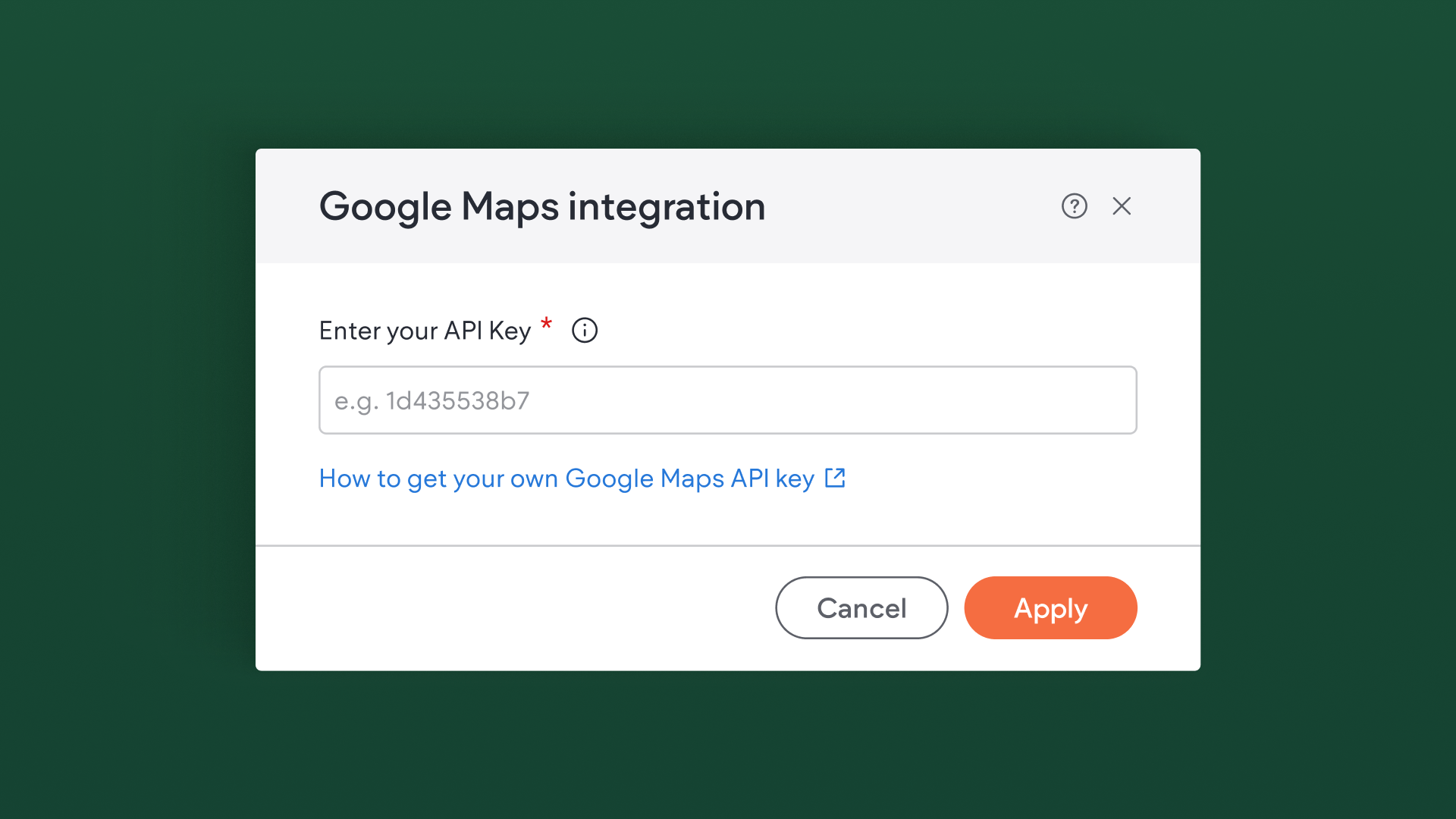
Use your Google Maps API key within Duda natively
Duda’s platform offers the ability to swap Mapbox with Google Maps account-wide. This is a super seamless way to offer your clients Google Maps functionality without having to fiddle around with code. After you enter your API key, Google Maps will become the default in all location search and maps for the Content Library and other applicable widgets.
To enable Google Maps account-wide:
- Generate an API key within your Google Maps account. To see how to generate an API key, take a look at
Google’s documentation. You should review
Google's Usage and Billing policy first, though.
- If your Google account is configured in such a way that the API key only functions on certain websites, you will need to add duda.co, your site domain, and if applicable, any white label domains to the list of allowed websites in your Google Account.
- In the Duda dashboard, click on your avatar in the upper right corner and select Account
- On the Account Settings page, scroll down to the Google Map Integration section and click Set Up
- Paste your API key in the field, then click Apply to All Sites
You can switch back to Mapbox at any time—no data will be lost. Keep in mind that, while Google does offer a very generous free tier, their API is not free. At the time of publication, developers could expect to make a little over 28,000 API calls per month before accruing any charges.
If you anticipate a significant number of monthly views across all of your client sites, this may not be the best option for your agency. Luckily, there are other ways to add Google Maps to your clients’ sites.
Embed Google Maps via a responsive iFrame
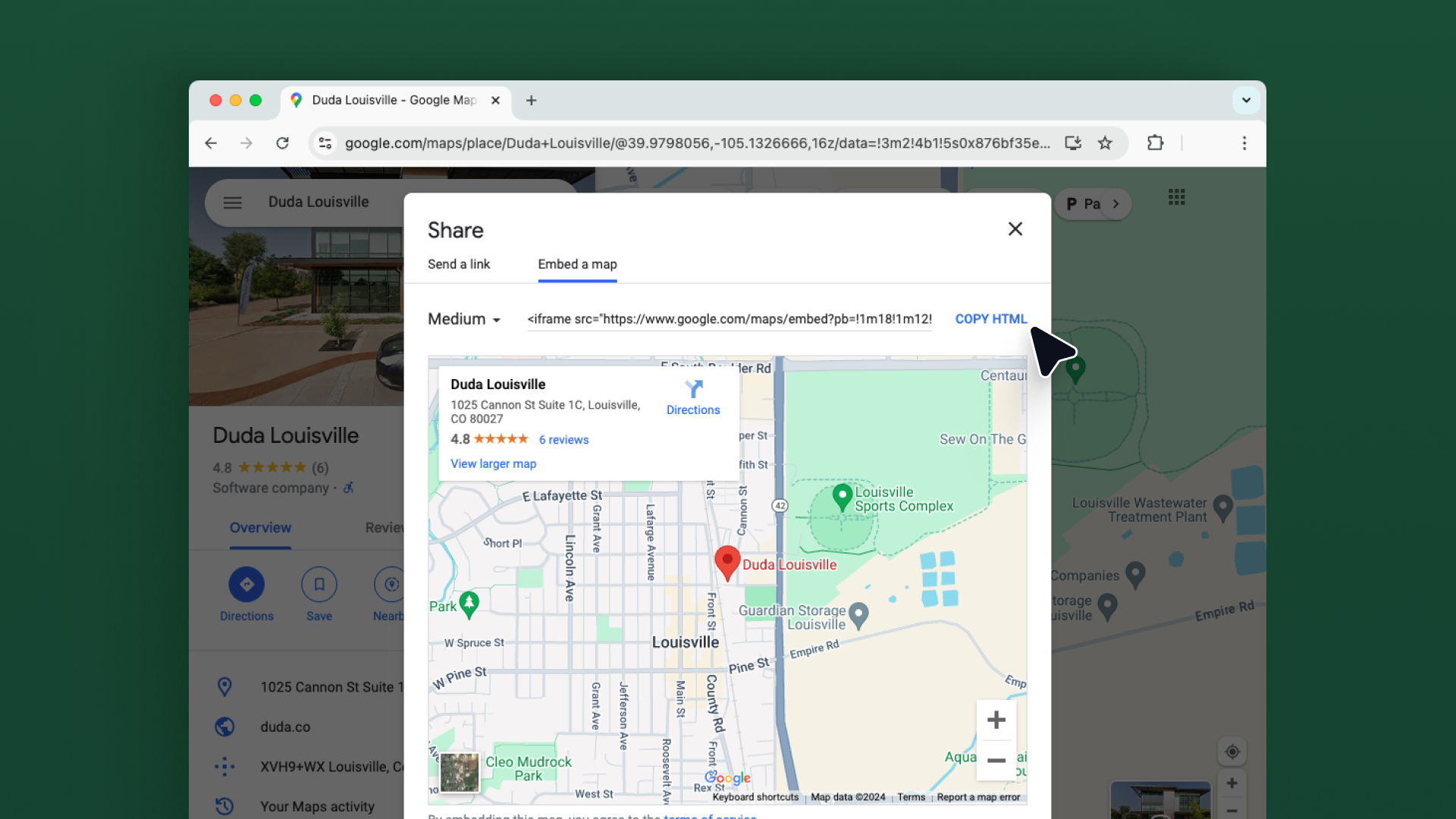
Conveniently located within the
Share menu on Google Maps’ desktop website is a handy “embed code.” If you were to copy this code then paste it into an html widget on your client’s site, you would see a lovely Google Maps element with very little effort.
Unlike the account-wide integration, this somewhat manual process can be done per-client, perfect when you have other customers who are happy to use the native Mapbox widget. More importantly, embedding Google Maps in this way does not require the use of their API—meaning no fees.
However, this element isn’t responsive. Luckily, that’s an easy fix. To start, we’ll need the embed code:
- Visit Google Maps’ website
- Enter the business address in the search bar, then click the search button
- Click on the Share icon
- Choose "Embed map"
- Select and copy the HTML iframe embed code
Then, we’ll need to paste that code into an HTML widget. It should look something like this:
If you take a peek at that code, you’ll notice that the width and height properties are clearly defined with fixed values, 600 and 450 respectively. We can substitute both of these numbers with a more flexible value, like 100%, to create code that looks like this:
Now, the embedded Google Maps element will expand to completely encompass the HTML widget container, making it responsive and easy to resize on any device. No further CSS styling or media query usage is necessary when using this method.fill the container it is placed in, a fully responsive experience.
Embed Google Maps via a responsive iFrame with CSS
While the above method does work, it isn’t the ideal way to do things. Most browsers understand what you mean by the code width="100%" height="100%," but that isn’t technically correct syntax. Instead, your code should look a little more like the following:
What we’ve done here is we’ve taken the embed that Google Maps gives us within their share menu, and we've wrapped it in a container. In this case, the container is named “map-responsive.” This allows us to apply CSS code to the container and the iframe in a more compliant way. The CSS should look something like this:
You can adjust the height of the map by tweaking the
padding-bottom value to your liking. This method of embedding and CSS styling should work for any HTML based website.
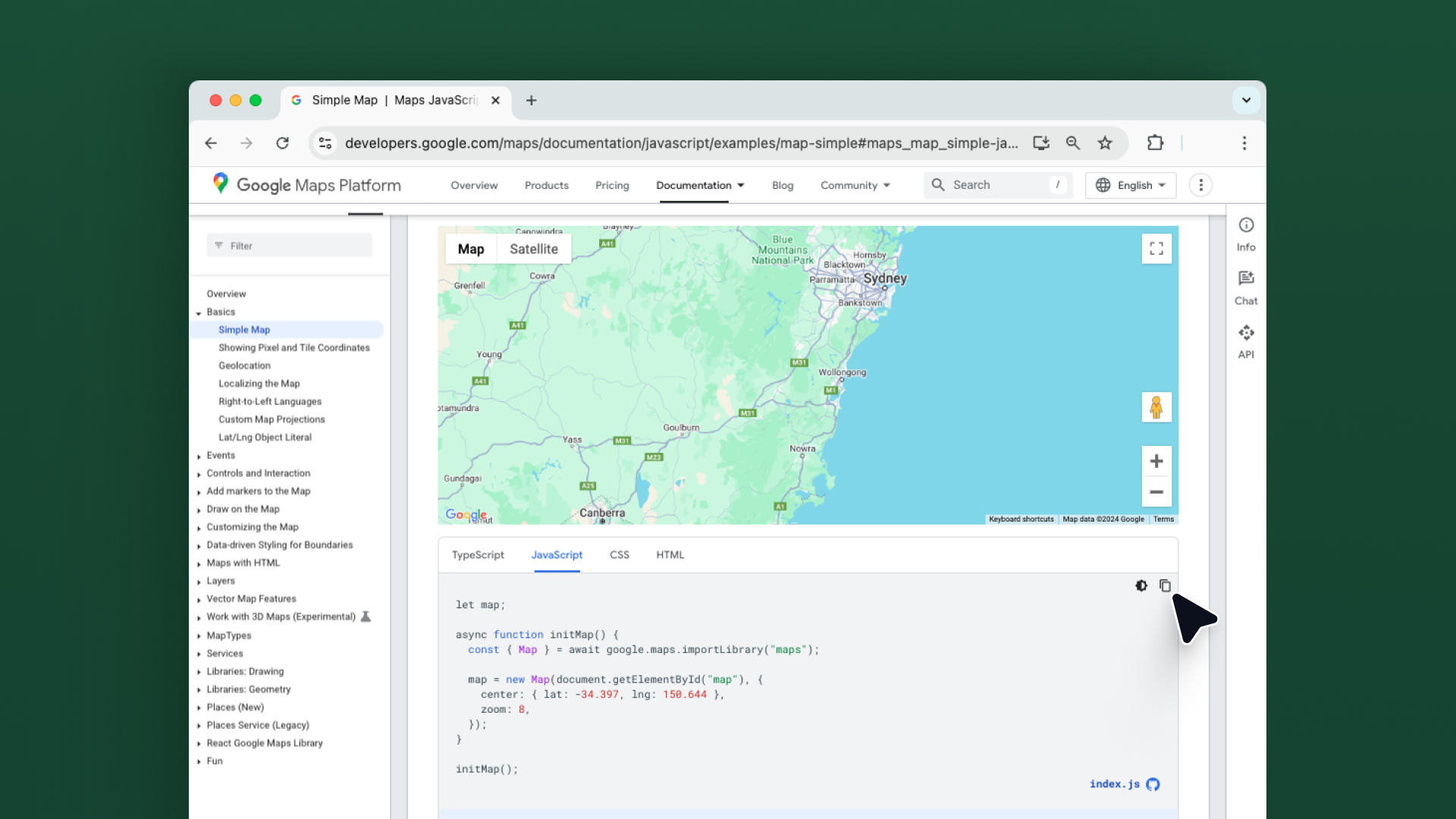
Create a map dynamically with Google’s JavaScript API
If you’re feeling exceptionally technical, you can render your own Google Maps element using their JavaScript API. This option enables quite a bit of customization, at the cost of more effort and technical experience. You can draw map markers, calculate distance and areas, display prominent points of interest, overlay heatmaps, and more. However, you also need an API key, which means there may be a cost.
Google’s developer documentation provides quite a bit more information.
Our example below is fairly simple compared to what’s possible.
First, you’ll need to create an API key. To do so, go to
Google’s Cloud Platform Console, create a new project, then generate the credentials. It’s important to
restrict the API key before you put it to use. Restrictions provide security and ensure that only authorized requests are made with your API key.
Next, you’ll need to add the scripts to your site. Here is some sample code showing what that could look like, starting with the CSS.
Then, the library itself. See how your API key is visible here? That’s why you want to restrict it.
That’s it! Now you have a responsive map created using Google Maps JavaScript API.
Which option is right for you?
If you’re prepared to accept the risk that there may be some charge associated with using Google Maps, or are happy to pass those charges along to your clients, then Duda’s native Google Maps solution is absolutely your best bet. Although, keep in mind, there’s nothing wrong with using the default Mapbox offering!
For cost-conscious agencies, embedding a Google Maps element is a great alternative. This eliminates the risk of any charges, and is very easy to implement for simple websites.
Of course, for more bespoke agencies, a super-custom solution may be the right choice.
Google Maps offers APIs, SDKs and many step-by-step tutorials and code samples to help users create simple responsive Google Maps or highly customized maps which can do all sorts of cool stuff. With just a few steps, you can augment your site with an array of functionality from a simple map view through highly complex and interactive mapping tools.