7 Design Tips For Building Better Websites From A Duda Designer

May 19, 2017
0 minute read

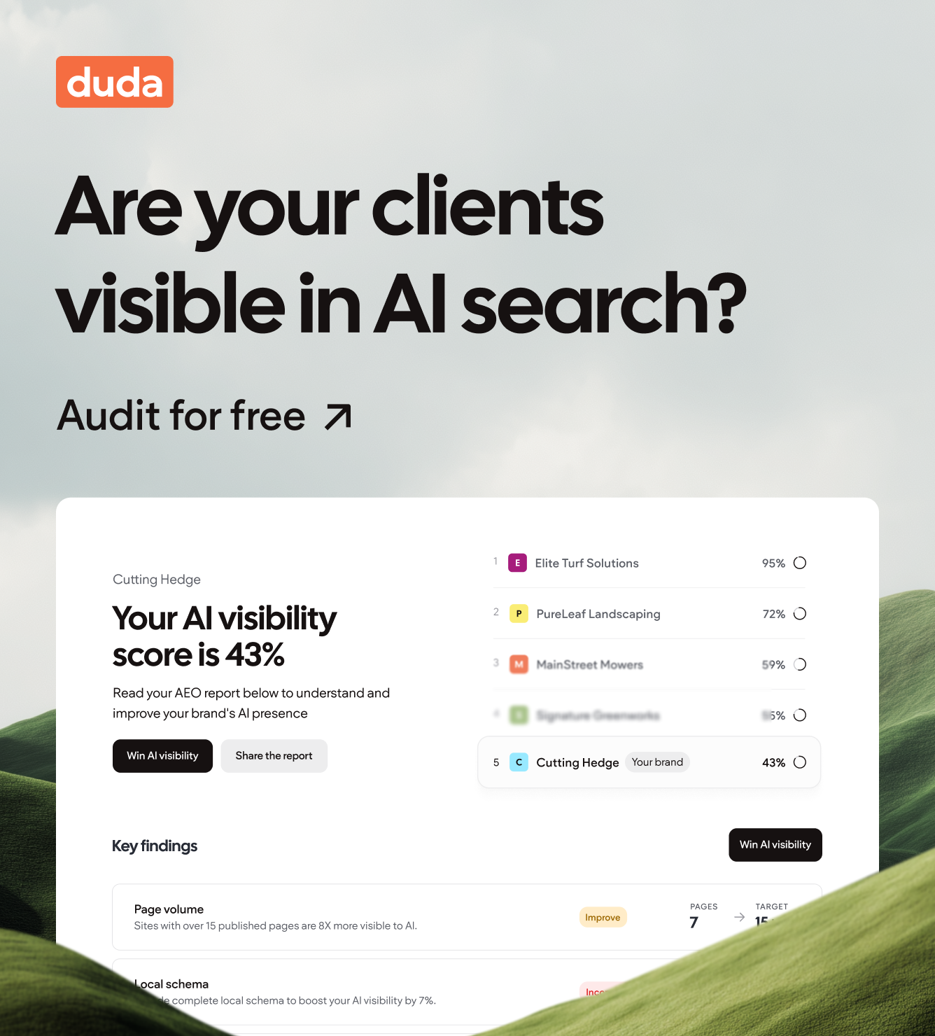
Whether you’re building your first site or your 101st site, it never hurts to have a handy reminder of how to make it amazing. So here are 7 things to consider when you build your next website.

1. Know Your Main Purpose & Audience

Main purpose

Before you start, take a moment to think about the purpose of the site. This simple factor will help you make important decisions like what images you should use, which font sizes are best, what colors are most appropriate, and more.

Consider what your customer wants to achieve with the website. For example:

  • Is it a restaurant website that should make it easy to reserve a table?
  • Is it a medical website meant to encourage visitors to make appointments?
  • Is it a photographer’s website that aims to be a portfolio of great images?

Once you’ve figured out the purpose of the website you’re building, it shouldn’t be too hard to determine its intended audience.

For example, if your website’s target audience is relatively old, you’ll want to use a large font size that is easy to read. If your target audience is young and hip (for example, surfers and skateboarders), you’ll want to use images of young people having fun. If you’re betting on an international audience (for example, if you have a B&B geared for overseas travelers), you’ll want to keep the text relatively short, so that there is enough room in the layout for translations that may be longer than the original text. You’ll also want to use Calls-to-Action (CTAs) that are unambiguous and easily translatable.

Calls-to-Action (CTAs)

Speaking of CTAs, make sure that these are easy to find and directly related to your website’s main purpose. For example, if you’re working on a restaurant website, make sure the Reserve a Table button is prominent, especially on the mobile version of the site. If your website is promoting a chain of ice cream parlors, the CTA may be broader (for example, Find the Parlor Nearest You). In this case, this message may be located on the Contact Us page.

Doodling often works for me

This isn’t a must-have, but I find that doodling often helps me get started with a website. I just get a paper and pencil and create a simple outline of what I want in the website. After I have a basic idea of what pages I want, and what kind of images I want on each page, it is easier to move to the next step – finding the right template.

2. Choose the Right Template

Now that you’ve done some critical thinking about the purpose of the website, you’re ready to choose the template. With so many styles and varieties, choosing a template can be more challenging than finding the right pair of running shoes!

Two different approaches come into play when choosing a template: by subject or by style.

By subject

If you go with this approach, you’ll choose a template according to your customer’s industry. So, if you’re building a website for an electrician, you might start with the Locksmith template. If you’re building a website for a driving instructor, you might start with the Academic Tutor template.

By style

You can also start with a template simply because you like the way it looks. If you like the structure or style, the navigation design or layout of the images, you can start with a template from an unrelated field and simply change the images so that it fits your customer’s business area.

3. Decide On a Color Pallete

When it comes to designing websites, you’ll want to choose colors that convey a certain message and work well together. Even if you’ve chosen color schemes for weddings, living rooms or your own closet, that doesn’t mean you know how to choose the best color palette for your websites.

The color palette you choose contributes to the readability, cohesiveness, and beauty of your websites. One good way of deciding what color palette to follow is by looking at other websites that you feel work well and paying special attention to their combination of colors.
 

Good site references are awwwards , land-book , Pinterest , dribbble and Behance . Another good resource is Stylify Me , a tool that detects the colors and fonts of websites. Just enter the URL of a site you like, and it will show you the site’s background colors, text colors, and fonts. To explore website color combinations, try Canva .

4. Way of Building in Sections

Dark-light-dark-light

If you browse through Duda’s templates, you may notice that the colors in most of them alternate between light and dark. Every Duda website – and most new websites in general – are built in sections. If one section has a picture, the next section is usually white or uniform in color; if one section has a gray background, the next section usually has a white background. For example, see the Tour Guide or National Park templates. You’ll notice that in both of them, sections that are mostly light are followed by sections that are mostly dark.

Full light / full dark

Another method is to create sections that are predominantly dark (or predominantly light). This method may be more suitable for landing pages with a single flow or feeling.

5. Not All Fonts Are Created Equal

There are thousands of different fonts in use today, and though it may be fun to scroll through them, not all of them are suitable for websites. Some fonts are better for some purposes; other fonts are better for others. The trick is knowing what font you should use to achieve the right mood for your website.

Traditionally, fonts have been divided into two styles: serif and sans serif. A serif font is one in which the letters have a small line, known as a serif, attached to their ends. A sans serif font is one in which the characters do not have this small tail. (The word “sans,” by the way, comes from the French, and means ‘without’.)                                                                                                                                                  As for whether you should use serif or sans serif fonts in various places on your website – that’s really up to you. In the past, when things were primarily printed, sans serif fonts were used for titles, while serif fonts were used for texts. In today’s websites, anything goes. Just remember that your choice of fonts has an impact on how users perceive your site.


6. Choosing Images — Dos & Don’t’s

Choosing images for your website can be one of the most enjoyable (and frustrating!) parts of building a website. Sometimes, good images are plentiful; other times they are hard to come by. Sometimes, you’ll have a great image that’s of poor quality. Also, your clients may provide you with images that they think are great, but are under par when it comes to their website.

Here are some tips for how you should (and shouldn’t) choose and use website images:

  • Do use positive images. If you are building a website for a cleaning company, use images of clean spaces.
  • Don’t use negative images. For that same cleaning website, don’t use images of dirty spaces. No one wants to see other people’s messes online.
  • Don’t put text on people faces. Put it above, below, to the left or to the right of their faces.

    blog_image_5
  • Do use images of people that website visitors will be able to identify with. Think diversity. Think inclusiveness. Think that you want any website visitor that reaches your customer’s website to feel that the website is speaking to them.
  • Do use smiling faces. It’s not required, but if a smile is appropriate, by all means, use it. Some people like to use images with faces looking directly at the camera. I’m not always in favor of this, but if it works for your website, go for it.
  • Don’t use images that are too small. If you have an image that’s 500px, don’t use it on full bleed (1920px) because it will come out looking pixelated. If these are the only images your customer provided you with, don’t use them in high resolution, because they won’t look good. (If the reverse is true, by the way, you have nothing to worry about because Duda automatically makes big images smaller (it’s one of the steps we take to improve page speed ).
  • Do use high-quality stock images and videos. A good stock image is better than a bad original image.
  • Do use the image editor tools that are built into the Duda editor. For example, if your client gives you an image that is too dark, use the image editor to make it lighter. If you have an image that has too much background noise, crop it out. The Duda image editor has several functions. You can read more about them here .

7. Websites Are Not Static Objects…Remember to Keep Them Alive!

Website are not static objects. They need to grow and develop. They need to change as needs change, with new images, updated blogs, refreshed fonts and more. Updating your websites on a regular basis is good for SEO, good for your customers, and good for you. 

There are lots of ways to update your websites. You can use Website Personalizations that show special messages on holidays and special events. You can integrate a blog and set a blog schedule so there is new, timely content on a regular basis. You can also add images that your customers provide of new products, positive reviews and company events. These are the little things that keep the websites you build fresh, relevant, and high-converting in the long run.


Did you find this article interesting?


Thanks for the feedback!
By Shawn Davis April 1, 2026
Core Web Vitals aren't new, Google introduced them in 2020 and made them a ranking factor in 2021. But the questions keep coming, because the metrics keep changing and the stakes keep rising. Reddit's SEO communities were still debating their impact as recently as January 2026, and for good reason: most agencies still don't have a clear, repeatable way to measure, diagnose, and fix them for clients. This guide cuts through the noise. Here's what Core Web Vitals actually measure, what good scores look like today, and how to improve them—without needing a dedicated performance engineer on every project. What Core Web Vitals measure Google evaluates three user experience signals to determine whether a page feels fast, stable, and responsive: Largest Contentful Paint (LCP) measures how long it takes for the biggest visible element on a page — usually a hero image or headline — to load. Google considers anything under 2.5 seconds good. Above 4 seconds is poor. Interaction to Next Paint (INP) replaced First Input Delay (FID) in March 2024. Where FID measures the delay before a user's first click is registered, INP tracks the full responsiveness of every interaction across the page session. A good INP score is under 200 milliseconds. Cumulative Layout Shift (CLS) measures visual stability — how much page elements unexpectedly move while content loads. A score below 0.1 is good. Higher scores signal that images, ads, or embeds are pushing content around after load, which frustrates users and tanks conversions. These three metrics are a subset of Google's broader Page Experience signals, which also include HTTPS, safe browsing, and mobile usability. Core Web Vitals are the ones you can most directly control and improve. Why your clients' scores may still be poor Core Web Vitals scores vary dramatically by platform, hosting, and how a site was built. Some of the most common culprits agencies encounter: Heavy above-the-fold content . A homepage with an autoplay video, a full-width image slider, and a chat widget loading simultaneously will fail LCP every time. The browser has to resolve all of those resources before it can paint the largest element. Unstable image dimensions . When an image loads without defined width and height attributes, the browser doesn't reserve space for it. It renders the surrounding text, then jumps it down when the image appears. That jump is CLS. Third-party scripts blocking the main thread . Analytics pixels, ad tags, and live chat tools run on the browser's main thread. When they stack up, every click and tap has to wait in line — driving INP scores up. A single slow third-party script can push an otherwise clean site into "needs improvement" territory. Too many web fonts . Each font family and weight is a separate network request. A page loading four font files before rendering any text will fail LCP, especially on mobile connections. Unoptimized images . JPEGs and PNGs served at full resolution, without compression or modern formats like WebP or AVIF, add unnecessary weight to every page load. How to measure them accurately There are two types of Core Web Vitals data you should be looking at for every client: Lab data comes from tools like Google PageSpeed Insights, Lighthouse, and WebPageTest. It simulates page loads in controlled conditions. Lab data is useful for diagnosing specific issues and testing fixes before you deploy them. Field data (also called Real User Monitoring, or RUM) comes from actual users visiting the site. Google collects this through the Chrome User Experience Report (CrUX) and surfaces it in Search Console and PageSpeed Insights. Field data is what Google actually uses as a ranking signal — and it often looks worse than lab data because it reflects real-world device and connection variability. If your client's site has enough traffic, you'll see field data in Search Console under Core Web Vitals. This is your baseline. Lab data helps you understand why the scores are what they are. For clients with low traffic who don't have enough field data to appear in CrUX, you'll be working primarily with lab scores. Set that expectation early so clients understand that improvements may not immediately show up in Search Console. Practical fixes that move the needle Fix LCP: get the hero image loading first The single most effective LCP improvement is adding fetchpriority="high" to the hero image tag. This tells the browser to prioritize that resource over everything else. If you're using a background CSS image for the hero, switch it to anelement — background images aren't discoverable by the browser's preload scanner. Also check whether your hosting serves images through a CDN with caching. Edge delivery dramatically reduces the time-to-first-byte, which feeds directly into LCP. Fix CLS: define dimensions for every media element Every image, video, and ad slot on the page needs explicit width and height attributes in the HTML. If you're using responsive CSS, you can still define the aspect ratio with aspect-ratio in CSS while leaving the actual size fluid. The key is giving the browser enough information to reserve space before the asset loads. Avoid inserting content above existing content after page load. This is common with cookie banners, sticky headers that change height, and dynamically loaded ad units. If you need to show these, anchor them to fixed positions so they don't push content around. Fix INP: reduce what's competing for the main thread Audit third-party scripts and defer or remove anything that isn't essential. Tools like WebPageTest's waterfall view or Chrome DevTools Performance panel show you exactly which scripts are blocking the main thread and for how long. Load chat widgets, analytics, and ad tags asynchronously and after the page's critical path has resolved. For most clients, moving non-essential scripts to load after the DOMContentLoaded event is a meaningful INP improvement with no visible impact on the user experience. For websites with heavy JavaScript — particularly those built on frameworks with large client-side bundles — consider breaking up long tasks into smaller chunks using the browser's Scheduler API or simply splitting components so the main thread isn't locked for more than 50 milliseconds at a stretch. What platforms handle automatically One of the practical advantages of building on a platform optimized for performance is that many of these fixes are applied by default. Duda, for example, automatically serves WebP images, lazy loads below-the-fold content, minifies CSS, and uses efficient cache policies for static assets. As of May 2025, 82% of sites built on Duda pass all three Core Web Vitals metrics — the highest recorded pass rate among major website platforms. That baseline matters when you're managing dozens or hundreds of client sites. It means you're starting each project close to or at a passing score, rather than diagnosing and patching a broken foundation. How much do Core Web Vitals actually affect rankings? Honestly, they're a tiebreaker — not a primary signal. Google has been clear that content quality and relevance still dominate ranking decisions. A well-optimized site with thin, irrelevant content won't outrank a content-rich competitor just because its CLS is 0.05. What Core Web Vitals do affect is the user experience that supports those rankings. Pages with poor LCP scores have measurably higher bounce rates. Sites with high CLS lose users mid-session. Those behavioral signals — time on page, return visits, conversions — are things search engines can observe and incorporate. The practical argument for fixing Core Web Vitals isn't just "because Google said so." It's that faster, more stable pages convert better. Every second of LCP improvement can reduce bounce rates by 15–20% depending on the industry and device mix. For client sites that monetize through leads or eCommerce, that's a revenue argument, not just an SEO argument. A repeatable process for agencies Audit every new site before launch. Run PageSpeed Insights and record LCP, INP, and CLS scores for both mobile and desktop. Flag anything in the "needs improvement" or "poor" range before the client sees the live site. Check Search Console monthly for existing clients. The Core Web Vitals report surfaces issues as they appear in field data. Catching a regression early — before it compounds — is significantly easier than explaining a traffic drop after the fact. Document what you've improved. Clients rarely see Core Web Vitals scores on their own. A monthly one-page performance summary showing before/after scores builds credibility and makes your technical work visible. Prioritize mobile. Google uses mobile-first indexing, and field data shows that mobile CWV scores are almost always worse than desktop. If you only have time to optimize one version, do mobile first. Core Web Vitals aren't a one-time fix. Platforms change, new scripts get added, campaigns bring in new widgets. Build the audit into your workflow and treat it like any other ongoing deliverable, and you'll stay ahead of the issues before they affect your clients' rankings. Duda's platform is built with Core Web Vitals performance in mind. Explore how it handles image optimization, script management, and site speed automatically — so your team spends less time debugging and more time building.
By Ilana Brudo March 31, 2026
Vertical SaaS must transition from tools to an AI-powered Vertical Operating System (vOS). Learn to leverage context, end tech sprawl, and maximize retention.
By Shawn Davis March 27, 2026
Automate client management, instant site generation, and data synchronization with an API-driven website builder to create a scalable growth engine for your SaaS platform.
Show More

Latest posts