Thomas Deininger, a Rhode Island based artist, has garnered over half a million followers on Instagram with his captivating sculptures. Each piece uses non-recyclable, non-biodegradable materials to create beautiful renditions of living creatures—mostly birds. When you look at his work from straight on, they appear to be a hyper-realistic recreation of a particular animal. However, from the side they look entirely different. They look like bundled trash.
What you’re witnessing in the video above is a manipulation of “parallax.” According to the
Cambridge Dictionary, parallax, a byproduct of human stereo vision, is the effect by which the position of an object seems to change when it is looked at from different positions.
That’s not a very intuitive definition. Instead, if you can, hold out your thumb at arm's length, close one eye, line it up with a distant object, then quickly switch to the other eye while keeping your thumb still. You should be able to see your thumb “shift” positions relative to the background object. It may be slight, but what you’re witnessing is an example of parallax.
Deininger uses parallax artistically to highlight the relationship between our natural world and the trash we release into it. While maybe not as thought provoking, websites often attempt to create a form of “parallax effect” as well—typically to great artistic effect.
In the physical world, parallax depends on a couple factors, the main being a three dimensional space. Unless you’re creating some pretty new-age websites for devices like Meta’s Quest or the Vision Pro, your visitors are probably bound to two dimensions. That means, to achieve this effect, you’ll need to get creative.
What does parallax look like online?
Designers have been playing with the concept of depth in user interfaces for decades. If you’ve ever added a drop shadow to an image or a button, then you’ve attempted to recreate depth as well. Parallax is a natural extension of this.
Imagine a background image that moves slower than the foreground when scrolling, or an element that shifts position slightly in relation to your mouse. These are both different ways to recreate parallax on the web, with the former using scroll as the reference for position and the latter using the mouse.
We do this ourselves, both on our website as well as in our templates. Our “Chef Restaurant” template, created for a fictional restaurant named Baillotte, uses a parallax effect to tailor a more engaging experience for visitors.
Before we dive into all of the different ways you can recreate parallax online, it’s worth taking a moment to discuss an under-appreciated element of great design; moderation. Too many scroll animations or moving elements can be jarring and disruptive, not to mention an accessibility nightmare.
Visitors with motion sensitivity, vestibular disorders, or other neurological conditions certainly won’t appreciate a website with elements moving everywhere from all directions. To offer the best experience to the widest audience, consider:
- Keeping parallax effects to a minimum. Don’t disorient your users or distract them from meaningful information. Keep it decorative!
- Restrict movements to small areas of the screen. An element shouldn’t move dramatically across the screen, that would be disorienting.
- Don’t go too fast. Quick motion, particularly with mouse-based parallax effects, can look jerky and unattractive. Subtlety is key.
With that out of the way, let’s take a look at five different ways to achieve a parallax effect on your website.
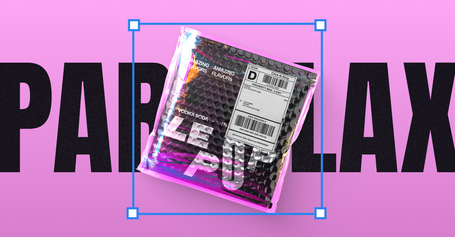
Fixed background
A fixed background is what most designers would imagine when asked to describe a “parallax effect.” Essentially, the background image doesn’t move while all other elements do. You can see this in action in the Chef Restaurant template mentioned earlier, or via the image below.
One reason why this effect is so ubiquitous is that it’s incredibly easy to implement. Using CSS, all you really need to do is apply the code
background-position: fixed;. Drag-and-drop website builders make it even easier. In Duda’s Editor 2.0, this effect can be achieved by selecting “Static” in the design panel via the “Image position type” portion of the “Background” section.
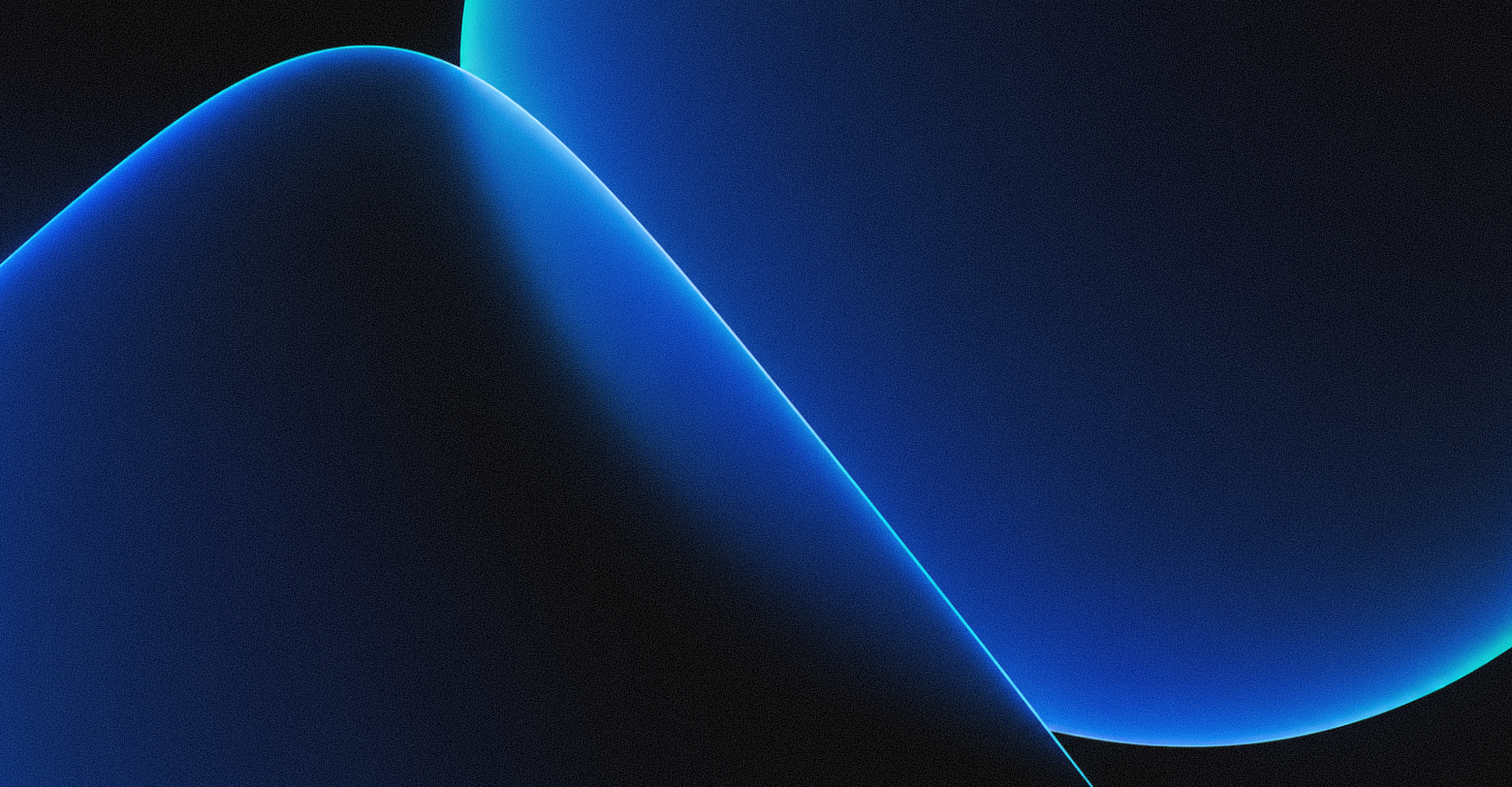
Vertical scrolling
Vertical scrolling is a little different, and a little more authentic. In this scenario, the background and foreground move at varying speeds. This is much more difficult to implement using code, but is exceptionally easy in Duda.
Using the exact same design panel as before, we can apply a background image then select the aptly named “Parallax” option within the “image position type” portion of the “Background” section. The effect, shown below, is a background image that moves slightly slower than the elements placed on top of it.
Note that you won’t be able to achieve a parallax scrolling effect by using a solid colored background, and for good reason. If you remember our thumb example from earlier, an important part of the parallax effect is the relationship between the foreground and the background. If the background lacked an image, then there’d be no way to create that much needed relationship.
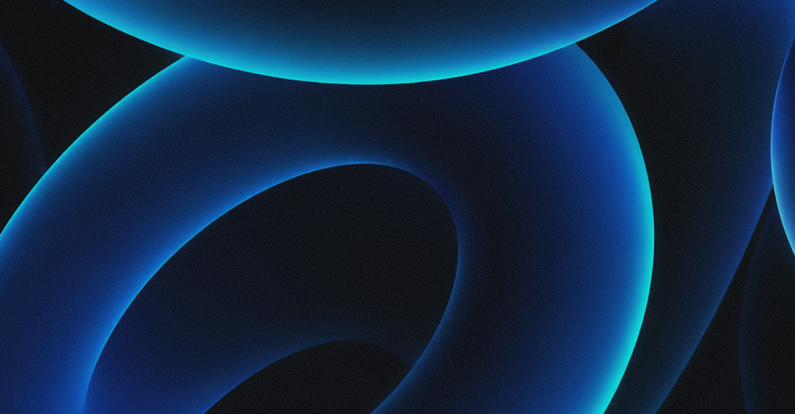
Horizontal scrolling
Horizontal scrolling is similar to, but far less common than, vertical scrolling. In this instance, elements may slowly move from one side to the other as a user scrolls vertically. The United Nations uses this effect heavily on their
2022 Sustainable Development Plan microsite.
If you’re an agency who builds websites for SMBs, this effect is probably overkill. However, a subtler version is very achievable.
In Duda, select any element you’d like to animate then choose, unsurprisingly, “Animations” from the design panel. Choose “Scroll” as the trigger, then “Slide” as the animation. You can play around with the exact parameters of this animation yourself, but so long as you’ve selected either “right” or “left” as the direction what you’re left with is a lovely parallax effect.
The best way to implement this, though, is to have another element that can act as a reference. To do that, follow the exact same steps as above on another nearby element, but ensure that the second element is set up to perform the animation at a slightly different speed than the first. You can see how that looks via the elements below.
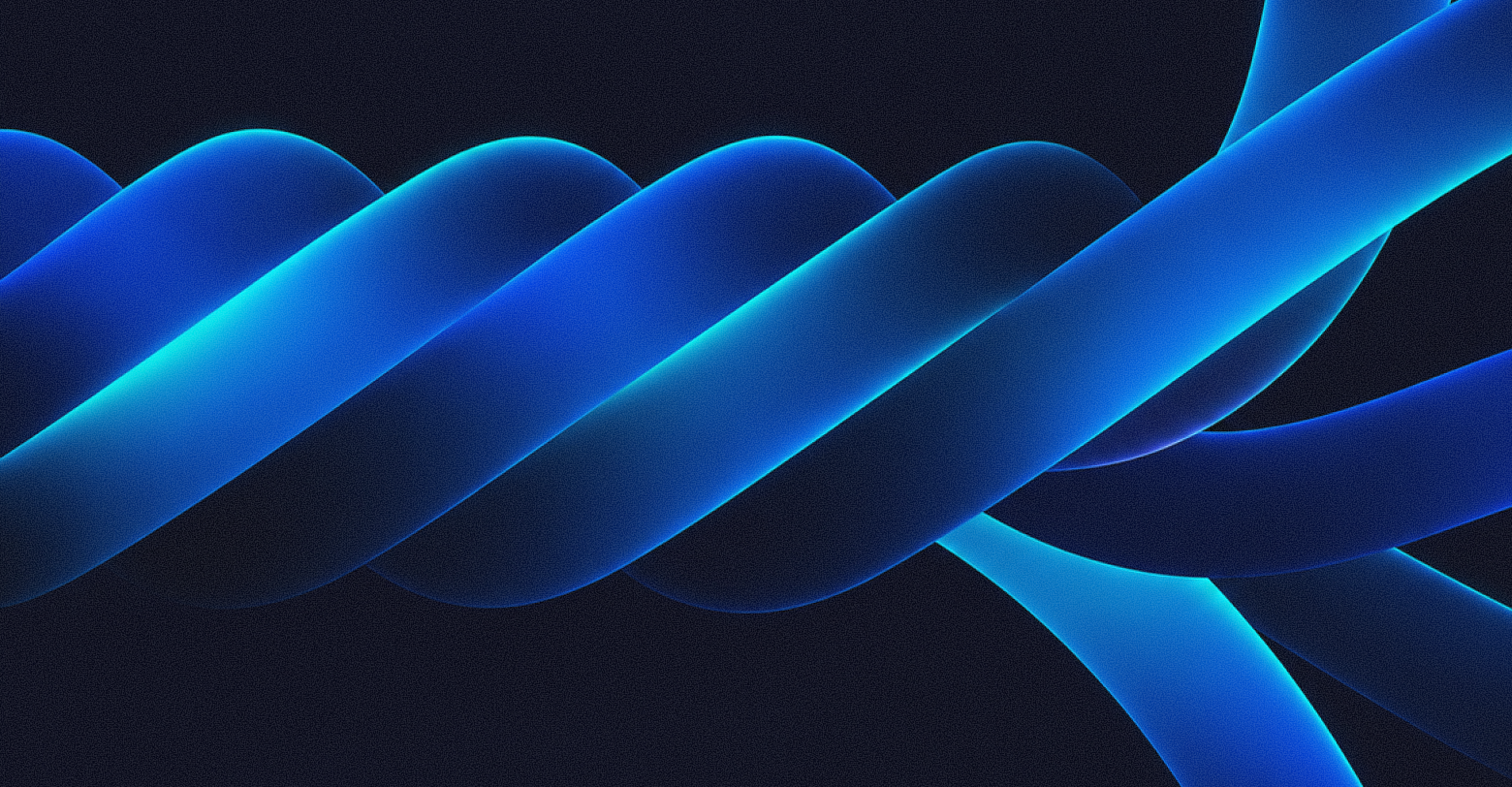
Scroll-trigger animations
By now you should be picking up how parallax animations work. Two identifiable objects are moving at different speeds based on some trigger, like scrolling. While we’ve primarily used the background to achieve this, foreground objects can move at different speeds relative to each other as well via “scroll-trigger animations.”
We used an effect like this on the 2024 Dudacon website. As users scrolled towards the agenda summary, different columns rose at different speeds.
To do this in Duda, select the element you’d like to animate, then choose “Animations” from the design panel. Select “Scroll” as the trigger and “Slide” as the animation, then play around with different properties until you’re happy with the speed and distance that the animation occurs. This is very similar to how we achieved the horizontal scrolling parallax effect, but in this scenario we are operating in any direction, not just left and right.
Mouse-based parallax
In every example we’d used up until this point, the user’s point of reference is determined by their scroll position. However, the mouse is another great way to achieve this effect. Keep in mind, though, that dramatic movements in relation to the mouse can create a poor user experience. As always, work in moderation.
Consider the example code above written by
Clément Gaudinière. Orbs in the background move in relation to the mouse. Unlike earlier examples where elements moved in relationship to each other to create a parallax effect, this example uses the cursor itself as the focal point.
Duda doesn’t support cursor-based animations out-of-the-box, so you’ll need to put on your developer hat to achieve this effect. Luckily, with tools like Custom Widgets, HTML blocks, and Dev Mode, implementing really bespoke experiences like this are pretty easy.
However, if you do decide to go this route, consider offering a way for users to turn it off. Unlike other parallax effects, this method has the greatest potential for accessibility issues. HTML standardized media queries like “prefers reduce motion” make respecting user preferences around animations super easy.
What’s next?
Now that you’ve seen a few ways to add parallax effects to your website, the next step is to actually do it. Many of our newer
templates use parallax effects, and plenty of websites on our
inspiration page do too. If that’s not cutting it, our
Facebook Community is a great place to connect with other website building professionals. Take a peak at what they’ve built, and don’t be afraid to ask how they did it! Once you’ve made something you’re proud of, be sure to share it too. The next generation of designers will thank you.