Growing up, you probably remember adults cautioning you to “not judge a book by its cover.” While this timeless expression is excellent advice for both children and adults, this is possibly the worst piece of advice to follow in
website design.
In a recent study conducted by
Stanford, 75 percent of website visitors judge the credibility of a business on how its website is designed. So as a designer, it’s crucial to stay up to date on the latest trends to make sure your websites stand out from the competition and make the right first impression.
To make things simple, we’ve rounded up the top ten website design trends for 2022. Let’s dive in.
1. Dark Mode
From Google’s search engine to Apple’s OS, dark mode is all the rage in the tech world and web design. Dark mode refers to a low-light interface that uses darker colors such as black and gray as the primary background for your website design.
While this web design trend has only become popular recently, the concept of dark mode has been around for a while. Some of the world’s first computers used dark mode to prevent fatigue for coders who spent many hours looking at a screen.
Dark mode has gained popularity due to users’ increased time spent looking at mobile and desktop screens.
The primary benefits of using dark mode for website design are making highly visual websites pop and allowing users to have an easier time focusing on particular images or CTAs. Dark mode is typically associated with power and elegance, making this a great trend to use for minimalistic designs.
It’s best to avoid using this design for websites that contain large amounts of text since it is harder to read.
Pro tip: When designing in dark mode, use high-contrast images with lots of space to avoid making your website look cluttered. Use muted or neutral colors for design elements since bright colors may appear too harsh.
2. Retro-Inspired Design
From clothing to websites, retro-inspired design has made a big comeback in 2022. Retro-inspired website designs use older style images, fonts, colors, and layouts to drum up nostalgia from website visitors. From 1980s themed designs to old school Victorian era-inspired designs, designers have the freedom to transport visitors into a different time era with this trend.
Since retro-inspired designs play on the emotional connection that visitors will have with the represented period, the main benefit of using this type of design is to increase conversions through emotion.
While retro-inspired designs can be great for brands with unique or quirky personalities, it is best to avoid using these designs for technical products since retro fonts can be challenging to read with large amounts of content.
Pro Tip: When designing a retro-themed website, add vintage graphics layered on top of faded images for a color pop effect. Using brightly colored elements and pixelated photos can help make your design stand out even more.
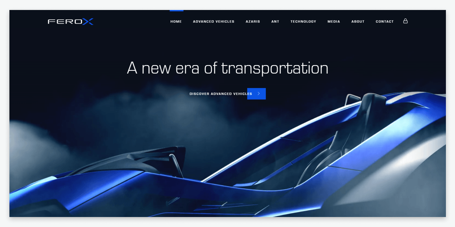
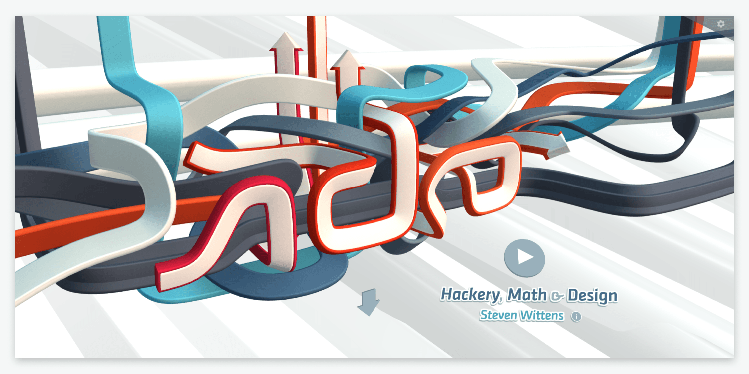
3. INTERACTIVE 3-D ELEMENTS
Incorporating interactive 3-D elements into your website design is guaranteed to make your design stand out from your competition. 3-D web designs place objects along the X, Y, and Z-axis of your website, giving the appearance of that element popping out of the screen.
Compared to traditional 2-D website designs, 3-D interactive designs can create more engagement from visitors by giving them a truly immersive experience. 3-D interactive elements also allow designers to bring anything from real estate properties to eCommerce products to life with a 360-degree view.
This can lead to improved conversion rates since visitors better understand the products or services that the website is promoting. While adding 3-D interactive elements can make your website pop, it’s important to have other meaningful content on your site so that the rest of your website doesn’t fall flat.
Pro Tip: Adding too many interactive 3-D elements to your website design can be dizzying and distracting for your visitors. Try to focus on only adding 3-D features where they add to the user experience that you want to enhance and avoid creating entire pages in 3-D.
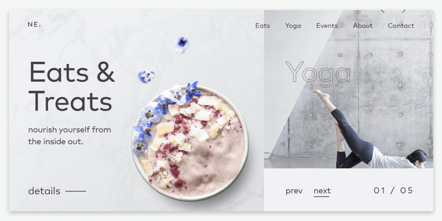
4. Split-Screen Websites
For web pros looking to spice up their designs, split-screen websites can be a great way to turn up the heat. Split-screen is a website layout that divides a homepage or landing page into two or more vertical parts. This design allows separate diverse content or messages to live on the same page.
As the ultimate A/B testing design, split-screen websites help guide users to follow whichever part of the design appeals to them the most. One of the main benefits of using this trend is to draw visitors’ attention to the desired element, such as a CTA or product image. Since many websites still do not use this unique approach, it is an excellent way to stand out against other minimalist designs.
Using split-screen design is best for websites that don’t have extensive content since this can make the design look too cluttered. Take advantage of split-screen design by
creating a new responsive website with Duda.
Pro Tip: Use a split-screen design to promote two or more products or messages. Use enough white space to draw viewers’ eyes only to important messages to keep the website’s structure flowing cohesively.
5. GLASSMORPHISM
Made popular by Apple in many of their recent user interfaces, glassmorphism is becoming increasingly popular in web design for 2022. If you are unfamiliar with this term, glassmorphism is used to describe UI design that emphasizes light or dark objects placed on colorful backgrounds blurred to give the impression of frosted glass.
Used correctly, glassmorphism gives the illusion of glass panels floating in vertical space, transforming traditional websites into modern masterpieces. Most of the appeal of using glassmorphism is the wow factor visitors receive when first entering a website that uses this design.
Glassmorphism is best for websites that have more visual content versus text-heavy content. While this design is beautiful, it can make elements appear to be CTAs, so use these sparingly.
Pro Tip: When using Glassmorphism, pick one or two elements to use this design on to make it stand out. Give dimension to the design with delicate borders and shadows with low contrast backgrounds to make the website look less cluttered.
6. ONE-PAGE WEBSITES
Similar to landing pages, one-page websites have become increasingly popular in 2022 due to their simple navigation and fluid user experience. Compared to traditional multi-page websites, one-page websites tend to have a higher conversion rate because messaging is more concise and direct than in a multi-page website.
One-page websites are best used for freelance portfolios, small businesses, or visually driven content since these designs rely on simplicity to only relay necessary information and CTAs. One-page websites can be highly beneficial for increasing user engagement and are often great for improving mobile-friendliness.
While this design trend is not ideal for websites with a lot of content, it’s a great option for websites that are relatively light in content and information.
Pro Tip: When designing one-page websites, keep the color scheme in harmony with the website’s background color to keep designs minimalistic. Stick to simple navigation and scrolling instead of menus to keep visitors engaged.
7. TEXT ONLY HERO IMAGES
Historically, hero images have played an essential role in a website’s ability to grab a visitor’s attention, strengthen website navigation, and inform them what the website will focus on. Typically the hero image contains a photo, illustration, or 3-D graphic. But with this trend, instead of an image, designers are using bold, oversized text to grab a visitor’s attention.
Some of the main benefits of using this design approach are getting the visitor to take action quickly with vibrant copy and making the text more appealing through a stunning visual display. This popular new way of creating hero images allows designers to have the text itself make a statement instead of pictures or graphics.
New to creating hero images? You can learn all about the best practices for
creating hero images here.
Pro Tip: Use bold, oversized fonts with striking colored backgrounds to make these hero images stand out. Make sure that the text makes a statement to draw viewers’ attention.
8. Inclusive Design
You may have heard about inclusivity in the workplace, but what about website design? Inclusive design, which has become increasingly popular in 2022, focuses on creating equally engaging, functional, and practical user experiences for all website visitors.
While inclusive design works to make websites more accessible to a wide range of people, we’ll speak about gender-neutral design specifically. Gender-neutral design looks beyond traditional identities associated with gender and focuses on techniques that appeal to everyone no matter what gender identity they associate with.
Gender-neutral designs typically avoid using colors associated with male and female personas, such as blues or pinks. Instead, these designs use prime and monochromatic colors to create a user experience that anyone can find valuable regardless of gender. Colors such as brown, white, yellow, gray, and green are great starting points for designing gender-neutral websites.
One of the main benefits of using this type of design is to create a better user experience for your client’s website visitors, especially those who have been marginalized due to gender norms. Start creating your own gender-neutral designs faster with Duda’s
dynamic website templates.
Pro Tip:
Use fonts neither strong nor curvy to avoid representing anything too masculine or feminine. Focus on using minimalistic back and white icons, avoiding sharp or curved edges.
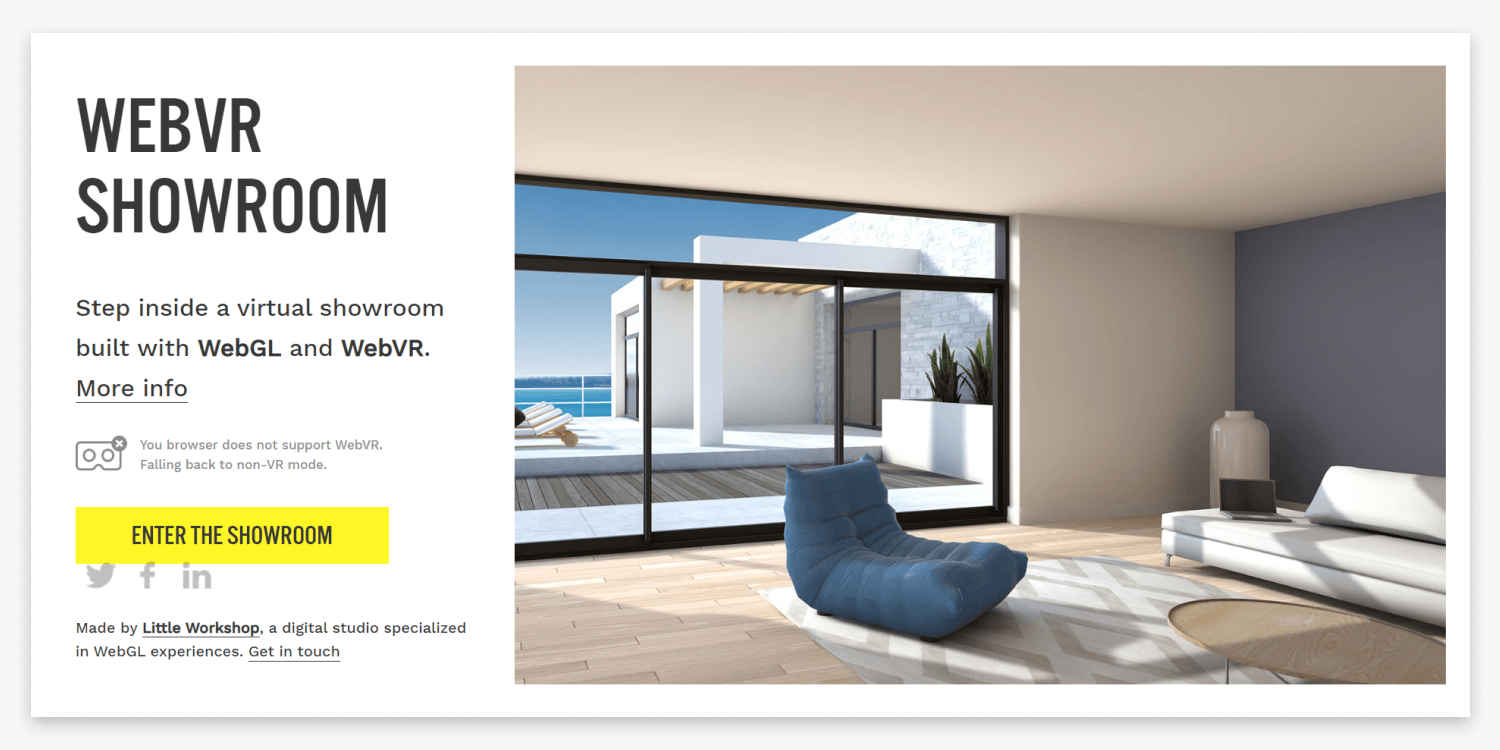
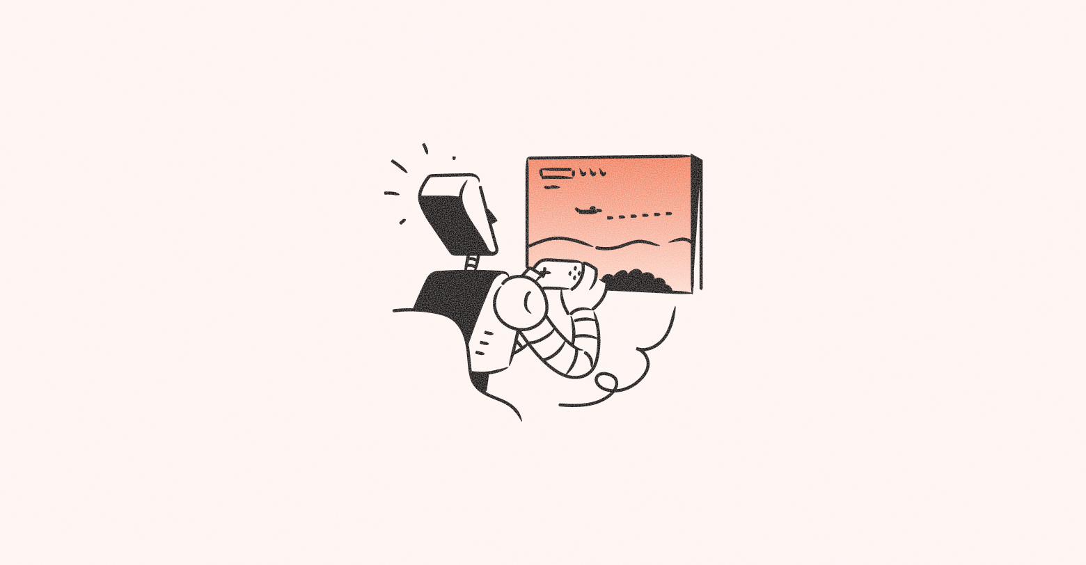
9. Virtual Reality
From video games to websites, using virtual reality in design has gained a lot of traction in 2022. Virtual reality gives website visitors the sense that they are experiencing or exploring their surroundings in real life.
Some of the benefits of using virtual reality in website design are to pique visitors’ interest and leave a lasting impression of the product or service being showcased. Using virtual reality in design also allows businesses to build a stronger brand identity and convey a more powerful message than text alone.
Common use cases for using virtual reality in website design include showcasing how products would look in your home, what clothing or makeup would look like on a customer, or what an apartment looks like without ever leaving the comfort of your home. Although virtual reality can be extremely beneficial in web design, it’s important to note that using too much VR can lead to poor website performance and loading.
Pro Tip: Use familiar visual elements in tandem with VR and keep the style consistent with other aspects of the website, such as fonts and colors. VR elements can be complicated to develop, so make sure that your team has the bandwidth for adding these elements into the design.
10. HORIZONTAL SCROLLING
Our last design trend for 2022 takes a new approach to traditional vertical website scrolling and turns it horizontal. Just as the name suggests, websites with this design allow visitors to scroll both horizontally and vertically.
The main benefits of using horizontal scrolling in design are providing an unforgettable user experience and maximizing screen space for visitors using wide computer monitors. This design is also great for websites with more visual content, such as a portfolio, online gallery, or catalog.
The only downside to this design is that it takes more planning than vertically scrolling websites since many visitors are still largely unaware of this type of design. It provides a unique break in a traditional design that can aid in better storytelling when used correctly.
Pro Tip: Add clear indicators such as arrows that tell website visitors that scrolling can happen horizontally. Use simple organization and include a visible menu for navigation of the rest of the website.
Key Takeaways
While there are plenty of other great design trends to implement in your website builds in 2022, these are some of our favorites. Keeping up to date with what’s popular in the industry will position your agency to keep your clients coming back for more unique website designs and their visitors engaged.
Interested in using any of these design trends for your website builds? Get started on Duda today with a free trial.
Related Posts
By Mike Paciello
•
May 19, 2026
The web had its worst accessibility year in six. On GAAD's 15th anniversary, learn why the 2026 regression is a process problem and how Duda and AudioEye help agencies fix it.
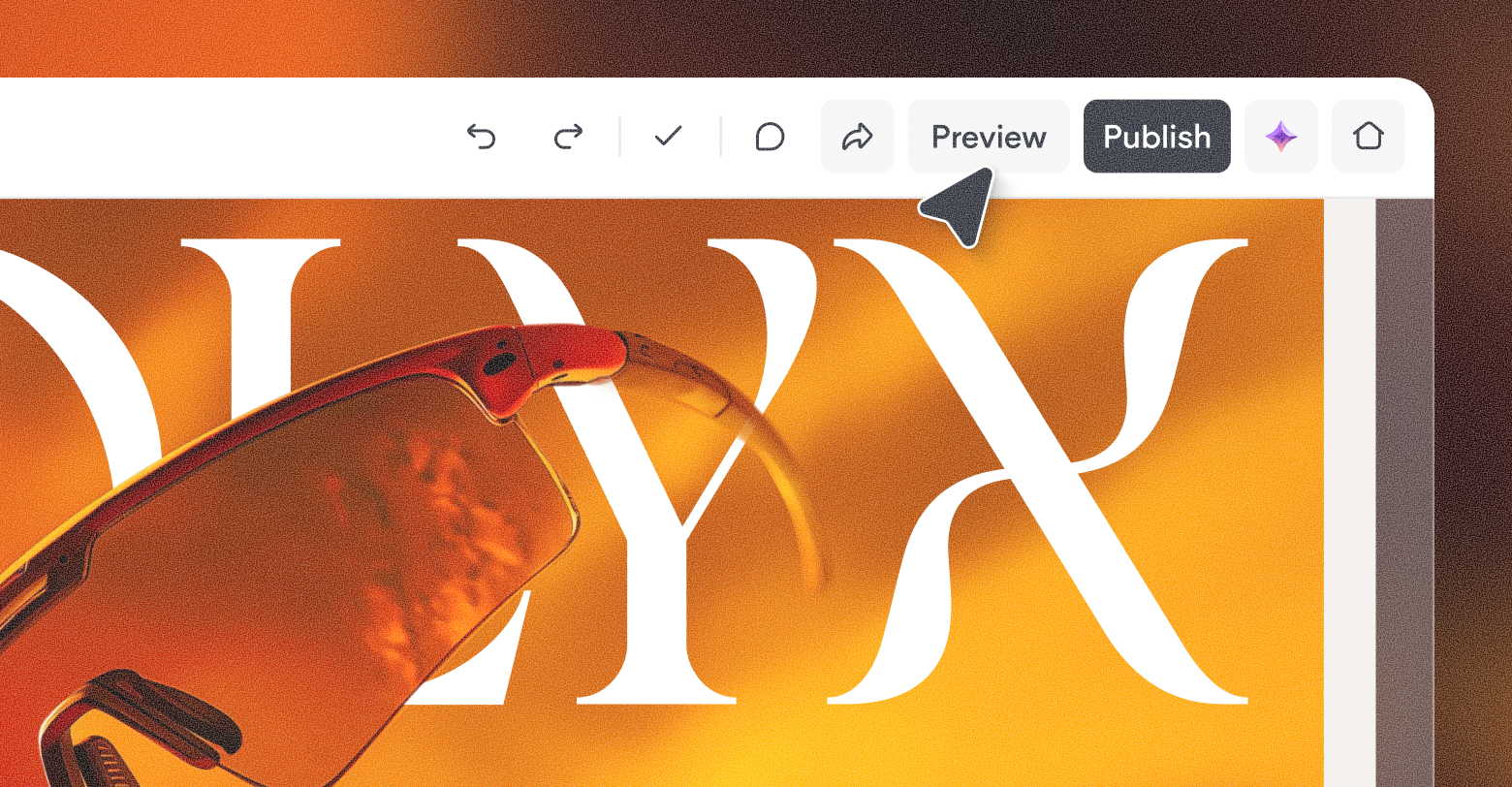
By Duda
•
March 10, 2026
Discover a more intuitive, professional UI with a streamlined sidebar and enhanced top navigation, helping you build faster and with greater confidence.
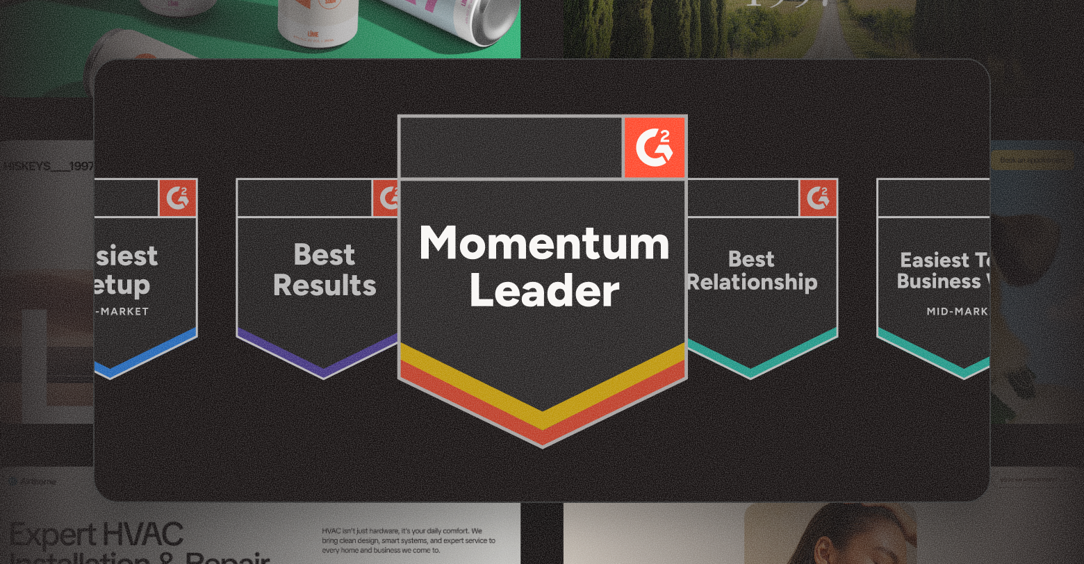
By Stephen Alemar
•
October 23, 2025
Discover why Duda is a top-rated website builder on G2, recognized for usability, easy setup, strong relationships, and excellent results, all backed by real reviews.
Show More