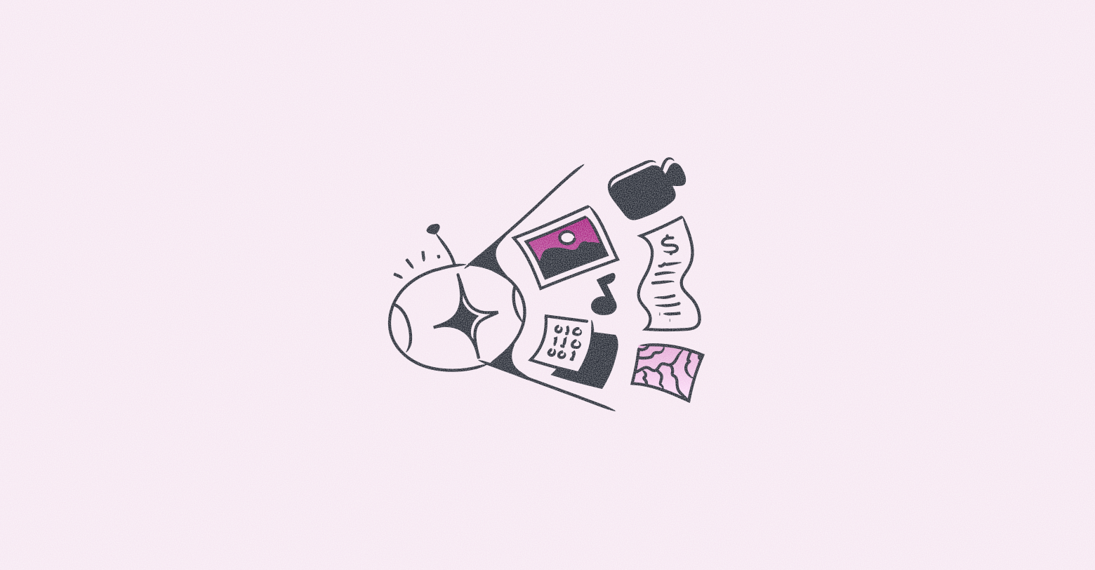
Looking to impress your clients, refresh your portfolio, discover Duda’s newest
website builder features and capabilities – all at the same time?
We have just what you need — quick and easy tips for refreshing your sites.
You’ll delight your customers by showing you care about their online presence and improving your own portfolio at the same time. You’ll also familiarize yourself with some of Duda’s latest updates, which can help you improve all of your sites – current and future.
Your site renovations can be as simple as you like. Anything from
updating the hero image or
integrating Instagram to replacing global fonts and button style. It all depends on the current state of the site and how much time you can invest in the changes.
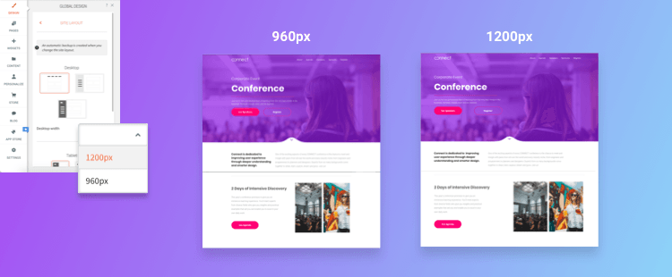
1. UPDATE SCREEN WIDTH TO MAKE THE MOST OF WHAT YOU’VE GOT
Every time you build a site, we recommend that you start your design process in the Global Design panel. Refreshing your site is no different. The first change we suggest is updating the screen width
from 960 px to 1200 px.
In the past, all sites were designed at 960 px but screens got bigger over time, and now the new standard is 1200 px. So, open the
Global Design panel of any site and look for the Desktop width toggle. If it’s not already toggled to 1200 px, toggle it now.
Note: This won’t have any effect on smaller views of your site. Just the desktop view.
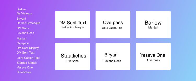
2. UPDATE FONTS SO THEY LOOK FRESH, MODERN, CLEAN
Changing a site’s font family can have a subtle but important effect, making the site look cleaner, clearer and more modern. You can opt for a font that’s similar to your current one, or go for something that’s totally different, changing the overall look and feel of the site.
There were 14 new fonts added to Duda a few months ago; read more and see samples of them
here . But you don’t need to use a ‘new’ font to give your site a new look. You can use any of the 100+ fonts in the platform to refresh your look.
If you choose a new font, make sure you update it for all levels of text so it applies automatically for all areas of the site (even in elements that you may not have used yet).
3. UPDATE BUTTON STYLES (BECAUSE BUTTONS HAVE FEELINGS, TOO)
It may seem hard to believe, but buttons can go out of style. Boxy buttons from the early days of the internet look ugly and jarring today. Most buttons these days have rounded corners, no borders, and a softer look that’s easier on the eyes.
This doesn’t mean your site buttons need to look like every other button on the internet, but if you want an easy site refresh, try these adjustments:
- If you’ve got boxy buttons, soften the edges.
- If you’ve got borders, consider getting rid of them.
- Add a shadow to help the button stand out.
- Change the font to something fresh and attractive.
4. REVISING THE HEADER – SO MANY OPTIONS TO CHOOSE FROM
Depending on when you first built the site, you may not see the full range of header options available today. Click on the header element on the site, upgrade if prompted, and choose from one of ten header layouts.
Each header layout is a bit different – logo placement, social icons, 1 or 2 rows, etc.
Think about the goals of the site, and choose your header accordingly. Do you want social icons? A click to call button? A big logo right in the center?
Sticky Header
Sticky headers aren’t new, but they are important. If you haven’t toggled on this feature yet, now’s the time to do it. Making your header sticky means visitors will see it even as they scroll. It will be minimized, leaving room for other information on the page, and the background color can be different, if you like.
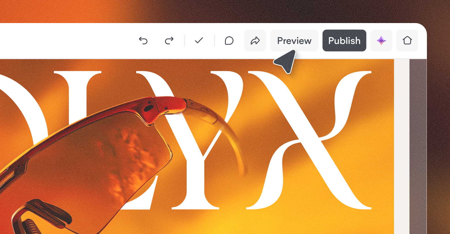
5. REPLACE THE HERO IMAGE FOR A SUPER QUICK WIN
Images speak volumes. Changing the hero image on your site has a huge impact on a visitor’s first impression – and it’s so easy to do.
You can replace the image with something else that’s already in the template or with something you add to the Photo Gallery (you’ll find thousands of free and premium images, all without leaving the site).
You can even take an image that’s displayed elsewhere on the page and do a quick switch. The effect is immediate.
Toggle on the parallax effect so that the image looks great when it’s scrolled, tweak the image as much (or as little) as you like and you’ve got a great new look, front and center.
6. UPDATE TEXT
Not every text update needs to be a complete rewriting to the extent of Moby Dick (for example).
Change some headlines.
Improve some button copy . Shorten a long paragraph. Replace tired verbs with exciting ones. These small changes can have a great effect. If the text on your site has been around for a while, a quick review and fresh set of eyes can help you eliminate unnecessary bits of texts or add clarity with new texts.
7. ADD A FLOATING BUTTON
Floating buttons were added to the platform a few months ago, and if you haven’t integrated them into your sites yet, now is a great time to do so. Floating buttons increase conversions by ensuring that your site’s main call-to-action stays on the viewers’ screen, even if they scroll down the page.
Where that button leads varies by site, of course. Your client may want visitors to:
- Get a Quote
- Register Now
- Contact Us
- Book an Appointment
- And more
Whatever the action, keeping it available and visible at all times is guaranteed to make it more clickable.
Where should you place the floating button?
In most cases, it’s best to put the button at the bottom right or left corner, so it doesn’t get in the way of written text on the page.
8. KEEP THINGS LIVELY AND ATTRACT ATTENTION WITH ANIMATIONS
Exciting effects are a great way to draw attention to elements on your site. They bring visitors’ attention exactly where you want it and make the site dynamic and exciting. Here are three ways you can integrate animations into your sites.
Entrance animations
Motion can emphasize the sections you want visitors to focus on (like a phone number, contact button or service). With entrance animations, you can add motion to widgets and elements when they first appear on the page. Choose from the following options:
- Fade in
- Fade in from right
- Fade in from left
- Fade in from bottom
- Bounce in
- Bounce in from right
- Bounce in from left
- Zoom in
Hover effects
You can add hover effects to multiple elements on your site, including images, icons and buttons. You’ve got lots of effects to choose from, including:
- Zoom out
- Opacity
- Float
- Forward
- Grayscale
- Reverse grayscale
- Blur
- Blur and grayscale
Note that both entrance animations and hover effects only appear on desktop. On mobile, they would slow down web page loading speed, and this is definitely not something you want.
Lottie animations
This
brand-new capability enables you to add any type of animation that you like — from one that you create on your own or one of hundreds that are available free from Lottie. For full instructions on integrating Lottie Animations, see
this support article.
One more thing about animations
Everything in moderation. As with all good things in life, you don’t want to overdo the effects and animations on your site. They shouldn’t be the only thing a site visitors notices on the site – they should definitely be used as a tool for attracting attention to specific elements or messages.
9. REPLACE OLD SECTIONS WITH NEW ONES
Sections aren’t just a fantastic tool for building new sites or adding content; they are also great for refreshing your site without any adjustments to content.
Add a predesigned Section from the same category as your current section. There are
so
many to
choose
from ! Replace the default content with content that’s already on your site, and remove the old section. Simple and quick, it’s a great way to integrate a new design into your site without actually redesigning anything!
10. NO TESTIMONIALS YET? ADD THEM NOW!
Testimonials bring so much value to your site. They add credibility, build customer trust, show potential customers that you have experience, and more. If your customer is selling something, there’s a
huge chance that their potential clients are going to look for reviews to help them make the purchase decision.
Make this easier for site visitors by adding testimonials to the site. Using a predesigned testimonial Section cuts down on your design work. As for getting the testimonial content, ask your clients for positive messages they may have received on social media, via email or SMS, etc. Make sure they get the customers’ permission to use these quotes on their sites.
Note 1: Some of the predesigned Testimonial sections have images in them, but not all. If your client can get images from the people behind the testimonials (perhaps via their Facebook or Twitter accounts — and of course with permission) great. If not, choose a Testimonial Section that doesn’t have images.
Note 2: Testimonials don’t need to be long. In fact, short testimonials can be much easier to read. So read the testimonials before adding to the site and edit them to a reasonable, readable size.
11. Connect with Instagram — Everyone’s already there
Everyone is on instagram – not just your kids. Instagram is a hugely influential social network these days, with more and more businesses on it, and more users following businesses. Instagram has more than one billion active users, and its audience is increasingly older. Furthermore, about 80% of people on Instagram follow a business.
Talk to your client about Instagram. If they don’t have an Instagram page for their business yet, they should start one. And if they do have one, it’s time to connect it to their sites via any Photo Gallery widget. For more on this, check out
this article about adding Instagram to your Duda website from our product release blog.
12. REVISE, REVIEW AND REFRESH YOUR CONTACT FORMS
Contact Forms can fill so many different purposes on your site. They can solicit addresses for newsletters, updates, more information, etc.
A few notes:
- Contact forms
don’t need to be long (and shouldn’t be, in fact.)
- Contact forms
do need to be protected. Toggle on the
reCaptcha validation (it’s now invisible and automatic) to prevent spam.
- Contact forms can be a great convenience for your site visitors. If they want more inquire about something, they just drop the message into the box, add their address, and send.
If you’ve got contact forms on your sites, now’s a great time to make sure there are no excessive fields (maybe get rid of the Fax number field) and toggle on the reCaptcha.
13. ADD SOCIAL LINKS & BUSINESS HOURS FOR A BETTER FOOTER
Just because the footer is the last element on a page, that’s no reason to neglect it. To the contrary – for site visitors who reach this area of the page, it’s really important. It’s where they may find what they haven’t found yet – links to other pages, social media links, contact details, business hours, etc. Take a look at the footers on your sites and see if this space is optimized.
Perhaps you can add or update one of the following elements:
- Social icons: This widget
underwent a facelift several months ago, and now includes Google My Business, WhatsApp and Waze, along with dozens of other social icons. These are super handy for visitors, so check with your clients and add what’s relevant.
- Business hours: If your client has a brick-and-mortar store, add the hours to the footer. Business hours may not be sexy, but they are handy and can help bring site visitors to your customers’ business.
- Subscription box: Adding a simple subscription area can generate lots of leads. For visitors who want to know about sales, promotions, or just want to stay up-to-date.
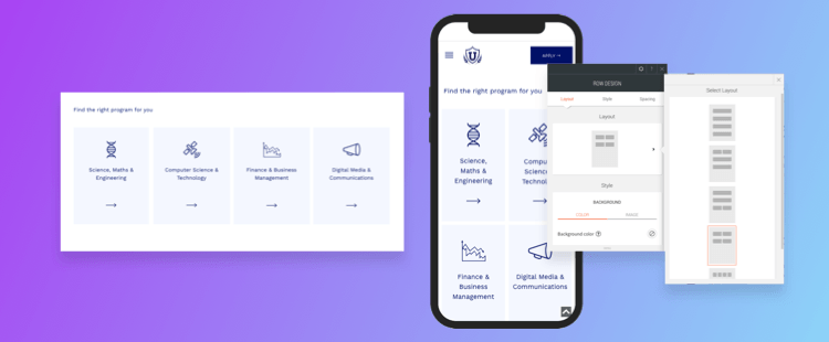
14. NOW, MOVE TO MOBILE AND MAKE EVERYTHING FANTASTIC
Once you’ve refreshed your desktop site, it’s time to move to mobile. Assume that 70% of your visitors are on their mobile devices and take the time to make it look fantastic.
Any changes you’ve made to the desktop site need to be reviewed on the mobile version – this includes everything from images, fonts, button size and more. A few areas to pay close attention to:
Alignment: Go through all text and images to make sure they are aligned the same way.
Image size & icons: Adjust the size of your icons and images so they fit mobile.
Menu design: Don’t forget to design the Hamburger Header and Menu (choose from several layouts).
Padding: This is really important and should not be neglected. Padding is what makes text readable on scroll and easy to look at.
Rows / columns: Choose the right layout for your columns on mobile, and reverse the column order if you like.
AND THAT’S JUST FOR STARTERS 😁
These are just a few ideas for how you can refresh your sites with new features and updated designs. And this list is just the tip of the iceberg. For more tips, as well as step-by-step instructions, tune into
this workshop replay, where Anath Eventzur, one of Duda’s super talented product designers, shows you just how to improve your sites, quickly and elegantly.
Related Posts
By Mike Paciello
•
May 19, 2026
The web had its worst accessibility year in six. On GAAD's 15th anniversary, learn why the 2026 regression is a process problem and how Duda and AudioEye help agencies fix it.
By Duda
•
March 10, 2026
Discover a more intuitive, professional UI with a streamlined sidebar and enhanced top navigation, helping you build faster and with greater confidence.
By Stephen Alemar
•
October 23, 2025
Discover why Duda is a top-rated website builder on G2, recognized for usability, easy setup, strong relationships, and excellent results, all backed by real reviews.
Show More