In this content series, Scale and Thrive: Growth Insights for Agencies, by Agencies, we share proven tips and insights from agencies who scaled their operation and delivered proven growth. This blog post was written by Orel Y. Shalom, a successful agency owner with over a decade of experience in the field. Over the years, Orel has led more than 70 employees, producing over 10,000 websites for clients in a wide range of verticals.
Maintaining the pulse of your agency’s design studio is paramount to stay ahead of the competition and keep your clients happy.
Just like you, an agency owner, I wanted my studio to perform at its fullest capacity because, ultimately, it translates to more clients. I wanted to maintain a pulse on my agency’s studio and for everyone to know the big picture; for everyone to know where the studio is in terms of its performance. I wanted our design KPIs to be clear-cut.
That’s why I came up with the idea to create the perfect KPIs dashboard. In essence, it’s three different design dashboards: one for each of the designers, one for the entire studio, and one for the studio lead.
When connected, they become a command center that empowers my agency (and, I’m sure, it could do wonders for yours, too).
What do I mean by “empowers my agency?” In a nutshell, these KPI dashboards help me with:
- Effective studio workload management:
Providing a quick overview of the outputs and inventory sites currently in the pipeline and are yet to be completed.
- Rewards:
They are the source I turn to when I need to reward designers based on their performance and encourage them to upsell.
- Monitoring client progress: It’s how I never lose sight of my clients or their needs.
My ultimate objective is to assist your agency in enhancing efficiency, scaling operations, and thriving, which is why I’ve decided to shed light on the purpose of this pivotal dashboard control center and the ways it helps my agency measure my design studio’s success, track design KPIs and ensure the team operates smoothly, like a well-oiled machine. Hopefully, you can successfully apply my professional know-how and find just the spot where it aligns with your agency.
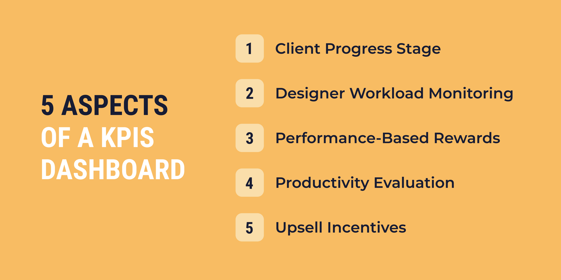
Each KPI dashboard has a purpose
To give you a general idea, each dashboard covers five crucial aspects:
- Client progress stage:
The idea is to track the progress stage of each client, ensuring that no client is overlooked or neglected.
- Designer workload monitoring:
By monitoring the workload of each designer, we can effectively assign website projects and ensure a balanced distribution of work.
- Performance-based rewards system:
In my agency, we have a rewards system that is tied to individual designer performance. The dashboard is there to help us evaluate and measure designer performance against set criteria, on which I will elaborate further.
- Overall productivity evaluation:
With this dashboard, we can easily assess the studio's overall productivity by analyzing key design KPIs, such as hourly website production rate and the project’s monetary value generated per working hour.
- Upsell incentives for designers:
We’ve incorporated incentives within the dashboard to encourage designers to promote upsells. I figured that offering rewards or bonuses tied to upselling activities is the best way to motivate our team to identify opportunities for upgrades and contribute to the studio's revenue growth.
By focusing on these five areas, our design KPI dashboards provide a comprehensive and meaningful overview of our design team’s performance, enabling both the team and management to make informed decisions and drive continuous improvement.
KPI dashboard design: What does it look like in my agency?
Now that I’ve told you about the purpose of the dashboards, it’s time to dive into their actual look and feel.
Designer KPI dashboard
This dashboard empowers designers to stay informed about the big picture while effectively managing their clients. Each one of our designers gains comprehensive visibility into the number of clients they are handling and their progress with each client. On average, our designers are entrusted with managing a portfolio of 30 to 60 clients a month. As I mentioned in one of
my previous blog posts, a client is assigned to a designer only after the project manager has collected all the required materials.
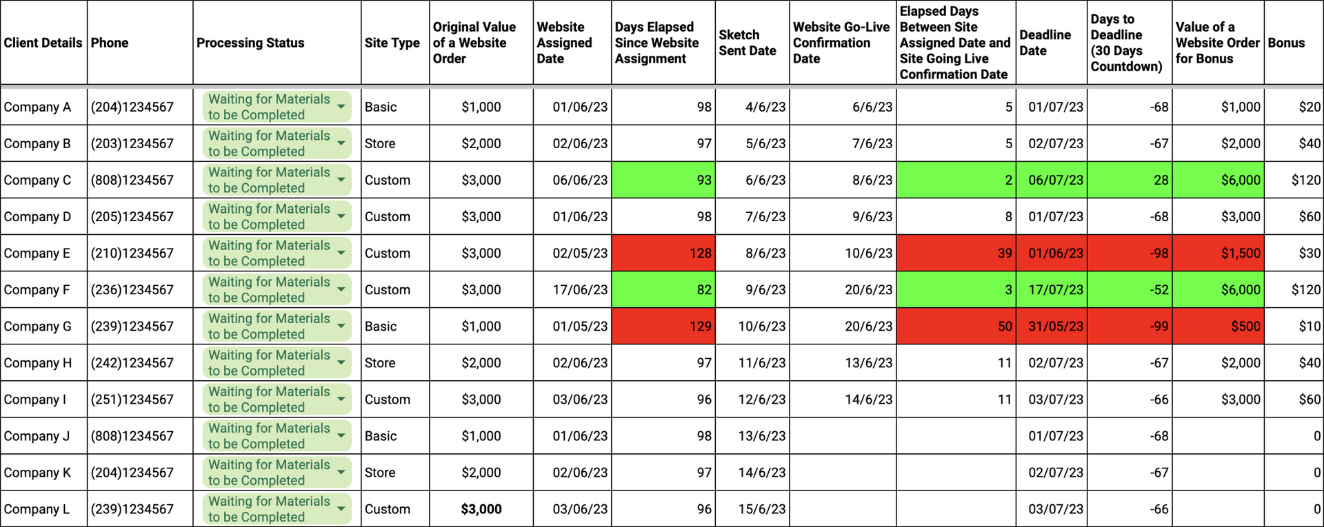
Let’s talk about the main elements and metrics of the designer dashboard, which I also like calling, designer project board. It provides designers with full control: each designer can seamlessly edit and update various project components, like processing status, sketch sent date, etcetera, to ensure smooth progress.
- Client Details: Includes relevant information such as the client’s name and phone number for easy identification and communication. My tip is to link these details to the complete client profile in the CMS for more convenience.
- Phone:
Displays a client’s phone number for ease of use.
- Processing Status:
Tracks the progress of each project using various statuses, including "Waiting for Intro Call," "Waiting for Sketch," "Waiting for Materials to be Completed," "Sketch Sent (Waiting for Corrections/Approval)," "Sketch Approved (Waiting for Design Finalization)," and "Approved for Going Live." This feature ensures transparency and enables effective project management.
- Site Type:
Specifies the type of site requested by the client, whether it's a basic site, store, or a custom design site not based on a template. This offers valuable insight into the designer's workload based on the complexity of the assigned websites. Plus, it's a handy metric to ensure fair recognition and rewards in line with the type of websites they're dealing with.
- Original Value of a Website Order: Indicates the value of the client’s website order, providing insights into the amount of money the client has paid for their project. This metric is essentially a navigational tool for both the designer and their supervisor. It reveals the 'value' a particular website brings to the table. It shows where there might be a little wiggle room to add a little extra, maybe another hour's work, or an additional feature, all to keep the client satisfied. What’s more, it helps the designer gauge how this client contributes to their monthly goals and bonus.
- Website Assigned Date: Records the date when the project manager assigned the project to the designer after collecting all the required materials, helping track project timelines and ensure timely execution.
- Time Elapsed Since Website Assignment:
Represents the number of days elapsed since the website assign date.
- Sketch Sent Date:
Tracks the date when the design sketch was sent to the client for review and feedback. It helps to monitor the review process and subsequent project stages. It's my agency’s little trick; it signifies the start of our 'service months' stopwatch. In other words, it’s our contract’s finish line with a given client. We use it to expedite client cooperation, ensuring they send in their revisions and approve the site on time.
- Deadline Date: Signifies the target date by which the designer is required to complete the website.
- Website Go-Live Confirmation Date:
Captures the date when the client confirms the website going live.
- Elapsed Days Between Site Assigned and Site Going Live Confirmation Date:
Calculates the duration in days between project assignment and scheduled website go-live date.
- Days to Deadline:
Calculates the number of days remaining until a project’s deadline. Think of it like a countdown clock set automatically for a month from the website assigned date. If the designer completes the project within the first 3 days from the assigned date, the countdown turns green. If they go beyond thirty days, the countdown turns red and the numeric value becomes negative. And, it's an indication that it’s time to switch things up. That’s when our studio lead steps in, passing the task over to another designer.
- Value of a Website Order for Bonus: Indicates the monetary value of a client’s website order based on the time frame it was completed by a designer. Website’s total monetary value for bonus is displayed at the bottom, providing insight into the designer's monthly performance.
- Bonus:
Quantifies the bonus amount awarded to the designer for a project. It is derived from a website’s value for bonus. This brings me to my next point.
How the reward system for designers works in my agency
- The size of the monthly bonus is determined by the “Total Value of Websites for Bonus” metric and website delivery times.
When it comes to website delivery times, there are three distinct categories:
Express Delivery: This category includes all website orders that a designer completes between 0 to 3 days. In this case, the website’s original value is doubled. - Standard Delivery: Website orders that take between 4 to 30 days to complete. This is when the website’s original order value remains unchanged.
- Extended Delivery: If the delivery time extends beyond 30 days, we classify it as extended delivery. In such instances, the original website order value is reduced by 50%.
In terms of the “Total Value of Website Orders for Bonus,” there are different levels that a designer can reach. To qualify for a 2% bonus, a designer must reach a minimum order total of at least $10,000 per month. Reaching at least $15,000 per month, gives the designer a 4% bonus.
I know this can be confusing, so let me give you an example:
Let’s say a skilled designer successfully created 10 websites within a month, each valued at $1,000 (Original Value of a Website Order). For bonus calculation purposes, 8 of these websites were completed within the standard timeframe of 4-30 days, totaling $8,000 (the original website value remained unchanged). - One website was finished in just 2 days, which doubled the original website value, making it $2,000. Another website took 37 days, resulting in a reduced original website value of $500. Overall, the designer's work amounted to $10,500 in “Total Value of Website Orders for Bonus”, exceeding the $10,000 threshold and qualifying for a $210 bonus (2% of the “Total Value of Website Orders for Bonus”). Had the “Total Value of Websites Order for Bonus” surpassed $15,000, a higher bonus rate of 4% would have been applied.
Generally speaking, failure to meet the bonus criteria for a particular site results in a 2% deduction from other bonuses. The studio lead can adjust bonuses accordingly.
When issuing bonuses, I take client satisfaction into account as well. Designers who maintain an 85% customer satisfaction rate receive a $200 monthly bonus. To be eligible, at least 50% of the clients need to provide service ratings, and the average score should be at least 85. These ratings are typically obtained via email when presenting the website to the client. As I’ve mentioned in one of my
previous blog posts, in this email, my designers ask the client to personally rate their service.
Regarding upsells, designers earn a 10% commission for each successful upsell. And, if the total monthly upsells amount to more than $2,000, the designer gets a 15% commission.
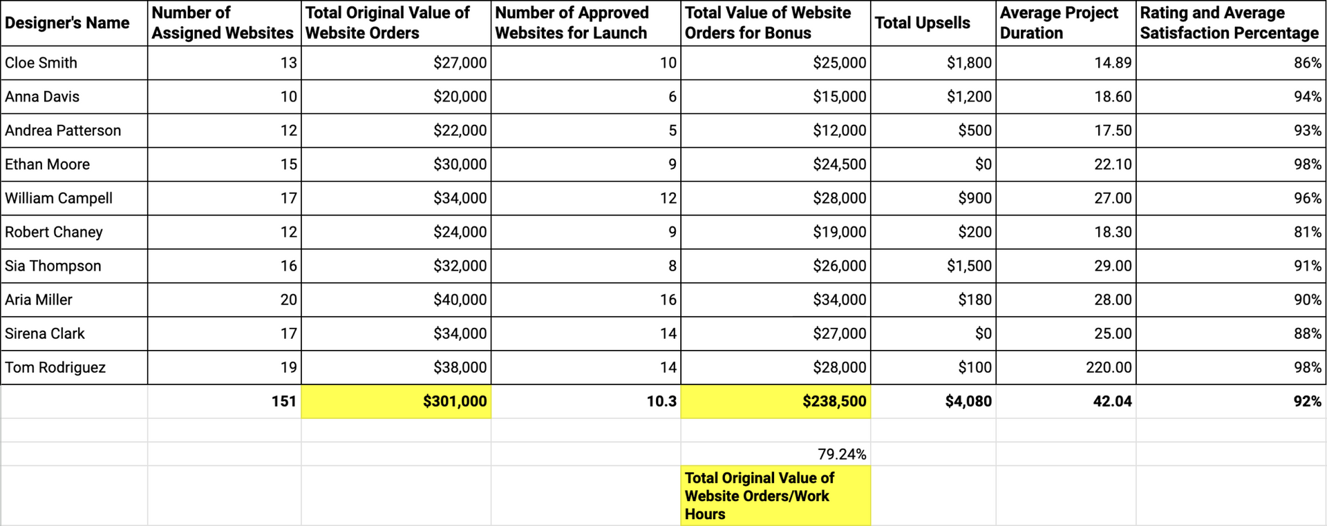
Design Team KPIs Dashboard - prominently displayed on the studio's large screen, presents the following key metrics:
- Designer’s Name: Clearly indicates the name of each designer in the studio.
- Number of Assigned Websites: Provides a count of the websites assigned to each designer in a given month.
- Total Original Value of Website Orders: Represents the cumulative monthly value of the placed website orders. It reflects the designer’s workload and their potential to achieve their goals based on the number of clients they have to cater to.
- Number of Approved Websites for Launch: Shows the number of websites that have received approval for launch in the current month, indicating successful completion and readiness.
- Total Value of Website Orders for Bonus: Displays the total monthly monetary value generated from client website orders that have been approved, per designer.
- Total Upsells: Tracks the combined value of monthly upsells made by each designer, highlighting their success in generating additional revenue through additional services or upgrades.
- Average Project Duration: Calculates the average number of days it takes for each designer to complete a project. This metric provides insights into meeting deadlines and aids in assessing project management efficiency.
- Rating and Average Satisfaction Percentage: Presents the overall rating received by each designer from clients, along with the average satisfaction percentage. This information reflects the quality of their work and the level of satisfaction they deliver to clients.
At the bottom of the design team KPIs dashboard, we have a column that summarizes the aggregated metrics for the entire studio, providing a comprehensive overview of the average performance and productivity of the design team as a whole.
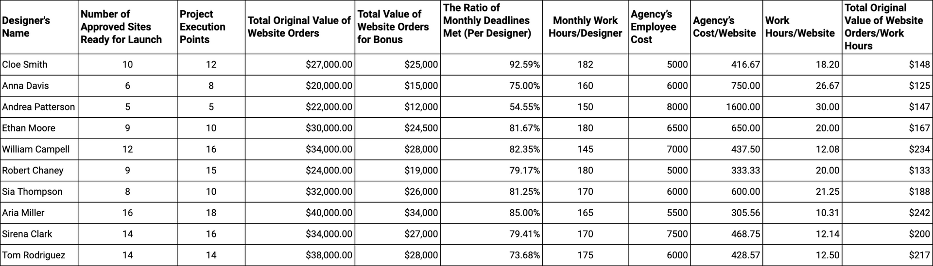
3) Studio Lead KPIs Dashboard - This tool is our magic wand that helps us manage everything efficiently, while also giving us a sneak peek into the productivity and effectiveness of our designers in a given month. With this tool, my studio lead can make informed decisions and optimize performance with ease and confidence. It encompasses a range of essential metrics and features :
- Designer’s Name: Clearly displays the names of each designer in the studio.
- Number of Approved Sites Ready for Launch: Indicates the number of websites that have received approval and are ready for launch.
- Project Execution Points: Each website is assigned a unique value in points. Template-based websites are considered equivalent to 1 execution point, whereas more complex, custom-built sites (like online stores) are worth 2 execution points. These metrics provide in-depth insight into designers' productivity.
- Total Original Value of Website Orders: Displays the total monetary monthly value generated from client orders that have been approved.
- Total Value of Website Orders for Bonus: Displays the total monthly monetary value generated from client website orders that have been approved.
- The Ratio of Monthly Deadlines Met (Per Designer):
The percentage
serves as another indication of a designer’s performance abilities. It’s calculated by dividing the Total Value of Website Orders for Bonus by the Total Original Value of Website Orders.
- Monthly Work Hours/Designer: Displays the total number of monthly work hours contributed by each designer, providing a measure of their productivity and contribution.
- Agency’s Employee Cost: Reflects the employee cost per individual website: The total employee cost (wages + expenses) divided by the number of approved sites ready to go live.
- Agency’s Cost/Website: Calculates the cost of creating a single website: Dividing the total number of employee hours by the count of approved websites they have successfully designed for deployment. This metric enables assessment of the studio's cost efficiency.
- Work Hours/Website: Determines the average number of work hours required to complete a website, aiding in project planning, resource allocation, and workload management.
- Total Original Value of Website Orders/Work Hours:
Reveals the value generated by the designer per one hour of work, showcasing their productivity and efficiency. It's like a handy gauge that measures the designer's ability to create value within each hour they dedicate to design by dividing the total value of client orders by the quantity of work hours of a given designer.
The dashboard also provides a comprehensive summary of the entire studio, consolidating the total values and percentages across metrics, enabling an assessment of the overall efficiency and performance of the design studio. That way, we can detect real-time anomalies, allowing the studio lead to promptly address customer bottlenecks and optimize operations.
Design KPIs Dashboards: Popular Use Cases
As I’ve already mentioned, the main usage is to assess my agency’s efficiency and performance, identifying opportunities for scale and improvement. However, the benefits of these design KPIs dashboards go far beyond that.
Performance Reviews - We effectively utilize the dashboards’ data to conduct regular performance reviews with designers. The use of binary colors aids in visualizing the status of each metric, facilitating effective monitoring and identification of areas for improvement.
Client Rescue Rallies - The data in these dashboards serves as a trigger for initiatives like client rescue rallies where we go above and beyond to engage with inactive clients, encouraging them to review their websites through direct conversations with designers who ask the clients to review their sites’ designs and leave feedback.
Annual Reports - My agency uses the data to prepare annual reports, analyzing trends and patterns throughout the year.
Final Thoughts
I was excited to share my experience and insights with you. However, I think both of us realize that what works for my agency might not work for yours. Consider your specific business needs and structure when incorporating these recommendations.
It may seem self-evident, but it is crucial to adapt the metrics, visuals, and reward systems to align with your agency's culture and vision.
With a well-designed and personalized design KPIs dashboard command center, you can make informed decisions, continuously improve, and stand out among other agencies. Good luck!