Há
pelo menos 800.000 fontes disponíveis para quem quer criar um site que será visualizado principalmente em dispositivos móveis. Em um universo tão grande de opções, a escolha pode tomar um bom tempo.
Primeiro de tudo, por que tantas opções?
Talvez porque a tipografia seja um componente vital para o design. Tipografia é mais do que fontes - é,
como diz Neil Patel, onde “... a arte encontra texto”.
Além da escolha da fonte, também inclui o comprimento da linha, kerning (espaço em branco entre as letras) e muito mais.
Patel também argumenta, “a fonte é um estilo específico de fonte com largura, tamanho e peso definidos ... Georgia é uma fonte; 9pt Georgia Bold é uma fonte.”
A fonte que você escolhe é importante. Isso influencia a percepção do usuário sobre a mensagem e a marca de uma empresa e tem um grande impacto na legibilidade do texto do site.
Então, com tantas opções, quais fontes (e tipos) você deve usar?
Nesta postagem, descrevemos as oito melhores fontes para mobile para você considerar na construção do site dos seus clientes.
Vamos nessa?
Serif ou SANS-SERIF?
Uma serifa é uma linha ou cone decorativo que aparece no final da haste de uma letra.
Portanto, uma fonte “serif” é qualquer fonte que contenha letras que incluam esse acréscimo decorativo.
Por outro lado, uma fonte sans serif (“sans” significa “sem” em francês) não incluirá esses elementos sutis de design.
Em um artigo de 2014 para a
Marketing Land, o empresário Jeremy Smith forneceu a seguinte orientação para designers que estão tentando descobrir qual fonte usar em uma página web:
- Para melhorar a compreensão e a legibilidade, escolha uma fonte serif.
- Para aumentar a legitimidade, escolha uma fonte com serifa.
Uma pesquisa feita pelo New York Times descobriu que as serifas aumentam a credibilidade; a fonte serif Baskerville influenciou especialmente os leitores a confiar no conteúdo da web.
- Para chamar a atenção, considere uma fonte sem serifa.
É aconselhável manter essas recomendações básicas em mente ao analisar as melhores fontes para mobile e selecionar a melhor delas para o site do seu cliente.
combinando fontes
Como você provavelmente sabe por experiência própria em design, certas fontes funcionam bem juntas e outras não.
Uma escola de pensamento é usar uma fonte sem serifa para os cabeçalhos e uma fonte com serifa para o texto do corpo.
No entanto, os opostos nem sempre se atraem e o ideal é garantir a escolha de duas fontes que se complementam.
Outra opção comum de design é emparelhar fontes semelhantes umas com as outras. A ideia neste caso é que fontes semelhantes suavizem as diferenças e mantenham os visitantes do site focados no conteúdo.
Dica Pro: A Duda permite que você
adicione fontes personalizadas e do Google de forma rápida e fácil, mas não exagere! Use duas a três fontes ou tipos de fonte em cada site.
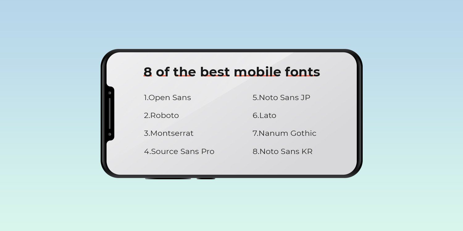
As 8 melhores Fontes para Mobile
Agora, vamos dar uma olhada nas oito melhores fontes para mobile. Para maior clareza, dividimos a lista em quatro fontes com serifa e quatro fontes sem serifa.
As 4 melhores fontes Serif para mobile
As fontes com serifa têm o que parecem pés (geralmente chamados de “traços”) anexados às extremidades das letras. Esses tipos de fontes geralmente parecem mais tradicionais e formais.
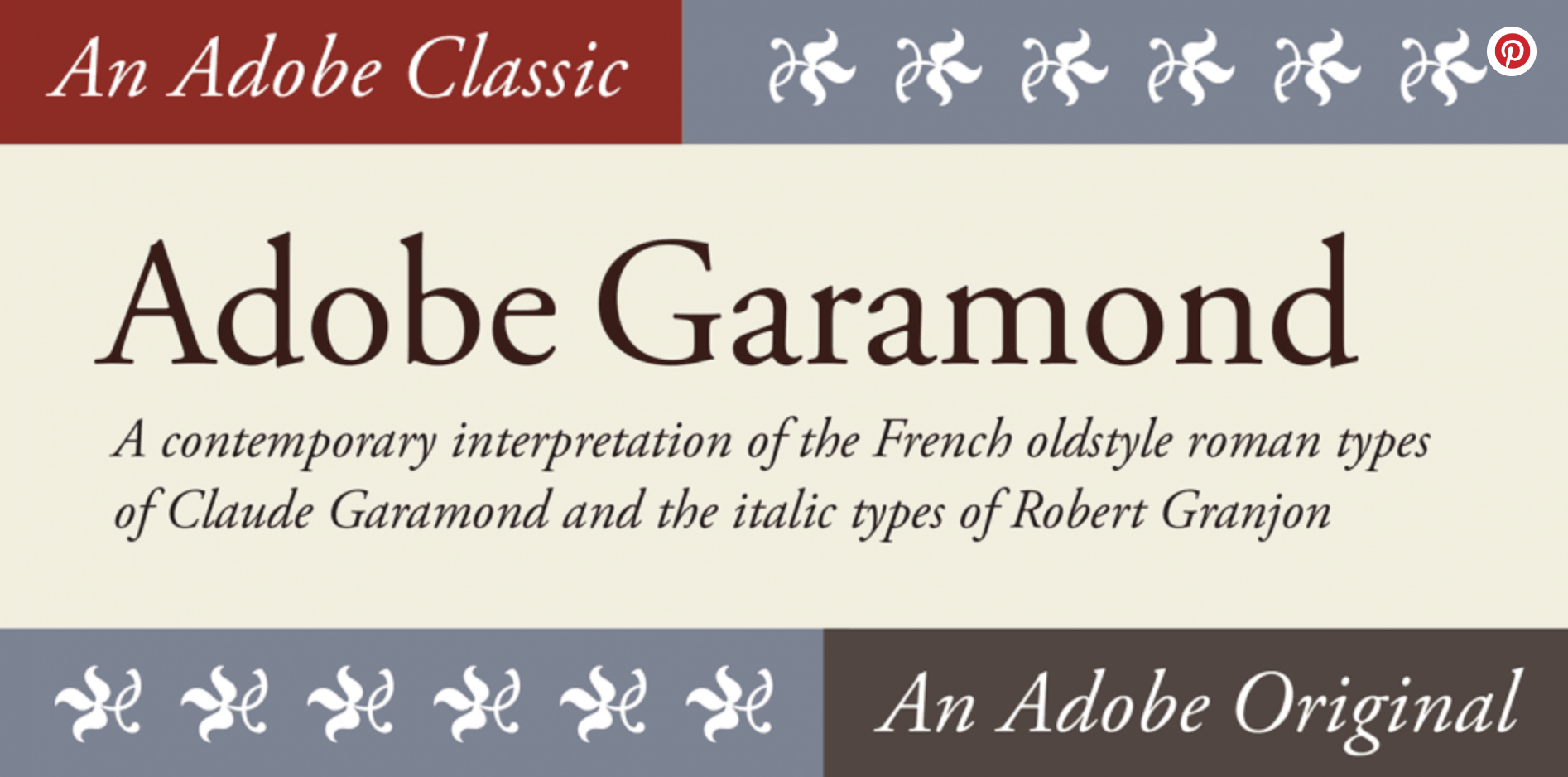
Garamond
Projetada em 1989 por Robert Slimbach, esta fonte é baseada na
tipografia Garamond com o nome do gravador do século 16 Claude Garamond.
Esta família de fontes é freqüentemente usada na impressão de livros. As várias versões de Garamond usam letras com uma estrutura relativamente orgânica que lembra a caligrafia antiquada, mas com um design mais estruturado e vertical.
Veja abaixo, cortesia da
Font Spring.
Essa fonte combina bem com Orpheus, Franklin Gothic e Prenton.
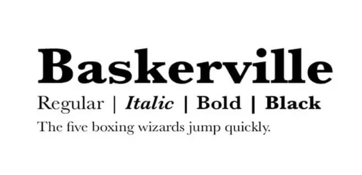
Baskerville
Esta fonte também é clássica e foi projetada na década de 1750 por John Baskerville. Ainda é comumente usado hoje porque lê bem e, como demonstrado no experimento de Morris, confere autoridade ao seu conteúdo e design.
Confira uma amostra dessa fonte abaixo, cortesia da
Font Magazine.
Essa fonte vai bem com Lucida Grande, Helvetica Neue, Open Sans, Georgia e Proxima Nova.
Computer Modern
Embora feita para computadores, foi inspirada na tradicional Modern Extended 8A da American Lanston Monotype Company, parte de uma família Monotype originalmente lançada em 1896,
de acordo com a Wikipedia.
Criada por
Donald Knuth, essa fonte é comumente encontrada nos design web para mobile, mas também aparece com frequência em artigos científicos.
Veja um exemplo abaixo, cortesia da
Identifont.
A Computer Modern combina bem com a Luxi Mono.
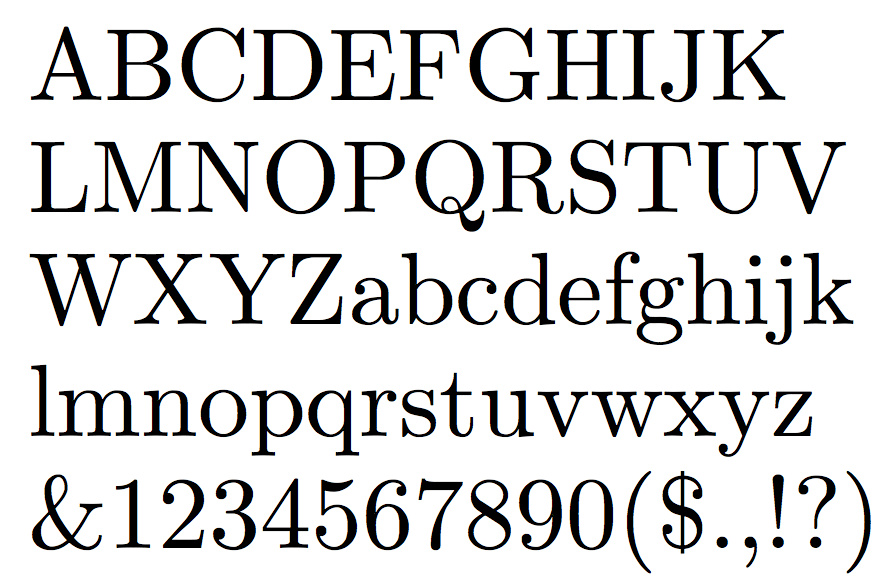
Georgia
A fonte Georgia combina bem com Helvetica Neue, Arial, Freight Sans, Open Sans e Lato.
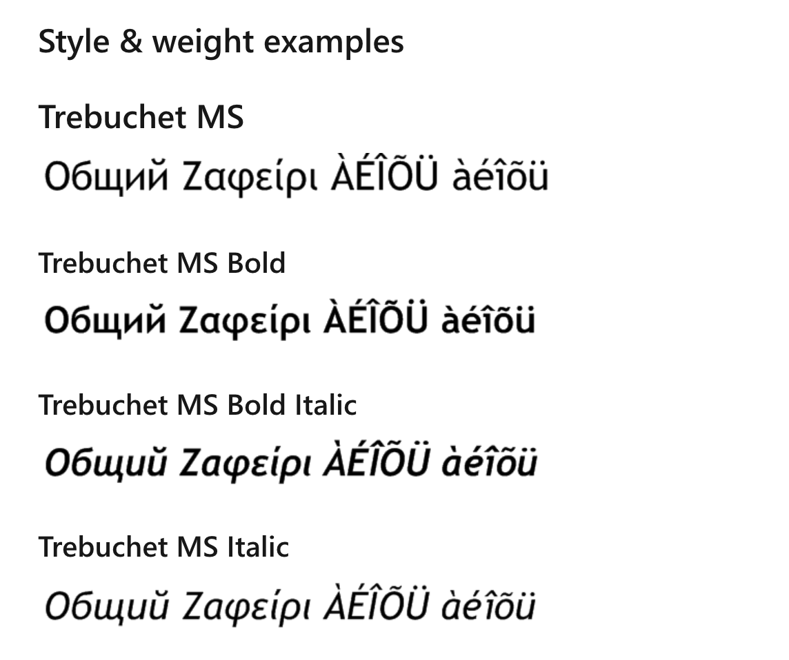
*BÔNUS* Trebuchet
Desenvolvida e registrada pela Microsoft, a Trebuchet é uma fonte muito popular para mobile.
Como a Microsoft aponta, a fonte, projetada por Vincent Connare em 1996, é uma sem serifa humanista feita para facilitar a leitura em uma tela.
A lenda é que as fontes Trebuchet foram nomeadas assim porque se destinam a ser o veículo que dispara mensagens pela Internet.
Connare queria personalidade nas letras, mesmo em tamanhos pequenos, ao mesmo tempo em que mantinha a clareza e a legibilidade. Ele também queria algo significativamente distinto de Verdana e MS Sans.
Você pode ver um exemplo dessa fonte da Microsoft na imagem abaixo.
Essa fonte combina bem com Fjord, Verdana e Georgia.
Precisa de um construtor de sites que permita criar sites para seus clientes com as melhores fontes para mobile?
Comece um teste gratuito na Duda hoje!
As 4 Melhores Fontes Sans-Serif para Mobile
As fontes sem serifa não têm os extensores estéticos nas extremidades das letras que as fontes com serifa possuem.
As fontes sans-serif tendem a parecer mais modernas e são mais fáceis de ler em títulos, botões e textos curtos.
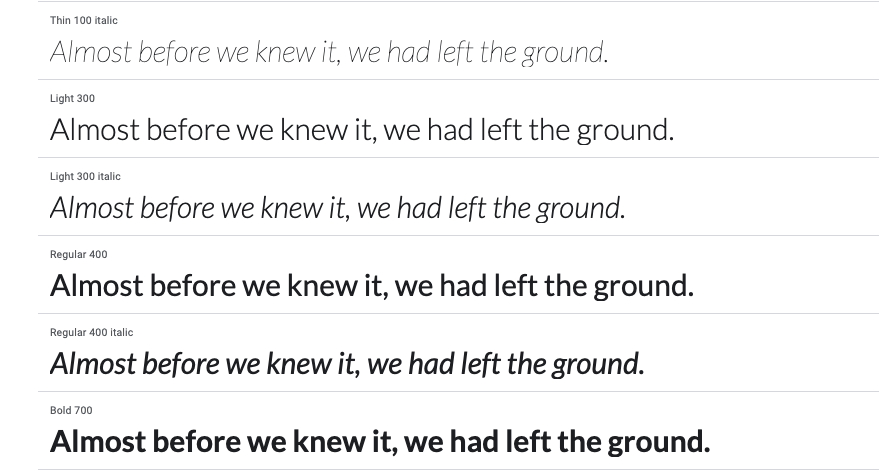
Open Sans
Open Sans é uma fonte sans-serif humanista projetada por Steve Matteson.
Projetada especificamente para a web e dispositivos móveis, ela usa pressão vertical, formas abertas e uma aparência neutra, mas amigável, para facilitar a leitura.
Veja um exemplo dessa fonte abaixo, cortesia do
Google.
A Open Sans combina bem com Montserrat, Lato, Brandon Grotesk e Roboto.
Roboto
A fonte Roboto foi desenvolvida pelo Google para mobile e é a fonte principal do sistema operacional Android para celular.
O Google a descreve como tendo uma natureza dupla, com um esqueleto mecânico e formas geométricas em grande parte, enquanto apresenta curvas abertas e amigáveis.
Você pode ver uma amostra dessa fonte do
Google abaixo.
A Roboto combina bem com as fontes Roboto Slab, Open Sans, Lato e Playfair Display.
Montserrat
Com base nas placas do antigo bairro de Montserrat, em Buenos Aires, esta família de fontes foi projetada por Julieta Ulanovskym. Ele usa um tipo geométrico otimizado para uso digital.
Você pode encontrar uma amostra dessa fonte abaixo no
Google.
A título de curiosidade, a Montserrat também é a fonte adotada em todas as peças de comunicação da Duda.
A Montserrat vai bem com Open Sans, Roboto Slab e Lora.
Lato
Desenhada por Warsawukasz Dziedzic no verão de 2010, o nome desta fonte significa “verão” em polonês. Tem uma sensação de abertura que é brilhante e de verão, o que o torna popular para aplicativos e sites mobile.
Você pode ver uma amostra dessa fonte na imagem do Google abaixo.
A fonte Lato combina bem com as fontes Superior Title, Mate, Futura, Caslon e Clarendon.
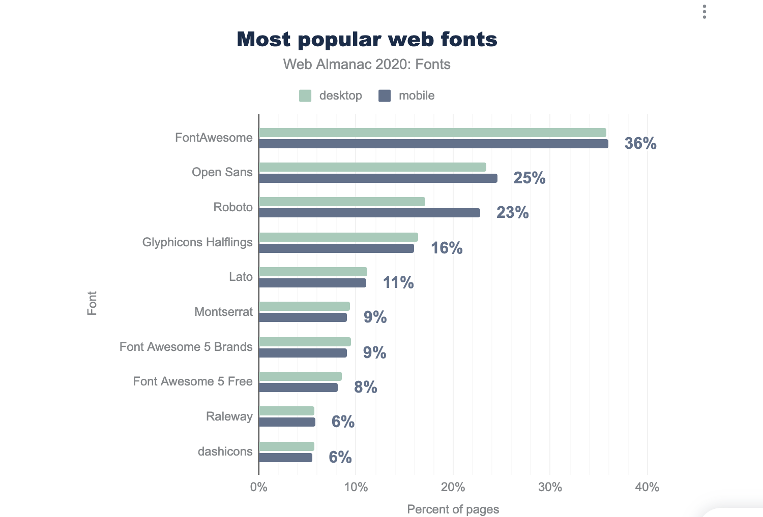
fontes para mobile mais usadas
Na lista acima, abordamos o que consideramos as melhores fontes mobile.
No entanto, elas estão longe de serem as únicas. Abaixo estão
fontes para mobile mais usadas, conforme o Web Almanac.
PALAVRAS FINAIS SOBRE FONTES PARA MOBILE
Na próxima vez que você criar um site para seus clientes, consulte as combinações de melhores fontes para mobile que discutimos para garantir que os visitantes possam ler facilmente o conteúdo do site em dispositivos móveis.
Ao restringir suas escolhas, pense na personalidade que você deseja transmitir com sua fonte.
Apenas certifique-se de manter o número de fontes em um único site em um máximo de duas ou três.
Finalmente, como acontece com todas as coisas relacionadas ao design de sites, conduza testes A/B com suas fontes sempre que possível e ajuste conforme necessário.