This article has been adapted from a presentation originally shared with the Leeds School of Business at the University of Colorado Boulder.
A landing page is a single webpage with the goal of
driving a prospect/customer to take a specific action. While websites may have several goals that ultimately encourage exploration, landing pages are typically designed with a single focus or goal in mind—the “Call-to-Action” or CTA.
CTAs take on many different forms, but you’ve seen them all before. A landing page may ask you to fill out a form, sign up for a service, download something, buy something, start a free trial, place a phone call, or more. In the marketing funnel, this action is considered a “conversion.”
Conversions are where a funnel ends, it’s the ideal destination for a prospect. However, they have to enter it from somewhere, don’t they? We call this the top of the funnel and, for many landing pages, this typically originates from some sort of paid or organic marketing. It may be email outreach, a social media post, or a pay-per-click campaign. Even
television ads have driven viewers to landing pages before!
So you understand why you might want to build a landing page, and what purpose it serves. Now, how do you actually do it?
The anatomy of a landing page
The most important part of any landing page is the area that is immediately visible when the page loads, without scrolling. We call this area “above the fold,” a term borrowed from newspapers, because it requires no additional action from the user.
The visible portion above where a newspaper is folded is crucial real estate because it’s the part that is visible to consumers before the paper is purchased. It’s what determines whether or not somebody actually reads the paper.
For landing pages, the same is true. If users aren’t immediately captivated by what’s visible above the fold, they won’t scroll. Even if they are, they still might not! The
Nielsen Norman Group found that web users spend about 57% of their page-viewing time above the fold.
You should take advantage of this crucial real estate by including the most meaningful information first—especially the CTA.
As the user scrolls down, they’ll begin to encounter additional information like social proof, benefits, and features. All of this should include additional CTAs intermixed to optimize conversion rates.
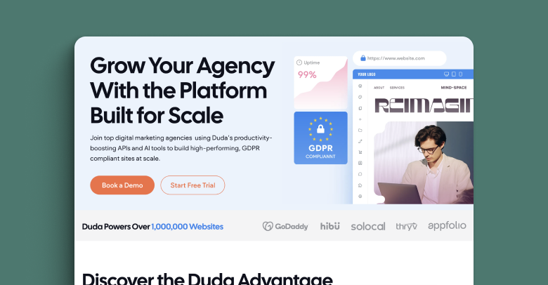
This landing page puts all of the most relevant information directly above the fold, with a clear CTA for visitors. The primary action, to “Book a Demo”, is highlighted in a vibrant orange while the secondary action, to “Start a Free Trial”, is outlined much simpler.
A short block of text alongside visually interesting images lays out the primary value propositions for this page. It’s immediately followed by social proof, in this case some well known brand logos, then again by more in-depth feature explanations.
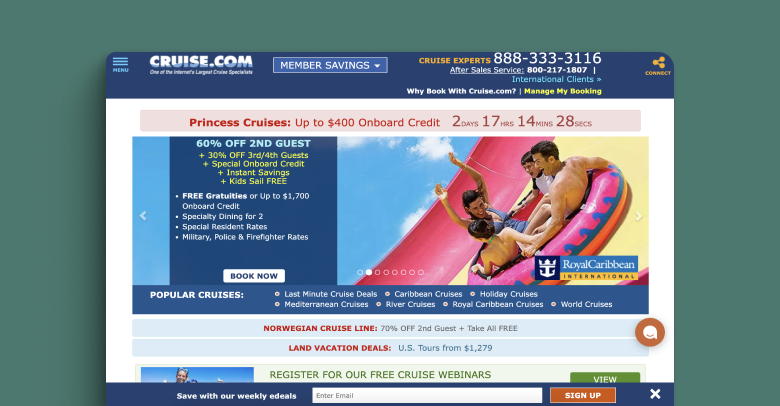
You can sum up many of the problems with this landing page with one single word: “overwhelming.” Beyond any issues with the design itself, which looks ripped straight out of the 90s, the page has far too much information and far, far too many CTAs. They’re asking you to call them, subscribe to their email, view their webinars, book a trip, browse their social media, etc.
It’s unfocused. Visitors don’t know what they’re supposed to do when visiting a new website, and this page doesn’t help guide them.
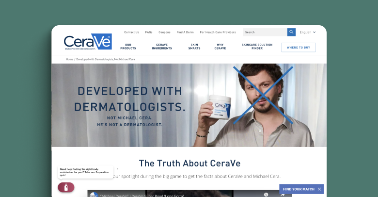
This page by CeraVe has the exact opposite problem—there aren’t any CTAs above the fold at all! This is a huge missed opportunity, especially given that this particular landing page was related to a widely successful (and expensive) superbowl ad campaign. Why spend all that money at the top of the funnel if you haven’t laid out a clear path for conversion?
Ready to build your own landing page?
As you can see, a good landing page is all about conversion. It should, with the help of good design, close the deal on prospects who have entered your funnel. If you only take one thing away from this, know that the real estate above the fold is far-and-away the most important part of any landing page. Be engaging, be concise, and offer a clear call to action in this area.
You can take a look at other landing page examples on
Duda’s templates page. When you’re ready to launch your big advertising campaign, these can act as a great jumping off point for building your own high-conversion page