Most web development professionals are familiar with the terms CSS padding and margins — but do you know the margin vs padding difference?
Padding and margins allow you to style your site’s elements in a way that allows your gorgeous design to shine through and produce a solid, successful customer conversion experience for your web design clients.
In
Duda, which was created to make
website building more efficient for web pros, you can control CSS margins and padding easily without diving into the code. But whether you use Duda to build sites or not, you’ll want to understand the finer points of CSS padding vs. margins to become a true command-line pro.
A Brief Overview of CSS
Before we dive in, let’s look at how CSS works at its core. All CSS uses the CSS box model for design, which essentially puts a box — transparent or otherwise — around every HTML element.
You add your content with text and images, you add a padding value to provide a clean transparent area around the content, you often include a border around the padding and content, and then the margin value adds a transparent area outside of the border. Margins determine the amount of space between adjacent elements, or whitespace.
CSS Padding vs. Margins
In CSS, the margin is the space around an element, while padding is the space between an element and the content inside of it.
Margin is outer space of an element, while padding is inner space of an element. If you add padding to an inline element, the changes will only occur on the sides of an element (right and left), not on its top and bottom.
Below, we’ll see when and how to apply them. But first, we need to review a couple other basics.
Two important things to know
- The default value of both padding and margin properties is 0, meaning that any elements that can be changed with CSS by default have no extra spacing.
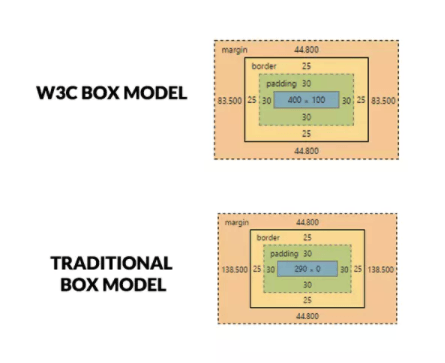
- You can change the type of box used. Browsers default to the W3C box model, which computes the width of the element to be equal to the content of the box excluding its padding and border, explains
Sitepoint. But you can specify the traditional box model, which considers the width of the element to be equal to the sum of the content, padding and the border. Here’s how
SitePoint illustrates the differences:
Use the following code to set up a traditional box model:
Understanding how to use padding is essential when making adjustments to most design elements in most platforms.
Padding is to be used when:
- You don’t want your content to touch the edges of the container. An example is when you have paragraph elements inside a div and you don’t want the text inside the <p> elements to touch the div’s border.
- You want the background of the element to be displayed in the produced gap. For instance, padding adjustments are needed if you’re building two divs side-by-side and you want both divs to touch each other, but don’t want their texts to touch. Add the padding to put space between the element and the content inside it.
- You want to increase the size of the element. For example, you would use padding if you want to increase the size of a button.
Here is a code example of how to set padding:
If you don’t have to set all four of these individually, the padding property allows you to set them all in one declaration, which goes clockwise around the element, like this:
Instead of specifying the length using pixels, you can also use pt, cm and other measurements. Another way to set padding is to use the percentage command. When using percentages, the percentage is set relative to the width of the containing element. Here’s an example of code:
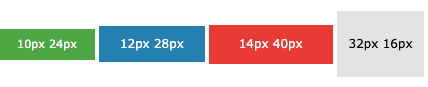
When you’re changing a button size with padding, you can use code like this:
This can be increased or decreased to change the size, as illustrated by
W3Schools.
- .button1 {padding: 10px 24px;}
- .button2 {padding: 12px 28px;}
- .button3 {padding: 14px 40px;}
- .button4 {padding: 32px 16px;}
Margins are another way to take control of design elements. Here are a few reasons you may want to adjust margins:
- Center an element. If you give “margin: auto” to an element with fixed width, it will center that element horizontally.
- Provide space
around
an element. For instance, when you don’t want the element to touch other elements around it, use margins.
The four margins are the same as you set for padding, but look like this:
- Margin-top
- Margin-right
- Margin-bottom
- Margin-left
Like with padding, you can use shortcuts instead of specifying each margin and can do it all in one command (with the order going around the element
clockwise):
If you specify one value, that value applies the same margin on all four sides. Use two values and the first margin applies to the top margin and bottom margin and second to the left margin and right margin. If using three values, the first applies to the top, then the second to both right and left, then third to the bottom.
You can also use percentages for margins. Or you can use command “auto” to allow the browser to calculate a margin. You can also use “initial” to set the CSS property to default the margin as the default set elsewhere on the web page when you change another item like color. You can also use the command “inherit” to set the margin to the parent element. To get a more in-depth understanding of these commands, check out this
W3Schools resource.
Unlike with padding, you can use negative values in margins. Negative margins will draw the element closer to its neighbors and create overlap elements. However, one of the main problems when you set margins is margin collapsing, and this commonly occurs when smaller margins overlap into larger ones.
How to Apply This in Duda
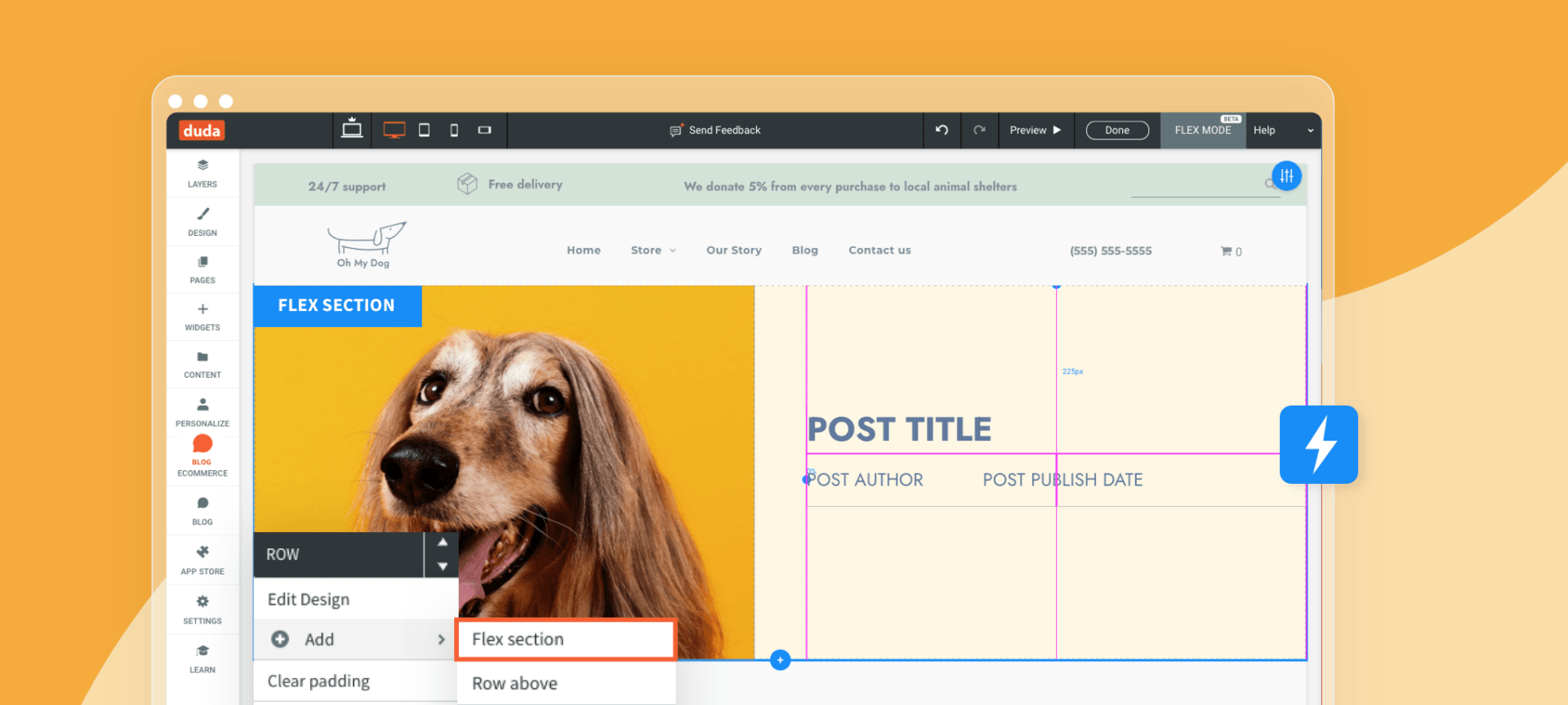
In
Duda’s website builder, it’s simpler to make these adjustments than using CSS or HTML code. You can easily specify the spacing and border of an elements, including padding and margins, by right-clicking the element on any widget, element, column, or row and then clicking Edit Design and the Spacing tab.
You can choose to use Containers and Flexboxes Edit the element’s content area and every part of the design super easily. The main difference between
Duda and other website builders is that you don’t need numerous tutorials, or extensive coding experience to build websites, but you still have all the customization you need.
Putting CSS Margins & Padding to Work
Start using the various methods of implementing padding and margins today to see which methods work best depending on your need. In no time at all, you’ll understand the difference between CSS padding and margins and know how to use them appropriately.