Choosing the right color scheme for a website isn’t just about aesthetics; it’s about impact. Colors evoke emotions, shape perceptions, and influence behavior, making them one of the most powerful tools in a designer’s toolkit. But where do these color trends come from? They don’t appear out of thin air.
Each year, industries like fashion, interior design, technology, and even food set the stage for emerging color palettes, dictating what feels modern, fresh, and relevant. From there, designers instinctively pull from these influences when creating digital experiences.
To go beyond just listing trendy color combinations, I teamed up with Efrat Riany, Marketing Design Lead, to bring to life the unique colors of each industry. Together, we’ve analyzed how the biggest players in design shape the palettes that will define websites in 2025.
But before we dive into industry-specific trends, let’s start with
Pantone Color of the Year 2025, a shade that will leave its mark across multiple industries.
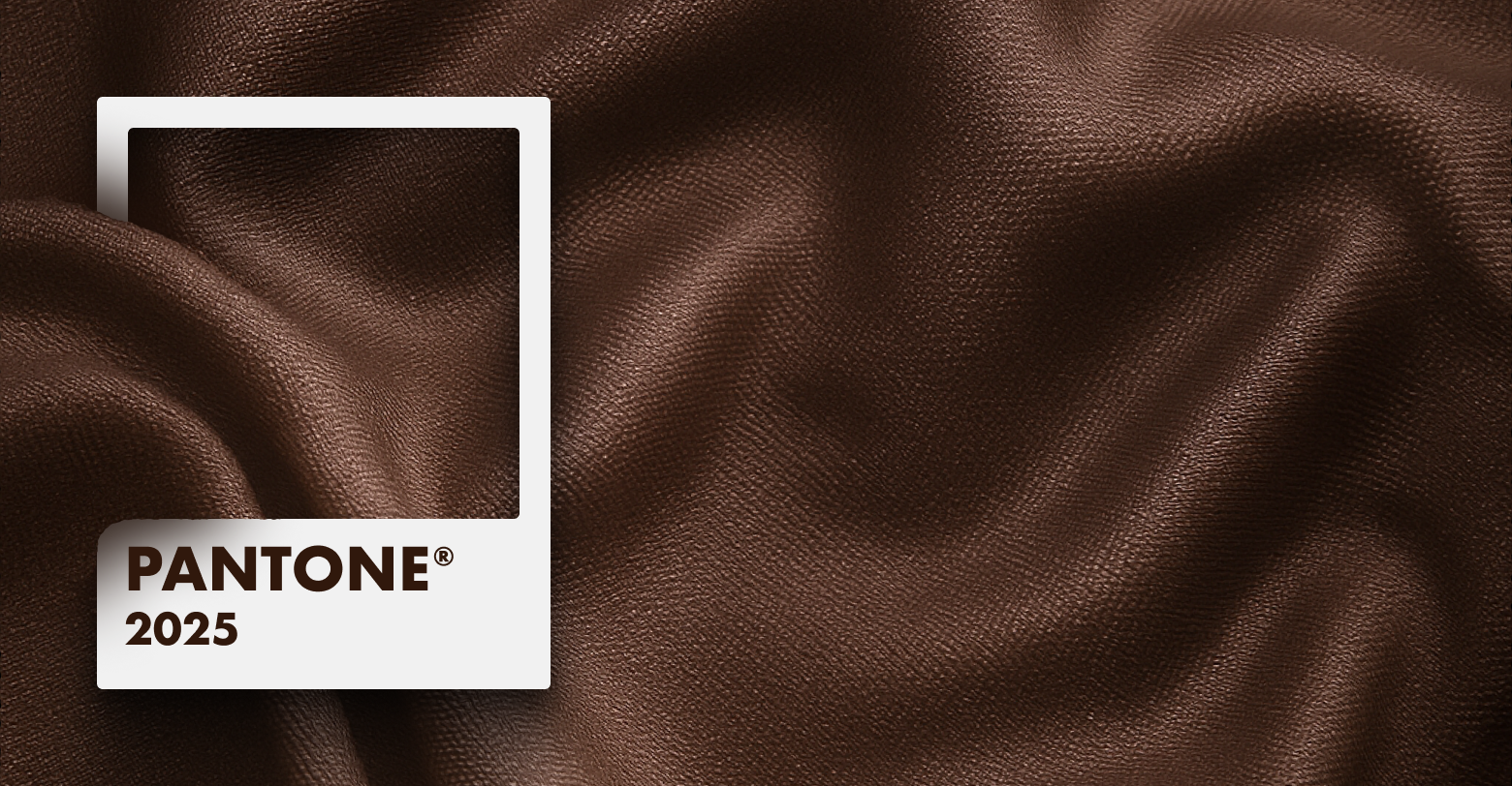
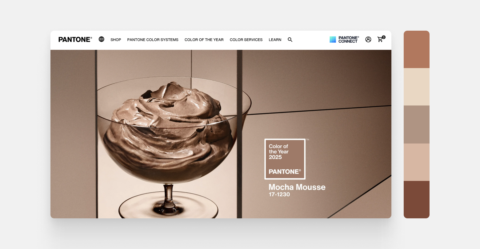
Pantone color of the year 2025: Mocha Mousse
Each year, Pantone selects a color that reflects the cultural and emotional mood of the world. For 2025, that color is Mocha Mousse, a rich, earthy brown that exudes warmth, sophistication, and timeless appeal.
Why Mocha Mousse? People are craving stability, comfort, and connection to nature. This shade delivers just that. It blends the organic feel of natural landscapes with the elegance of vintage aesthetics.
Where we’ll see Mocha Mousse:
- Fashion – In high-end collections, blending with warm terracottas and muted golds.
- Interior Design – A key player in the growing Sahara design trend, paired with sandy neutrals and textured elements.
- Technology – Used in UI/UX to bring a sense of grounded innovation, often paired with deep greens or sleek metallics.
- Food – Inspired by coffee, chocolate, and baked goods, bringing warmth and richness to packaging and branding.
- Automotive – Trending in luxury cars, especially in matte finishes and deep leather interiors.
But Mocha Mousse isn’t just a standalone trend. It pairs beautifully with complementary and contrasting colors based on the color wheel.
The Color Wheel & The psychology of color
To create color schemes that resonate with users, it’s essential to understand how colors interact and the emotions they evoke. The color wheel is the foundation of color theory, helping designers craft palettes that feel harmonious, vibrant, or intentionally striking.
- Complementary Colors (opposites on the wheel) create high contrast and energy (e.g., Mocha Mousse & Teal).
- Analogous Colors (side by side) create smooth, cohesive designs (e.g., Mocha Mousse, Rust, and Warm Beige).
- Monochromatic Schemes use variations of the same hue for a minimalist and sophisticated look.
Beyond color relationships, color psychology plays a role in design. Each shade has an impact on users. Here are some examples:
- Earthy Browns (like Mocha Mousse) evoke warmth, stability, and timeless sophistication.
- Deep Greens represent growth, harmony, and balance, making them ideal for eco-conscious brands.
- Soft Blues convey trust and calmness, often seen in tech and healthcare.
- Vibrant Reds & Oranges stimulate energy, passion, and urgency—great for calls to action.
By applying these principles, you can create website color schemes that not only look good but also
feel right.
But, as mentioned above, color trends don’t exist in a vacuum—designers, brands, and creatives pull inspiration from
fashion, interior design, technology, and even food to shape the visual language of their industries.
Every year, key industries set the tone for the colors we see in branding, websites, and products. These trends are influenced by cultural shifts, technological advancements, and even economic factors. What feels "modern" in 2025 will be shaped by the collective aesthetic of these industries.
Let’s dive into each sector, exploring their signature color trends, the standout color of the year, and how these palettes translate into stunning website designs.
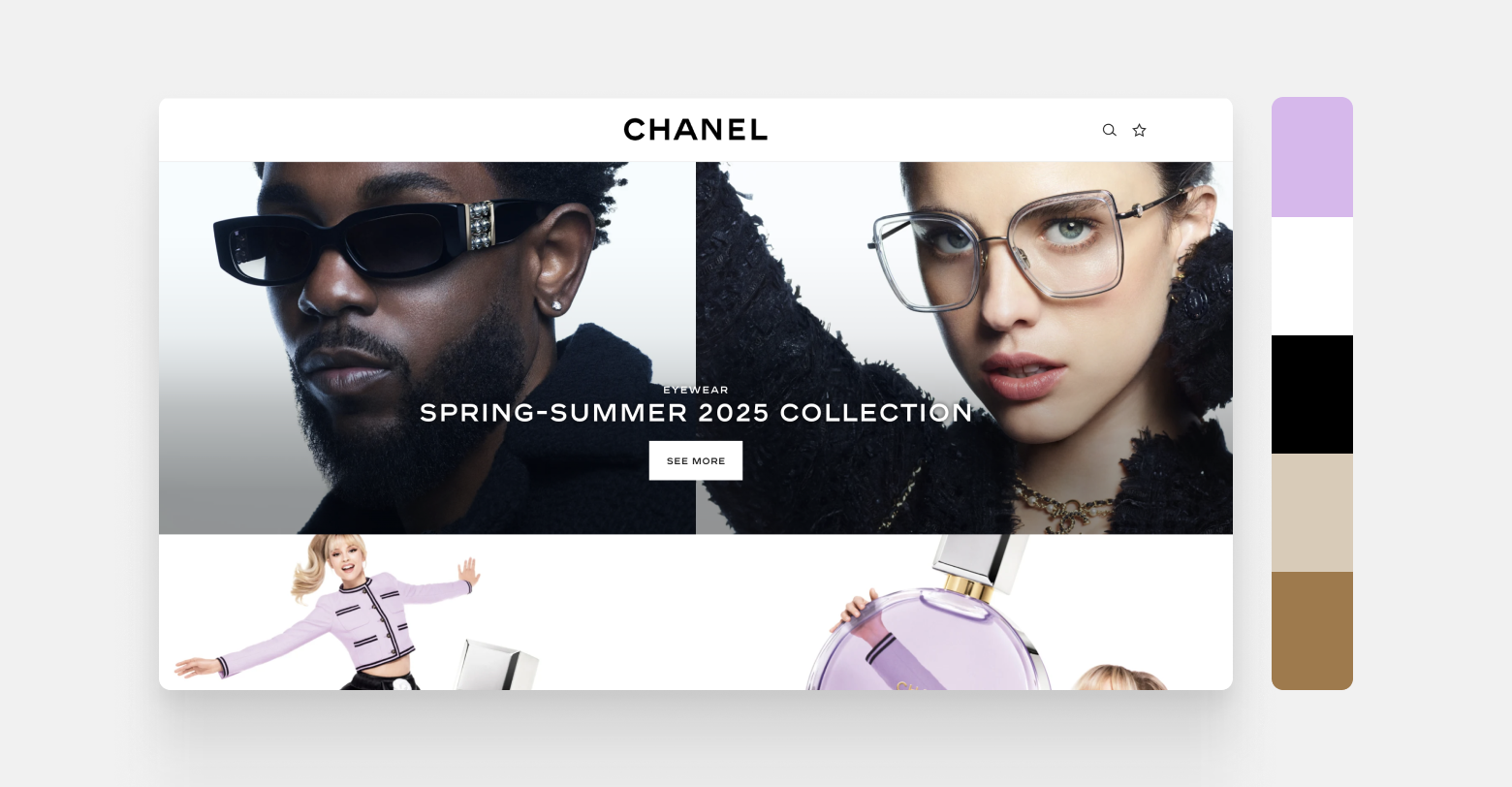
1. Fashion industry
Fashion trends often lead the way in shaping color direction across creative industries, and web design is no exception. Designers frequently look to seasonal collections, runway palettes, and the visual language of luxury brands to inform their choices. For 2025, Pantone’s Mocha Mousse, a warm, earthy brown, captures the fashion industry’s current embrace of grounded elegance and tactile comfort. This tone speaks to a desire for sustainability and understated richness, pairing well with timeless neutrals and soft pastels.
CHANEL’s website is a masterclass in luxury branding through color. Anchored in a black-and-white foundation that evokes the brand’s iconic heritage, the site layers in warm neutrals and soft pastels to create depth and seasonal relevance. The Cruise 2025/26 collection is presented in ivory and beige tones that mirror sun-soaked Mediterranean backdrops, while the Spring-Summer eyewear campaign leans into rich charcoals and deep browns to convey edge and sophistication. Soft lavender featured in the fragrance section introduces a touch of playful femininity, seamlessly woven into the layout to reflect Chanel’s commitment to timeless elegance with a modern sensibility.
Palette:
- Ebony Black — #000000
- Ivory White — #FFFFFF
- Soft Lavender — #D6B8EB
- Warm Beige — #D8CBB8
- Deep Mocha — #9E7A4D
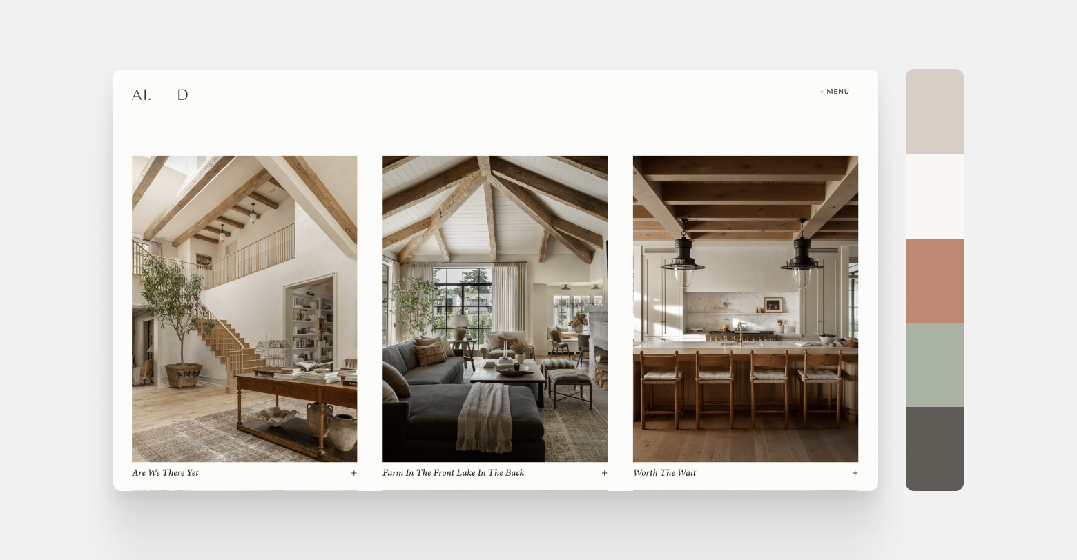
2. Interior design and furniture
Interior design is once again embracing the organic, this time with a heightened focus on earthy minimalism and soulful materials. In 2025, we're seeing a growing alignment with the Sahara-inspired palette: soft ochres, dusty clays, olive-tinted neutrals, and layered beige tones that recall sun-baked landscapes and artisanal craftsmanship. These palettes convey stillness and warmth, while still allowing for subtle contrasts and moments of bold expression. Mocha Mousse fits beautifully into this aesthetic as a grounding anchor, complemented by natural textures and timeless tones.
A stunning example of this direction is the Amber Interiors project showcase. The website’s visual language is defined by a mix of creamy whites, putty tones, weathered woods, and deep clay-like accents. The neutral backdrop allows detailed photography to shine, but the color palette does more than support; it enhances the story of each space. Muted sage, soft browns, and chalky whites echo the materials used throughout the interiors: washed linen, tumbled stone, brushed brass. The effect is luxurious without being flashy, warm without being rustic. It’s a palette made for digital serenity.
Palette:
- Chalk White — #F9F7F4
- Putty Beige — #D7CEC7
- Dusty Clay — #BC8A73
- Muted Sage — #A9B2A3
- Charcoal Wood — #5F5C57
3. Technology industry
The tech sector continues to drive sleek, high-performance design, but in 2025, we’re seeing a shift toward earth-meets-innovation palettes that blend grounded colors with digital polish. Instead of relying solely on electric blues and harsh contrasts, forward-looking tech brands are embracing more subdued, intelligent color choices that combine approachability with innovation. Think rich neutrals, clean whites, and deep greens used with restraint, supported by accents of chrome, copper, or soft gradients for a more natural digital experience.
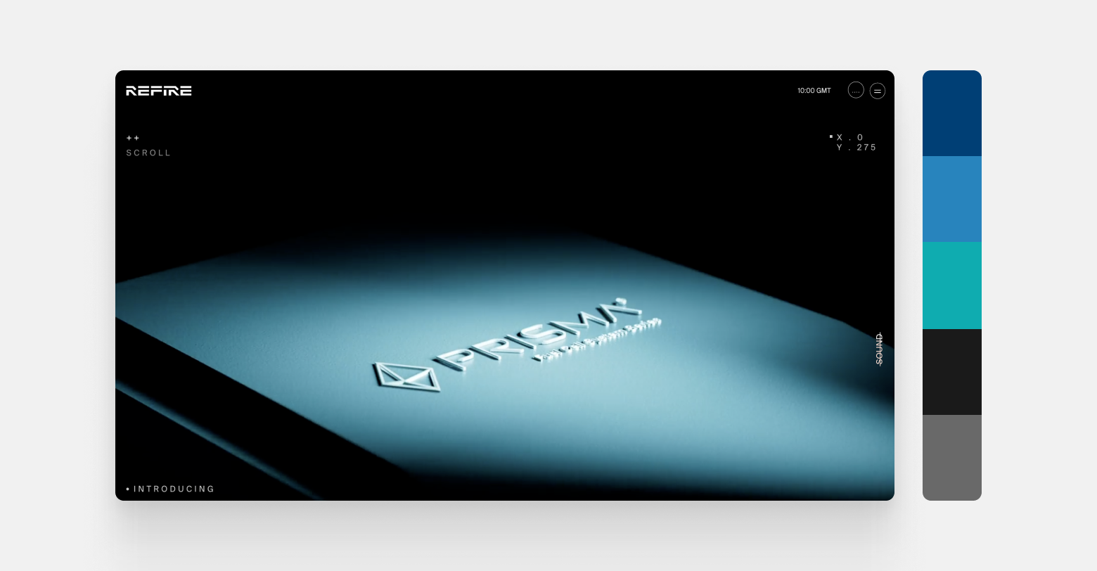
Refire exemplifies this new approach. The site’s design speaks to clean energy innovation, combining warm metallic tones and rich green hues to reflect sustainability and technological leadership. Against a minimal background of soft beige and charcoal, pops of deep teal and copper elevate the brand’s credibility and focus. It’s an elegant, confident palette that signals forward-thinking design, without needing neon. The result? A futuristic yet grounded interface that reflects the evolution of design in the tech space.
Palette:
- Primary Corporate Blue — #003F75
- Secondary Tech Blue — #2884BD
- Highlight Turquoise — #0FACB0
- Soft Black — #1A1A1A
- Graphite Gray — #696969
4. Food industry
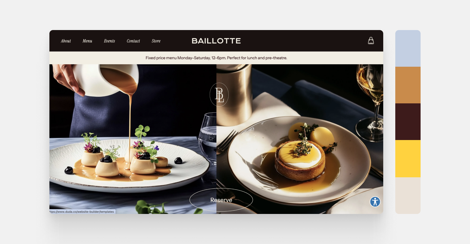
Color choices in the food industry tend to center on freshness, warmth, and appetite appeal, but in 2025, we’re seeing a shift toward more refined, emotionally engaging palettes. Rather than relying solely on deep reds or rustic earth tones, modern food brands are embracing hues that convey trust and clarity. One standout is Blissful Blue, a color identified by WGSN as a key shade for 2025. Its soft, tranquil quality brings a sense of calm and sophistication to digital environments while still feeling fresh and contemporary.
A perfect example is
Duda’s Chef Restaurant template, featuring a refined yet welcoming color palette. Periwinkle Blue sets a soft, serene foundation, while rich caramel and deep Bordeaux evoke the warmth and indulgence of fine dining. Accents of vibrant golden mustard introduce lively bursts of energy, perfectly balanced by creamy neutrals that invite comfort and relaxation. Together, these tones create a sophisticated, flavorful experience, ideal for restaurants and food brands that want to express creativity and culinary passion without compromising elegance.
Palette:
- Periwinkle Blue — #C3CFE2 (Soft, calming foundation)
- Warm Caramel — #C98B4B (Rich, indulgent warmth)
- Deep Bordeaux — #3D1B1B (Elegant, luxurious depth)
- Vibrant Golden Mustard — #FFD23F (Energetic and lively accent)
- Soft Cream — #EAE1D7 (Neutral, inviting balance)
5. Automotive industry
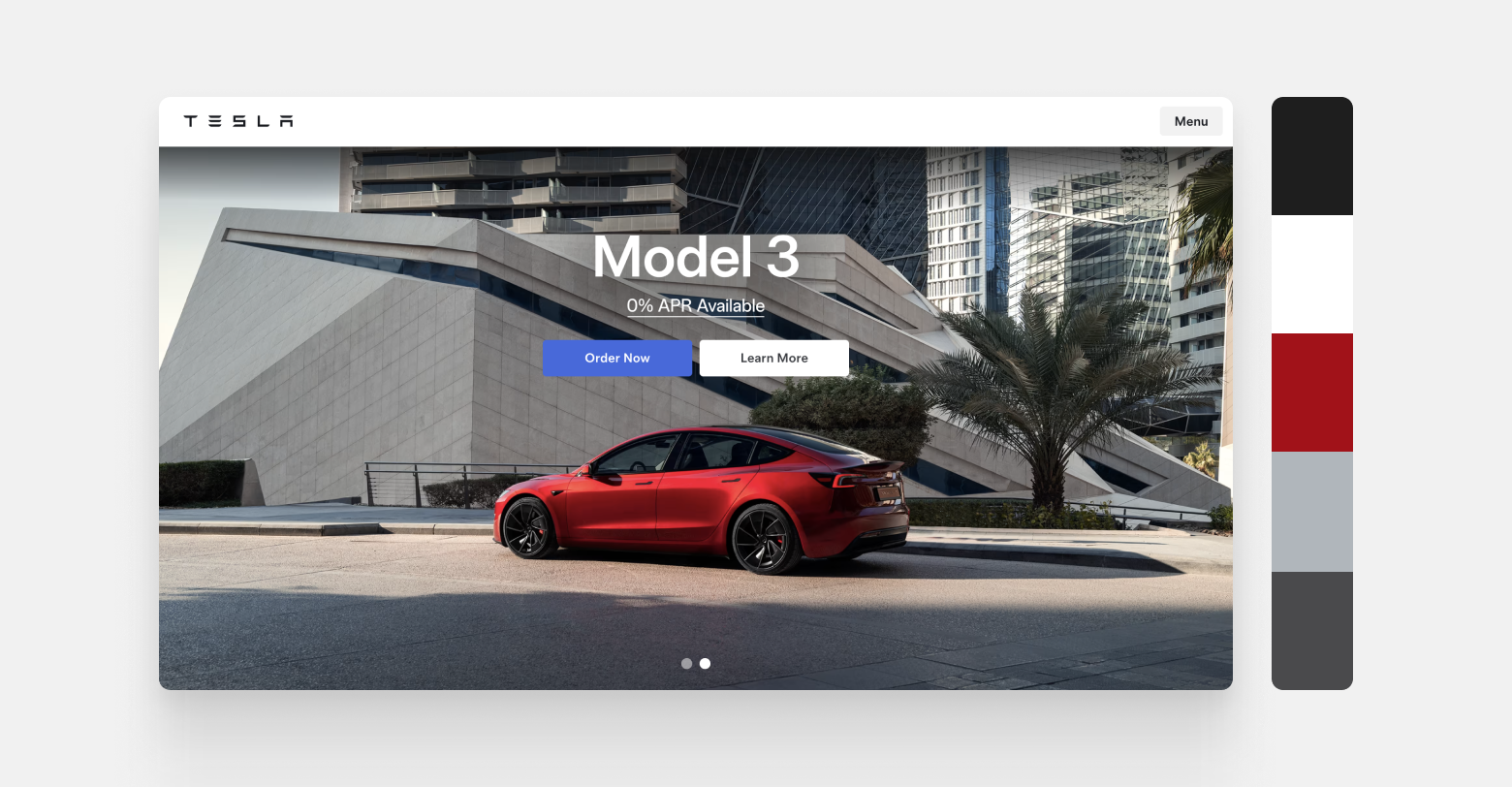
Automotive brands often rely on strong, high-contrast palettes to communicate power, performance, and innovation. In 2025, color choices in this space continue to evolve, but instead of flashy hues, many brands are opting for minimalist schemes that emphasize control and sophistication. Monochromatic palettes, chrome-inspired finishes, and deep charcoals dominate, with subtle uses of color to differentiate models or draw attention to features.
Tesla exemplifies this restrained yet futuristic direction. Their website leans heavily on a clean white and deep charcoal background, allowing the vehicles, often showcased in bold reds, blacks, silvers, or pure whites, to take center stage. The red of the Tesla cars stands out vibrantly against the dark tones, drawing immediate attention and highlighting the brand's focus on power and performance. Sleek grays and metallic tones echo the polished look of their cars, reinforcing Tesla's identity as cutting-edge and luxurious. This simple design, with little color except for the cars, shows Tesla’s focus on modern luxury.
Palette:
- Pure White — #FFFFFF
- Deep Charcoal — #1E1E1E
- Performance Red — #a11219
- Gunmetal Silver — #B0B6BB
- Graphite Gray — #4A4A4C
Other industries & final note
Beyond these core sectors, industries like Beauty, Healthcare & Wellness, Education, and Travel & Tourism are exploring their own distinct palettes in 2025. Beauty brands favor rosy metallics and skin‑tone neutrals to evoke radiance and inclusivity. Healthcare sites lean into calming blues and greens for trust and serenity. Educational platforms use energetic blues and oranges to inspire engagement, while travel and tourism embrace turquoise, sunny yellows, and palm greens to spark wanderlust.
No matter your industry, be sure to select colors that align with your brand story.
Here’s to a colorful 2025!