Many of us view efficiency as a refinement of our processes, but, really, it’s more of an elimination of friction. That friction can exist in many places—including our tools. When an interface feels cluttered or unpredictable, it drains the mental energy required for high-level creative and strategic work.
Your tools should be a source of inspiration, not friction. They should provide a focused, high-performance environment that allows you to move faster and build with greater confidence.
To support this goal, we are introducing a series of visual and structural uplifts designed to modernize the Duda experience. These updates go beyond simple aesthetics. By refining the core UI elements you interact with every day, we are creating a platform that feels more intuitive, looks more professional, and functions with greater precision.
A cohesive visual foundation
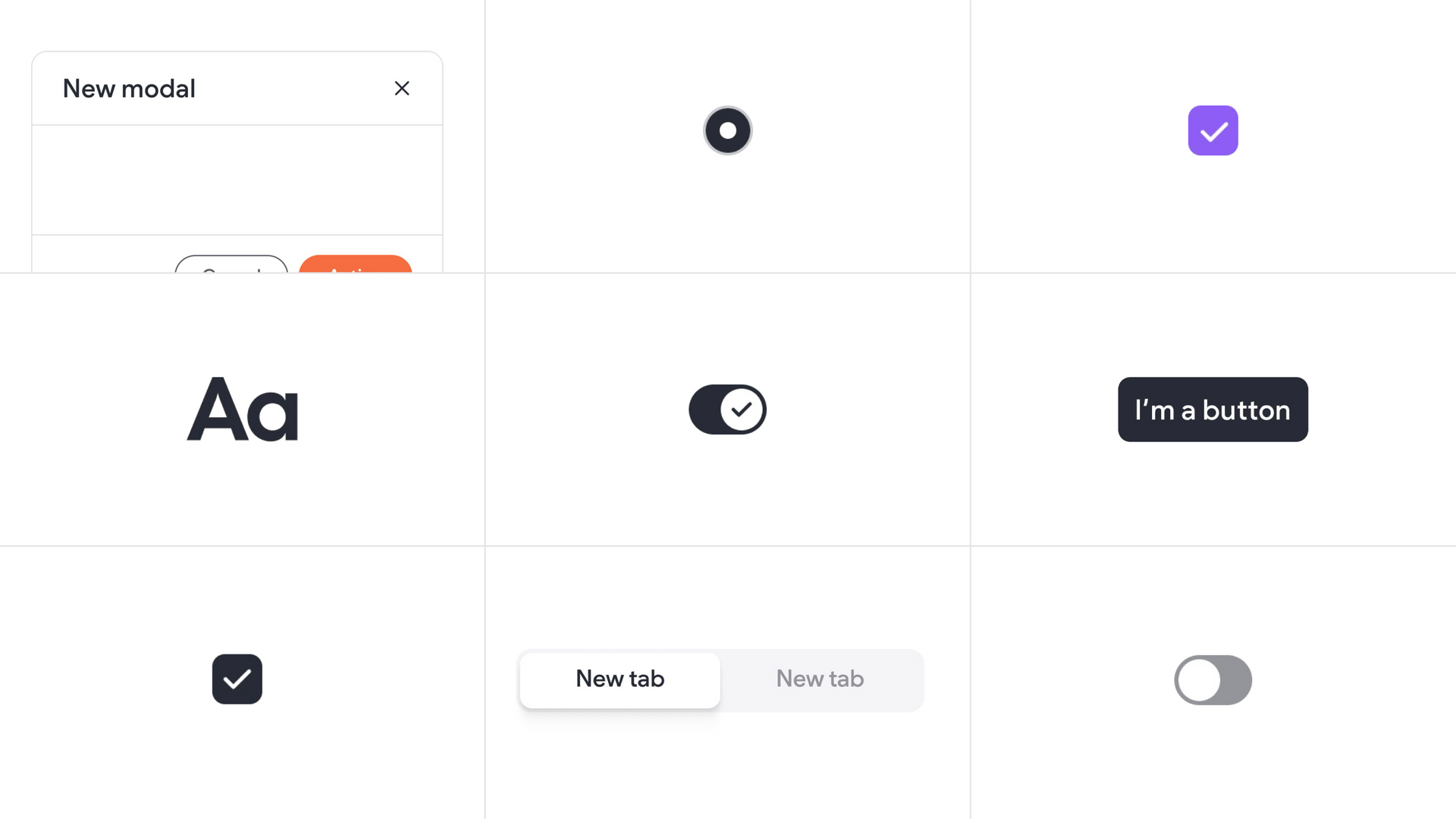
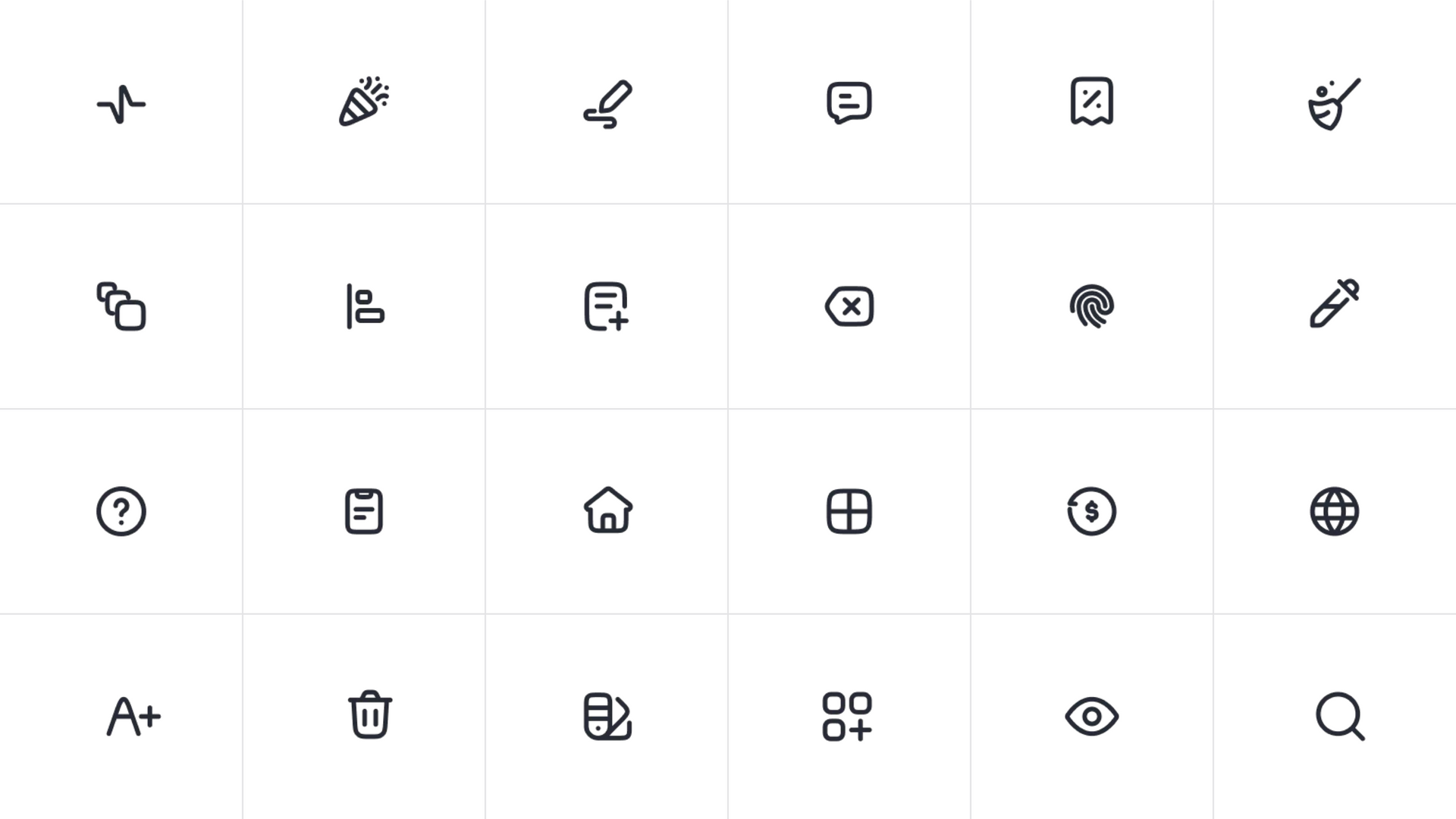
Your software should feel as trustworthy as the services you provide to your clients, and as beautiful as the websites you’re building. To achieve this, we have systematically updated the foundational elements of the Duda interface. You will notice new fonts, updated button styles, redesigned modals, and a fresh set of icons and illustrations throughout the platform.
These changes set a new tone that is cleaner and more balanced. We have updated small but critical details like popups, checkboxes, toggles, and empty states. While these improvements are subtle, they significantly impact your daily workflow. The result is a product that feels more cohesive and polished. You might not consciously notice every change to a toggle or a font weight, but you will feel the difference in how the platform responds to your input.
These updates, some live and others coming soon, offer better spacing and smoother interactions, ensuring that the visual environment remains consistent whether you are adjusting global styles or fine-tuning a specific widget. This consistency builds an intuitive sense of familiarity in the tool, allowing you to focus entirely on the site you are building rather than navigating the interface itself.
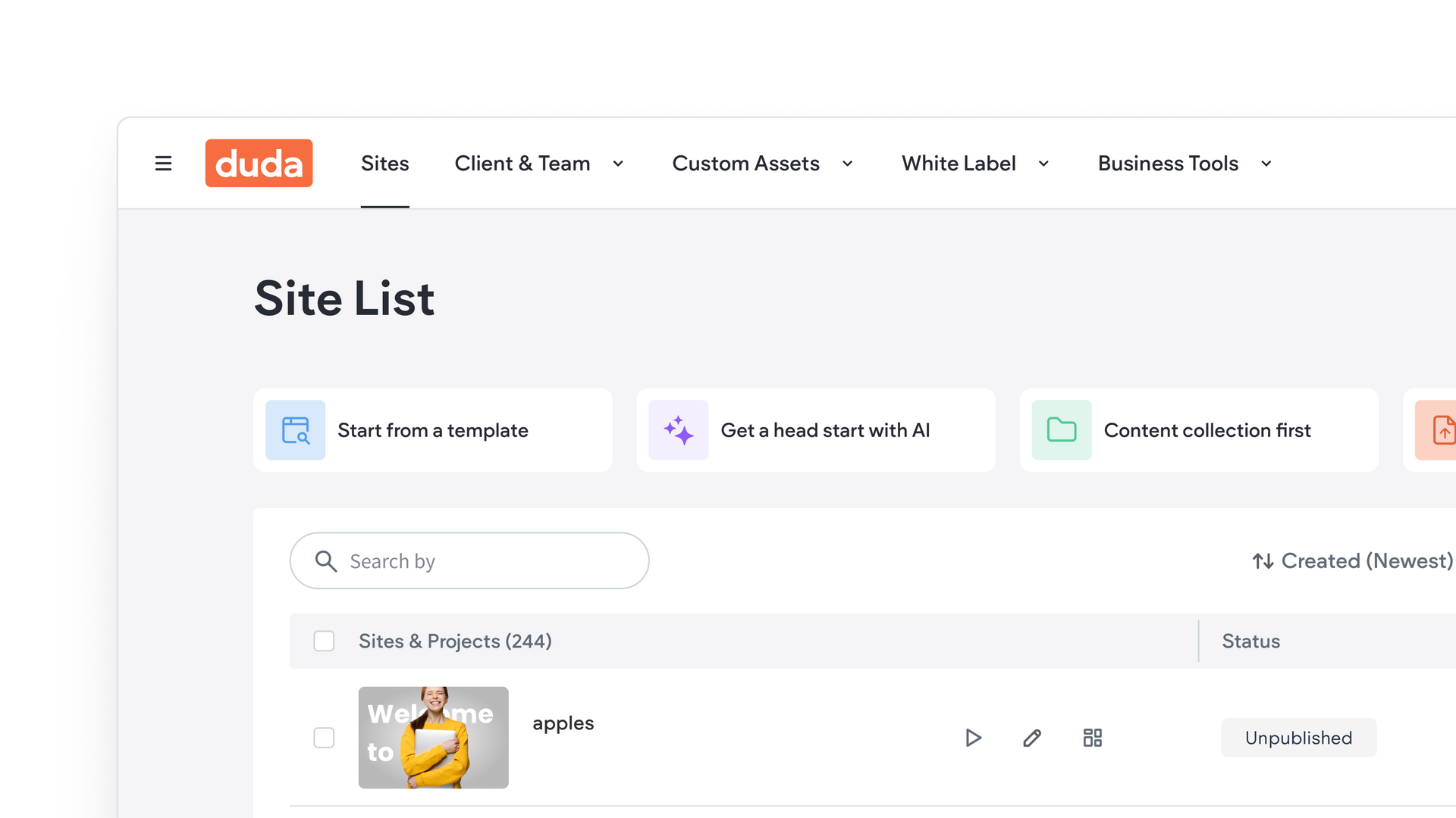
Streamlining navigation with the new sidebar
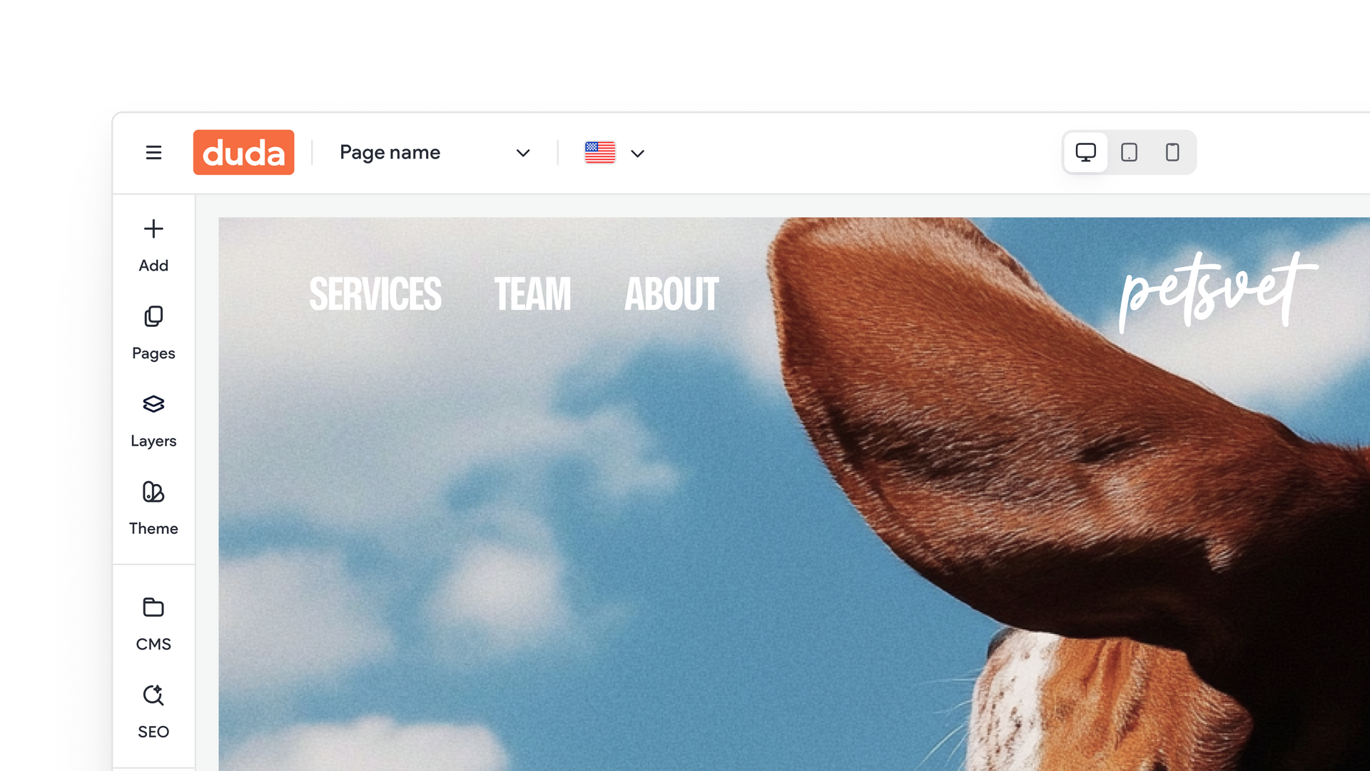
The sidebar is the primary entry point for most of your design actions. We redesigned this space to improve discoverability and reduce visual noise. The new layout features a structure that feels more balanced and open, giving the editor a fresher feel that adapts better to different screen sizes.
This update helps you find the tools you need faster without overwhelming your workspace. One of the most significant additions to this new sidebar is the integrated “Add Panel.” Previously, you might have found yourself switching between separate panels for widgets, media, and text. The new add panel combines these elements into a single, streamlined location.
By placing every drag-and-drop element within one location, we have made the process of building sections faster and more intuitive. You spend less time clicking through menus and more time executing your vision. This new sidebar is already live, and represents a major step toward a more efficient editing experience.
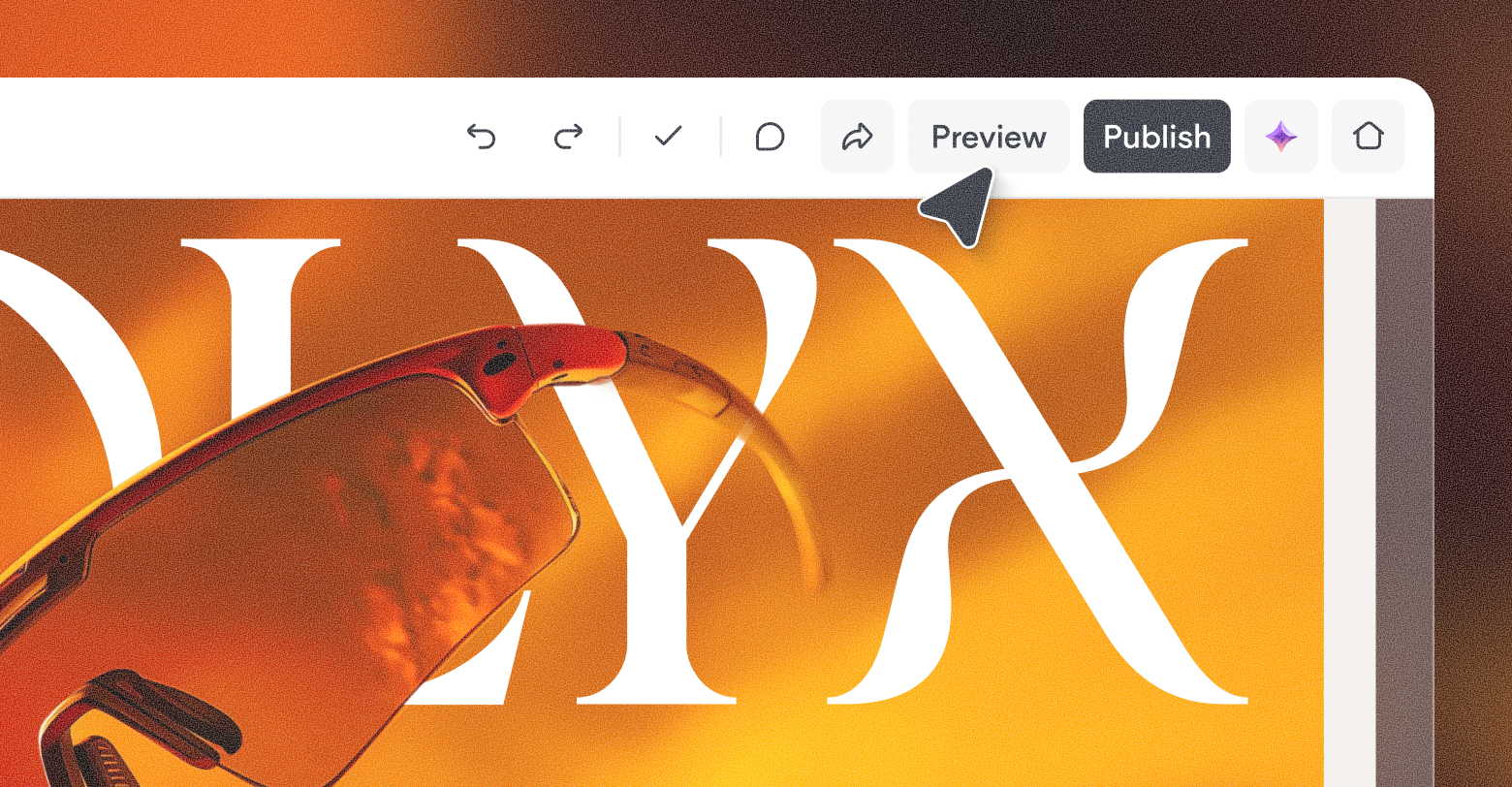
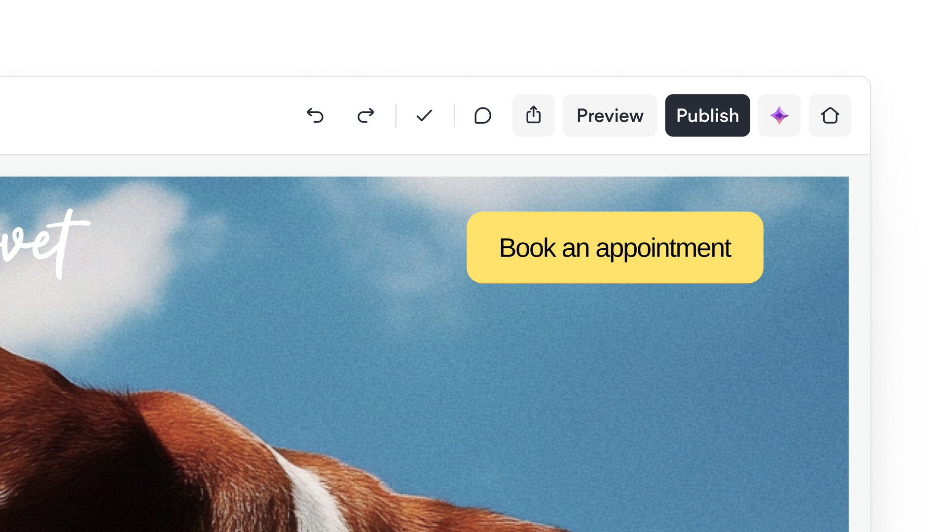
Enhancing focus with the new top navigation bar
The top navigation bar serves as the command center for your projects. As this new version rolls out to all users, you will notice a significantly cleaner layout that prioritizes your most frequent actions. We moved less-used functions into a "More" menu, clearing the path for the tasks that matter most during active editing sessions.
Several key improvements define this new top bar:
- Mega menu integration: A new mega menu makes it easier to discover platform capabilities quickly, reducing the number of clicks required to reach specific settings.
- Platform consistency: Navigation is now consistent between the Editor and the Site Overview dashboard. This visual harmony ensures that moving between client management and site editing feels natural and fluid.
- Simplified actions: We simplified the primary action buttons and standardized the location of the back and close buttons, making navigation predictable across different views.
- Increased workspace: By streamlining the top bar, we freed up more space for your content and custom code, allowing you to stay focused on the canvas.
These changes ensure that the interface stays out of your way. When the tools you need are exactly where you expect them to be, you can maintain a state of flow and complete projects in less time. Existing users can explore all of the changes in this
walkthrough video.
A foundation for continuous improvement
This modernization effort is not a one-time event. It is an ongoing project aimed at refining the details that make Duda the most professional website builder for agencies, SaaS platforms, and professionals building websites at scale. We view these updates as a foundation that allows us to build and deploy new features even more quickly in the future.
You can expect to see these refinements continue to roll out. Each update aims to make the platform more reliable, more capable, and more enjoyable to use. By investing in a modern, high-performance UI, we are ensuring that your agency has the best possible environment to deliver results for your clients.
Explore the new interface today and see how these improvements can speed up your design and development workflow.