La creación de bellas paletas de colores para sitios web puede ser un reto para muchos diseñadores. Afortunadamente, hoy en día existen muchas herramientas y sitios web que ayudan a crear increíbles paletas de colores. El objetivo de este artículo es presentar algunas de estas opciones.
Además, te daremos algunos consejos valiosos para dejar más bonitas las paletas de colores y contribuir a que los sitios web generen cada vez más resultados.
La importancia de la paleta de colores para un sitio web
En todas las ramas del diseño y las artes, el color es uno de los elementos clave para que el resultado final sea coherente y agradable a la vista.
Por lo tanto, la armonía de los colores utilizados y la psicología aplicada a través de ellos pueden interferir directamente en el éxito de los proyectos del sitio web.
Los dos componentes principales que deben tenerse en cuenta a la hora de crear paletas de colores para sitios web son el contraste y la armonía. Ellos harán que todos los colores se integren en tus propuestas cromáticas para los sitios web de tus clientes.
Te presentamos nuestra selección de herramientas y sites para ayudarte a crear paletas de colores
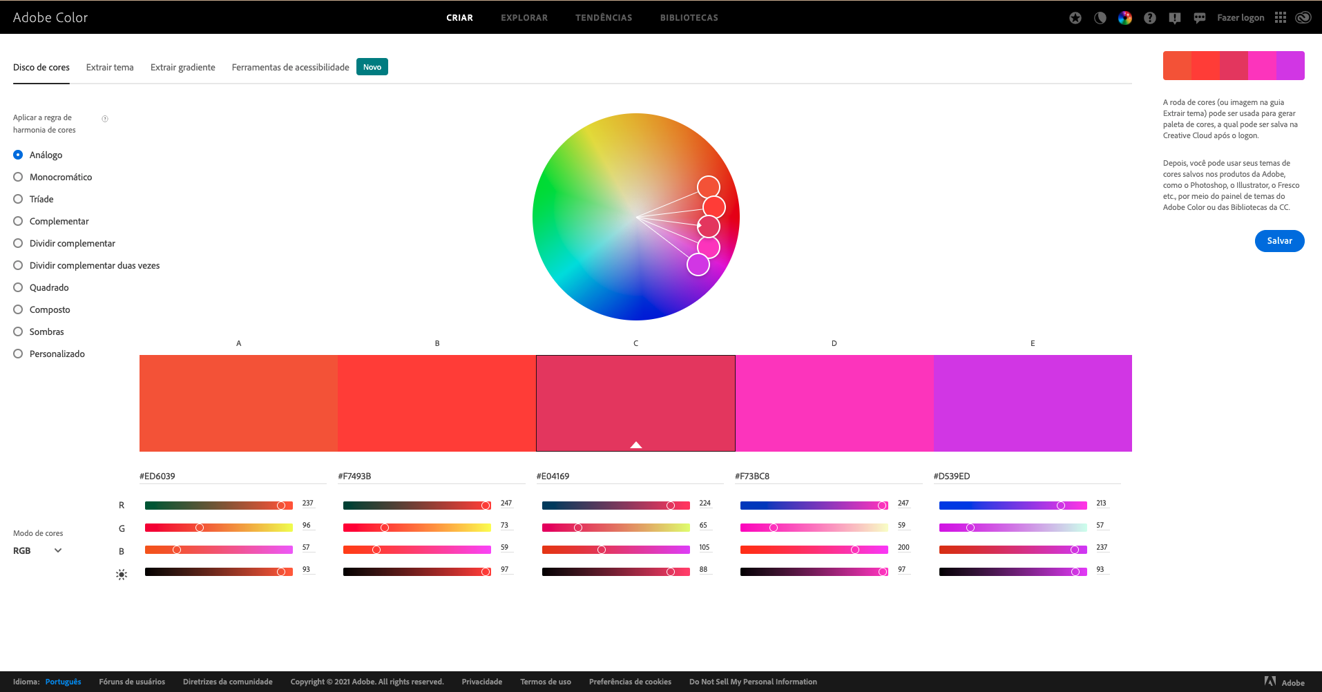
1. Adobe Color
Adobe Color es quizás la herramienta más conocida entre los diseñadores.
El antiguo Adobe Kuler es el sitio web de Adobe que permite crear paletas de colores, ofreciendo la posibilidad de integrarse con el software Adobe Suite, ya sea a través de las Bibliotecas o del propio panel Adobe Color Themes.
Esta herramienta es gratuita y trabaja a partir de los principios básicos de la teoría del color. Cuenta con un círculo cromático (color wheel) en el que puedes aplicar reglas de armonía para crear tu propia paleta.
El círculo cromático puede ajustarse de varias maneras para lograr la armonía de colores. Puedes buscar complementos, compuestos, tríadas y mucho más.
También tienes libertad para modificar los puntos para elegir el color de tu preferencia, y puedes explorar los temas creados por otros usuarios. Puedes guardar tus paletas favoritas para utilizarlas posteriormente o consultar las bibliotecas de paletas más populares.
Por último, también puedes extraer temas de una imagen, creando así una paleta de colores e incluso un degradado a partir de cualquier foto o ilustración.
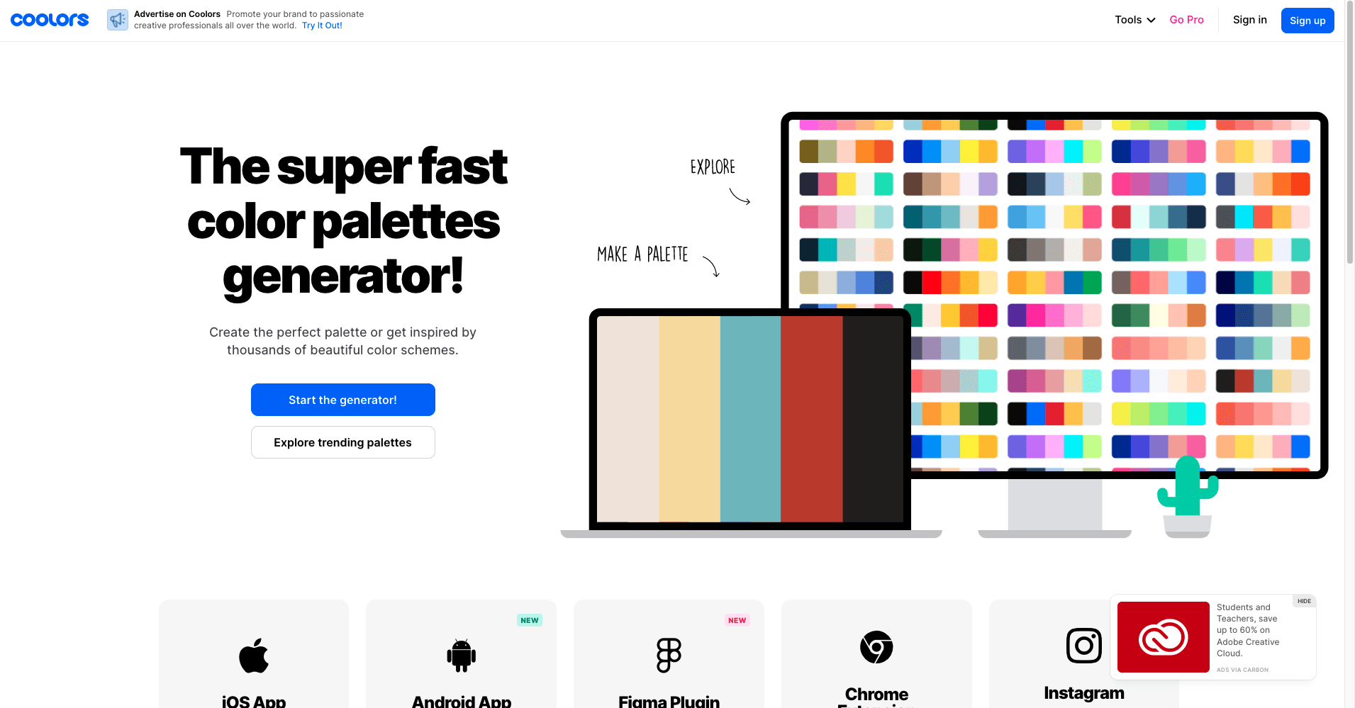
2. Coolors
Coolors ofrece herramientas muy completas para crear paletas de colores para sitios web. Es adoptado por un gran número de profesionales de UI Design.
La interfaz del sitio web es muy sencilla e intuitiva, lo que le permite a cualquier usuario encontrar combinaciones sorprendentes. Solo tienes que utilizar la barra espaciadora del teclado para crear infinitas combinaciones.
En caso de que quieras trabajar con una sola opción de color para la paleta de colores del sitio web, existe la opción "congelar". A partir del momento en que la pulses, podrás seguir generando otras combinaciones teniendo en cuenta el color que hayas seleccionado.
Las cosas se ponen aún más interesantes cuando se exploran las opciones de la barra superior, que te permiten cambiar el método de generación de la paleta, cargar cualquier imagen y también crear collages con la paleta generada.
Además, hay una opción llamada "explore trending palettes", en la que puedes ver varias paletas que son tendencia actualmente.
Lo más destacado de Coolors son las opciones de accesibilidad que simulan algunas deficiencias visuales como el daltonismo. De este modo, es posible crear una paleta de colores para un sitio web más accesible.
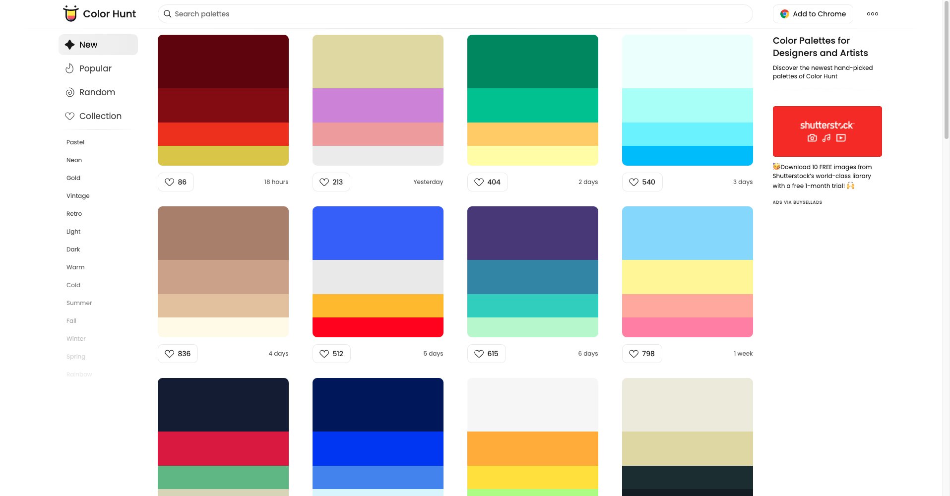
3. Color Hunt
Creado para ayudar a artistas y diseñadores,
Color Hunt es una auténtica vitrina de miles de paletas de colores. Ellas pueden (¡y seguramente lo harán!) servir de inspiración para que tú y el equipo de tu agencia creen muchas paletas de colores sorprendentes para los sitios web.
Las distintas paletas ya creadas y disponibles en Color Hunt van acompañadas del número de likes que ha recibido cada una en la plataforma, que es abierta y gratuita. Los likes que das quedan guardados y se puede acceder a ellos en el futuro.
Puedes utilizar los filtros para buscar las paletas más populares y crear tu propia colección. Si no encuentras una paleta de colores ideal para tu sitio web, puedes crear tu propia paleta haciendo clic en los 3 puntitos de la esquina superior derecha de la página web.
La herramienta de creación de paletas de colores de Colour Hunt es mucho más simple que las anteriores, sin embargo, permite una mayor libertad a la hora de crear paletas que "rompan las reglas de los colores". Otra ventaja es que puedes descargar una extensión para Google Chrome.
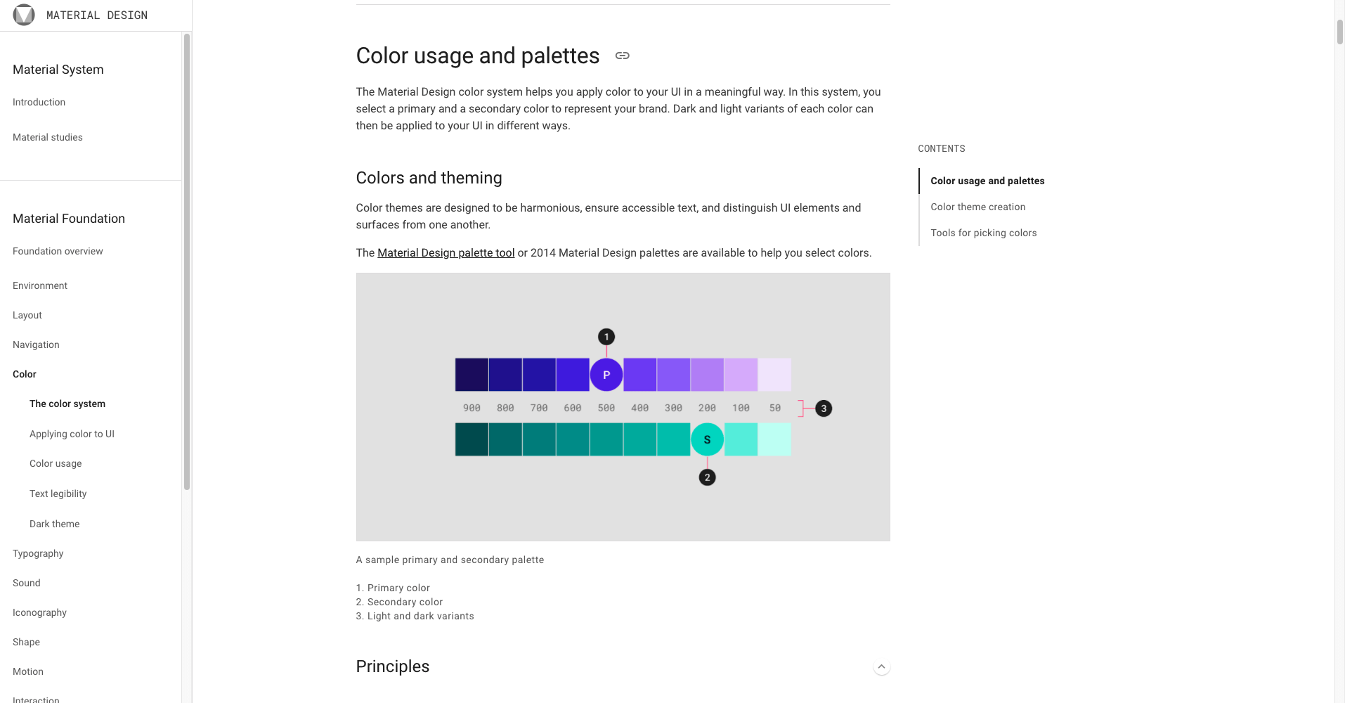
4. Material.io
Creada por Google,
Material.io es una plataforma que fomenta la colaboración entre diseñadores y desarrolladores. Apoyándose en el código-fuente abierto, proporciona directrices, componentes y herramientas que apoyan las mejores prácticas en el diseño y UI.
El sitio web presenta una gran cantidad de materiales que te ayudarán a mantenerte al día con las últimas tendencias y a conocer las mejores herramientas de diseño.
Si tu objetivo es elegir paletas para proyectos de diseño de interfaz móvil,
Color System de Material.io te será de gran ayuda. Solo tienes que elegir un color primario y el sitio web generará los colores secundarios y los esquemas de colores.
Al tener una amplia visualización de grupos de colores, es una gran opción para los profesionales del área de diseño web y de front-end. La herramienta tiene varias combinaciones y tonos de color que se están utilizando en sitios web y aplicaciones.
También puedes medir la accesibilidad del tema en la pestaña "Accesibilidad". Muy útil para los diseñadores de UI.
5. ShutterStock Colors Galore
Es posible que hayas oído hablar de ShutterStock, el banco de imágenes ampliamente utilizado por fotógrafos y diseñadores profesionales.
Además de ofrecer este servicio, la plataforma también cuenta con una herramienta llamada
ShutterStock Palette, que te puede ayudar a crear bonitas paletas de colores para sitios web.
Para los amantes de la manipulación y composición de imágenes, es la opción perfecta. Puedes buscar la imagen que quieras y ver automáticamente qué paleta de colores la compone.
Es decir, puedes crear la paleta de colores para tu sitio web a partir de una sola imagen de referencia.
ShutterStock Palette posee un "colours galore" con varios colores. Al hacer clic en el color deseado, el sitio web no solo muestra una paleta de colores según la regla elegida, sino que también describe el color y muestra imágenes que lo utilizan. Incluso puedes buscar imágenes con el color que has elegido.
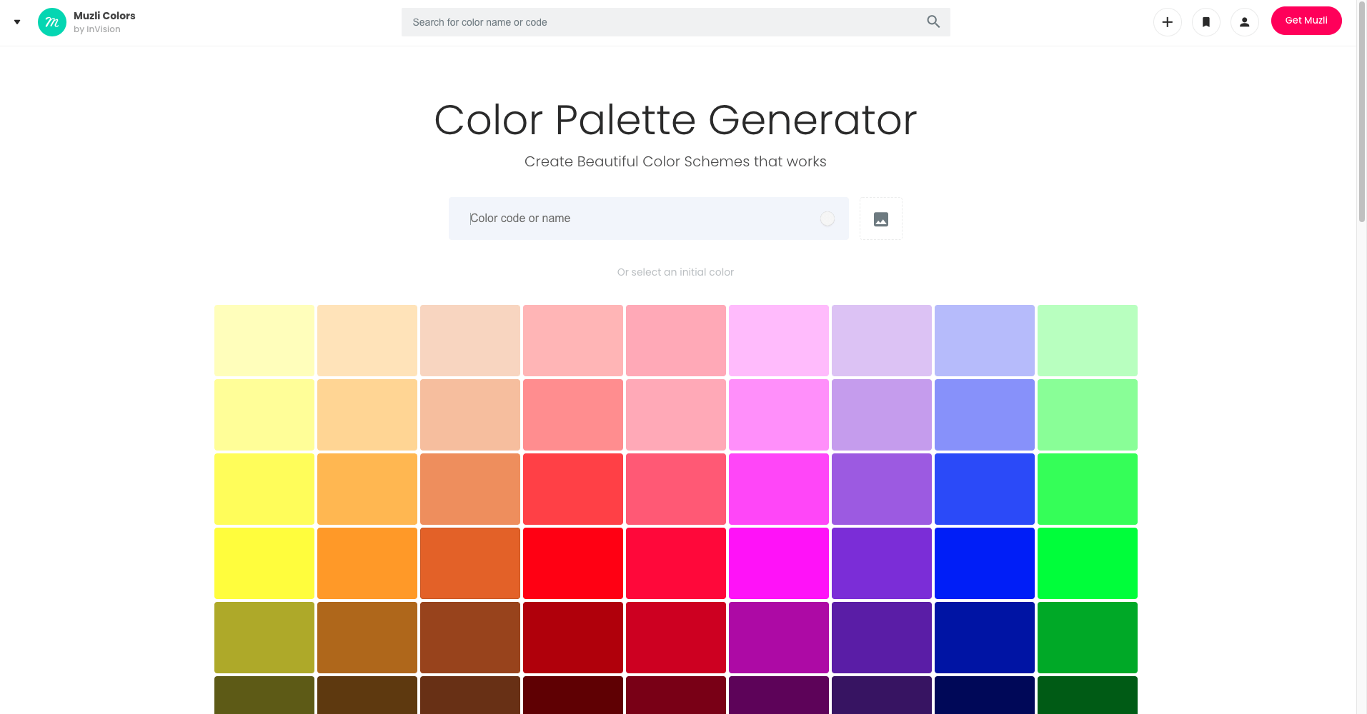
6. Muzli Colors
El sitio web
Muzli quiere ser la fuente secreta de inspiración e información para los diseñadores. Ofrece proyectos de diseño y noticias siempre que se abra una nueva pestaña en tu navegador.
Incluye inspiración para el diseño web, los mejores sitios web, los mejores logotipos, tendencias de la web, los mejores sitios web y aplicaciones móviles, sitios web minimalistas, sitios web brutalistas, ilustraciones innovadoras, recursos de diseño y mucho más.
Dentro de la plataforma,
Muzli Colors permite generar temas a partir de un solo color (o eligiendo una paleta ya hecha) y visualizar en tiempo real la combinación de colores en una aplicación ficticia.
Es una gran herramienta para aquellos que quieren crear esquemas de color para proyectos de UI Design. También es ideal para probar rápidamente si la paleta funciona en componentes de la interfaz de usuario como botones, títulos y textos.
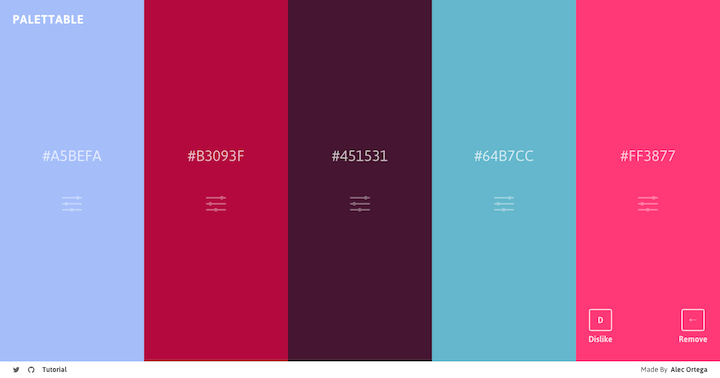
7. Palettable
Es muy sencillo de utilizar y no requiere conocimientos específicos. Se trata de
Palettable, que tiene una dinámica muy similar a la de Coolors.
Las combinaciones se generan en función de tu gusto. La herramienta te preguntará si te gusta o no un determinado color, hasta llegar a 5 colores, que es el número máximo permitido. De manera intuitiva, el sitio te mostrará nuevos colores a medida que vayas definiendo lo que te gusta.
También puedes ajustar el color que aparece, lo que simplifica aún más la experiencia. Fácil de usar, puede ser una herramienta útil para los principiantes que necesitan construir una paleta de colores para tu sitio web sin perder demasiado tiempo.
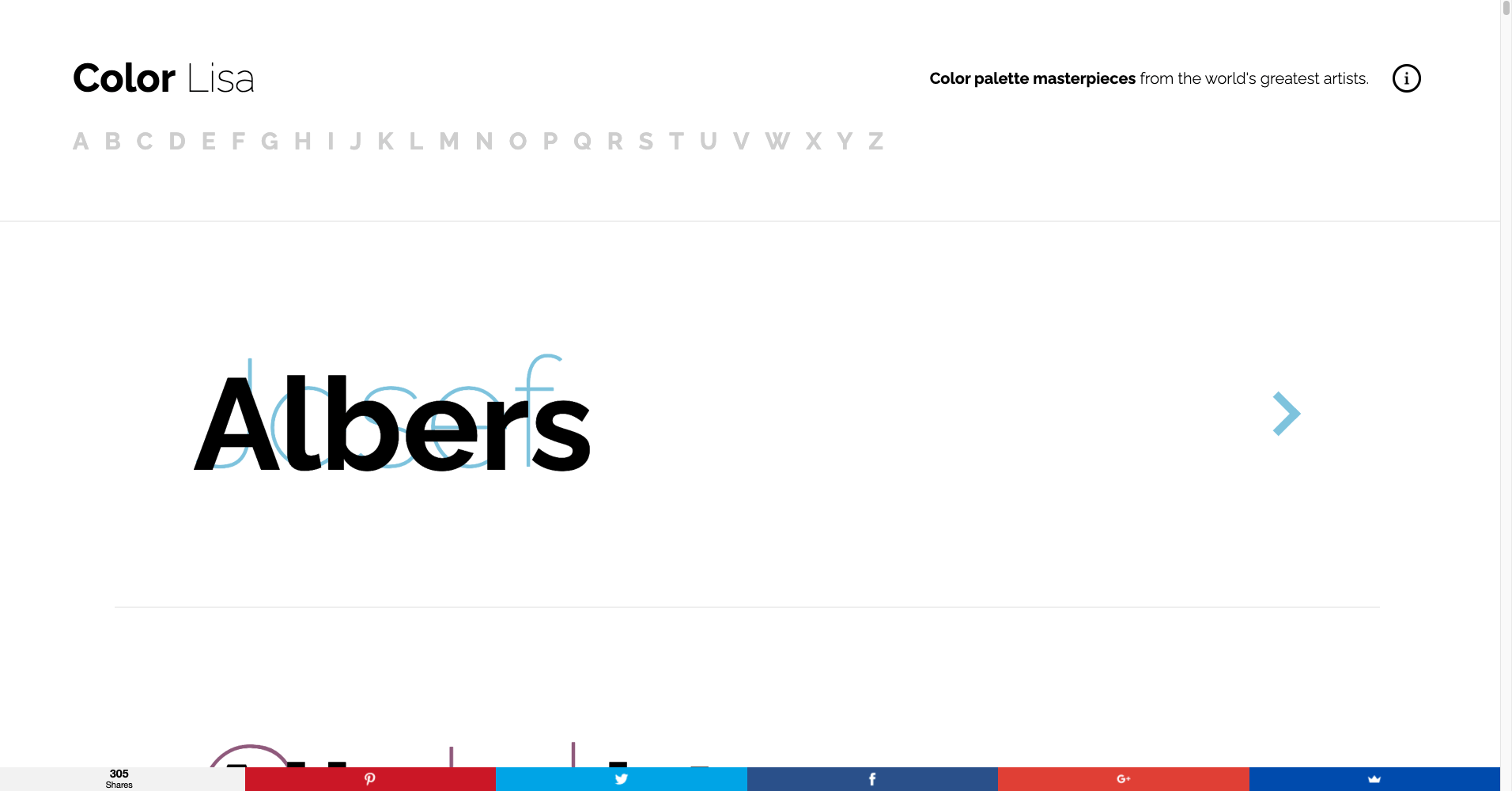
8. Color Lisa
Como su nombre está inspirado en el famoso cuadro de Mona Lisa,
Color Lisa examina las paletas de colores de algunas de las obras de arte más famosas de la historia de la pintura mundial. Puedes buscar por autor y obtener inspiración directa de los maestros.
Así es, Color Lisa te permite ver paletas de colores de obras de arte de diferentes pintores. Basta con buscar el nombre de un pintor y navegar por los colores de sus obras.
Cada paleta ha sido cuidadosamente creada por diseñadores apasionados por el color, artistas, curadores de museos y maestros de la teoría del color. Constantemente se añaden nuevas paletas.
No es un generador de paletas, pero su propuesta es muy inspiradora y puede ser muy útil a la hora de crear paletas de colores para sitios web. Lo interesante no es solo inspirarse en las paletas, sino también conocer obras de arte a partir de sus colores dominantes.
9. Movies in Color
Sí, lo has adivinado. La propuesta de
Movies in Color es bastante similar a la de Color Lisa. Solo que esta vez vamos a examinar escenas de películas y series.
Puedes usarlo para inspirarte en alguna escena famosa, como en Breaking Bad, True Detective y Kill Bill.
La propuesta es mostrar la relación entre el color, la cinematografía, la escenografía y el diseño. Uno de los objetivos es ofrecerles a los artistas y diseñadores, paletas de colores que puedan utilizarse en pinturas, películas, vídeos, diseño gráfico, diseño web y otras actividades.
El autor recibe solicitudes de películas para analizar y promete incluir nuevas paletas de colores cada semana.
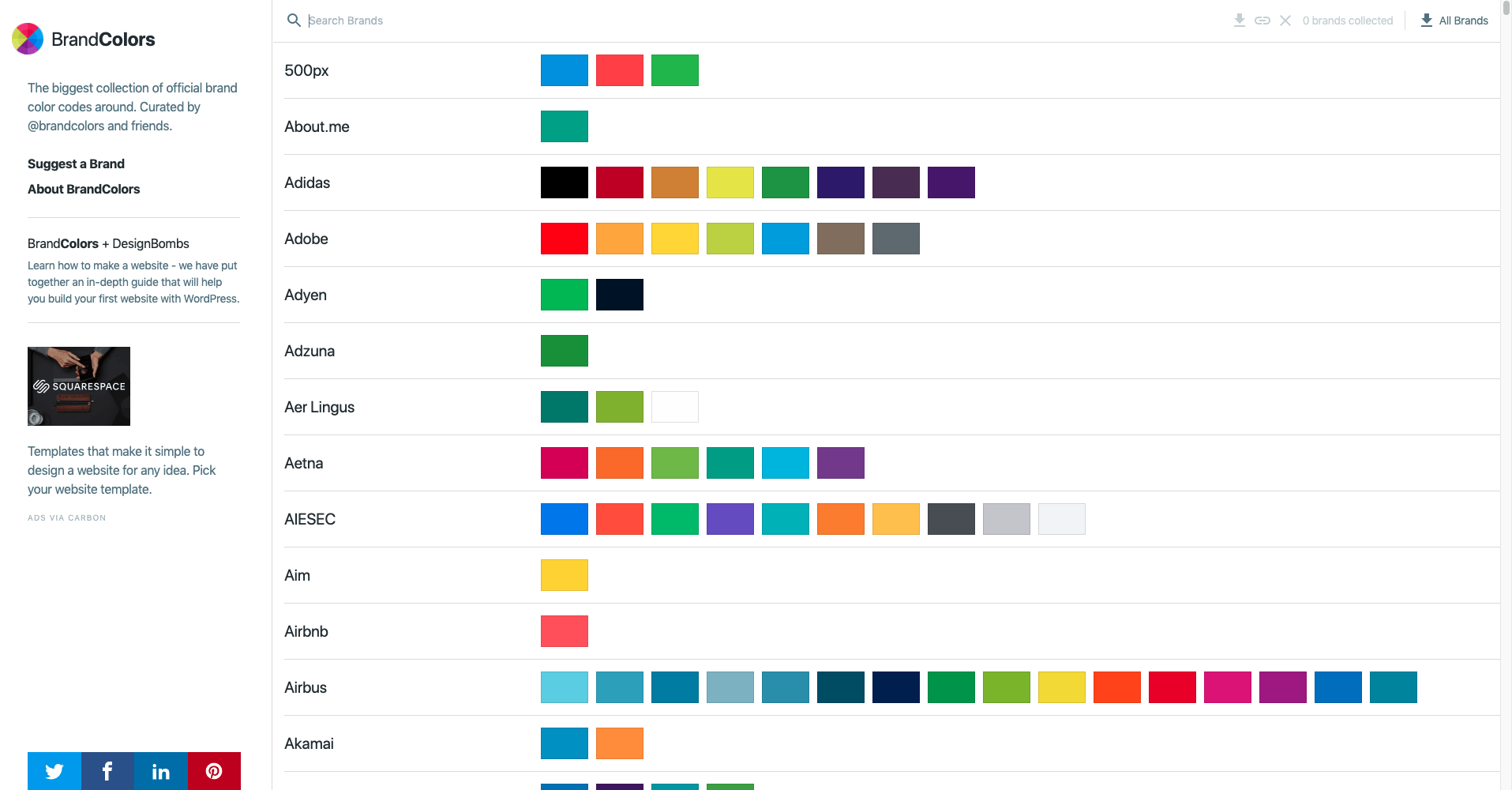
10. Brand Colors
Por último,
Brand Colors también trae una propuesta muy interesante: ¿qué tal inspirarse en las paletas de colores de las marcas famosas?
El sitio web cuenta con una colección de más de 600 marcas y más de 1600 colores que pueden servir de inspiración para tus próximos proyectos.
Puedes utilizar la búsqueda para encontrar paletas de marcas famosas. Cada una tiene una página independiente en la que puedes descargar el tema en CSS y otros formatos.
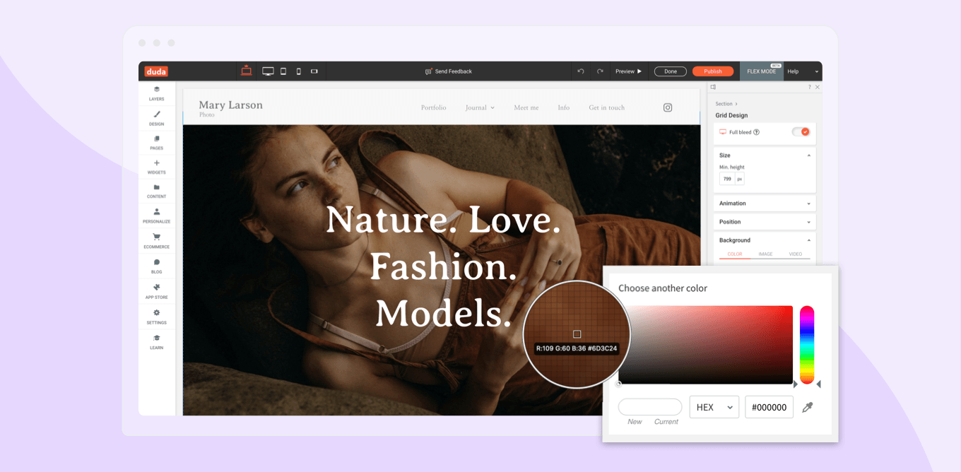
En Duda, las herramientas ayudan a dar vida a tu paleta de colores
En el editor de sitios web de Duda, es posible combinar perfectamente los colores en tus sitios web utilizando la
herramienta cuentagotas, ahora disponible en el selector de colores.
Esta te permite extraer un color de cualquier parte de tu sitio web - imágenes, texto, el nombre del color - y hacerlo coincidir perfectamente en otro lugar. No es necesario perder el tiempo tratando de averiguar el nombre exacto o el valor de un color.
Cuentagotas facilita la creación de sitios web de gran apariencia con colores uniformes de forma rápida y sencilla. Puedes utilizarlo para:
- Extraer un color de una imagen y utilizarlo para un título o un botón
- Sacar un color de cualquier parte de la pantalla y soltarlo en el editor
¿Aún no conoces Duda? Haz una
prueba gratuita ahora y descubre cómo podemos ayudar a tu agencia a escalar.